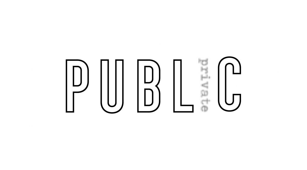

This is my first iteration of the two contrasting words I chose: public and private. I replaced the letter ‘I’ with the word private to signify how it is small and timid, hiding in corners away from attention. I chose a font which resembles the antique typewriters as they were always used in in movies and shows on important and sensitive documents like classified instructions or top secret papers.
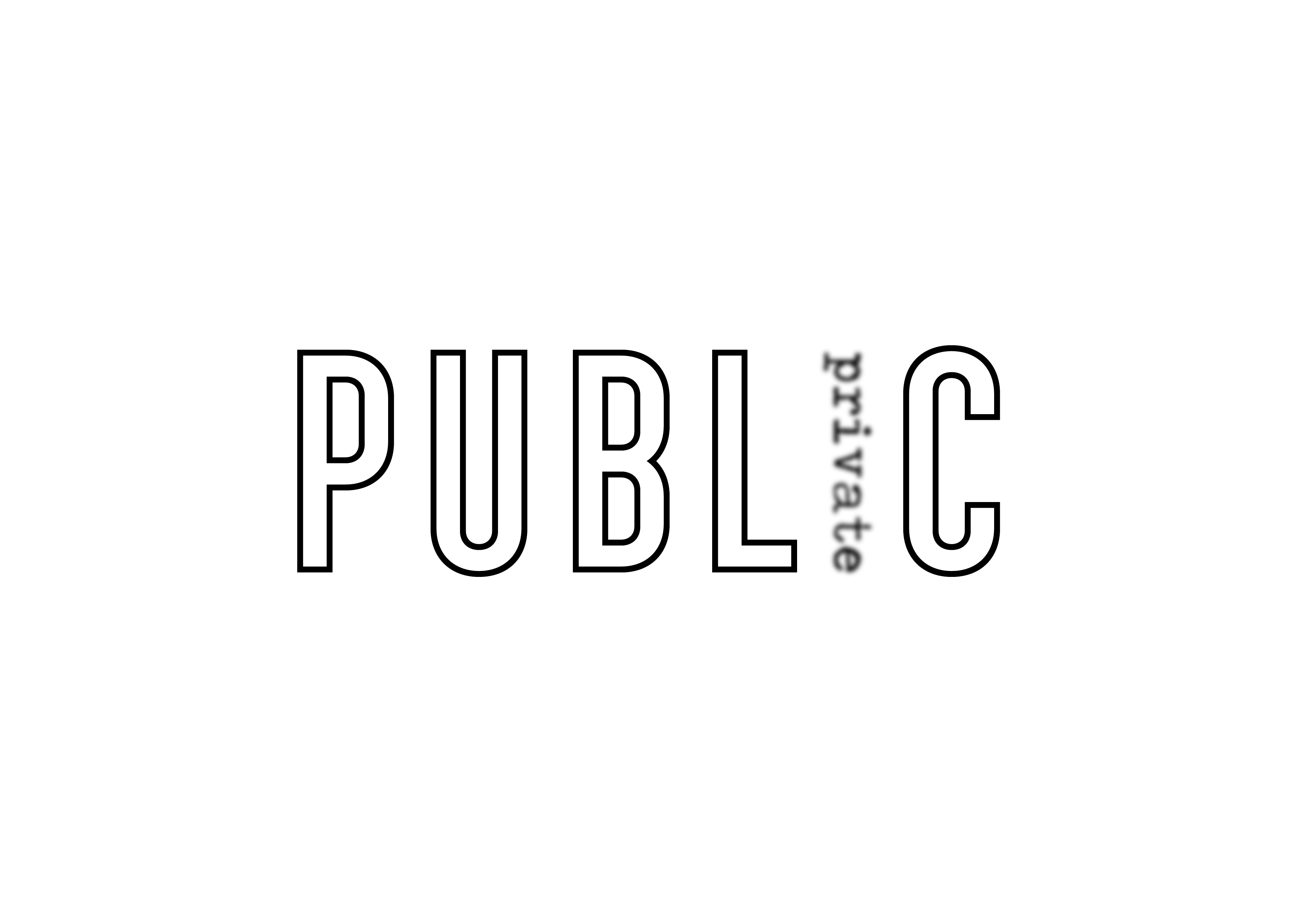
After the in-class critique, Lisa commented that the word private could be further pushed to evoke a sense of mystery around it. The blur effect would represent the fleeting motion of the word and it would show how the word tries to avoid being the focus. I tried to push the concept further by masking it with strokes, signifying being behind blinds. 