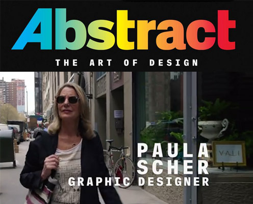
 Paula Scher was one of the first typographers I was exposed to by this TV Series on Netfilx called Abstract. From there, I was able to see typography from a different perspective. As Scher mentioned, one of the mantras she has was to ‘Illustrate with type’. Undoubtedly, I am struggling with using typefaces to my advantage which makes my designs look flat and stagnant. By using different typefaces as my brush strokes, it reinvents the way I look at designing my posters.
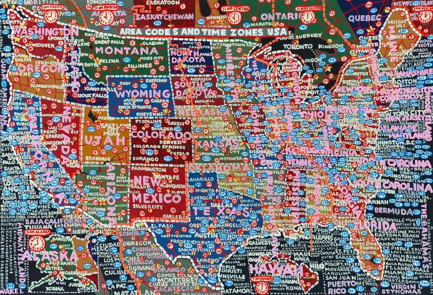
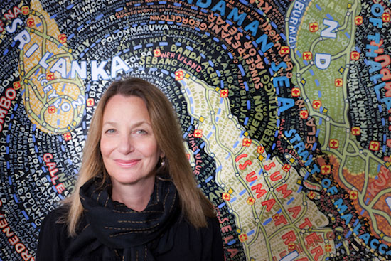
Paula Scher illustrated this map of the United States using demographic information about the region and she is using typography as her paintbrush.
Paula Scher is also highly against the use of the Helvetica typeface as she terms it to ‘neturalise feeling’ and she also blames it for causing the Vietnam war in another interview in the movie Helvetica. Typefaces have a personality of their own and we should use that to our advantage when designing.
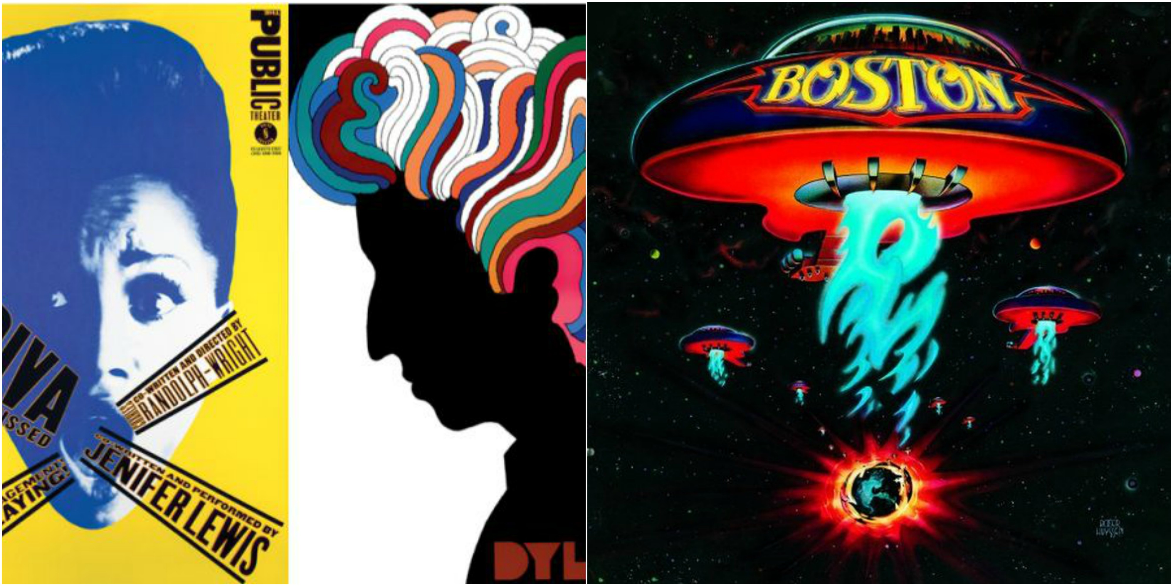
From her humble roots as a album cover designer, she was able to create many different album covers using custom typefaces which made her designs standout amongst the sea of generic album covers and typefaces.