
So my earlier ideas got rejected because it was too “touristic” as if its a promotion or publication for Singapore Tourism Board. So I decided to think it through again.
Idea 4: Silk Roads
For this idea is a play on the fact that previously Kampong Glam used to be a place where people do trade, selling different items to make a living. Another thing that stands out during my visits there is the number of streets there is, how they criss-cross each other and forms like a grid system for the area. So I could play with these 2 elements to create the zine.
However, I would think that the idea is not deep enough as a concept.
Idea 5: A Fictional Destination
So there is a palace. Many shops that sell different made things. Many shops that sell items needed to make stuff. A mosque. And food outlets, restaurants. An idea struck me in a way that it looks like the elements that can be found in a game. Castles, shops that sell items, a place of prayer, and food shops. So I could create a form of promotional content for a new in-game area that just opened. The design concept would be pixel art, like those Pokemon-top-view games.
However, I would feel like I’m just literally making the place into a game, and not really exploring much of the graphic forms and visuals.
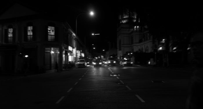
Kampong Glam at Night
So after rejecting my own ideas, I decided to go back to Kampong Glam. but this time I decided to go at night, to see what is there, and what are the differences, and to my surprise, it was actually quite different.
(Sorry for the bad images! I have really unsteady hands)
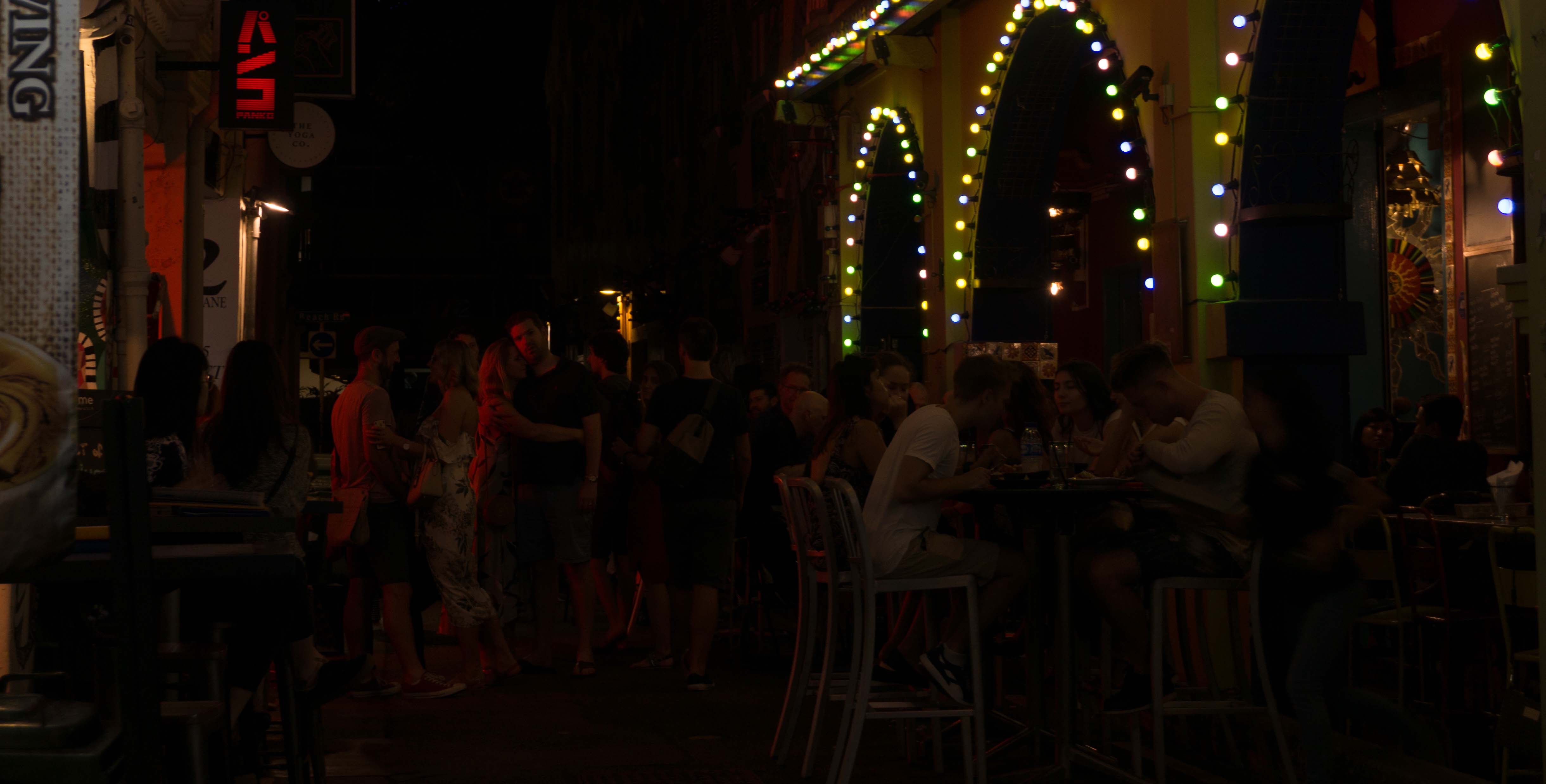
Eating and chilling
At night, there seem to be more people there to eat, drink and chill, and more food shops open at this time too.

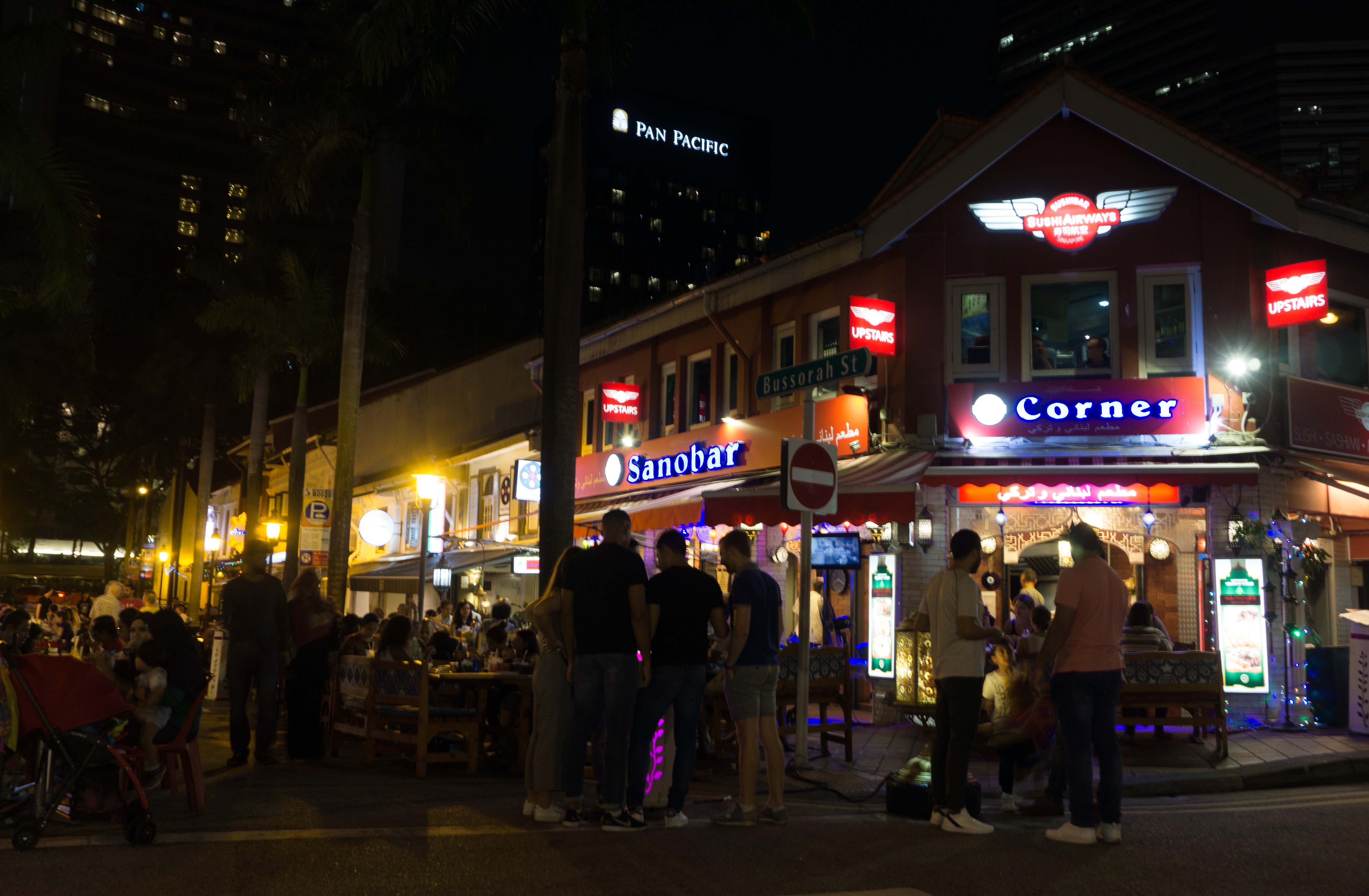
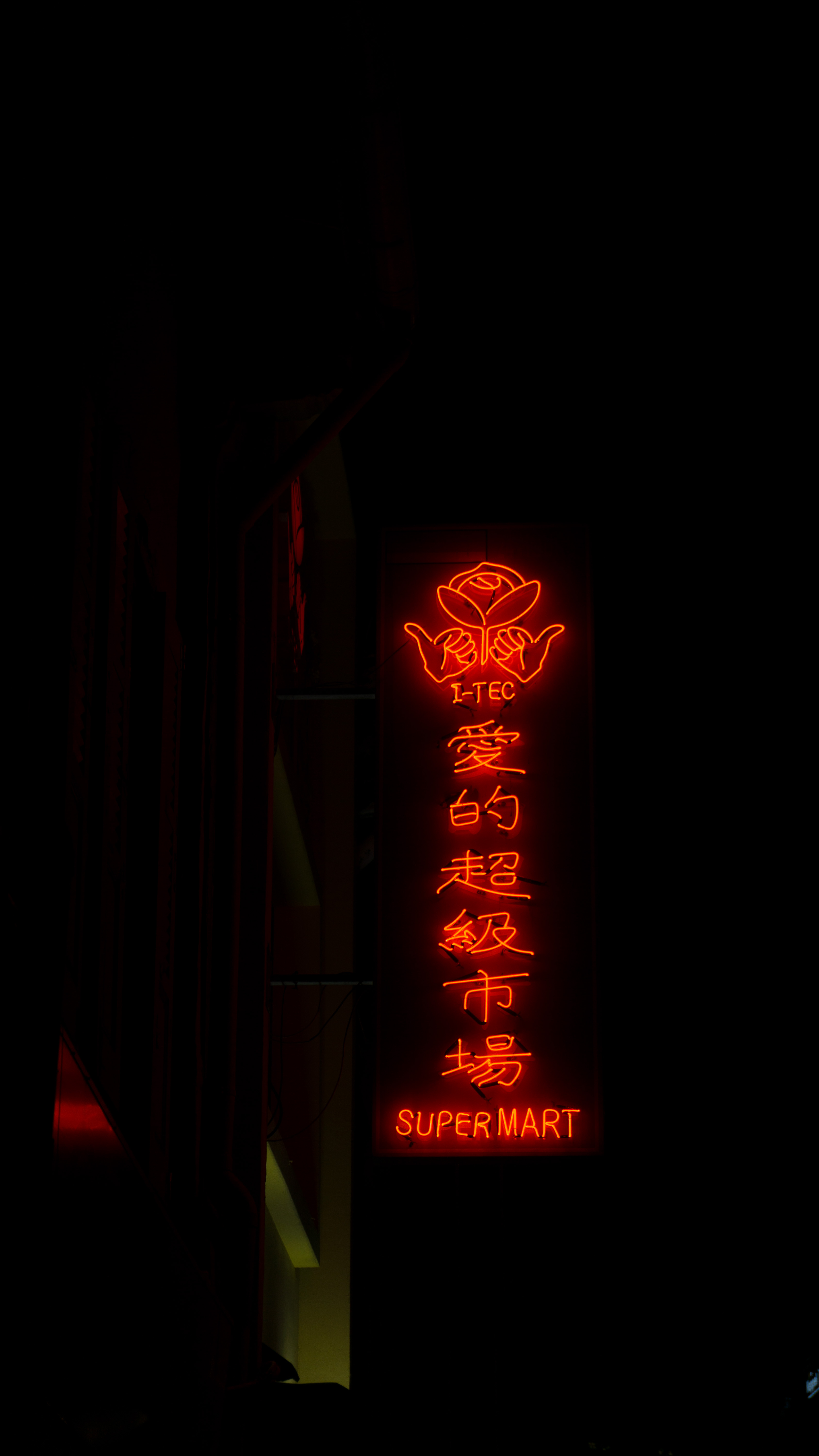
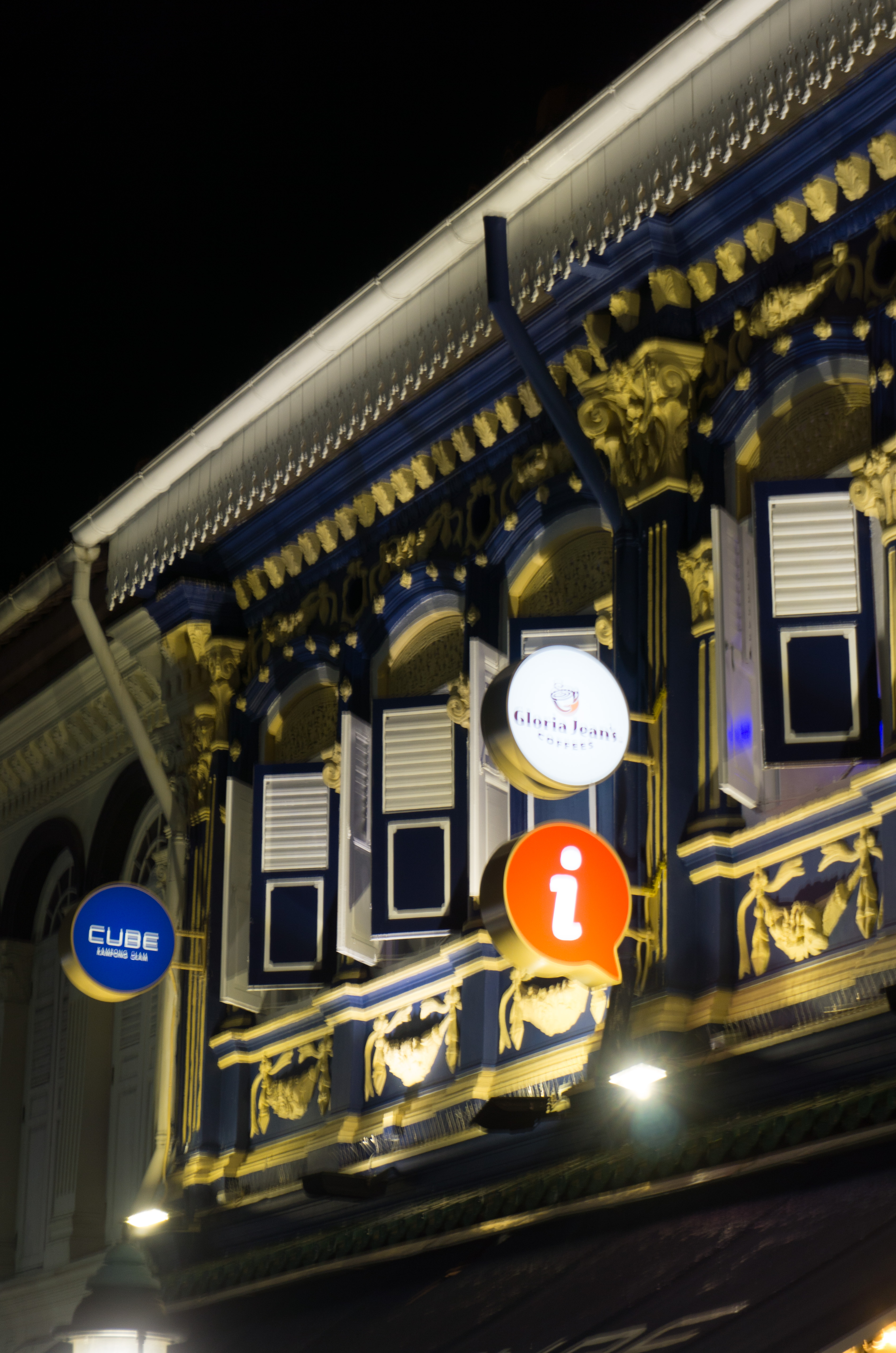
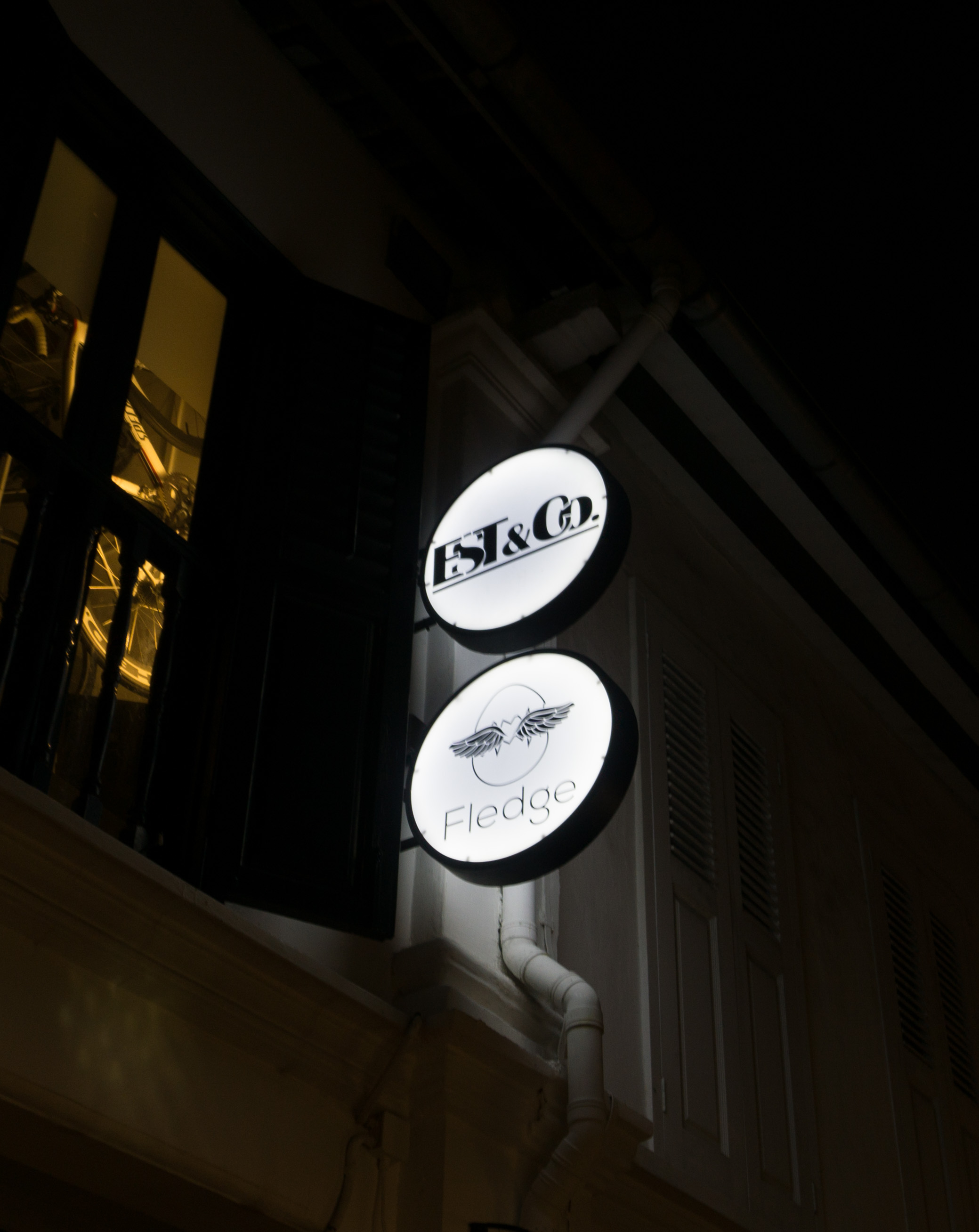
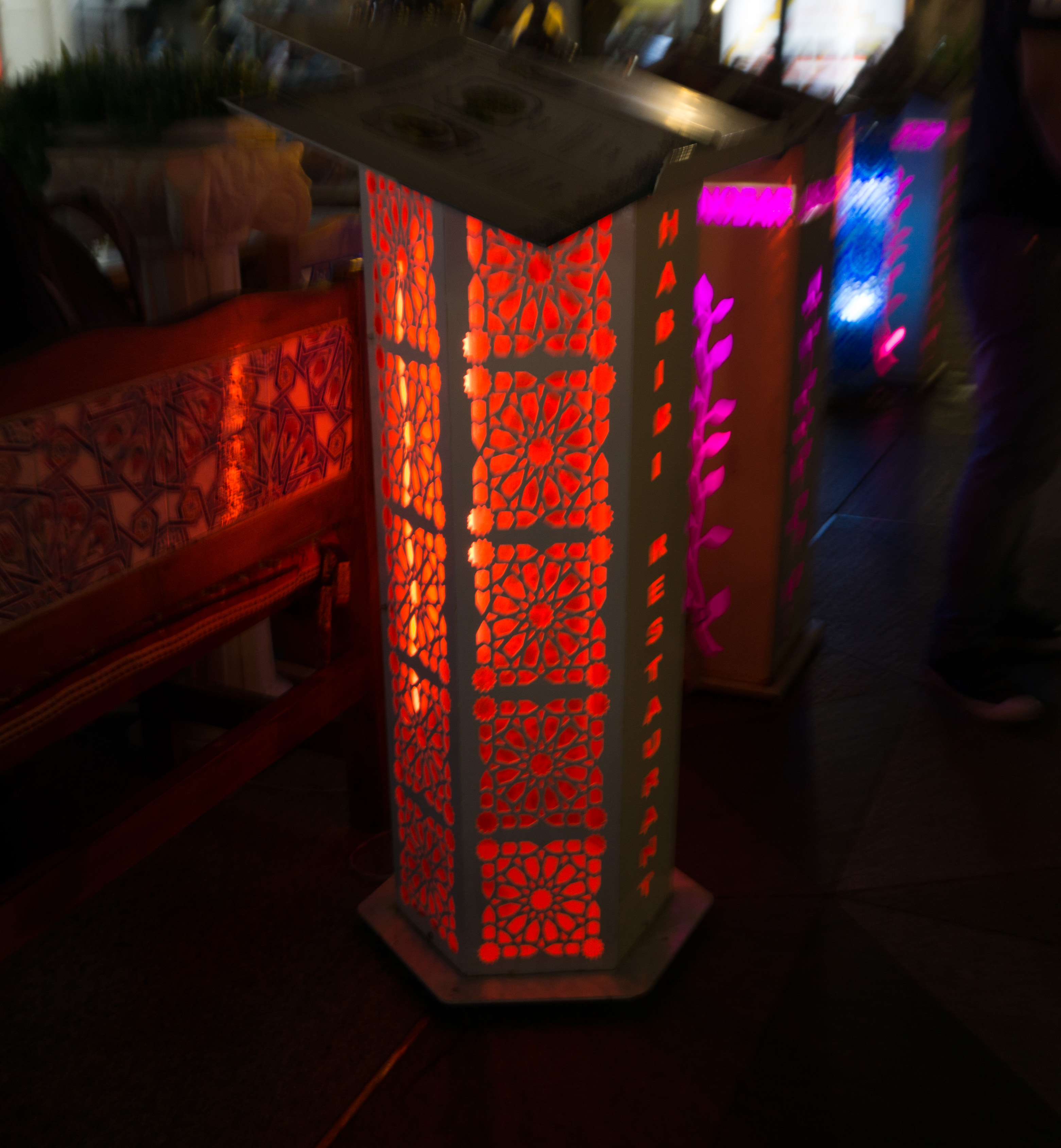
Neon lights and signboards
The things that would stand out the most would be the neon lights and the signboards that would only be switched on at night. In the day it would appear as just a plain signboard. Some signboards would even change colours!

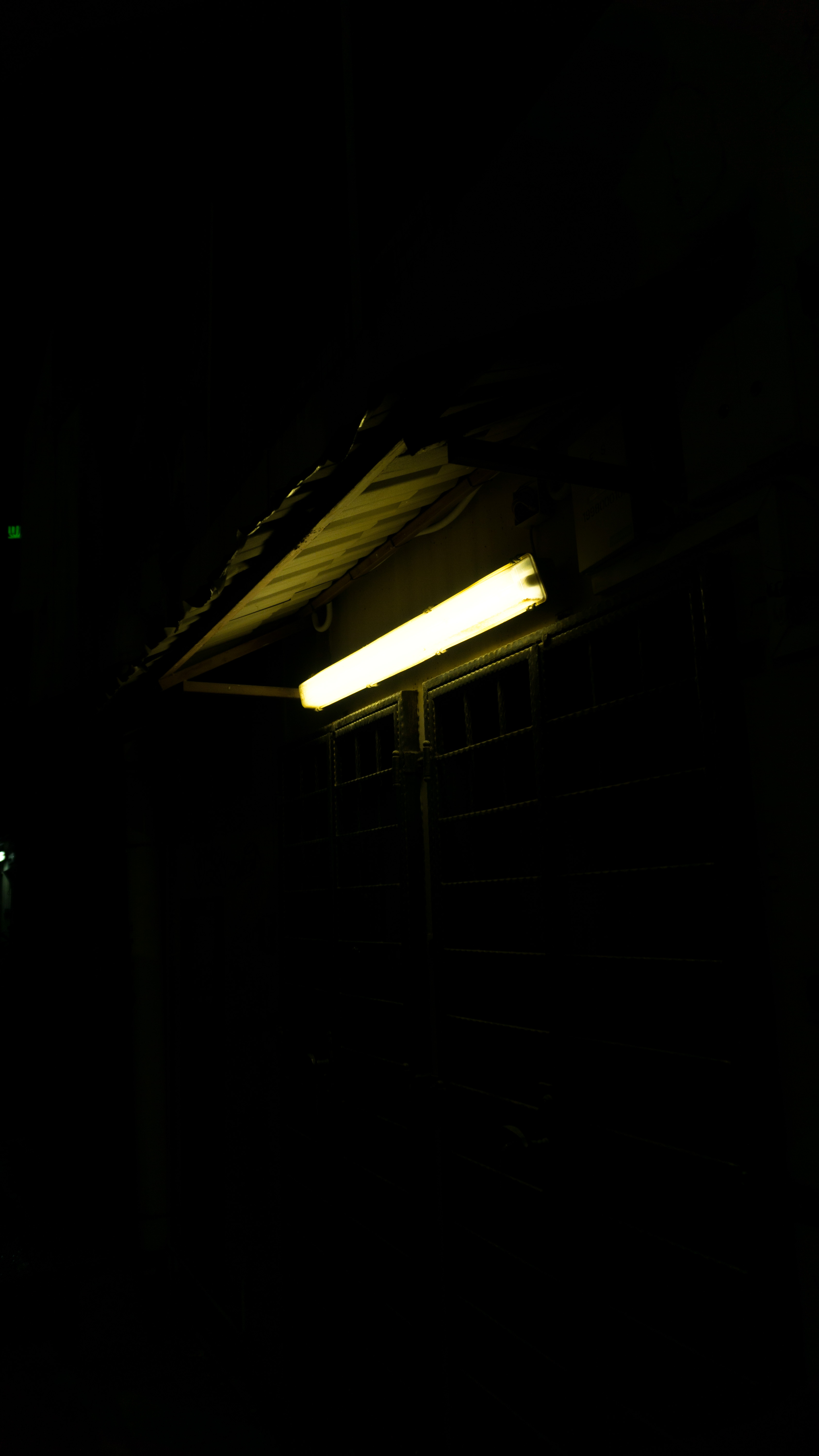
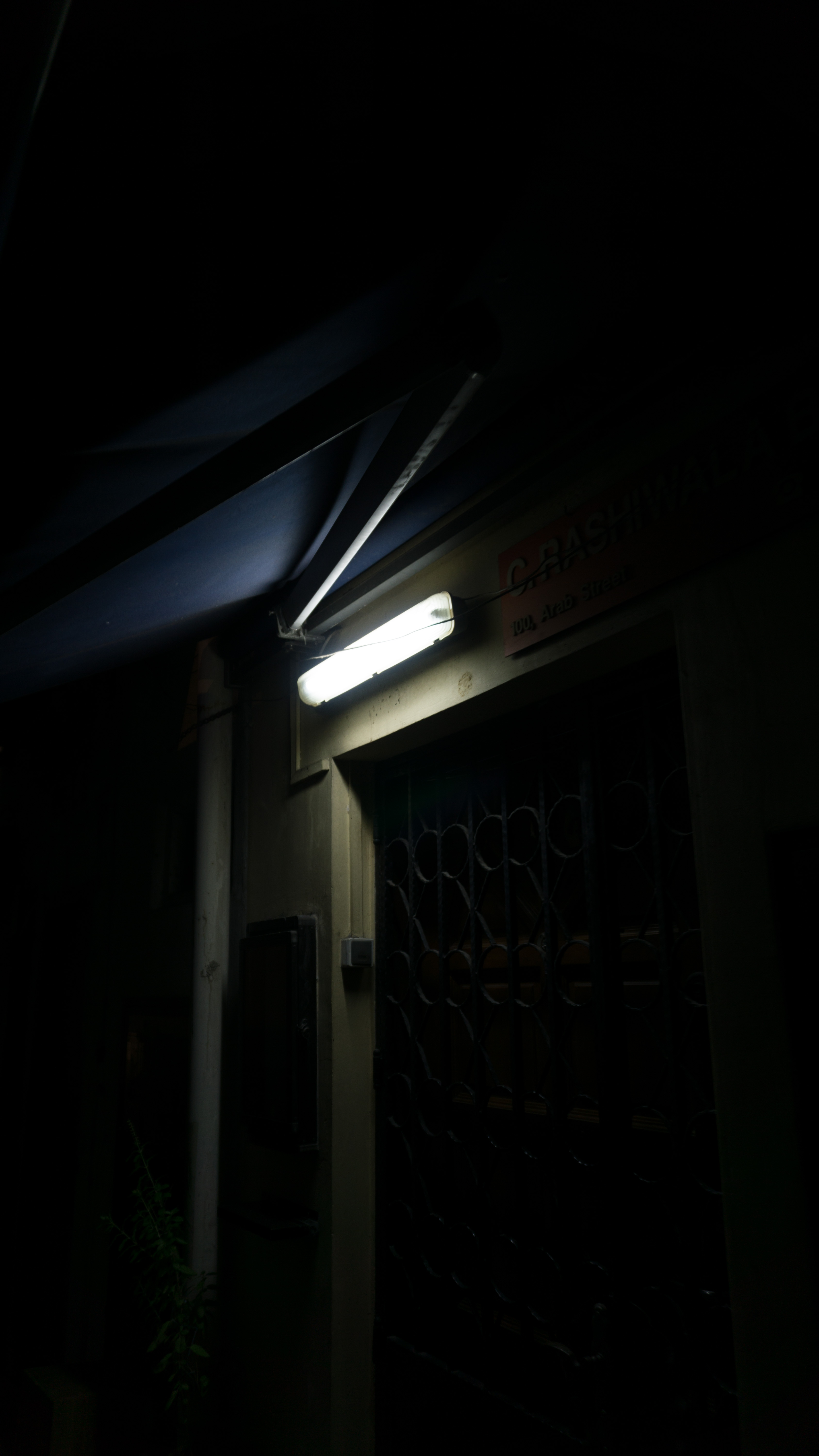
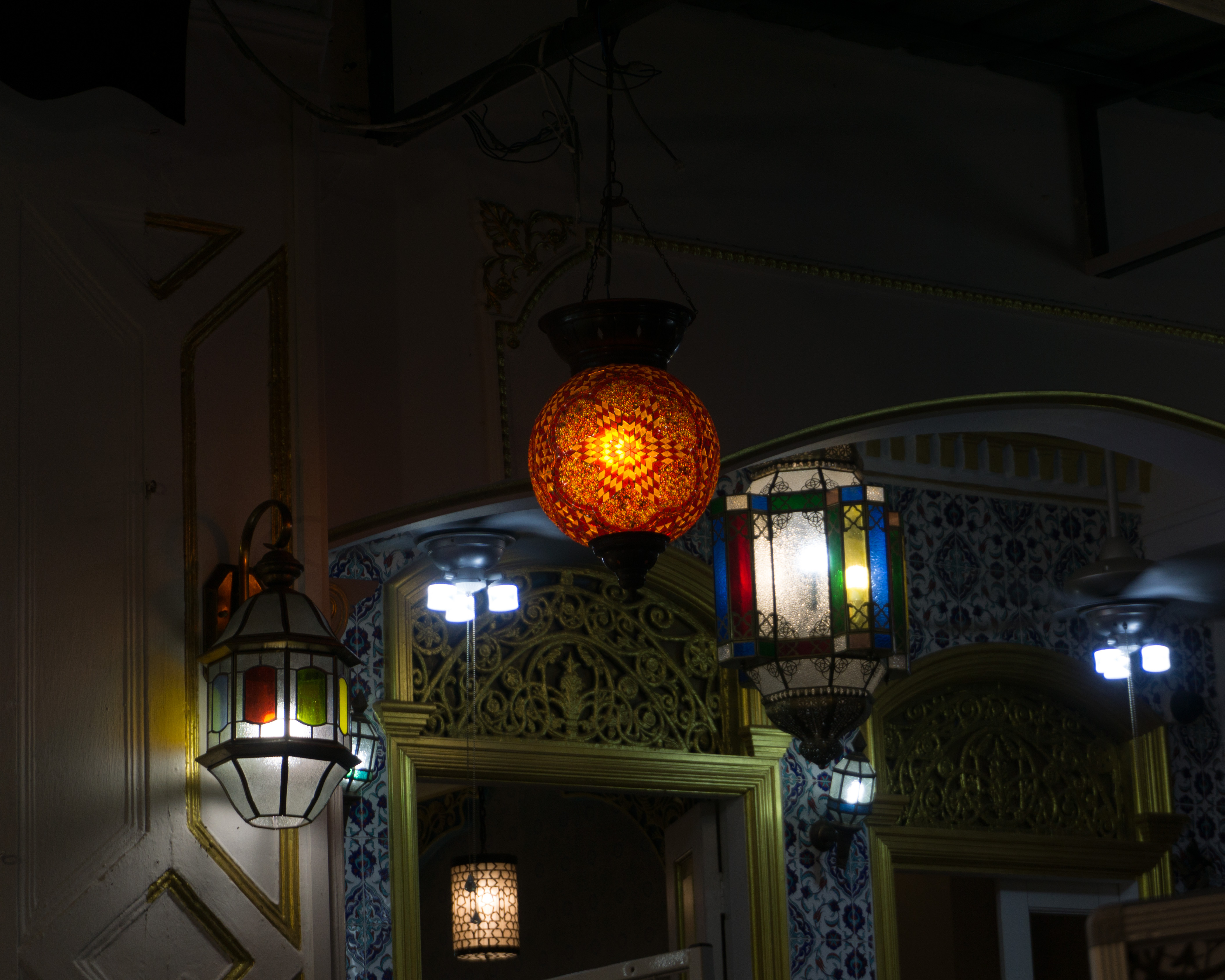
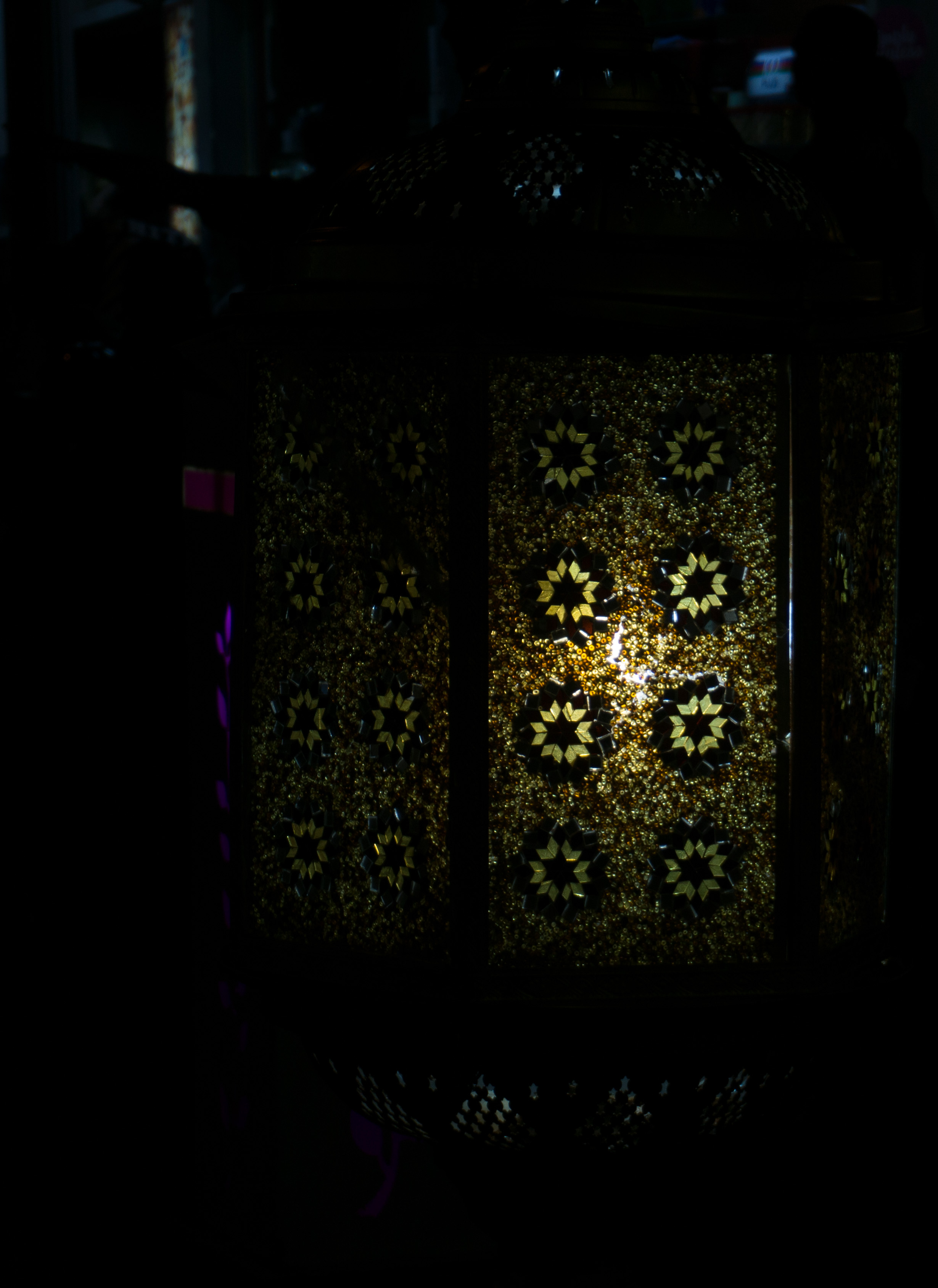
 Lamps of all sorts
At night, the lamps that you normally see along the streets will be switched on, hence creating and displaying all these different patterns and colours that you won’t normally get to see in the day.


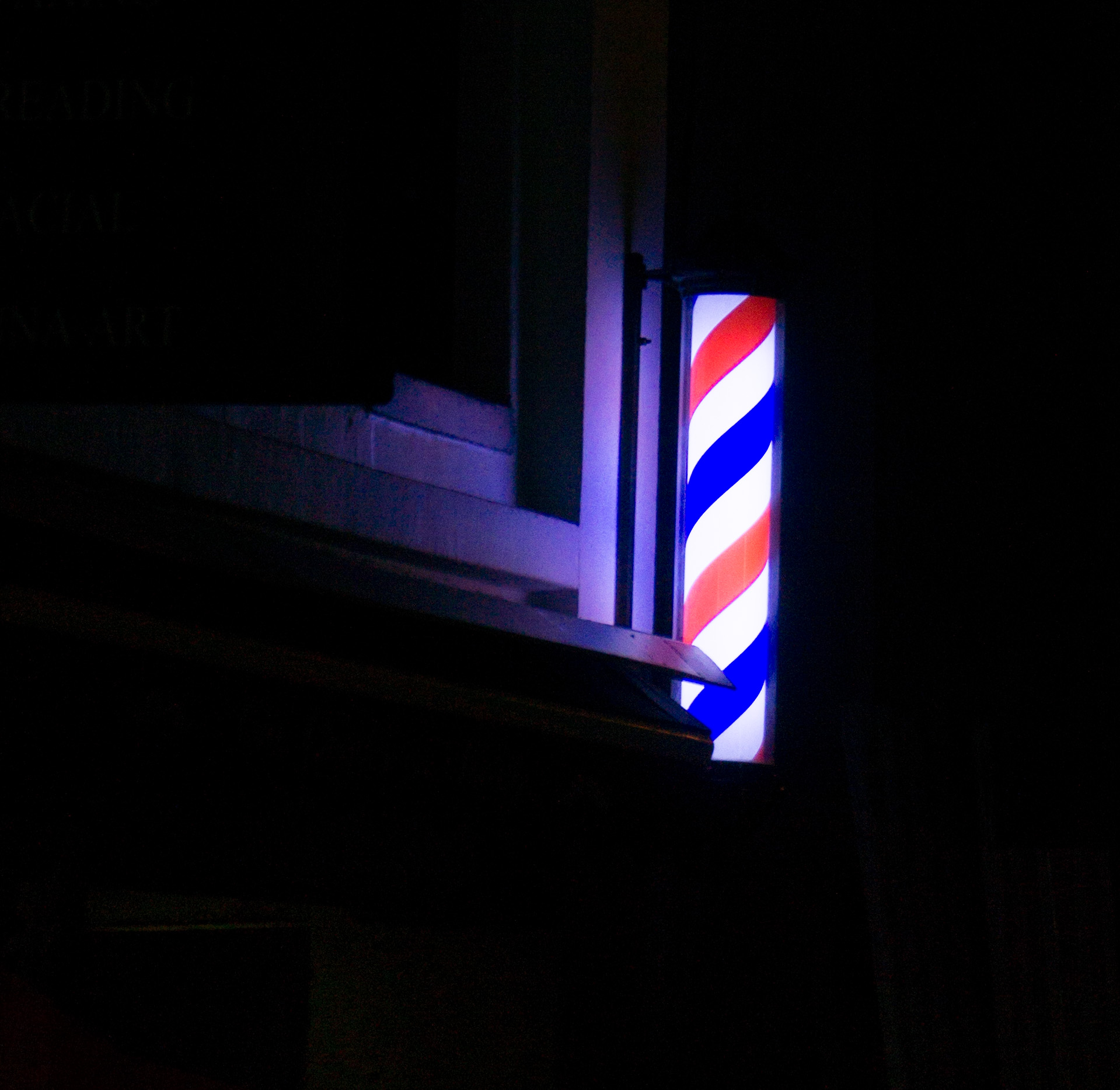
A barbershop that operates into the night
Bottoms up!
Not only referring to the drinking culture in Kampong Glam at night but the lights at some of the buildings at Kampong Glam also does it too. The lights shine upwards on the buildings creating a unique look and also making the buildings look different.
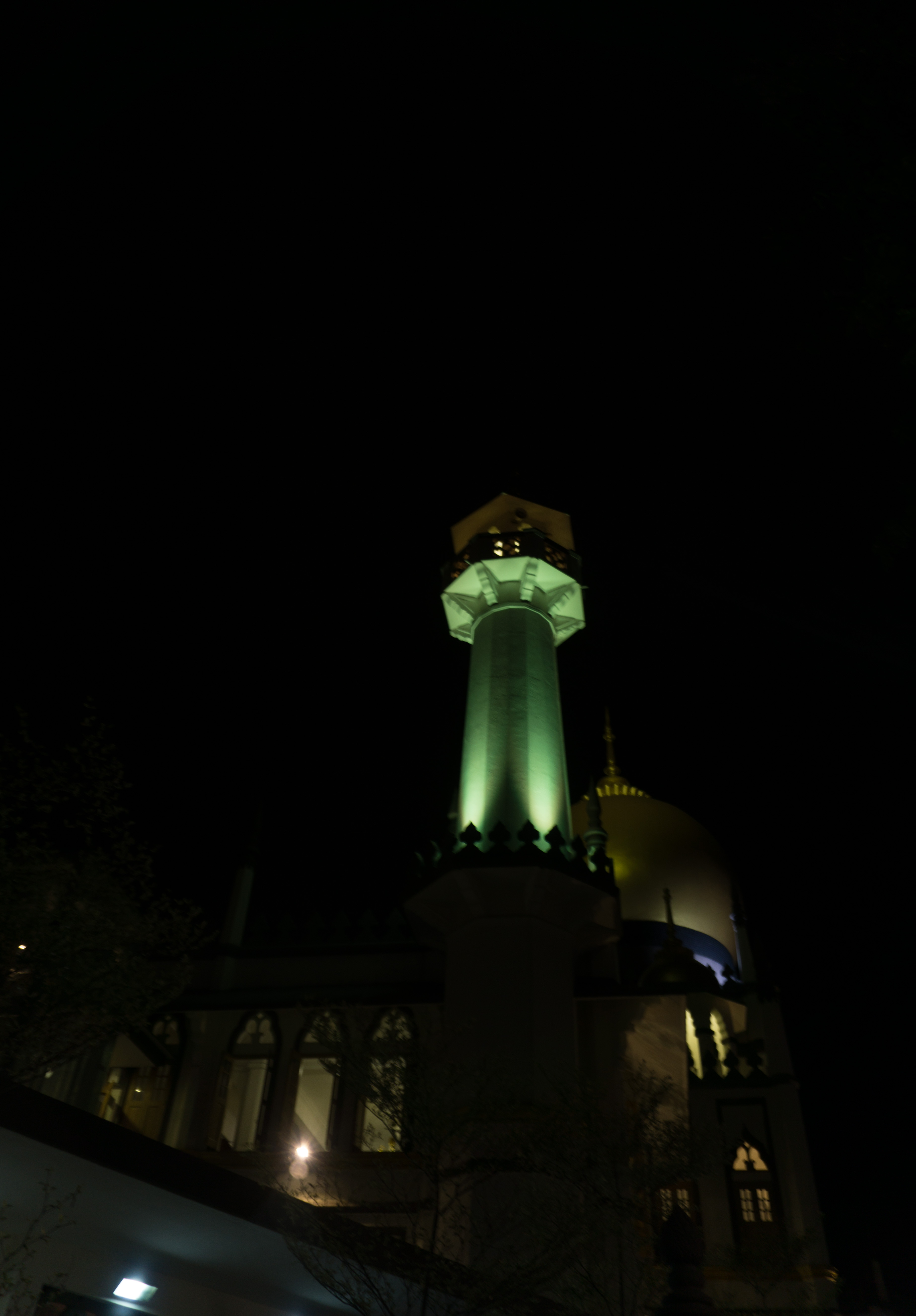
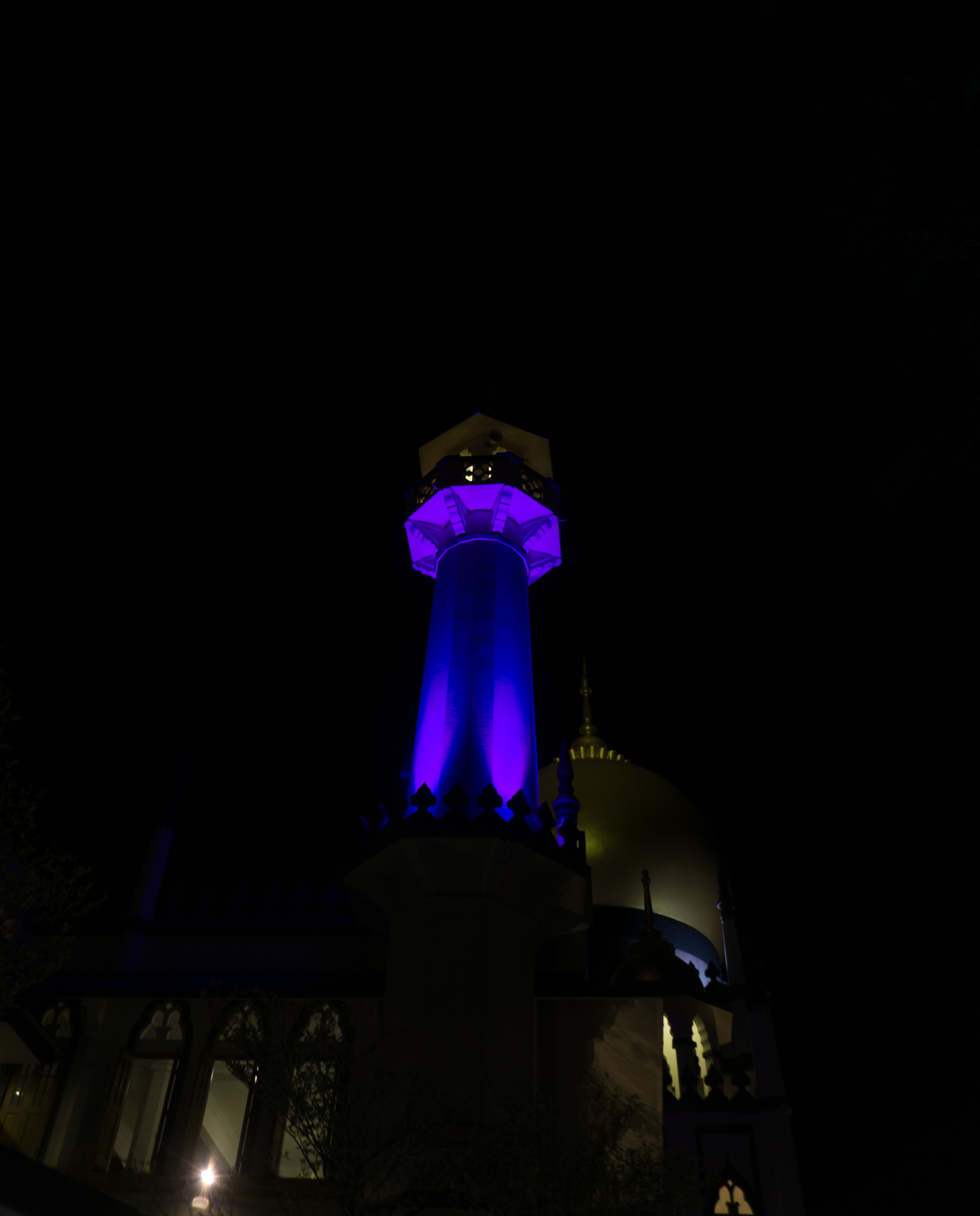
The lights on the minarets of the Sultan Mosque changes colours too!

 Other findings
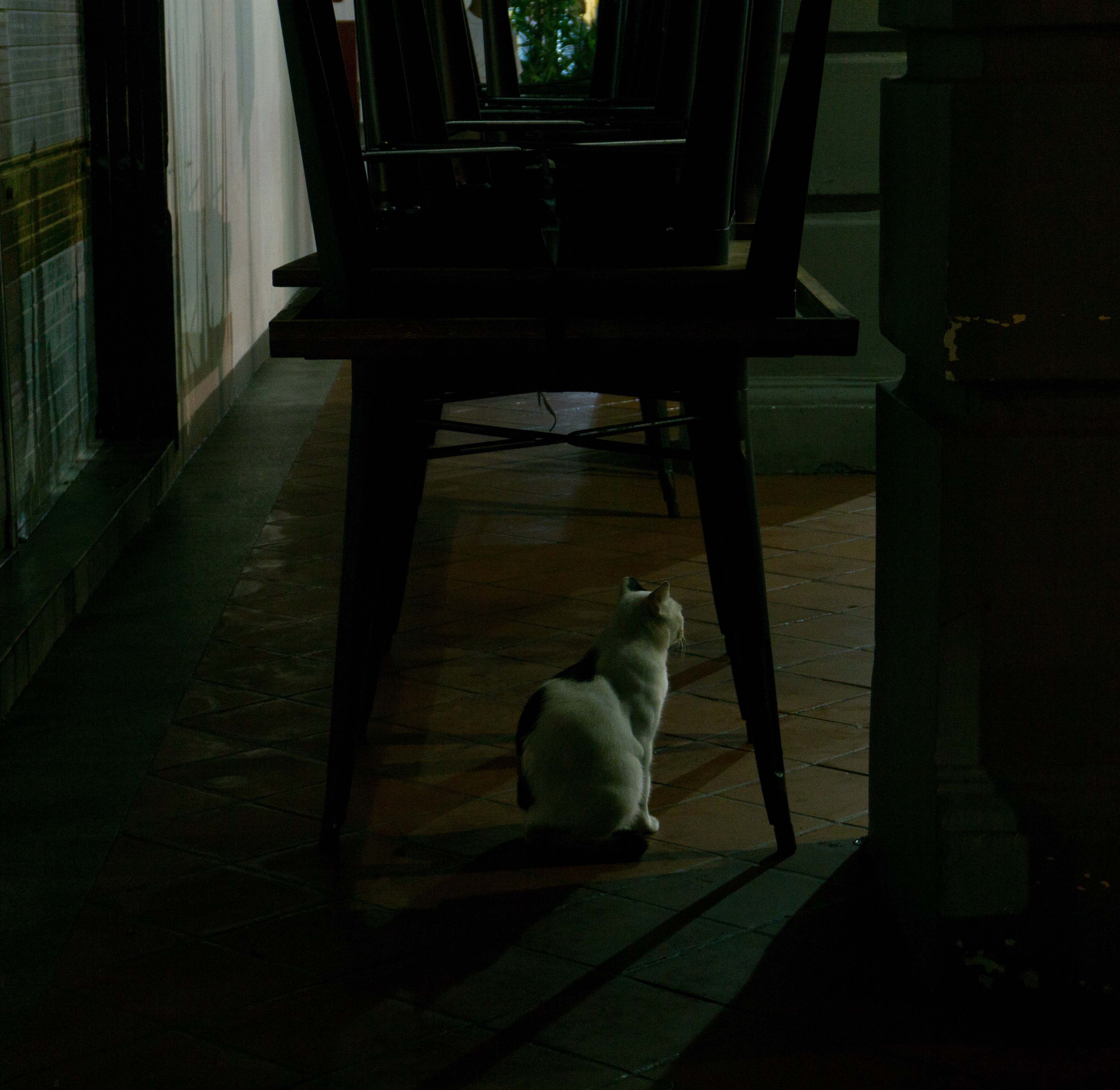
A friendly resident

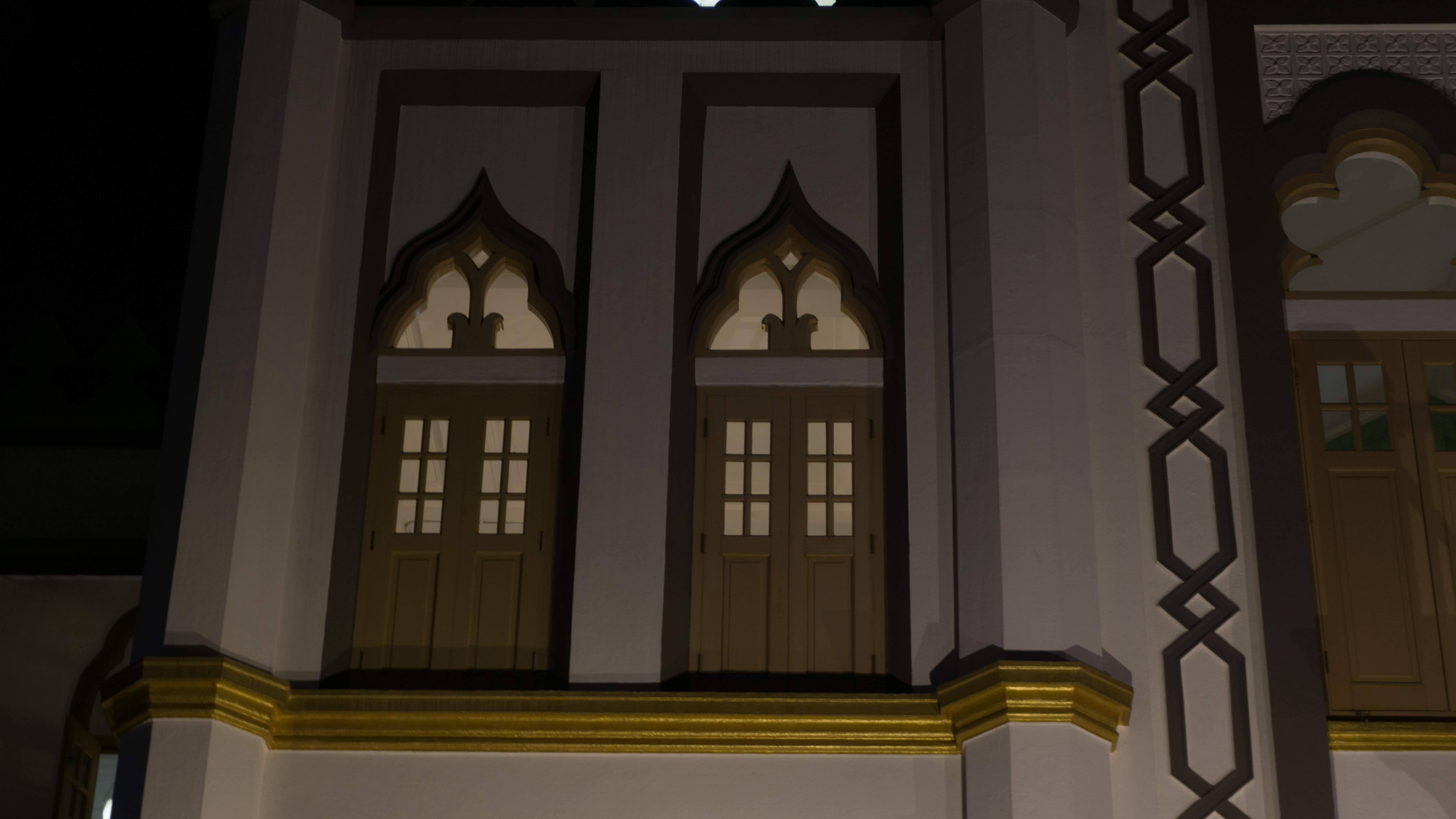
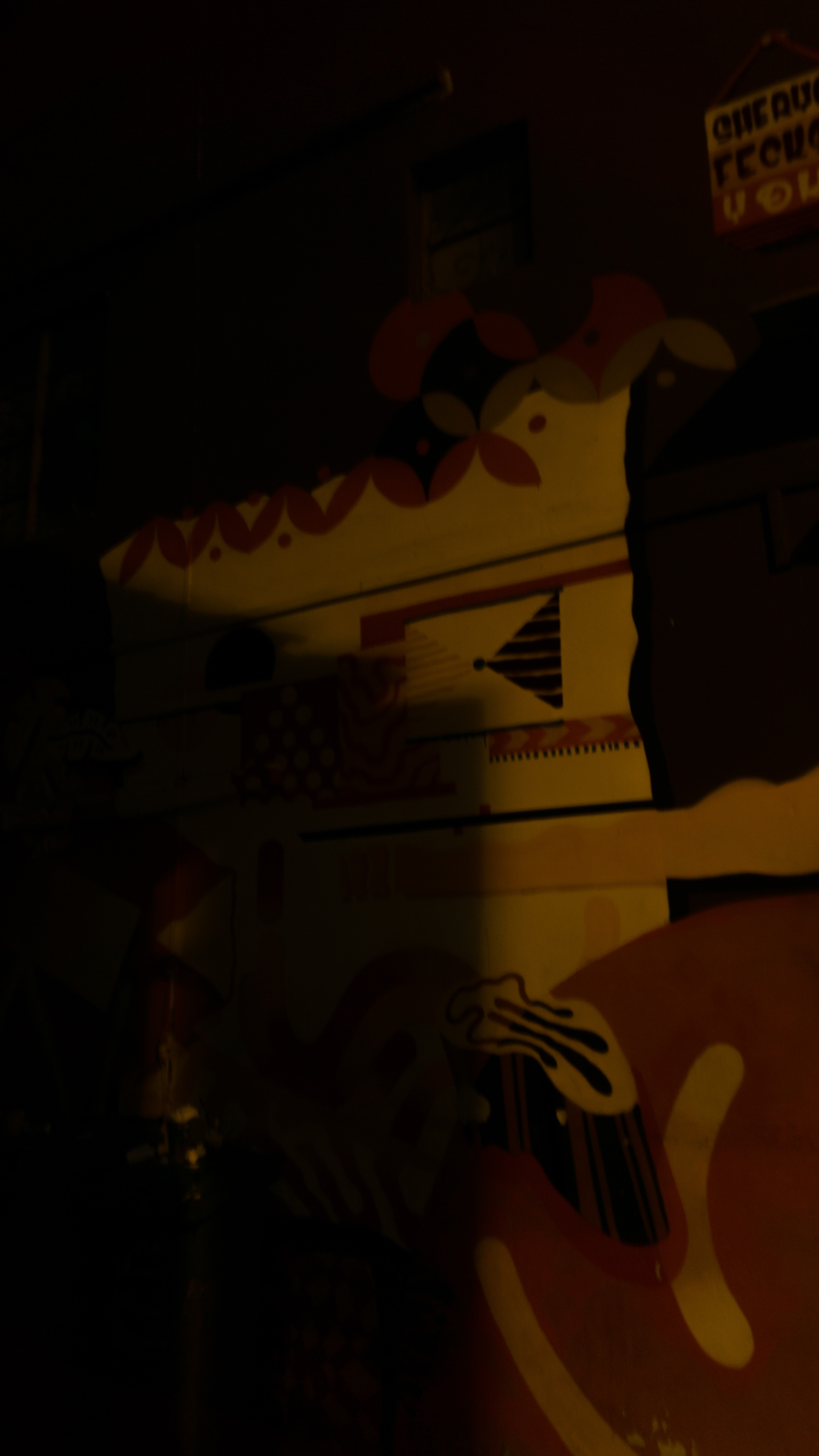
Lights from the nearby buildings, such as this Duo offices and residence, has a unique look too!

The lights shining in between the window panels make it look like an opening book effect
The many different lights caused a layering effect on the walls, which is really interesting!
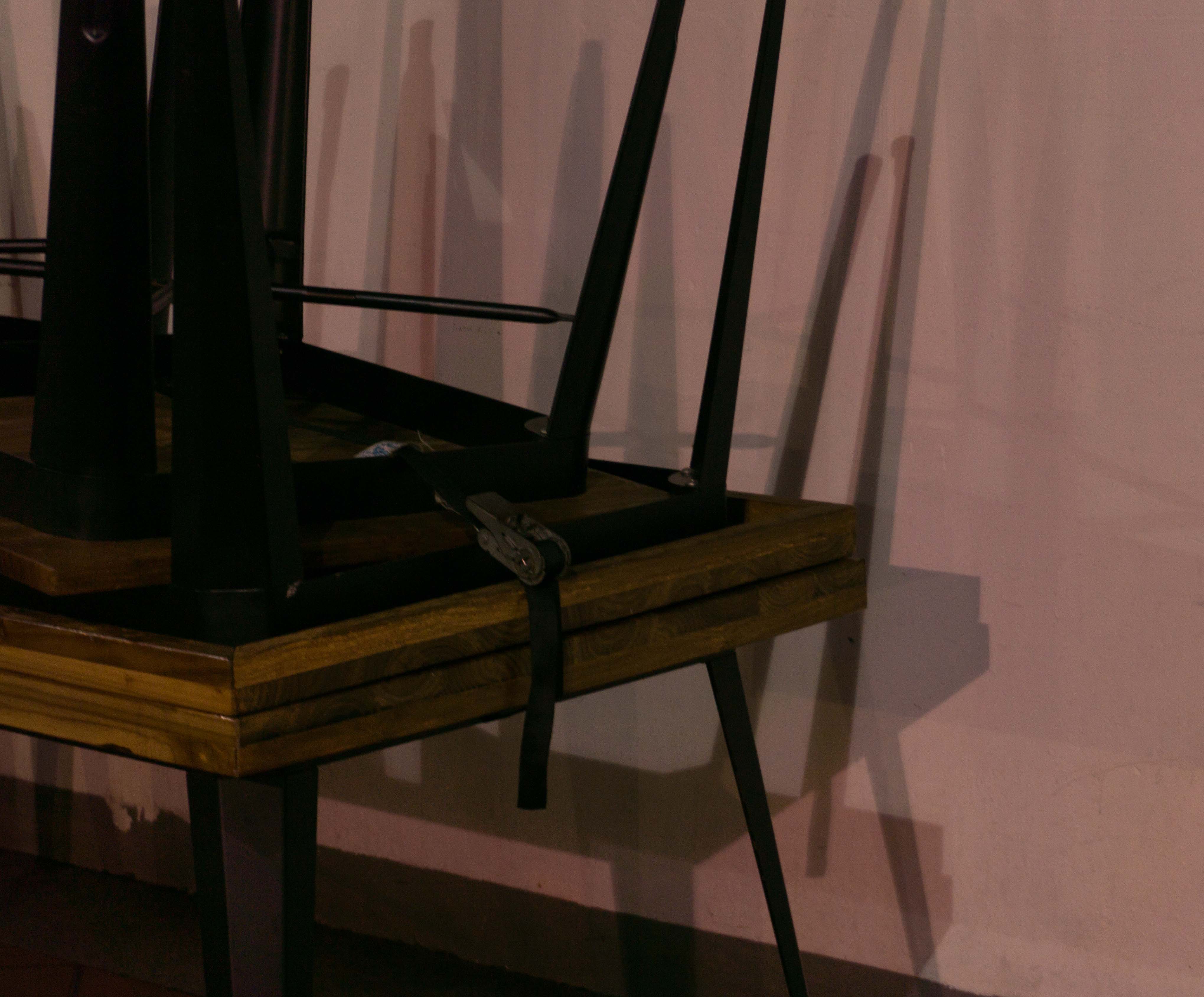
The lights also caused some of the seen patterns during the day to be hidden, creating an interesting look to it.
So after all these findings, I came out with another idea that hopefully works.
Idea 6: Day to Night to Day
After all the research and visits, I could see that there are different activities that would stand out during the day and also at night. In the day, most of the retail shops would be open, and the place would be crowded with tourists groups. In the night, however, the retail shops will be closed and the bars and pubs will open. The lights from different signboards and lamps will be switched on creating an entirely different vibe to the area. All these would be interesting to explore and put in the zine.


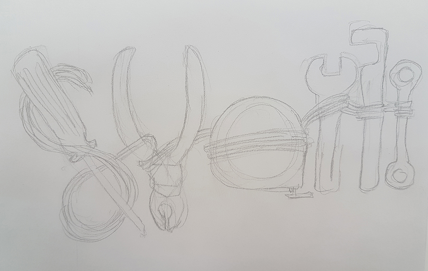

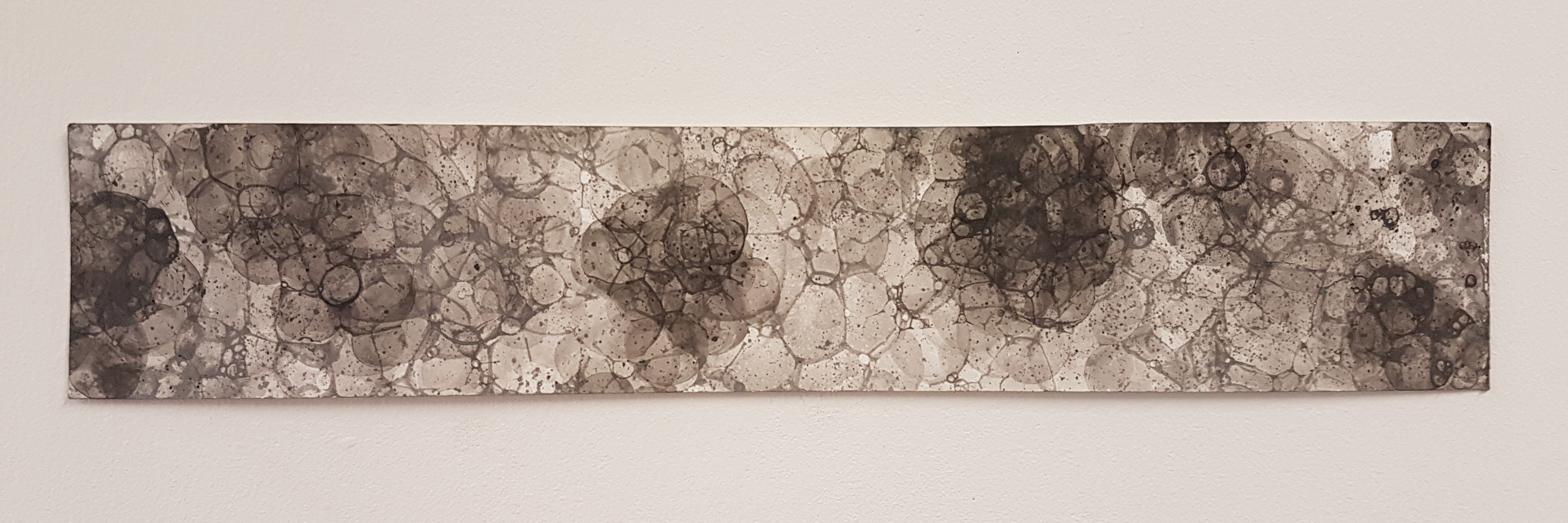

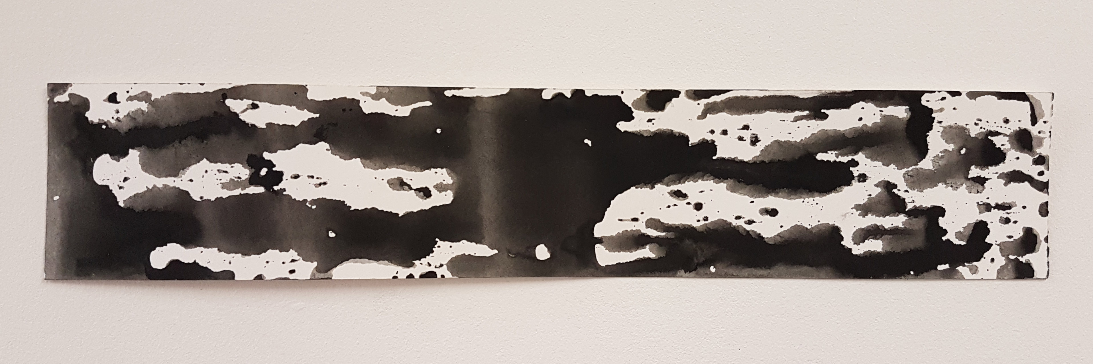
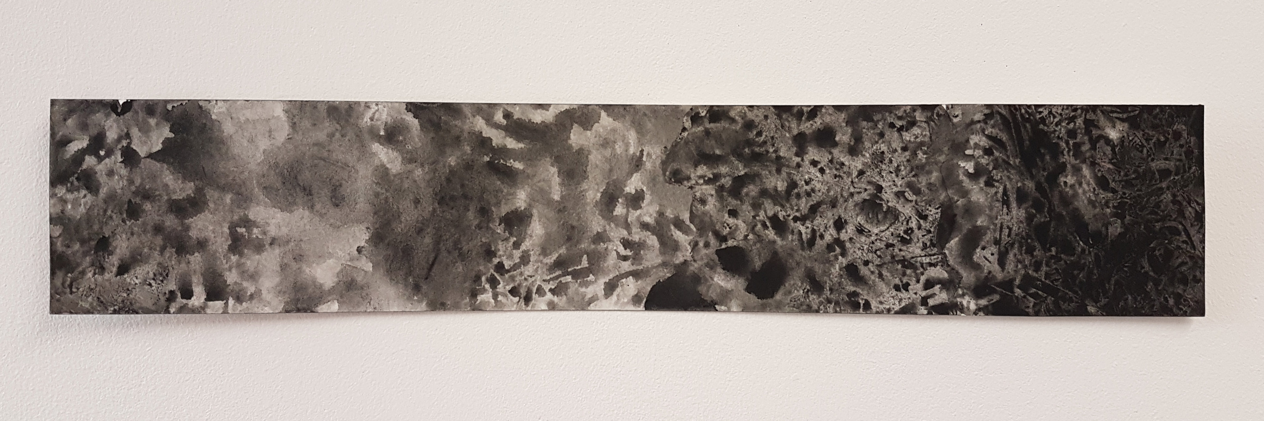
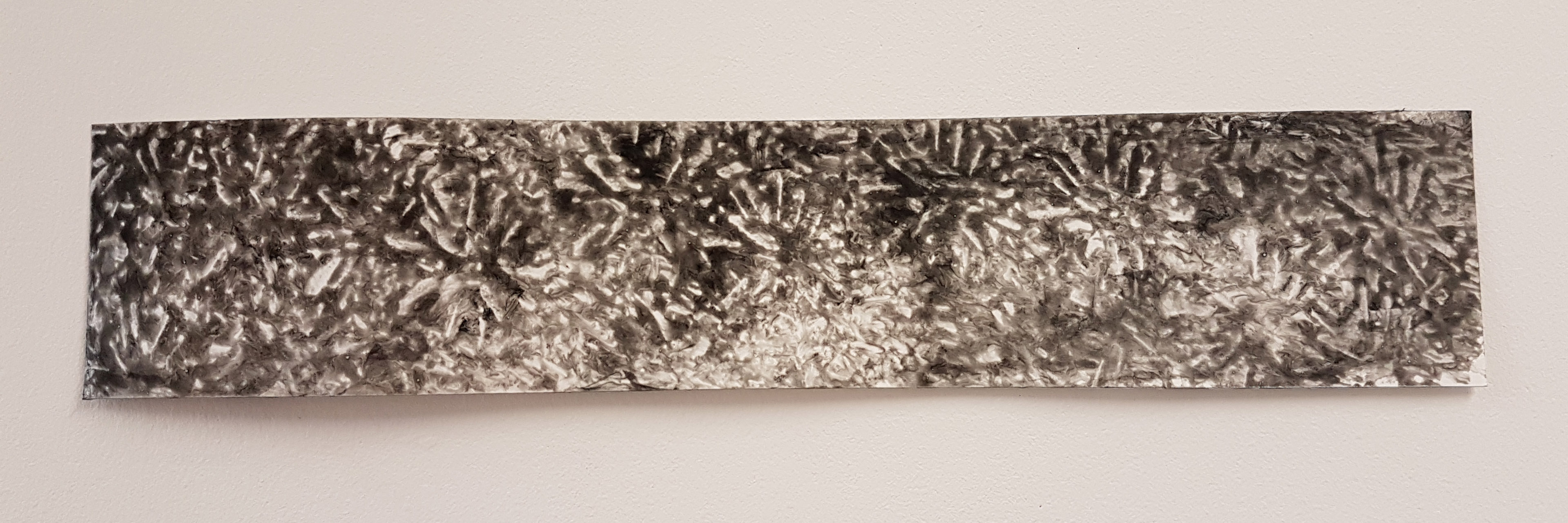 The feeling of great fascination, somehow creates explosions and fireworks in your head, in a literal sense: mind blown. (Would have used that word instead but its not in the list.)
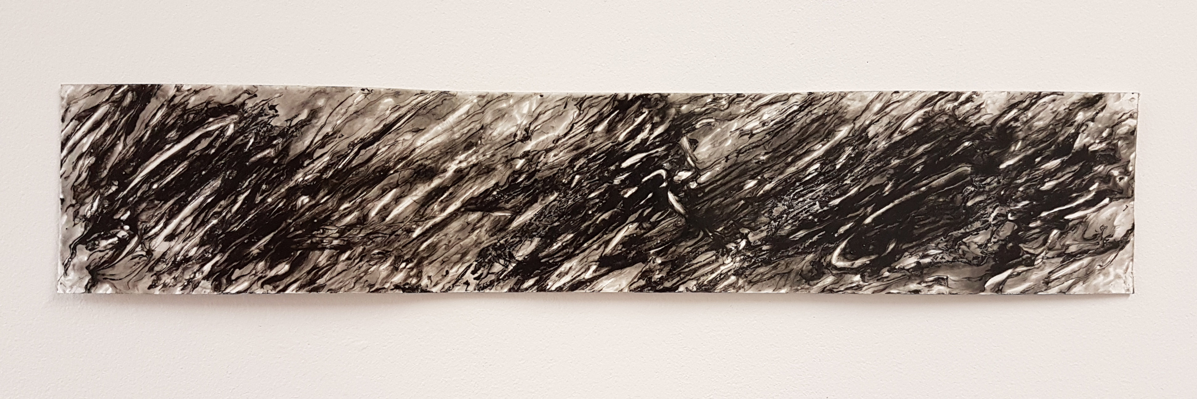


