Final Design Outcome
The finalised graphics for each of the regions:
Deliverable 1
The first deliverable is an event poster
Deliverable 2
Store sign
Deliverable 3
Deliverable 4
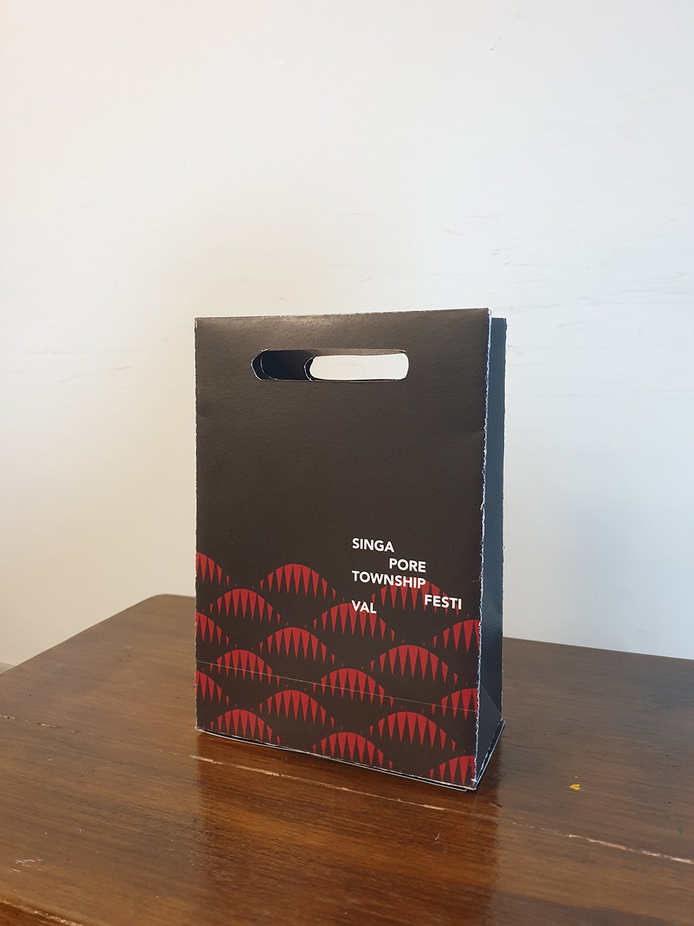
Paper bag design (exterior)
There are 6 posts tagged publication (this is page 1 of 1).
For this assignment, we are to create a series of illustrations for a fictional event, which could be anything. The deliverable is are themed illustrations of at least 5 illustrated items, which at least one of it has to be 3D.
First approaching this project, even though the project could be literally about anything, I would think having a more realistic approach is more suitable for the long run in terms of portfolio. I think to design for a fictional but realistic local event looks better for a portfolio than an invitation for an outer space birthday party.
The even that I decided to go for is a festival or a market with participants from the different towns in Singapore. It shall be called Singapore Township Festival. As the name implies, the festival is all about food and handmade items, in a sense promoting local produce and crafts and at the same time, the Singaporeans love for food.
The idea is that every town would have its own design or graphics, but the styling from all the graphics from all the towns could come together and look like it’s from the same event.
The graphics would be a visual representation of the history of the town, where the name derives from, or any urban legends that are linked to the town.
I can’t possibly do the designs for ALL the different towns in Singapore. So I decided to pick the 5 different regions in Singapore :
South would generally be referred to the smaller islands south of Singapore.
The reason why I chose these towns is that they are more recognisable to the public and have been there longer than a lot of the newly developed ones.
Since the illustration is more of a secondary graphic only as a supporting visual element for the different towns, I figured the illustrations should be more of a repeated pattern, where a visual element of the town is repeated to create a pattern.


Most of the towns in the North is named after (or has links to) a guy named Nee Soon, such as Yishun and Sembawang. He made his fortune from his pineapple and rubber plantation, hence the reference will be from these 2 items.

Pineapple

Rubber plantation
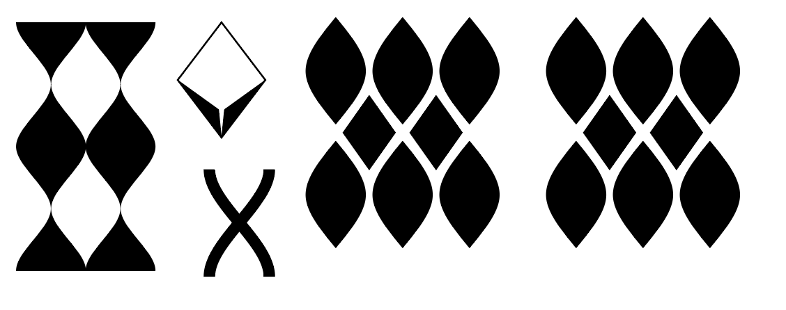 I combined the repetition of the pineapple with the lines and the collecting container of the rubber plantation.
Northeast long ago were mainly fruit plantations. Even the term Punggol means to “throw sticks at fruits so it falls”. Now towns like Sengkang and Punggol has sea themes to them, hence another element to combine it with.
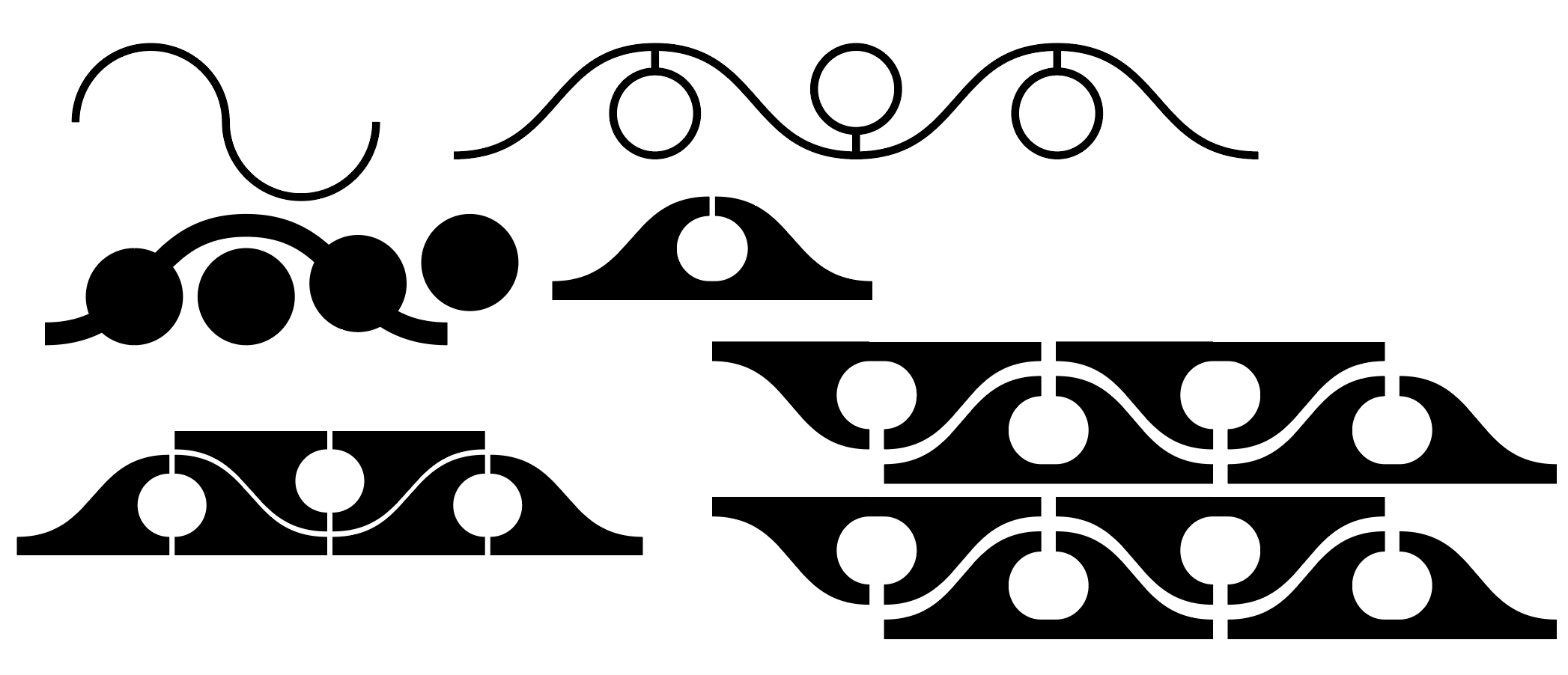 I combined waves and added a hanging fruit in it. When repeating the waves, it forms like a vine with fruits growing out from both sides.
Inspired by the story of how Bukit Merah got its name.

A hill
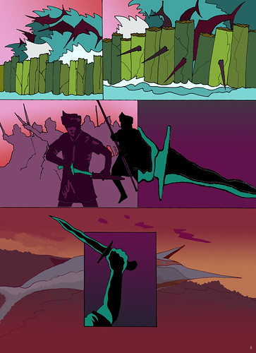
Story of Bukit Merah
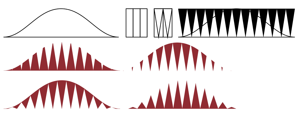 Combined the idea os the shape of the hill, the repetition of the banana stems used to build the wall, and the sharp nose of the swordfish into one form.
Inspired by the Tampines/tempinis plant.
.jpg)
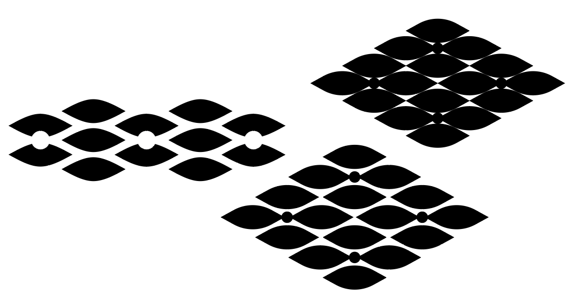 Included shapes of the leaves and the fruit of the plant.
Most of the west is known for its industrial area, and back in the day, Jurong is actually part of the Silk Road.
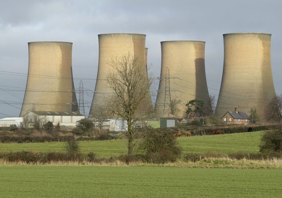
Cooling towers
 Included the form of a ship and some cooling towers into the form.

For the first idea, I was trying to go with the idea that just because a brand putting its presence into simple things like a plain t-shirt, it just becomes more expensive. So people are actually paying for the brand, rather than for function.
For the second idea was inspired by the Supreme Brick, but more to the idea of random items with brands putting their presence on it and selling the random items at a higher price.
The third idea is an assembly kit or a starter kit to be a Hypebeast.
I decided to go with the second and third idea as it is closer to the message that I want to convey through the illustration.
So initially I decided to combine the idea of random items with brands on them with the assembly kit, but the idea of having an assembly kit with random items would not make sense at all. So I decided to retain the items that make someone a Hypebeast. So the way that I would combine it is that both items, the random and the Hypebeast items, will still be there rather than having one replace the other.
For the illustration style, I decided to go to a more digital line-work and flat-lay as I felt like it would be a good way to represent the items that I would want to illustrate and also I think it is a good way to show the details within the items.
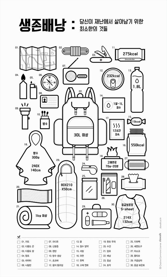
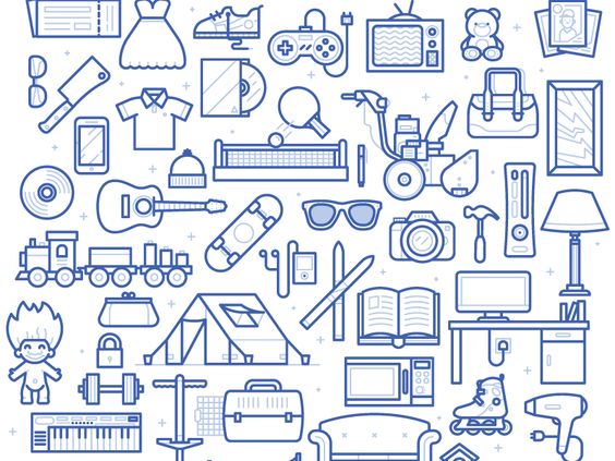

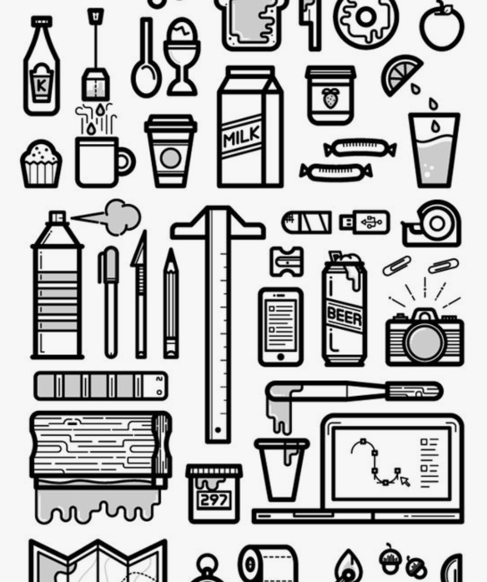
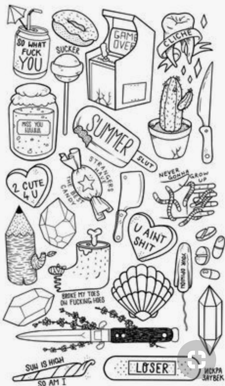
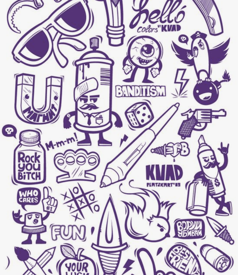 I was also thinking of whether to do it in a more static format or a more dynamic illustration
As for the initial design, I found it difficult to represent the brands, without having to put the brand logos itself. I tried to design the items based on what they are known for and their graphics that they normally include in their products, like the stripes in Off-White, and the bar in Supreme. But still, I felt like the items are still not well represented. In the end, I decided to proceed by adding the logos to it, which is seen below.
As for the colours, I would want to keep it neutral as I am putting a lot of brands inside, and I wouldn’t want any of them to stand out more than the other, and it would be quite chaotic to have a lot of colours in it. I also wanted to have almost like a template approach, like a flat drawing in fashion design where the colours don’t matter yet. Can also say that I having a neutral approach in this situation as these millennials are free to decide how they spend their money and does not directly affects me.
To add the logos, I have to tweak it a bit so as not to get into some copyright issues. Both items, the random and the Hypebeast, are present so that at first glance, it may just look like another flat lay of Hypebeast items, but when you look harder or look again, you can actually notice that there are random things in between.
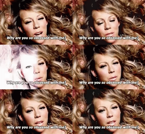
The second assignment requires us to do an editorial illustration for the bi-annual publication, Varoom. We are also to do the illustration based on one of three themes:
The illustration will be used as the cover of the Varoom magazine. So to begin this work, I would start my research on Varoom’s work.
According to the AOI – Association of Illustrators:
Varoom is the globally leading illustration magazine featuring a unique combination of industry insight and critical analysis of the field of illustration. It is a unique publication commanding a global audience commenting on and discussing the contemporary illustrated image in depth. It features interviews with illustrators, image-makers and designers as well as critical articles by leading commentators.
It is interesting to see the various illustrations featured on the cover of the magazine. Opens up my mind to the many different illustration styles and concepts there can be. Below is a sample of one of their latest publications:
More on the assignment…
According to Udemy:
Editorial illustration is artwork created in response to written text, usually an article in a magazine, newspaper, or blog. In this course, we will focus on how to analyze a text, develop a unique idea, and communicate that concept visually as a partner to the article. Editorial illustration is an exciting field because it allows the illustrator to inject their own opinions and unique voice into the work. We’ll focus on how to inject your own personality into your expressive illustration while still communicating your concept and illuminating the written word.
Some samples of editorial illustrations:

Illustration by Stephanie Wunderlich

Illustration by Agathe BB

Illustration by Joe Magee

Illustration by Sebastien Thibault
Images from Agoodson.com, and more of the details about editorial illustrations can be found there too.
When given these 3 options, the first theme that struck me was Obsession. Mainly because I don’t have enough experience in the feeling of empathy and I definitely have not much understanding of style. Those 2 themes are fairly broad and I believe that it would require much understanding of empathy and style before being more specific on what kind for the assignment. I went on with obsession as I felt that it is more relatable and is easier to understand.
So specifically to obsession, I would want to do obsession over Hypebeast clothing and items. There is a recent trend among the younger millennials where they tend to want to buy all the latest and hyped clothing and flaunt it when they go out or on social media. I just find it annoying and interesting how this thing developed in recent times and effects only a certain generation.
The term Hypebeast was initially from a website which main intention from the creator is to be the place to go for updates on the latest sneaker trends in the market. Somehow the brand expanded into promoting other types of clothes and the latest street culture that brands offer, hence the term Hypebeast refers to the culture or someone who is up to date with the latest clothing of culture trends normally promoted or sold by the up-market brands.
More on what Hypebeast is about here, on their own website.

More on the topic of obsession over Hypebeast stuff, there was a time when one of these brands, Supreme, came up with a brick that they launched as a humorous way to joke about how their customers and the market would buy anything that has the word ‘supreme’ written in a red box-shape just to remain in trend. They also made a lot of other items with the Supreme-red and the logo printed on it, and it almost became like an icon of mocking putting brands on random items but people would still buy them.
More on the Supreme brick here, by Highsnobiety.
So I got the idea for the assignment, I would want my illustration to be based on that idea of having brands putting their logo on random items and people would still buy them because they are so obsessed on trying to remain in-trend by buying all the Hypebeast stuff.
The audience of this illustration will firstly be these millennials. This is because they are mostly the ones who are having this obsession. Maybe it would help them realise that what they are doing is really silly.
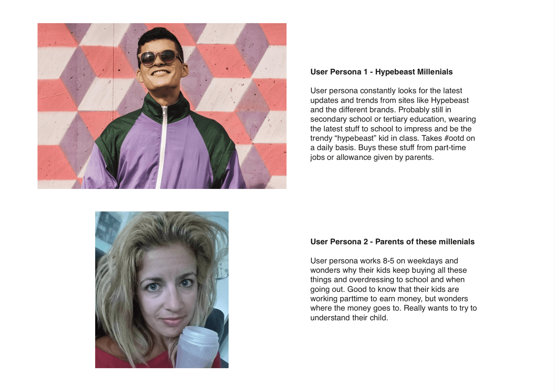 Moodboard
 I was planning to go for a neutral look, almost not representative of the items and the brands so that none of it stands out more than the other, that’s why I went for the monotonous black and white also so that colour meanings will not play much of a role in the illustration. I also plan to use a flat lay and more static than dynamic so that it is clear and to the point.
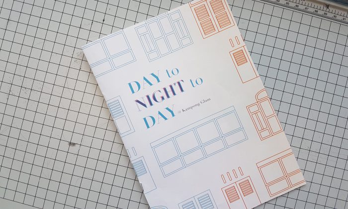
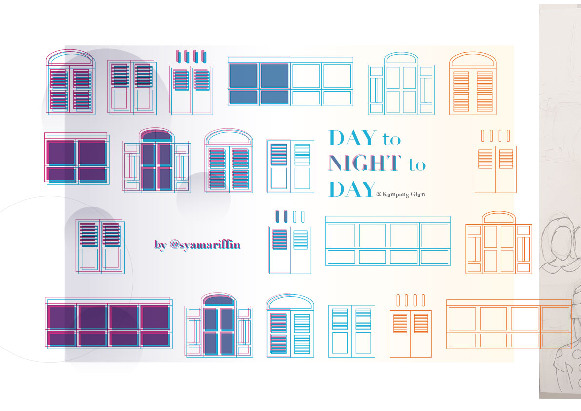
This design of the zine is to feature the two different sides of Kampong Glam – the day scene and the night scene. The zine is titled “Day to Night to Day @ Kampong Glam” to explain how the events in the area happen in a cycle — one after the other — despite the entirely different scenes of day and night.
The idea is the showcase the different prominent elements that one would notice when he/she goes to Kampong Glam in the day and in the night. From my research, I found that both the day and night are entirely different scenes, and I would like to show these 2 differences and how both of them are connected and complements each other in the zine.
The reader will be first introduced to the day scene, which is the front cover. What better way to introduce Kampong Glam then with a prominent feature of the place — the shophouses. So I represented that using the different styles of shophouse windows.
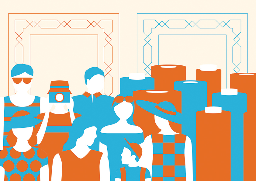 For the day scene, it would show the happenings that would you see during the day. Groups or tourists and tour groups would roam the streets, which can be seen on the left side of the spread. The other feature that can be seen during the day would be the retail shops selling fabric, textiles and carpets, which can be seen on the right side of the spread.
The two rectangular patterns on the top of the spread are to represent the long corridors along the shophouses and the patterns on it are similar to those that can be found on the Sultan Mosque, which is the most prominent building in Kampong Glam.
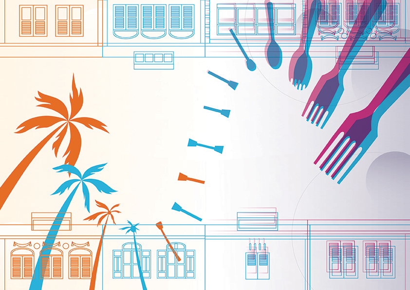
The middle spread would be the most important spread as it shows the transition from the day scene to the night scene. I tried to make both the design styles from both scenes to blend as seamlessly as possible together.
The two rows of shophouses, at the top and bottom, are to show the other prominent thing about Kampong Glam that can be seen in both the day and the night, which is the shophouses. In a way, it shows how the shophouses come in rows alongside each other at Kampong Glam.
Other than the colours, the elements in the picture also form a transition. It starts off with the palm trees, which is one of the elements at Kampong Glam that has become part of the place’s identity (normally complements the Sultan Mosque), which will transform to what looks like the shape of a lamppost, another element that would appear in both day (even though it is not used) and night, and transforms again into cutleries, showing that the food scene is more active at night and is one of the more major activities that happen at that time.
There is also a sense of symmetry in this spread to help support the idea of transition and balance.
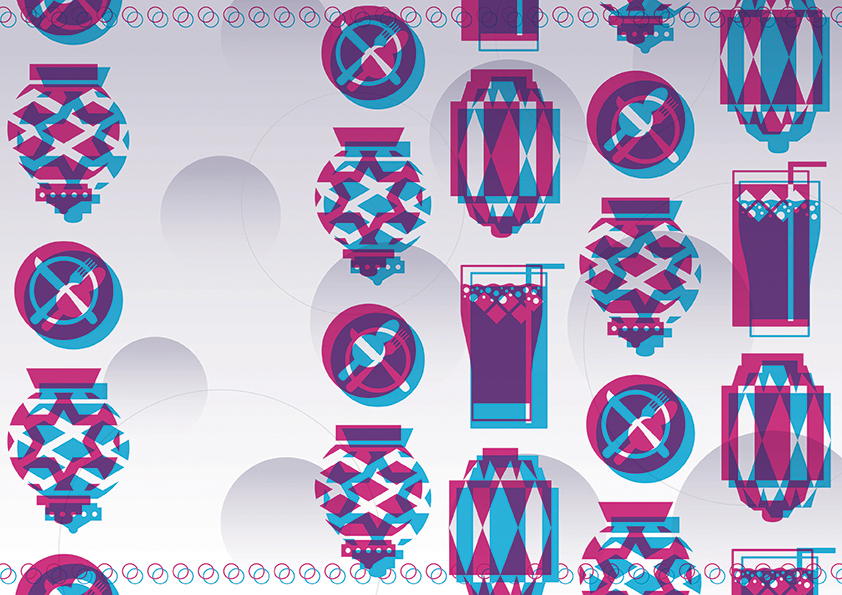
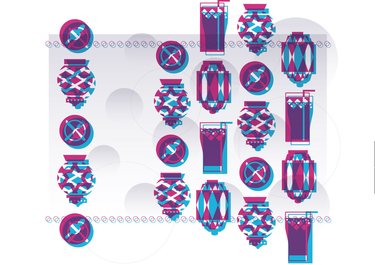
The last spread is the night scene. I would try to make this scene different from the day scene. The illustrations are mainly a repetition of the same illustrations, just taking turns overlaying and switching of colours. They are illustrations of the prominent things at night, which is the food and drinking scene and the many exotic lanterns that come in both circular and rectangular shapes with many different patterns on them.
Other than the entirely different colour scheme, the illustrations here overlay each other but off centre by a bit to form like a double image, which is an element I discovered at night where the lights form double shadows, most of the time coloured, creating double coloured shadows.
The circular features in the background and the background itself has a gradient element to it to show the down-up lighting that can be found on some of the buildings at night. So here I make the gradient in a way that is lighter from the bottom to help express this.
The overlaying circles at the top and bottom, however, are the lights that I find lining some of the buildings and arches of some restaurants and shops.
So what comes next after the last spread? The reader would normally flip to the back cover, which is also the night scene. The back cover is similar to the front cover only with the elements of the night.
Something looks funny on the back cover. It looks like the design for the night scene decreases or lightens up towards the right.
If you open up the back and front cover into a spread you can see that it forms another transition…
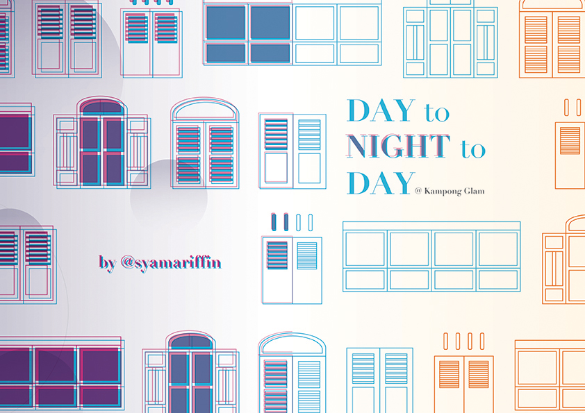 There is another transition here, hidden if the reader does not open up the cover and back cover into a spread. The night scene transforms back to the day. This is how it goes back to the title and the idea of the day and night scene is in a cycle, how one comes after the other, even though both are of almost opposite styles.
I chose to do flat illustration as it would allow me to create a clean style that would be easy and simple to understand. It would also allow me to do a clean overlaying of illustrations which is what I did for half of the zine to show the night scene.
There are also line works used in the design as it would help to lighten the spreads, in a way giving the reader a breather while flipping through the pages. It in a way prevents the spreads from looking too cluttered and filled.
I used the main colour blue which is consistent throughout the zine. I used blue as it is a cool and chill colour, in a way to represent the pretty chill culture and vibe the Kampong Glam has in both the day and night.
In the day I used its complementary colour — orange. It also helps to make the day scenes look bright like the day and also to represent the warmth during the day.
In the night, however, I used one of the blue’s triadic colours — a hue of purple. The other triadic colour was a hue of yellow which I did not find suitable to be used for a night scene. The hue of purple helped to support the night scene more. It gives a sort of mystery to the illustration too.
The first challenge would definitely be trying not to make the zine look like a brochure for Singapore Tourism Board. The location I got is Kampong Glam. It IS a tourism spot. So no matter what I do at first, it would definitely look like a tourism brochure for the location. So it took me a while to find a direction that would be away from that. It took me 3 weeks actually and I was still unsure about my idea.
Closing in to the actual supposed production time, I finally got my idea for the zine. With not much time left, I got to the production and sketches as soon as possible. The next challenge for me was laying out of the zine. I found it hard to make the illustrations into a layout since most of the laying out that I am used to involves the use of images and photographs. I had to consider laying out and experimenting with design principles and colour theories. It took me a lot of sketches and ideation to get to the final one that ended up in the zine.
Then the illustrations took a long time to design and illustrate. When alot of my friends actually tested prints and are done with the layouts, I was still attempting and trying to complete my first spread. So I panicked abit but I still tried.
The end product is not my best. I know that. If there was more time I would definitely attempt other layouts. Maybe more detailed illustrations and experimentation. But I was definitely still happy with the comments and remarks that I got from my peers.
(Disclaimer: Here are only the developments that went digital. Most of the other developments are in the Journal)
The feature image of this post is the mood board that I have created for the zine.
As we only have a limited number of spreads and pages to work with, I tried my best to compress a lot of the elements into those few pages. Also, I tried to connect and design the pages as a spread rather than individual pages so that I could show my understanding of spreads and in a way making use of the pages more.
This was actually the second-last spread that I worked on as I was finding it hard to attempt this and I actually left it last.
There were some main elements I plan to feature in the first spread. It being the day scene, I would definitely want to feature:
So the following are the layouts I did for the first spread.
I wanted to have a balance between the tourists and the textiles, making them almost equal. So I tried putting them side by side or even on the same page.
As this was the last inner spread that I worked on, I have trouble trying to show shophouses here since I have already featured the shophouses in the middle spread. So, I decided to make it into the corridor arches instead.
For the colours and style, I was very much inspired my Malika Favre’s work. I realise I was following too closely to it that it is starting to look very much like it too. So I had to change things up abit and change the colours too.
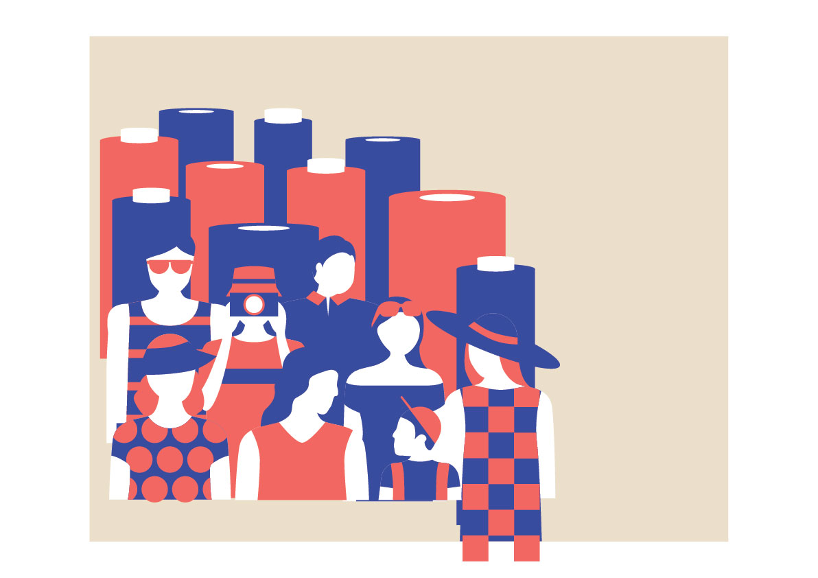
One of my attempts on the spread. It started to look very close to Malika Favre’s work, especially the colours.
I was not too satisfied with this spread as it still looked too solid and heavy despite my attempt to make it lighter by changing some of the illustrations into line works.
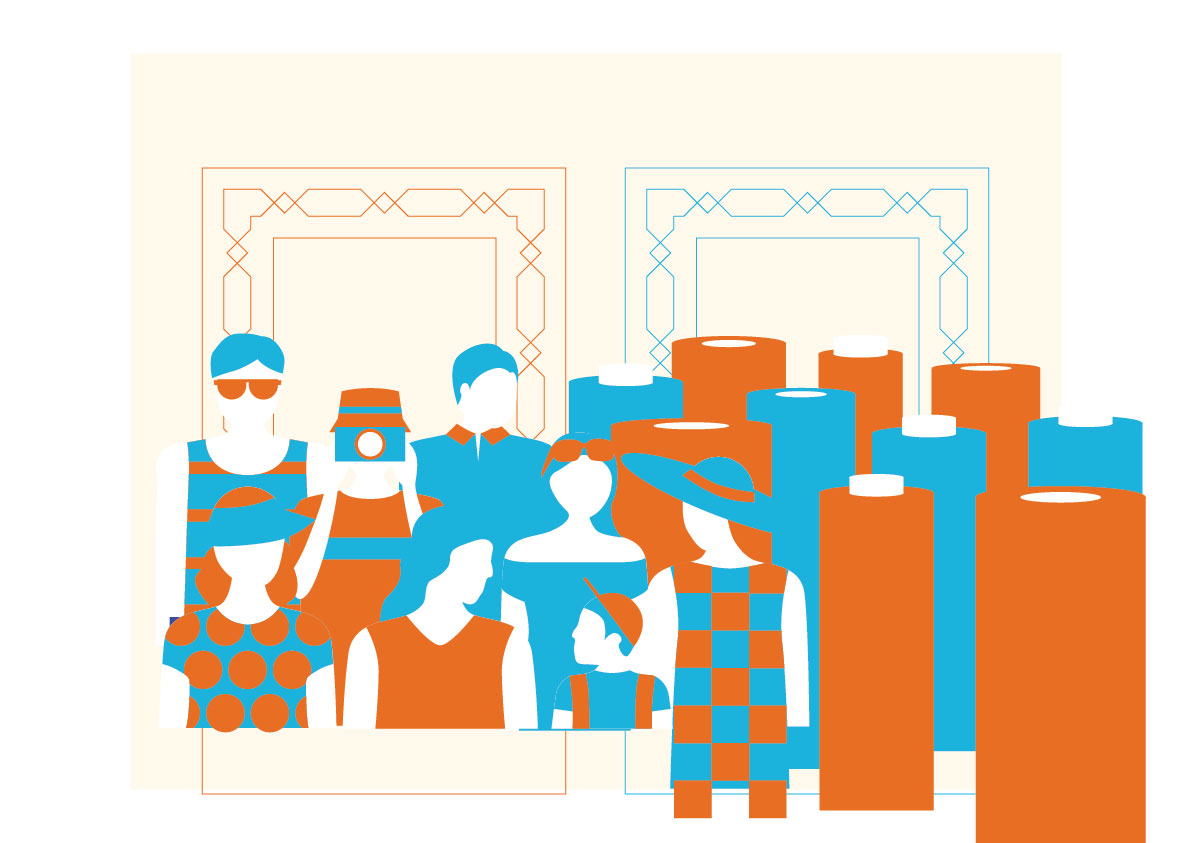
This was the second spread that I worked on. All this while I would know the importance of the middle spread as it is the transition spread and would balance out both sides of the zine.
Some elements that I would wanna feature in this spread is:
I tried to make it more dynamic for this and this page was particularly important to show the transition from day to night. So I spend alot of time on this to make the transition as smooth as possible.
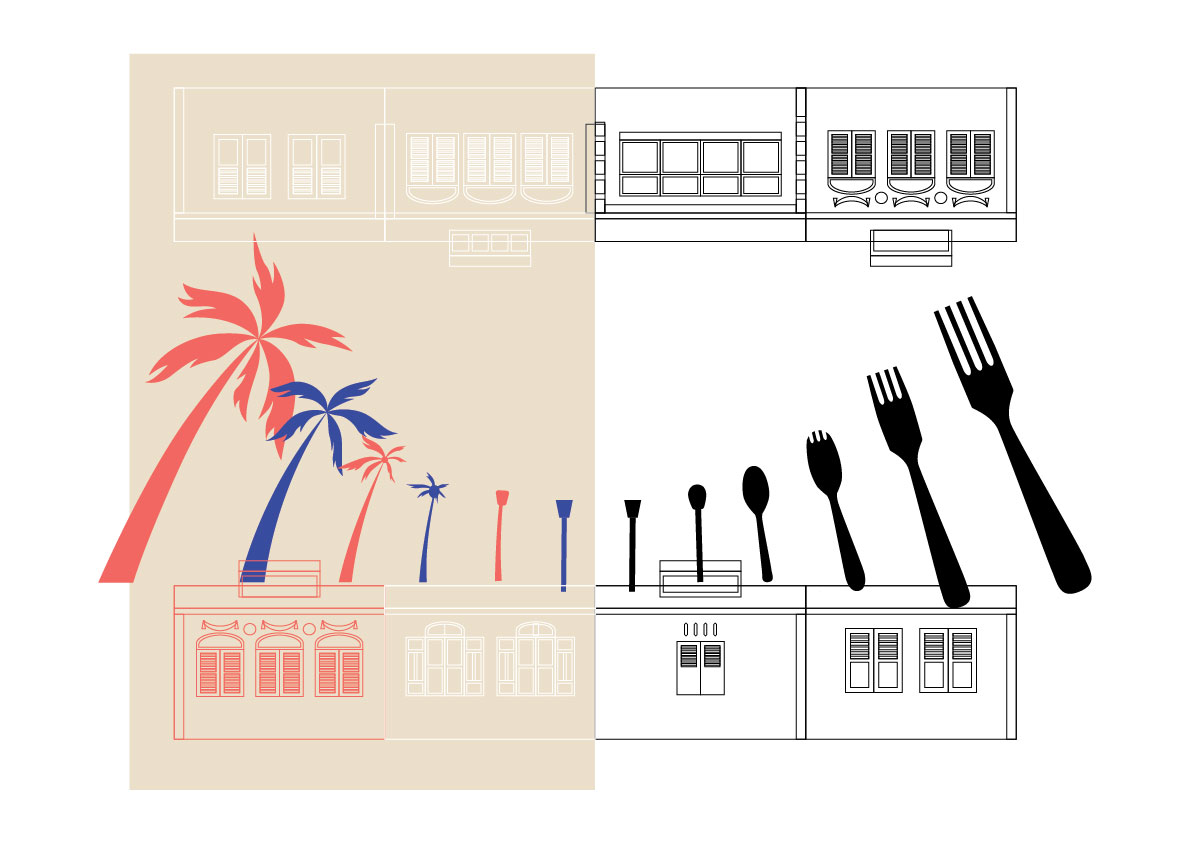
My first digitalised work for the middle spread. I realise that there were still too much space in it and it was not dynamic enough
I settle down with this as I think there is a right balance and dynamic movement in the spread. I think that the transition from day to night is seamless too, like there is no sudden change.
This was actually the first spread that I worked on as I really wanted to show the overlaying and the double shadow effect in the zine.
Some of the main elements that I wanted to show in this spread is:
I was satisfied with the layout of this spread as it was very close to what I had invisioned. The space on the left page of the spread was actually for text, but I decided not to put it in because i wouldn’t want it to affect the mood and feel the illustrations had conveyed.
This was actually the last page that I attempted as I was mainly focusing on the contents, and would leave this last so that I would know what the content is already like so that the cover page and back cover would be the design layout that holds all the contents together.
So what would be the better way to hold everything together and represent Kampong Glam? By using shophouses windows! (Since the shophouses have already been used by the middle spread)
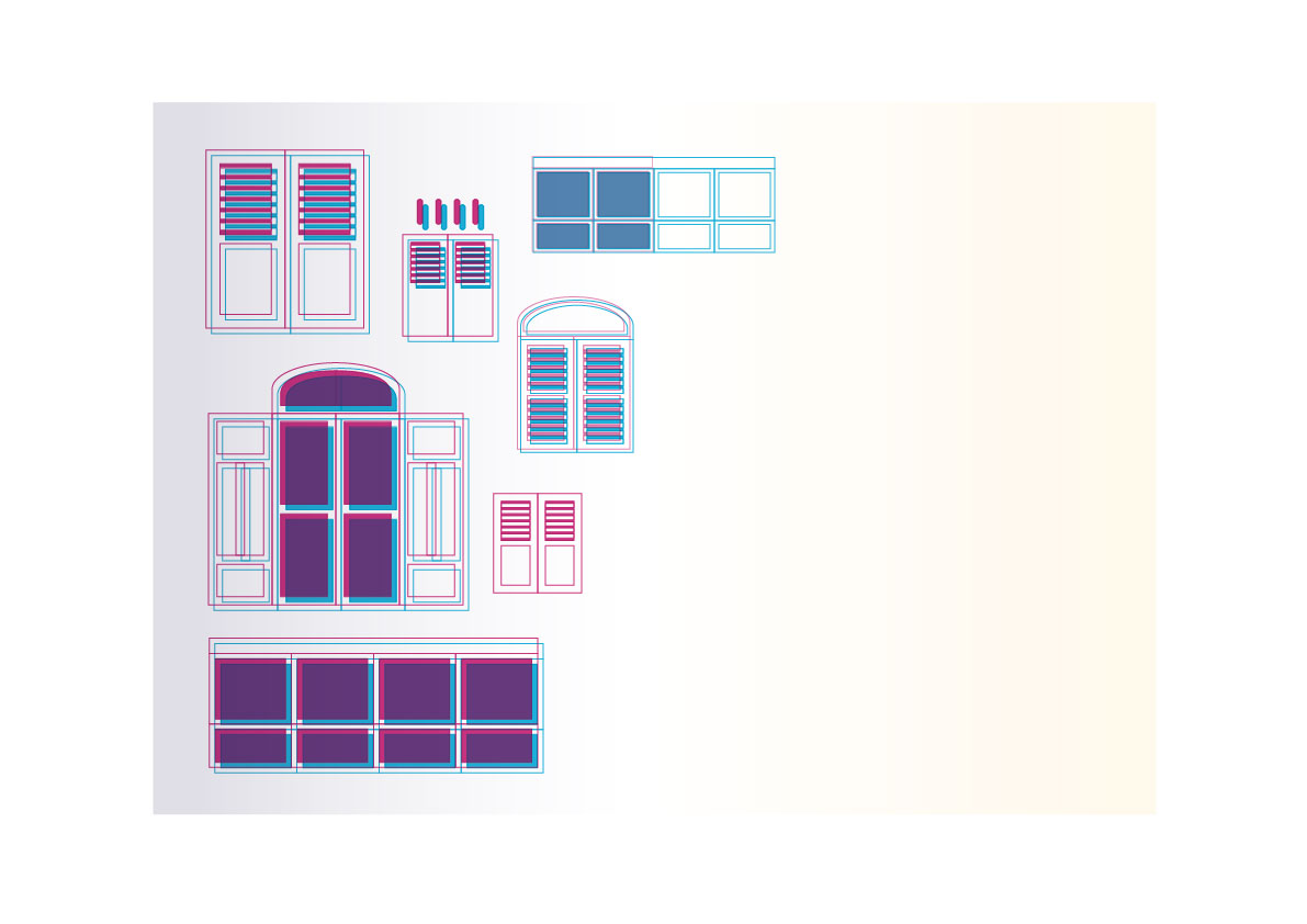
I wanted to make the windows of different sizes, but I decided not to as I think it would make the spread look too messy.
I was pretty satisfied with the outcome of this spread as it also has a smooth transition as the middle spread.
