(Disclaimer: Here are only the developments that went digital. Most of the other developments are in the Journal)
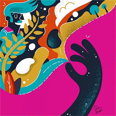
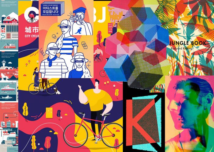
The feature image of this post is the mood board that I have created for the zine.
As we only have a limited number of spreads and pages to work with, I tried my best to compress a lot of the elements into those few pages. Also, I tried to connect and design the pages as a spread rather than individual pages so that I could show my understanding of spreads and in a way making use of the pages more.
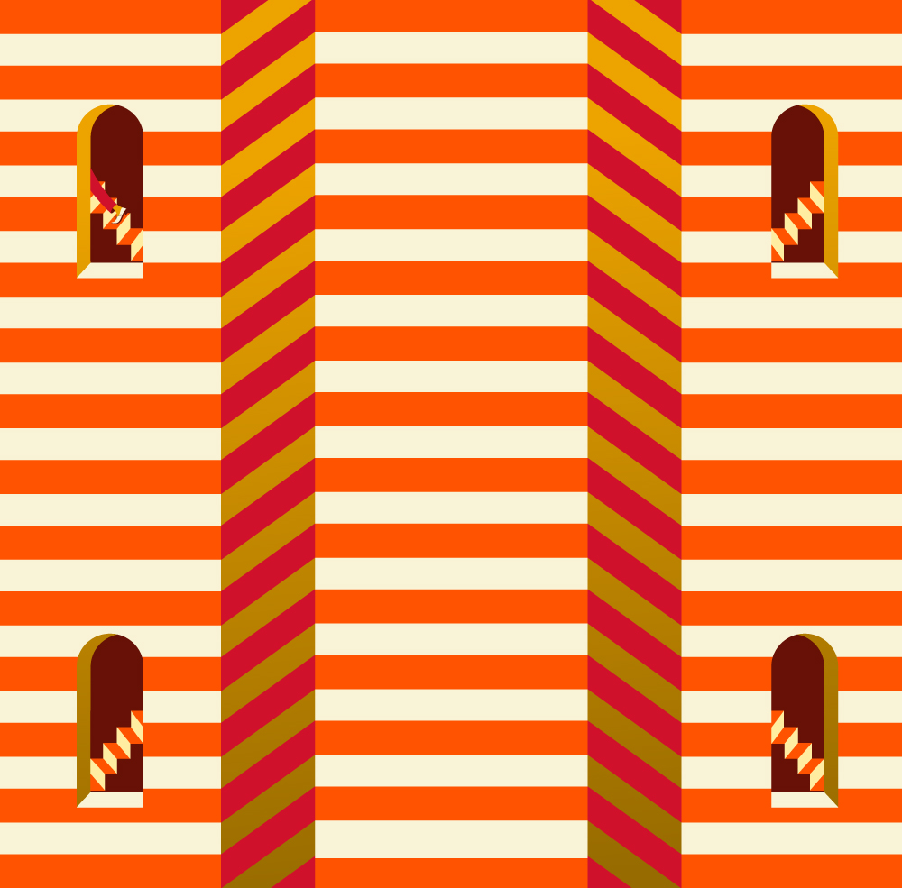
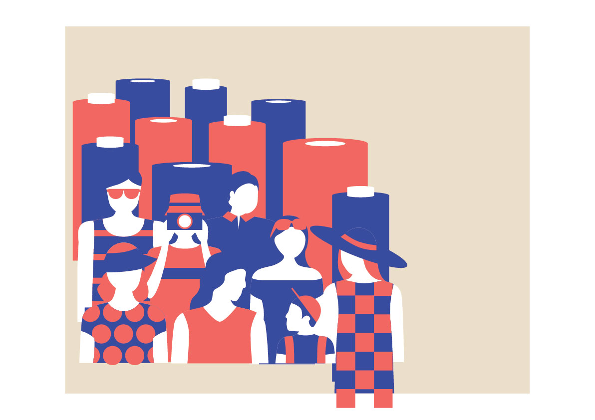
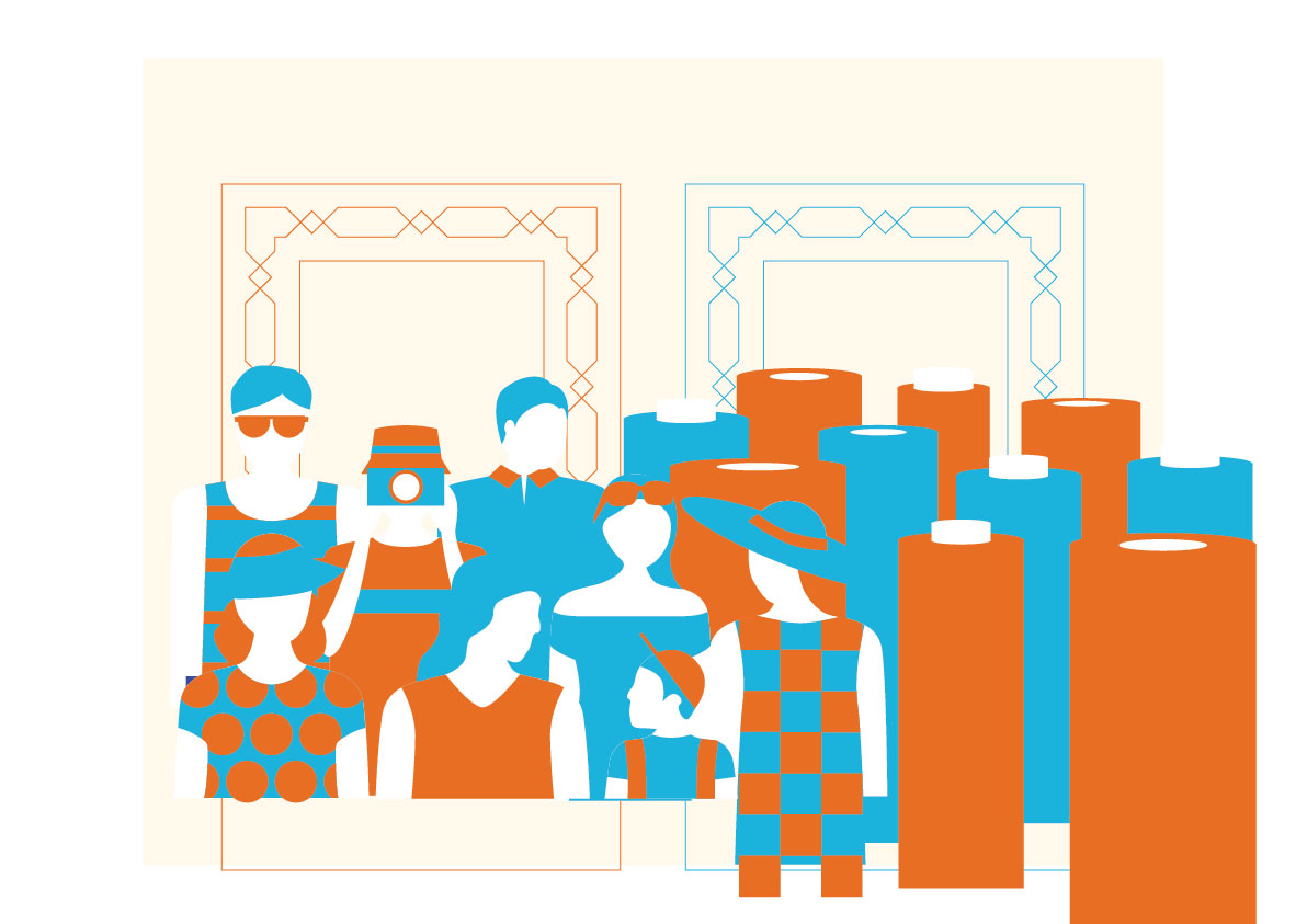
First spread
This was actually the second-last spread that I worked on as I was finding it hard to attempt this and I actually left it last.
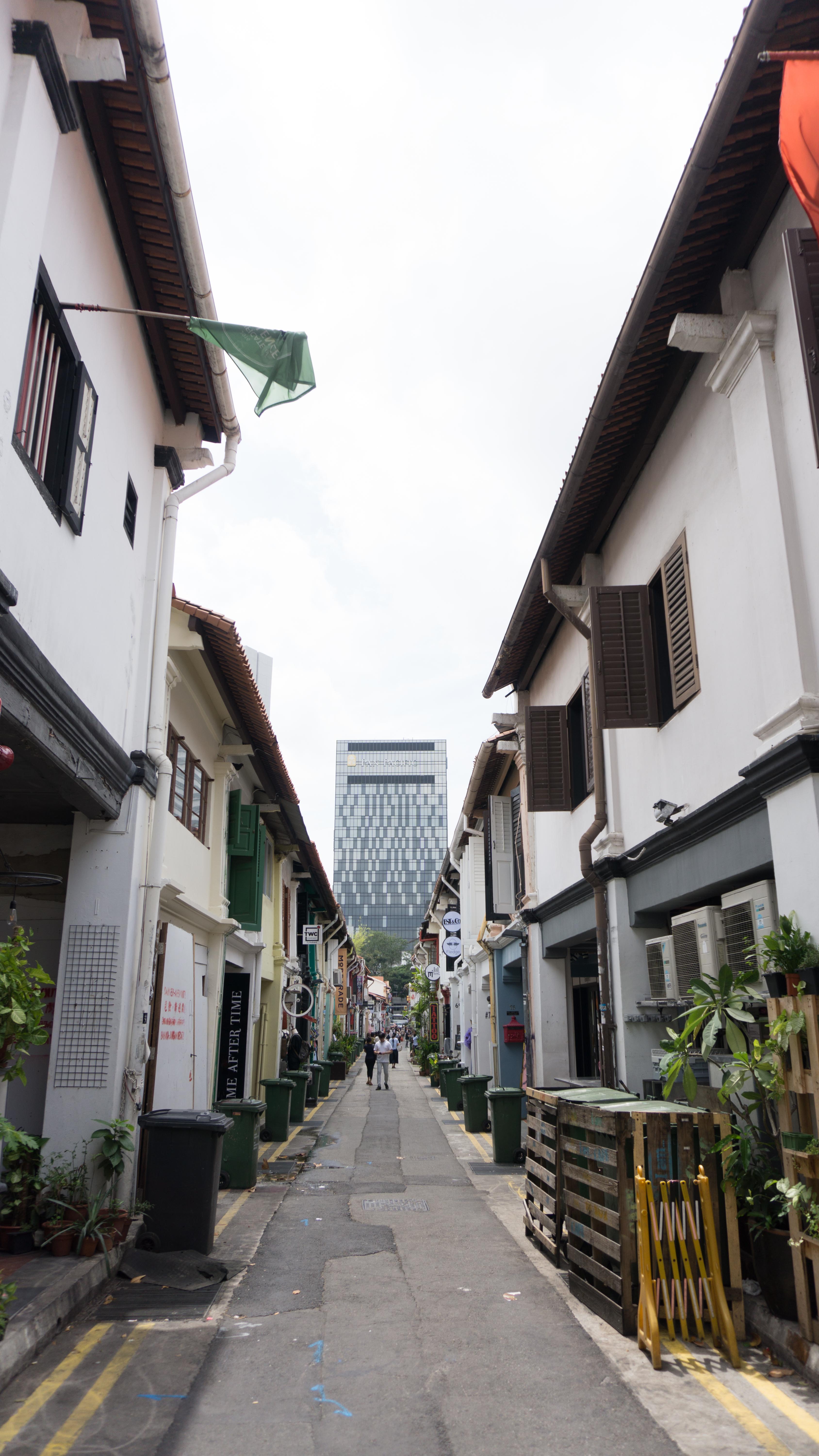
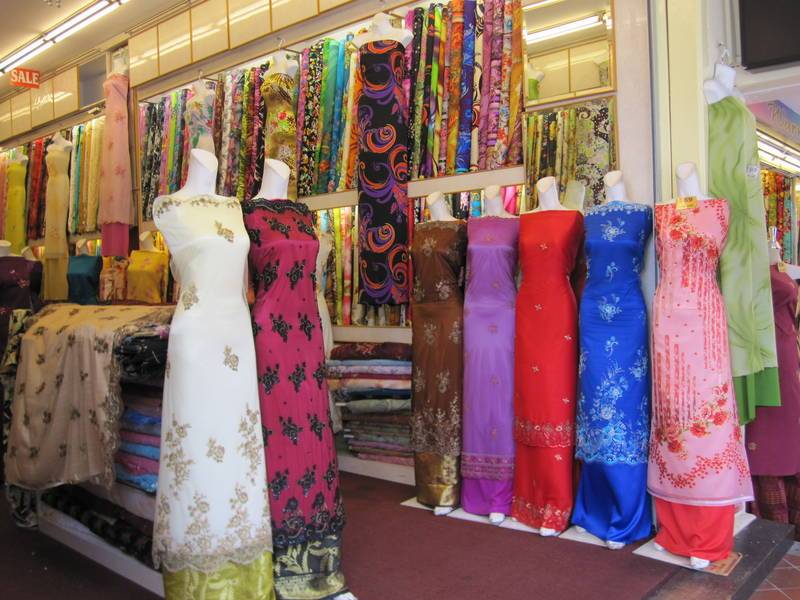
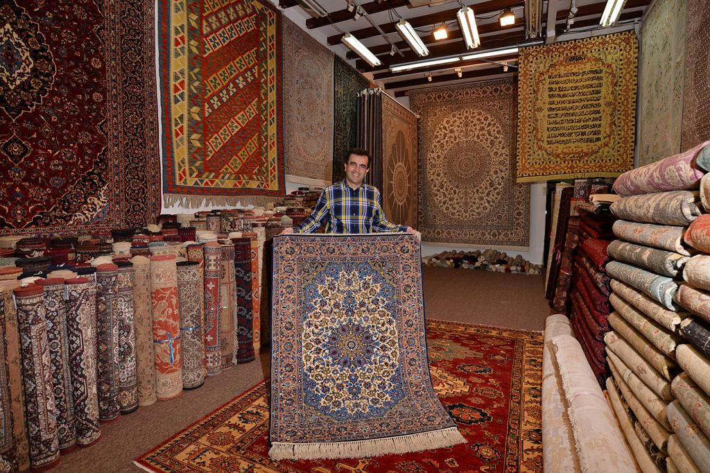
There were some main elements I plan to feature in the first spread. It being the day scene, I would definitely want to feature:
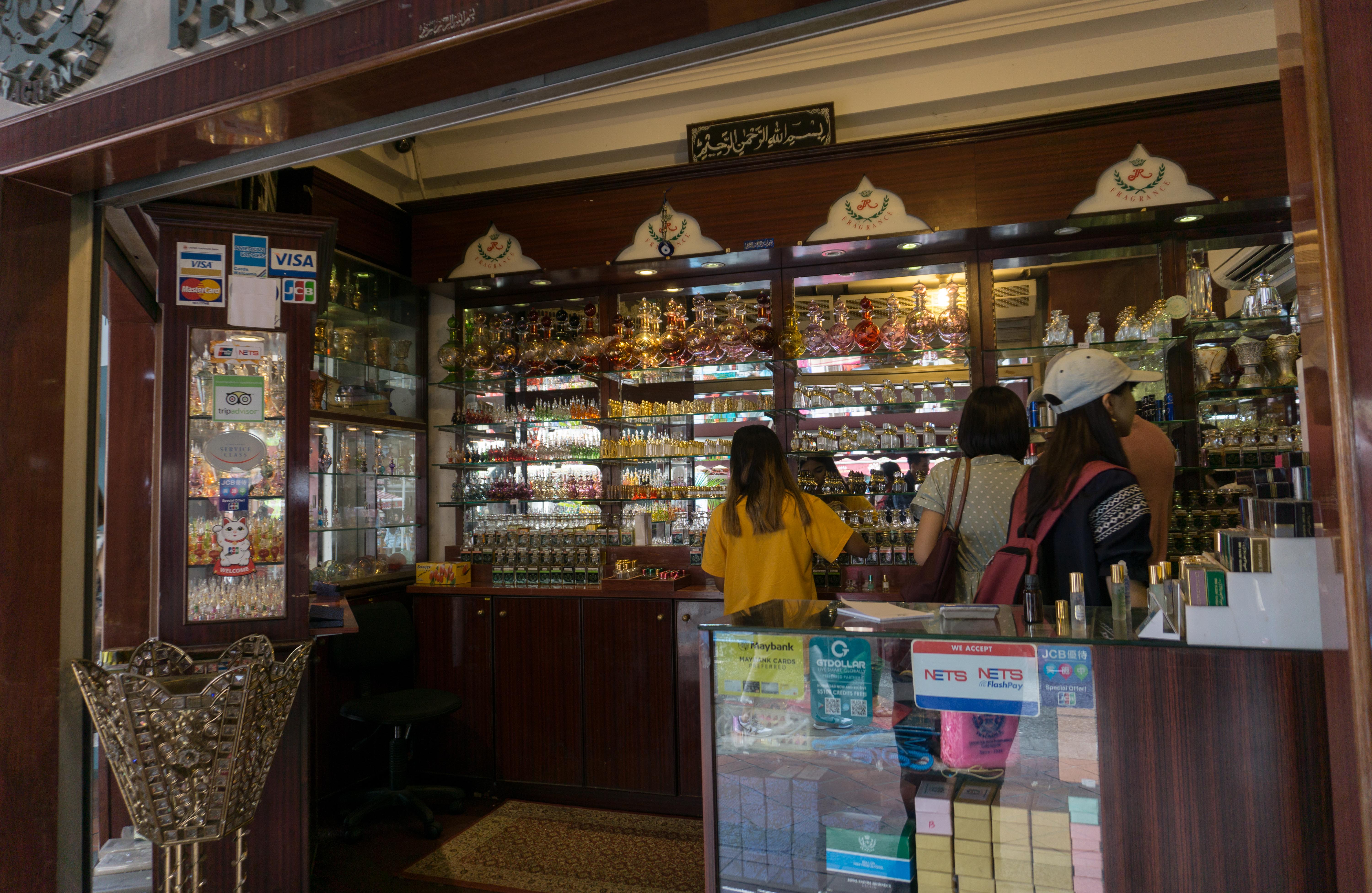
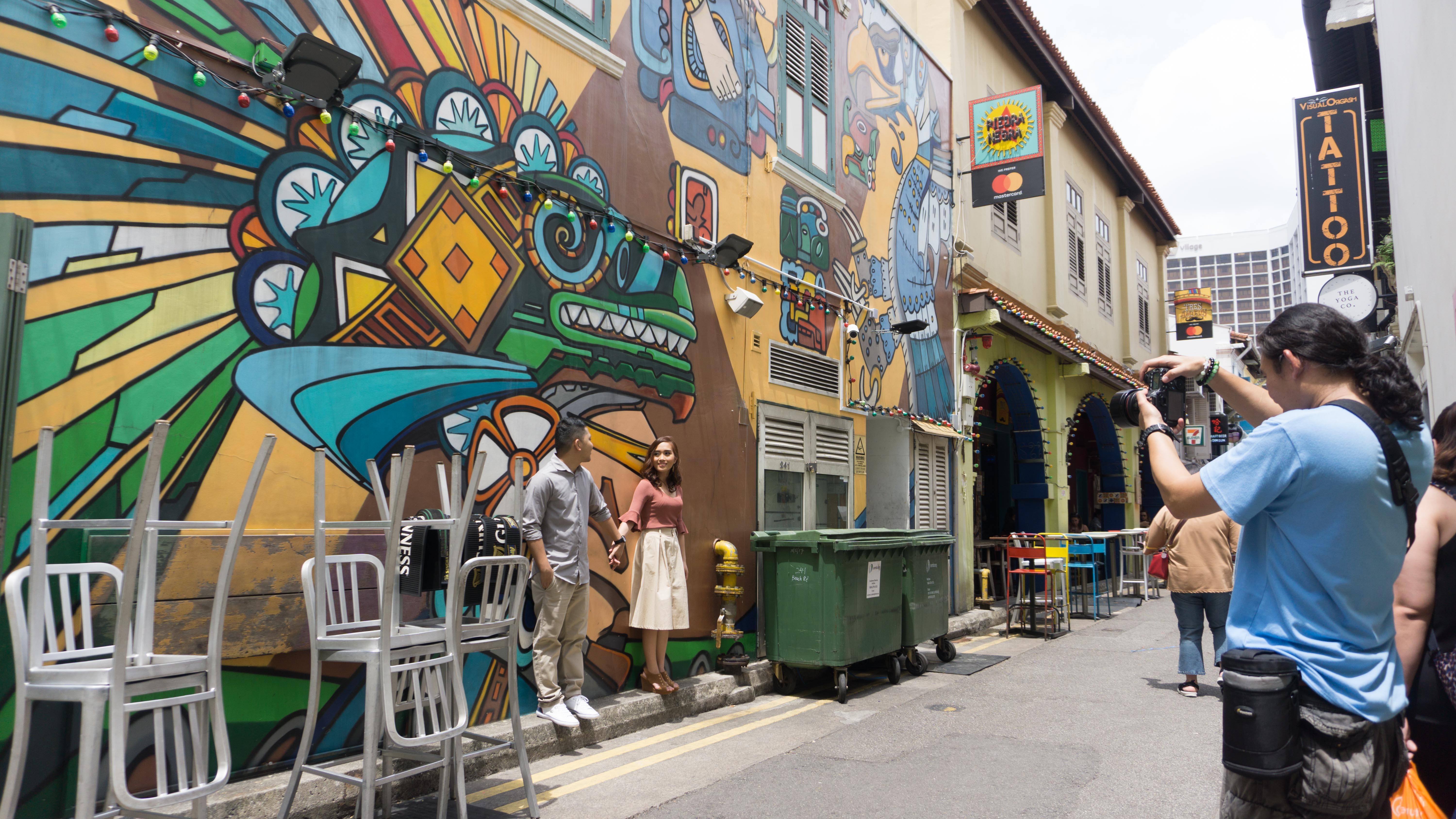
- tourists
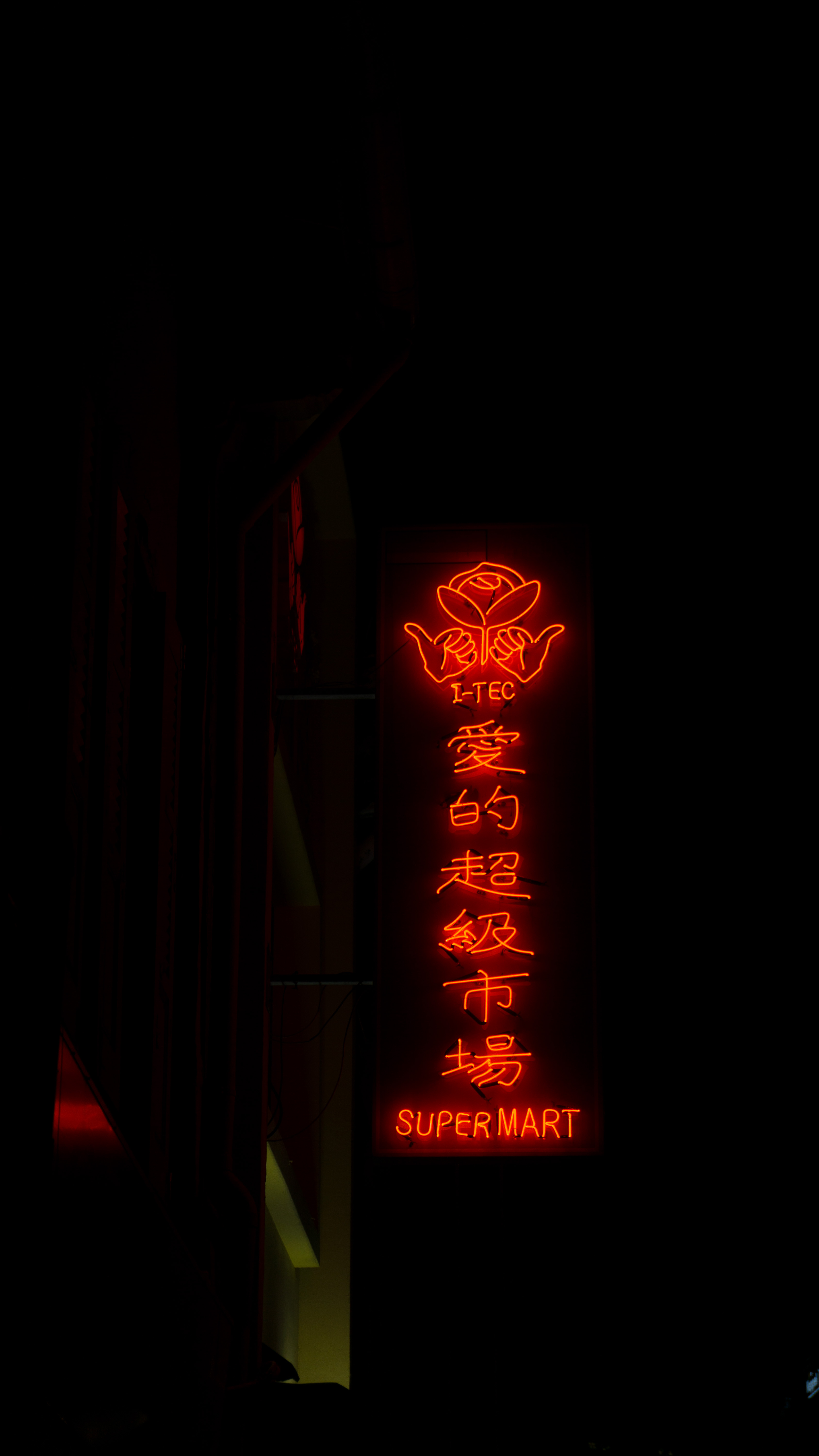
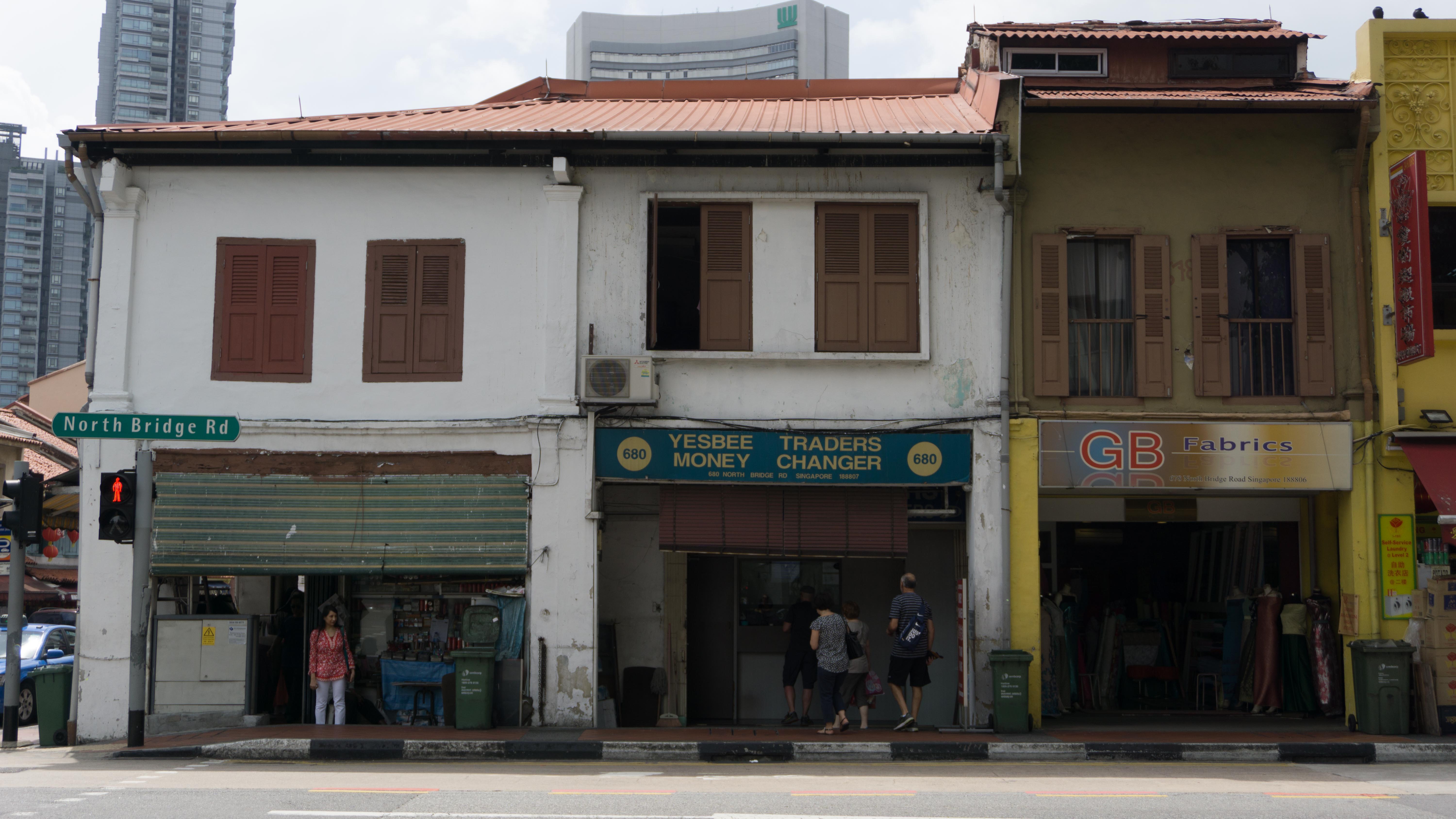
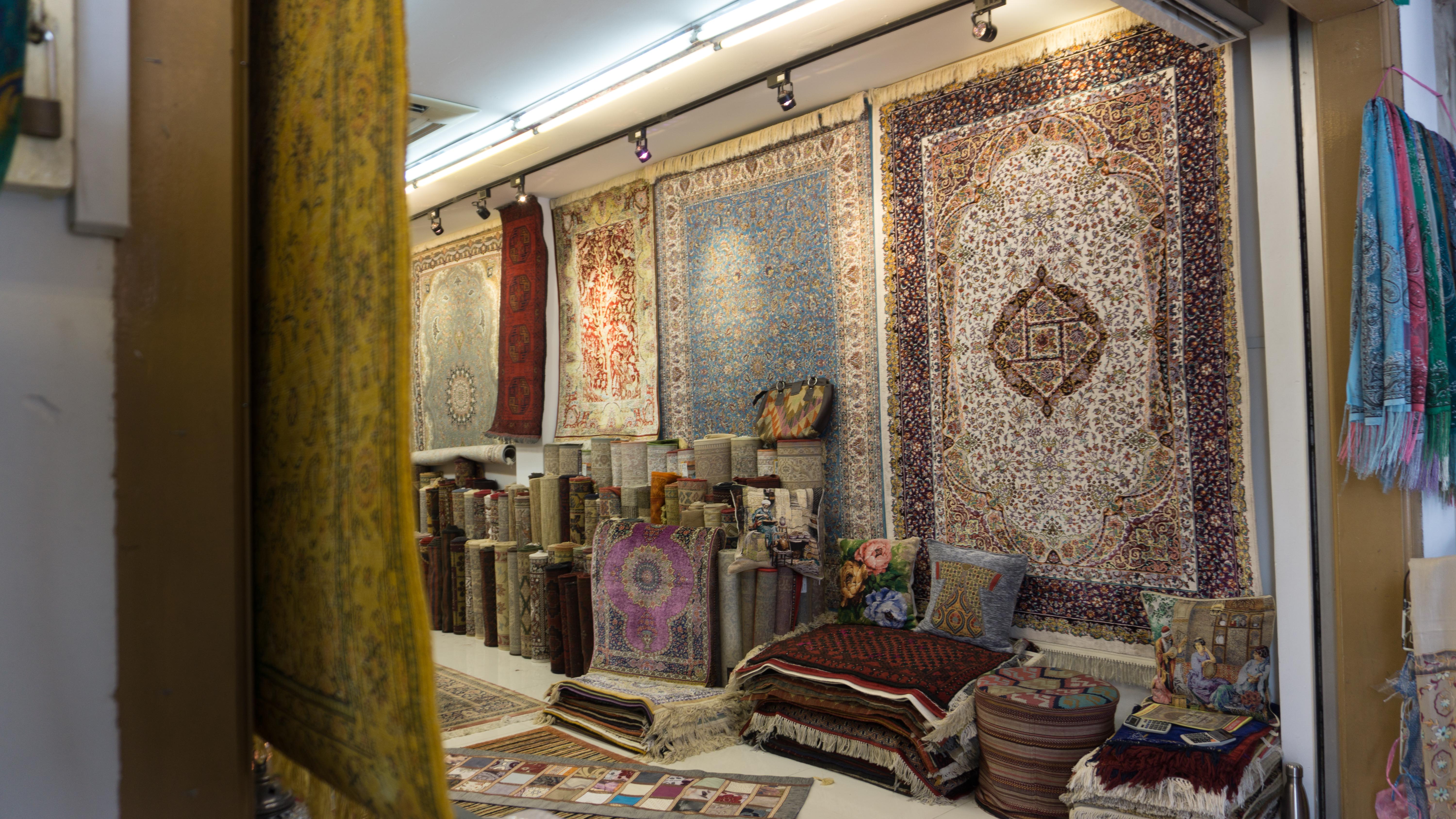
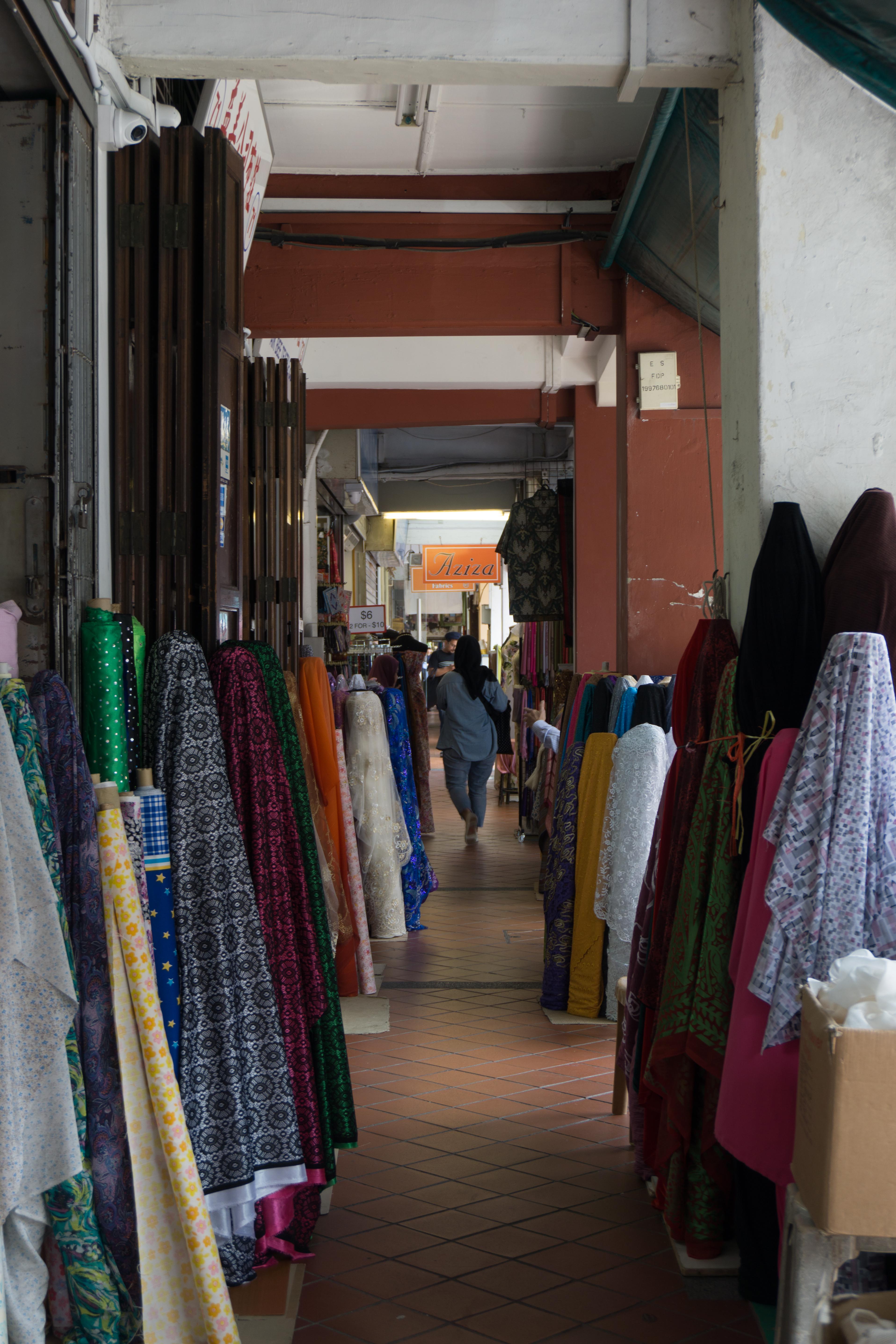
- fabrics/textiles
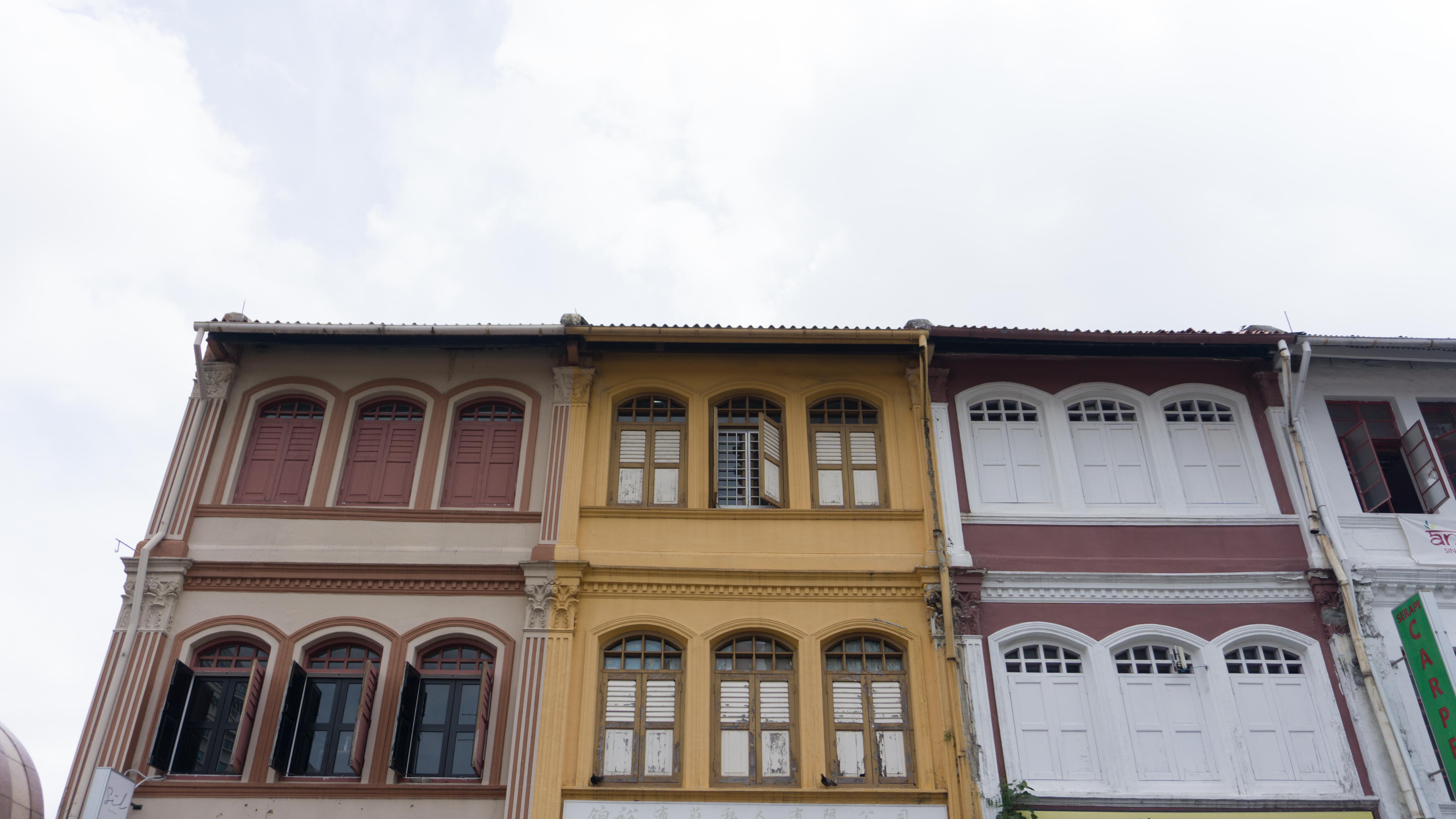
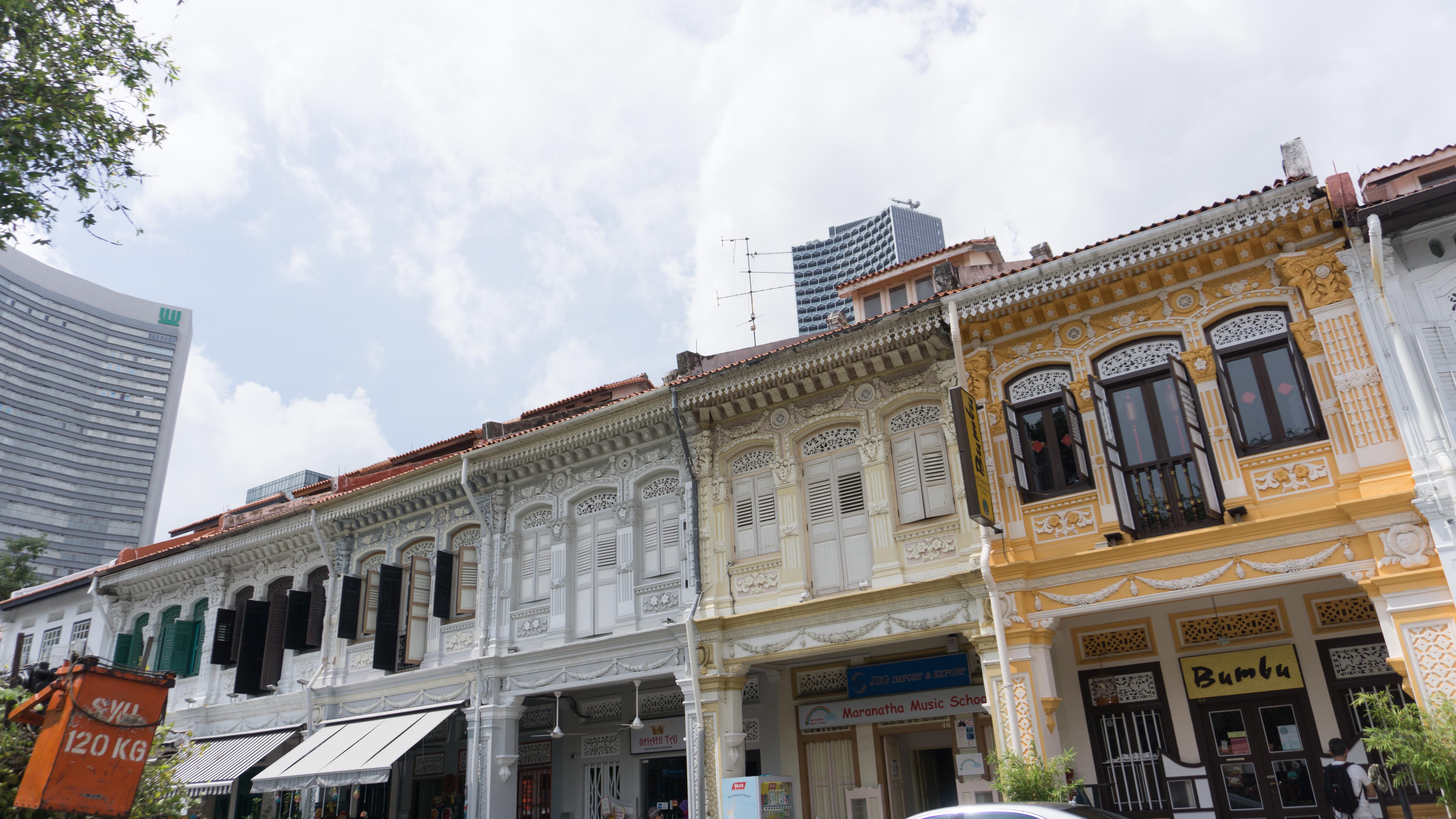
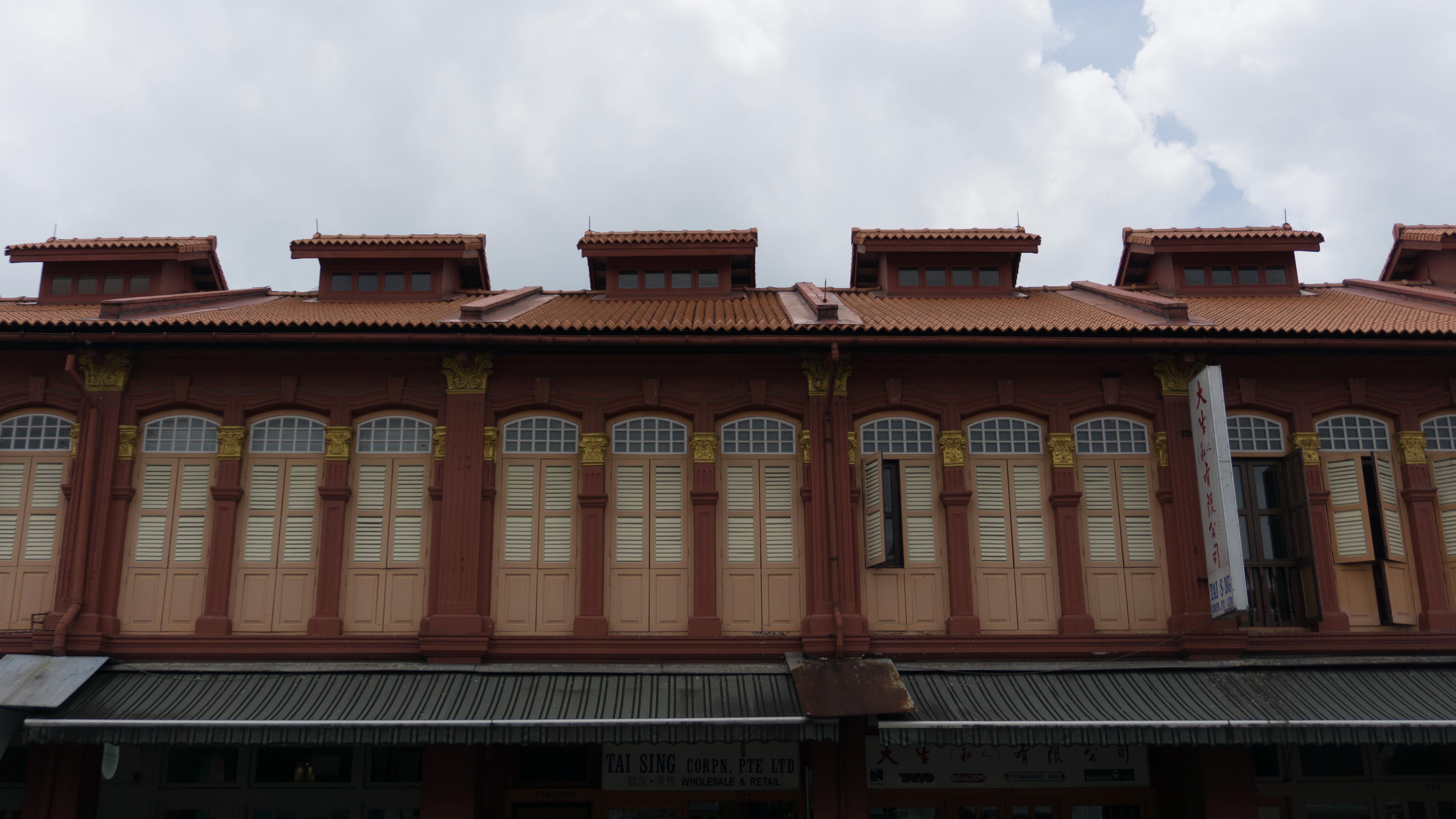
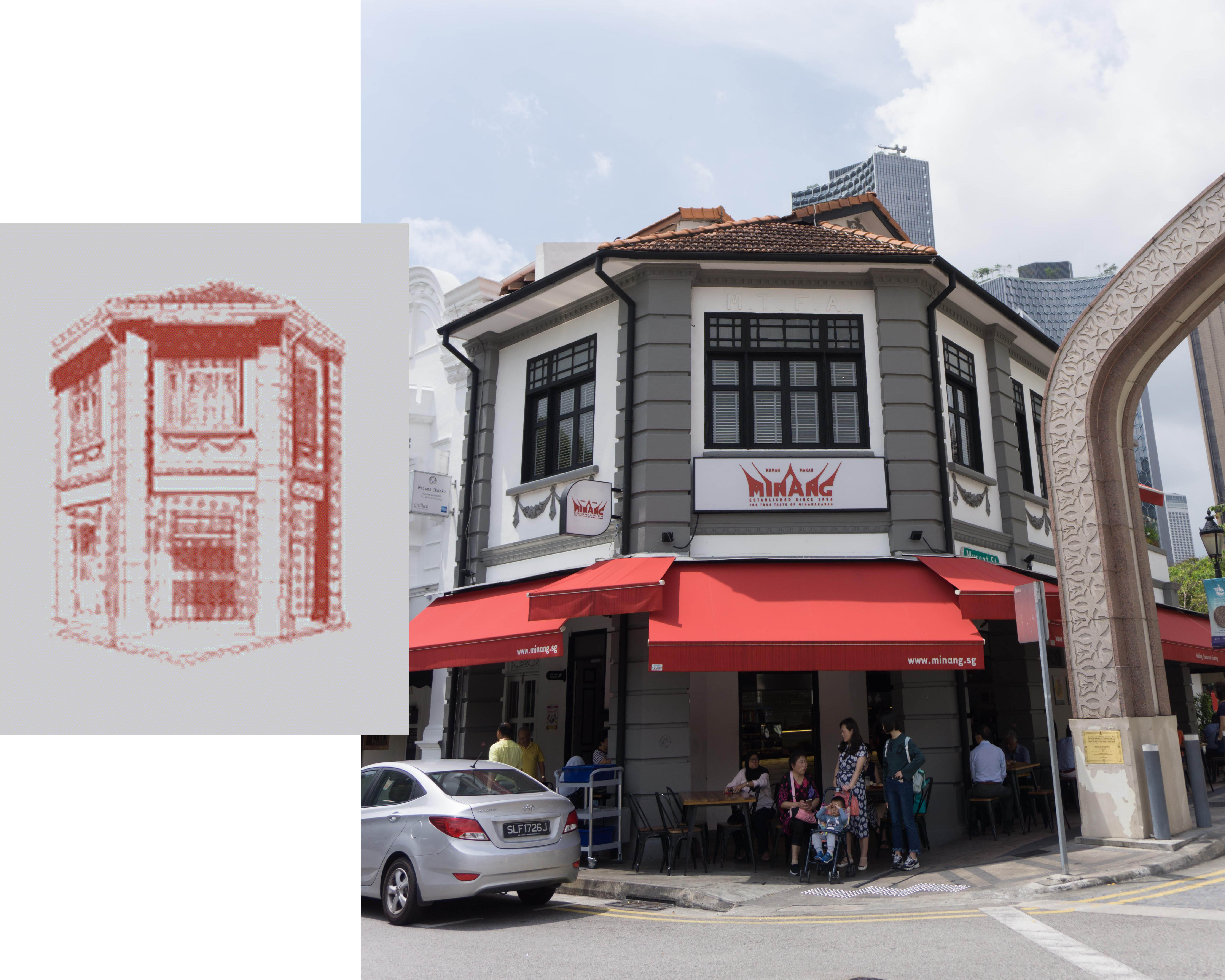
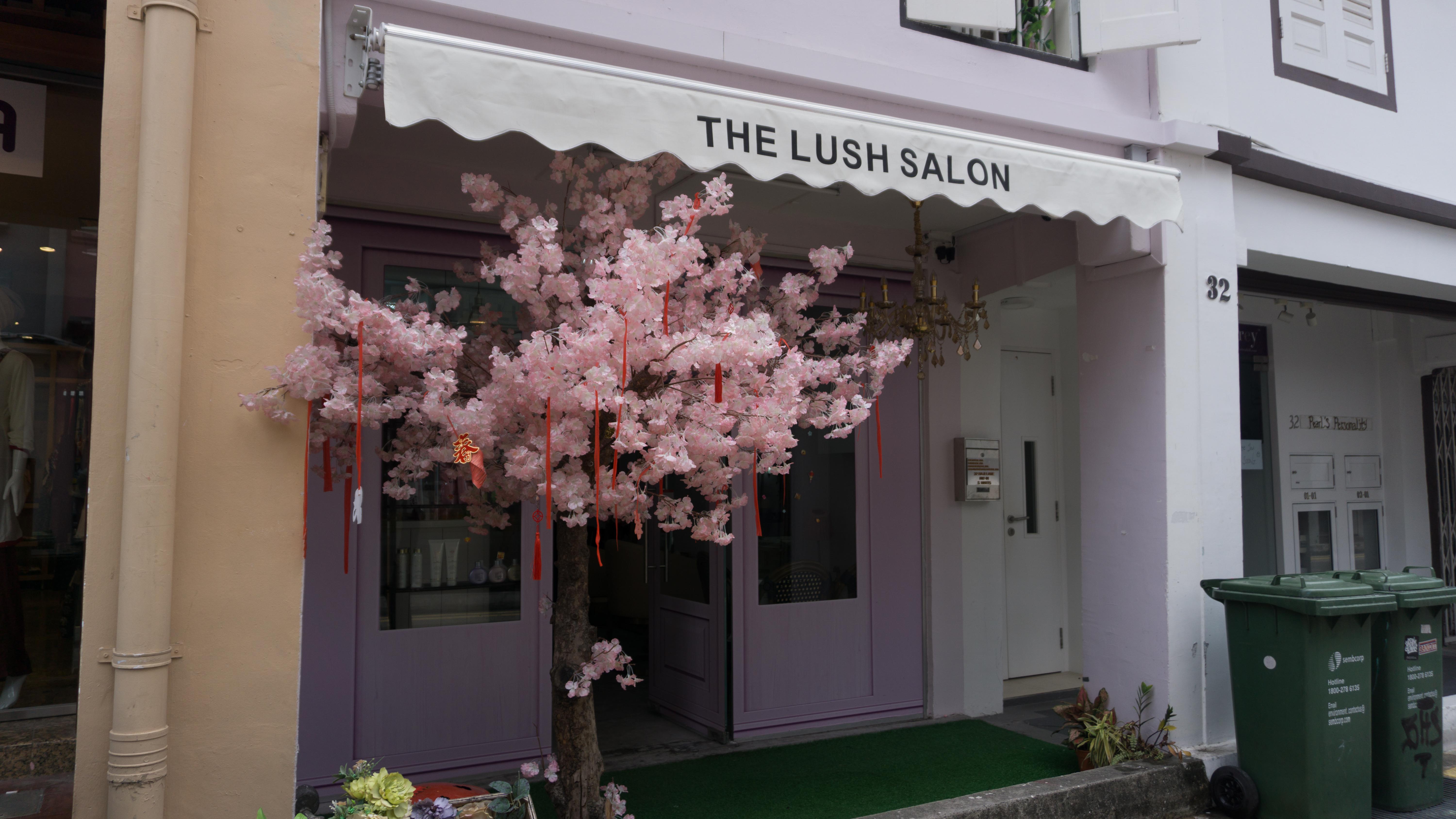
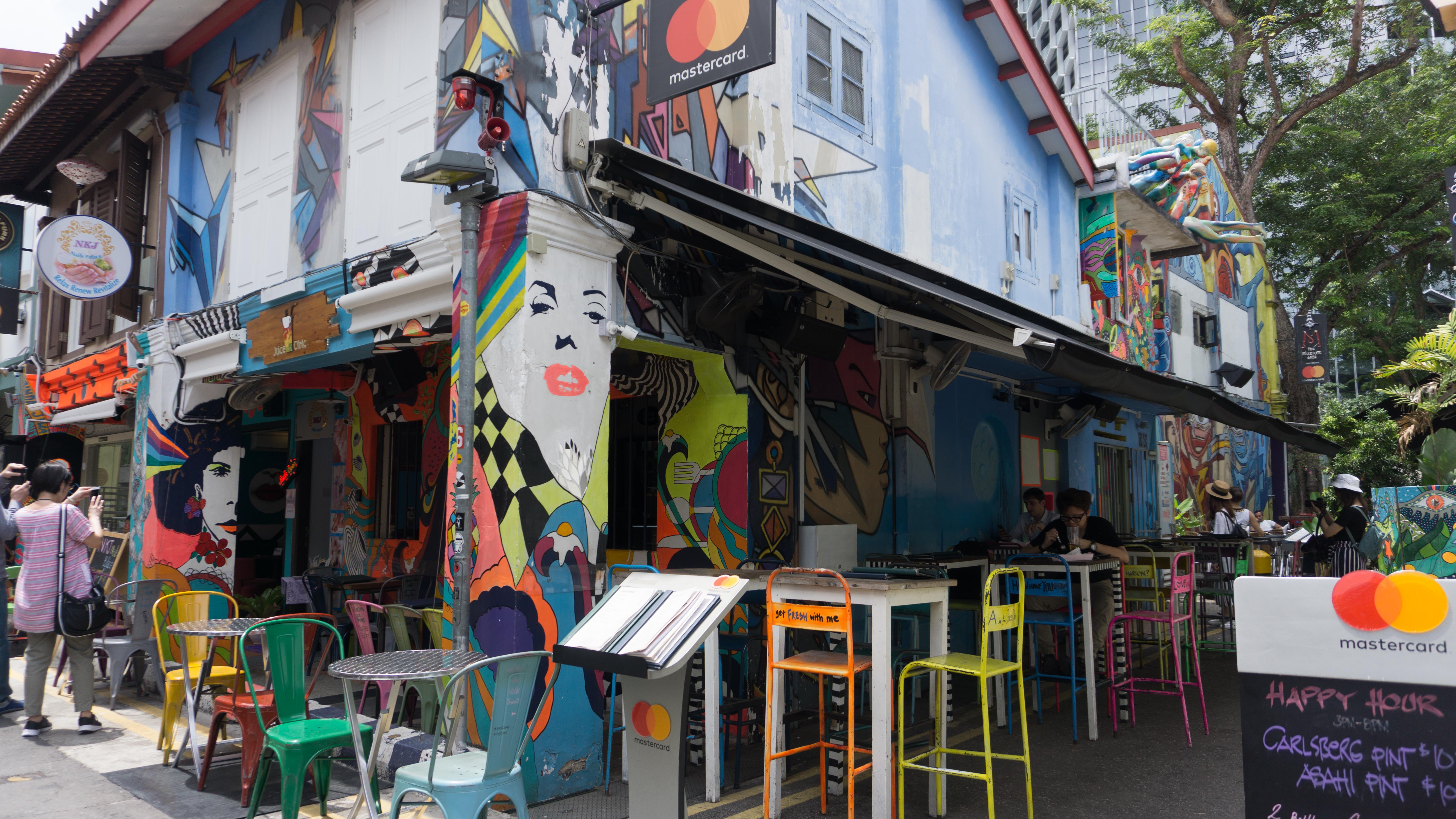
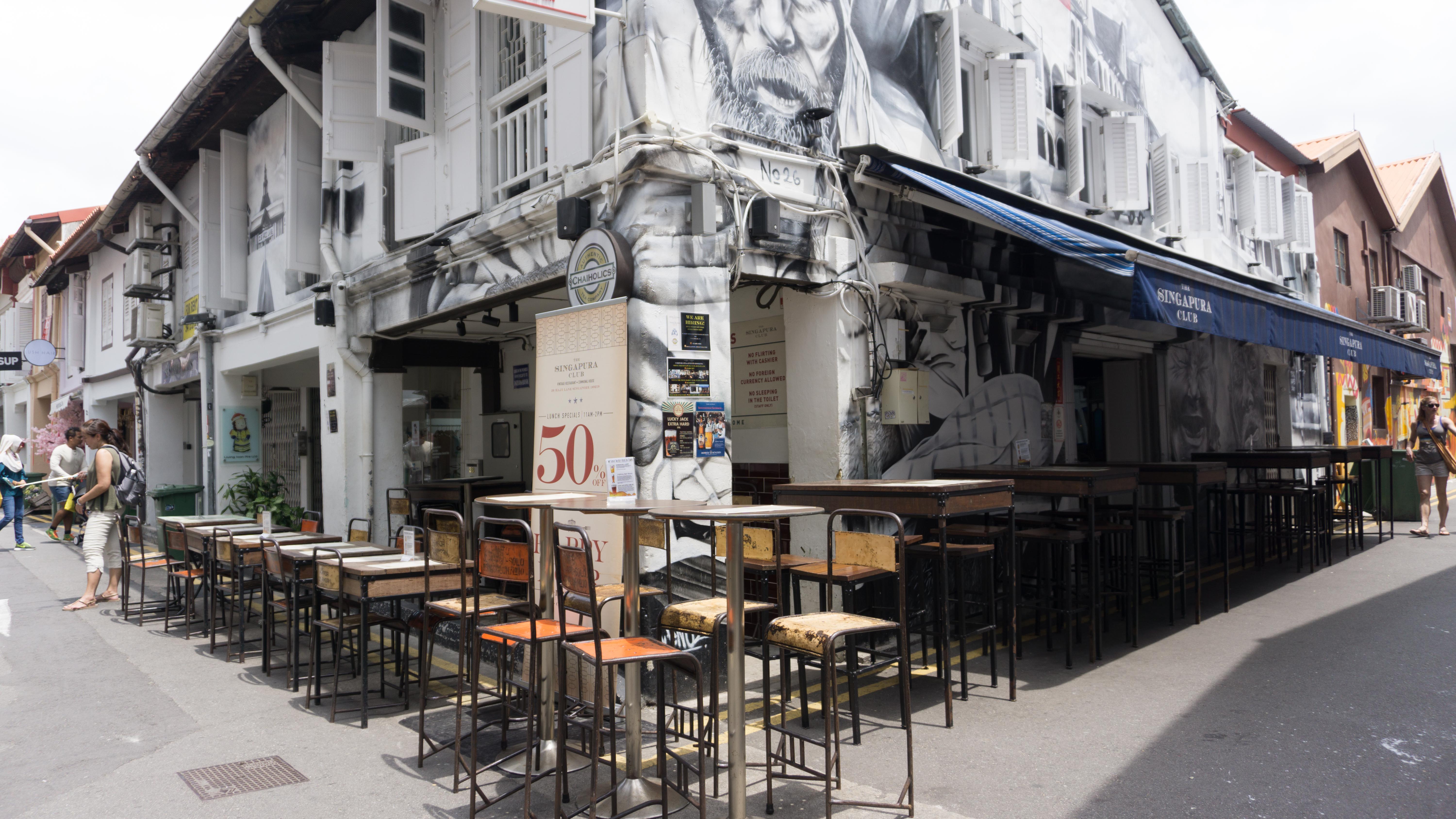
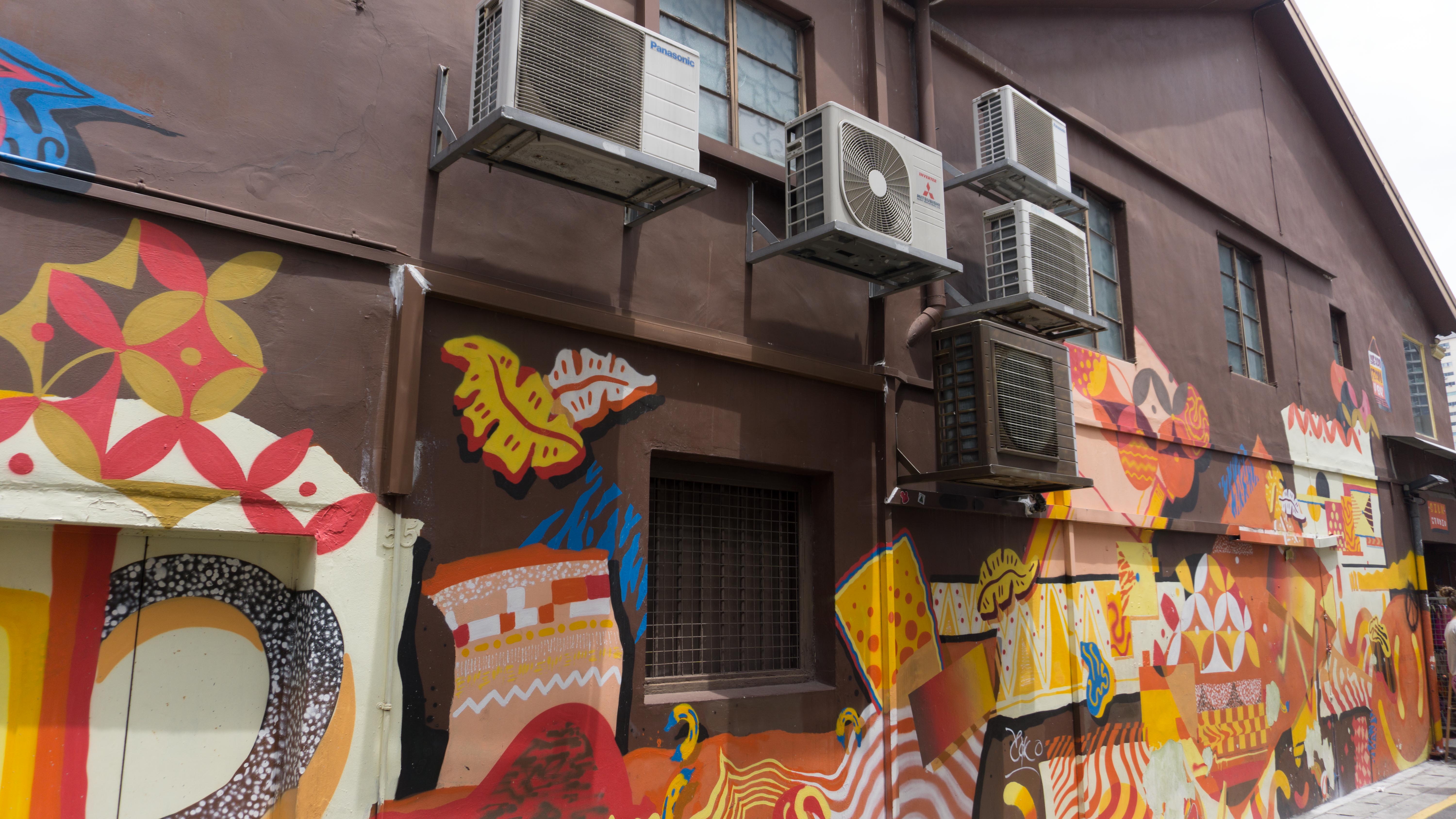
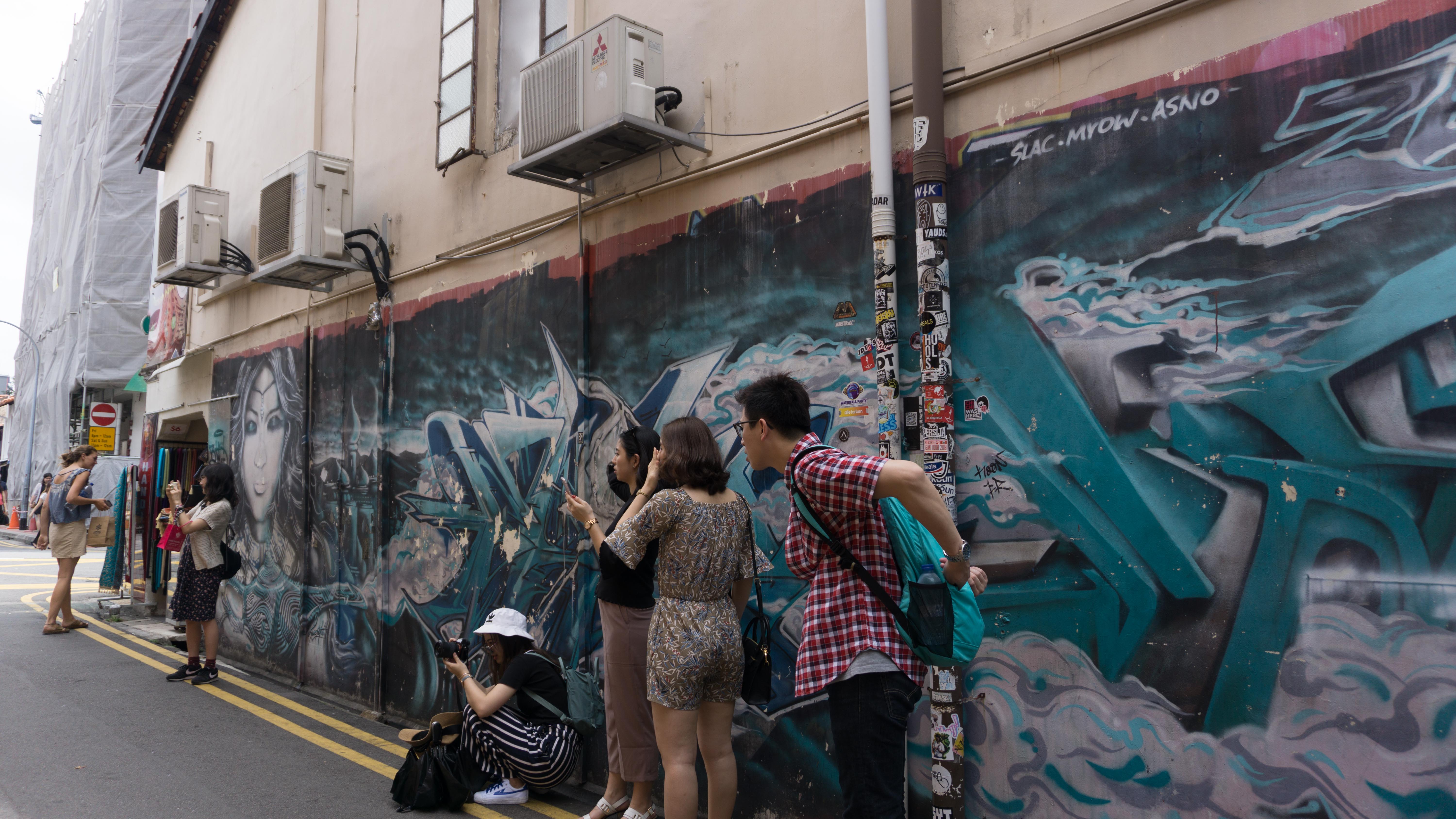
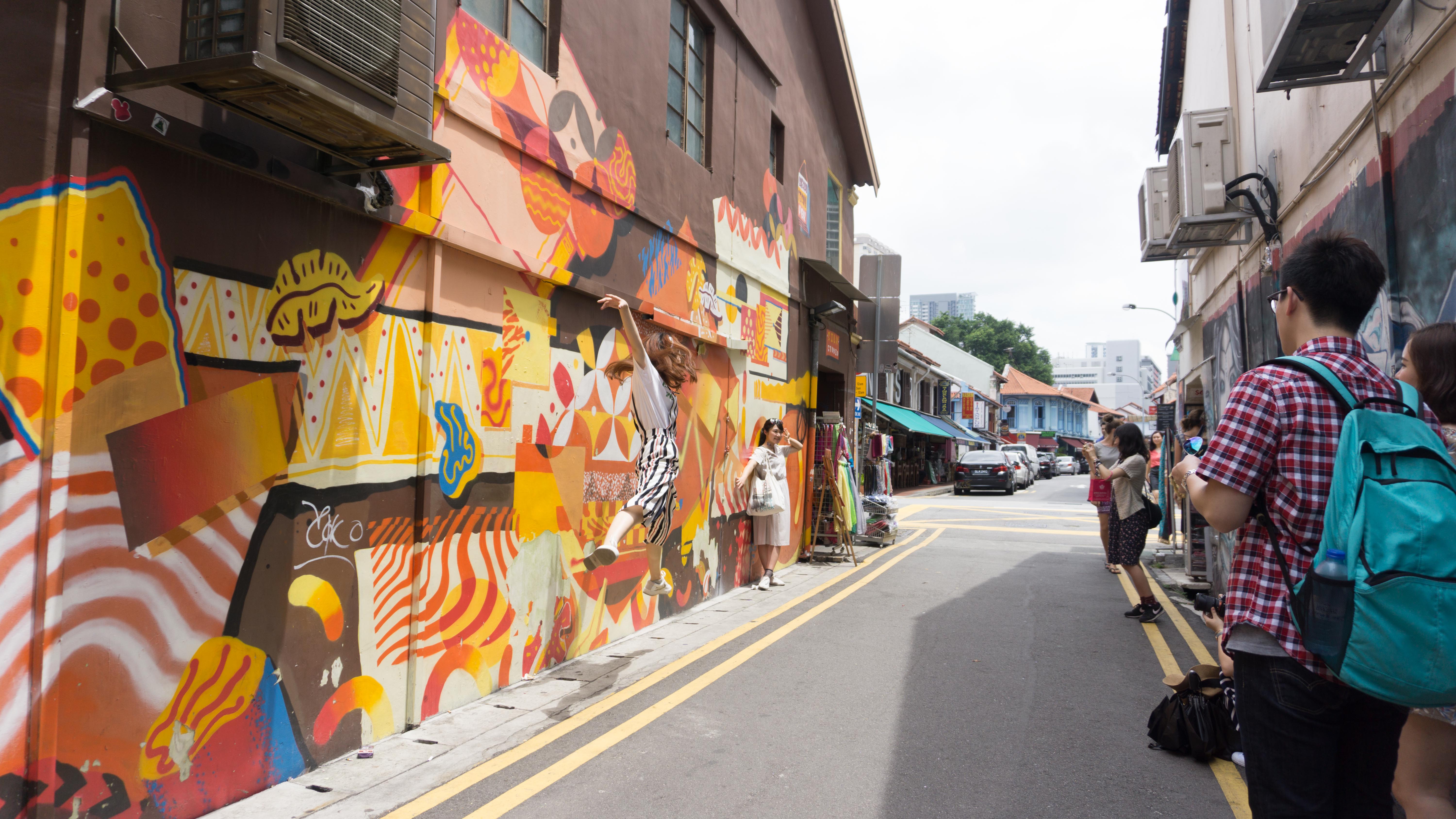
- shophouses
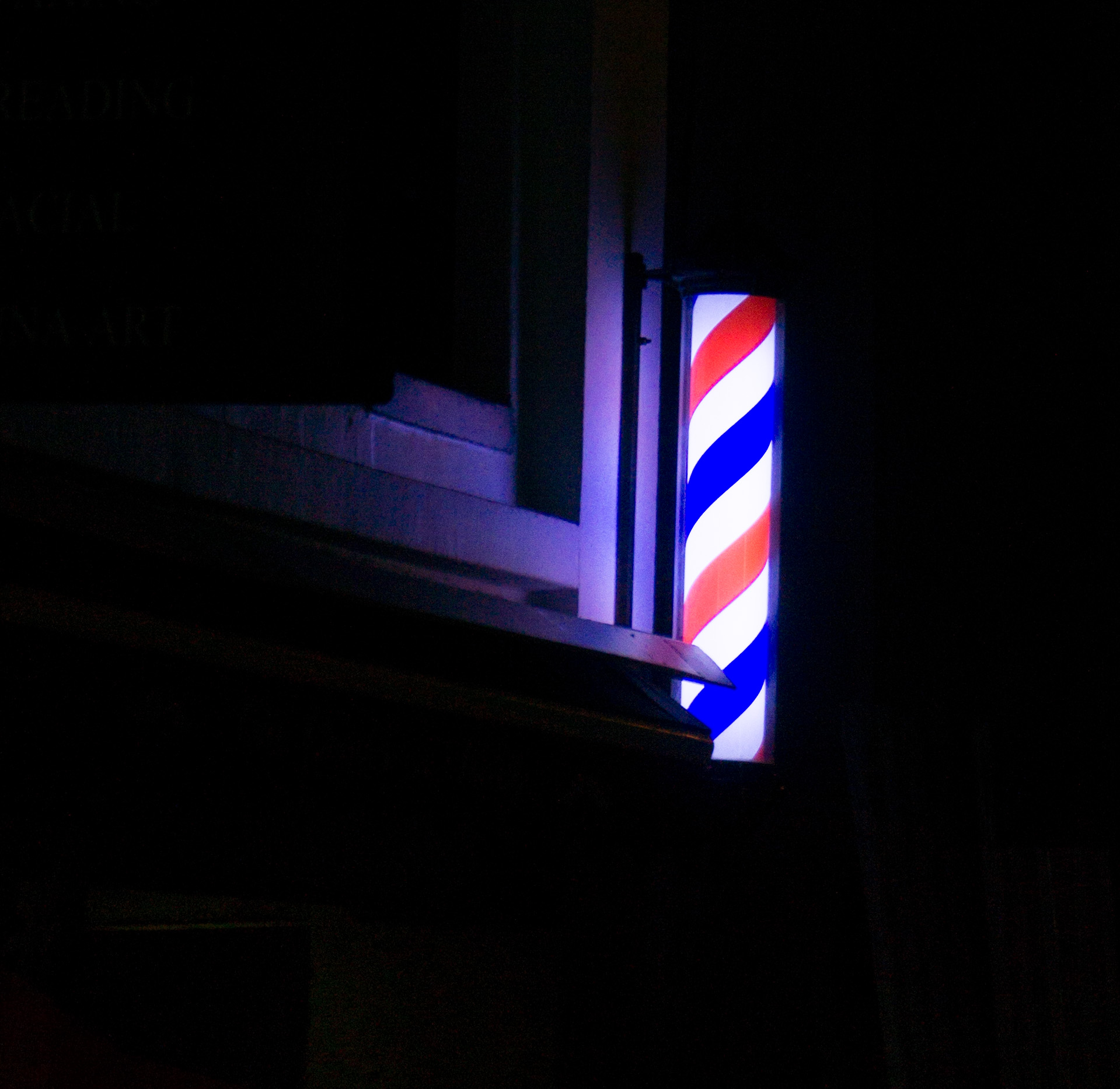
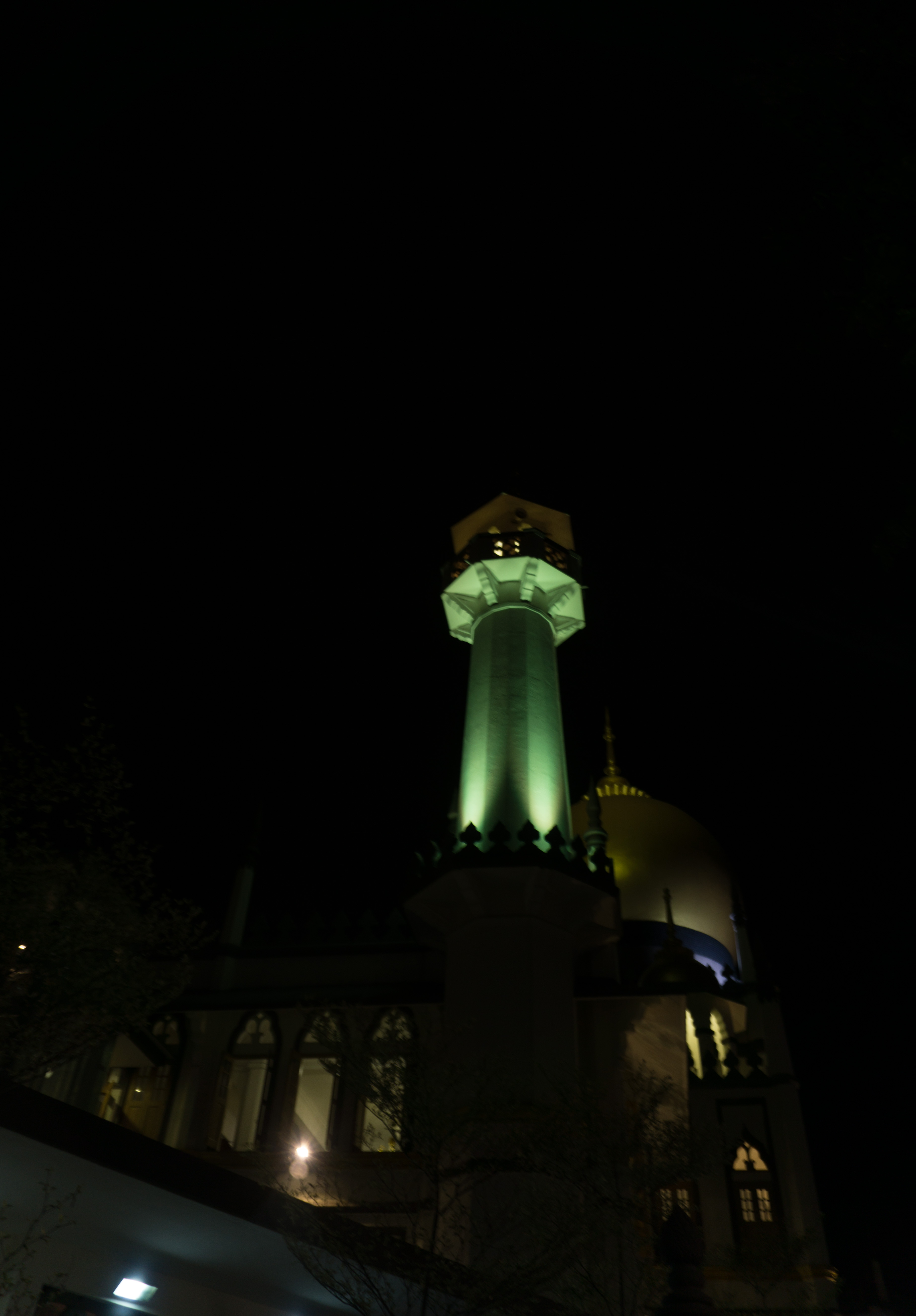
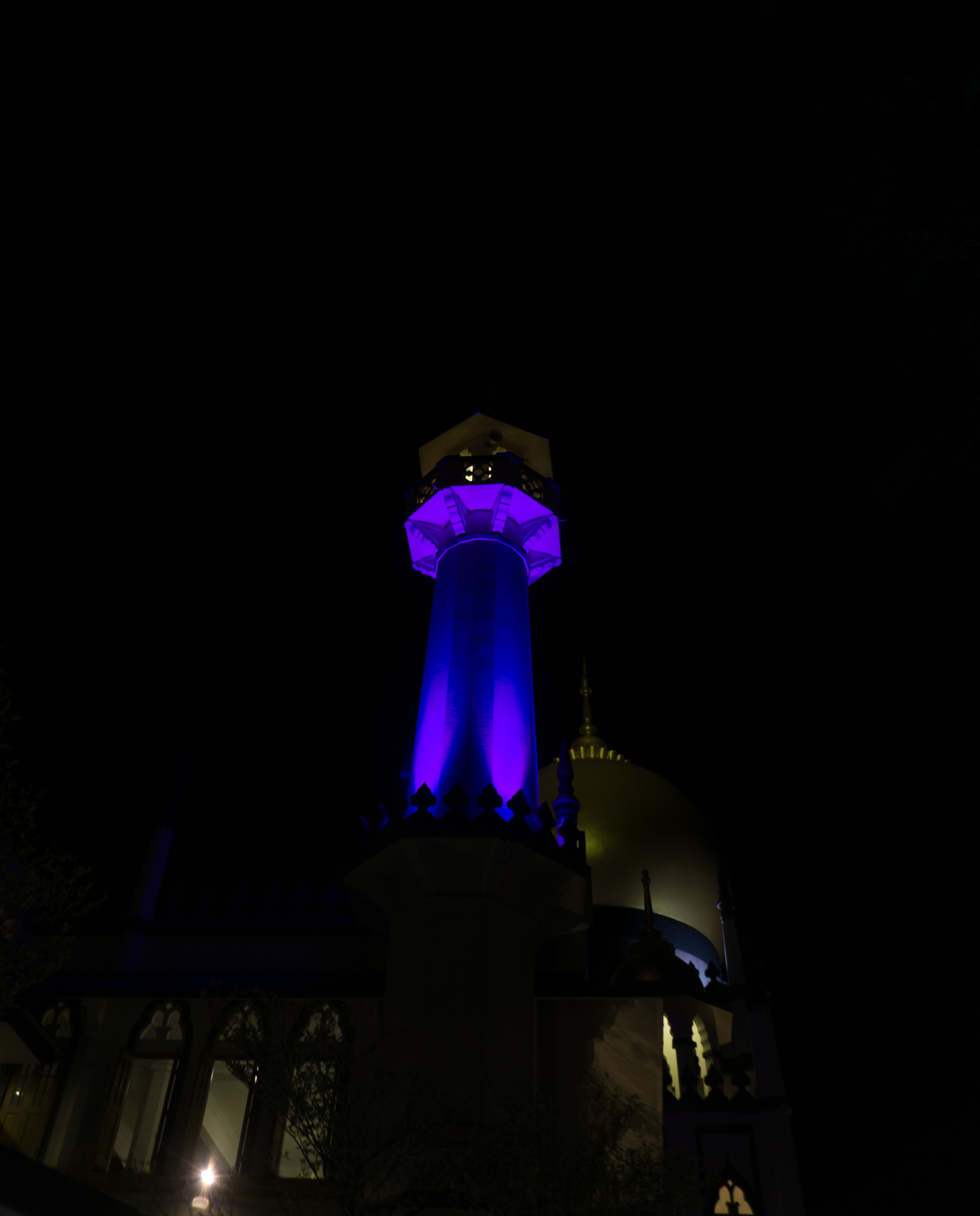
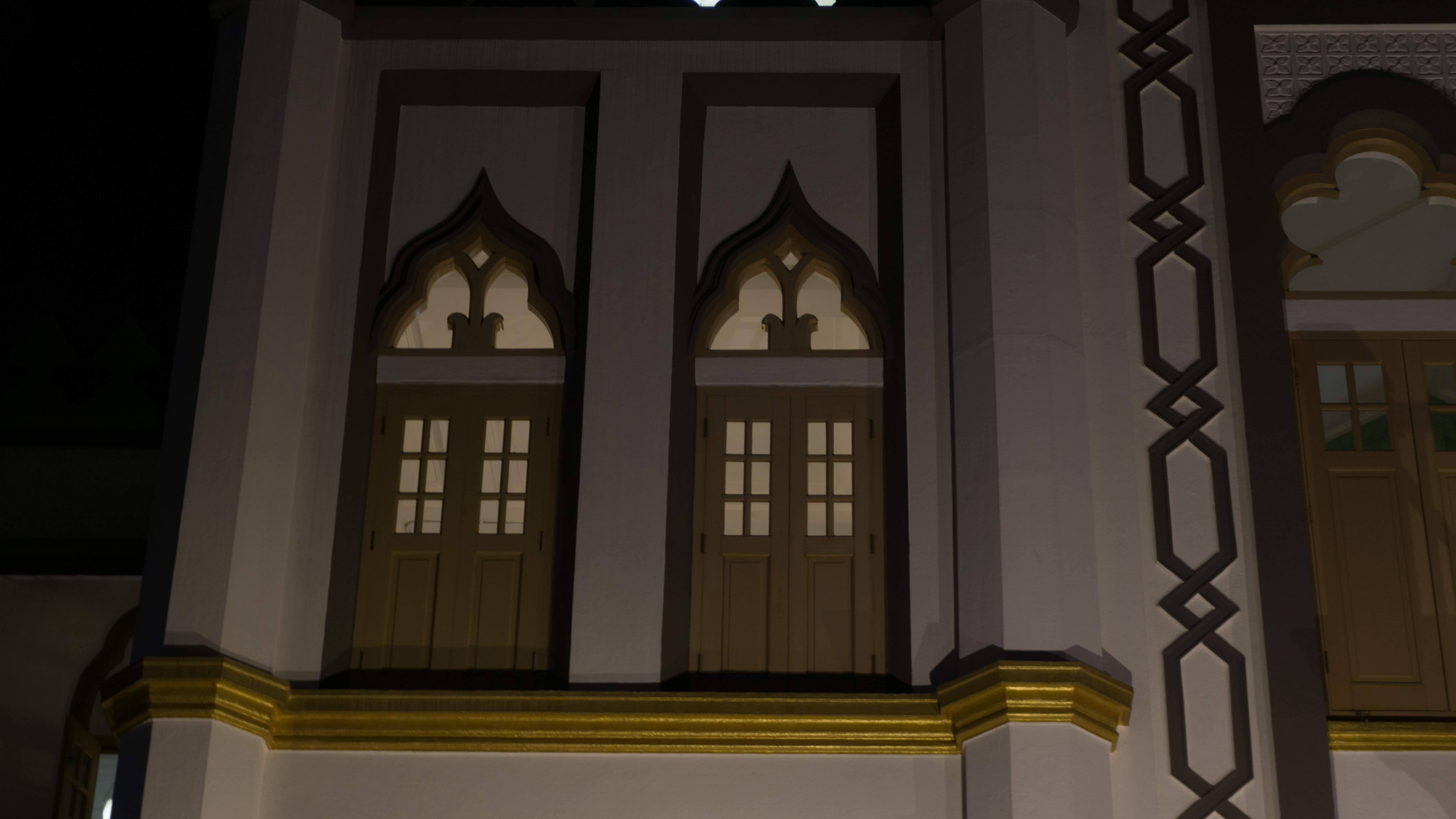
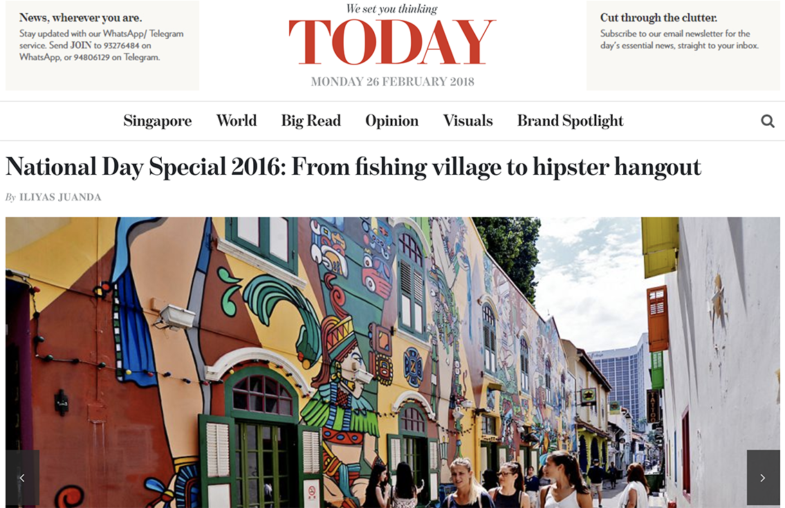
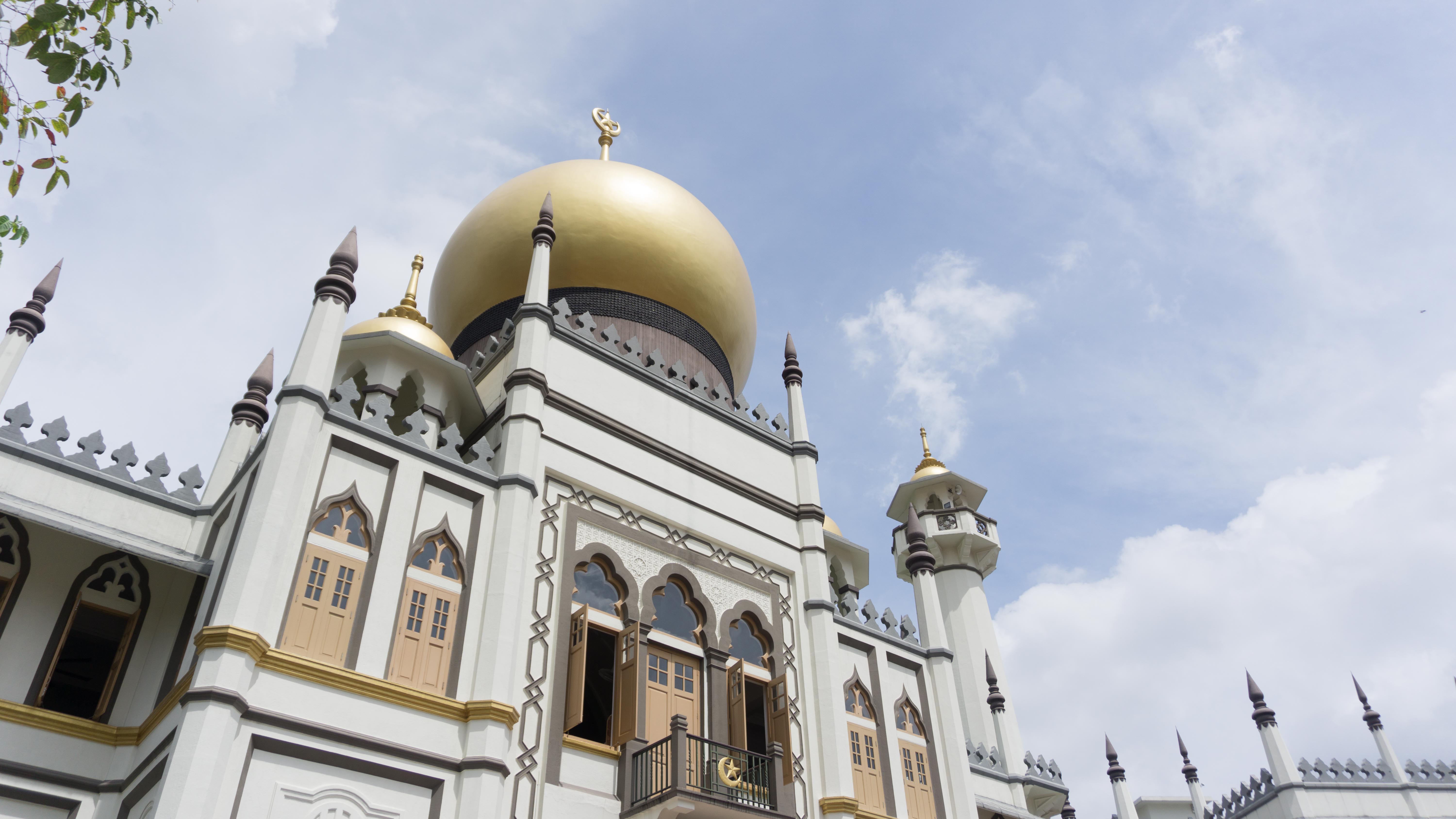
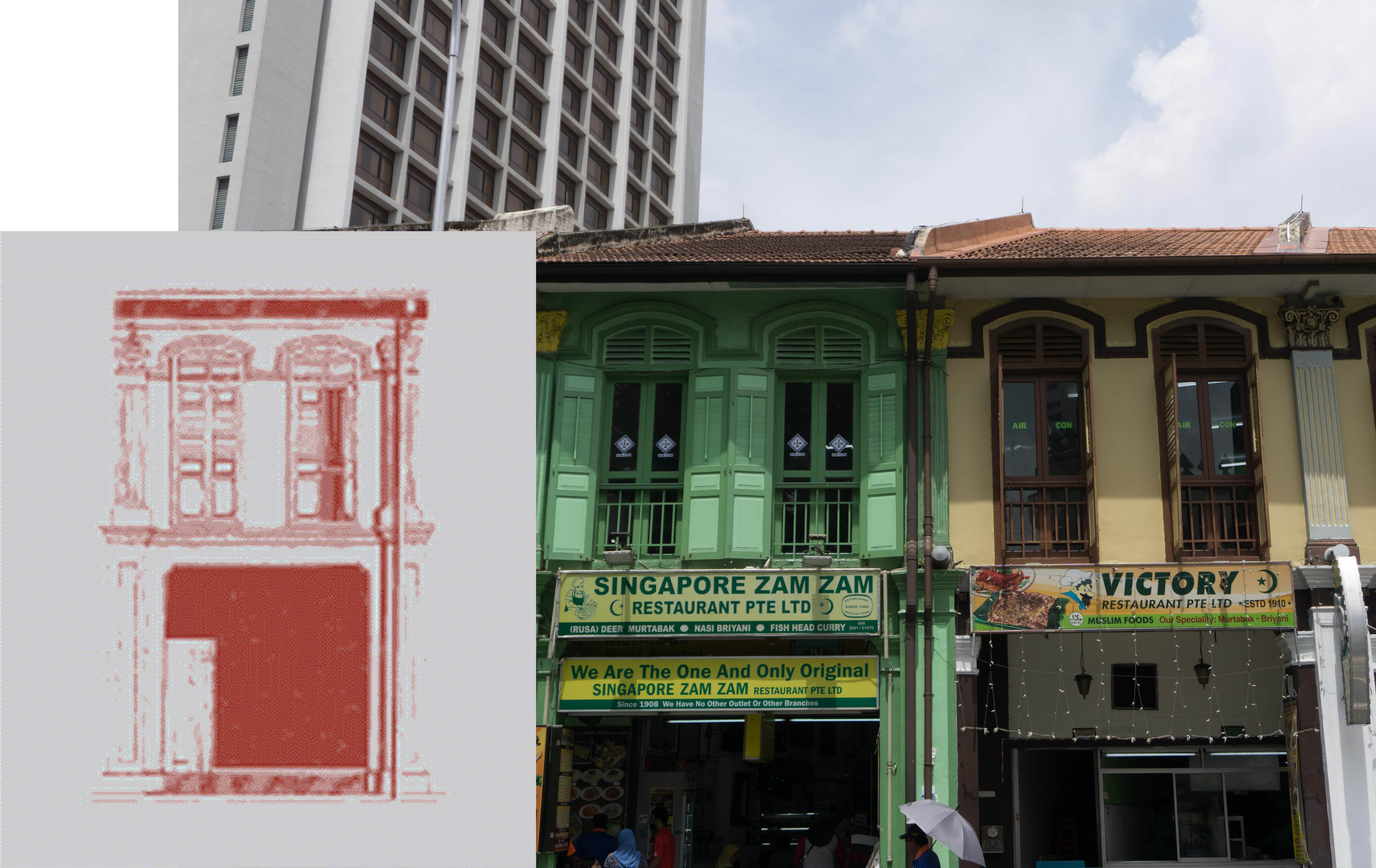
- Sultan Mosque
So the following are the layouts I did for the first spread.
I wanted to have a balance between the tourists and the textiles, making them almost equal. So I tried putting them side by side or even on the same page.
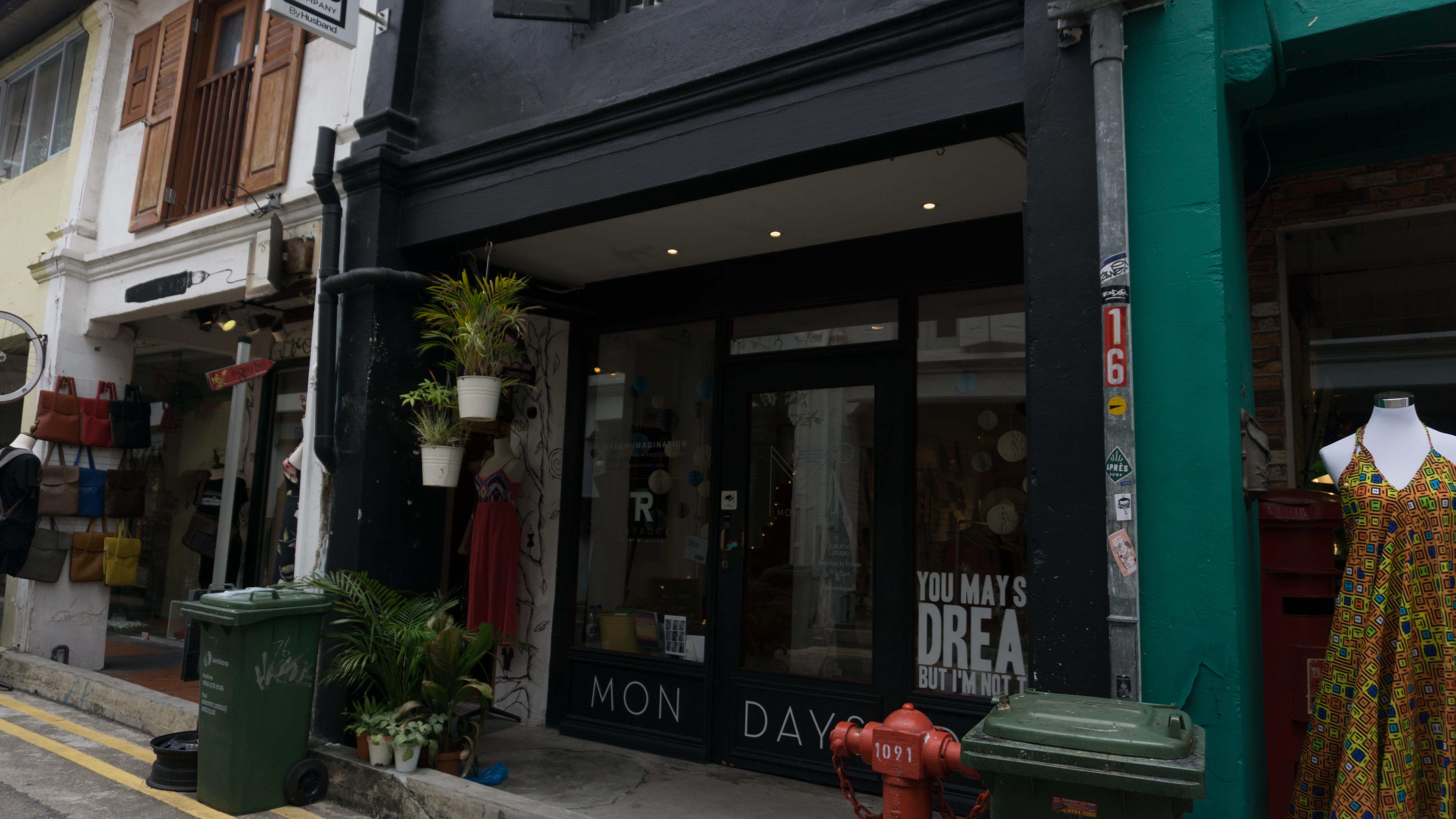
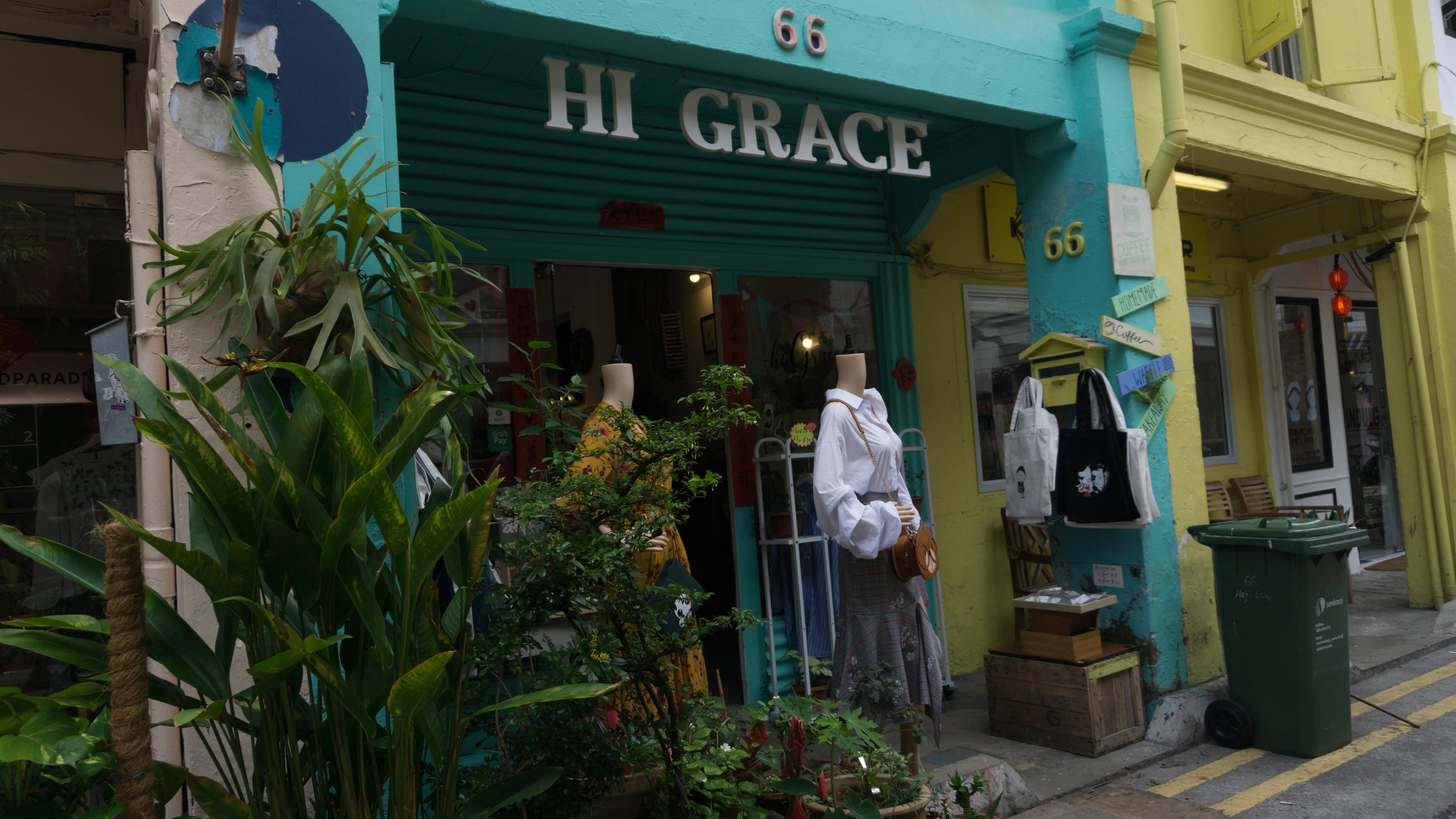
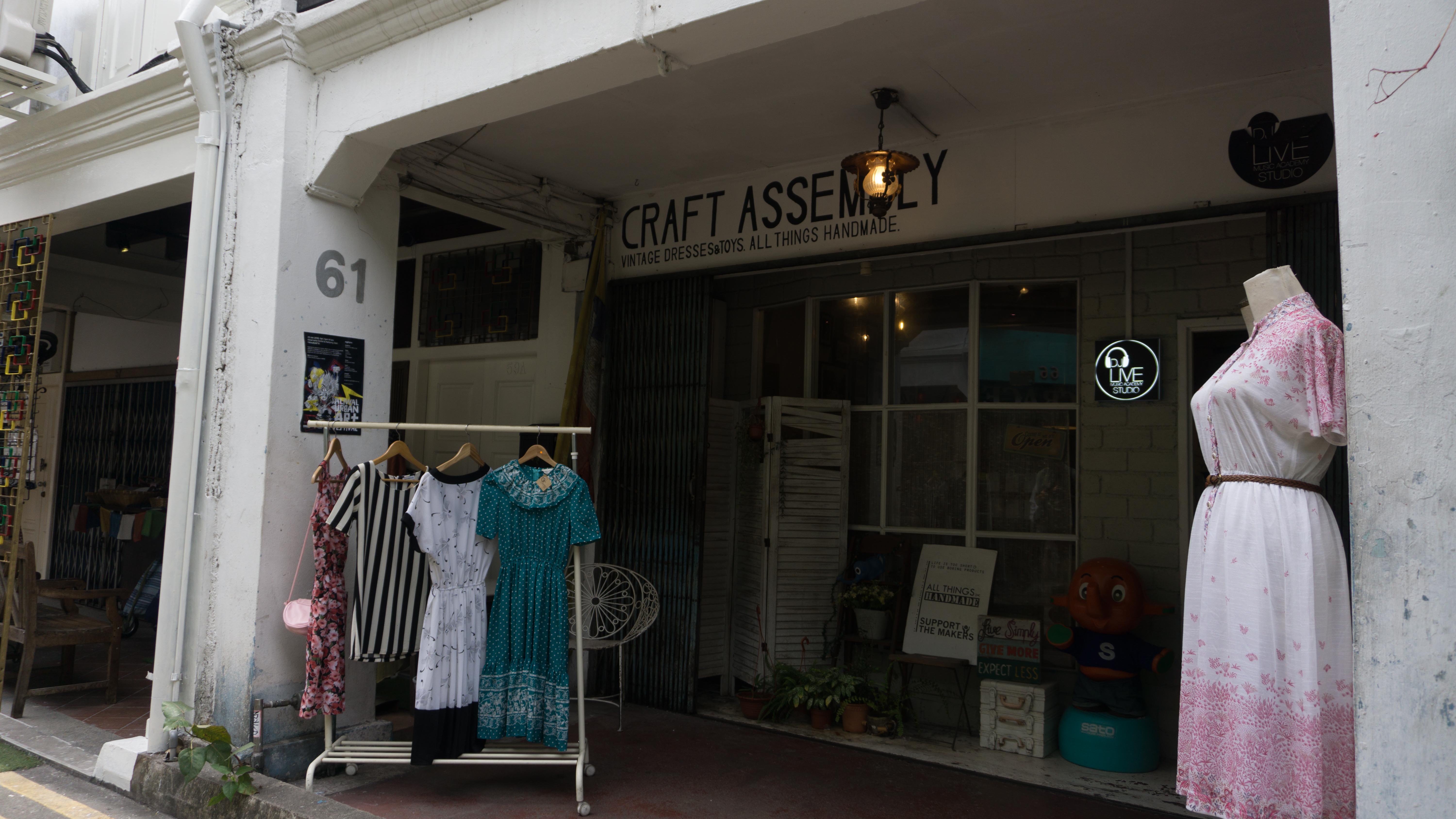
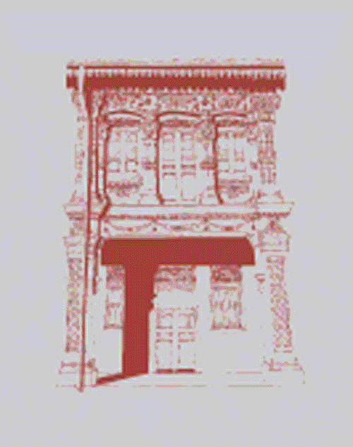
As this was the last inner spread that I worked on, I have trouble trying to show shophouses here since I have already featured the shophouses in the middle spread. So, I decided to make it into the corridor arches instead.
For the colours and style, I was very much inspired my Malika Favre’s work. I realise I was following too closely to it that it is starting to look very much like it too. So I had to change things up abit and change the colours too.

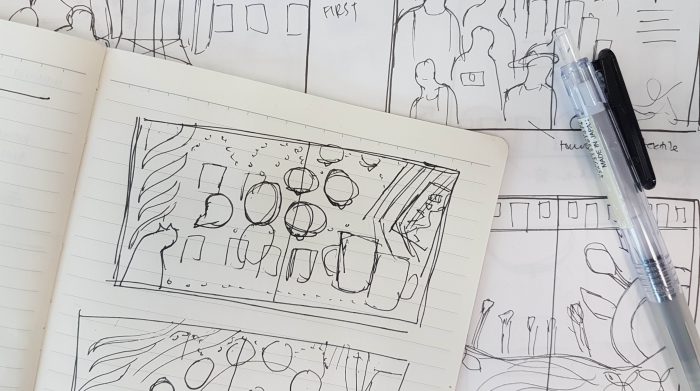
Initial sketches
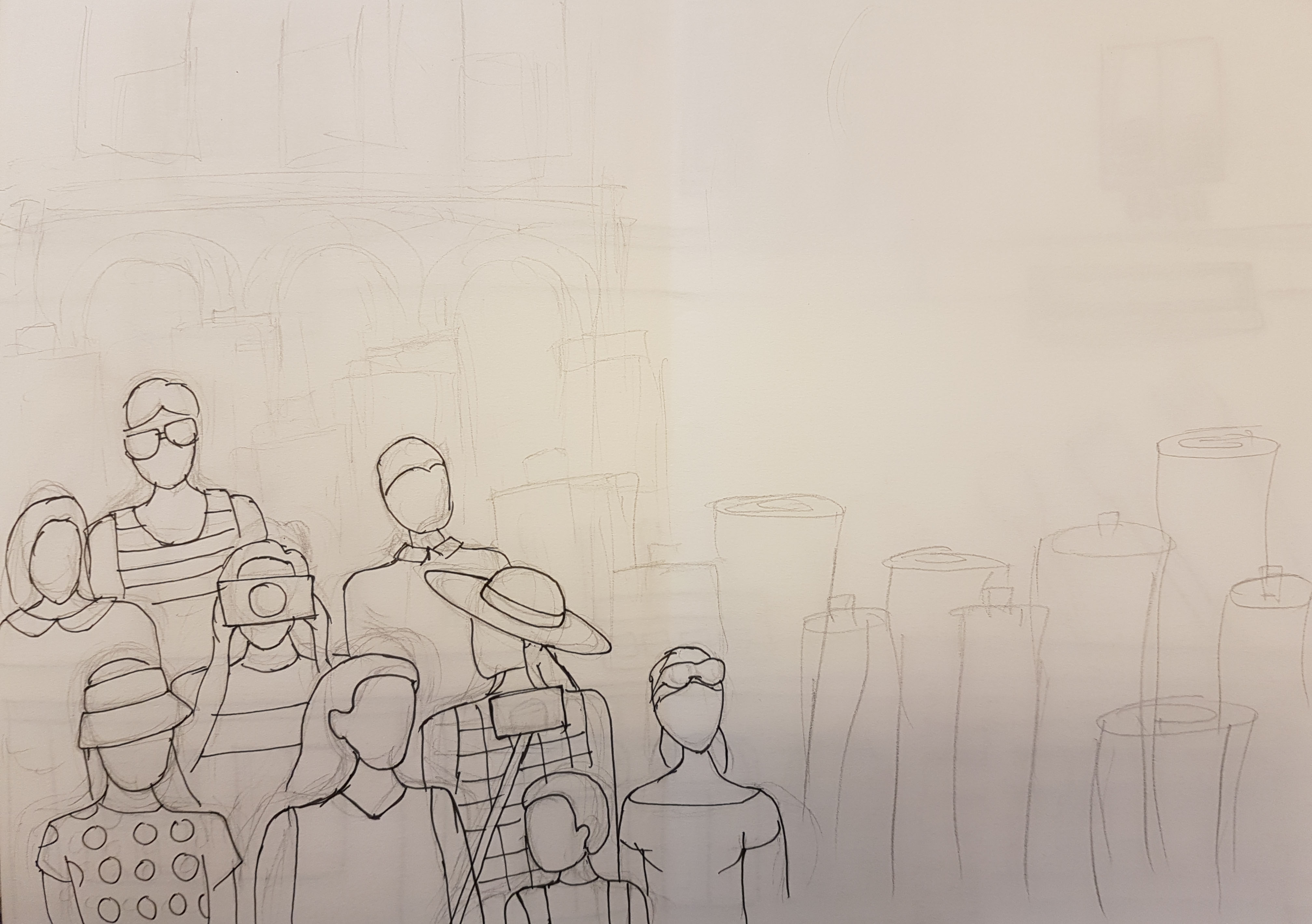
One of the first sketches I did

One of Malika Favre’s work that I was inspired by
One of my attempts on the spread. It started to look very close to Malika Favre’s work, especially the colours.
End result
I was not too satisfied with this spread as it still looked too solid and heavy despite my attempt to make it lighter by changing some of the illustrations into line works.
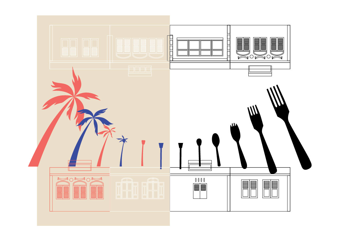
Middle spread
This was the second spread that I worked on. All this while I would know the importance of the middle spread as it is the transition spread and would balance out both sides of the zine.
Some elements that I would wanna feature in this spread is:
- palm trees (for the day)
- lampposts (as it can help to show the transition and looks close to cutleries and palm trees)
- cutleries (for the night)
- shophouses
I tried to make it more dynamic for this and this page was particularly important to show the transition from day to night. So I spend alot of time on this to make the transition as smooth as possible.
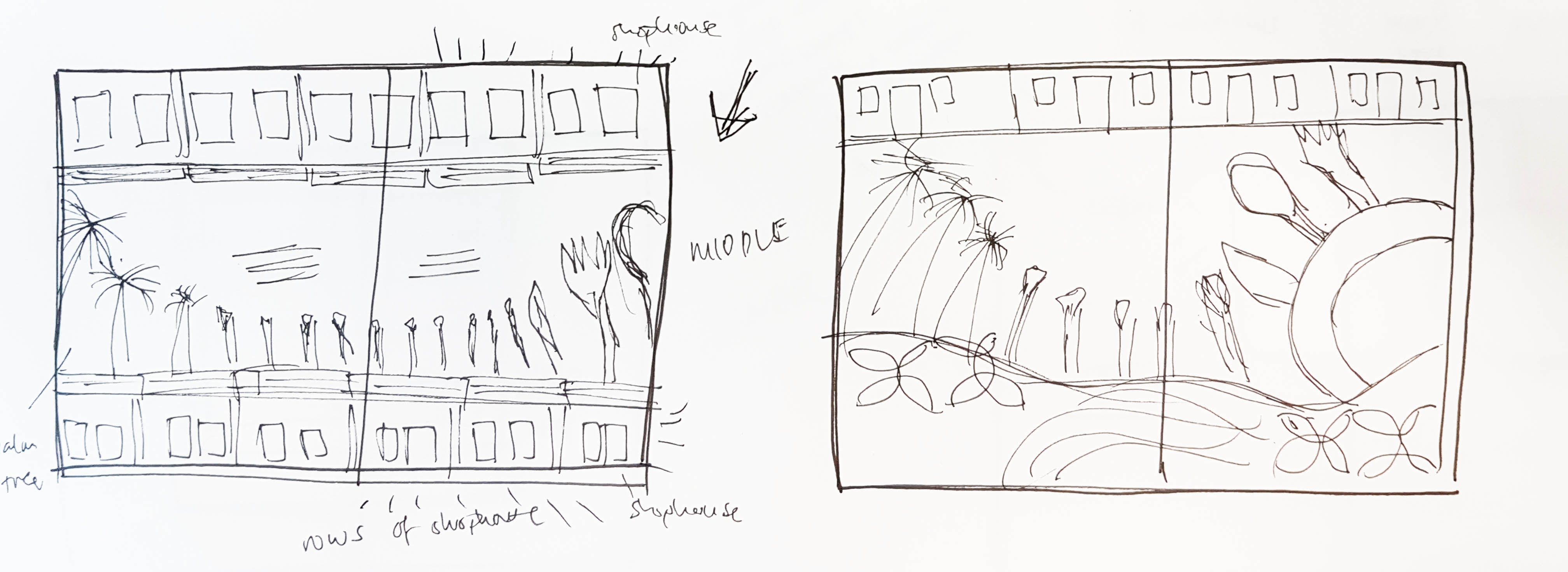
Initial sketches
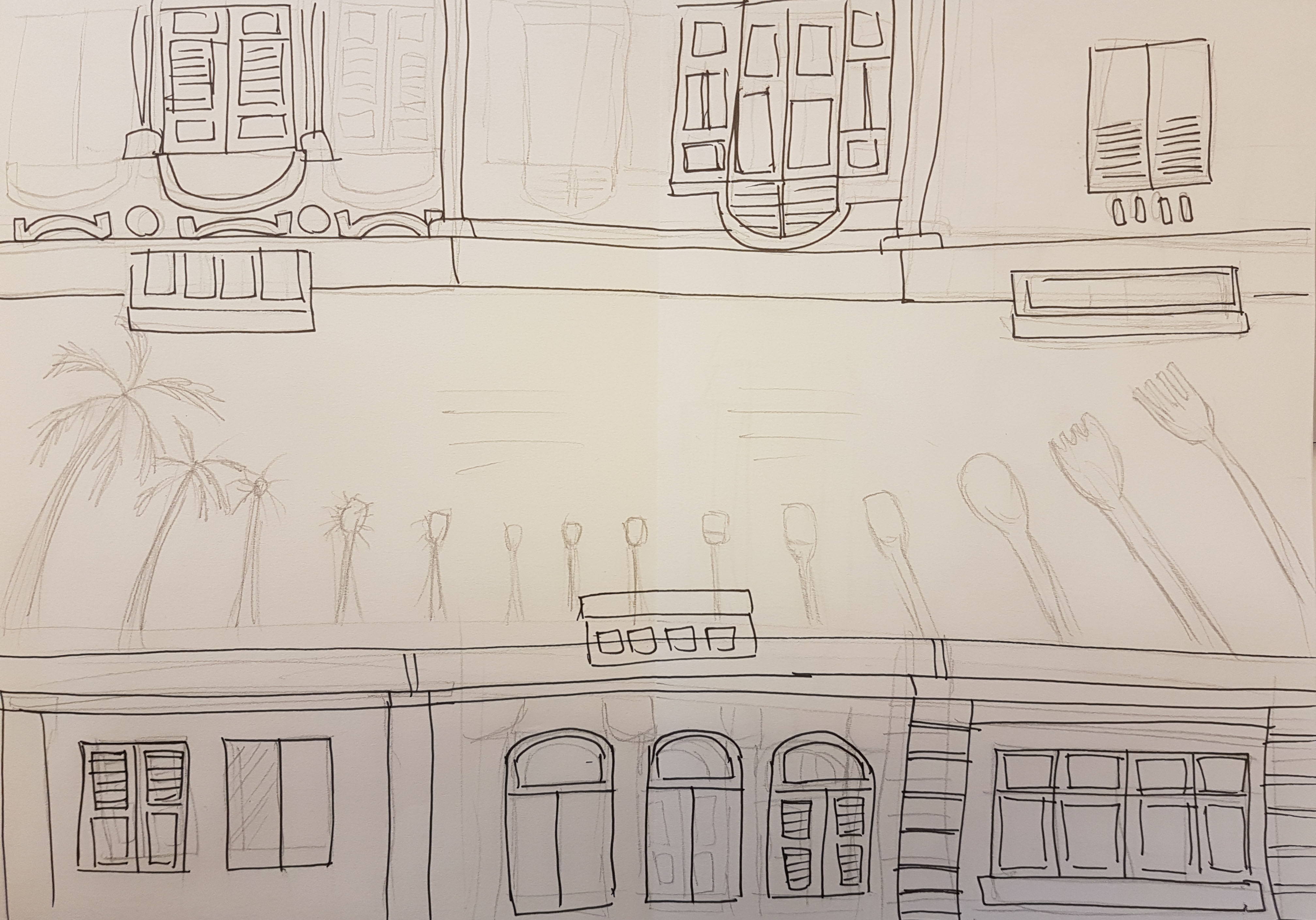
An initial sketch for the middle spread
My first digitalised work for the middle spread. I realise that there were still too much space in it and it was not dynamic enough

I tried to make it more dynamic. Almost there…
End result
I settle down with this as I think there is a right balance and dynamic movement in the spread. I think that the transition from day to night is seamless too, like there is no sudden change.

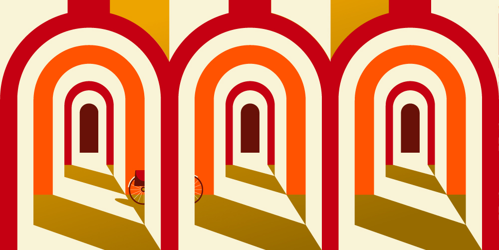
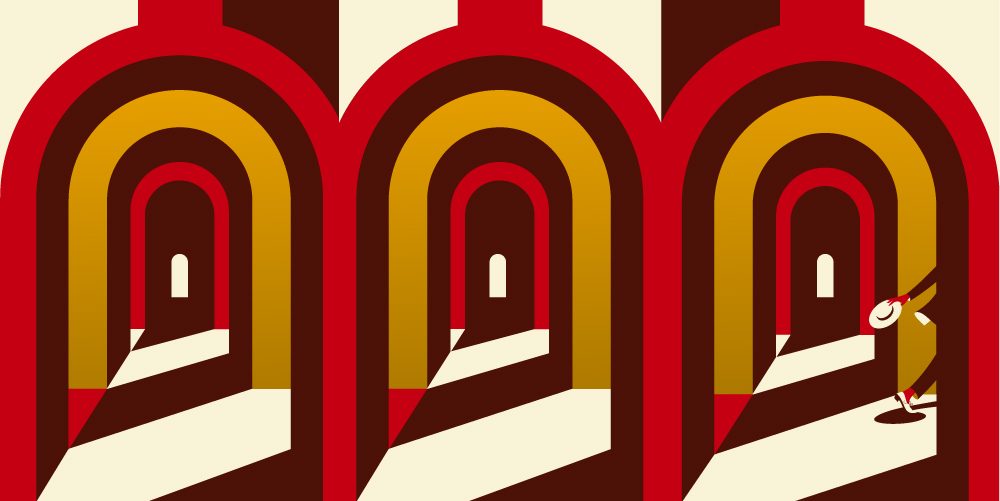
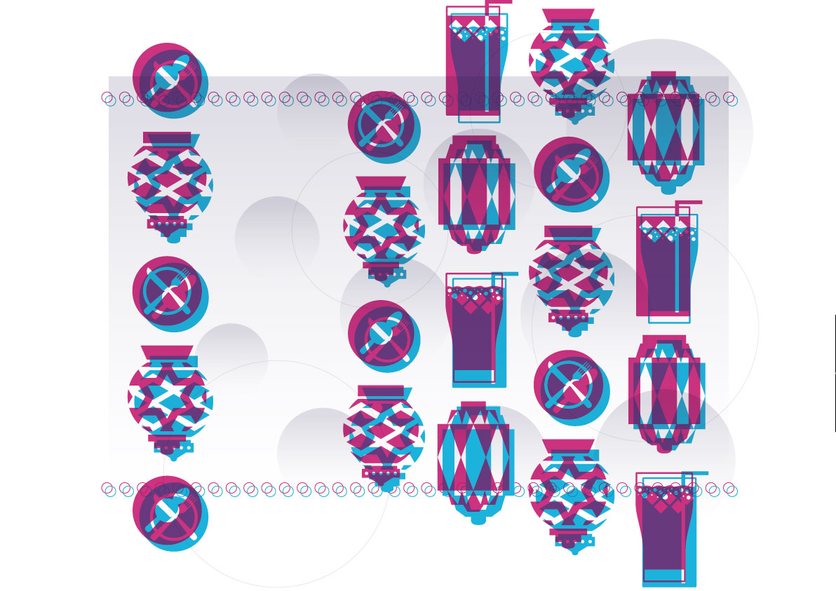
Last spread
This was actually the first spread that I worked on as I really wanted to show the overlaying and the double shadow effect in the zine.
Some of the main elements that I wanted to show in this spread is:
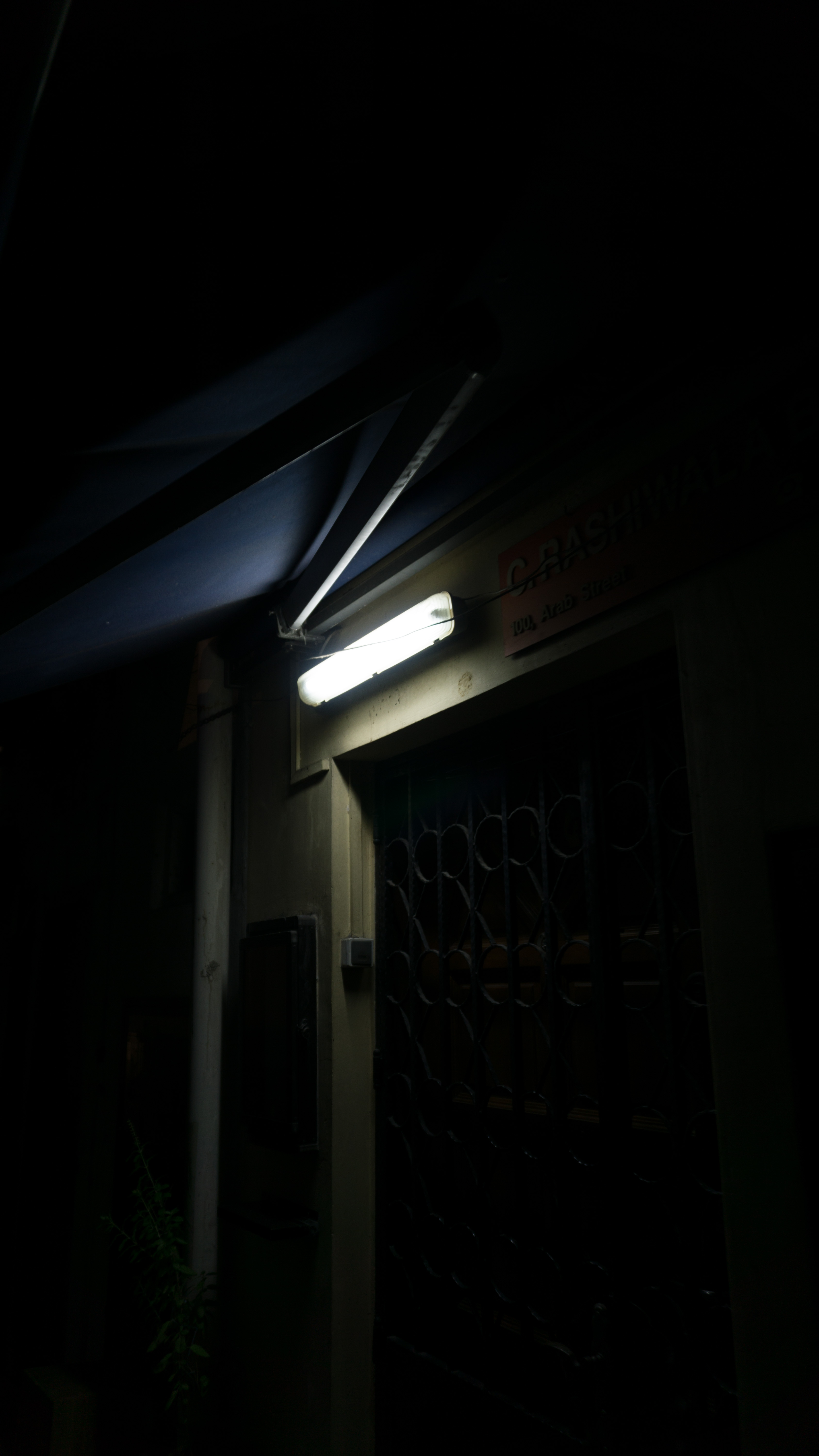
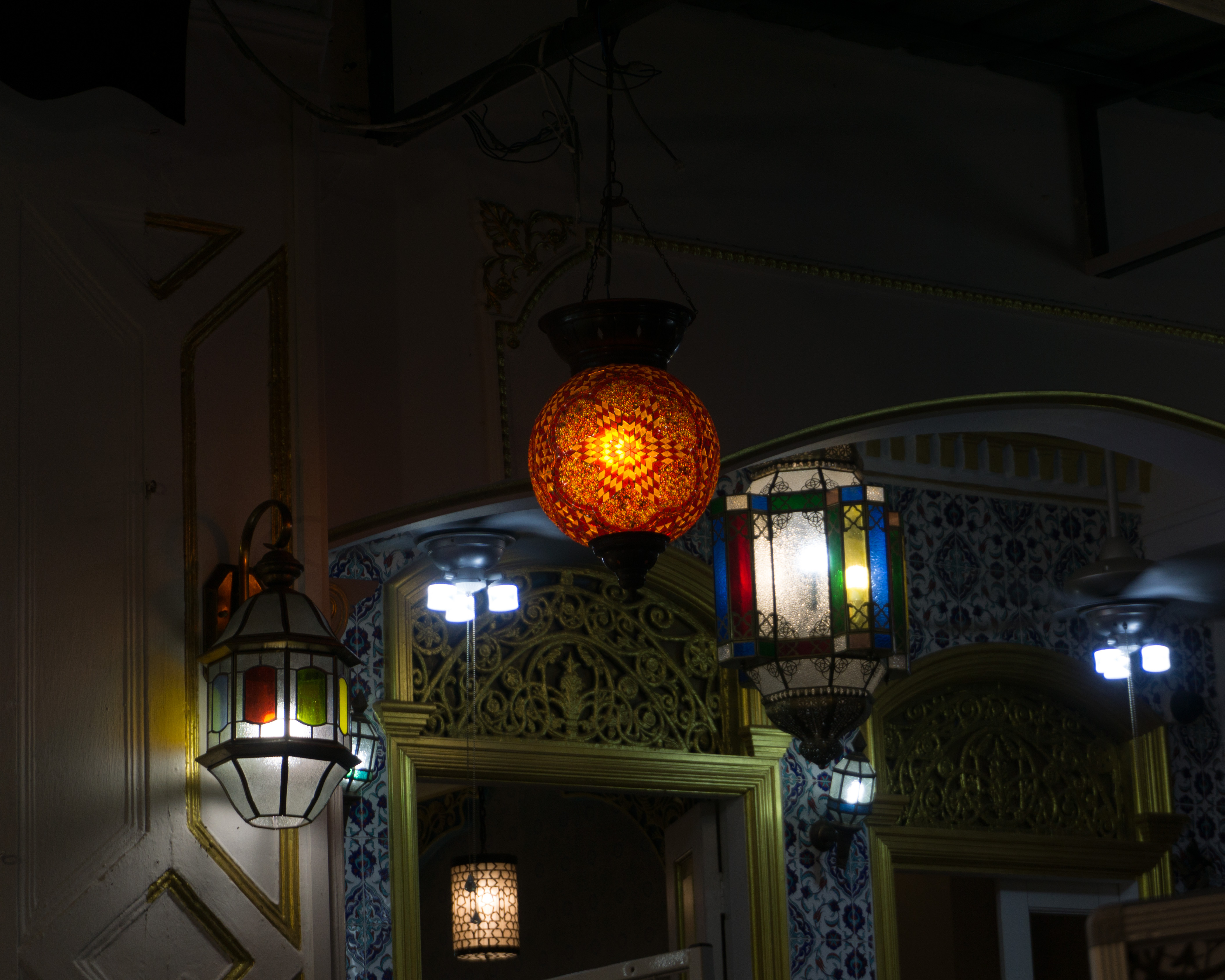
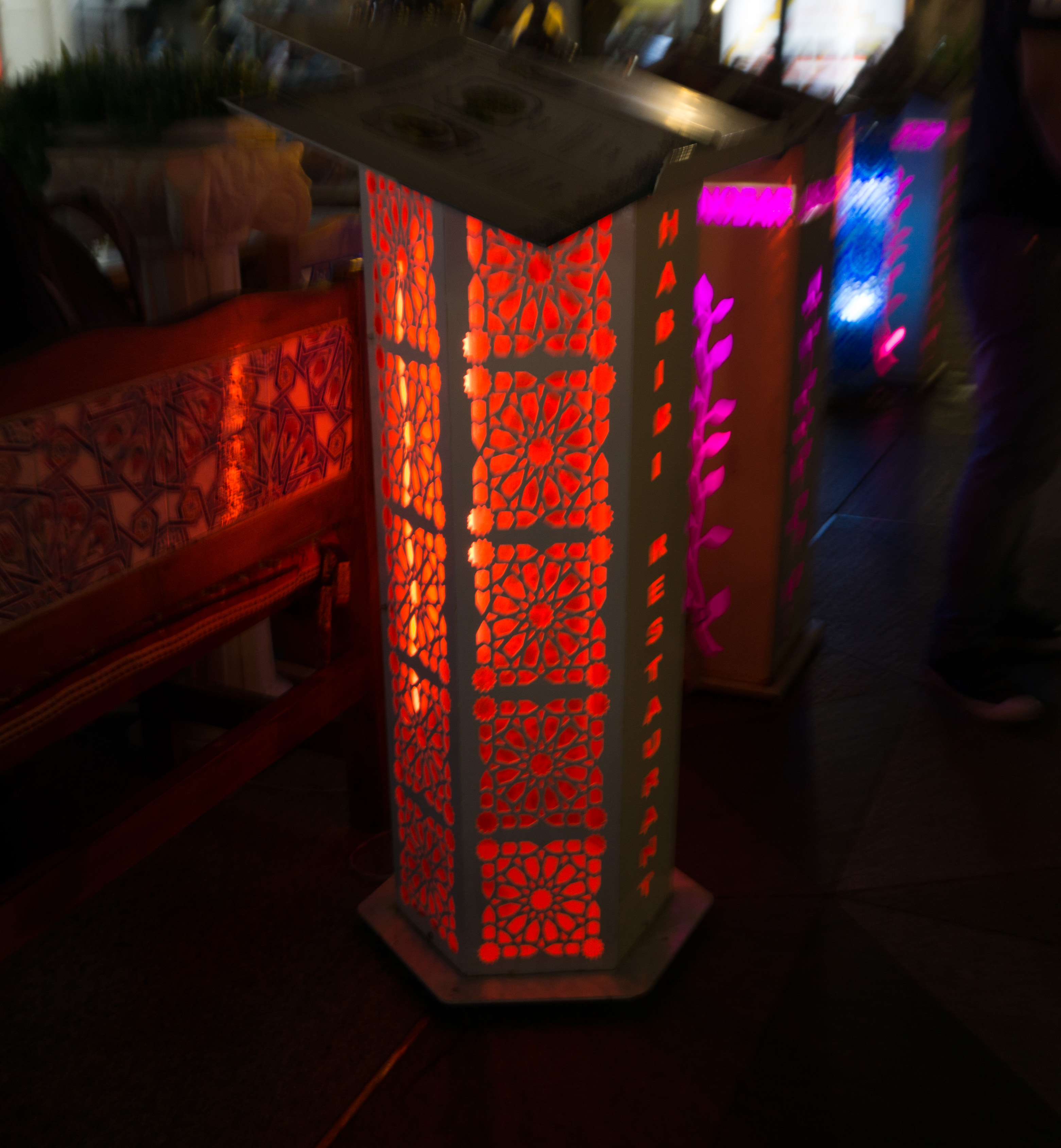
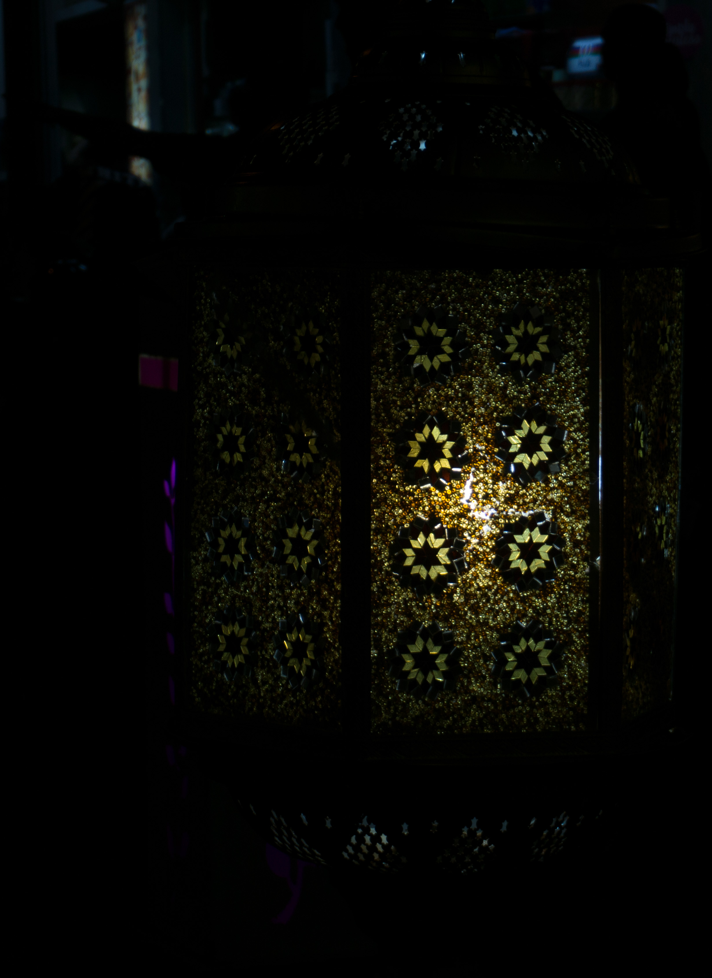
- exotic lanterns
- down-up lighting
- food scene (plates and drinks)
- lights

Initial sketches
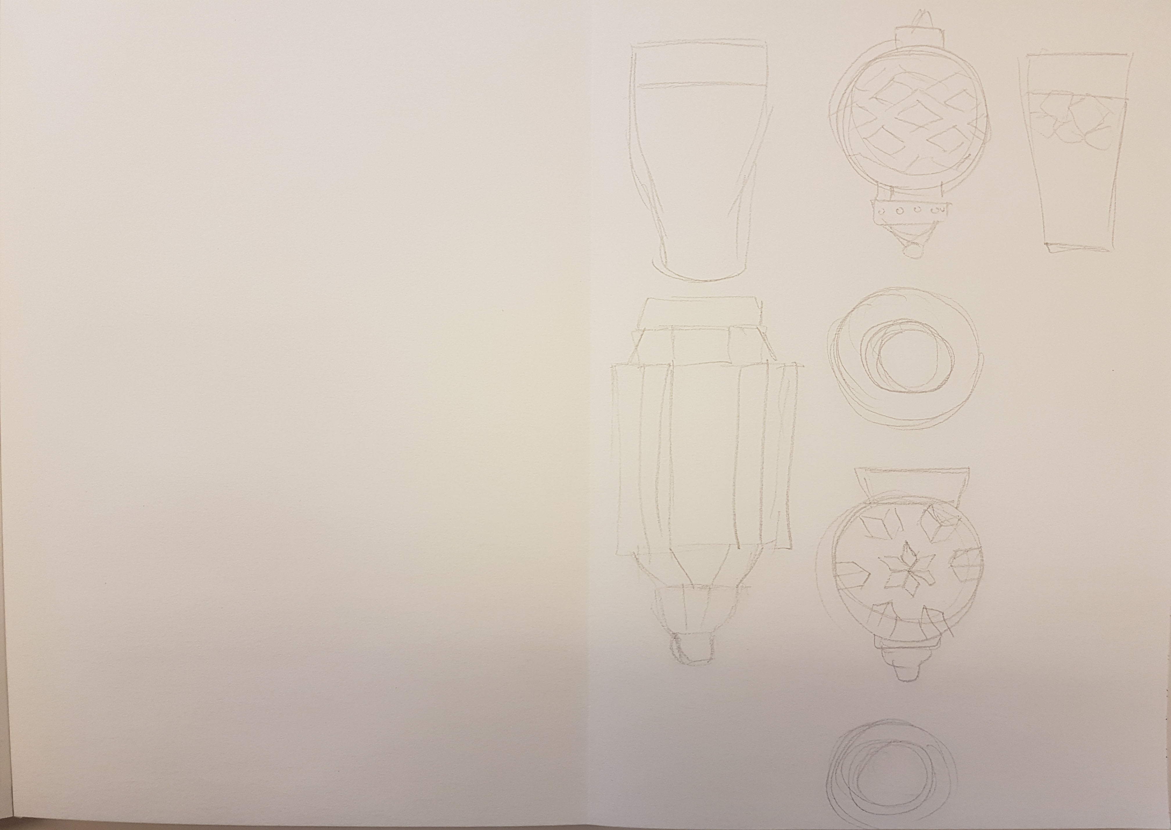
Can’t really see much here as I mostly worked out the shapes of the illustrations digitally
End result
I was satisfied with the layout of this spread as it was very close to what I had invisioned. The space on the left page of the spread was actually for text, but I decided not to put it in because i wouldn’t want it to affect the mood and feel the illustrations had conveyed.
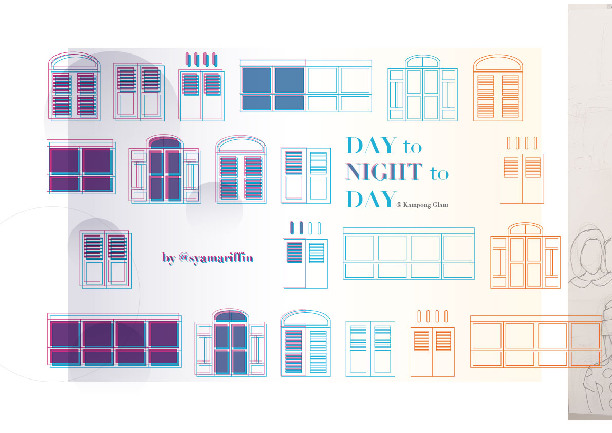
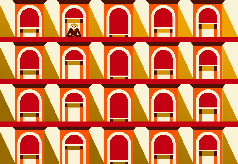
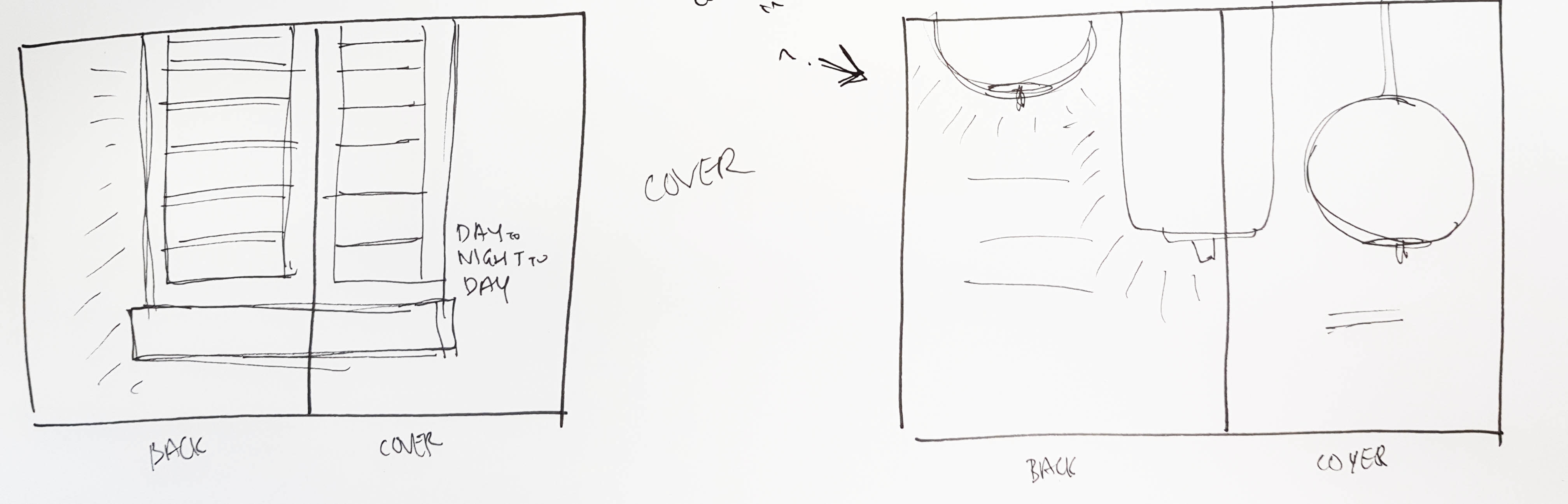
The cover and back cover
This was actually the last page that I attempted as I was mainly focusing on the contents, and would leave this last so that I would know what the content is already like so that the cover page and back cover would be the design layout that holds all the contents together.
So what would be the better way to hold everything together and represent Kampong Glam? By using shophouses windows! (Since the shophouses have already been used by the middle spread)
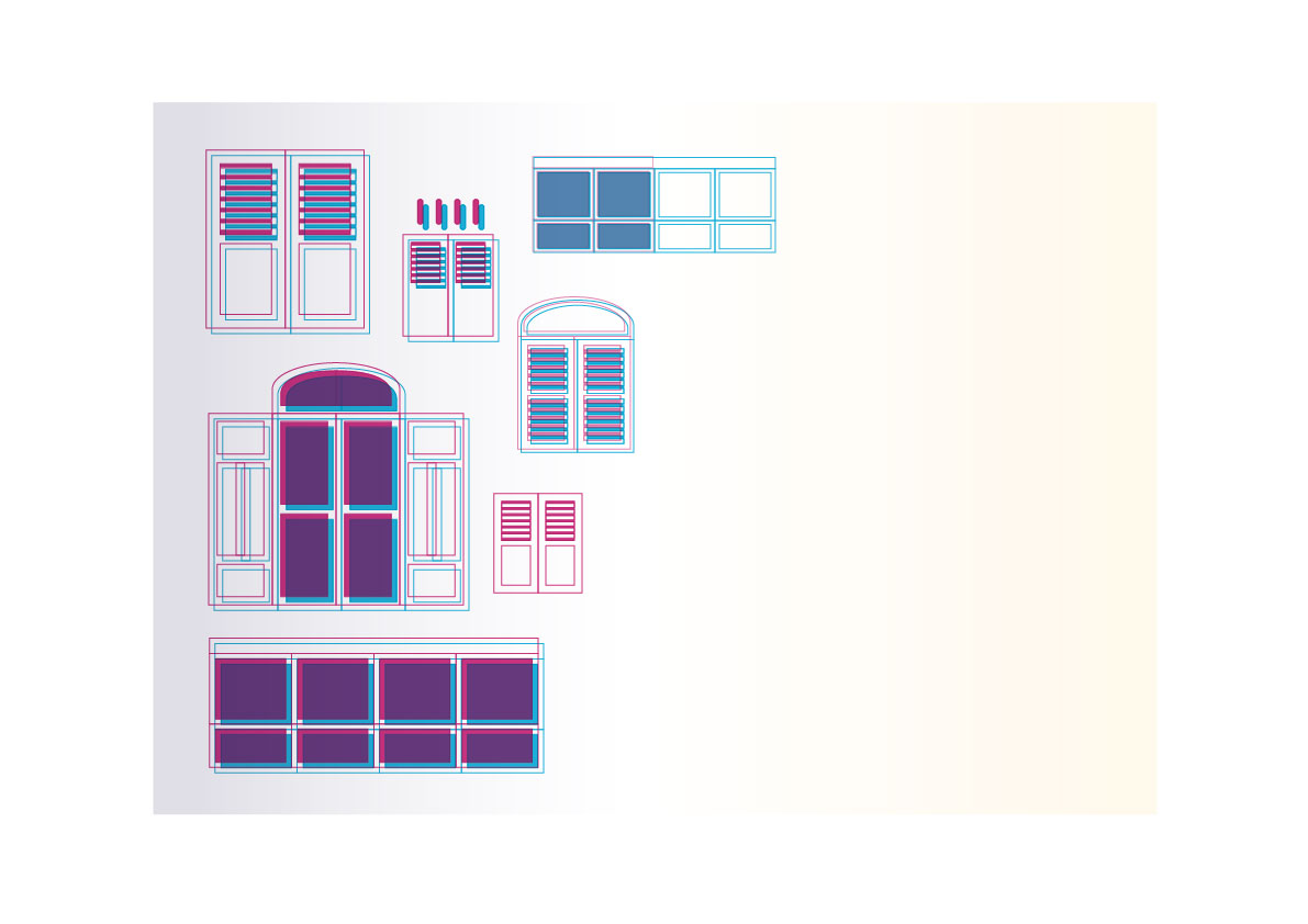
Initial sketches
I wanted to make the windows of different sizes, but I decided not to as I think it would make the spread look too messy.
End result
I was pretty satisfied with the outcome of this spread as it also has a smooth transition as the middle spread.