Final Design Outcome
The finalised graphics for each of the regions:
Deliverable 1
The first deliverable is an event poster
Deliverable 2
Store sign
Deliverable 3
Deliverable 4
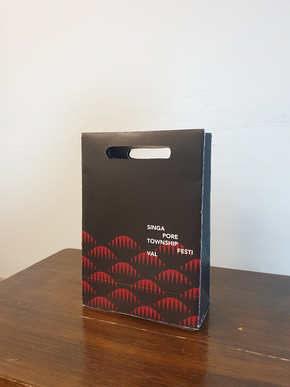
Paper bag design (exterior)
There are 9 posts tagged art (this is page 1 of 1).
For this assignment, we are to create a series of illustrations for a fictional event, which could be anything. The deliverable is are themed illustrations of at least 5 illustrated items, which at least one of it has to be 3D.
First approaching this project, even though the project could be literally about anything, I would think having a more realistic approach is more suitable for the long run in terms of portfolio. I think to design for a fictional but realistic local event looks better for a portfolio than an invitation for an outer space birthday party.
The even that I decided to go for is a festival or a market with participants from the different towns in Singapore. It shall be called Singapore Township Festival. As the name implies, the festival is all about food and handmade items, in a sense promoting local produce and crafts and at the same time, the Singaporeans love for food.
The idea is that every town would have its own design or graphics, but the styling from all the graphics from all the towns could come together and look like it’s from the same event.
The graphics would be a visual representation of the history of the town, where the name derives from, or any urban legends that are linked to the town.
I can’t possibly do the designs for ALL the different towns in Singapore. So I decided to pick the 5 different regions in Singapore :
South would generally be referred to the smaller islands south of Singapore.
The reason why I chose these towns is that they are more recognisable to the public and have been there longer than a lot of the newly developed ones.
Since the illustration is more of a secondary graphic only as a supporting visual element for the different towns, I figured the illustrations should be more of a repeated pattern, where a visual element of the town is repeated to create a pattern.


Most of the towns in the North is named after (or has links to) a guy named Nee Soon, such as Yishun and Sembawang. He made his fortune from his pineapple and rubber plantation, hence the reference will be from these 2 items.

Pineapple

Rubber plantation
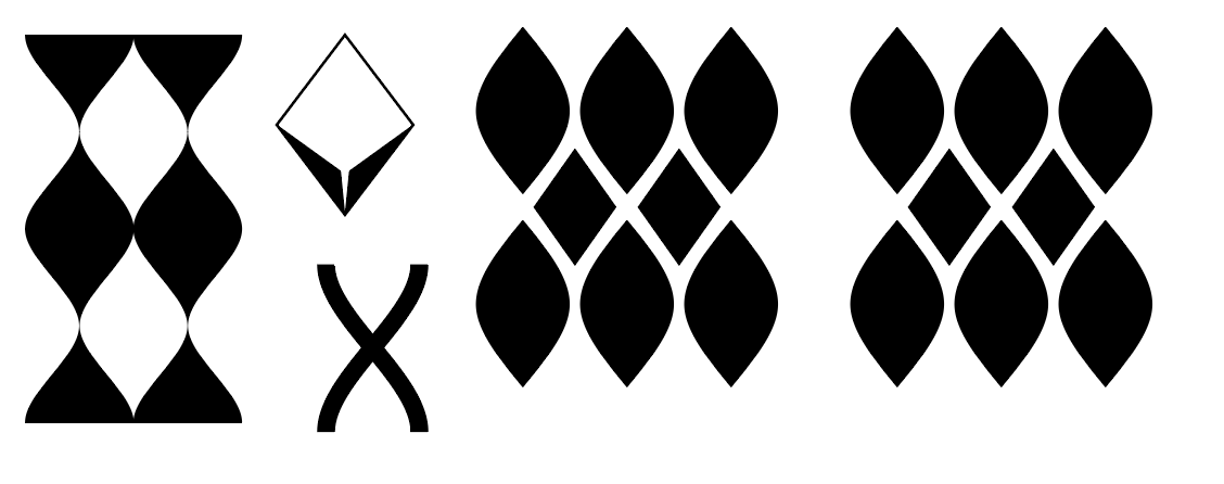 I combined the repetition of the pineapple with the lines and the collecting container of the rubber plantation.
Northeast long ago were mainly fruit plantations. Even the term Punggol means to “throw sticks at fruits so it falls”. Now towns like Sengkang and Punggol has sea themes to them, hence another element to combine it with.
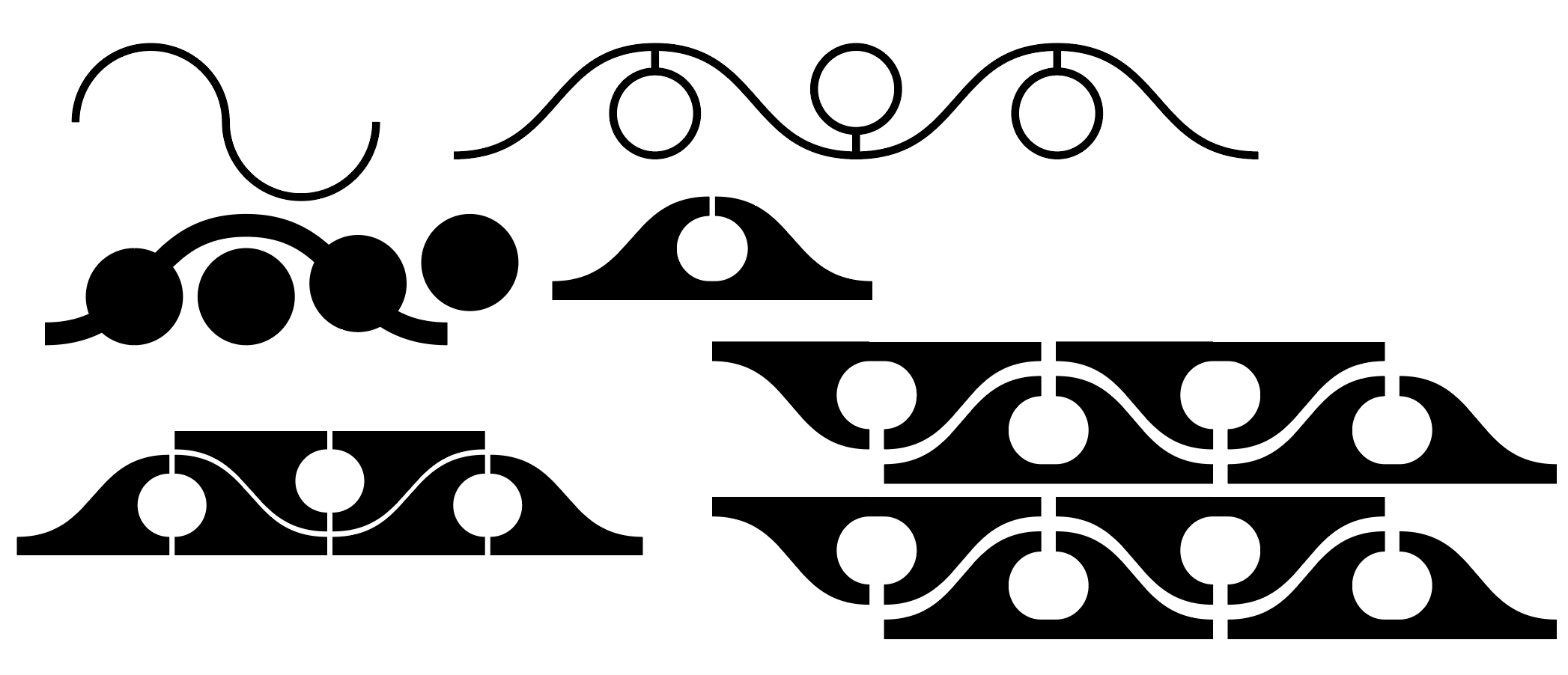 I combined waves and added a hanging fruit in it. When repeating the waves, it forms like a vine with fruits growing out from both sides.
Inspired by the story of how Bukit Merah got its name.

A hill
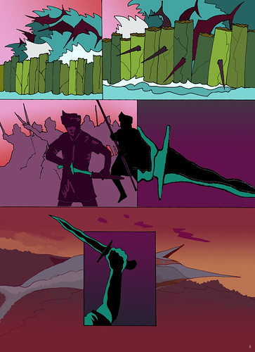
Story of Bukit Merah
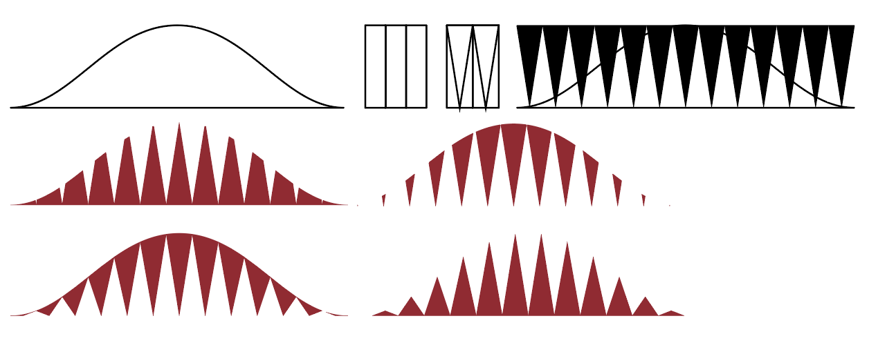 Combined the idea os the shape of the hill, the repetition of the banana stems used to build the wall, and the sharp nose of the swordfish into one form.
Inspired by the Tampines/tempinis plant.
.jpg)
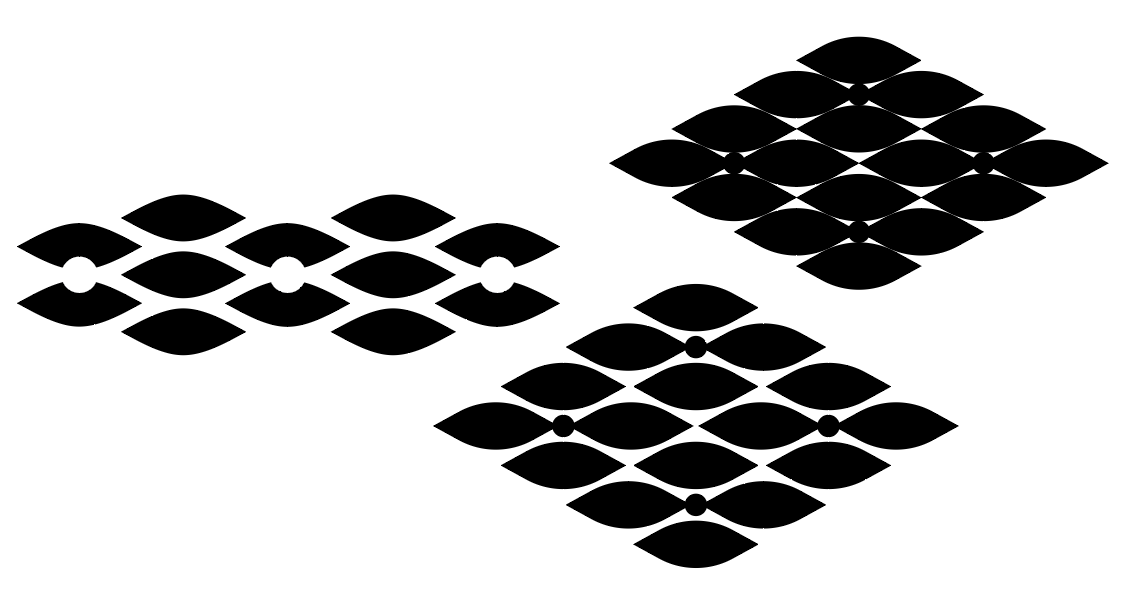 Included shapes of the leaves and the fruit of the plant.
Most of the west is known for its industrial area, and back in the day, Jurong is actually part of the Silk Road.
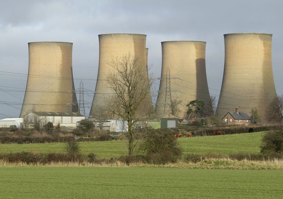
Cooling towers
 Included the form of a ship and some cooling towers into the form.

For the first idea, I was trying to go with the idea that just because a brand putting its presence into simple things like a plain t-shirt, it just becomes more expensive. So people are actually paying for the brand, rather than for function.
For the second idea was inspired by the Supreme Brick, but more to the idea of random items with brands putting their presence on it and selling the random items at a higher price.
The third idea is an assembly kit or a starter kit to be a Hypebeast.
I decided to go with the second and third idea as it is closer to the message that I want to convey through the illustration.
So initially I decided to combine the idea of random items with brands on them with the assembly kit, but the idea of having an assembly kit with random items would not make sense at all. So I decided to retain the items that make someone a Hypebeast. So the way that I would combine it is that both items, the random and the Hypebeast items, will still be there rather than having one replace the other.
For the illustration style, I decided to go to a more digital line-work and flat-lay as I felt like it would be a good way to represent the items that I would want to illustrate and also I think it is a good way to show the details within the items.
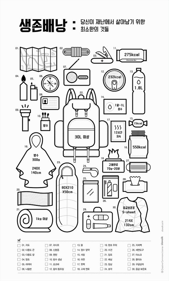
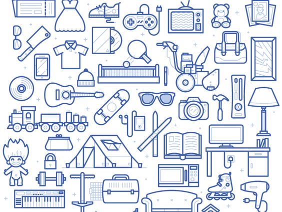

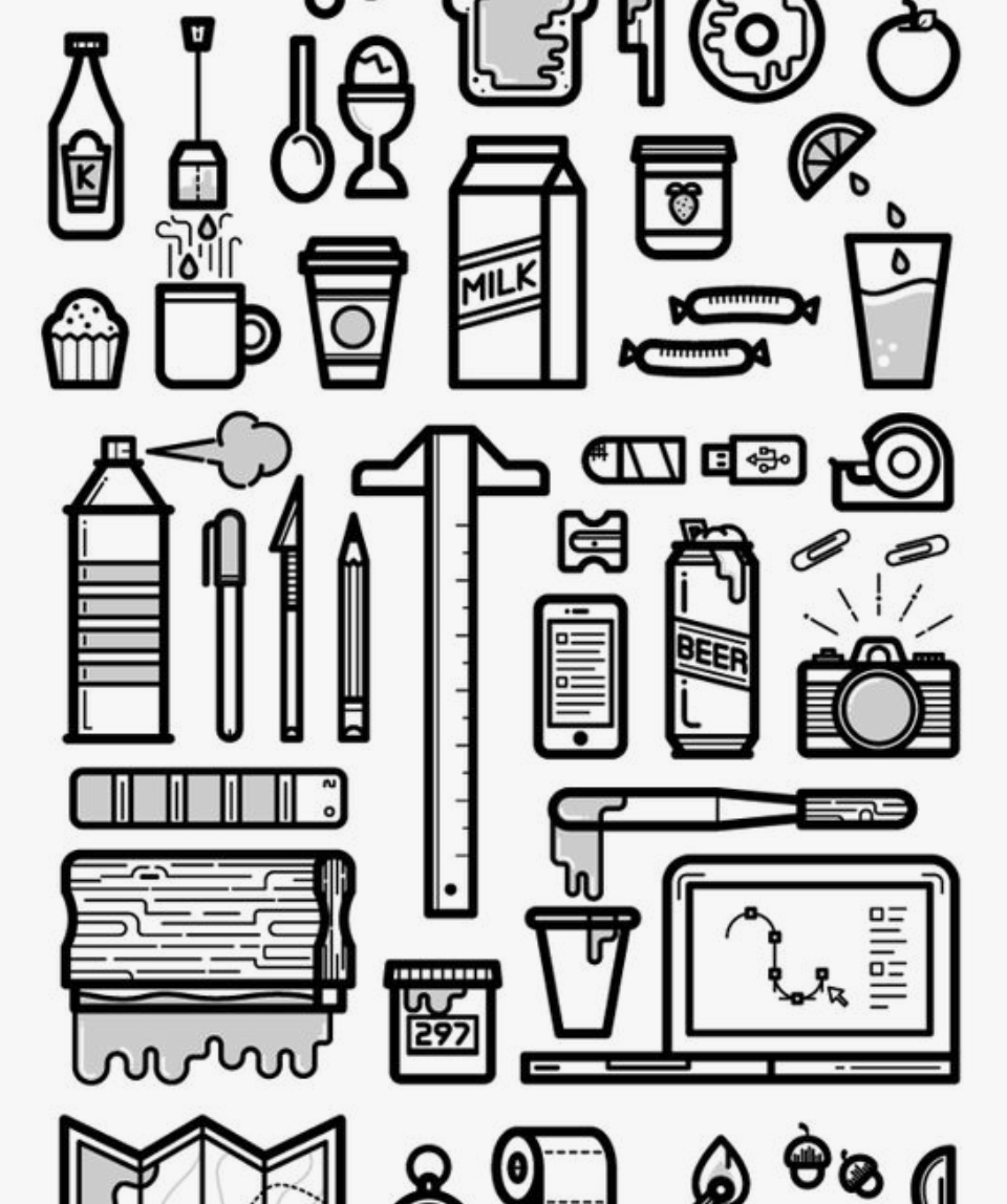
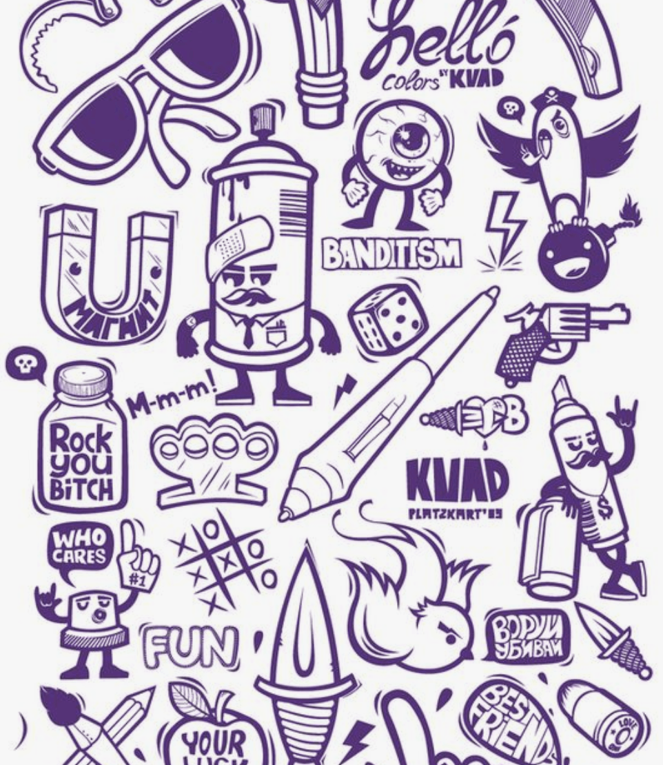 I was also thinking of whether to do it in a more static format or a more dynamic illustration
As for the initial design, I found it difficult to represent the brands, without having to put the brand logos itself. I tried to design the items based on what they are known for and their graphics that they normally include in their products, like the stripes in Off-White, and the bar in Supreme. But still, I felt like the items are still not well represented. In the end, I decided to proceed by adding the logos to it, which is seen below.
As for the colours, I would want to keep it neutral as I am putting a lot of brands inside, and I wouldn’t want any of them to stand out more than the other, and it would be quite chaotic to have a lot of colours in it. I also wanted to have almost like a template approach, like a flat drawing in fashion design where the colours don’t matter yet. Can also say that I having a neutral approach in this situation as these millennials are free to decide how they spend their money and does not directly affects me.
To add the logos, I have to tweak it a bit so as not to get into some copyright issues. Both items, the random and the Hypebeast, are present so that at first glance, it may just look like another flat lay of Hypebeast items, but when you look harder or look again, you can actually notice that there are random things in between.
The second assignment requires us to do an editorial illustration for the bi-annual publication, Varoom. We are also to do the illustration based on one of three themes:
The illustration will be used as the cover of the Varoom magazine. So to begin this work, I would start my research on Varoom’s work.
According to the AOI – Association of Illustrators:
Varoom is the globally leading illustration magazine featuring a unique combination of industry insight and critical analysis of the field of illustration. It is a unique publication commanding a global audience commenting on and discussing the contemporary illustrated image in depth. It features interviews with illustrators, image-makers and designers as well as critical articles by leading commentators.
It is interesting to see the various illustrations featured on the cover of the magazine. Opens up my mind to the many different illustration styles and concepts there can be. Below is a sample of one of their latest publications:
More on the assignment…
According to Udemy:
Editorial illustration is artwork created in response to written text, usually an article in a magazine, newspaper, or blog. In this course, we will focus on how to analyze a text, develop a unique idea, and communicate that concept visually as a partner to the article. Editorial illustration is an exciting field because it allows the illustrator to inject their own opinions and unique voice into the work. We’ll focus on how to inject your own personality into your expressive illustration while still communicating your concept and illuminating the written word.
Some samples of editorial illustrations:

Illustration by Stephanie Wunderlich

Illustration by Agathe BB

Illustration by Joe Magee

Illustration by Sebastien Thibault
Images from Agoodson.com, and more of the details about editorial illustrations can be found there too.
When given these 3 options, the first theme that struck me was Obsession. Mainly because I don’t have enough experience in the feeling of empathy and I definitely have not much understanding of style. Those 2 themes are fairly broad and I believe that it would require much understanding of empathy and style before being more specific on what kind for the assignment. I went on with obsession as I felt that it is more relatable and is easier to understand.
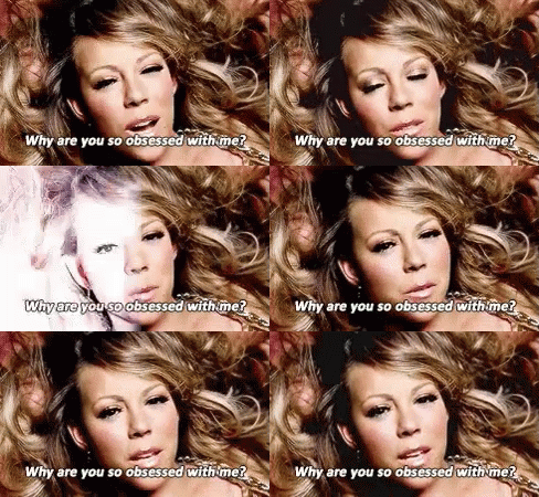
So specifically to obsession, I would want to do obsession over Hypebeast clothing and items. There is a recent trend among the younger millennials where they tend to want to buy all the latest and hyped clothing and flaunt it when they go out or on social media. I just find it annoying and interesting how this thing developed in recent times and effects only a certain generation.
The term Hypebeast was initially from a website which main intention from the creator is to be the place to go for updates on the latest sneaker trends in the market. Somehow the brand expanded into promoting other types of clothes and the latest street culture that brands offer, hence the term Hypebeast refers to the culture or someone who is up to date with the latest clothing of culture trends normally promoted or sold by the up-market brands.
More on what Hypebeast is about here, on their own website.

More on the topic of obsession over Hypebeast stuff, there was a time when one of these brands, Supreme, came up with a brick that they launched as a humorous way to joke about how their customers and the market would buy anything that has the word ‘supreme’ written in a red box-shape just to remain in trend. They also made a lot of other items with the Supreme-red and the logo printed on it, and it almost became like an icon of mocking putting brands on random items but people would still buy them.
More on the Supreme brick here, by Highsnobiety.
So I got the idea for the assignment, I would want my illustration to be based on that idea of having brands putting their logo on random items and people would still buy them because they are so obsessed on trying to remain in-trend by buying all the Hypebeast stuff.
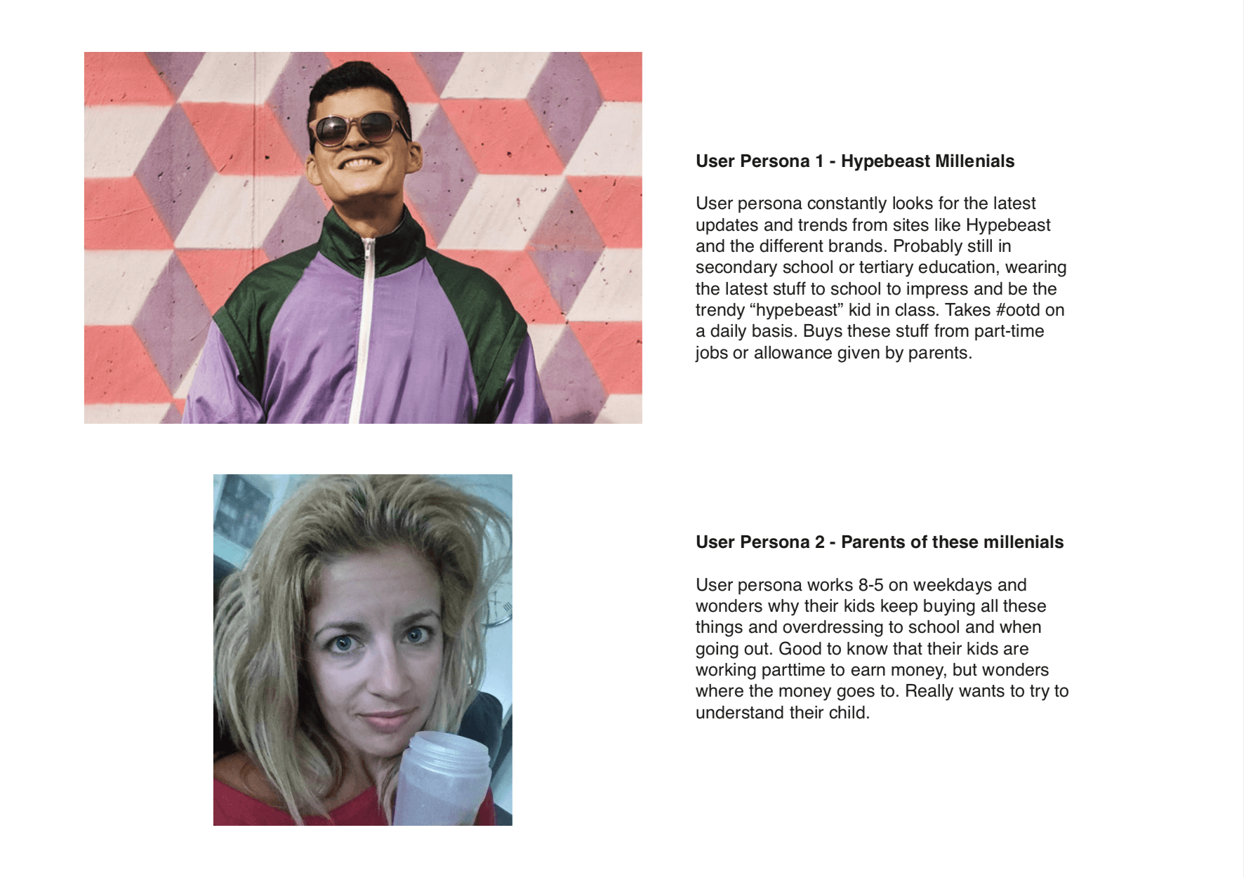
The audience of this illustration will firstly be these millennials. This is because they are mostly the ones who are having this obsession. Maybe it would help them realise that what they are doing is really silly.
 Moodboard
 I was planning to go for a neutral look, almost not representative of the items and the brands so that none of it stands out more than the other, that’s why I went for the monotonous black and white also so that colour meanings will not play much of a role in the illustration. I also plan to use a flat lay and more static than dynamic so that it is clear and to the point.
The artist in focus is Marc Lee. He is a Swiss media artist who has created various interactive art projects, installations and performance art for almost 20 years, which is displayed all over the world. His artworks are very daring which would normally showcase cultural, political and social meanings in them.
His works have been exhibited in museums all over the world, such as the National Museum of Modern and Contemporary Art in Seoul, South Korea, New Museum in New York and the Intercommunications Center in Tokyo, Japan.
Marc Lee also does lectures and teach in workshops about art and interactive art around the world such Shanghai Institute of Visual Art and China Academy of Art in Huangzhou.
The chosen artwork by Marc Lee is 10,000 Moving Cities. It is an interactive net-based installation. There is the Virtual Reality version which has a telepresence-based element added to it, and also an Augmented Reality version which has an accompanying app that would be used and plays a part in the interactivity of the installation.

Interface selection where users get to select a city or a location that they would want to see displayed
Before the installation could begin or before the user could interact with the installation, the user would have to select a location or a city from an interface by searching or selecting a blue or red pin on the interface. After the city or location is selected, images, sounds, texts and videos would be searched on the internet. These sound would then be displayed or projected at the location of where the user is at. The images, videos and content displayed on the installation itself or displayed through the app or devices, depending on whether you are viewing the installation through Augmented Reality or Virtual Reality. Every time a city is selected, a new search will take place hence the experience will be different every time.
These two different platforms will be explained more below.
The version with the Virtual Reality, or VR, is viewed through devices that users use, namely high-tech goggles such as an HTC Vive or anything similar. This device will be located inside a space where sound could be projected and immersed by the user, and also an area where the user could actually move around without bumping into anything or anyone. As mentioned before, the user would select the location or city via the goggles. The visuals would then appear through the goggles and displayed on tall imaginary buildings. The user would then get to look up or down and move around the space to immerse themselves in the installation.
Below is a video to see how the HTC Vive is used and how the installation works for Virtual Reality.
Then there is the Augmented Reality version that makes use of a mobile app to view the displayed visuals. In real life, there will only be an empty space, but when viewed through an app on a smartphone or a tablet, the user gets to see imaginary buildings appearing right in front of them and throughout the space. The user would also get to carry around the device with the app and walk through and amongst these imaginary buildings to view them closer and in greater detail. What is displayed on these imaginary buildings are similar to the one displayed in the Virtual Reality version, but again, the images and the sounds played are not the same and will vary for everyone.
Below is a video that would help to show how the app and the Augmented Reality works in the installation.
There is also an offline version where the installation does not use any apps or devices. The basic set up for the installation are real physical white cubes of varying heights spaced on in a space. Similarly, the user still selects a city or a location on an interface, but instead of appearing through goggles or mobile devices, the images will be projected on the white cubes. These cubes would then represent the different buildings that make up the city skyline. The user would then be allowed to walk through and amongst these cubes with projected images and videos as if they are walking through the city that they have selected. Sounds would also be played in the location to add to the immersive experience.
The offline version of the installation is shown in the video below.
For this installation, entropy – the lack of order and predictability – is seen here as the images projected on the cubes or displayed in the VR are all in a way randomized to that moment and for different people. The users in a way also would not know what would be displayed or what would appear. Even if they have a rough idea on what would appear, they can’t exactly decide on what the images will be and it will always be different for different people. Also, as mentioned earlier, every time a city is selected, a new search will take place and new images, sounds, texts, and videos will appear, creating a different and an unpredictable experience every time, hence, entropy.
This installation is definitely an immersive type of installation where the users get to use their many senses to engage and interact with the installation. The user gets to see the images projected through the app, the goggles or the cubes. They get to hear the sounds played in the area that adds on the to the immersive experience. They also get to walk around the space with the goggles, the mobile device or even walk among and in between the cubes with displayed images.
In conclusion, 10,000 Moving Cities is an immersive installation by Marc Lee where users get to experience the ever-changing cityscape. The content of the installation is different every time so there is a sense of entropy for the users. He also allowed users to experience this through Augmented Reality, Virtual Reality or even an offline mode where users get to walk about a physical space without any devices on. With this, he has allowed users to experience the installation with different platforms, with each of this platform similar to each other, so that the experience is similarly immersive yet different in content.
Lee, M. (1970, January 01). 10.000 Moving Cities – Same but Different by artist Marc Lee. Retrieved from http://marclee.io/en/10-000-moving-cities-same-but-different/
Marc Lee is a Swiss media artist that has created interactive art projects, installations and performance art for almost 20 years. He is very daring in his works which would normally showcase cultural, political and social meanings in them.
His works has been exhibited in museums all over the world, such as the National Museum of Modern and Contemporary Art in Seoul, Intercommunications Center in Tokyo and New Museum in New York.
He also does lectures and teach in workshops about art and interactive art around the world such as Shanghai Institute of Visual Art, and China Academy of Art in Huangzhou.
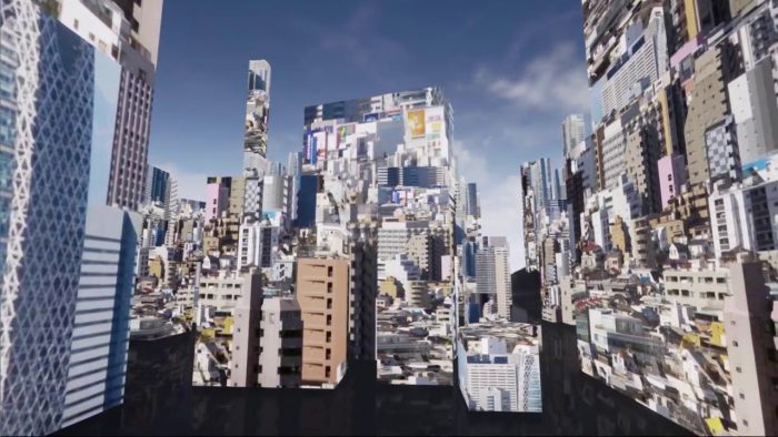
10,000 Moving Cities is an art installation that involves several projectors and white large boxes. The installation begins when the user selects the desired location that would be projected onto the white large boxes. Once selected, various moving images from the internet will be projected onto the large boxes. The user can then walk through and in between the large boxes and immerse themselves with the visuals projected as if they are there in the city that they picked earlier. Sounds from the internet will also be played alongside the images to make the experience for the user more immersive.
With the millions of images in the internet, every projection on each surface and also every projection by a different person will be different. That is why the installation is called 10,000 Moving Cities – Same but Different.
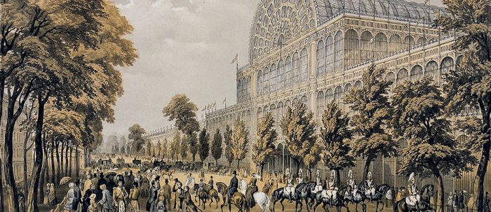
The Great Exhibition in 1851 was meant to be a showcase of modern designs, art and technologies, especially during the industrial age of that time with its many discoveries and world explorations. However, many artists felt like the works that were showcased during the exhibition was hideous. They felt that the beauty in art was lost, as if they were made by machines (Victoria and Albert Museum, 2011). This has led to the beginning of the Aesthetic Movement of which the main intention of creating art purely for the aesthetics without any political or social meanings behind it, hence the term: Art for art’s sake. It was started to deconstruct and to contrast with the Victorian traditions and also traditions of art that requires meaning behind them (Easby, 2016). They also had the idea that excellent craftsmanship should be in all forms of artwork.
Artworks created under the Aesthetic Movement goes against the norms of the Victorian era and hence the artists and the art were mocked by traditional Victorians who still held on strongly to their values (Karuga, 2017). The movement also supports the idea that art should not be just be limited to artworks but it should be applied to everyday life (Victoria and Albert Museum, 2011). It could be expressed through different mediums such as metals, ceramics, clothing and even turned into furniture. This gave creative freedom to artists from different forms of art such as poets, sculptors, musicians, carpenters, smiths, fashion and interior designers (Karuga, 2017). This would, in turn, help each of these forms of art flourish and become a stepping stone towards modern art. Artists explored forms, both natural and geometric, and also turn their studies into simplified lines. Some artists even took reference and studied previous art styles, such as Renaissance art, where the beauty of the male anatomy was seen with equal importance as the female (Victoria and Albert Museum, 2011). Also, since it was a time of exploration and discovery, some artists studied or even collected art from outside of Britain, such as Asia and the Middle East, such as the art styles from Japan, which has also inspired the Japonisme. (MacCarthy, 2011)
One of the more prominent artists of the Aesthetic Movement was Christopher Dresser. He believed that good taste and design would never improve until it was made available to the majority. Initially, good design was only available to those who could afford it, such as the upper class and the wealthy, due to the excellent craftsmanship. So, Dresser designed items that even the more affordable works are well designed. He made his designs cater to the different groups of people and made them affordable. He also believed that items should preferably be both useful and decorative (HeadHandHeart, 2012).
Christopher Dresser also sold items from overseas, like Asia and Africa, as these items had unique aesthetic values in them – something different from what the Victorians are used to seeing. He also made these items affordable due to the difference in exchange rates between the countries. In his design works, he took his reference of natural objects and designs, like plant forms and animal movements, and studies them. He would then turn these studies into simplified lines and forms which he would stylise and turn into his designs. After his trip to Japan in 1877, his works started to take on more interesting forms and styles, influenced by the Japanese design styles. He also started to explore and use more metals in his works, especially silverware. Another thing that he adopted from the Japanese culture was putting his name onto the works that he produced. This was also considered as an early form of branding (HeadHandHeart, 2012).
The Aesthetic Movement was an early stepping stone for the arts to move towards the modern era. With artists such as Christopher Dresser with his works and studies from years ago still inspiring modern artists today, it shows that works and inspiration could start from anywhere and sometimes deconstruction of an existing style is the first step to creating a better one.
References
Easby, R. M. (2016, June 3). The Aesthetic Movement. Retrieved from https://smarthistory.org/the-aesthetic-movement/
[HeadHandHeart]. (2012, October 23). Christopher Dresser – TRUTH BEAUTY POWER [Video File]. Retrieved from https://www.youtube.com/watch?v=igbB8TRQnuA
Karuga, J (2017, September 16). Art Movements Throughout History: The Aesthetic Movement. Retrieved from https://www.worldatlas.com/articles/art-movements-throughout-history-the-aesthetic-movement.html
MacCarthy, F (2011, March 26). The Aesthetic Movement. Retrieved from https://www.theguardian.com/artanddesign/2011/mar/26/aestheticism-exhibition-victoria-albert-museum
Victoria and Albert Museum. (2011, April 7). Cult of Beauty: The Aesthetic Movement 1860-1900 [Video File]. Retrieved from https://vimeo.com/22071648
A simple Google search led me to a simple definition on ThoughtCo.com:
“Mark making is a term used to describe the different lines, patterns, and textures we create in a piece of art. It applies to any art material on any surface, not only paint on canvas or pencil on paper. A dot made with a pencil, a line created with a pen, a swirl painted with a brush, these are all types of mark making”.
From my own understanding, mark making is creating visuals using any form of medium. Artists also use different techniques of mark making as a way to express their thoughts and emotions into their artwork, giving their artwork more depth and meaning.
In the dictionary says that monoprint is a single print taken from a design created in oil paint or printing ink on glass or metal.
Basically, a monoprint is a single impression of an image made from a reprintable block that has textures or design etched or created on it. There are many different methods of monoprinting.
Below is a video of a simple technique of monoprinting, where the art is “transferred” over to the paper after the art work is created on a surface.
Here is a similar method, but now uses reductive monoprint, where certain shapes or patterns are laid on the surface and when paint is applied, it covers the other areas but not where the shapes or patterns are, creating a negative space and capturing the shape in the process.
There are many other methods of monoprinting, but generally the idea of “capturing” a shape, texture or design of an object, and transferring it onto a paper or surface is similar.
A famous monoprint artwork would be Andy Warhol’s monoprint of Marilyn Monroe:
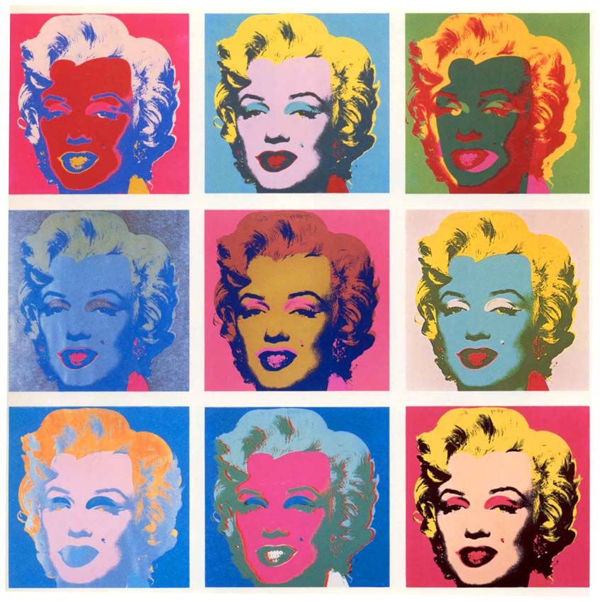
https://i.pinimg.com/originals/a5/3d/5a/a53d5a9cc7a419a6ef8b4f47881a1137.jpg
In my opinion, monoprinting is a doable method of mark-making, but it requires quite some creativity to know what sort textures and tools used and the positioning of those objects that is suitable for the artwork.
Fumage is a technique in which impressions are made by the smoke of a candle or kerosene lamp on a piece of paper or canvas.
Some artists would leave the artwork as it is after painting it with the smoke/fire. However there are other artists that would use various tools to create textures or bring out the shapes of the designs in the artwork.
I would say this method of mark-making would require ALOT of practice and very much coordination of both hands and the mind, but if this technique is mastered it would create really beautiful and unique artworks.
A well-known artist that uses fumage would be Steven Spazuk. Some examples if his works are shown below:
Frottage is the technique or process of taking a rubbing from an uneven surface to form the basis of a work of art. Basically, in rubbing a medium on paper that is layered above a textured object, in captures the texture and shape on the paper.
An example of frottage would be a work by Max Ernst, which he layered papers on wooden floors and rubbed the paper with soft pencils.