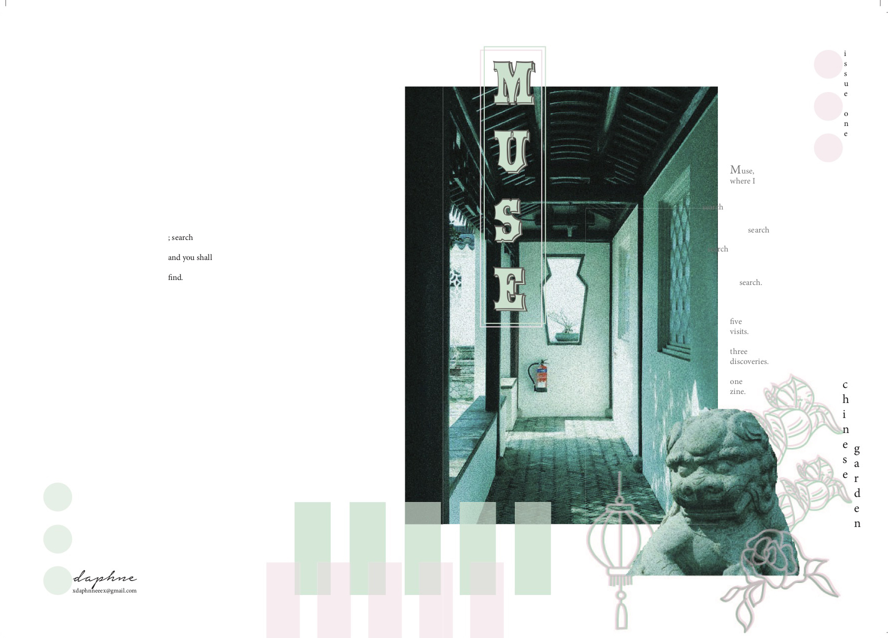
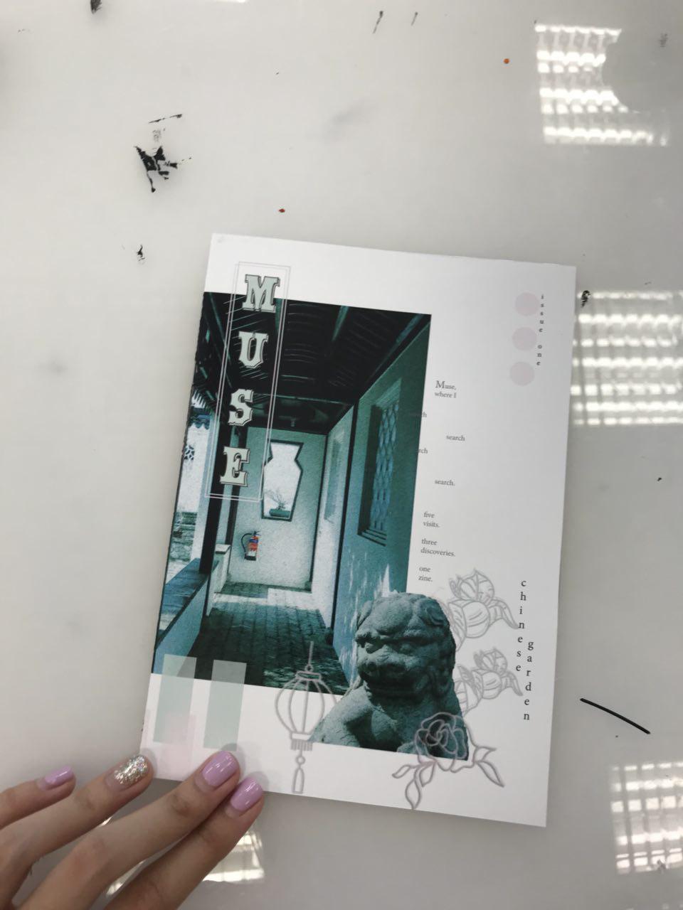
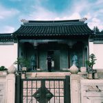
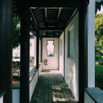
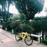
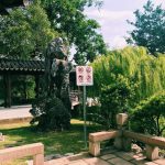
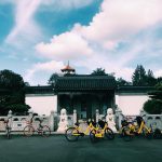
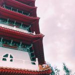
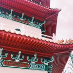
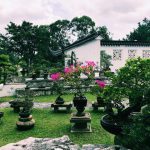
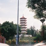
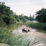
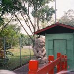
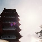
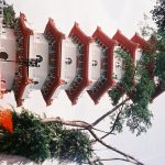
MUSE | chinese garden looks at Chinese Garden, Singapore in a different perspective and records the contrast of the place through pictures and words, slowly revealing them to its readers.
In Locale assignment 2, we are to visit a neighbourhood and create our very own zine!!!!
A “zine” is a self-published, non-commercial, independent publication, a DIY magazine-like thing.
Because you do it yourself it can be pretty much anything you want it to be, favorite bands, personal stories, subcultures, or collections (that’s the joy of zines!).(*screams* really excited) To embark on an exploration around a local neighbourhood! Find out what makes the neighbourhood unique and what are some of the interesting features in the area. The aim is also to develop one’s investigative research skills and present information in a visually engaging manner. To introduce inspiration and serendipity into creative development. To explore experimental formats and understand alternative layouts and grid formats. To learn more about binding methods and ways of putting together a self-made digital publication.
Concept Behind My Pieces
After exploring and discovering Chinese Garden (as seen in Locale Part I), the concept behind my zine is highlighting the contrast of Chinese Garden in a much subtle way through short proses, and photographs that might highlight each type of contrast in each spread.
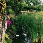
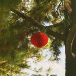
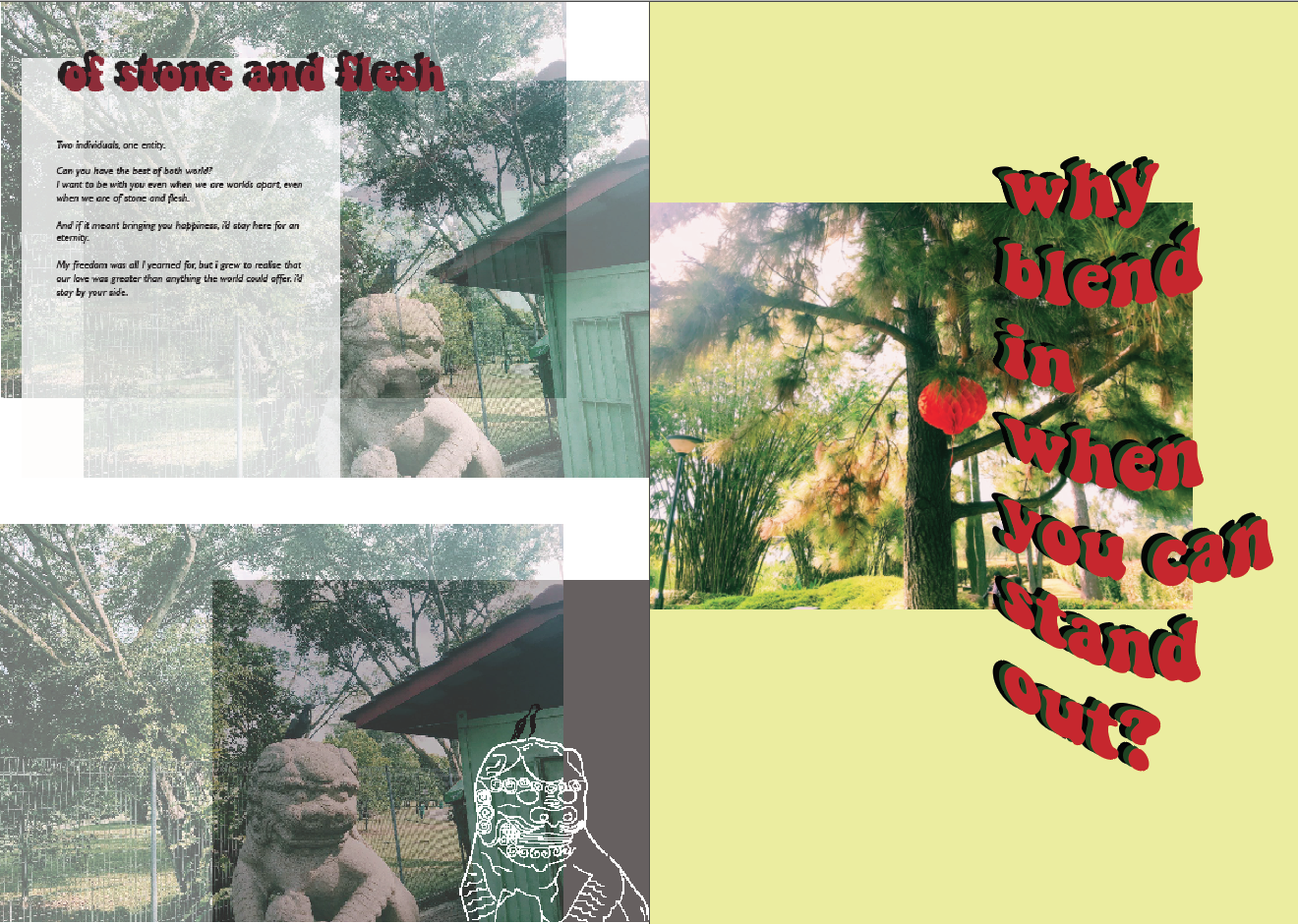
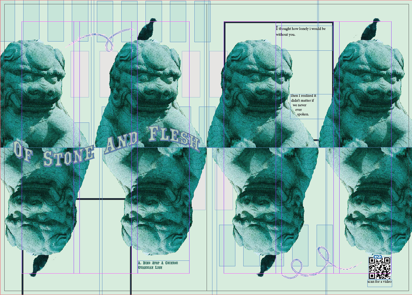
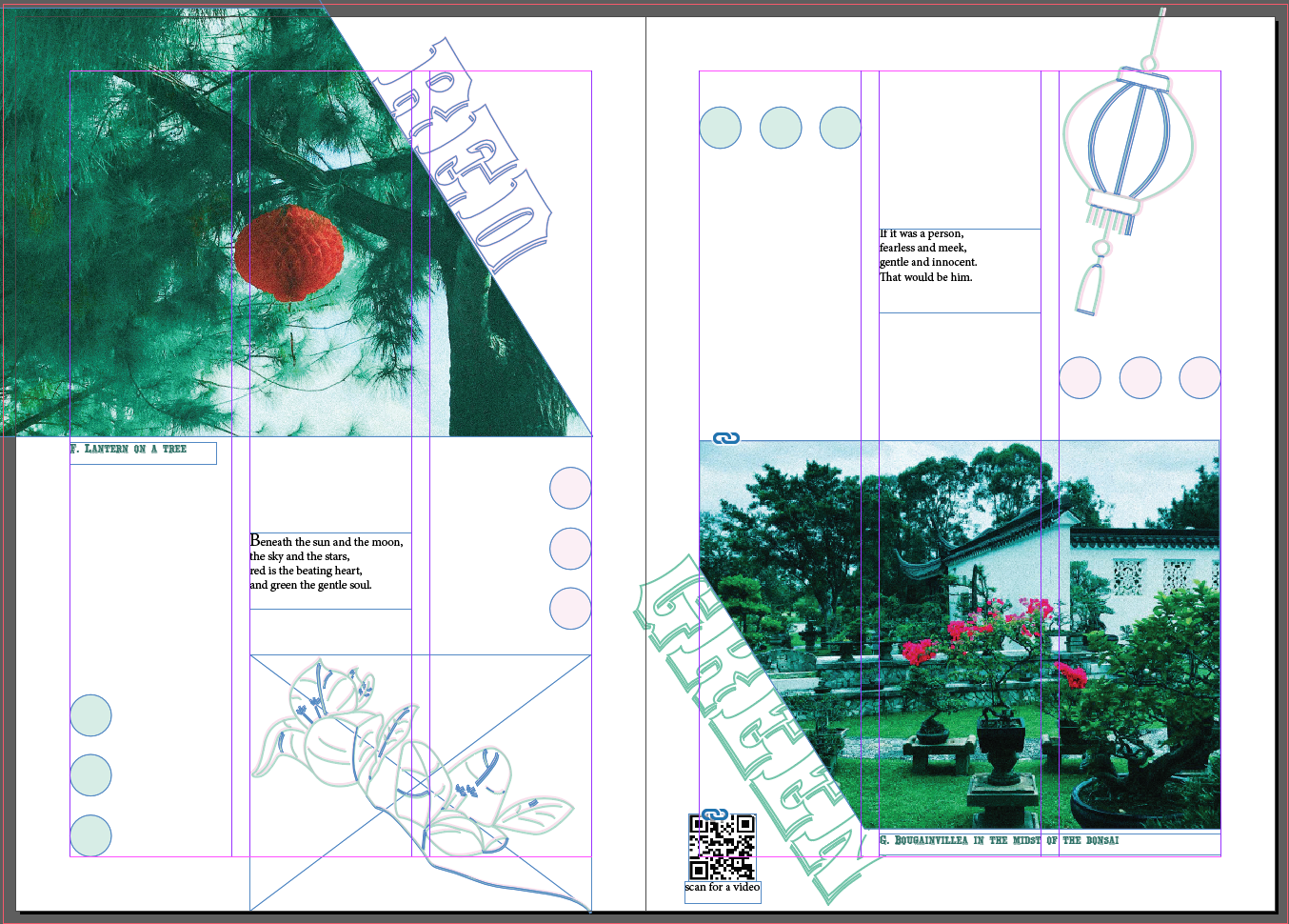
1st Spread: Highlighting the contrast of the living and non-living “animals”.
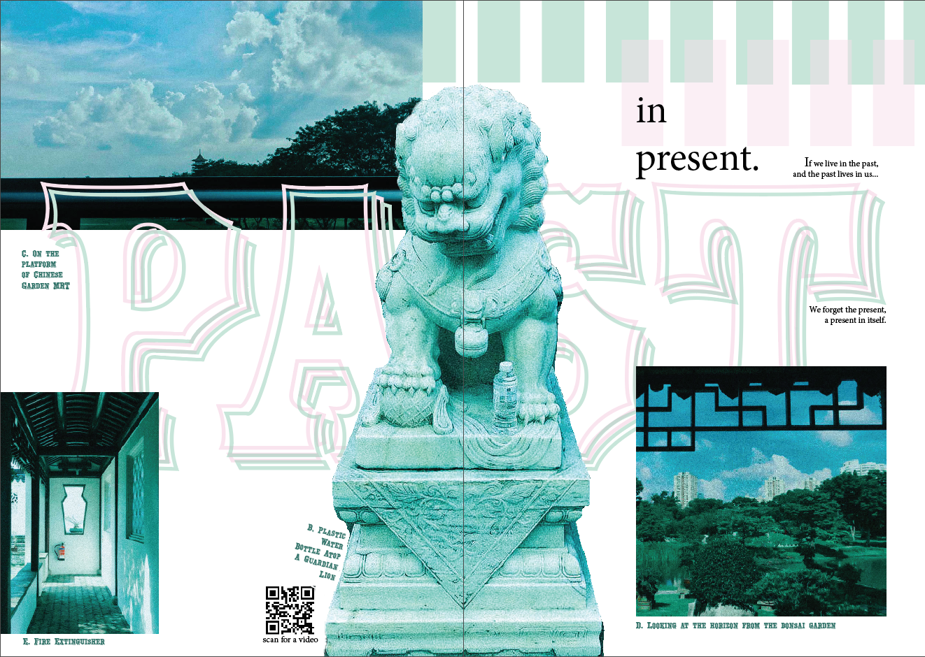
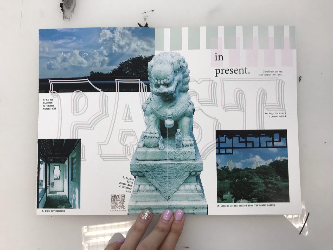
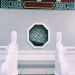
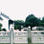
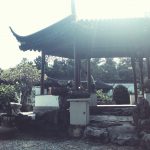
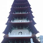
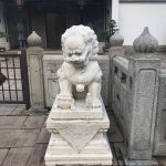
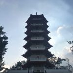
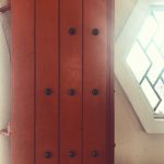
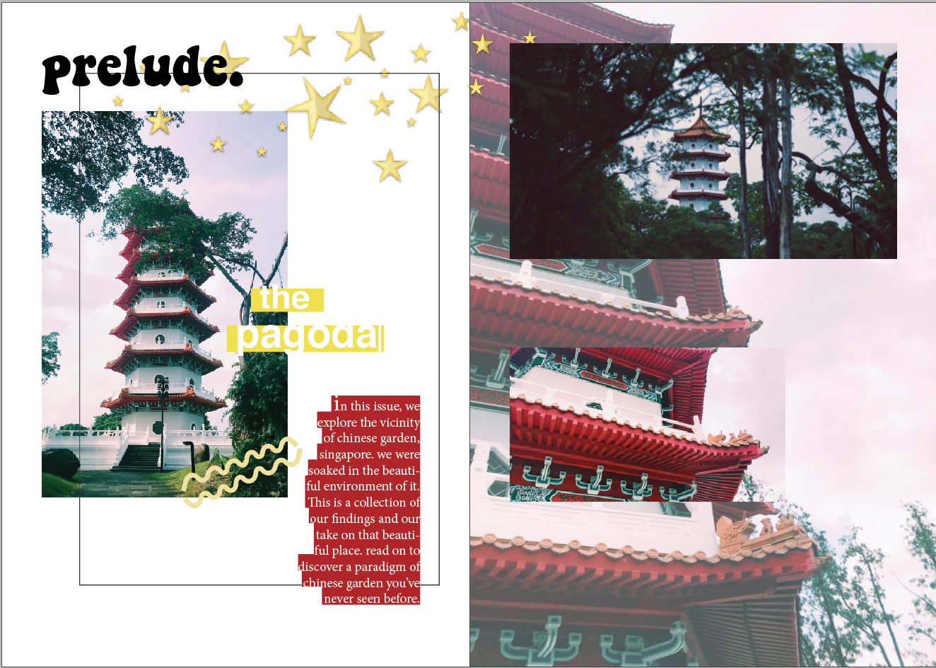
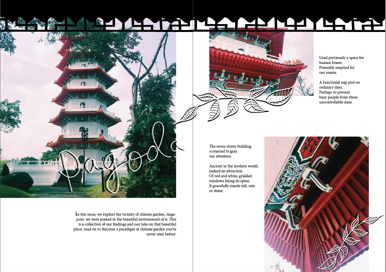
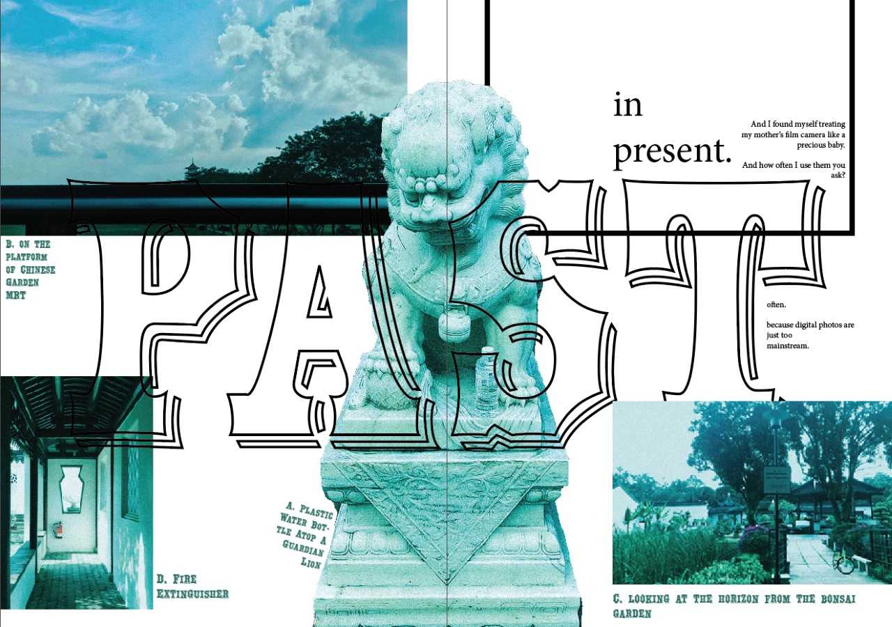
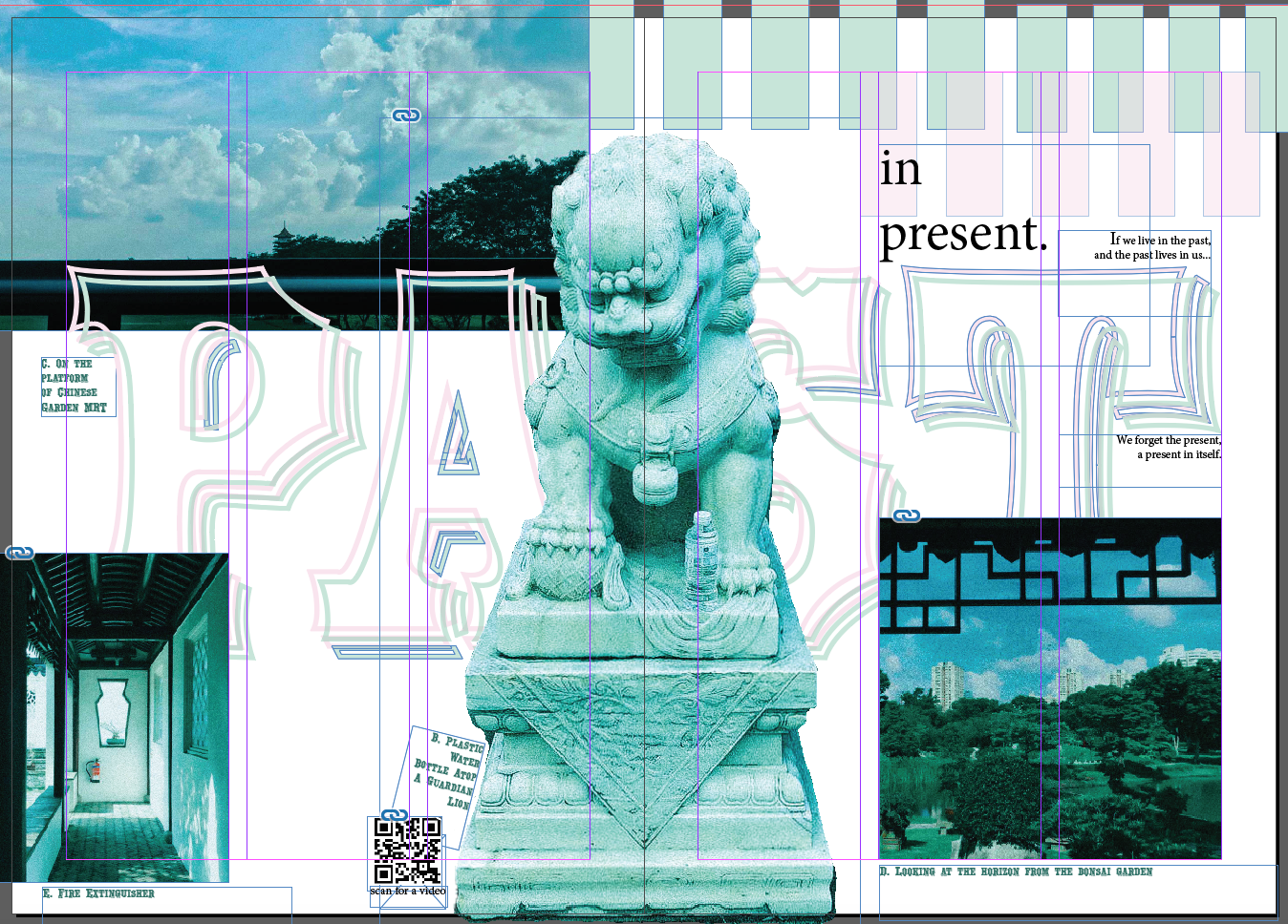
2nd Spread: Highlighting the past and present objects, architecture that we can observe.
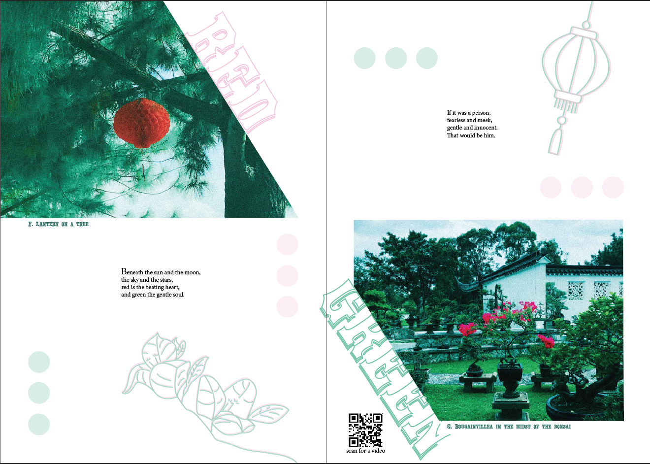
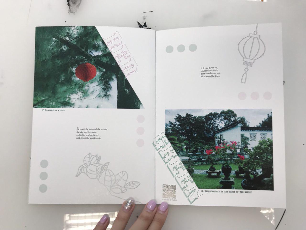
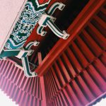
3rd Spread: Highlighting the complementary colour scheme of red and green.
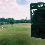
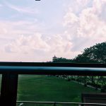
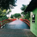
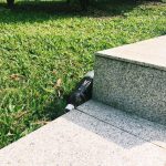
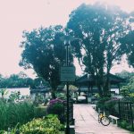
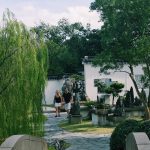
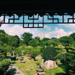
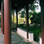
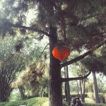
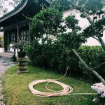
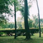
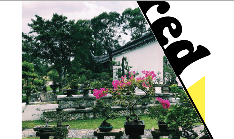
Site Visit & Photographs
from my iPhone 7 and camera
Mood Board
images from pinterest
I looked through Pinterest many times and collated a few images or covers and layouts that I really like and the colour scheme that I am going for (green, blue, red).
Inspirations and Research on Layout and Presentation
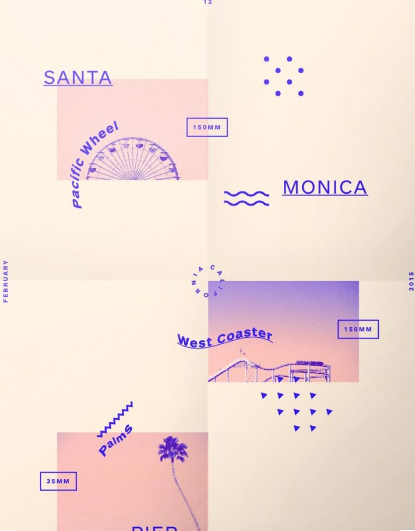
taken from: http://ceoul.tumblr.com/post/124438211816/gridologie-just-finished-this-one-santa-monica
Texture & White Spaces
I particularly like the memphis texture that the artist has included to the white spaces, yet giving it enough breathing spaces for the reader.
Texts
I like the adventurous approach to the texts. The warp effect gave it a sense of flow and rhythm to the otherwise static page.
Colours
Enjoy the colour consistency throughout the page. Analogous colour of pinkish tone and purple makes this page really soothing to read.
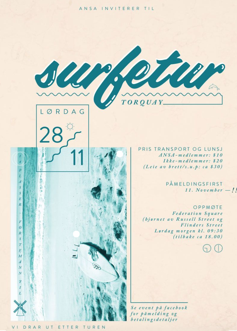
taken from: https://78.media.tumblr.com/tumblr_mcusdfv0tG1qctmo8o1_1280.jpg
Sense of Hierarchy
There is a sense of hierarchy in this page. The biggest is the picture of the shore, then the headline “surfetur” then the smallest is the rectangular box “LORDAG 28/11”.
Colour
Complementary colours used (blue and orange).
Texture
Used the squiggly to create a sense of texture.
taken from: https://i.pinimg.com/originals/1d/6a/af/1d6aafef758f12c866fbfc00b2f96266.jpg
Theme Continuation
I like how there is a conversation between the hands at the top and bottom of the page.
Collage
The collage of small elements gave the page a little three-dimensional effect.
Texture
The lightning bolt and the star gave the page a quirky texture, something of strong statement and gave interest to the page aside from texts and images.
Balance
There is balance in both sides of the page. Although it is heavily highlighted by the black borders, the right side is balanced out by the busy elements going on on the left. The orange texts and the eye on the picture on the right creates another minor visual balance, everything else is muted in colour (black, white, light beige)
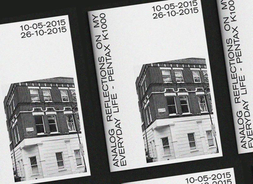
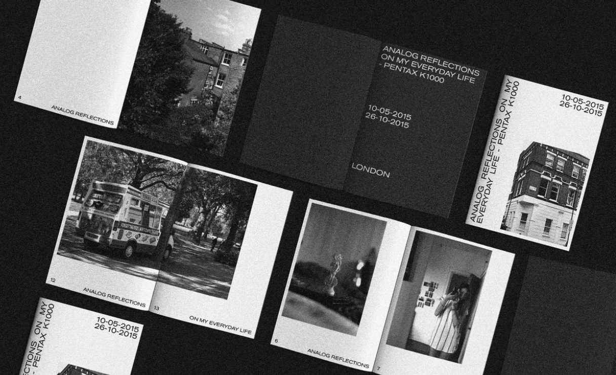
taken from: https://www.behance.net/gallery/53249095/Analog-Reflections
taken from: https://www.behance.net/gallery/53249095/Analog-Reflections
Really like the entire vibe of the zine, minimal, few texts and the pictures speak the message.
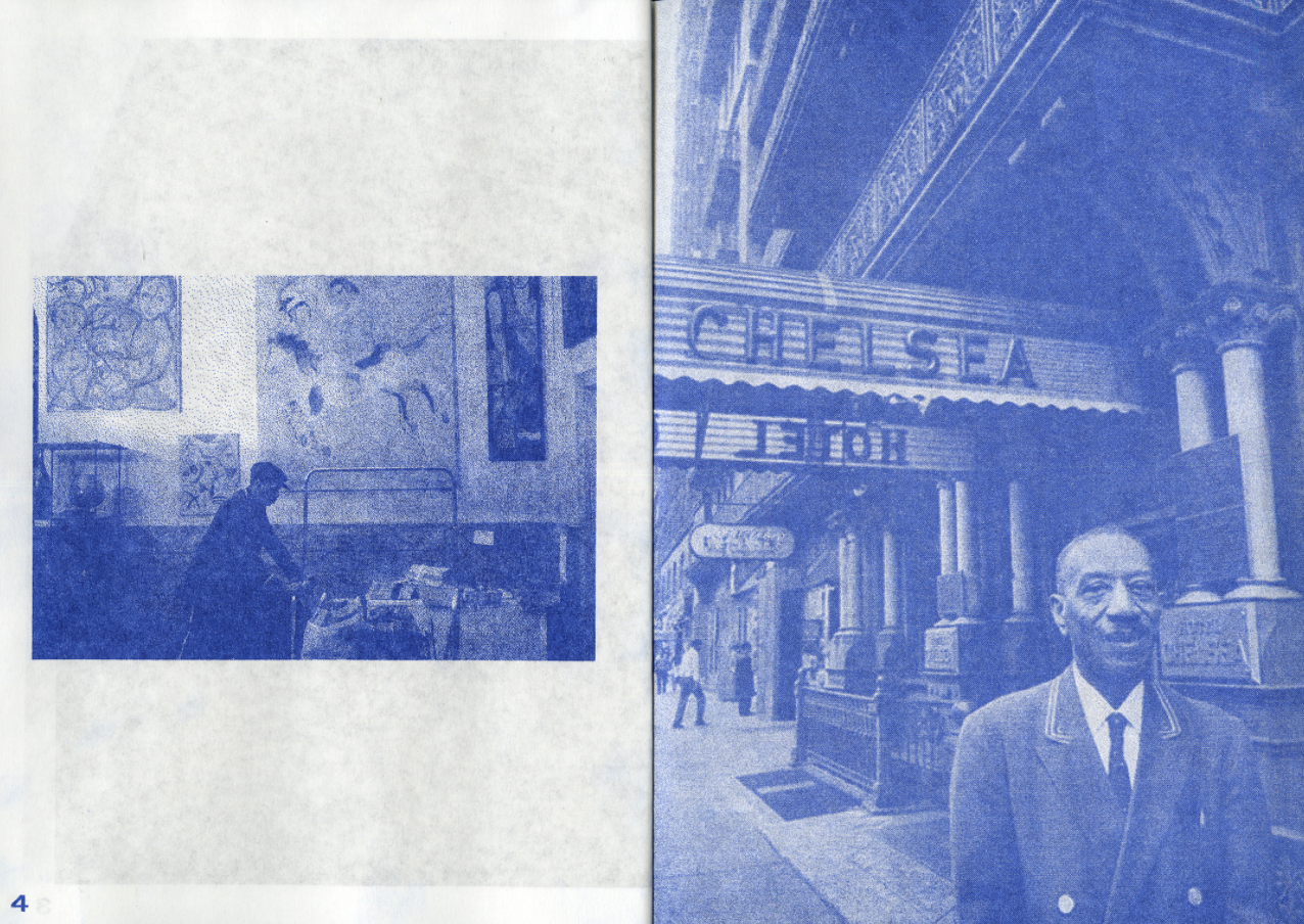
taken from: https://www.behance.net/gallery/58335321/The-Chelsea-Hotel-zine
Like the photos edited, very uniform throughout this zine. Something I want for my zine too!
Fonts Used
Yorktown is used for headers
Yorktown
and Minion Pro used for the proses.
Minion Pro upper and lower case
Designing Process
My designing process came a long way. Started from the bottom and now we’re here! hahhaha
But my final design really looked a lot different from the start!
Initial Phases
that evolved slowly…
then this happened after a talk with Brendan over how troubled I am about my zine at 3 am in the morning at NTU Starbucks… this happened after a few hours…
the rest is history!
BUT here’s my work from bleed to bleed
Adding Videos
Also, I decided to add moving images to enhance the visuals from the zine to the audience. I thought that to fully be able to grasp the environment of the place, merely pictures will not suffice. Besides, my first visit there was filled with boomerangs, as seen in my research presentation, so I thought for my subsequent visit, I take videos too! Special shoutout to Jun Meng , a film student who went to site visit with me and got some footages with me! Enjoyed it thoroughly! Here are our fruits from the labour which I had included in the zine using QR codes!
takeaways!!!
Initially I was super excited for this project!! To design a zine is my first, plus I really enjoy writing, so I thought I can really combine both together into my first ever publication. Then as the process continues, it got harder and harder especially when my layout was not fixed, and had to go back and forth with merely sketches which was when I feel like I am lagging behind everyone.
That was when I realize talking to your friends about it is really important especially when you have a mind block and you don’t know where or how to carry on!!!! special shoutout to Teri, Sihui, Niki, Brendan, JJ, Gloria, JunMeng. (hope i did not miss anyone)
And people around are really there to help you, when you have the ideas, ask for opinions, don’t shy away. Just get the critiques, you will learn and be better from there!
Also, during this project, I tried many new things in terms of layout, stared at InDesign for hours and hours and I can still be on similar layouts, but Pinterest is your good friend! (but don’t plagarize!) get inspired, use the elements you like and make them your own! Look out for the vibes you’re going for and work from there. It is similar to finding your style first then choosing the clothes! (cuz then you will have selected designs to choose from! easier)
overall it was quite an experience! to start from a blank inDesign
to something you can call your own!!
It was hell of a ride! BUt it was one of the greatest ride!!