; MY LINE IS EMO: The Phrases That Tells It All [Gallery]

Final Product presented on 4 September 2017

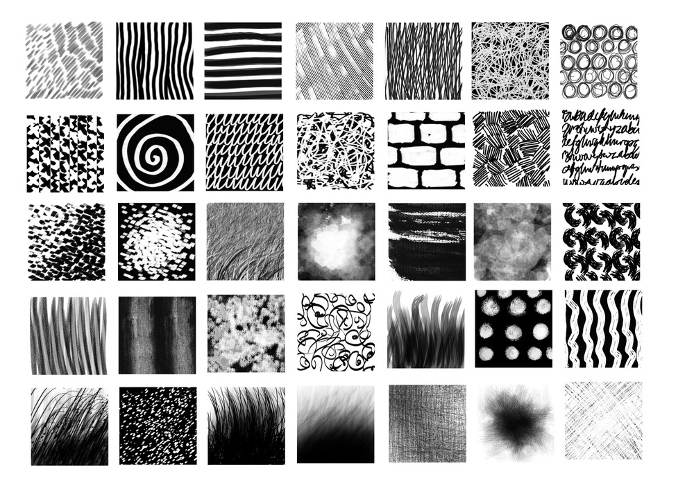
How I decided to approach this project is by first brainstorming about how each emotions resonates with me, and subsequently working with different mark-making techniques to fit the qualities of each emotions to bring out its entity. My brainstorming process can be viewed here. I decided to categorise the emotions according to positive and negative emotions.
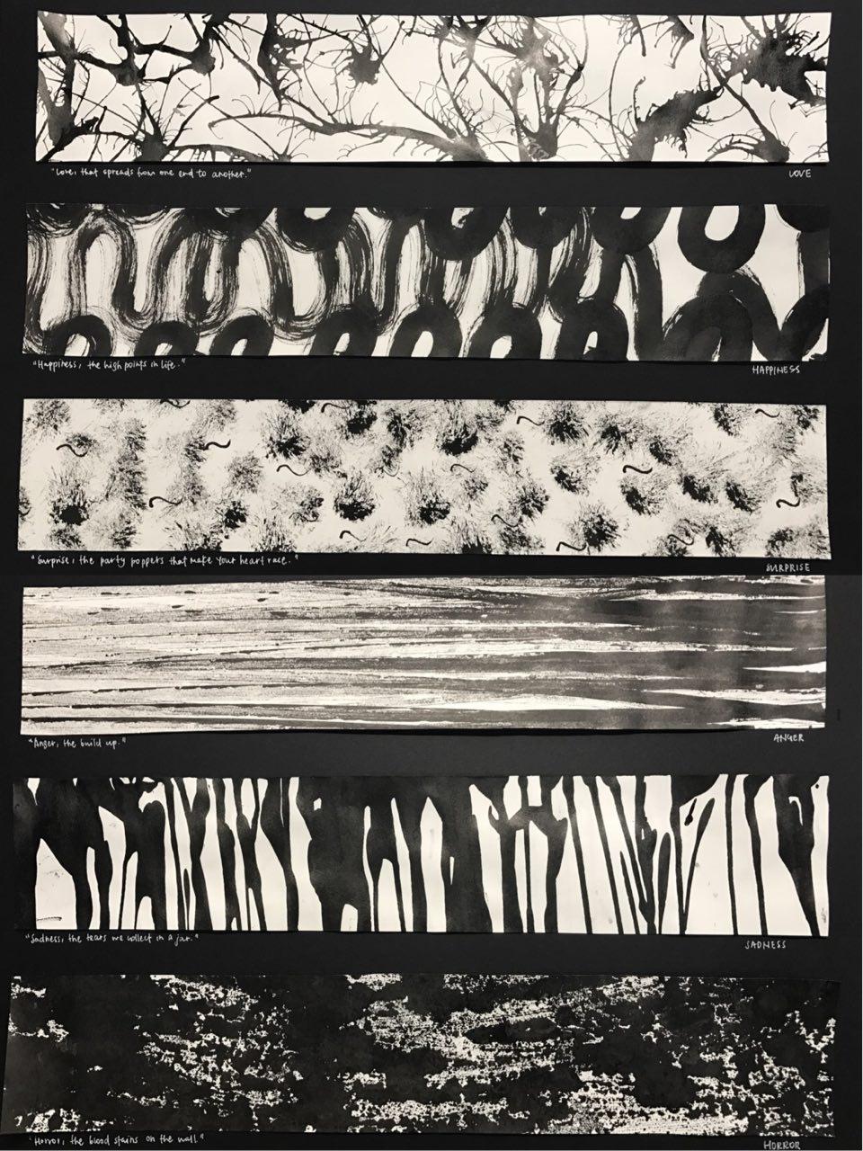
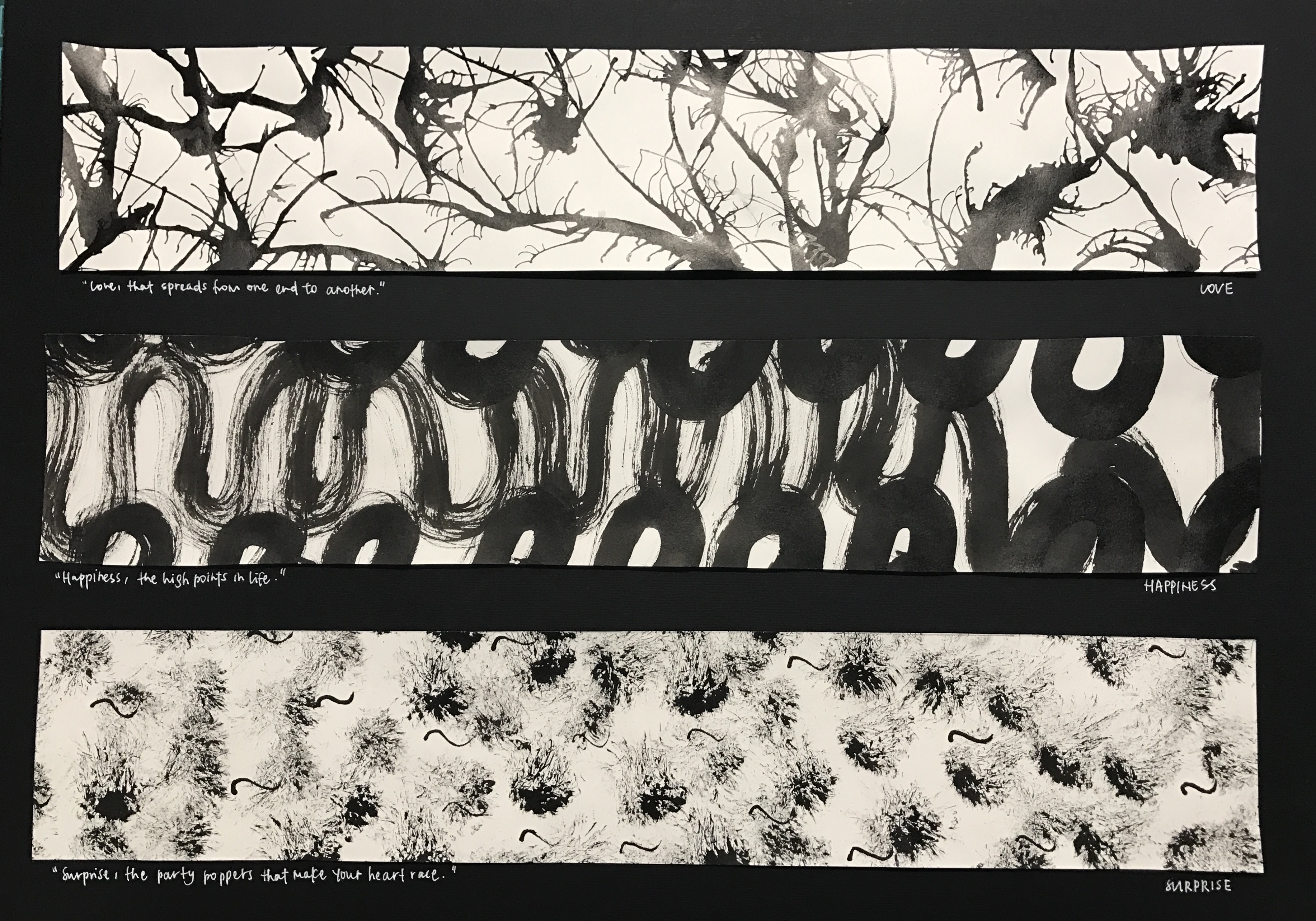
Top to bottom:


1.love

Love, that spreads from one end to another

thought process:

Love spreads from one person to another. Be it from your family members or from the people around you, love spreads in an outward motion. Also, we love because we are first loved. The feeling of being loved is similar to having tiny explosions inside of you, the tiny butterflies you feel, the warm and hearty feeling. The organic and fluid shape created shows a gradual outward motion with hard-edges. As the shapes intertwine, it shows the actions 0f love transmitted from one to another.

methodology:

The first panel was created by putting large amounts of ink on the paper and then using a straw to blow the ink in an outward direction, not fearing that they will connect with each other.
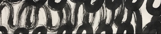
2.happiness

Happiness, the high points in life

thought process:

Happiness are the high points in life. There are high points in life when there are low points in life, hence the flowy nature of the second panel created. Life can be seen just like what is created in the panel, much like a roller-coaster. The soft-edges seen are like the times when we are overwhelmed by the tough moments in life when we find it hard to find happiness in life. However, when we try to find happiness in life, we can always find them. This was created on a huge sheet of paper to recreate the large motion of being happy since it is associated with being free-styled and liberal.

methodology:

Using a brush to create large motion of swirls across a huge sheet of paper and cropping out the section that I wanted.
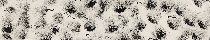
3.surprise

Surprise, the party poppers that make your heart race

thought process:

Surprise is interpreted as good surprise. Good kind of surprises are much like birthday surprises or farewell surprises. In parties, party poppers are very commonly seen, hence it is the main subject in the third panel. The motion of the creation of the third panel also brings out the surprise factor. As a semi-dry brush is jammed onto the paper to create the effect, it gives a sudden fast motion, describing the nature of a surprise. Also, the effect created very perfectly described intensity of shock across time. As time passes, the intensity of shock gradually decreases, therefore, as it goes further away from the middle, the ink lightens, bringing out the element of surprise. Initially, I thought the party popper effect was not clearly brought out, so I added tiny swirls across the paper to mimic the strings that come out of party poppers to add more essence to the panel, and I thought it worked quite well as I do not mistake them as fireworks or explosives.

methodology:

Dabbing semi-dry brush onto the paper, then creating swirls using the back of a brush.
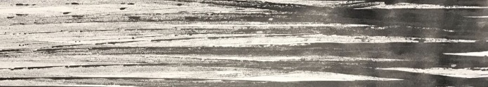
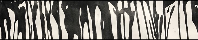
4.anger

Anger, the build up

Anger would most of the time be an accumulation of different events that ultimately build up to the ultimate event of being angry. The gradient seen on the paper also describes the intensity of anger very well. When the limit is met and one is angry, the initial emotion will be fury and hence, it coincides with the darker regions on the panel. Across time, one will be cooled down and that will coincide with the lighter regions on the panel.

methodology:

The forth panel was created by putting ink on my mini toy car and running it across the paper to create the straight strips of ink.
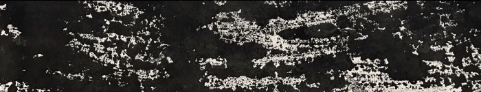
5.sadness

Sadness, the tears we collect in a jar

The first thing that came to my mind when I think about sadness is tears and the act of crying. Also, we tend to be sad over things that are significant and intimate to us, hence the phrase “we collect in a jar”, since they are something we hold close to our hearts, we will keep them in a secret place.  Therefore, the fifth panel is made up of fluid, tears-liked figures mimic the tears that flow down your cheeks when you cry.

methodology:

This panel was created by running black ink down the paper, creating the dripping down effect and cropping the top section of the paper out.
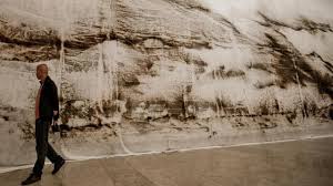
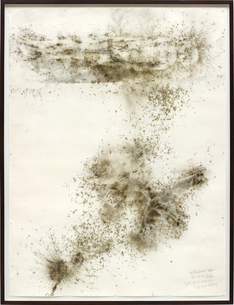
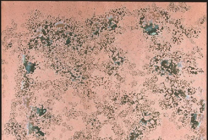
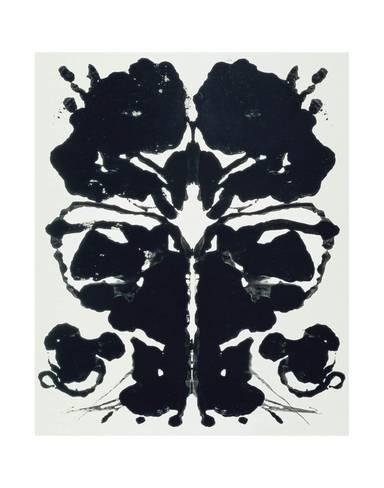
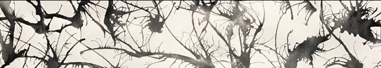
6.horror

Horror, the bloodstains on the wall


taken from: http://www.widewalls.ch/andy-warhol-piss-paintings/


I was very inspired by Andy Warhol’s oxidation painting effect as I thought they give off a gory and scary feeling to its audience. It is as if we cannot fully make sense of what is in front of us, but we sort of know its something unpleasant. Working towards that direction, I experimented with a few methods by imprinting ink from different surfaces onto the paper. I worked with different kinds of plastic bags, and tiny ones usually for food storage and found out that I prefer the effect of a zip-lock bag much better due to its smooth texture. As if blood was smeared across the glass wall, the gory effect it gave really resembles that of horror movies I usually watch.

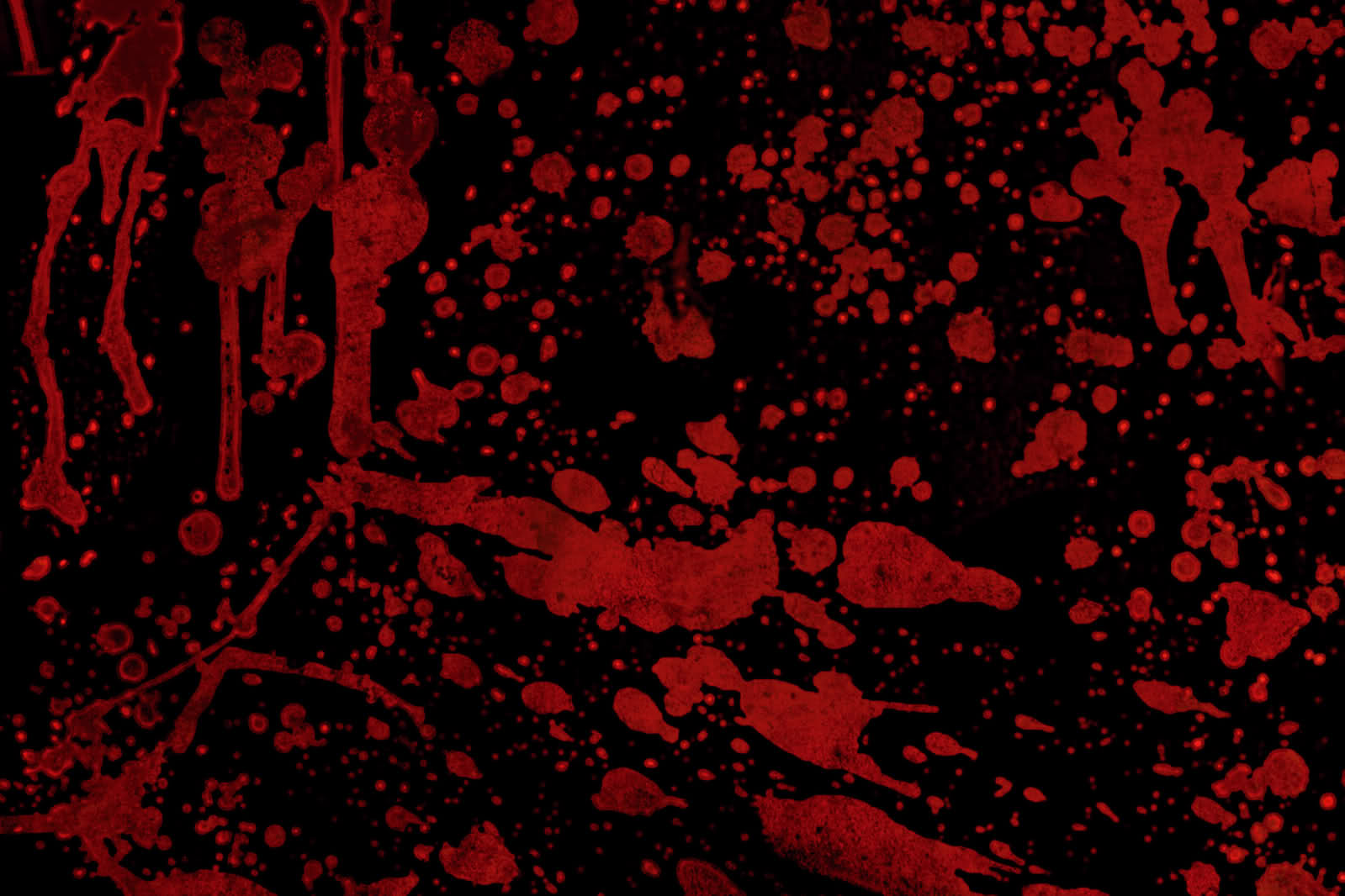
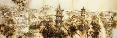
taken from: http://historiadelavidadeblaze.blogspot.sg/2015/07/t2-carmesi.html


methodology:

Putting large amount of ink on a zip-lock bag and transferring the ink onto paper and cropping the parts out.

———————————————————-

Critique:

I like the directional element to the work, how the work can be categorised as horizontal, vertical, etc. It brings out a strong visual unity…

I came to realise that how I had categorised my emotions gave a “directional element” to the entire project. Like how anger contrasted with sadness, which then contrasted each emotions even more. I thought that was a good observation by my classmate that I had unintentionally displayed in my work.

I like your idea of using quotes!

As I approached this project, I thought emotions can be hard to express sometimes, hence the word “mixed-feelings”. Truth is sometimes we cannot comprehend or understand how we feel in a certain occasion or event. I thought the quotes really put things into a certain context or situation which can bring out the idea of each emotions even more, enhancing the understanding of each emotion further.


Conclusion:

Overall, I really enjoyed creating each emotions because they truly resonated well with me. Also, looking at how my friends created their prints was really interesting as well as I have classmates who experimented with oil and also capturing the contact print of a ball hitting the ground and et cetera. Even so, I enjoyed experimenting with different objects that I can find at home to create these prints as a final product and am overall encouraged by my lecturer, Joy, and my classmates’ comments and feedbacks for project 1. Although I would have hoped to be riskier with the objects I used, but never really got to try. Despite that, I thought this has been a great opportunity for me as during the process, I constantly found myself on a look out for objects with interesting texture and how I can use them for mark-making. As we close this project, I hope to further try out different mark-making techniques and hope to work with the linoleum and the pressing machine in future!

; MY LINE IS EMO: Mark-making – Introduction & exploring the artists

Hello! Welcome to my first ever OSS post regarding mark-making. In Project 1: My Line is Emo, we have to make use of mark-making techniques to create 6 abstract, black and white strips to convey 6 different emotions (i.e. anger, love, joy, fear, sadness and surprise). This post will include some artworks by relevant artists that I have done my research on.

What is mark-making…(?)

it is used to depict the creation of various lines, patterns and textures. It can apply to any of the aforementioned points on any type of medium.

// CAI GUO QIANG’S GUNPOWDER DRAWINGS

taken from: https://www.tumblr.com/search/cai%20guo%20%20%20qiang

taken from: http://4rtgallery.blogspot.com/2014/08/gunpowder-art-by-cai-guo-qiang.html

Cai Guo-Qiang’s artworks are mostly inspired by his Maoist and Socialist beliefs as it often is the main concept of his popular pieces. His gunpowder works reflects the Mao’s ideology of “destroy nothing, create nothing”.

methodology: a sketch of whatever that is to be depicted is drawn and subsequently carved into a stencil which will then be put on a mattress of gunpowder in varying grades and types that awaits the mini explosion

taken from: http://4rtgallery.blogspot.com/2014/08/gunpowder-art-by-cai-guo-qiang.html

I found a rather interesting video on how his gunpowder drawing is made.

thoughts:

Cai Guo Qiang’s unconventional method of mark-making is indeed out-of-the-blue, enthralling and inspirational as complex figures like the Chinese corner tower and dense vegetation as seen.

Using gunpowder to create such intricate works is indeed impressive, however, I do not think that it can be used in this project. Instead, attempting to tweak his idea, a stencil can still be created, perhaps of organic objects, followed by the splattering of large amount of paint over the surface to create marks on the canvas.

Cai Guo-Qiang’s Life Beneath the Shadows

taken from: https://www.artsy.net/artwork/cai-guo-qiang-life-beneath-the-shadow-the-brahan-seer

His gunpowder pieces are not only eye-catching, in this piece-Life Beneath The Shadow, the result of the gunpowder on the canvas gave a rough texture and gave very delicate details. The spirit of breakthrough and the eagerness to fight for survival can be seen through the texture and the details of the stains from the gunpowder.

// MARK BRADFORD

taken from: http://artillerymag.com/mark-bradford/

Mark Bradford’s works can be often associated with collages on paint and his use of grid-like structures in his works. Although his works also comprises of installations and videos, this post will be mainly focusing on his printed or 2D works.

Mark Bradford’s Kryptonite 

taken from: http://www.saatchigallery.com/artists/artpages/mark_bradford_kryptonite.htm

Mark Bradford’s Kryptonite is a mixed-media made out of collage and paint on paper that brings to thought a master plan of an urbanised city with the usage of rectilinear structures that could almost be seen like grids when placed next to each other. His usage of lines further aggravated the illusion of grids.

thoughts:

The usage of colour allowed the attention of the audience to be shifted to the spots of red and black in the middle of the painting itself. It is as if Bradford was recreating a satellite image of a city with the use of structured lines that are mostly parallel to each other.

The use of colour here might not be relevant to Project 1: My Line is Emo since it is to be made black and white, however, the use of parallel lines and grid-like structures can be a way to express rigidness and structure. Possible emotions that might be relevant to that could be anger.

// SOL LEWITT

Sol LeWitt was an American artist notably known for his Minimalistic and Conceptualised style. His clever usage of simple lines are very much highlighted in his style of work.

Sol LeWitt’s Scribbles

taken from: http://www.madrenapoli.it/en/collection/sol-lewitt-scribbles/

Sol LeWitt’s Scribbles although in 2D, seemed 3D due to the subtle difference in the white and black portion. The gradient created a “popping” illusion to the white portion of the wall drawing eliciting a sense of depth to the otherwise uniform and flat surface of a wall. To look further into the wall drawing, Scribbles, as its title suggest is made up of scribbles in graphite

taken from: http://www.pacegallery.com/exhibitions/11686/sol-lewitt-scribble-wall-drawings

thoughts:

The dash of white portion in his monochromatic wall drawings instantly captures the attention of its audience. As if a lightsaber illuminating a dark room, the dash of white created a sense of hope and forward-lookingness, relevant to the emotion of joy.

//ANDY WARHOL

taken from: https://www.biography.com/people/andy-warhol-9523875

Andy Warhol was an American artist known for his pop art and his visual art movement and was dubbed the “Pope of Pop”. His works are often associated with the celebrity culture and his artistic expression.

Andy Warhol’s Shadows

taken from: https://www.guggenheim.org/exhibition/andy-warhol-shadows

Warhol’s Shadows is made up of 102 silkscreened canvases that stretches across the entire interior of Guggenheim Museum, Bilbao. The bright hues of colours used reflected Warhol’s style of pop in his works, added onto the canvas by sponge mops.

thoughts:

Warhol’s technique of using sponge mops to create these abstract figures is unconventional yet a unique mark-making tool to create the strokes that fades out subtly at the sides and areas with lesser pressure. His subject matter can be seen as a figure of a human body from the shoulders up, complementing his famous works that are often of celebrity figures. The use of sponge mops can be a notable point for Project 1: My Line is Emo.

Andy Warhol’s Oxidation Paintings

Warhol’s Oxidation paintings can be seen as one of his controversial works of artistic experimentation as many either loved or hated them.

taken from: http://www.widewalls.ch/andy-warhol-piss-paintings/

Otherwise known as piss painting, Warhol’s oxidation paintings are abstract pieces achieved using his body fluid, after time causing the harsh marks on the canvas.

methodology: To create Warhol’s famous oxidation paintings, he first lay out huge amounts of canvas coated with copper paint and invited many of his close friends to urinate on them. The compounds in the body fluid will then react with the copper paint, creating some aesthetically pleasing colours as the uric acid causes metal components to be stripped. Slight alteration of the colours can be made, interestingly, is by alter the diet of the urinator, by including more vitamin B in his diet to give it blue and greener hues.

taken from: http://www.widewalls.ch/andy-warhol-piss-paintings/

thoughts: Warhol’s oxidation or piss paintings, is an alluring way of mark-making, slightly eccentric yet not weird per se, since the result of such abstract paintings turned out pretty aesthetically pleasing. How he experimented with piss inspired me to reach out to objects that might seem a little unusual to common people in creating my very own mark-making tools.

Andy Warhol’s Rorschach

Warhol’s Rorschach works were first created for clinical purposes whereby an inkblot is created. Thereafter, it is interpreted and deciphered by patients for medical purposes known as the Rorschach test.

taken from: http://www.allposters.com/-sp/Rorschach-Posters_i9417203_.htm

methodology: A patch of ink is first placed on one side of the paper and then folded down to be present on the other side of the page, creating a print of symmetrical pattern.

thoughts:

I am unsure if Warhol was given specific instructions on how the inkblots should look like or it is totally randomised. Despite that, i thought this is a way of mark-making is rather intriguing, looking at the end result. However, how I might tweak Warhol’s methodology is  by eliminating the symmetry on both sides of the paper, allowing more overlays at certain places.

// JULIE MEHRETU

Julie Mehretu is an Ethiopian-American artist, notable for her abstract, layered paintings, where she often use urban landscapes as her inspiration.

Julie Mehretu’s Stadia II

taken from: https://www.artsy.net/artwork/julie-mehretu-stadia-ii

As quoted by Julie Mehretu, “As you come close to it […] the big picture completely shatters and there are these numerous small narratives happening.” talking about her layered abstract works that is often referenced from the urban landscape around her. 

methodology: Mehretu often uses layers of acrylic paints on the canvas as she stacks layers of mark-making by pencil, pen, ink and thick layers of acrylic paint.

thoughts:

Indeed, like what Mehretu said about her works, as audiences go closer to her work, our focus changes into the smaller details that might not have caught our eye at the start. However, because of that very fact, I find her work a little messy and hard to capture my attention in the beginning. Despite that, as I look longer, the entire picture starts to fall into place and I can start to comprehend what her work represent, for instance, her Stadia II piece. The foreground does look untidy, in spite of that, as we shift our attention to the background, Stadia II makes more sense as the interior of a stadia becomes more clear to the audience.

// CY TWOMBLY

taken from: xhttps://en.wikipedia.org/wiki/Cy_Twombly

Cy Twombly was an American artist and one of the most prominent Abstracti Expressionist who later moved to Italy in the later part of his life. Twombly served in the U.S army as a cryptologist and that greatly influenced and affected a  large part of his artistic style. He then became intrigued by tribal art and the history of Graeco-Roman (relating to ancient Greeks and Romans) past in his home in Rome. He was described as an emotionally eloquent and intelligent artist

taken from: https://www.wikiart.org/en/cy-twombly/leda-and-the-swan

Cy Twombly’s Leda and the Swan 

Leda and the Swan is amongst Twombly’s most well-known and accomplished works. It reflects his love for historical stories, literature and the classical realm which grew after he moved to Rome in 1957. Leda and the Swan is a Romanic myth whereby Jupiter is transformed into a swan that tries to entice Leda who then ;after gave birth to Helen of Troy. Leda and the Swan uses lines to correctly illustrate the union of Leda and Jupiter as seen by the swirls and scribbles in peach that is oval in shape on the canvas.


——————————————————–

On 21 August, Monday, our class had a discussion on the things we had learnt from our artist research.

self-taken

Something I found interesting from the discussion is that Cai Guo-Qiang’s process of gunpowder artworks can be considered performance art when a huge number of audience were present to see his process of his artwork creation.

Cai Guo-Qiang’s process of creating his artworks video.