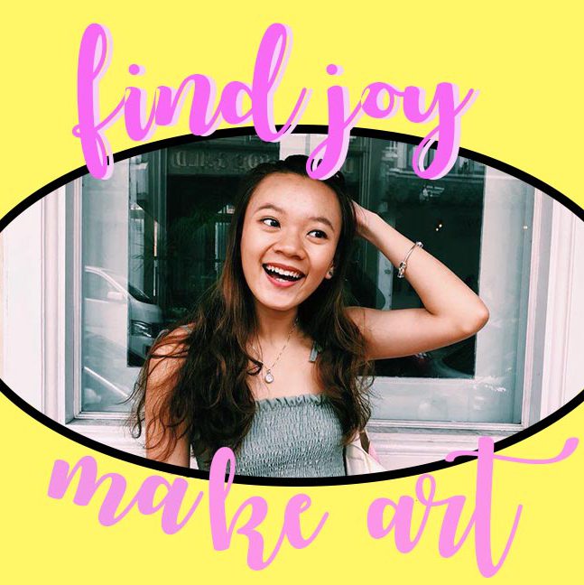

Gaia’s Metamorphosis
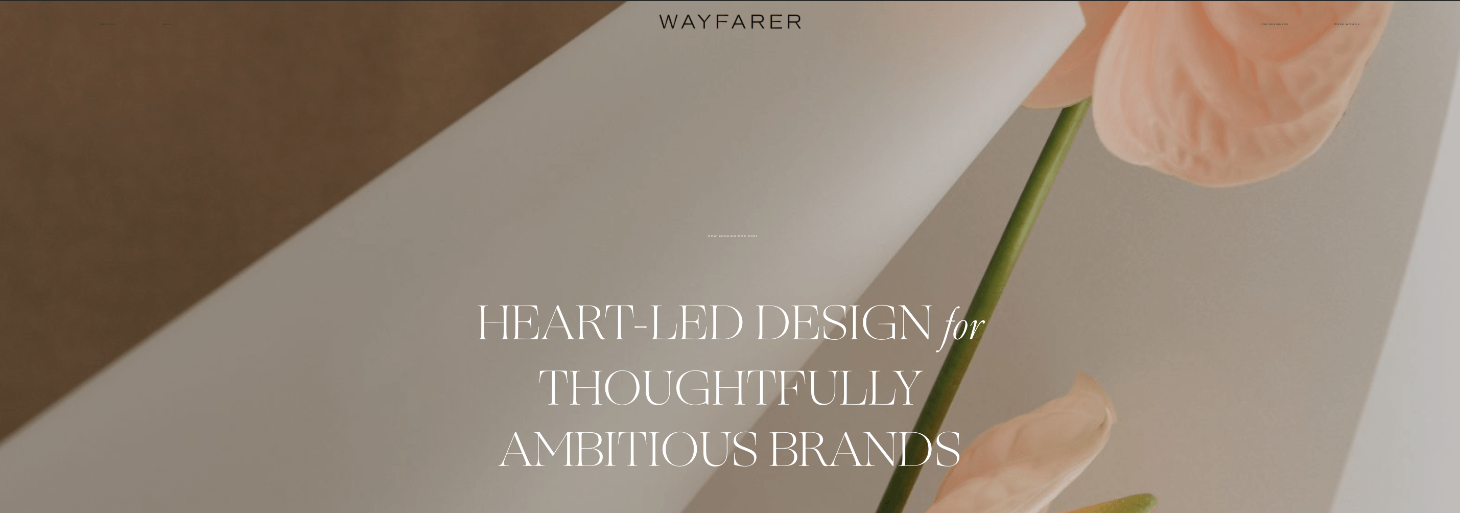
http://www.wayfarerdesignstudio.com/
Started in 2016, Wayfarer Design Studio was founded by Abbey McGrew 1 month after she graduated college and still travelling the world. Wayfarer Design Studio then became her portable design studio where she communicated with her clients mainly remotely.
The meaning behind the name came from the need to travel with her athlete husband who was always travelling for his job and that Abbey believes that every business owner is a wayfarer at heart.
Wayfarer: A traveler by foot, a person who goes on a journey; a nomad, a roamer or a wonderer.

https://www.instagram.com/wayfarerdesignstudio/
Wayfarer Design Studio is a brand + web design studio that partners with thoughtfully ambitious brands.
Design Philosophy:
https://www.instagram.com/wayfarerdesignstudio/
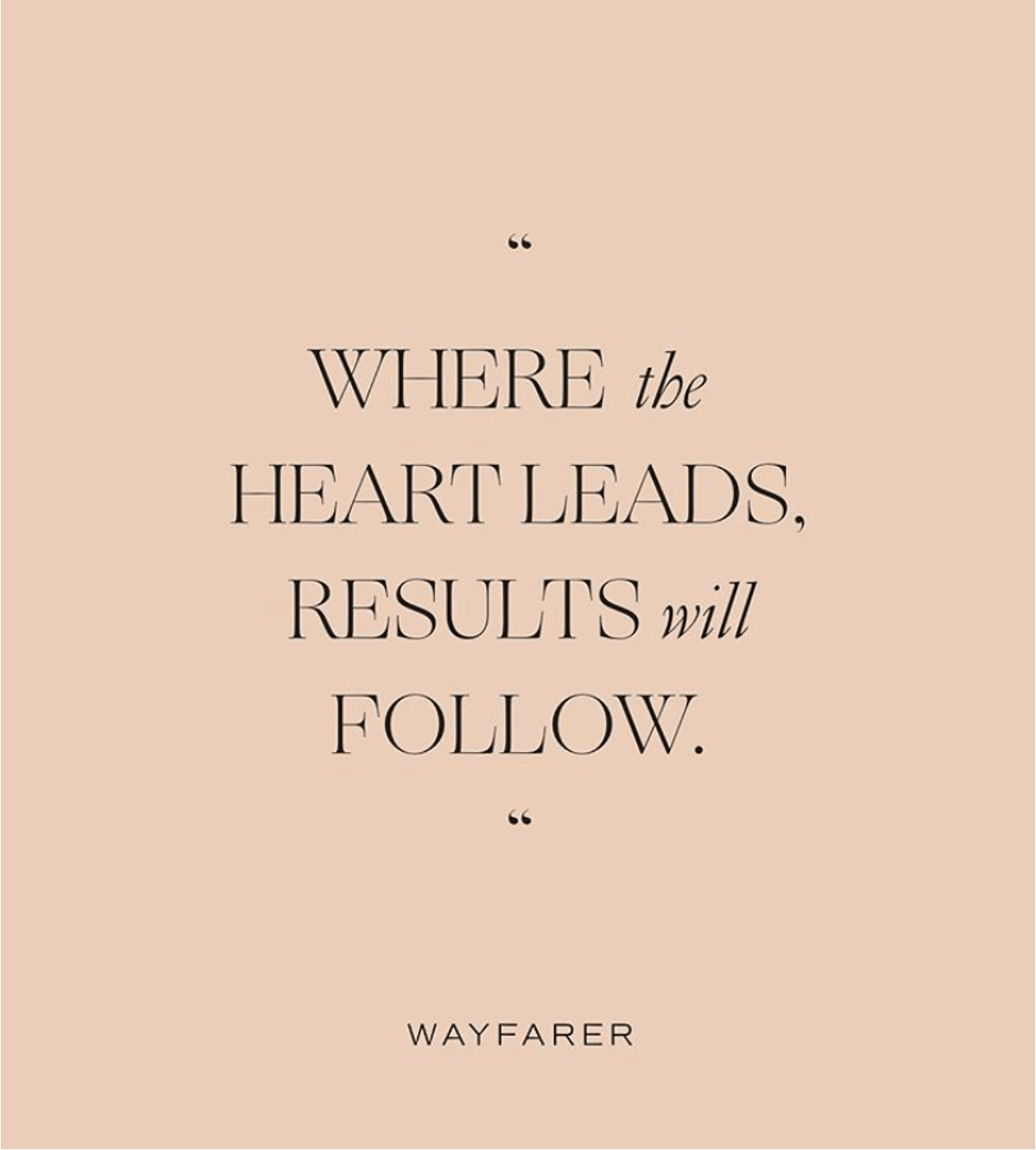
“Where the heart leads, results will follow”, is not just Abbey’s life mantra but the design philosophy she has set for Wayfarer no matter which project or client she is working on, with a goal that every design decision is to be heart-led.
Core values that has followed Wayfarer for 4 years is Intentionality, Connection & Empowerment.
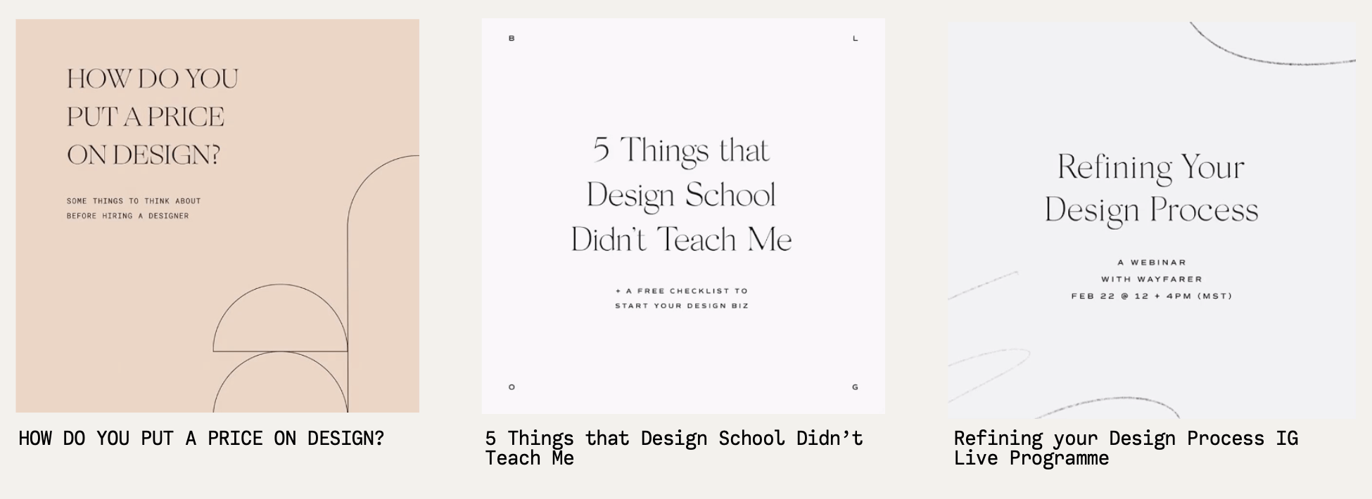
This four core values can be seen through the way Abbey uses her influence on Instagram. Apart from using Wayfarer as a platform for her to gain clients and showcase her portfolio, Abbey uses her platform to empower fellow designers and embrace and address the dilemmas of designers all around the world.
https://www.instagram.com/wayfarerdesignstudio/
These are just some examples of content she put out on her platform apart from her works. Abbey, having started from the bottom herself, realises that many challenges and dilemmas she faces in her journey as a designer are shared by many other designers around the world. Through her social media platform, she discusses these, otherwise, seen as touching or sensitive topics with her fellow designers.
Documentation of explorations and process
What first caught my eye about her work is Abbey’s crazy amount of explorations she puts up on Instagram. Little things like where she got her inspiration from and how many explorations she did to arrive at the final one, shows how open and fearless she is about getting criticisms and judgement, especially from a social media platform where these are pertinent. Apart from that, she teaches the importance of embracing the process of explorations and even encourage designers to always include their process when pitching ideas to their clients. Her take is that not the outcome, but also the process that is valuable. Hence she is big on getting her clients involved in her design thought processes.

https://www.instagram.com/p/CDJ0KJ6nkox/
What Abbey taught me is that as a designer, beyond making things look visually appealing, many forget about the power of connection well-created, heart-led design can bring to the table.
“Stop making pretty stuff and start making things with heart, soul and life.”


Hence, this event is all about designing something of a person, to create a totally customised experience.
It is an event filled with a compilation of narcissism when you’re first and you can do whatever you like. A themed event that might not always make sense but as long as you like it.
A poster regarding the event:

A towel for a dip at the pool, but totally exclusive to the event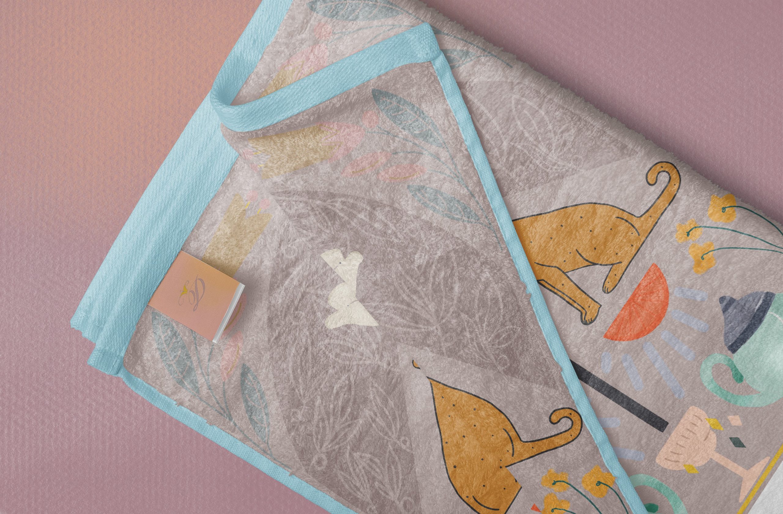

Some custom tableware to be used during the all-me event
And last but not least, some chocolates, because who doesn’t like chocolates?

Process


Research and Mindmaping


Initial Stages of Ideation
The initial stages of ideation was to involve food into unconventional objects or living things. As I was beginning to sketch and formulate a direction for this project, I found myself doodling food and animals and girls. Therefore, you can see the Siew Mai Cats, the Frida Kahlo ice-cream and girls in the prawn rolls! (Funny how they are all my favourite snacks!)
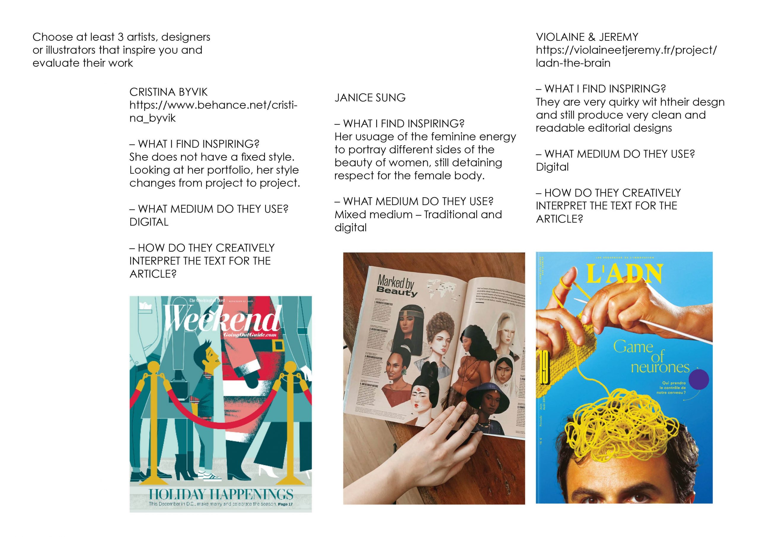
After consultation, I was advised by Lisa to dive in deeper into the meaning of Fantasy and what does it mean for me? Given a few references below,

After viewing how Brian Pollett portrayed his idea of the after effects of drugs and the relationship between drugs and art (pixels), I decided to start on a blank canvas and relook at the meaning of Fantasy in my own interpretation.
After brainstorming, I realise that I am intrigued with the idea of botany, serpents and girls all at once. Growing up as a Christian, my religion exposed me to the idea of the good and the evil – gaining inspiration from the garden of eden and the forbidden fruit. As an old scripture that explains the curses then made to men and women, I wonder about the unexplained and the explained. What is an extension of the real world (of logic), is magic or imagination just part of the science of illusion? But, things left unexplained are totally fine! This gave birth to my interpretation of Varoom Fantasy Edition
References:
Artist Takes 20 Different Drugs And Creates 20 Illustrations To Show Drug Effects

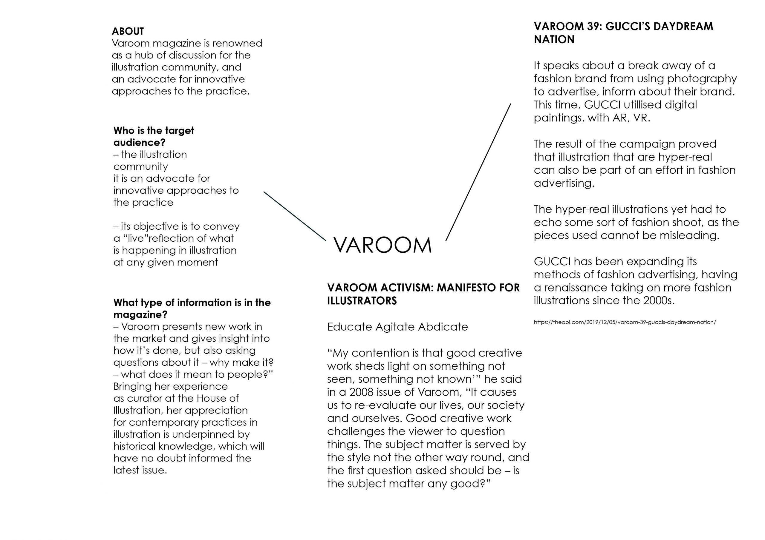
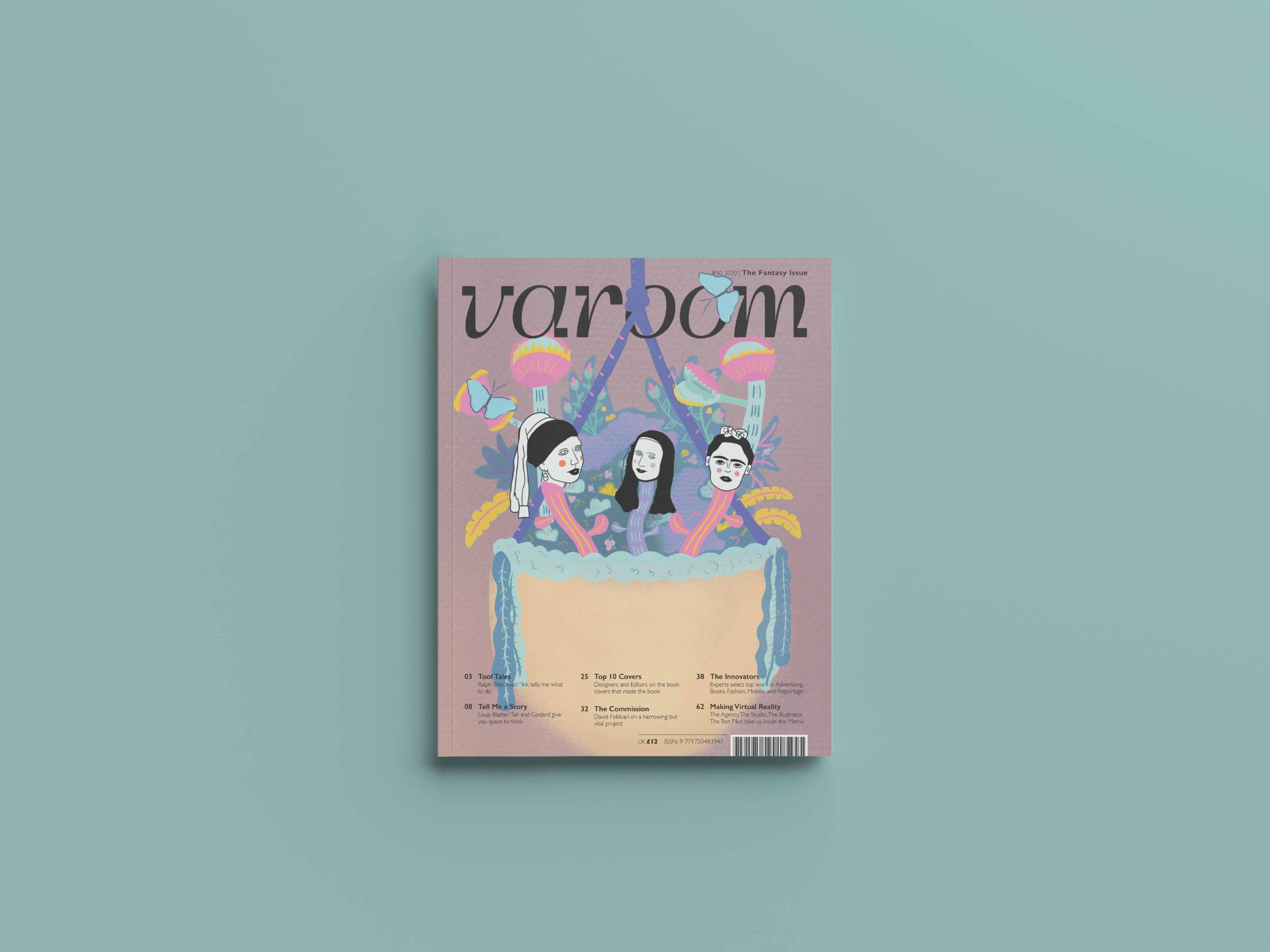
Varoom Magazine Fantasy Edition
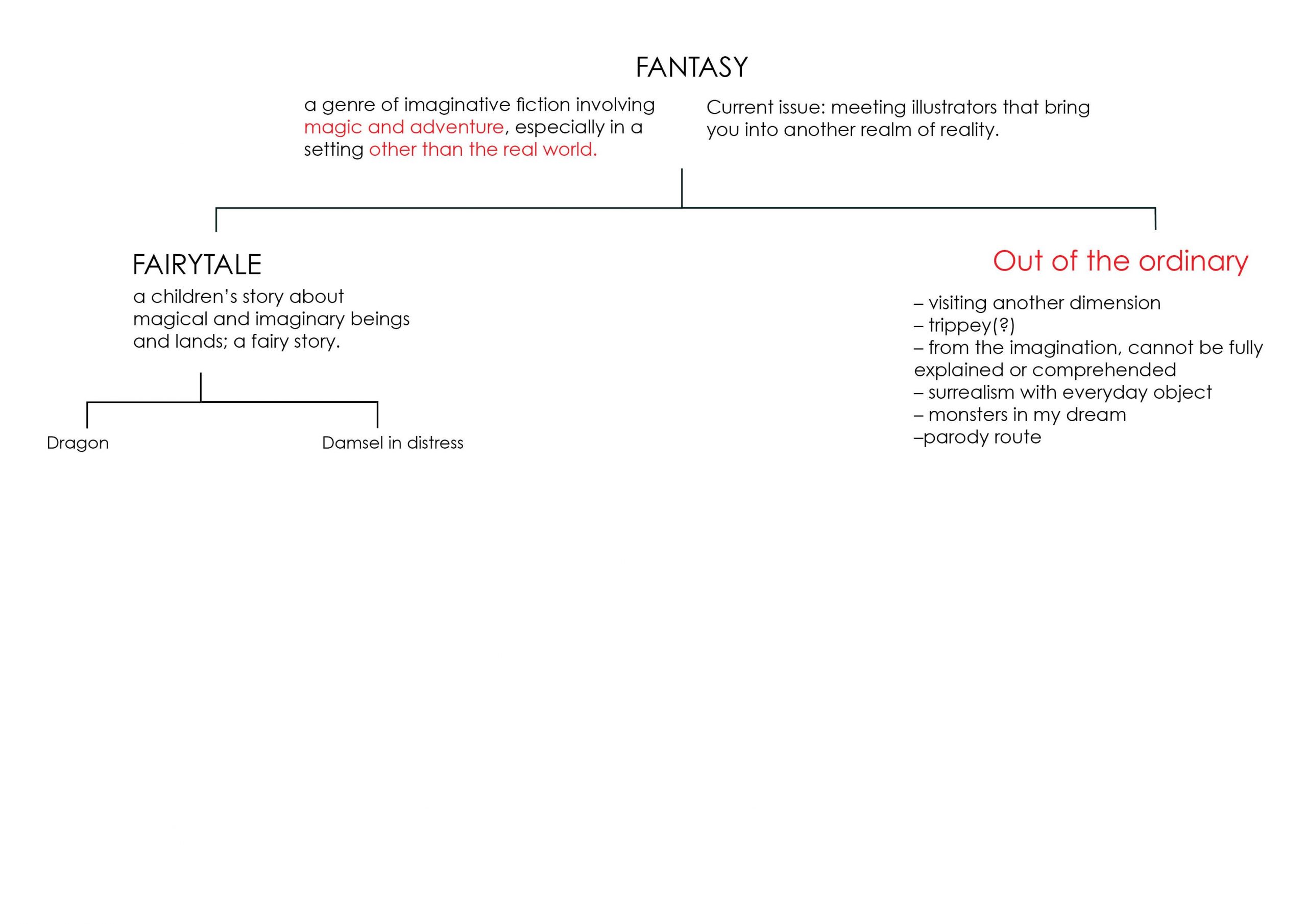
Fantasy is a genre of imaginative fiction involving magic and adventure, especially in a setting other than the real world.
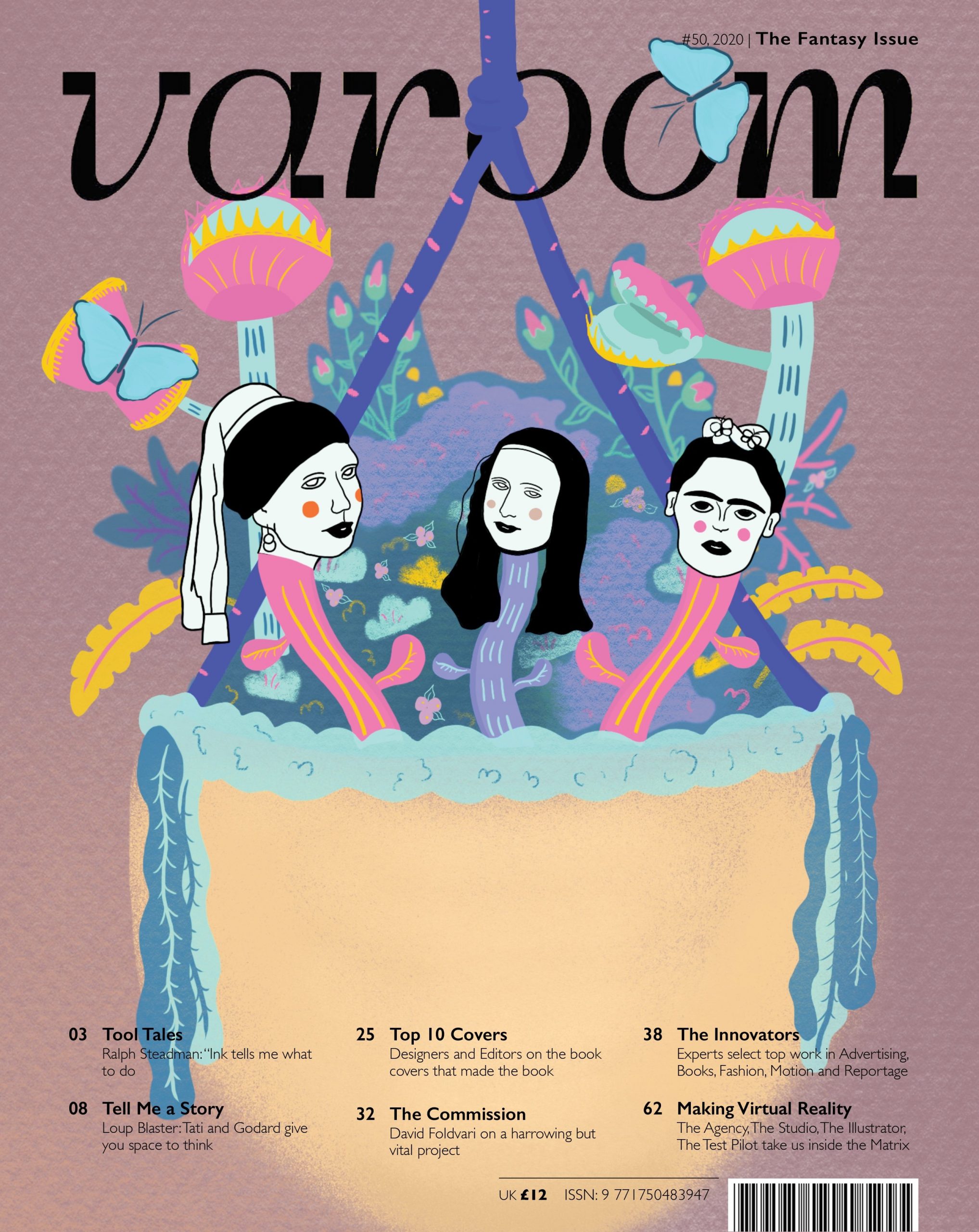
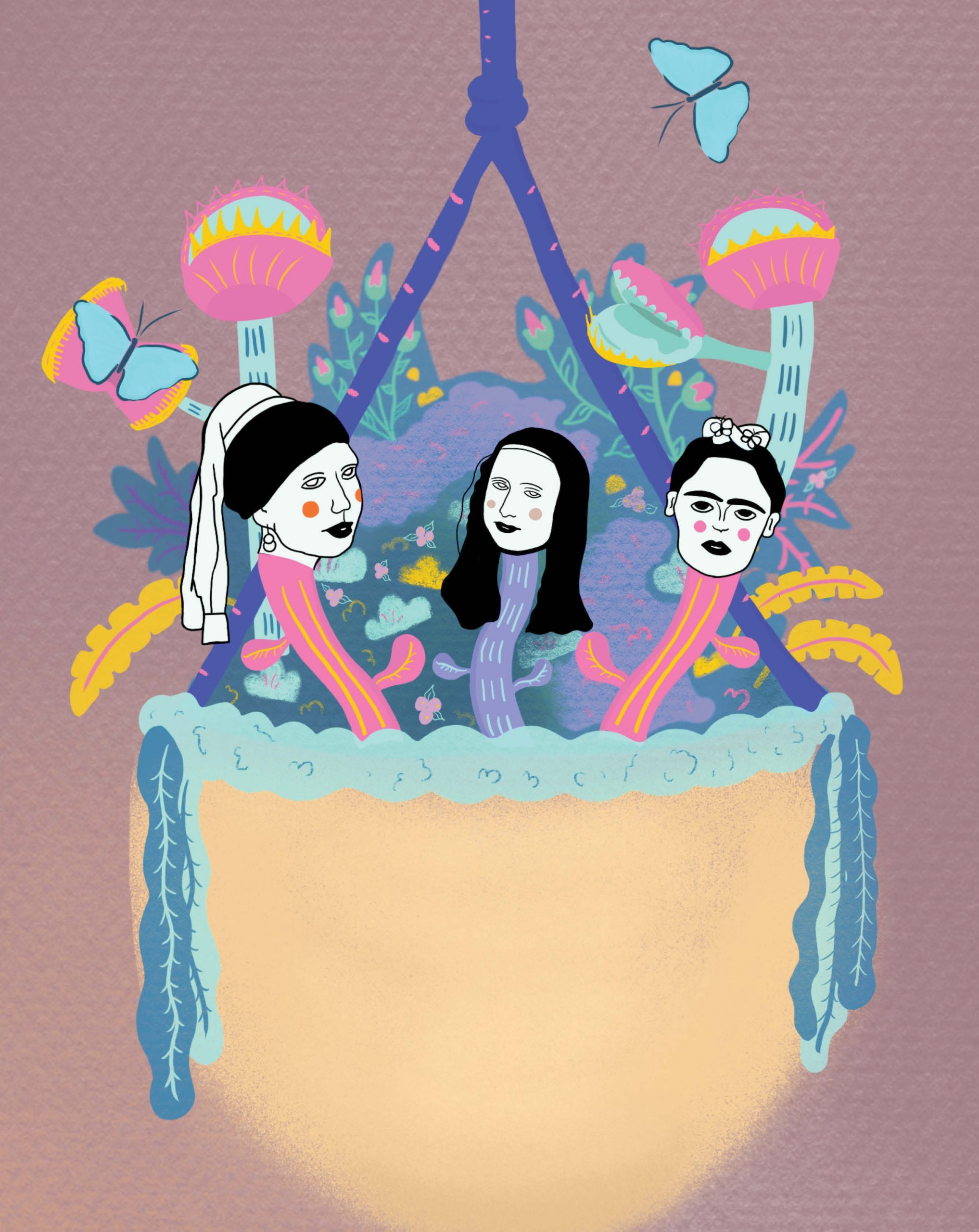
I wanted to explore Fantasy in the form of the art scene’s conspiracies infused in a botany, flora and fauna setting.
The contained mini version of God’s garden of eden, depicted in a form of a basket of plant life, mirrors that of God’s creation of our world that also contains the good and evil. (The fruitful plants and the Venus fly trap – carnivorous plant)
The notable faces – The girl with the pearl earring, Mona Lisa and Frida Kahlo. The conspiracies circling these women (fiction and non-fiction) brought about the idea of the illusions and the seen and the unseen.
Facts and background about these women
The Girl in the pearl earring (the subject of the painting by Johannes Vermeer)

It was speculated to be the artist’s daughter, yet was argued to be classified as a type of work that is called a tronie. “Tronies are paintings that focused on the face of a subject with an added element of fantasy or an exaggeration of expression that differentiates them from portraits.” The identity of the girl created mystery and curiosity to art goers.
Mona Lisa (the subject of the painting by Leonardo da Vinci)

Many thought that the gaze of Mona Lisa follows the viewer no mater where it is viewed at and has been debated to be haunting and feels like you have been watched by Mona Lisa herself.
2. Differing interpretations of Mona Lisa’s smile
The smile has been interpreted differently from many people. It is also deemed to be ever changing depending on the angle it’s viewed at.
3. Identity of the subject.
Although it is widely known that the sitter is Lisa del Giocondo, there are a shortage of definitive evidences and many fuels alternative theories regarding the subject of the painting.
Frida Kahlo (the person and the subject 55 self portraits)

Being born in 1907, Frida changed her birth year to 1910. She had a series of near death experiences throughout her life time of which made her isolated and alone which resulted in many series of self-portraits which she quote, “Because I am so often alone….because I am the subject I know best.”
She is best known often known for her portraits mixed with autobiological elements, realism and fantasy, that made her more than a person, but also an icon. Her physical and painted self blurs the living and the non-living.

Varoom Fantasy
The fantasy about the unknown and the known, the living and the non-living is blurred through a paradoxical combination of two elements from two different spectrums. The colours used are bright and enticing, very much like a sweet indulgence of mystery that allures people’s attention and gazes and embodying the visual myth of enchanting gardens, contained.
References:
During lesson, Lisa gave us a huge A3 paper and tasked all of us to draw a favourite piece of clothing in the wardrobe, favourite story book and our front door!

I took a bit of time to actually think about each item, visualising and them and trying to draw them from my memory was a little bit tough!
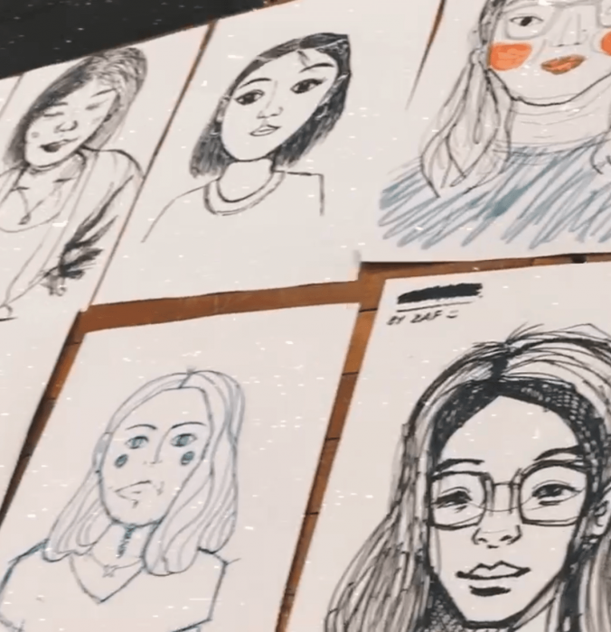
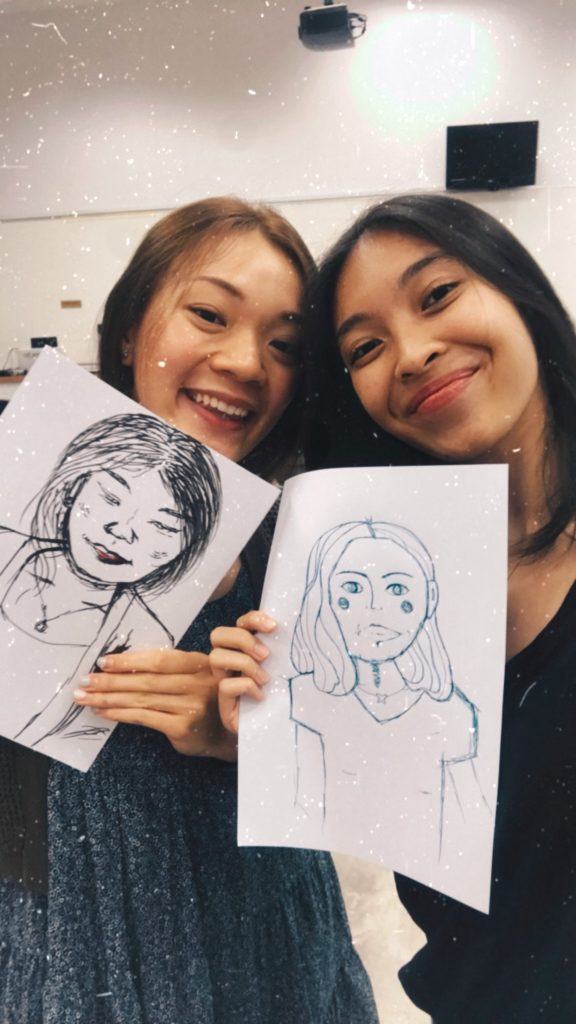
During week 2’s illustration class, we got to get in pairs and draw a portrait of someone we were not close to in class. And my partner was Qistina!
The timer was set at 15 minutes and we were all paired up, observing and drawing each other.
After the 15 minutes was up, we placed all our pieces on the table for a quick view of everyone’s work and we were very amazed by everyone’s take on drawing the other person!
On to activity 2,
We were tasked to draw on our paper using geometric shapes and there were specific instructions that were given to us, like drawing the first shape in the second shape etc (I cannot remember the exact instructions), but the instructions come in a series and at the end of all the instructions, it is out end piece!
We had another round of showcase to see how each other’s works all turned out!

My partner for the first project Inanimate Portrait is Desmond!
Before starting on the project, we conversed and got to know a little bit more about ourselves and our experiences.
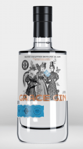
Some things that stood out to me is that our favourite go-to alcoholic beverage is Gin and Tonic. I usually have it on my nights out but for Desmond, it was a little different. Since he stays in hall, he has a bottle of Gin in his fridge for some nights when he feel like having a drink. Hence, I thought, a bottle of Gin has to be part of his portrait.
Apart from that, we spoke about our aspirations. For Desmond, all geared up in an Adidas T-shirt and sneakers told me that he would love to work for Nike, the renowned sportsbrand someday. I laughed and pointed out that he is in a whole gear of Adidas and he told me that he only gears himself up in one brand per day, so no Adidas T-shirt with a pair of Nike runners, ever, and I caught him on his “off-day”. That exchange spoke out to me and Nike has to be the second element.
Talking about hobbies and interests, I asked him about calligraphy since I briefly remembered he does lettering on his free time when we worked together in Year 2. He still does it sometimes although lesser due to his busy schedule. Besides, he would invest heavily into his tools, that includes his pens and ink. He commented that one of his most expensive investment he made to this hobby of his is purchasing a $300 over dollars calligraphy pen. Yet he says that having good tools shows in his works and is overall a good investment since he will use them for years. Third element it is!
With all the exchange, the impression I have of Desmond is that he is very much a traditionalist and there is an old soul within him. When composing his piece, I decided to include that element in.
Process
I knew straight up that I wanted to first start on the bottle of Gin and Tonic. As I was researching on labels of alcohol bottles, I found many with vintage illustrations.
In thought, I realise that the logo of Nike is inspired by the side-view of the wings of the goddess, Nike. I thought about tweaking the Nike label brand a little and decided to illustrated the Nike goddess in Greek mythology instead of using merely the iconic tick. With that, I started researching on the characteristics of the Nike goddess. Through Britannica, I found out that Nike is the goddess of Victory and is often seen with a palm branch, wreath. Also, Nike is always wingless unless portrayed alone.
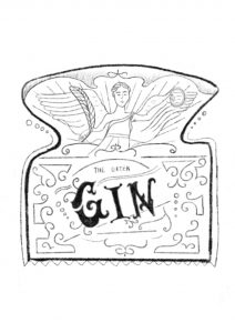
Also, the lettering “Gin” was also inspired by Desmond’s lettering hobby. I further looked at traditional, vintage letterings to create the final “Gin”.
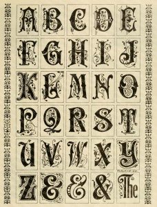
taken from: https://www.etsy.com/sg-en/listing/184033049/printable-alphabets-with-ornamental
For the consult, I had many issues with the composition.
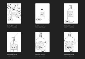
I showed my classmates a few and that was when I decided to also include a patterned background that’s Bauhaus styled since I thought that portrays the traditionalist style pretty well. Initially I thought the background was also fighting for attention, since the pieces are to be in black and white, I decided to turn down the opacity by a tad bit.
Reference
Working on my own inanimate portrait, I decided to look at what interests me now and what I love to look at. It was then I realise I enjoy looking at illustrations of tarot cards especially when it looks like it is the “hype” thing now as people would pay ten over dollars to have a reading done by a random stranger online.
After looking at tarot cards for hours in a bookstore, I spoke to the store person about it as she saw me looking at them for the longest time. She explained that the tarot cards are actually based on the interpretation of the tarot card reader depending on the energy and the illustrations he/she gets from the card. Hence, tarot cards can be seen re-illustrated and reinterpreted by different tarot readers. It is a subjective reading up for interpretation and discussion.
Process
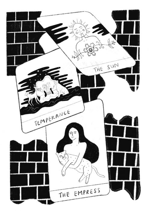
Riding on that, I decided to look at some cards that I often see myself looking at. They are The Empress, The Sun, Temperance.
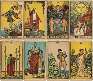
illustrations on traditional tarot cards
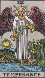
traditional tarot – the temperance card
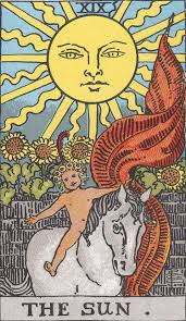
traditional tarot – the sun card

traditional tarot – the empress card
These are the elements I came up with for the different cards.
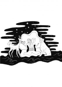
the temperance card
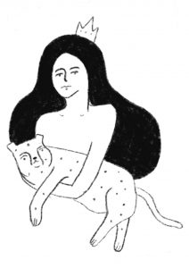
the empress card
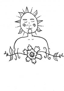
the sun card