At the Milan Furniture Show of 2005, what shocked Fukasawa about the aluminium stools he had designed then sparked the birth of a new design philosophy and movement that later was coined “Supernormal”. The designer aluminium stools were “plonked on the floor for people to sit on” instead of being placed on pedestals and “displayed on plinths like the other new products” at the show that year (Rawsthron, 2006). The stars of the show was not the limelight of the Milan Furniture Show, seamlessly blending themselves as entourages. However, how product designer, Jasper Morrison viewed the entire situation at the Milan Furniture Show was vastly different. He was taken aback by that epiphanic phenomenon. The set of designer furnitures integrated into the environment flawlessly. That was when we saw the birth of Supernormal through an empirical moment.
Supernormal consists of being less concerned with the visual aspects of the object, putting more emphasis on the practical use of the object in its environment (Domus, 2006). The main focus here is how the use of the particular object, in its most simplified form, impacts its users with solely its functionality. As Naoto Fukasawa would put it as his philosophy, “Achieve simpleness as a way to achieve completeness and harmonious relationship between users, objects, and environment.” (Nedgis, N.D). When the use and the simple design of the product coalesces and unites, this amicable fusion forms a whole. When user experience is further enhance by stripping away the counterproductive details, this simplicity completes and complements well in our daily environment. For Morrison, Supernormal is a link bridge between going away from the ordinary and trying to value-add to our ever changing man-made environment (Bhan, 2008).
Notable artists in the field of Supernormal designs include founders Naoto Fukasawa and Jasper Morrison.
Fukasawa’s philosophy is simply, “Without Thought”. He places awareness in the normal, mundane ways people interact and live in the environment (Fukasawa, 2007). Therefore, his designs often revolve around the unconscious, harmonious accord of people and things in its environment (Fukasawa, 2007). His designs incorporates human qualities that plays with our common knowledge of problem solving. He uses shape, colour, texture in its most condensed manner in his products in the enhancement of his simplistic industrial designs for products for users to have an instinctive knowledge of how and what the product is used for, stripping the need for an instruction manual (Fukasawa, 2007). He often uses the phrase “designing the unconscious”, convening the need to focus on our “core awareness” (Fukasawa, 2007). He is attentive to the daily actions we all take, cracking an egg or wearing our socks. Observations then turn into analytical break down of the every actions we make, having an “active memory” of each step in our daily task (Fukasawa, 2007). After the analysis, thoughtful design then takes place. This is what differentiates his meticulous design in the market. As for Jasper Morrison, his role as a designer revolves around enabling ideas to surface, avoiding creating a “facade” for the products, making things out of nothing. Instead, it is by being aware of what is already in the surrounding (Fukasawa, 2007). Supernormal products often as he described as “lack of problems” (Fukasawa, 2007). The design itself seem to have an ease that suggest that the problem never really existed, very much aligned with Marcel Duchamp’s notion of “there is no solution because there is no problem” (Fukasawa, 2007). There is a clear notion tapped onto the idea of Supernormal products. They have positive atmospheric influence and by default, they look acutely normal (Fukasawa, 2007). They are objects that we are so accustomed to see and use that we see and use them without thinking, or thinking too much into it. Supernormal products “play on a deeper level of human sensibilities” as it allures to an common knowledge we all have, based on our shared experiences. It is the experience of figuring things out with what we have and trying to get by in our natural habitat (Fukasawa, 2007).
One appliance worth noting under the Supernormal manifesto is the CD Player that Naoto Fukasawa designed for MUJI in 1998. Fukasawa noted the visual similarity the design he had for the CD Player with that of the rotating blades of a domestic extractor fan. He incorporated the innately simple structures of the extrator’s operating controls – a straightforward pull-cord used to switch the appliance on and off (Fukasawa, 2007). The cord very instinctively invites users to pull it, triggering the operating controls to play the music in the CD Player. This creates an interactive experience between the user and the product. Fukasawa was very clear in creating an appliance that would evoke an unconscious cause of action for the users to utilize that product in their own environment (V&A, N.D). Despite placing large focus on the use of the product rather than the visual aspects of it, Fukasawa makes sure his users know what the product is used for. The CD Player designed for MUJI holds a shape of a typical CD cleverly placed in the middle of the player (Fukasawa, 2007). This is to ensure that users instinctively know what the use of the product is. This, as such, has become a norm design factor sifted into industrial design in creating electronic goods and household appliances (Fukasawa, 2007).
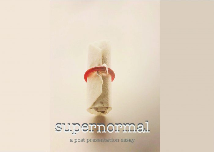
Having studied and observed how Naoto Fukasawa’s works are vastly different from the rest in the product design industry, Masato Sasaki deemed his design philosophy to be one that supplements James Gibson’s study of ecological psychology although they are not based on it (Fukasawa, 2007). In summary, Gibsonian theory about ecological psychology brings relation of potential human action to its living environment, under the umbrella of the term “affordance” (Fukasawa, 2007). “Affordance” describes the property of the object that provides its users with perceived or latent potentials — “action possibilities” (Fukasawa, 2007). This theory proves that objects cast a passive environment into one that is in an active determinant role (Fukasawa, 2007). Fukasawa uses minute details, guiding the behaviours of users. For instance, Fukasawa’s tea bag for the “Re-design” exhibition has a duo function ring slot that neatly holds the tea bag in place and is also the handle of the tea bag while brewing the tea, bearing the colour of the tea when it is good to consume. The whole interaction of tea drinking with Fukasawa’s design is the subconscious realization of when the tea is good to drink by colour observation (Fukasawa, 2007). Granted, the use of mnemonic devices on guiding behaviours in product design proves successful in the designs of Fukasawa.
Good design always explains itself naturally, without the need of an instruction or a thought of “what is that for”, with that, I think Fukasawa and the pioneers of Supernormal has successfully and seamlessly integrated products of design into our daily lives with stealth. Scraping the need of an instruction manual. Many designers strive to make their work out of the blue, extraordinary. Yet, looking at Fukasawa’s simplistic designs that functions incredibly well, where function and design work hand-in-hand, it is of no surprise that his smart designs are indeed a trademark of industrial designs. I quote from Naoto Fukasawa himself, “The objects that really make a difference to our lives are often the least noticeable ones, that do not grab our attention. They are the things that add something to the atmosphere of our homes that we would miss the most if they disappear. That is why they are supernormal” (Rawsthron, 2006). Certainly.
1213 Words
Supernormal Essay in PDF
Bibliography
Bhan, N. (2008, March 23). ‘Jasper Morrison and Naoto Fukasawa discuss Super Normal Design’ Core77. Retrieved from: https://2021supernormal.wordpress.com/dialogue-defining-super-normal-jasper-and-naoto/
Domus. (2006, July 10). Naoto + Morrison = Supernormal. Retrieved from: https://www.domusweb.it/en/design/2006/07/10/naoto–jasper–super-normal.html
Fukasawa, N. (2007). Naoto Fukasawa. Phaidon
Nedgis, N.D. Naoto Fukasawa. Retrieved from: https://www.nedgis.com/en/designers/naoto-fukasawa
Rawsthorn, A. ( 2006, June 11). Celebrating the beauty of ‘super normal’ little objects of daily life, International Herald Tribune. Retrieved from: https://www.nytimes.com/2006/06/11/style/11iht-dlede12.1944160.html
V&A, N.D. CD-Player | Fukasawa, Naoto. Retrieved from: http://collections.vam.ac.uk/item/O1227135/cd-player-fukasawa-naoto/
