VC1 | brochure final

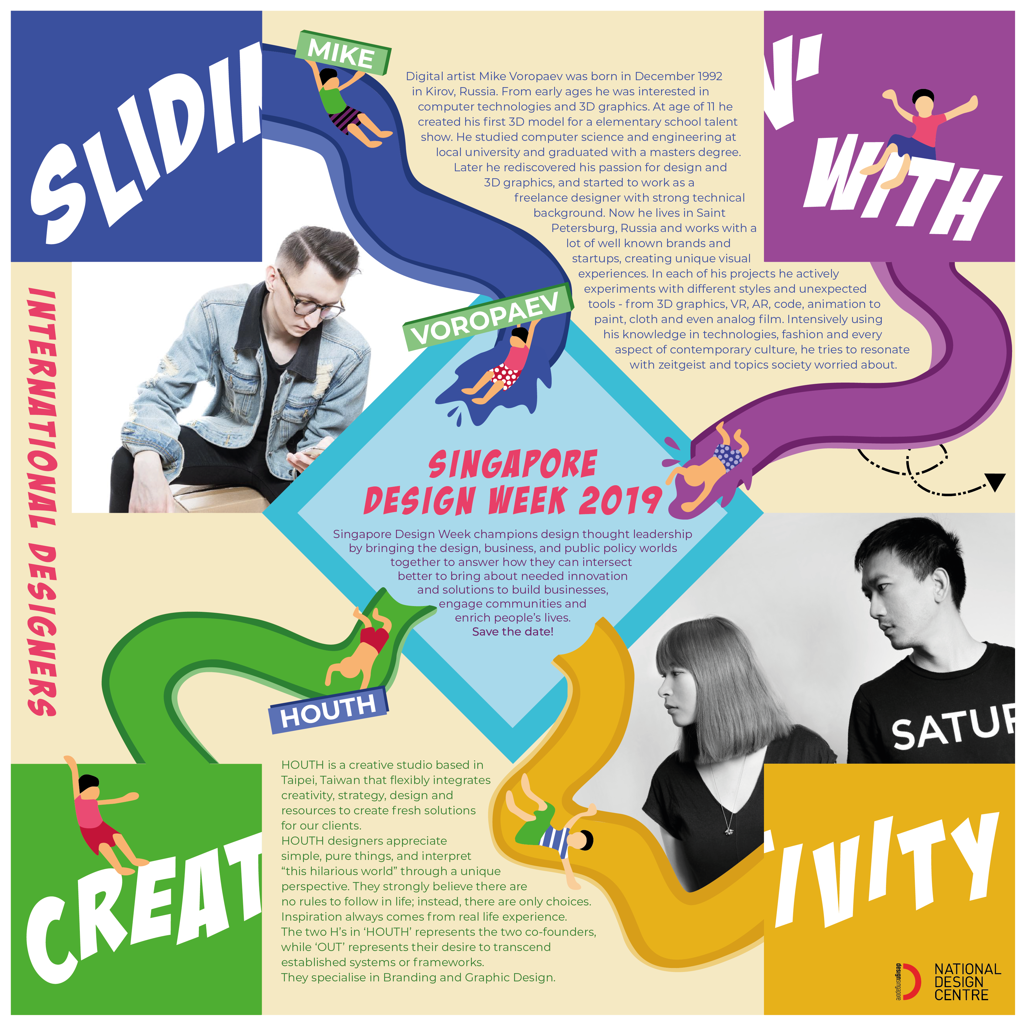
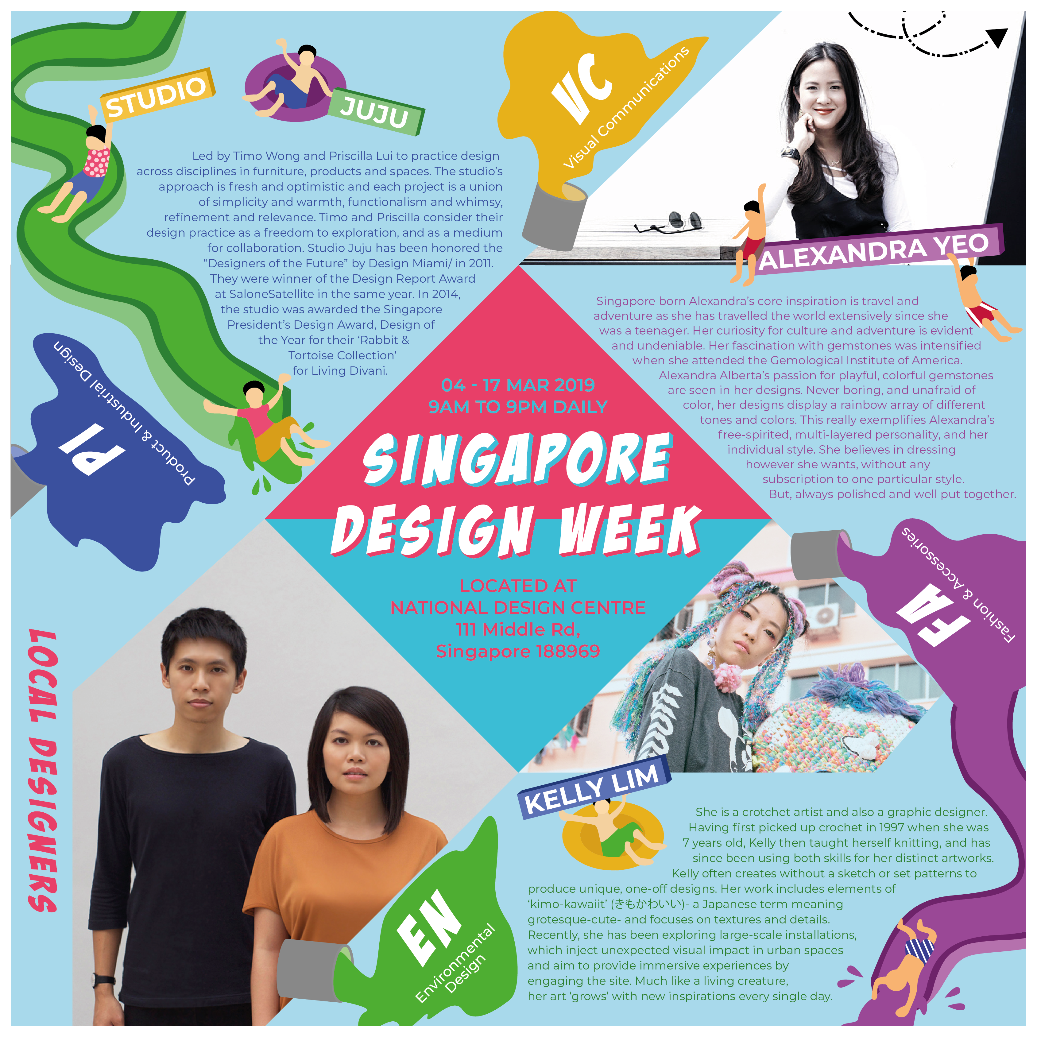
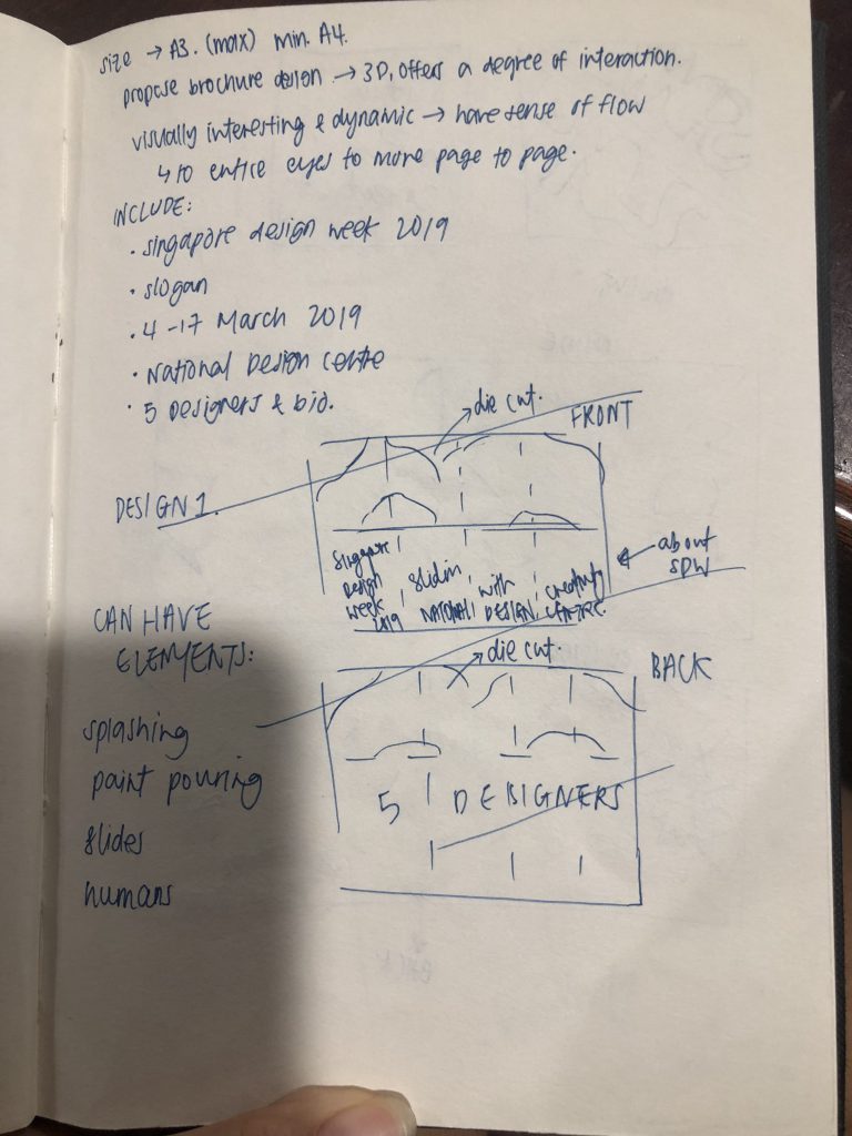
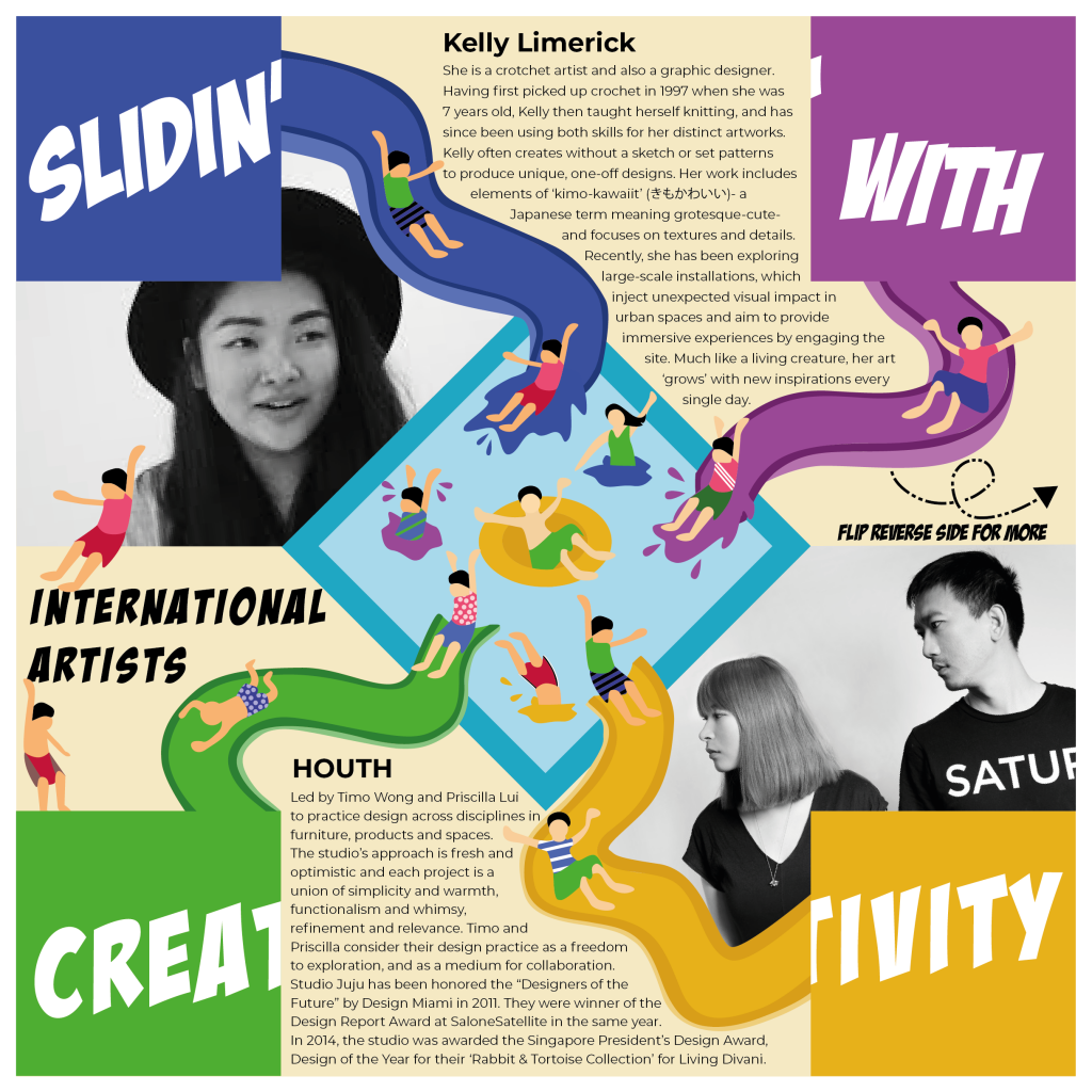
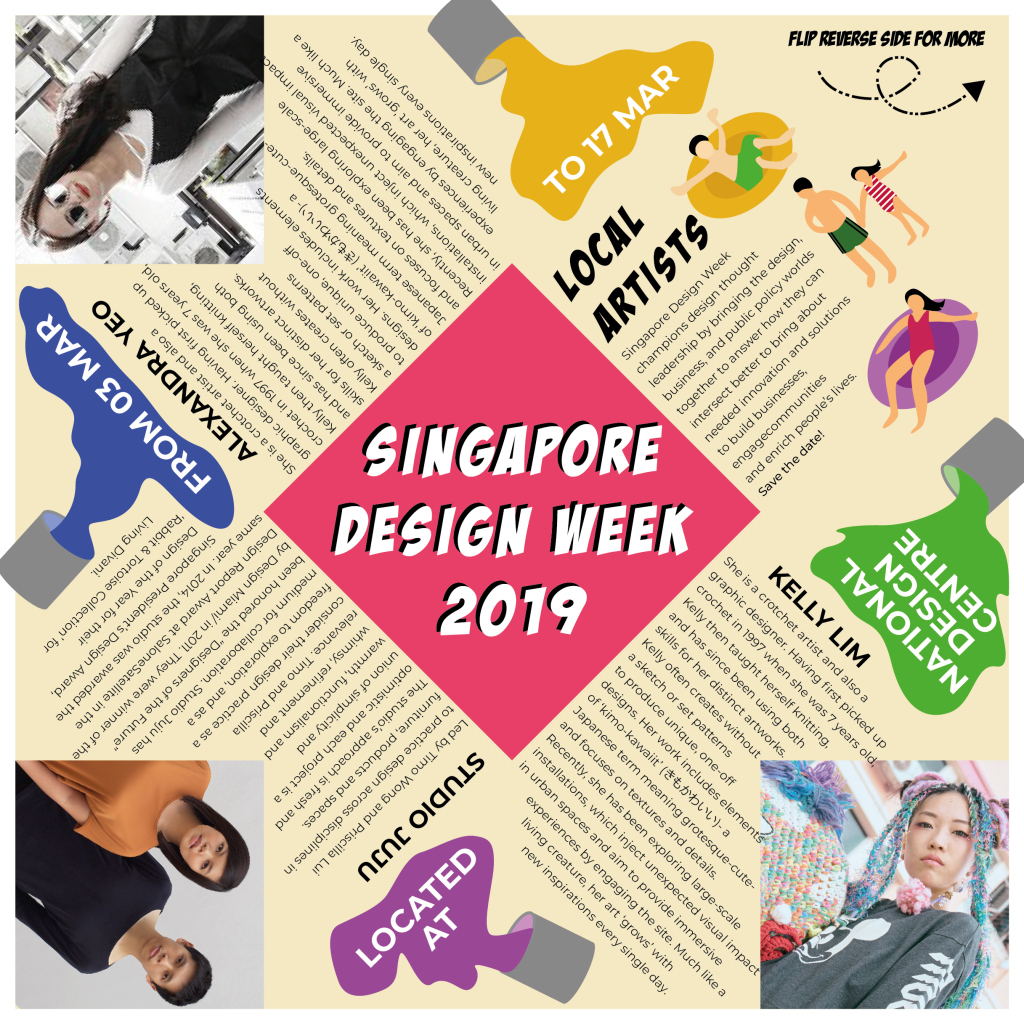
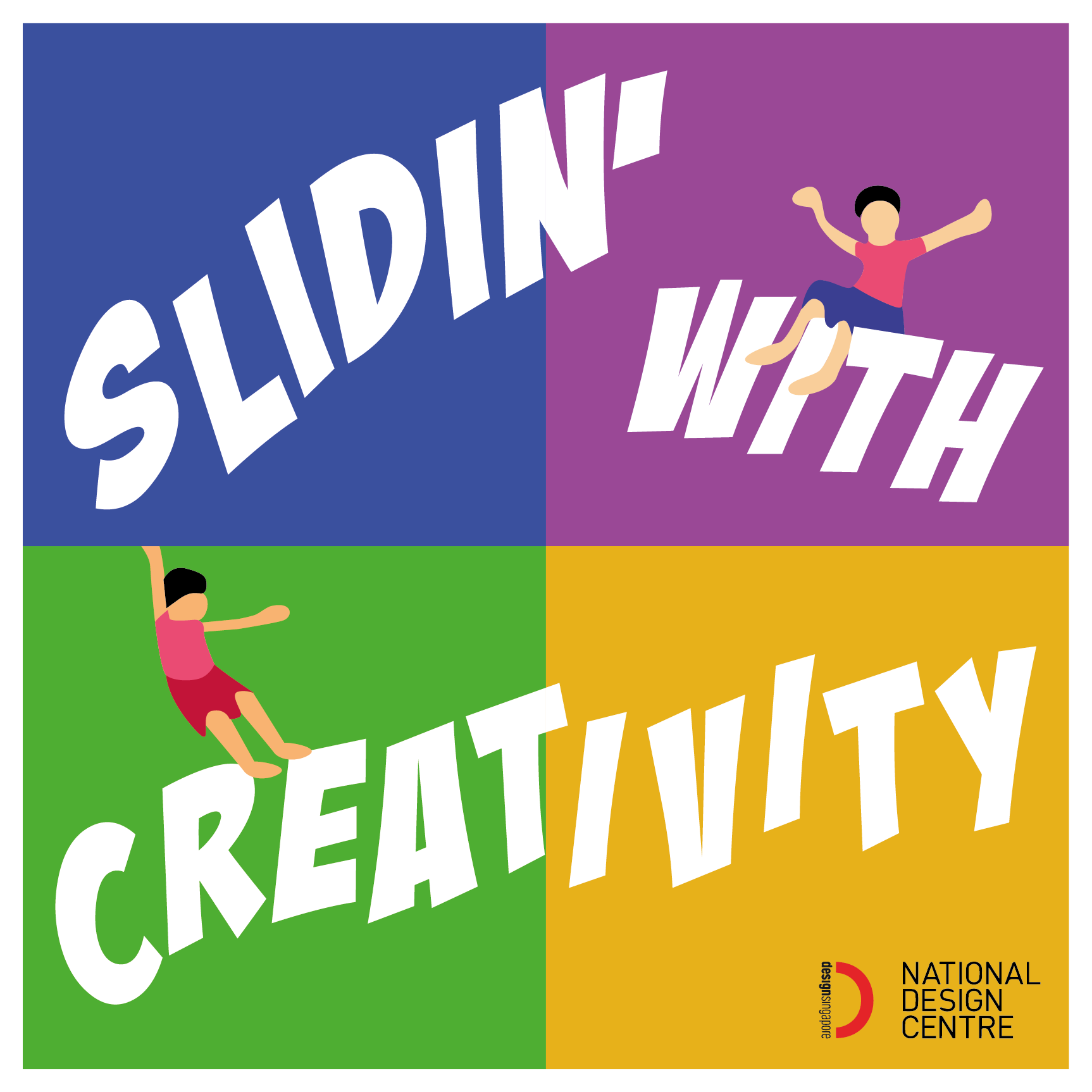
Task: To conceptualize and create a brochure that’s appropriate for the Singapore Design Week 2019.

Your poster should include the following:

  • Singapore Design Week 2019;
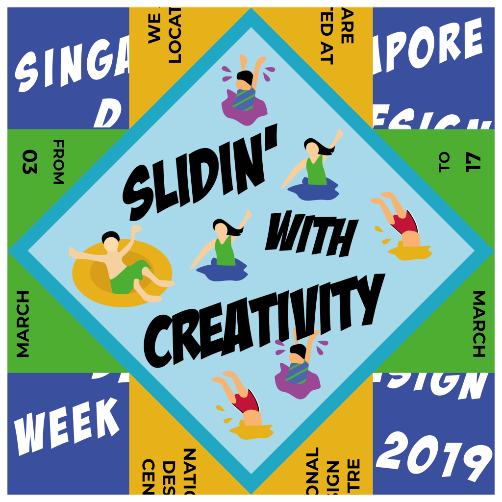
  • A Slogan (of no more than five words) that captures and reflects the aims of the event.
  • 04-17 March 2019
  • National Design Centre
  • Singapore Design Week champions design thought leadership by bringing the design, business, and public policy worlds together to answer how they can intersect better to bring about needed innovation and solutions to build businesses, engage communities and enrich people’s lives. Save the date!
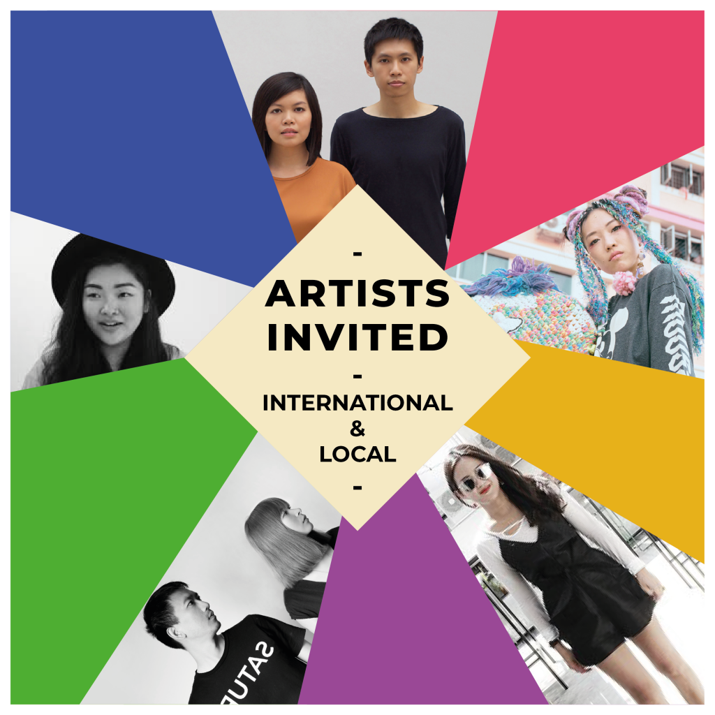
  • 150 words write-up each of 5 designers, 2 international & 3 local.

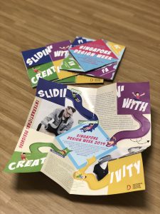
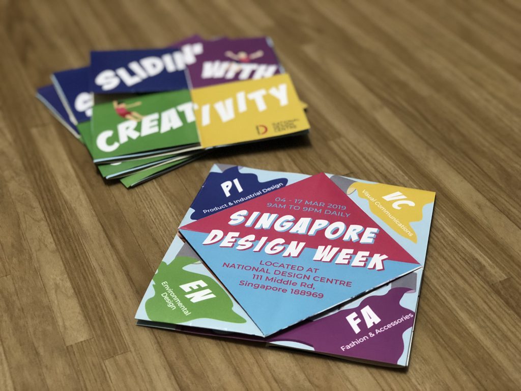
Here’s the digitalised version of the brochure and a video format.
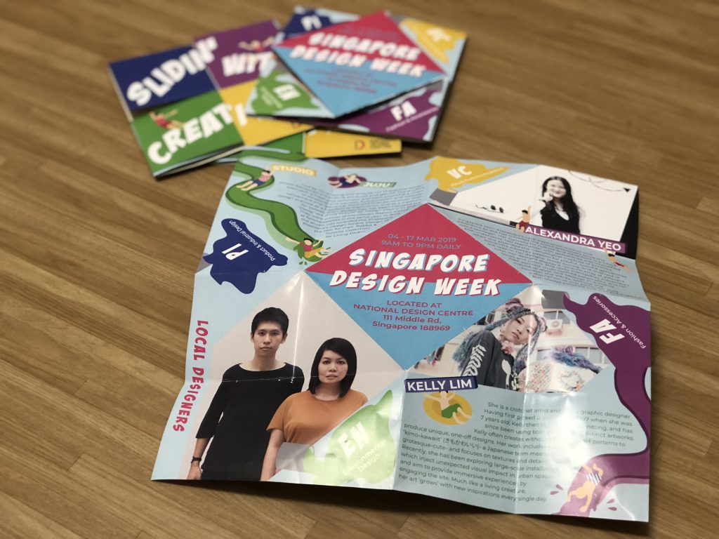
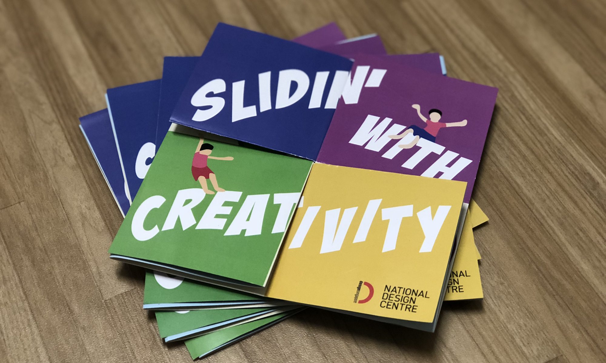
These are videos and pictures of the physical brochure.


Read here on my design process and my write-up for the designers!

VC1 | brochure five designers

VC1 | brochure explorations

Reflection on Assignment 2

Prior to completion, I had a really tough time trying to break out of the grids and the straight lines. I wanted a more interesting fold as I feel that something visually engaging and playful will work really well with a fun fold as well. However the fold restricted me in a manner whereby there are fixed places for certain elements and that got me caught up on how to incorporate the stuff I had to put inside in a manner where it’s cohesive too.

I tried to make sure of the 5 main colours to show cohesiveness between the 2 spreads – yellow, green, blue, purple and pink. By having 2 different background colours, I think that it brings out the contrast as well. I also unintentionally found out that there was another way to read the back spread (you don’t have to fully open the whole thing to read it’s damn sik!!!!)

ALSO, I realised that the fold might be a little hard for the audience to understand. While showing to the class, half my mind was afraid that people might not know how to fold it back!!! But thankfully most of them knew how to.

Feedback from classmates

Visually engaging, front spread the 4 coloured squares opening up to the bigger square and having the slides shows continuity. Brings our eyes to the communal area (middle section which is like the pool)
Fun elements that helps to make it more visually engaging.
Too much text, alignment of the text can be better.
Fold might be a little too complicated.
Although the slogan at the cover breaks when open, it still shows continuity.

Feedback from Michael

Way better than the consultation, issue that I had was resolved. To push the design further, can explore in having Singapore Design Week in the front (beige side) to have more “play” around like Slidin’ with Creativity.
Slides can be more fun as well, as the variations of the slides seem quite similar.
Can have more different curves.
Maybe can have the same colour treatment for the designers’ name.

Overall, I enjoyed doing up the project and if given another week or so, I think it will be a better work!

Till then,
Flazéda!
jamz
x

VC1 | brochure explorations

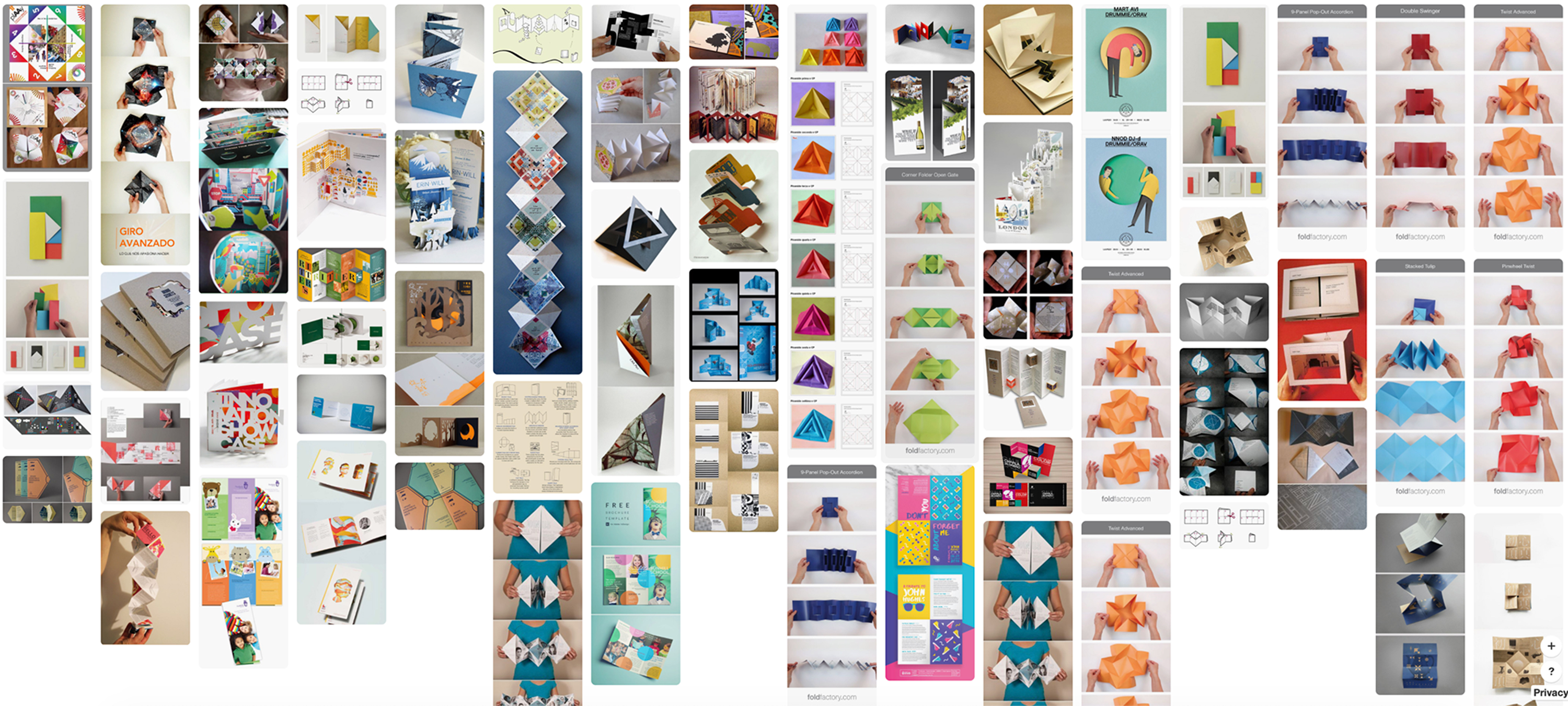
Before deciding on my final brochure design, I went onto pinterest to search for some inspirations!

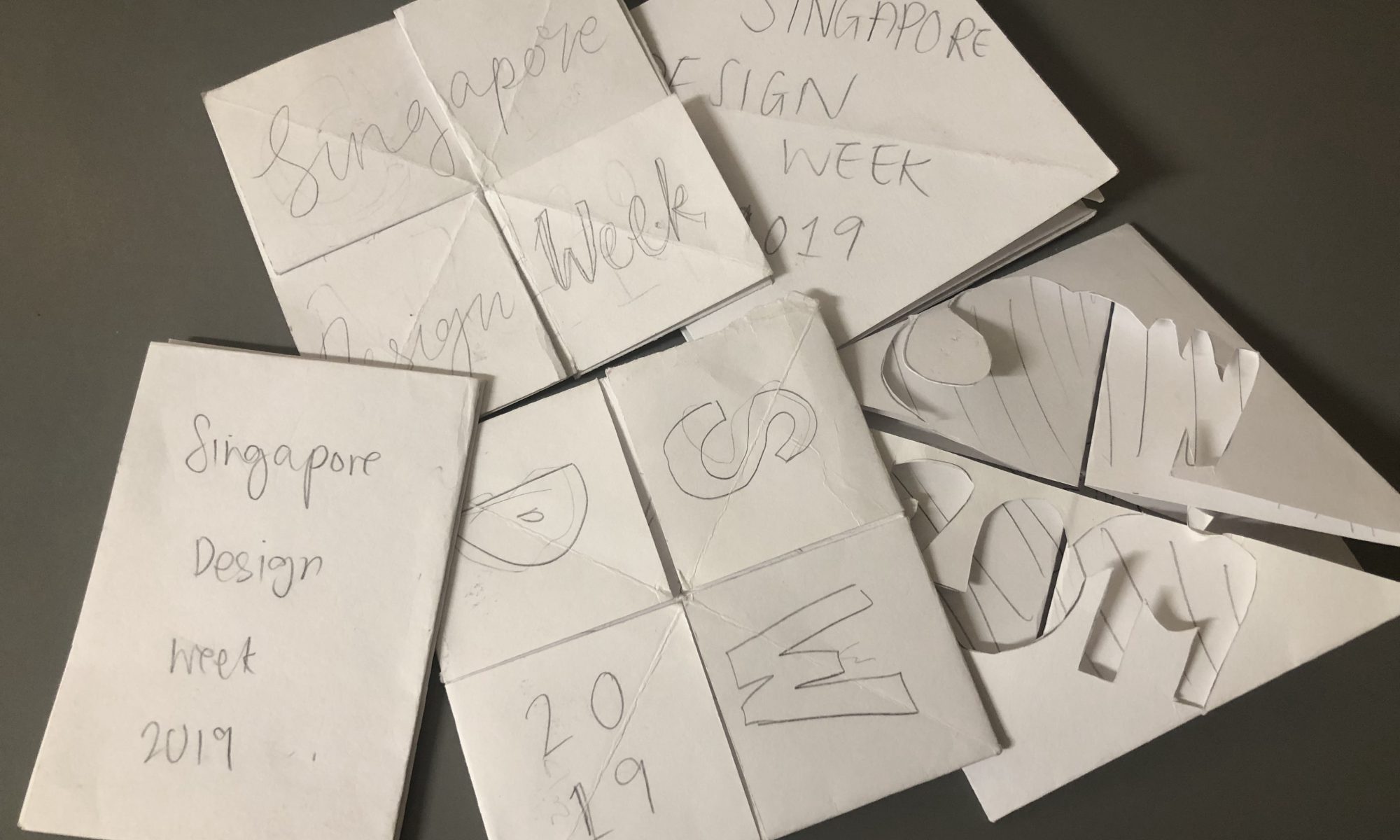
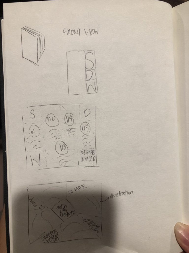
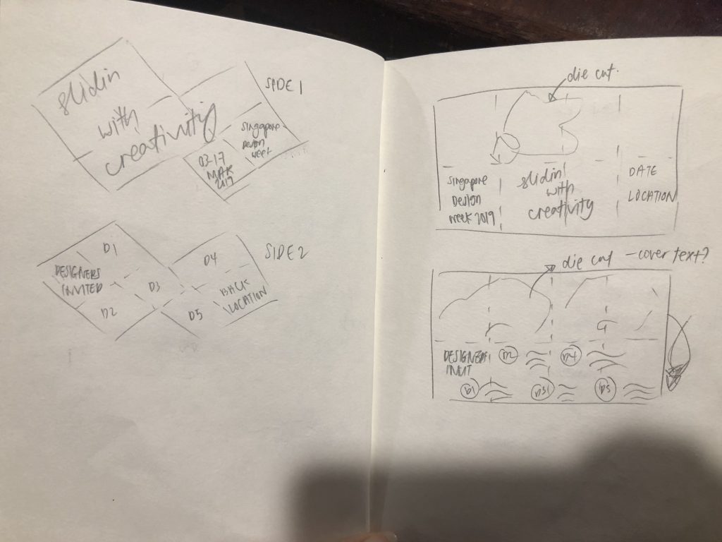
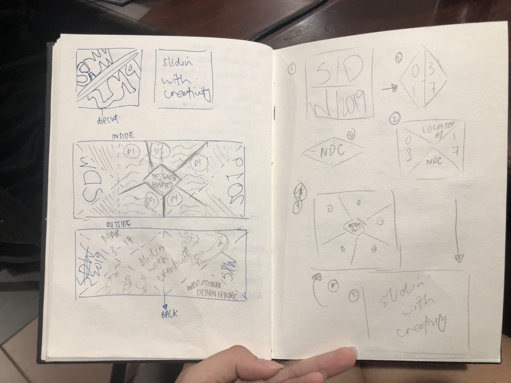
From there, I came up with 5 different designs which I felt that will suit my theme of “Slidin’ with Creativity”. These are just some sketchbook drawings!

Out of the 5, I think that the last 2 suits the whole theme more as there was a more “playful” vibe to it. The 4th design was a game many Singaporeans played during our primary school days and its does bring back a lot of young and fun memories! I asked around for opinions on which was better and many agreed that the last one suited the overall look more, while the other brings us back to younger days!

But I wanted to try both designs and see which worked out better thus I went to digitalise both.

Design 1

design 2

I had trouble trying to fit in 5 designers into a square, especially design 1 where  the design was binded the 4 paint elements – which I wanted it to be there so that when the brochure is closed, it can be seen.

design 2 was just a draft to show Michael how it will look like!

Comments from Michael during the consult

Scrap Design 2, design 1 is better.
Break out of the square grids, give the whole design more breathing space.
Can have more “fun” and “play” for the text.
Have the “Singapore Design Week” at both the back and front, with the date and information inside. Have the SDW write-up at the back diamond.
Tighten leading for international artists.
Make the humans smaller. BREATHING SPACE!!
Orientate to 1 direction. 4 paint buckets at the back, can have elements of SDW (PD, VC, etc)
Can have the humans holding names of artists.
Will be good to have colour contrast on both pages.

I went on to further develop my idea and came up with the final design!

Till then,
Flazéda!
jamz
x
GRAPHICFORM | overview

Project 1: hello! my name is

A typography assignment using our names to illustrate on 4 occupations. I used JAMZ, my nickname, and illustrated the jobs: Post-man, Lantern Painter, Hawker Centre Cleaner & Batik Painter, to address the issue of dying trades & jobs in Singapore’s context.

Click here for jamz :-))


Project 2: Locale – Zine

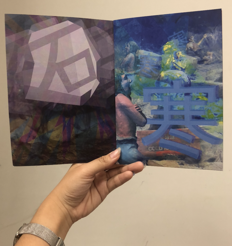
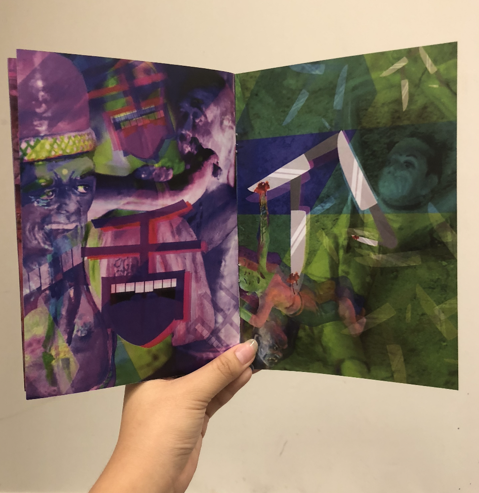
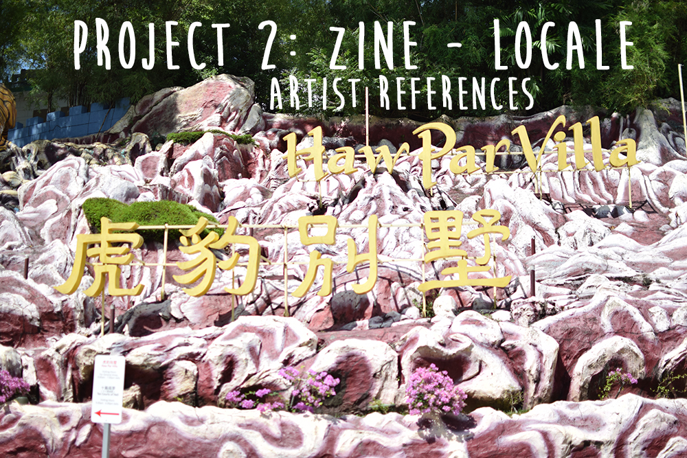
A zine assignment on exploring a local neighbourhood, and presenting it in an abstract manner. The location I worked on was Ten Courts of Hell, an attraction at Haw Par Villa, and I created a zine to illustrate the punishments of Hell.

Let your journey to Hell begin! >:-))


Mandatory shot with the assignments!!
Year 1 , Done & Dusted!!!

Till then,
Flazéda!
jamz
x

GRAPHICFORM | locale zine

ABOUT THE PROJECT:

To respond to a specific location in Singapore, expressing it’s uniqueness through an abstract graphic form.

Create an A5 Saddle Stitched zine with a maximum of 8 pages.

Let’s go on a journey to Hell!

CONCEPT

To focus on the effect that Ten Courts of Hell gives visitors, upon visiting that attraction. Tapping on to the creepy and scary vibe that Ten Courts give, to create an abstract zine that makes people hallucinate and trippy!

ART DIRECTION

I wanted to focus on the punishments without text, and mostly pictorial. However, I was afraid that just pictures will not reach out to viewers on the punishment, thus the addition of the Chinese words illustrations.

I consistently used a colour scheme for each page, and only at the back cover page, bringing them together. Trippy/hallucinating art style was also incorporated in the artwork.

Stone – Grey
Cold – Blue
Heart – Red
Boiling – Orange
Tongue – Purple
Knives – Green

LINKS TO:
RESEARCH

GRAPHIC FORM | LOCALE RESEARCH

INFOGRAPHICS

GRAPHIC FORM | LOCALE INFOGRAPHICS

PROCESS

GRAPHIC FORM | LOCALE – ZINE PROCESS

ARTIST REFERENCES

GRAPHIC FORM | LOCALE – ARTIST REFERENCES

Feedback from classmates:

Feedback from Joy:

It’ll be better to have consistency in the Chinese words illustration
Colours are working out better with one colour on each page, and it comes well together on the last page.
Strongest spread – cooking spread (spread 2), which incorporates the mural & words.

Personal Reflection:

Overall, I had really mixed feeling about the zine that I’ve created. I felt that I could’ve done way better than what was produced, but I couldn’t think of other ideas to make the zine abstract.  There were many ideas floating around in my head, but none of them seem to tick the checklist of “abstract”. But, thankfully I didn’t give up!! I decided to start working randomly till an idea got to me, which I stuck with it through! Making a zine sure isn’t easy, as there are many pages to take care of, and it is very important to be consistent – something I’m not very good at. After many trial and errors, I finally got my zine to come along together and I’m just glad that at the end, it all (kinda) worked out well! Super hyped that I managed to create something I can call my own, from scratch, and I got to learn more about zine-making!

About 60% happy with my zine :’)

Fun fact: showed my mum my zine and she had goosebumps viewing it halfway, and didn’t dare to finish it HAHAHA.

Assignment 2, Completed!!

Till then,
Flazéda!
jamz
x

GRAPHICFORM | locale artist references

I was greatly inspired by trippy art to create my zine, as I wanted to give people these reactions:

“what just happen”

“my mind got blown”

“so creepy”

thus I went to my trustworthy site – Pinterest to get some inspirations, and here’s what I got!

I realised they usually have very vibrant colours, and sparks at random places. Tons of overlay was used also to create the effect of messy, random.

pinterest : jvnxie ☹ ☻
Image taken from https://i.pinimg.com/564x/d7/e5/d9/d7e5d963de7f4aa413a1939cea1f4bcd.jpg
Image taken from https://i.pinimg.com/564x/b1/05/83/b10583c7f4f5ec3ad88bee638081847a.jpg

From this, I went ahead to experiment my own style of trippy art!

Chineasy is a publication that I saw on Ted Talk! The artist, ShaoLan Hsueh, a Taiwanese based in London, came up with easy pictorial way to teach children Chinese, in a visually engaging manner!

Home

She incorporated the Chinese words into the form itself and it was easier to learn those words, especially for kids and visual learners!

ohmyasian: “2114. Chineasy by Shao Lan Hsueh. Cute drawings to help you remember some easy chinese characters! ”
Image taken from https://i.pinimg.com/564x/a1/23/79/a123797751633f41a3c1f502d149173d.jpg

I was greatly inspired by her work to come up with mine as well, not to teach Chinese, but to inform my zine’s viewers about the punishments in Ten Courts.

I didn’t want to include chunky text as description, and just wanted something sweet, simple, yet have other meanings to it.

Chineasy-14
Image taken from https://i.pinimg.com/564x/3b/af/1e/3baf1ea48bb048e98216e703371f417d.jpg

Some illustrations done by her!

Therefore, I did up illustrations of a few Chinese words, and that really aided me a lot in my zine!

That’s it for my art references!

Till then,
Flazéda!
jamz
x