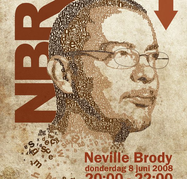
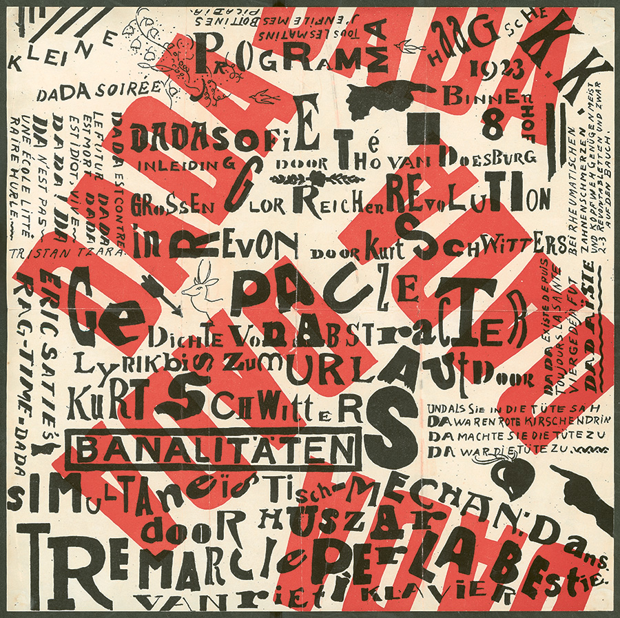
My initial impression of Neville Brody’s work was that it heavily resembled works from the period of Dada, whereby there is exensive usage of clipped graphics, shapes and even fonts. I can see why his designs were unconventional to the point whereby he was continuously failed in art school.
His work effectively tethers on the line of breaking the rules of typography and creating something revolutionary. I agree with his statements given on his lecture of how as commercialism continues to grow, the essence of our designs have to be reduced down to the point whereby its primary functions would be to attract attention and convey a message.
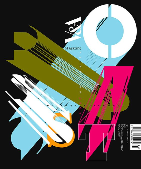
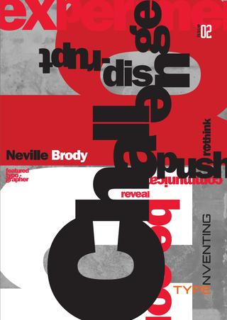
In this design, Neville aimed to create depth through layering and using a 2D space. The abstract strokes in this layout is definitely striking and resembles post modern design, whereby there are many sharp edges and striking colour to capture the readers attention.
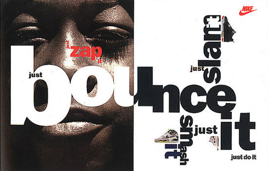
This poster is able to highlight the dynamism of using nike shoes, in an extremely unconventional way whereby there is the use of a variety of kernings and leadings which may give of an unpleasant aesthetic.
In hindsight, to become a revolutionary, the unconventional and bold has to be done – ones that are not afraid to lose what they have. Which is why there are so little of these brilliant people around as they have the ability to revolutionize and change the landscape of graphic design as we know it.