Category: History of Design – G2
History of Design [ VC ] – Bauhaus
![History of Design [ VC ] – Bauhaus](https://oss.adm.ntu.edu.sg/ytan149/wp-content/uploads/sites/1883/2018/11/Creative-Responds_Bauhaus_featureimage.jpg)
When I think about shapes and colours in Singapore, the first thing that came to mind was Playgrounds. Looking at the example I found, a playground at West Coast Park, you can see the use of basic shapes and primary colours used in the structure in accordance to Kandinsky’s colour theory. Not all of them follow his rules but you may see the round roofs and stepping ‘stones’ are blue, the pillars are red and those hexagonal bars are yellow. In my creative response, the composition may be the plan view of a playground. Instead of using yellow as the dominant, I used red because it was favoured by Bauhaus the most.

In-class Assignments 1:
In-class Assignments 2:

History of Design [ VC ] – Art Nouveau

Art Nouveau is known for its organic curves, flowing lines, repetitions and decoration. The style is romantic with a sense of grandeur and fantasy. It uses many elements from nature such as floral and fauna. Thus I chose the canopy of a tree as the base of my creative respond. I cut out the most distinct branch from the image, replicated it and started to rotate and flip in all directions; while making sure that the lines were continuous and smooth.

The pattern created not only reminds one of the painted glass windows of a church, it also brings to mind the skylight of the Rendezvous Hotel at Bras Basah.

In-class Assignment 1:
In-class Assignment 2:

Out of all of William Morris’s Textile patterns, this one stood out to me the most. The warm use of reds and oranges, contrasting against the dark black background, gives off a warmth feeling. The different types of flowers seems to be celebratory of some kind which reminded me to Chinese New Year. When compared with the pattern of Chinese Embroidery, the similarities are self-explanatory.

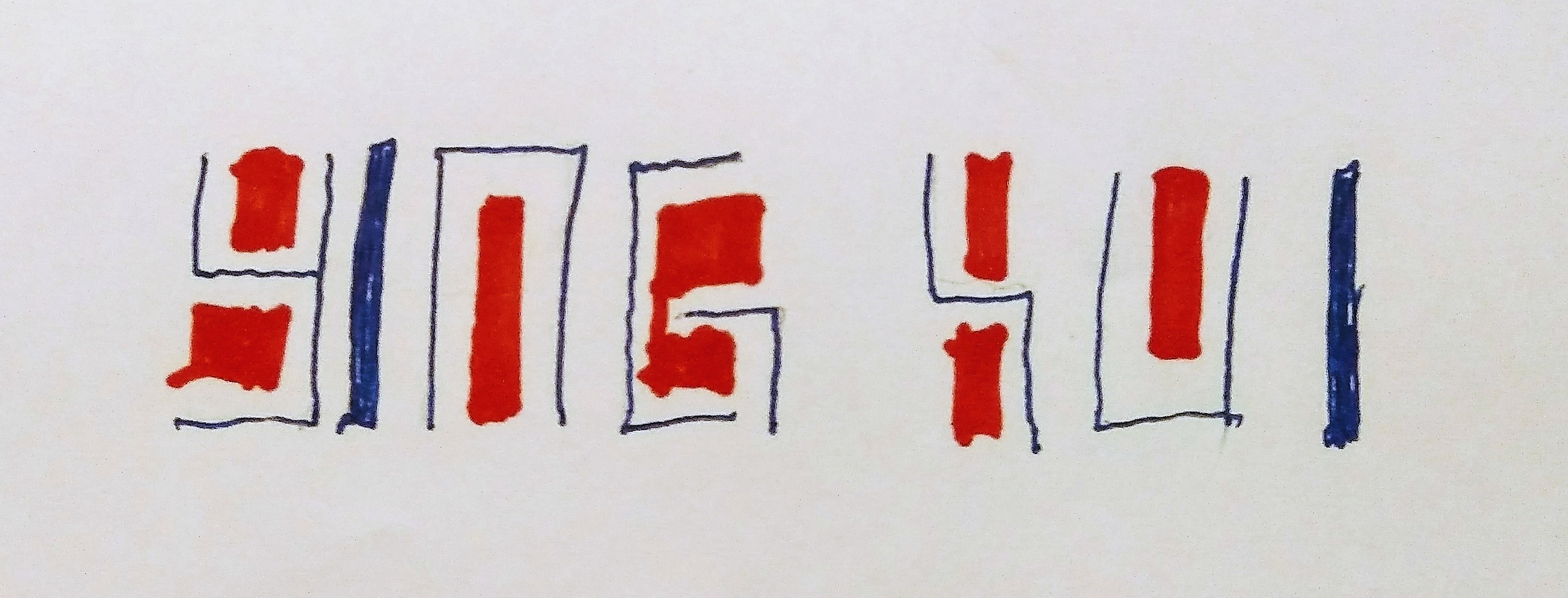
History of Design [ VC ] – Rebus
My Name:
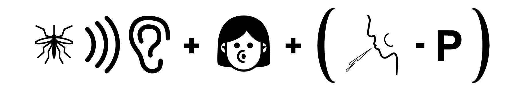
Sound of a mosquito (ying~) + Blowing out air (hoo) + [ Spitting (Pui!) – P ]
In-class Assignment 1:
In-class Assignment 2:
Reference Images from Noun Project:
Spitting by Richard Cordero
listen mosquito by corpus delicti, GR
Blowing by AomAm, TH
History of Design [ IM ] – HYPERESSAY
![History of Design [ IM ] – HYPERESSAY](https://oss.adm.ntu.edu.sg/ytan149/wp-content/uploads/sites/1883/2018/10/12.jpg)
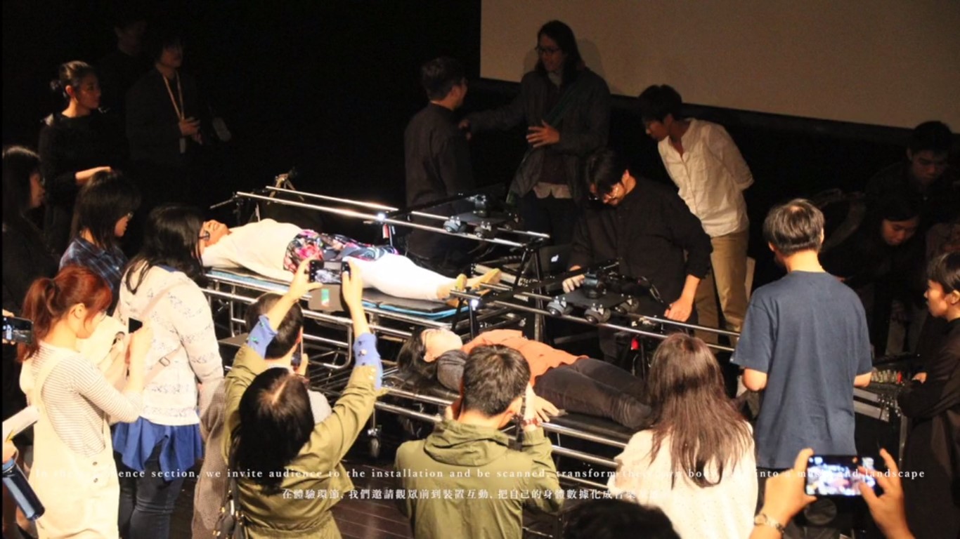
Soundscape of Body was created by Hong Kong New Media Artist – Keith Lam, for the 2018 Body Donation Day by the Body Donation Program of the University of Hong Kong. The piece was specially choreographed to bring awareness to the relationship between life and death.
As the artwork comes in two parts, there are two sets of experiences – the first being the performance, the second being the audiences’s own trial with the body scanner. Associative thinking comes into play as the artwork provokes thoughts about the value and meaning of life and our body; which will be further discussed in the immersion section.
The experience in the first part of Soundscape of Body may be constant for every person but how each person perceive it, is different. Each individual had lived different lives, some might have lost a love one, others might once have been close-to-death. The way each reflects on the subject of life and death is variant, adding on to the plurality of the outcome on top of the indeterminacy of entropy; caused by the subject’s freedom of movement.
However, unlike Variation V, Soundscape of Body is less about Entropy and more about the message received. It is obvious that the second part of the event stands higher on the interactivity scale which results in a change in the role of viewer. From being a passive viewer of a performance, to an active participant of your their creation. In spite of the change in perspective, it is still a very sensual piece of work, onstage and offstage; more so onstage when they are under the scanner.
We may suggest that such posture is one common in life and death. Especially when the scanner forces the participant to lay down flat, in a rather unnatural stiff way as if they were in a coffin. Even though the bed on which the participants lay is not constrained, the scanner above somehow makes one uncomfortable and shrinks within range of the scanner. Thus willing to the catalyst of behavioral art.
When looking at the performance as a whole, the artwork carries similar mechanics to John Cage’s Variation V. Both artworks are relies on the movements of the human body and vice versa. It is a interdependent relationship. “A retroactive process of human involvement, in which the artifact functions as both matrix and catalyst.” as stated by Roy Ascotts in his essay – Behavioral Art and Cybernetic Vision. Matrix being the Processing and Arduino system and catalyst being the visual and sound output. This two factors combine to create behavioral art, where by the experience of ‘viewing’ the artwork is no longer one dimensional.
Though majority of the artwork resides in Interactivity, there are elements from Hypermedia and Immersion too. A part of the experience includes viewing your own and other audience’s Body Soundscape online, ready for download and online sharing.
There is awe when visiting the site as the soundscapes deconstructs the body into abstract representation of graphs and unfamiliar sounds. They bears the same impression of collective narrative from Shelly Jackson’s SKIN project, where a story is told in a form of tattoos on 2095 volunteers; each holding one word to the story. If one of these 2095 people were to die, the story would be incomplete; going back to the value and meaning of life and death. It is a massive web made of connections in which you sense when replaying the soundscapes, seeing the vibrations of others lets one in to their astral space. It is almost spiritual as one ‘touches’ a another’s core of existence.
Keith Lam himself had mentioned his preference for tangibility in his work at an interview. He says that physical form adds a different aspect to an artwork; “Something direct, real, and perhaps a formal way of communicating with our audience” and that “virtual reality should be used out of the of necessity in creating un-real things”.
It is true that VR now has the ability to immerse the user, mimicking close to reality. But as Keith Lam mentions, it is not the only way and should be used only when necessary. Without the use of VR, he is still able to incorporate a rather strong immersive experience for the audience as presence is psychological; perceived in your personal mind space.
For more details on the Artist: https://oss.adm.ntu.edu.sg/ytan149/hyperessay-keith-lam/
For more details on the artwork: https://oss.adm.ntu.edu.sg/ytan149/hyperessay-soundscape-of-body/
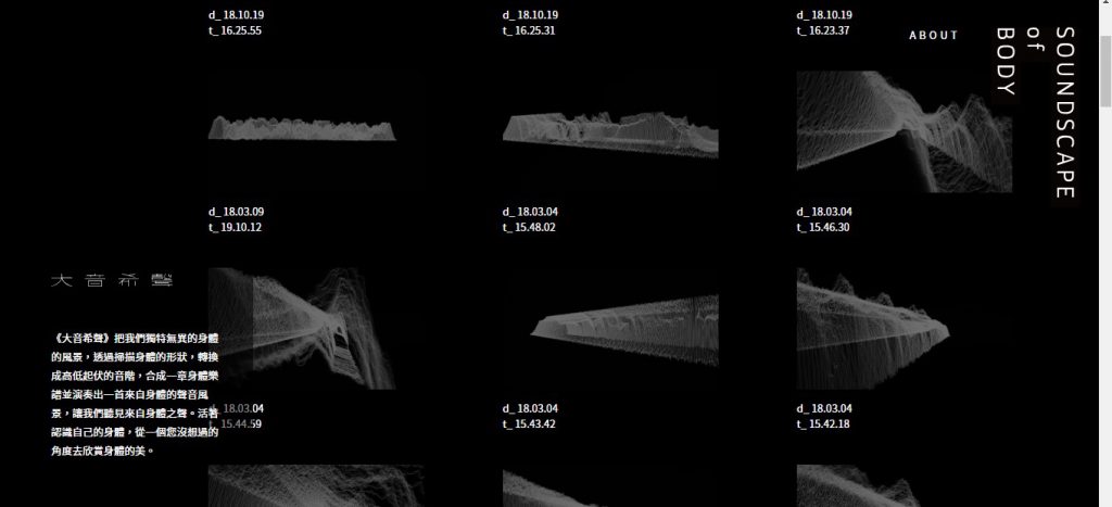
History of Design [ IM ] – Soundscape of Body
![History of Design [ IM ] – Soundscape of Body](https://oss.adm.ntu.edu.sg/ytan149/wp-content/uploads/sites/1883/2018/09/8.png)
Soundscape of Body (大音希聲) was a recent performance created for the 2018 Body Donation Day by the Body Donation Program of the University of Hong Kong. It was choreographed specially to introduce the audience to “life and death education” while provoking thoughts about the value and meaning of life and our body.
The performance works by scanning the body using low energy lasers, then translating the readings into music and lights. It was designed to bring a new perspective to how perceive the body, transforming flesh to soundscape; it reflects the body’s nature and relationship with our life.
“The largest square has no corners. The greatest vessel takes the longest to finish. Great music has the faintest notes. The great form is without shape.”
Tao Te Ching, chapter 41
Keith Lam talks about natural raw building blocks (hair and skin etc) and uniqueness of each body – different shapes and sizes. The form are like “mountain ranges and coastlines”, thus a landscape which can also be read as a musical score. The concept makes this performance is very similar to John Cage’s Variation V as it used the same idea of the human body as the subject to produce sounds and projection.
Performance Process
The audience are first introduced to a body as the dancers enter the scene, wandering among them, wearing only bodyline.
When the dancers lie down on the bed, the lights turned off followed by the start of the audio and visual projection.
The bodies are scanned twice each to generate the music and visuals one by one. They start with subtle movements “with the idea of exploration” before making bigger movements beneath the scanner; starting with the fetus position signalling the start of a new life.
Different speed and volume of movement generate different layers and rhythm of audio and visual. The musician (people that control the system) and dancers coordinate to allow wider gestures such as sitting up.
As the end approaches, the performance reaches its peak and becomes more intense. The strong and fast change in movements leads to more layers that are louder and stronger before a diminuendo to calm and peaceful movements.

You may watch the video here -> http://dimensionplus.co/sob/gallery/20180304/154459/
At last, the dancers rises from the bed after the music fades out, turning to watch their own body soundscape.
After the performers leave the stage, a voice over leads the audience to feedback and rethink about our own body with expressive arts self exploration process and to think about life.
The ending script is as follows:
Life creates stories,
and our bodies contain all these chapters,
none of our bodies are the same,
every life is unique …
And now…I’d like to invite you to notice your breath,
with an appreciating heart,
notice the rhythm of your heartbeat and your pulse,
listen to the message from each and every single part of your body,
(1 min)
and now… (House light fades in)
in your house program, there is a sheet with the outline of a body,
if that was your body,
what kind of picture/landscape would you draw in this body?
(5 mins)
Life is precious,
For sure our bodies are worthy,
and even when we reach the end of our lives,
our bodies are still precious.
Reflection:
This performance is quite a lengthy one, about half an hour. A very slow burn process to immerse the audience into a ‘meditative’ state where they can tap into their own existence. The ending script uses phrases similar to “you are breathing manually” to awaken your conscious awareness of your body functions that are usually natural and done without your control.

Reference:
History of Design [ IM ] – Keith Lam
![History of Design [ IM ] – Keith Lam](https://oss.adm.ntu.edu.sg/ytan149/wp-content/uploads/sites/1883/2018/09/Keith-Lam-Feature-Image.jpg)
Keith Lam, 林欣傑, a New Media Artist from Hong Kong.
As a new media artist, can you create without electricity? I think the question raised in the video is worth pondering. In the video he talked about stepping outside your comfort zone and searching for new approaches. If you cannot create outside of your field, then it is your creative process that needs to be reviewed. The materials should not be a burden.
He is interested in the boundaries between technology and art and is very open to integrating ideas from different disciplines, forming ‘mutant’ projects as well as cultivating the T-shape designer instinct in his students.
He explains his preference for tangibility when being asked “So you Prefer Something more tactile in your art?” in an interview. Stating that physical form adds a different aspect to an artwork, “something direct, real, and perhaps a formal way of communicating with our audience”. There is a disconnection between the content for VR and its usage. He says VR is uneccessary unless you want to create an experience that cannot be created in real life. In his opinion, “virtual reality should be used out of the of necessity in creating un-real things”.
As New media refers to the means of mass communication using digital technologies such as the Internet, Keith Lam associates with the label as he plays with the interaction between user and modern technology.
Awards:
PRIX Ars Electronica, Japan Media Arts Festival and Young Artist of Hong Kong Arts Development Awards, selected as “40 under 40′′ of Global Creative Talent by Perspective Magazine.
Invited Festivals:
Ars Electronica Festival, FILE, ISEA, New Technological Art Award, 404 Festival, Split Film Festival, Microwave International New Media Arts Festival and Hong Kong Arts Biennale, around the world at Austria, Belgium, Brazil, UK, The Netherlands, Italy, Japan, Argentina and Taipei, etc.
Teach:
External Examiner of Hong Kong Design Institute, Visiting Associate Professor of Guangzhou Academy of Fine Arts, Art Director and consultant of Shenzhen New Media Arts Festival. He taught at the School of Creative Media of City University of Hong Kong, Visiting Lecturer of Hong Kong Art School, Hong Kong Academy of Performing Arts, School of Design of The Hong Kong Polytechnic University and Hong Kong University, University of Hong Kong and Chinese University of Hong Kong. International Jury of GDC.

He founded Dimension Plus, a New Media Creative Studio, in 2009 with Escher Tsai. Their works revolves around New media spaces and cross-discipline interactive design; experimenting with new ways to enhance the communication and experience between the product and user.
“In the digital era, we still believe the sense of existence while we are living in the real world. By mixing-and-matching of Digital-Physical, we transfer the invisible and digital into a tangible and visible texture, creating works with combination of digital and analog, linking the digital and physical from two heterogeneous dimensions.”
Dimension Plus is recognized worldwide as they are often exhibit in expos and art festivals etc in various of cities and countries including Italy, Austria, Japan, Beijing, Shanghai, Guangzhou, Hong Kong, Taiwan, etc.
They have also earned multiple awards all over the world including Gold Award of DFAA2013 (Design For Asia Award 2013) and Asia Digital Art Award 2012 at Japan, etc.
Under Dimension Plus, there is the Maker Space LAB and common room & co. (a collaborative cultural space that consists of a makerspace of LAB by Dimension Plus and an independent bookstore, Book B). These spaces allows the community of creatives to gather, share and exchange ideas; connecting people from various kind of discipline for more organic discussions.

Reference:
http://dimensionplus.co/en/index.html
https://www.fablabs.io/labs/labbydimensionplus
https://www.facebook.com/commonroomandco/
https://onu.is/blogs/inside-out/hong-kong-interview-with-keith-lam
http://journal.the-readymade.com/post/157938292379/keith-lam-new-media-artist-touch-the-city
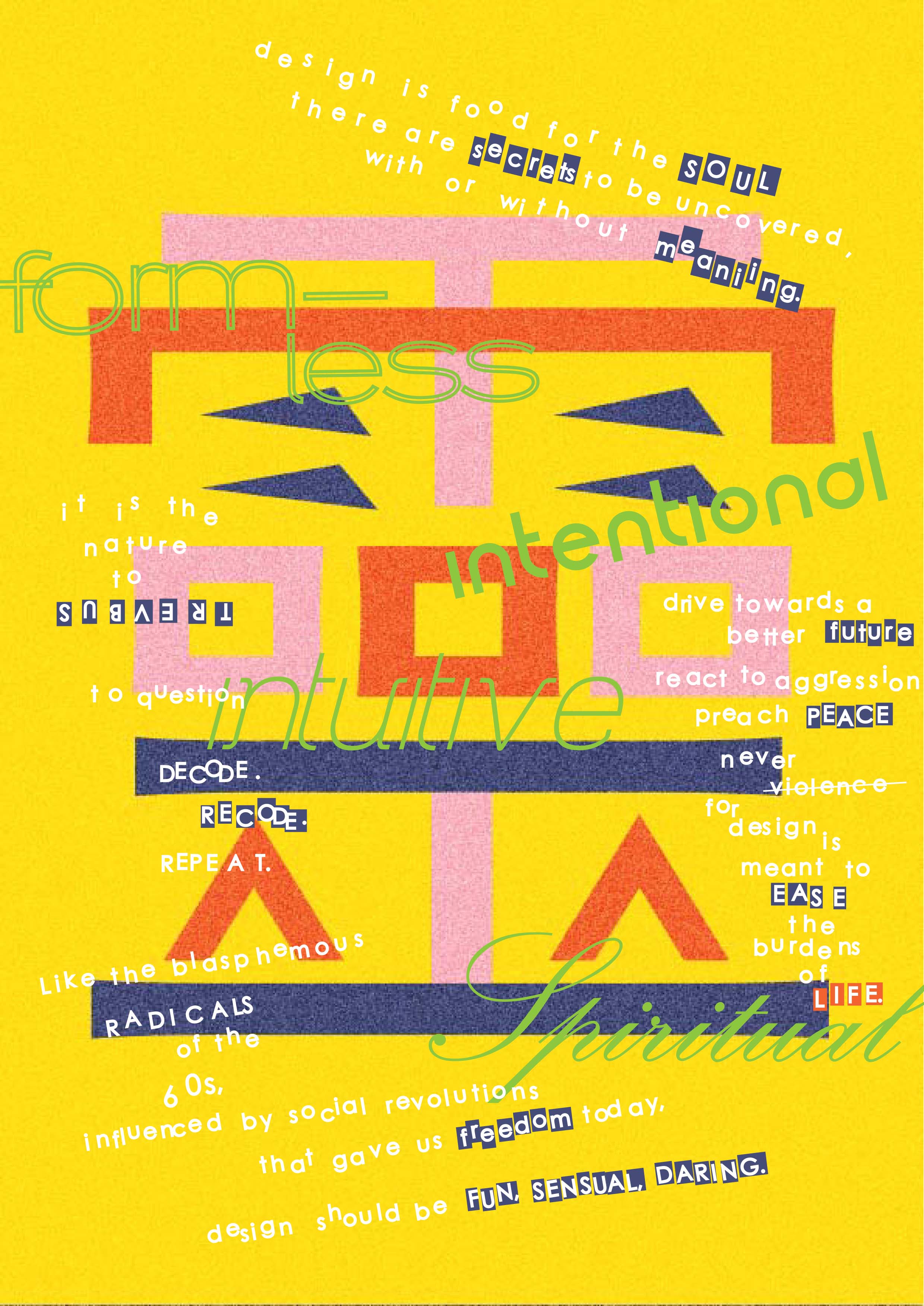
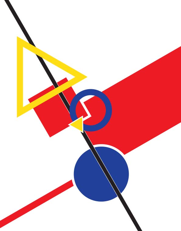
History of Design [ PD ] – Memphis & Postmodernism
The Memphis movement is characterized by the aesthetics of the Memphis Group, an Italian postmodern design collective. (Artsy.net.) Despite its name, the movement originated from Milan, Italy where Ettore Sottsass founded the Group in December 1981. (Feroleto, 2010) He gathered several other Italian designers, architects, and writers who all shared the same ideals, to discuss and redefined the Modernist-dominated 20th century design principles. The term ‘Memphis’ came from the Bob Dylan song – “Stuck Inside of Mobile with the Memphis Blues Again”, that played during that first meeting.
The Bauhaus and Modernism movement preached about form after function, stripping design to its bare minimum to create timeless beauty and as renowned architect Mies Van De Rohe states, “less is more”. However, according to Sottsass, “Functionalism is not enough. He felt that design should be sensual and exciting”. (Howarth, 2015) The Memphis Group viewed the Modernist’s minimalist approach to be void of personality, individualism or to put it simple, lifeless; in Robert Venturi’s words – “less is bore”. (Bisset, 2013)
Memphis members were sick of the uniformity and strictures of contemporary design and worked to redevelop a new way, inspired from previous movements such as Art Deco and Pop Art, as well as 1950s Kitsch styles and futuristic themes. (Bisset, 2013) Freed from the rules of Modernism, the Memphis members became open to experimentation; playing with every element possible. They wanted to bring back fun and excitement into design and first presented their ideas at the 1981 Milan Furniture Fair, in a display of preposterous-looking furnishings that mocked the presentations of ‘Good Design’, modernist’s functional approach. (Bisset, 2013) Memphis was hated at first, being described as “a shotgun wedding between Bauhaus and Fisher-Price”. (Howarth, 2015)
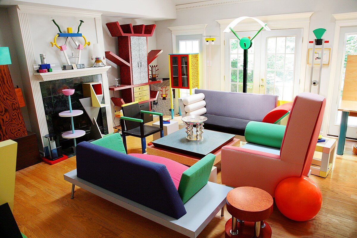
The distinct characteristics of the Memphis Group include bright colours, Kitsch styling and geometric forms. The playful design language clearly manifested their aim with the use of bold expressive texture, colour, unorthodox shapes and contrasting materials. (Scott, 2017) Other than creating cartoonish, wacky and whimsical appearance, the Memphis members also favoured the use of ‘inappropriate’ and cheap materials, especially plastic laminates for its ‘lack of culture’. (Feroleto, 2010) The vibrancy, eccentricity and ornamentation opposed the modernist ideals; breaking the barriers between high and low-class design. (Feroleto, 2010)
The Memphis movement also made design more flexible, revolving around change as Sottsass left the group in 1986 stating that the only way for a design group to keep evolving was for its principal members to leave. (Bisset, 2013) This attitude for constant transformation resonated best in the 60s when the post-war baby boom after the second world war led to an unprecedented number of teenagers and young adults in the 1960s. The sudden hike in younger population meant potential new audience and business opportunities for the fashion and media industry, who turned to the art world, seeking ideas to attract the attention of these youths. (International School History, 2015)
The Pop Art movement was known for its use of bright colours, bold forms, plastic and repetition. Pop artists were inspired by mass consumerism, popular culture and explosions of popular prints that attracted the youth market. Prior to the Memphis movement, Pop artists emphasized on fun, change, variety, irreverence and disposability; openly questioning the precepts of ‘good design’, rejecting modernism and its values. They too favoured low cost, poor quality materials which followed their idea of expendability over durability; aiming to blur the boundaries of fine art and commercial art.

Pop Art being at its peak in the 1960s, brought about the loud and boldness of that period; claiming to be cheap, pop and instant. With the industrial revolution’s third comeback, came a big market of ready-to wear clothing from more efficient mass production and new synthetic materials from the inventions of new technology; clothing became cheaper and more affordable for the masses. (Galliano, 2003) Other than that, futuristic ideas were also marketed to excite the young people, killing off the “rules” of the 50s as designers began to create scandalous new styles. (Galliano, 2003)
This era of peace was accompanied by its own chaos. As baby boomers were the first post war generation, they were allowed better education, mobility and independence which fuelled their self-confidence that resulted in their defiant attitude. (International School History, 2015) More people were able to enrol into universities, getting higher education and becoming increasingly aware of social issues around the world such as war and starvation. (International School History, 2015) Globalization and music spread word of freedom and when the Vietnam war began, these idealistic youths reacted very strongly creating social discourse that we now call the Student Movement.
Students all around the world went on strikes, some dropped out to protest passively; forming the hippie culture. While others challenged the universities’ authority, reformed the rules and took over their schools to promote, freedom, revolution and a better future. The radical changes preached by the Student movement inspired many other campaigns such as the consumer revolution, workers rebellion, black identity, environmental movement, women’s rights, lgbt etc. (International School History, 2015)
In tandem with the Pop art movement was the Anti-design movement, also referred to as the radical design period. Just like all other postmodern design movements, Anti-design was a reaction against modernist ideals; recognizing it as glorified mass production. The anti-design movement is identified by their use of strong colours, distortion of scale and their iconic use of irony and Kitsch to undermine the functionality of an object. (Martinique, 2016) Anti-design was made to be featured pieces, more than just function as they were meant to be enjoyed. (Martinique, 2016)
Occurring in 1960s Italy, anti-design ran along side with the revolution led by the student movement. In 1968, student protestors and workers disrupted the Milan Triennale, demanding better rights and higher standards of living. The social discourse raised questions for designers who fed on consumer culture, resulting in contradicting socio-cultural twist in their designs. They were influenced by the revolution to ponder and weigh the purity and functional value of a product, asking what constitutes as ‘good’ taste and design? As such, many anti-design products were transformable, including owners to participate in the design as the designs are flexible and can change in shape; for example, stackable chairs. Function can be illegible, and form could be recycled. (Martinique, 2016)
Like the pop art movement, anti-design rebelled against modernism by making disposable products, following the come-and-go trends. This ‘instant’ culture would mean more consumerism and anti-designers wanted to subvert the way consumers thought about a product. (Martinique, 2016) Why should durable pieces be superior? Anti-designers felt that objects should be temporary, quick to be replaced by something more functional. (Moffat, 2011)
Though Sottsass was the spokesman for the radical period, Alessandro Mendini, another member of the Memphis group, had also made significant contributions to the anti-design movement. He joined Studio Alchimia in 1976, promoting balanced design with aesthetic contemplation and meaning. They experimented with alternative design and intellectual approaches – Re-design and Banal design. Re-design was to convey humour, value and meaning, applied through decoration. While Banal Design addresses the intellectual and cultural void perceived in mass production. This approach began new interest for semiotics within the design community.

In conclusion, the Memphis movement was the more exaggerated version of the anti-design movement. It was a combination of all post-modernist movements before it; mostly inspired from the 1960s. Design is rooted deep in the ideas of humanity, a surge in social reform can spur changes in all artforms, all events interconnected. The Sacco chair by architect Piero Gatti, Cesare Paolini, Franco Teodoro is the perfect example. Since they were architects, they wanted to incorporate ideas form architecture into product design; designing a chair to be as flexible as possible to adapt to different situations, using mouldable materials. They chair, made in 1968, clearly reflected era’s politics, a rebellious piece in the face of the 1920s modernist classics. (McNairn, 2013)
(1260 words)
References
Artsy.net. (n.d.). Memphis Design | Artsy. [online] Available at: https://www.artsy.net/gene/memphis-design [Accessed 8 Sep. 2018].
Barnes, S. (2018). How the Memphis Movement Went Against “Good Taste” to Inspire Designers Today. [online] My Modern Met. Available at: https://mymodernmet.com/what-is-memphis-design/ [Accessed 8 Sep. 2018].
Bisset, C. (2013). From Modernism to the Memphis Group. [online] Radio National. Available at: http://www.abc.net.au/radionational/programs/archived/bydesign/5017088 [Accessed 8 Sep. 2018].
BUDDS, D. (2017). Inside Italy’s Most Transgressive Design Movement. [online] Fast Company. Available at: https://www.fastcompany.com/90149336/inside-italys-most-transgressive-design-movement [Accessed 8 Sep. 2018].
Connox.com. (n.d.). The 1960s: Design, furniture and trends | Connox Blog. [online] Available at: https://www.connox.com/design-knowledge/60s-design.html [Accessed 8 Sep. 2018].
Craswell, P. (2016). Memphis: Avant-garde and the celebrity designer. [online] The Design Writer. Available at: http://thedesignwriter.com.au/memphis-avant-garde-celebrity-designer/ [Accessed 8 Sep. 2018].
Feroleto, P. (2010). Memphis Design Information and Photographs. [online] Italy Chronicles. Available at: https://italychronicles.com/italian-design-focus-on-the-memphis-design-movement/ [Accessed 8 Sep. 2018].
Galliano, C. (2003). That Crazy, Crazy World. [online] Mtholyoke.edu. Available at: https://www.mtholyoke.edu/courses/rschwart/hatlas/1960s/world.html [Accessed 8 Sep. 2018].
Howarth, D. (2015). Postmodernism in design: Carlton bookcase by Ettore Sottsass. [online] Dezeen. Available at: https://www.dezeen.com/2015/08/03/ettore-sottsass-memphis-group-carlton-storage-unit-tahiti-lamp-postmodernism/ [Accessed 8 Sep. 2018].
International School History (2015). 1960s Student Movement. Available at: https://www.youtube.com/watch?v=N4IhrMuQV70 [Accessed 8 Sep. 2018].
Koufou, A. (n.d.). Art Movements in the 1960s and the Debate about Modernity. [online] Nnet.gr. Available at: http://www.nnet.gr/historein/historeinfiles/histvolumes/hist09/historein9-koufou.pdf [Accessed 8 Sep. 2018].
Marshall, C. (2016). Meet the Memphis Group, the Bob Dylan-Inspired Designers of David Bowie’s Favorite Furniture. [online] Open Culture. Available at: http://www.openculture.com/2016/10/memphis-group-the-bob-dylan-inspired-designers-of-david-bowies-favorite-furniture.html [Accessed 8 Sep. 2018].
Martinique, E. (2016). Anti-Design Movement – Aestheticism of the Modern Era. [online] Widewalls. Available at: https://www.widewalls.ch/anti-design-italian-movement/ [Accessed 8 Sep. 2018].
McNairn, L. (2013). The original Sacco beanbag – very cool design. [online] Inside the Collection. Available at: https://maas.museum/inside-the-collection/2013/09/23/the-original-sacco-beanbag-very-cool-design/ [Accessed 8 Sep. 2018].
Moffat, C. (2011). Anti-Design – The Art History Archive. [online] Arthistoryarchive.com. Available at: http://www.arthistoryarchive.com/arthistory/antidesign/ [Accessed 8 Sep. 2018].
Scott, H. (2017). The Return of Postmodern Design & the Memphis Group | Chandelier Creative. [online] Chandelier Creative. Available at: https://www.chandeliercreative.com/article/the-return-of-post-modern-design-and-the-memphis-group [Accessed 8 Sep. 2018].
Image References
A collection of objects by Memphis. (2011). [image] Available at: https://en.wikipedia.org/wiki/Memphis_Group#/media/File:Memphis-Milano_Movement.jpg [Accessed 8 Sep. 2018].
Anon, (n.d.). [image] Available at: https://www.pinterest.com/pin/446278644317705441/?lp=true [Accessed 10 Sep. 2018].
Sacco Chair. (2013). [image] Available at: https://maas.museum/inside-the-collection/2013/09/23/the-original-sacco-beanbag-very-cool-design/ [Accessed 8 Sep. 2018].