
![]()

Project 3 | Final

![]()
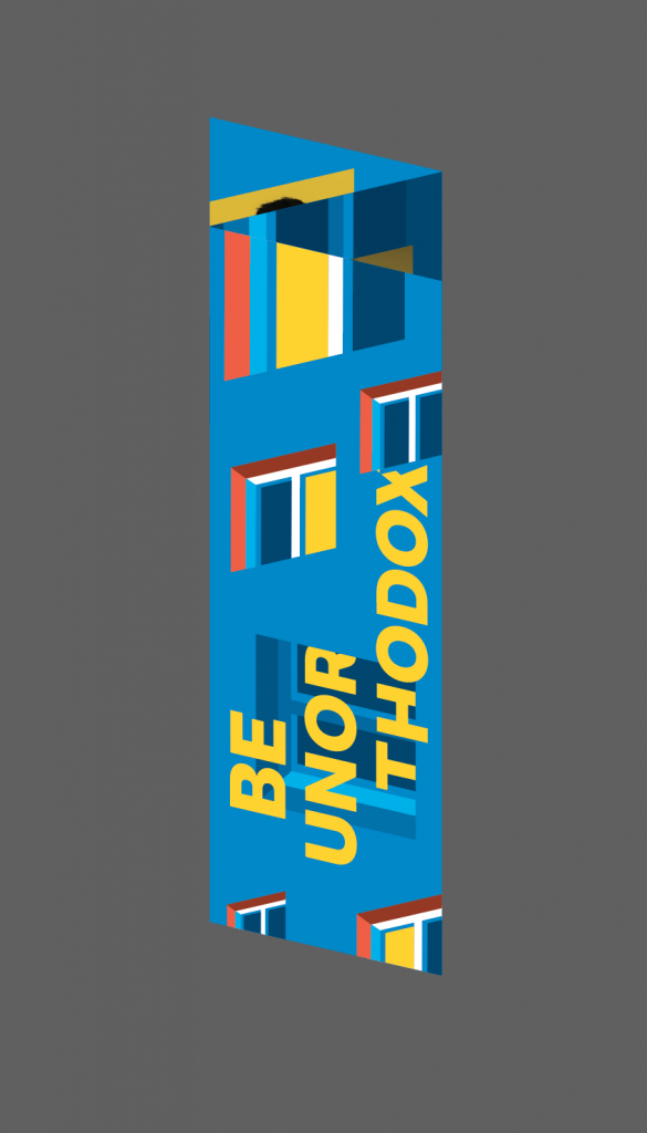
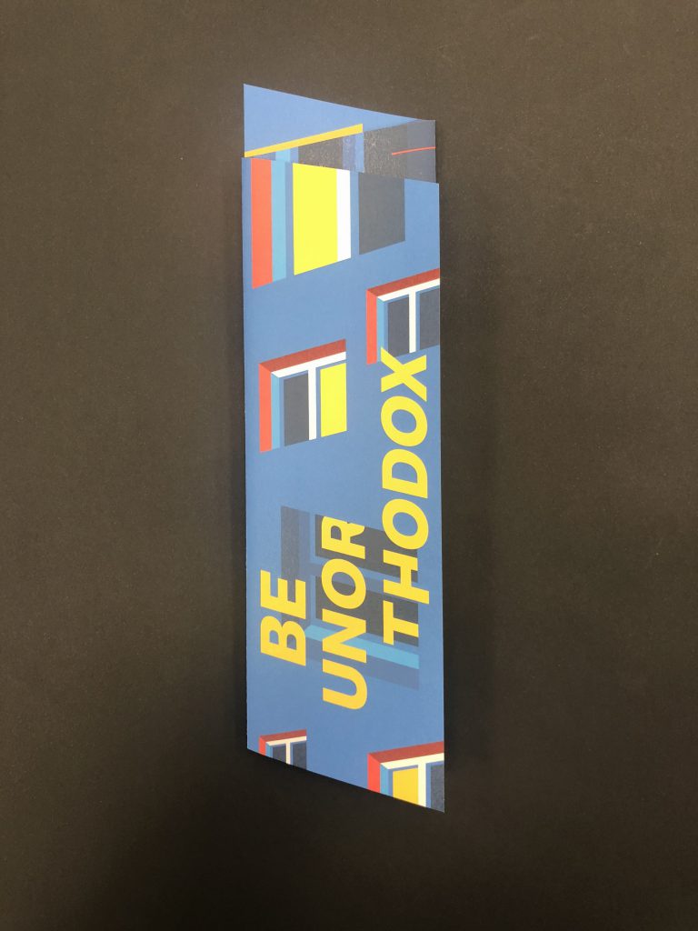
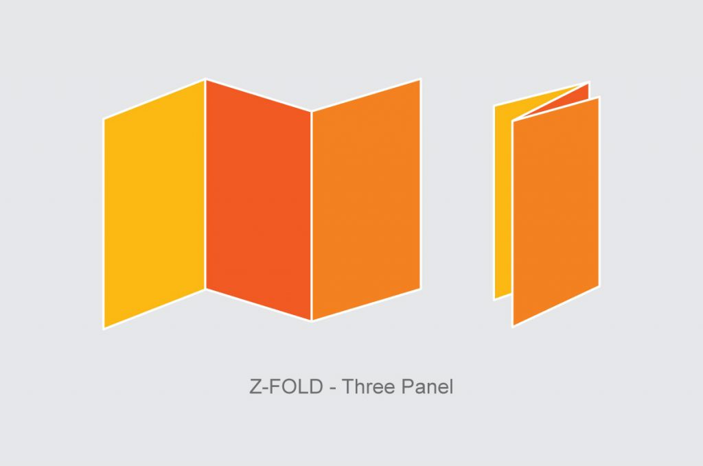
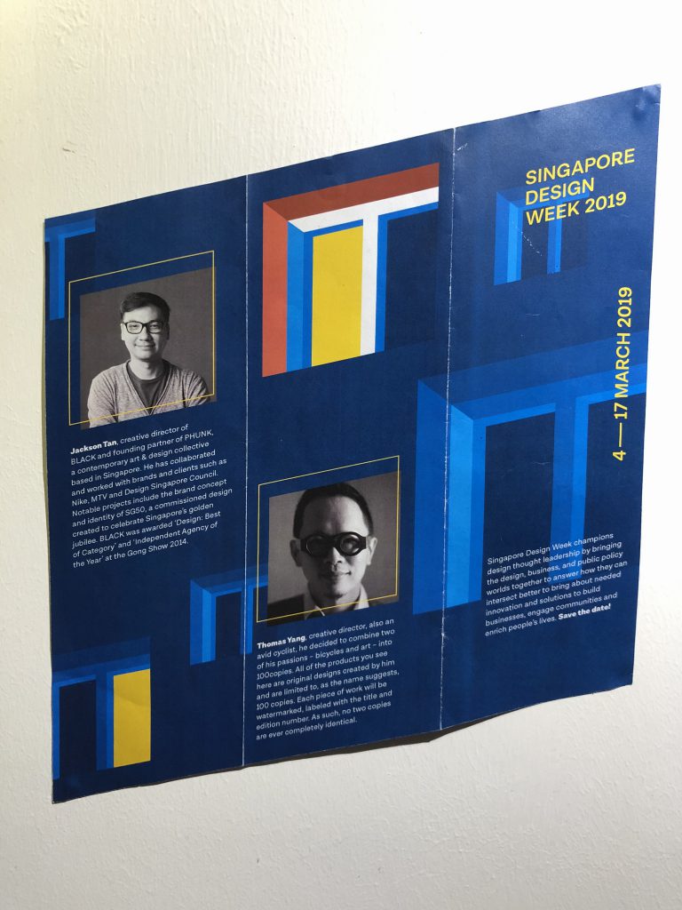
As much as there are so many different kind of paper folds out there, I personally chose a 3 panel z-fold for my final brochure design. Initially I thought we had to incorporate our whole poster in the brochure but turns out it is not necessary.
I didn’t want to exaggerate any of the folds or have any complicated die-cuts. I felt that the content within is much more important. But in order to make things interesting, I incorporated my skewed window shape the 3 panel z-fold to have a stronger relationship with my previous poster design.
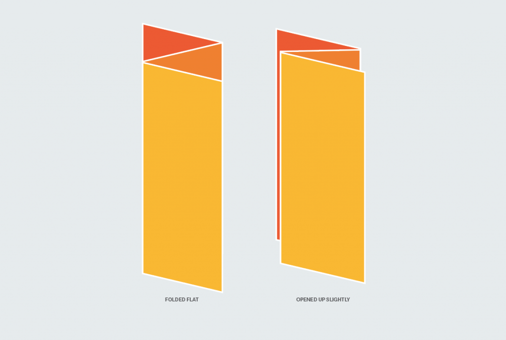
Having the shape of my window integrated into my brochure results in the protruding of inner page and the back page. Hence I tried to play with all the elements and try to have kinda like a sneak peak of the inner and back page.
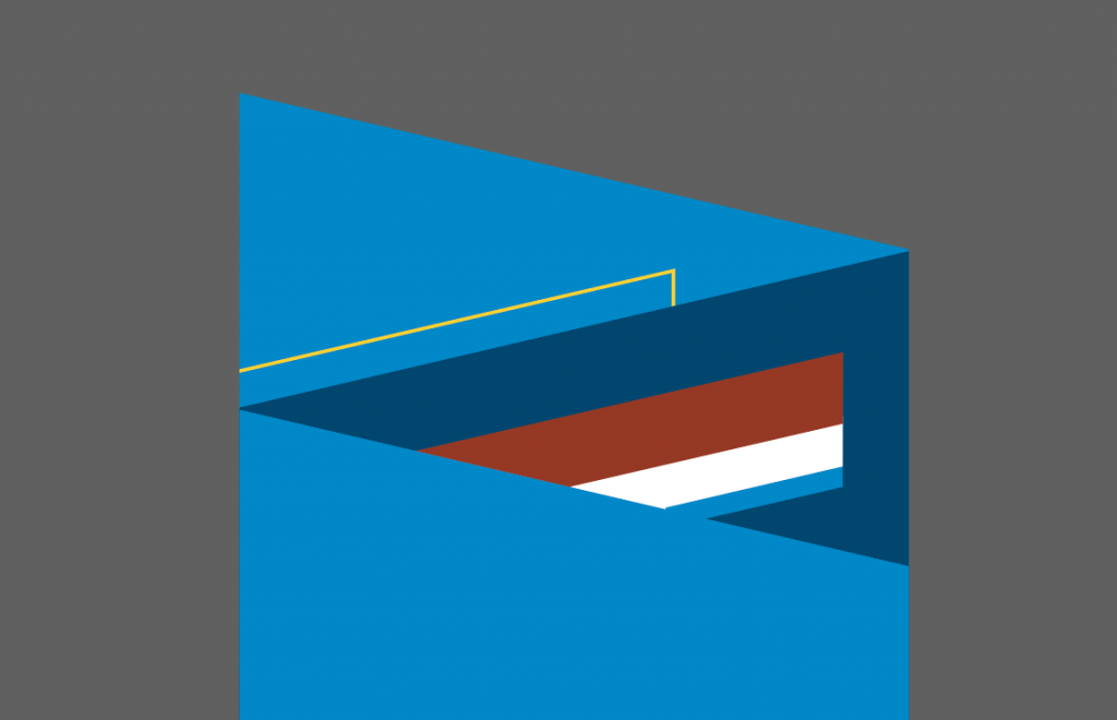
Initially I thought of showing a sneak peak of a lit window for the inner page, but it kinda failed miserably. The window doesn’t really show much and the red colour is also feels out of place.
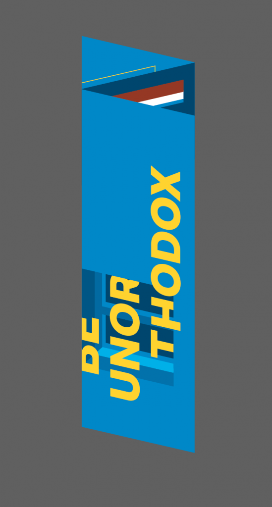
I had my title to purposely cut across the second page but when it is folded in, my title looks like an error instead of a purposeful treatment. The front page was seem too empty and quiet for a front cover of a brochure.
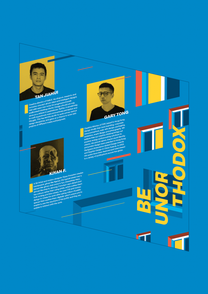
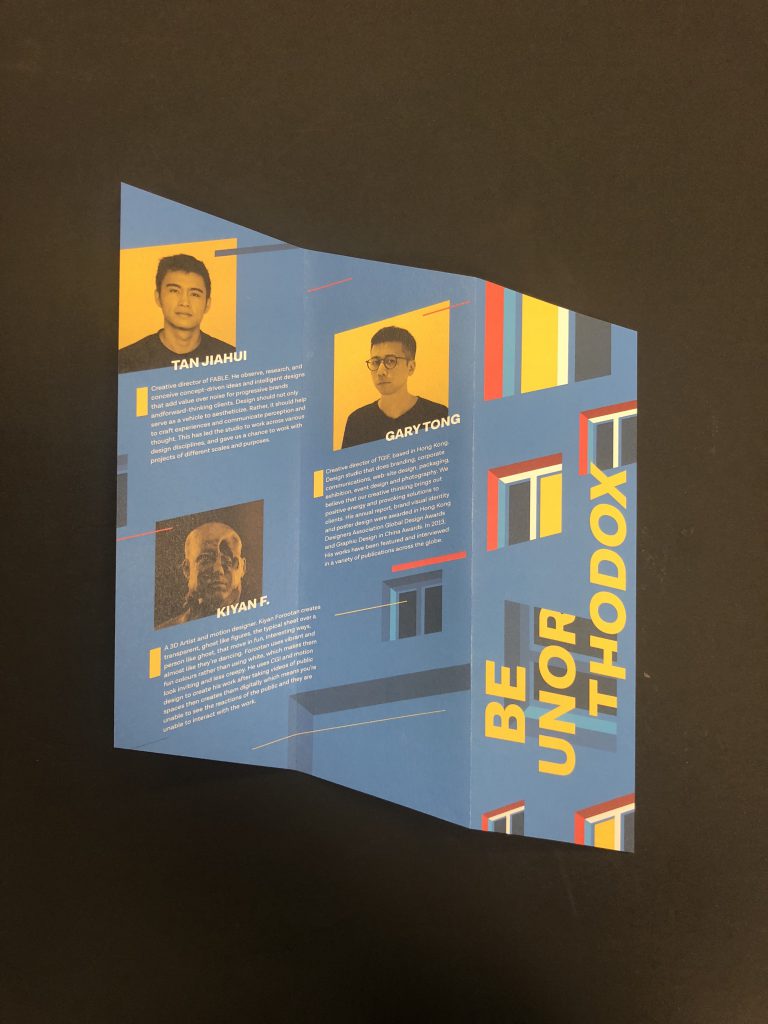
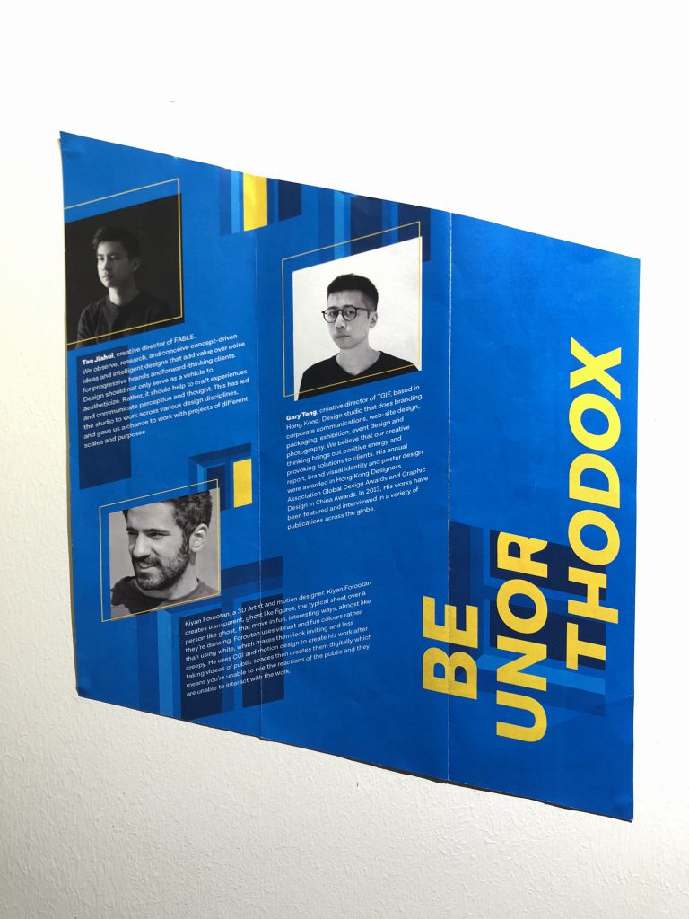
Initially I’ve muted the colours of the profiles and a border around the profile so that the lit windows would have more of the contrast. But after rounds of consultation, was told that there are too many empty gaps and spaces in between, there are too many windows, the names of the artists don’t really stand out from the body copy and the yellow border don’t really make emphasis of the profiles. Hence, everything was kinda scraped.
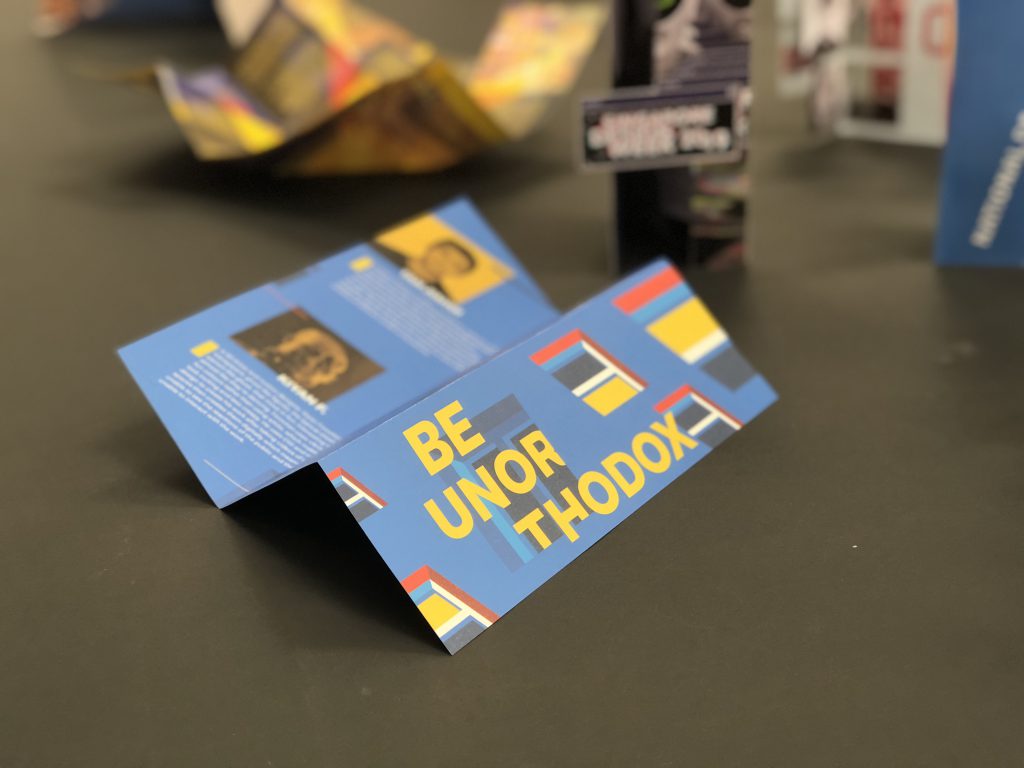
The sneak peak of the brochure is much more clearer now with the illusion of 3 layers of window being seamlessly joined together. This creates a more enticing experience for the reader without having to open the brochure fully yet.
Instead of having the profiles in B&W, I’ve put a yellow filter on top of them so that now it has more relationship with the look and feel of the brochure. I’ve add the coloured windows at the front cover instead, and the title not cutting into the second page. I’ve also replaced windows with lines whereby the subtle hint of the windows are still kept remained. Small little yellow boxes beside each profile shows the emphasis as well. The artists names are taken out from the body copy and standing alone.
The information page are all in yellow to differentiate from the featured artists. Multiple lines with different weights cut across the page of the brochure to show the dynamics and also help to lead the readers’ eyes.
Overall it was quite an experience, and having only the basic technical skills wouldn’t bring me anywhere. Designing a brochure is not as simple as I thought it would be, the importance of the flow of information, the placement of the elements and especially the measurements. I’ve always try very best to break away from my comfort zone, my safest design style. Constantly reminding myself to break the grids, not to be afraid of exploring…. to BE UNORTHODOX.


My initial 3 concepts were rejected due to being too rigid, too literal and too educational. Where the taglines don’t really flow with my moodboard as well.
Final concept; I feel that we designers in Singapore are constantly being trapped, or very much restricted / having censorship due to politics. Hence most of us tend to obey the rules and not going off the grid, like myself, always trying to stay safe and not stepping up. We are constantly questioning ourselves, are we designers, or are we artists. How are we able to escape from our comfort zones and be different.

My initial concept was to have multiple buildings with windows to represent us living under HDB flats, implementing the way of us being trapped in boxes. HDBs are like boxes and boxes. The buildings are then being too straight in the face. I then slowly removed the buildings and only leaving the windows behind.
Initially I had one huge window smacked in the middle, opening halfway to represent a door-like structure also to show the opening to much more opportunities behind. Afterwards I thought having only a huge window doesn’t make any sense to my concept. This sketch is therefore being scrapped.
Having only the windows, in it’s very simplified form, on one whole background. The background represents one building with multiple windows on it. Having the illusion of multiple buildings stacking on top of one another.
I came up with a few taglines to go along with my concept;
“Boxed up” – this was my initial tagline, it was seen too literal and straight up forward.
“Are you boxed up” – edited from the previous to being like a open ended question instead, but it was rejected due to it being a question and not a tagline.

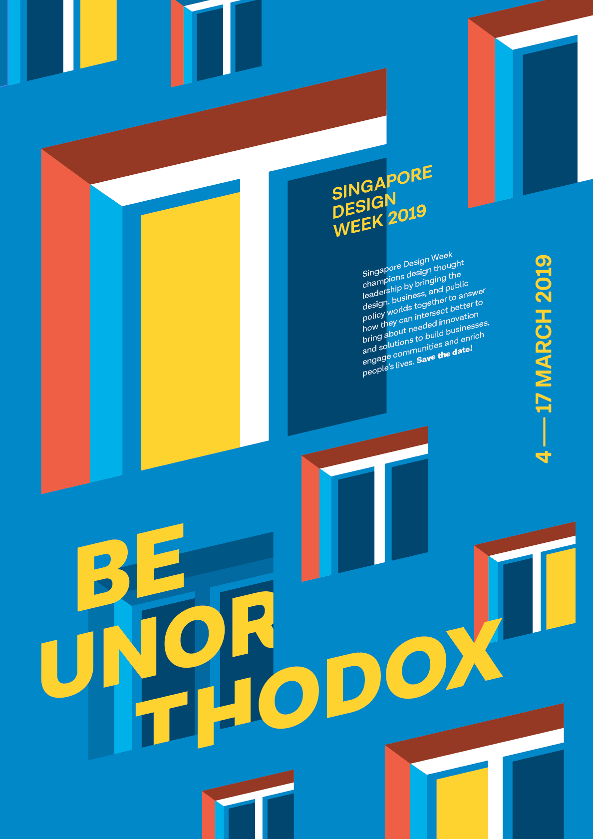
The colours on my 1st draft were a bit off, the “Singapore Design Week 2019” was also bigger my tagline. The tagline is too small and wasn’t as prominent and is also at a very awkward position.

I have updated my tagline to;
“Be unorthodox” – being said to be unusual and unconventional is what all we need nowadays to differentiate ourselves from the rest.
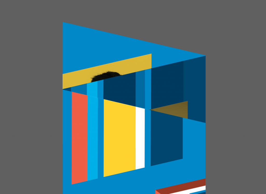
The lit windows are the ones that are stepping out of their comfort zones, or trying to be unusual than the rest. The colours of the background and the windows are much more muted so that the yellow would pop more than the rest. The tagline is being integrated into the windows to show more relationship with the elements.

I felt that the emphasis should be on the punch line instead of “Singapore Design Week 2019” as it is the first thing that catches peoples’ attention. Therefore the tagline is being enlarged. I also tried to lay it over the window to show the foreground and background.

I’ve tried to explore a different font after consultation but it doesn’t really work that well. So I’ll stick back to Draft 3‘s font.

After much consultations, were told to minimise windows; what they always say “Less is more”. The colours of the window frames were updated with a stronger red. Tagline being the most important one, I have it in yellow as well to really enhance the contrast. I cropped the tagline as well to have the illusion of it cutting in and out of the window. This final draft has a total of 4 layers, the top layer being the tagline, singapore design week 2019, date, 2nd layer being the information of the event, 3rd layer being the windows and last layer being the background.