

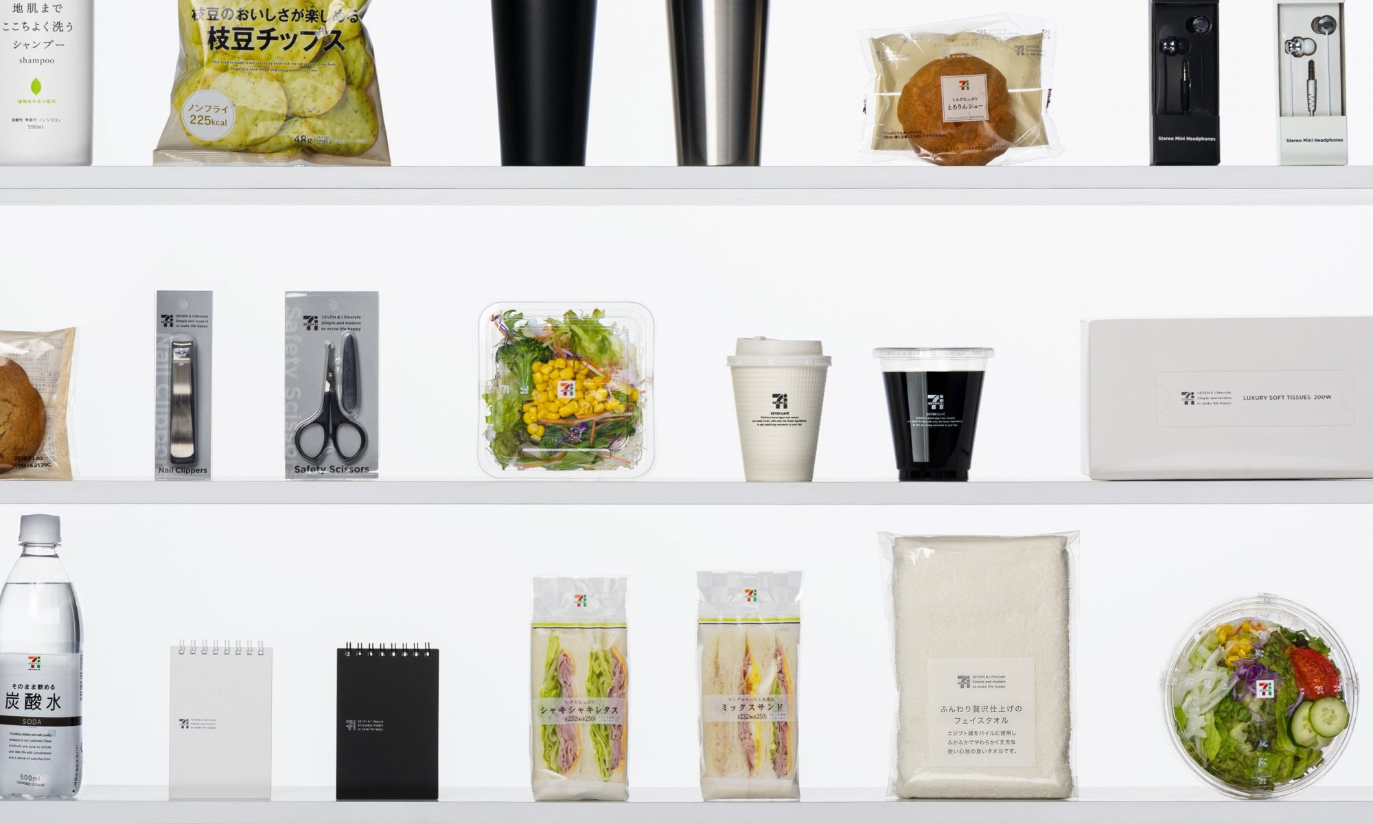
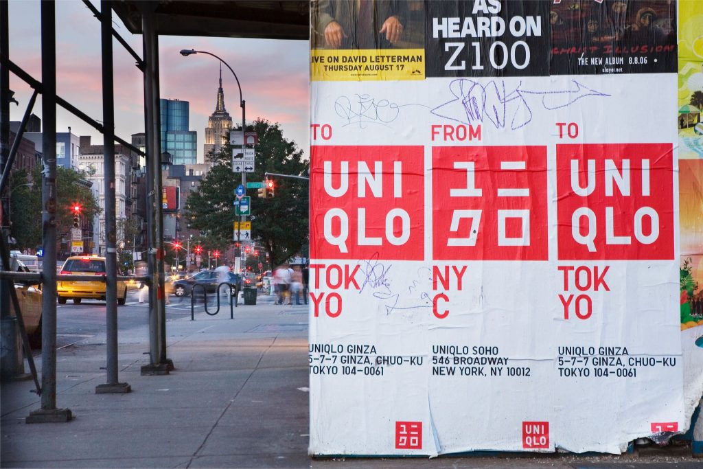
Creative director Kashiwa Satō has not only electrified the design world but also injected vitality into struggling companies and stodgy institutions with his bold, innovative approach to branding. He launched his own design studio, Samurai, in 2000. His profession focuses ranging from logo design, product design to the orchestration of comprehensive branding strategies and even architectural design direction. Some of his high-profile clients as Honda; the National Art Center, Tokyo; Seven-Eleven Japan; NTT Docomo; Uniqlo; and Meiji Gakuin University.
Throughout his works, there are always inspiration from the Japanese culture and traditions within. His philosophy is that a brand has to be simple, memorable, and direct. Satō has proudly honed an approach of “iconic branding”. His idea is to identify the core message which he wants to bring across, then to design an icon to aid in bring the message further, succinctly and instantaneously across linguistic and cultural barriers.
Icon = Logo
Sato chose red and white, which he said instantly identifies Uniqlo as Japanese because it is reminiscent of the country’s flag. “logo” goes beyond the actual physical illustration. It becomes the visual pivot point from which comes the representation of the brand anywhere it appears. It’s the typeface, the color scheme, the placement and arrangement of those visual elements that take a brand beyond.
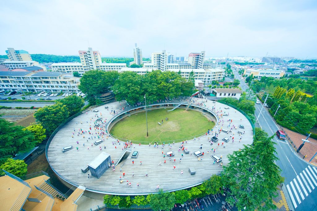
Icon = Space
Branding adapts beyond digital representation, color scheme, and message. Branding is the space you inhabit. He attributes his branding success to listening. Based around the concept “Architecture of kindergarten itself is one gigantic playground,” he contrived a building with a large wooden roof where children could learn and play.
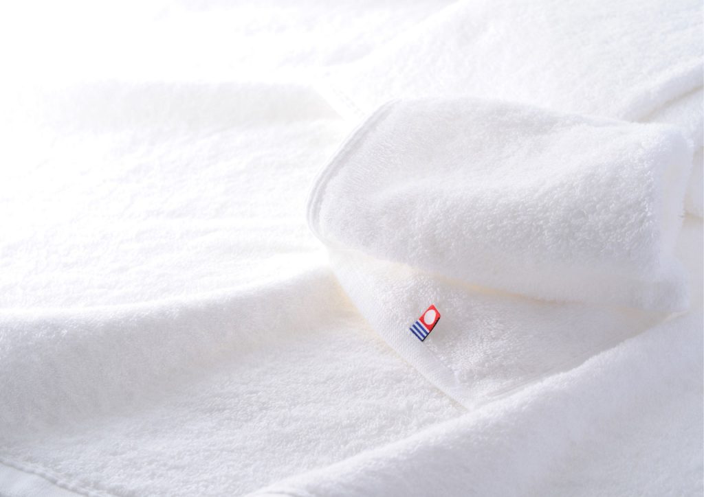
Icon = Method
A rebranding project for the Imabari towels, a mainstay of the local economy of Ehime Prefecture. Where the Imabari towel industry was struggling in the face of cheap foreign competition. Capturing the essence of their complicated woven jacquard patterns and their amazing softness and absorbency in which he then uses a pure white towel to portray the message of “trust, safety, quality”. The logo also stands out from the white towel itself, the white in the logo stands for gentleness; the blue evokes the soft water of the Imabari region and conveys trust and safety; and red is a symbol of the sun and vitality.
All in all, Kashiwa Satō delivers a fresh perspective of design to the world but not to forgo his Japanese culture. His designs are not only clean, simple yet direct but also how everything has been carefully considered whether it be the architecture, product design, promotion and launch of a brand. The complete package.
References:
Williams, S. (2020). Kashiwa Sato: Branding is limited by tradition & common sense | 816 New York. Retrieved October 2020, from https://816nyc.com/kashiwa-sato-brand-limited-common-sense/#.X3suNi8Rq_g