Image Making Through Type – Research & Process

For this assignment, we are to create our own individual type with our initials based on the 4 different occupations. We are to extrude the main elements from the different occupations and adapt it on our initials. This assignment also aimed to train our eyes to pay more attention to details, even if it’s the slightest.


Here are some of the sketches in the earlier stage. Initially I didn’t really understand the brief well.  Almost all my ideas are leaning away from the expectations. Occupations that didn’t make to cut; barber, taxi driver, key maker, casino player, sushi chef. I was told that it wasn’t that exciting or it has already been done before.

After much consultations, I have decided on the 4 occupations. The 4 occupations I chose to work with :

Pizzaiolo  | Willy Wonka Tailor | Origami Artist


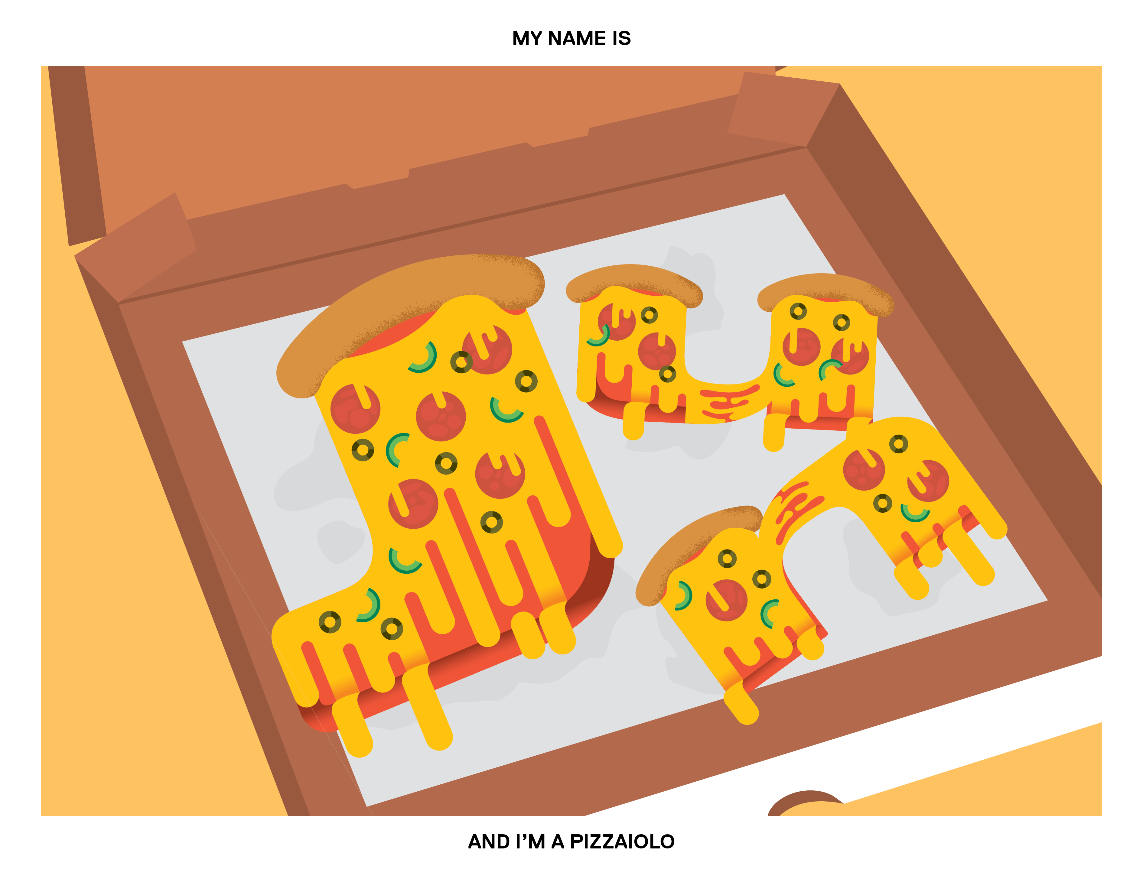
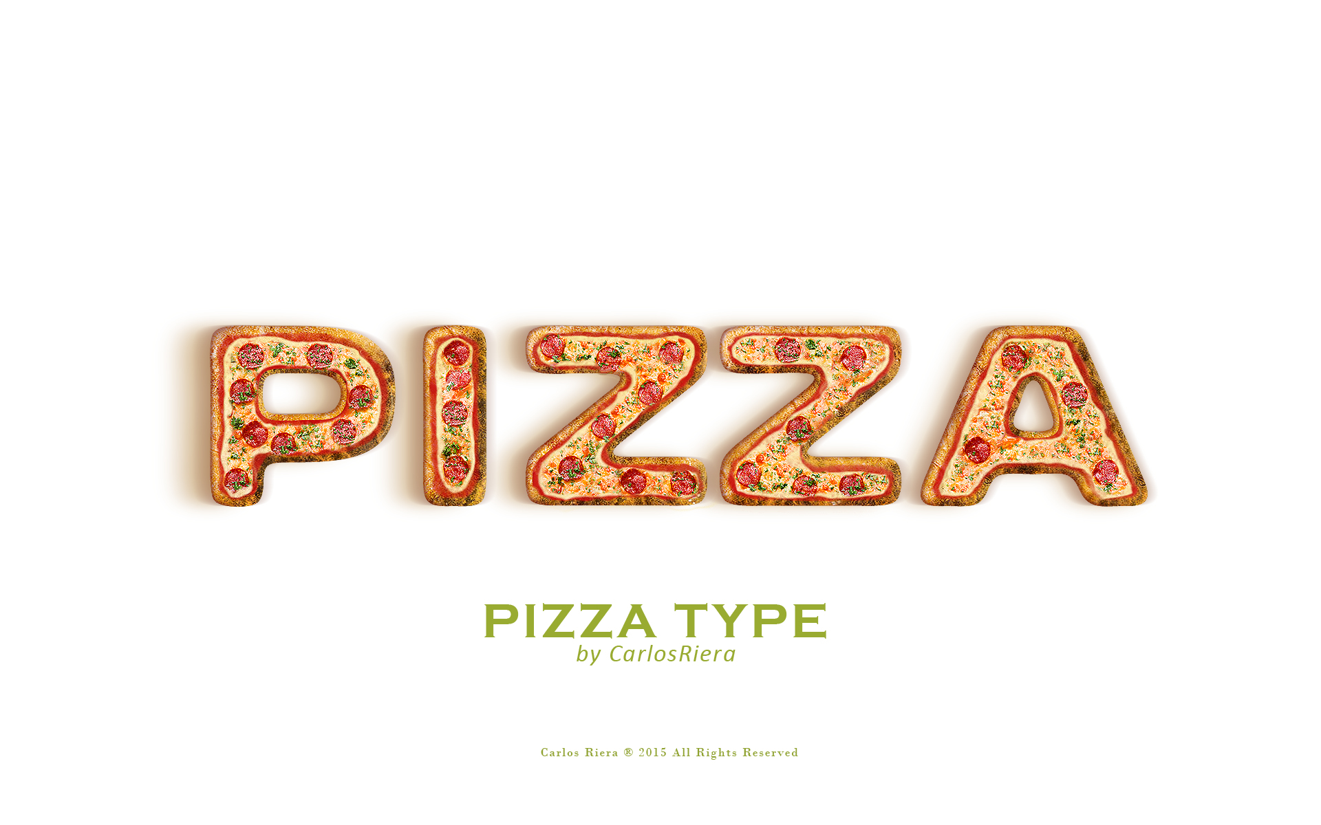
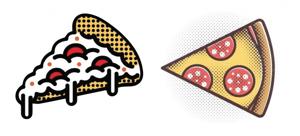
Pizzaiolo; a pizza chef

Attributes; pizza dough, crust, sausage, olives, peppers, cheese, tomato sauce

colour palette
image from brandser.es
image from designinspiration.com

First draft

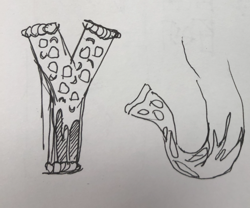
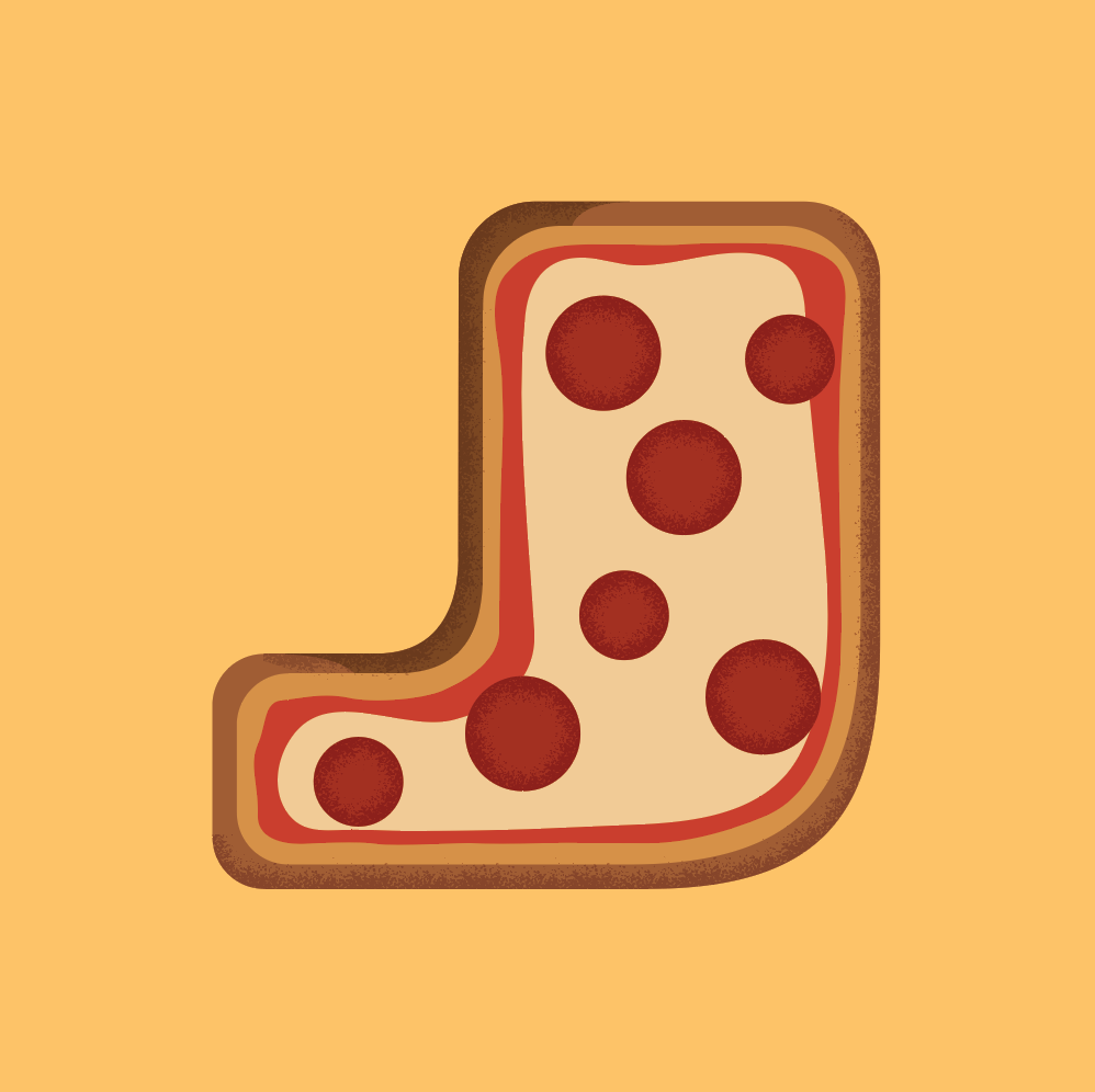
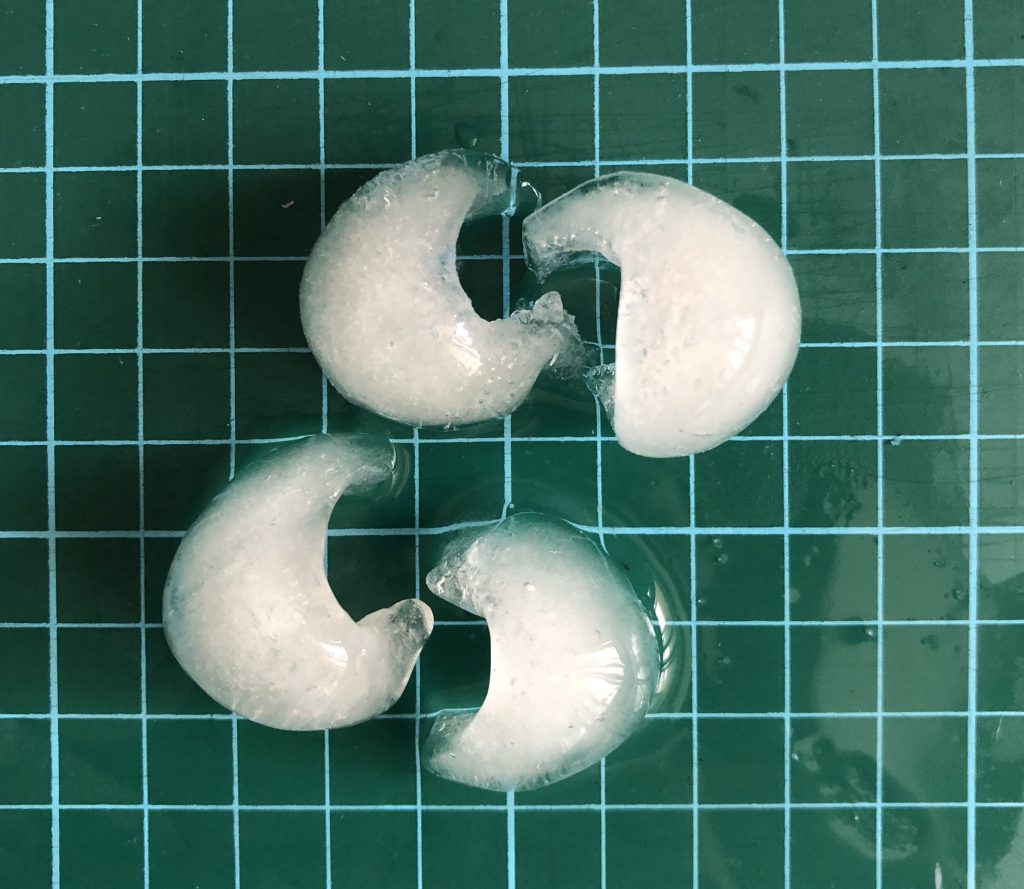
The pizza on the letter ‘J’ looks really raw and unfinished. I tried adding gradient and patterns brush onto my ‘J’ to create more depth and personal touch to it. But the results wasn’t that satisfactory.

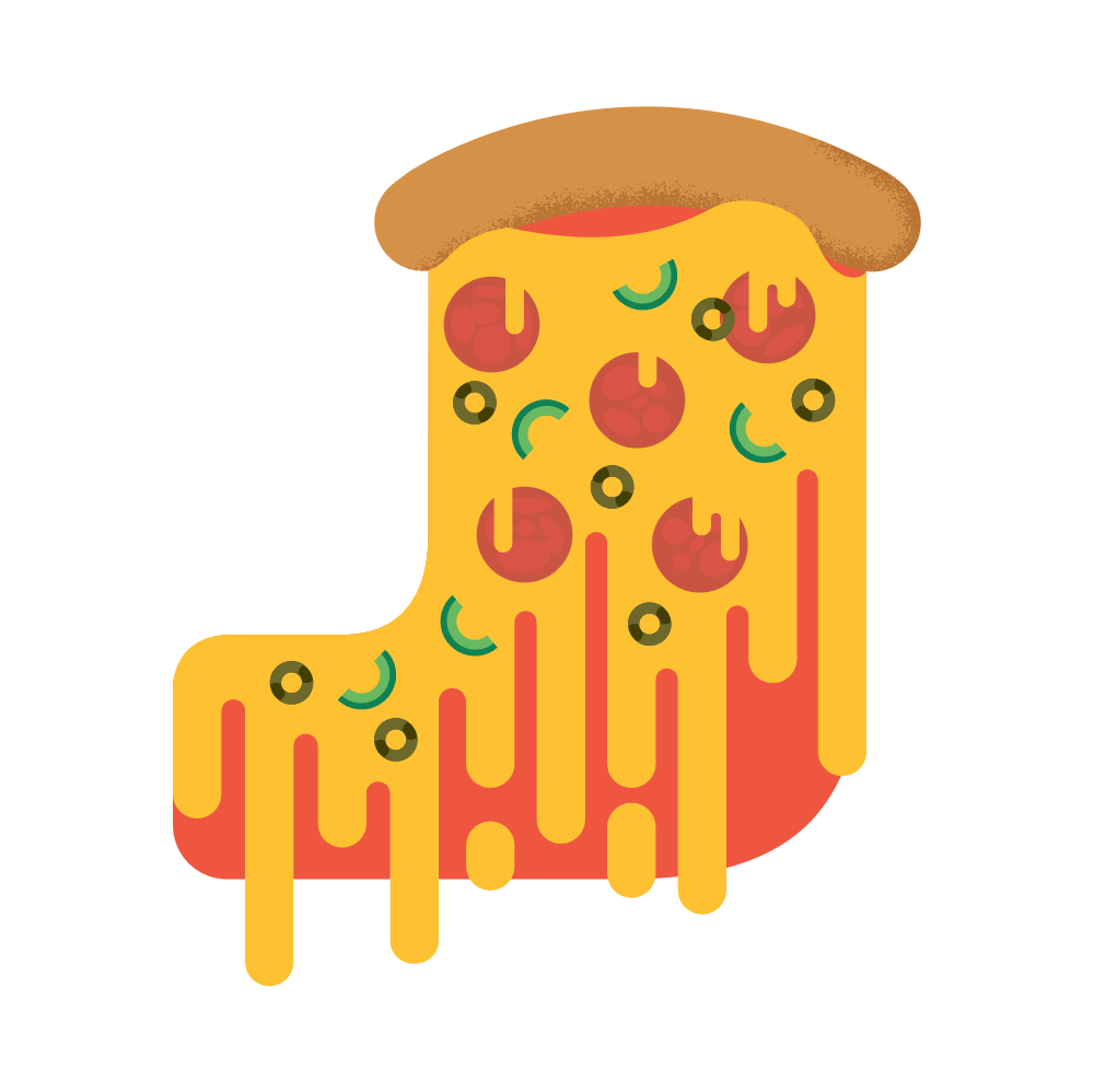
After much alterations, I’ve decided to mainly have the cheese flows down my letter ‘J’. The pizza looks more authentic and fun instead of being too serious. I’ve also added green peppers, olives and pepperoni sausages to make the whole pizza to look more appealing.

Final composition

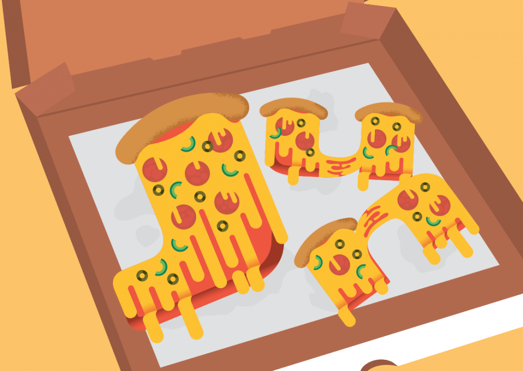
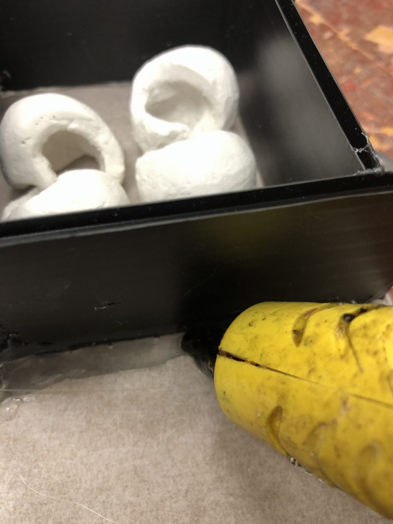
I’ve placed them on a traditional pizza box with the oil paper to make the whole initials come together one one instead of individuals.
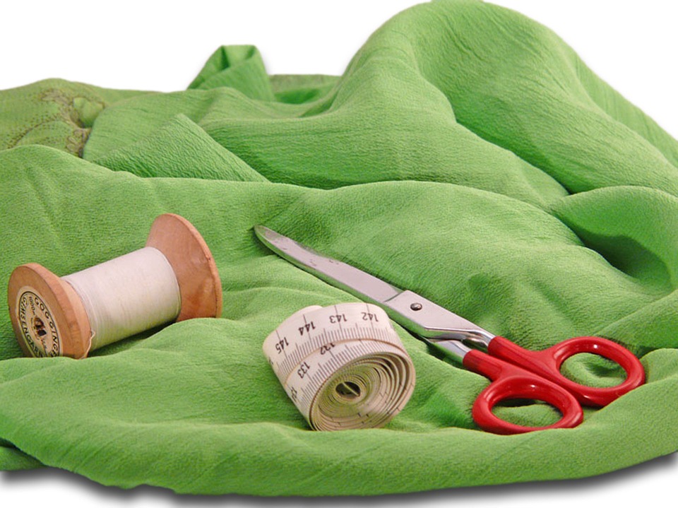
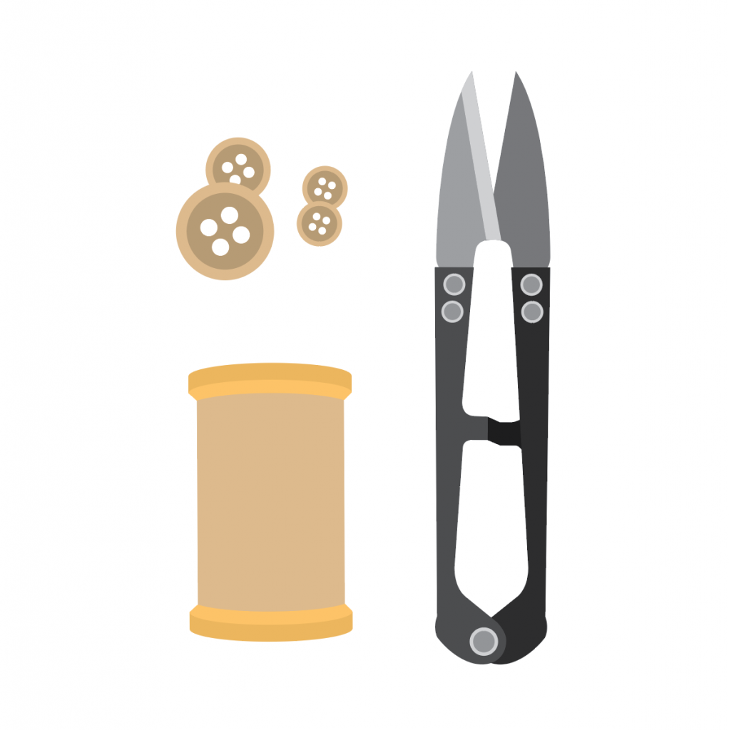
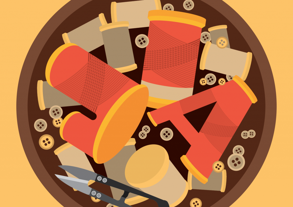

Tailor

Attributes; Needle, sewing thread, sewing scissors, measuring tape, buttons, cloth.

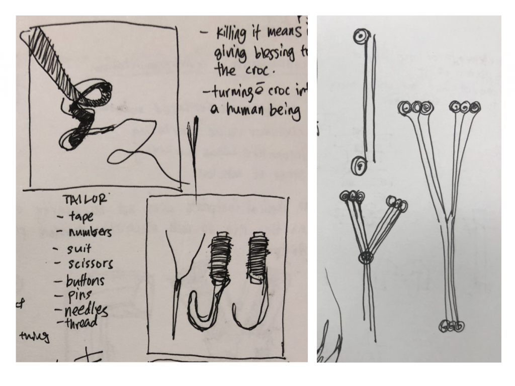
Initially I wanted to create the flowing down of the yellow measuring tape to form my initials. Using one single thread piercing through a needle, forming ‘Y’ and over flowing sewing thread forming the ‘J’.

Elements; buttons, thread, scissors

I’ve a bowl to contain the initials created using the sewing thread. I placed them in a position as such that it creates more depth. The composition is more interesting than placing them symmetrical to one another.

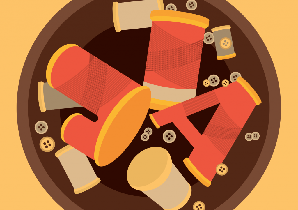
The composition still looked as unfinished, so I’ve added more buttons and sewing thread to fill the bowl.
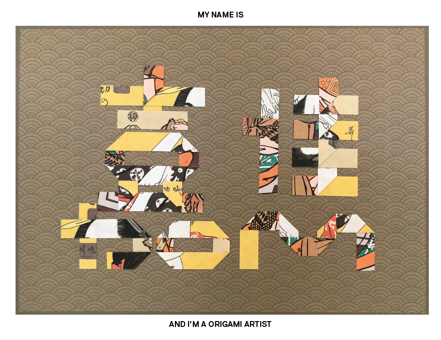
Final composition

Origami artist

Attributes; origami paper, foldings.

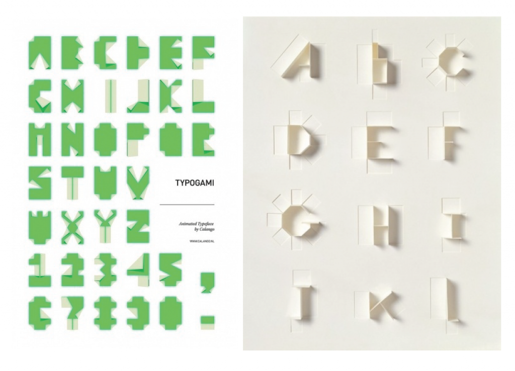
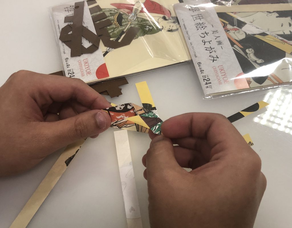
My initial thoughts were to use my english initials. But I feel it rather loses the traditional essence. Also I didn’t go with vector for this occupation. The folds and such won’t be able to shine in vector form. So I’ve gotten the origami paper and tried folding my chinese name instead.

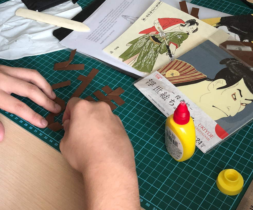
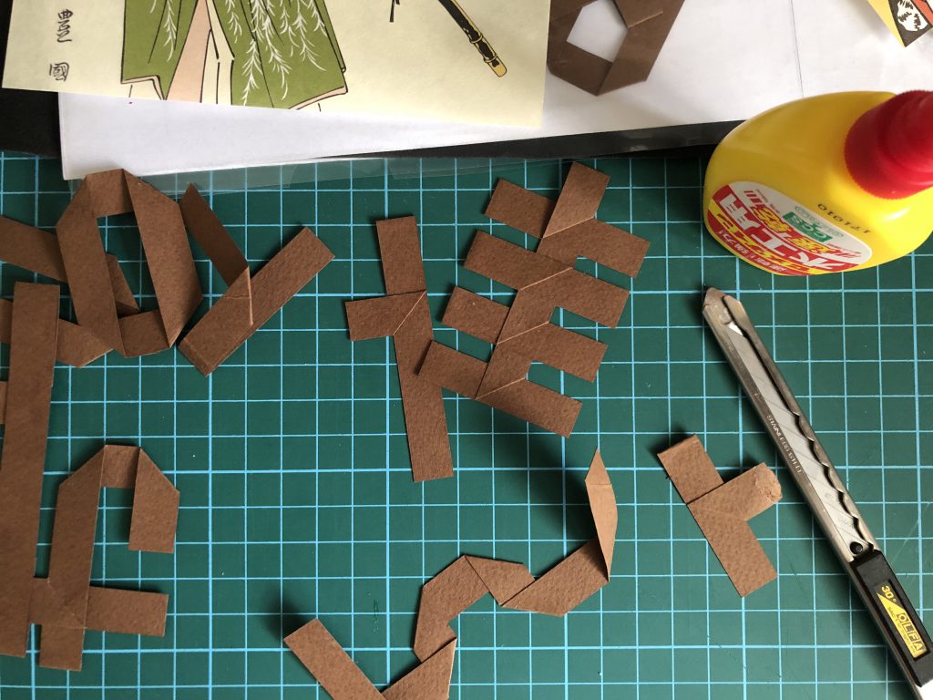
The only difficulty I faced is the consistency of the thickness for each folds. Initially I was to use brown paper against on origami patterns as a background. But the brown didn’t really stand out from the pattern.

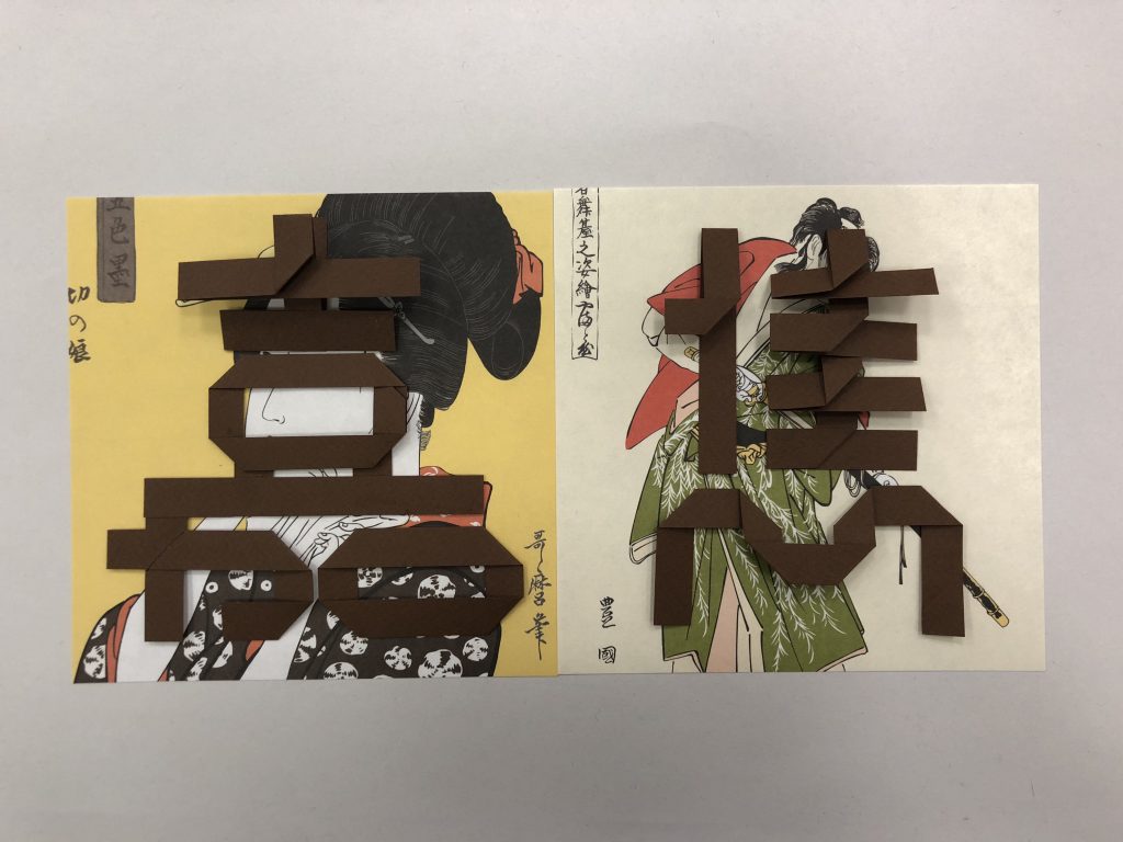
It was rather dull and not obvious. So instead of using the brown paper for my name, I changed into using the origami paper instead.

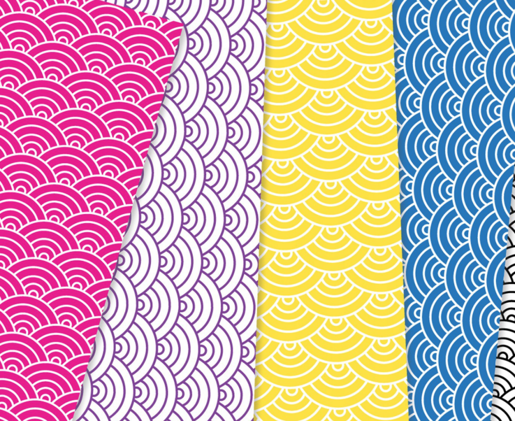
After deciding to use the origami paper to fold out my chinese name, I’ve created a seigaiha wave pattern as a background.

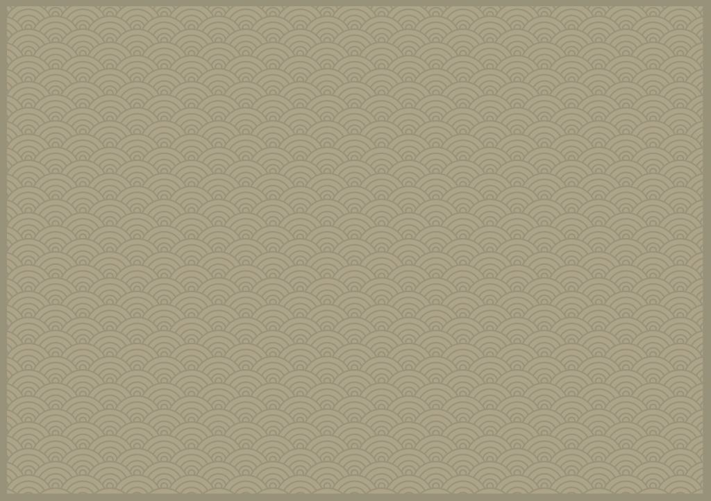
A slight darker green is used for the seigaiha wave background in order to bring out the emphasis on the chinese characters. Analogous colour  is introduced in this occupation.
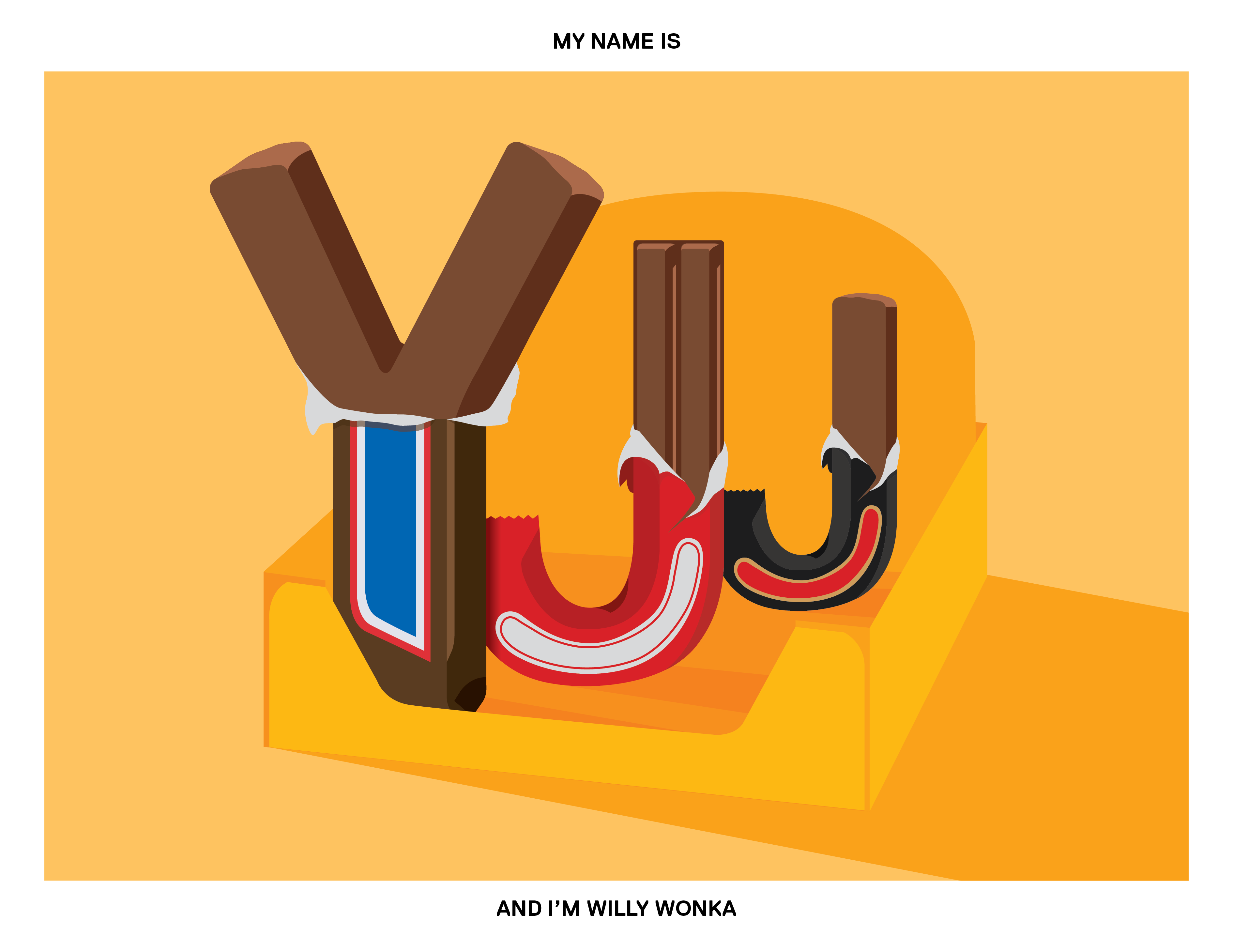
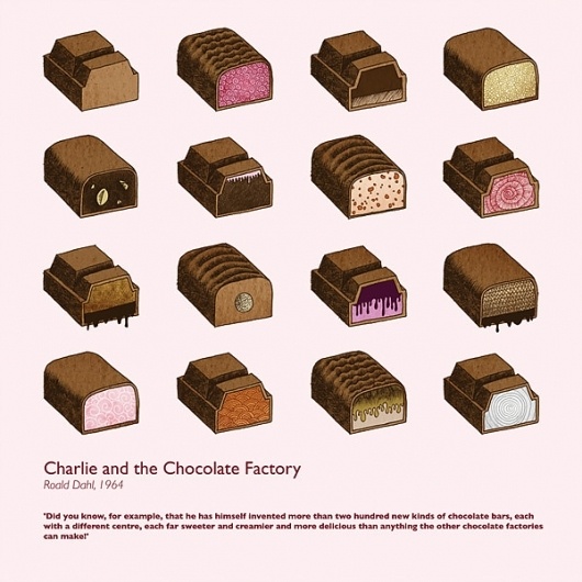
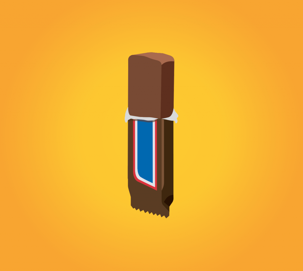
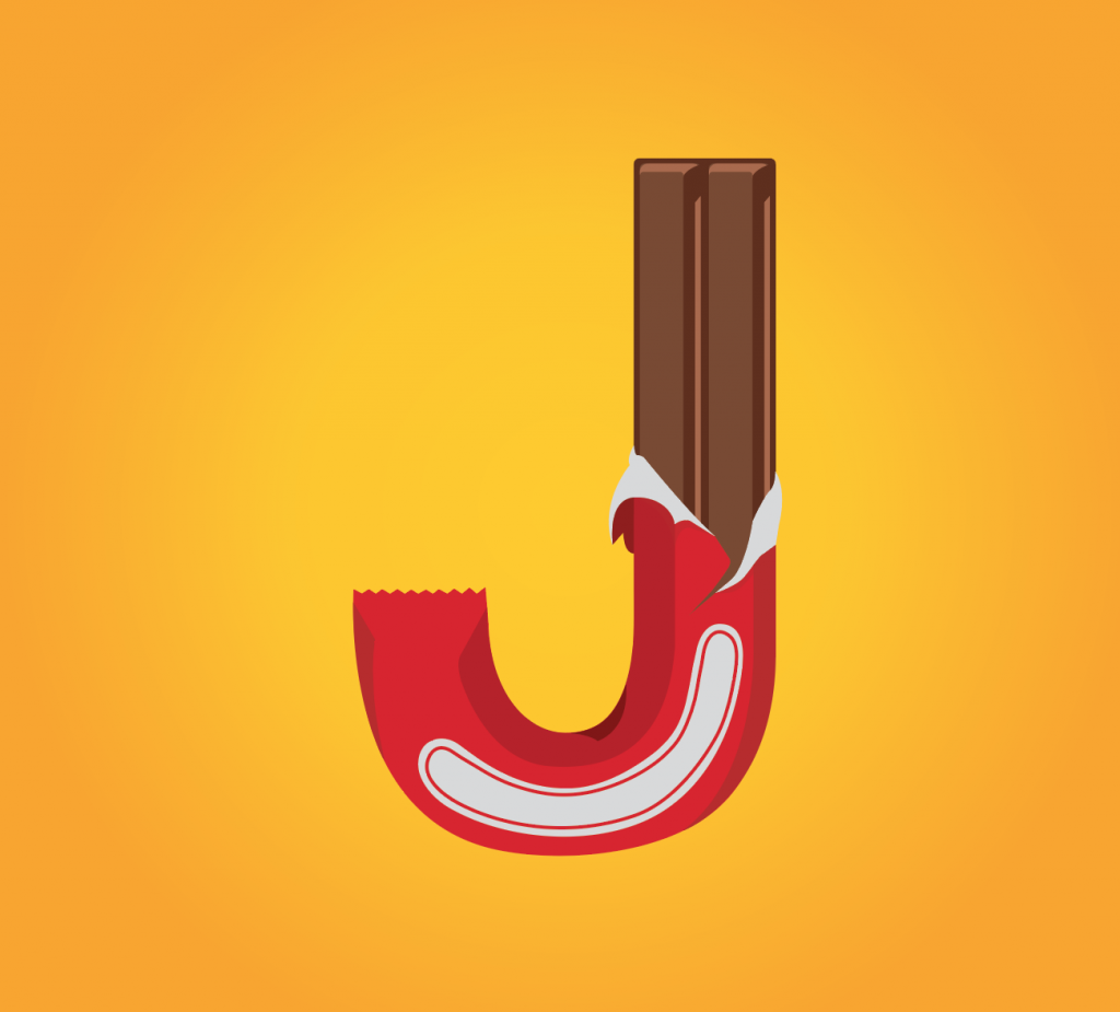


Willy wonka

Attributes; chocolate, chocolate bars, more chocolate

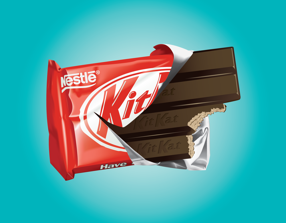
I’ve formed up my initials using some of the famous chocolate bars; snickers, mars and kit kat. I did not want the branding to be so obvious, so I merely used their iconic colours instead. I had the wrapper peeled off to have the personal touch to it.

Two bars were integrated into one single packaging that creates the wholesomeness for the initials ‘Y’. Snickers were used for this design.

Kit kat bar is being used for this. The packaging followed through the arc of stem of the letter J.

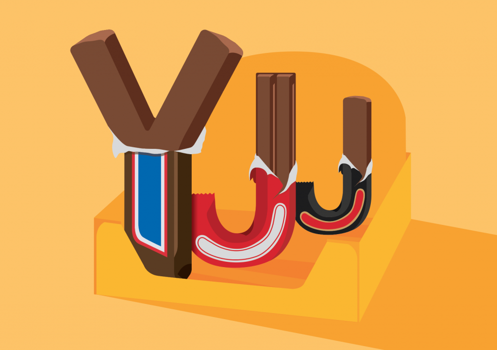
Initially I only had them placed side by side, with the same height and width. The composition wasn’t as exciting. The next thing came into my mind was to have a box to hold them all together. It is  also seen commonly on supermarket shelves. So in the end I’ve added the box to my composition. I’ve also played with scale, from a large ‘Y’ gradually to a smaller ‘J’. That created the depth of field.

Exquisite Glitch

For this micro-project, we didn’t have any rules or boundaries set from the start therefore we went crazy on the edits. Similarly to our previous D.I.W.O micro-projects, we didn’t have much control of the outcome. I was quite surprised for the 2nd edit, whereby there are black and white swans. I was somehow expecting something normal. Different people would have different way/style of editing. The essence of the original image can still be seen in the final glitch. This is the beauty of a collaborative artwork.


Research Critique 2

Posted by Yuen Jia Jun on Monday, 29 January 2018


The Third Space is a space that is commonly shared among, nowadays and it is  also able to connect people together no matter how far they are apart.

But most startling is the fact that the third space is simply an integral fact of everyday life in the 21st century.” — Randall Packer, The Third Space

The boundaries in the the third space is being break down in terms of time and space whereby is it surpassed in the virtual space.  It manipulated our senses into that we both are very close to one another. The closeness could be seen through our conversation between the both of us.  It seems like we are literally at the same location seamlessly.  The intimacy were created whereby we both refilled the “same bottle” for one another and shared the “same bottle”.

“… based in distant physical locations could meet and perform together, in the same “living image.” – Maria Chatzichristodoulou, about Satellite Arts Project

The collaboration between us where we passed the bottle across the two screens and shared the bottle. The conversations we exchanged in the third space created the illusion that the both of us seems like we are interacting with each other side by side in real time but actually we are not.

Therefore, the third space does not only increases the intimacy between the two parties but also bringing back the connection relationship we have all lost in time due to technology advancements.

Pandora Revisited

For this assignment, we were to create different modules based on the given 3 keywords. The keywords that I have gotten — Lift, Shift and Reflect.


Module 1

Module 2

Process

In the end I went with Module 2, it is easily stackable compared to Module 1. For the mould, I tried both of the methods, Latex and Silicon. The silicon method did not work very well, the mould only managed to capture one side of my module. Hence resorted to the latex method…… 10 hours of horror.

The results were better than I expected compared to the silicon mould. The replicas that came out from the latex mould were as good as the original!


Silicon Casting

Initially I wanted to stack 3 of my modules together creating this spinal cord-like structure. Due to the multiple openings/holes of the modules, the silicon may slipped into the multiple openings and taking the modules out of the cast may be a big problem.

So I went with this structure instead. The modules interlocked with each other which creates an infinity sign.

So I placed 4 of the replicas together for the cast.

Final ice tray

Research Critique 1

A collaborative project with Amanda and Karen.

The topic we touched on was low self esteem. People nowadays in our generation put criticism against themselves at the front. They are worried about how they are perceived by the society regarding on their looks, body or even their personality.

We had Karen stayed still on a chair holding a sign saying “I have low self-esteem. What do you want to comment on my body image? Please write a comment on the corresponding body part.”

Karen is acting as the supposedly low self esteem girl. She is depressed at her body image and is very concerned about how the society perceived her. Her body acts as a blank canvas and our group had our classmates to put down their thoughts about Karen’s body image directly onto her. We briefly gave them a simple instruction, to read the sign and told them that they could write wherever they want with the provided markers. The audiences would have full freedom/control of the artwork.

The ‘source’ materials are open to all; to remix, re-edit and redistribute, either within a particular DIWO event or project, or elsewhere. The process is as important as the outcome, forming relationally aware peer enactments. – Marc Garrett

The only down point is that people would naturally take a peek on what other audiences wrote. Therefore their thoughts might also change due to after looking at what the previous person had gotten down on Karen.

Our idea is mainly to have audiences to make contributions towards our ‘canvas’ and the process of them putting down their thoughts. Unlike the traditional art making by a single artist whereby the end result is only thing they are looking for. Similarly to Yoko Ono’s Cut Piece whereby we can’t take control of the outcome. The audiences are the ones that will determine the outcome at the end. If there’s isn’t any participants, the blank canvas would remain blank.

Micro Project_3: The ‘Same’ Place

A collaborative project with Naomi. (Action starts at 0:52)

Posted by Yuen Jia Jun on Monday, 29 January 2018


After a long day of school, two friends decided to quench their thirst by refilling their bottles at the ‘same’ water cooler for one another.

LOCATION

Naomi was at the water cooler right outside the 4D room.

I was at the water cooler near the lounge at level 1.

OBJECTIVES

The objective was to make the whole interaction seems like the both of us are at the same location.

OUTCOME

The end result was slightly better than we expected. But if we were to be given more time and a better network connection, the experience would run smoother.

DIFFICULTIES

  • At first we didn’t figure out how the Facebook live’s split screen would work.
  • Internet connection. In order to sync seamlessly, both of our internet connection has to be fast.
  • Naomi’s phone wasn’t compatible to the newest Facebook live function and she wasn’t able to join in the split screen mode.
  • The alignment of water cooler was difficult to coordinate on our own side especially since we only had one hand free. The other hand was holding the bottle, the other had to hold the phone.
  • We were disrupted in the middle of our live, where someone wanted to use the water cooler. Therefore we had to pause for awhile during our live.

OVERALL EXPERIENCE

  • It was a fun and interesting experience.
  • Expect the unexpected.
  • We will be interested to explore more different interactive concepts using the Facebook live