For this assignment, we are to create our own individual type with our initials based on the 4 different occupations. We are to extrude the main elements from the different occupations and adapt it on our initials. This assignment also aimed to train our eyes to pay more attention to details, even if it’s the slightest.
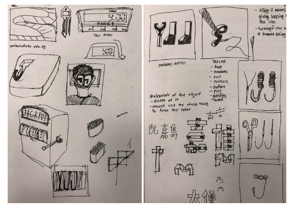
Here are some of the sketches in the earlier stage. Initially I didn’t really understand the brief well. Almost all my ideas are leaning away from the expectations. Occupations that didn’t make to cut; barber, taxi driver, key maker, casino player, sushi chef. I was told that it wasn’t that exciting or it has already been done before.
After much consultations, I have decided on the 4 occupations. The 4 occupations I chose to work with :
Pizzaiolo | Willy Wonka | Tailor | Origami Artist
Pizzaiolo; a pizza chef
Attributes; pizza dough, crust, sausage, olives, peppers, cheese, tomato sauce

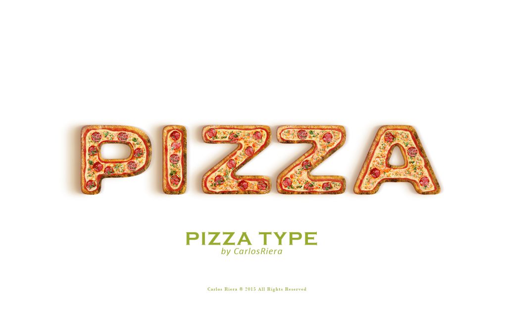
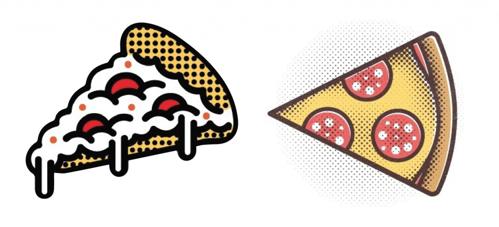
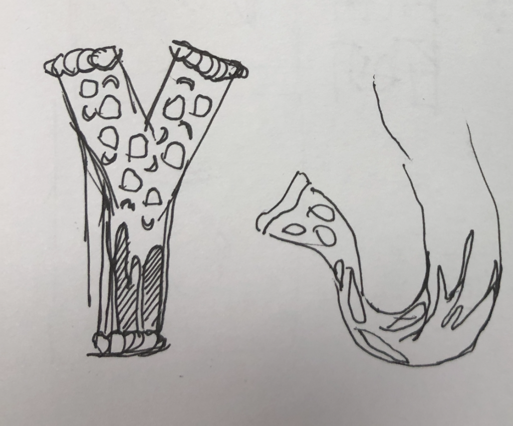
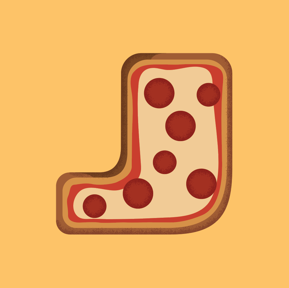
The pizza on the letter ‘J’ looks really raw and unfinished. I tried adding gradient and patterns brush onto my ‘J’ to create more depth and personal touch to it. But the results wasn’t that satisfactory.
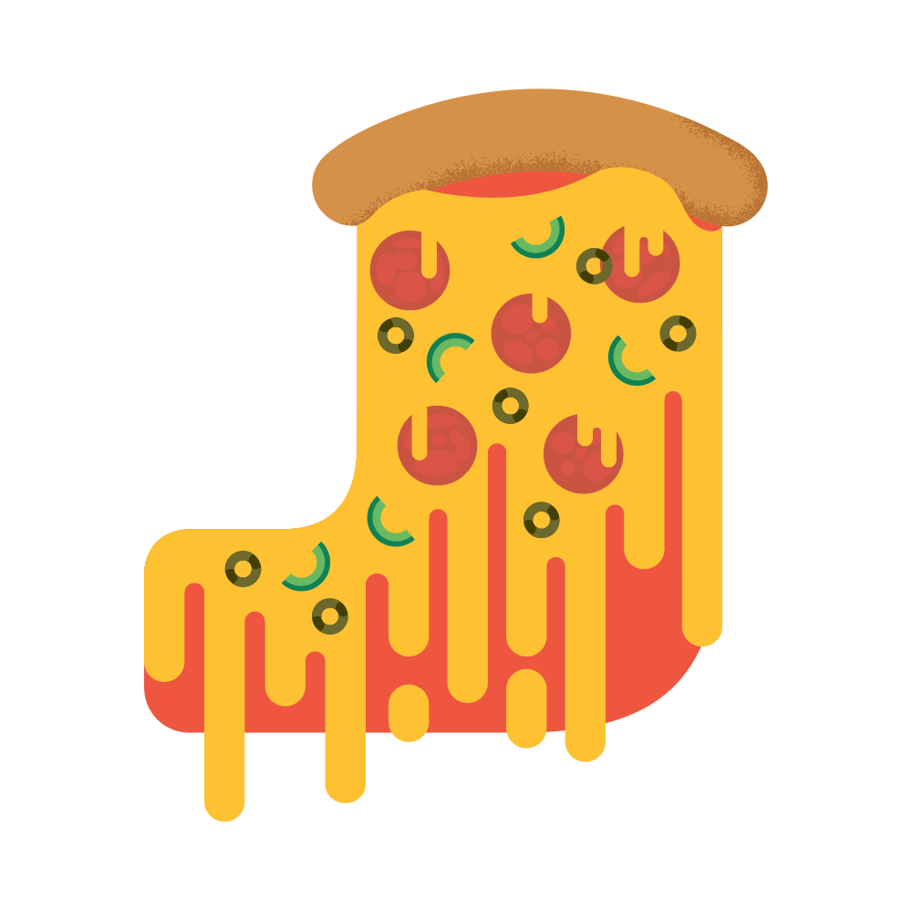
After much alterations, I’ve decided to mainly have the cheese flows down my letter ‘J’. The pizza looks more authentic and fun instead of being too serious. I’ve also added green peppers, olives and pepperoni sausages to make the whole pizza to look more appealing.
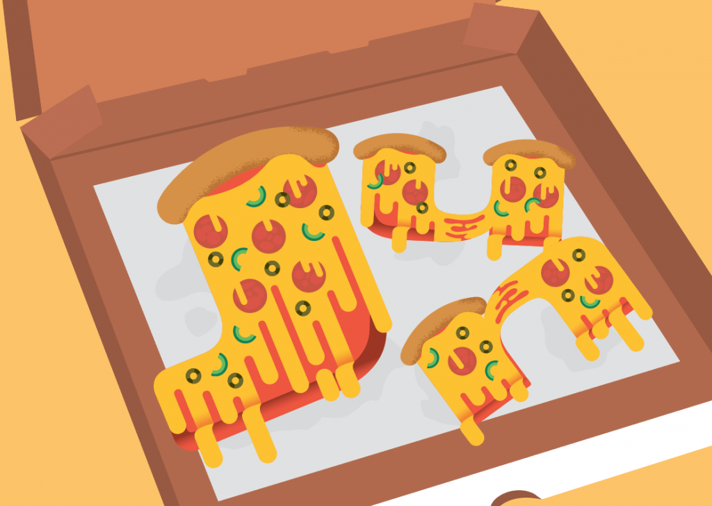
I’ve placed them on a traditional pizza box with the oil paper to make the whole initials come together one one instead of individuals.
Tailor
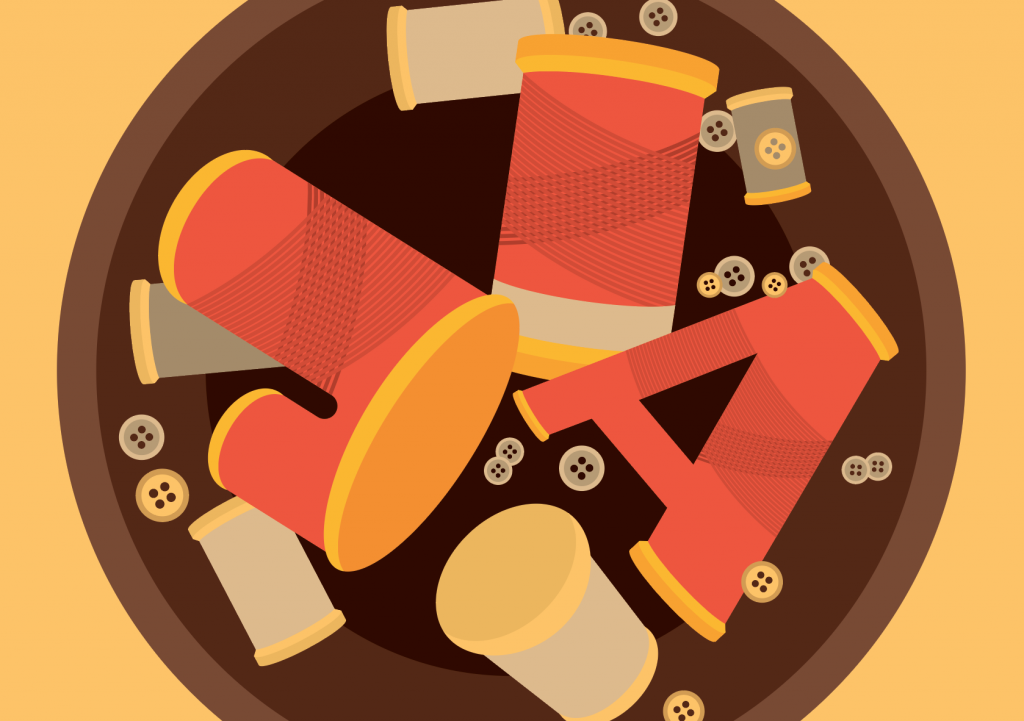
Attributes; Needle, sewing thread, sewing scissors, measuring tape, buttons, cloth.

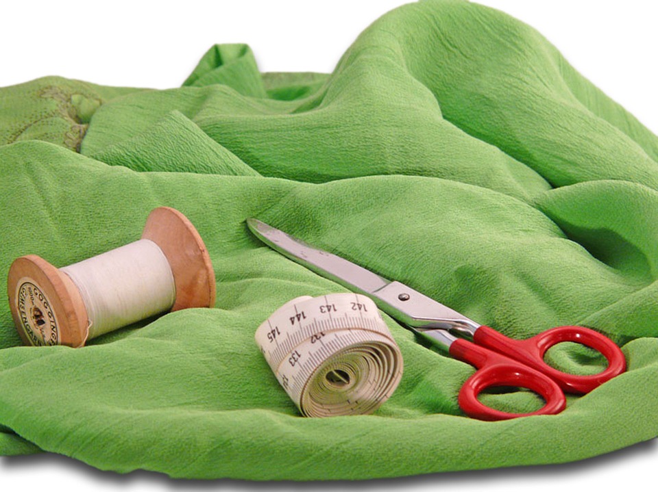
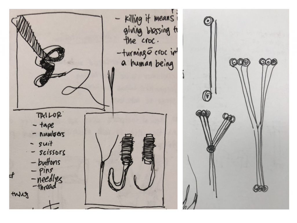
Initially I wanted to create the flowing down of the yellow measuring tape to form my initials. Using one single thread piercing through a needle, forming ‘Y’ and over flowing sewing thread forming the ‘J’.
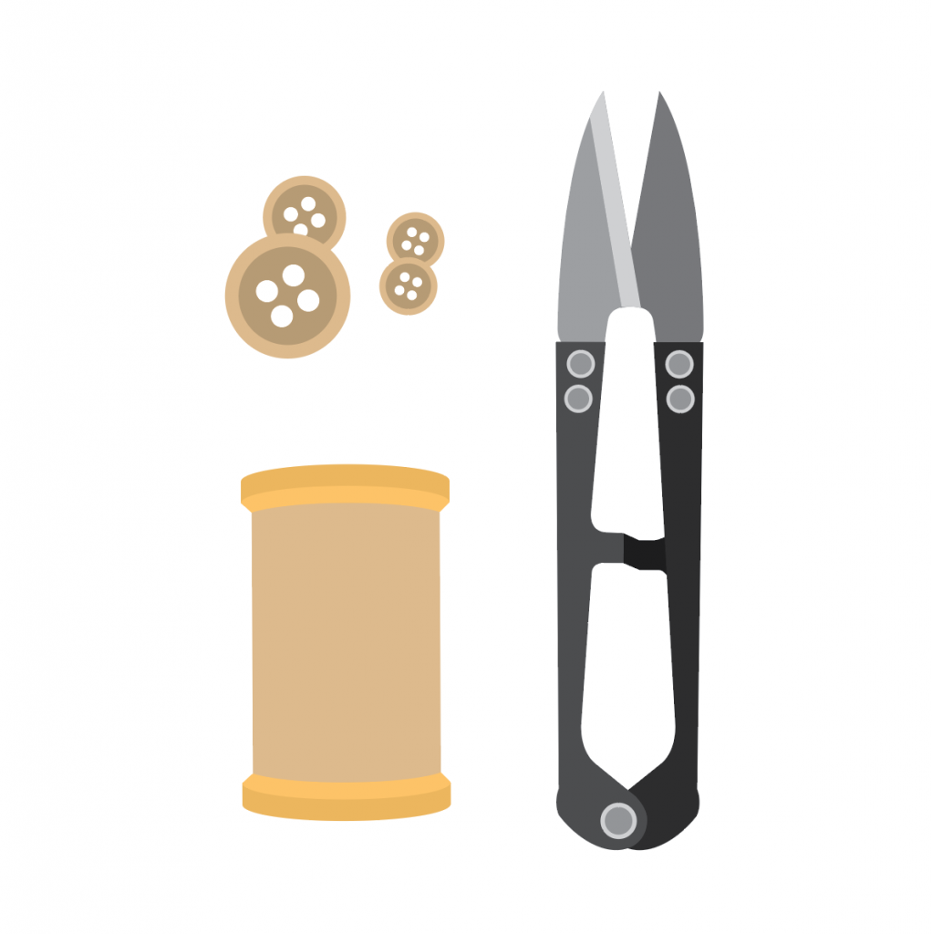

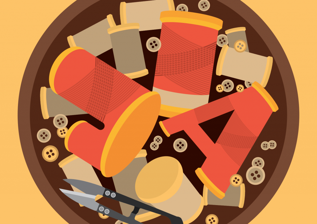
I’ve a bowl to contain the initials created using the sewing thread. I placed them in a position as such that it creates more depth. The composition is more interesting than placing them symmetrical to one another.
The composition still looked as unfinished, so I’ve added more buttons and sewing thread to fill the bowl.
Origami artist
Attributes; origami paper, foldings.
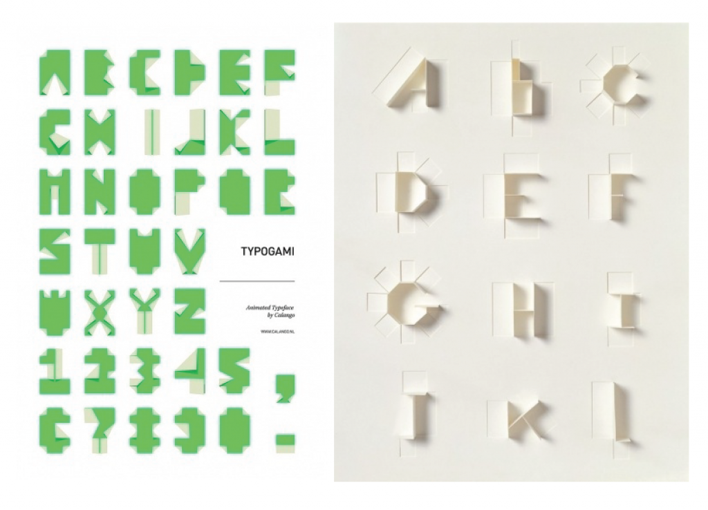
My initial thoughts were to use my english initials. But I feel it rather loses the traditional essence. Also I didn’t go with vector for this occupation. The folds and such won’t be able to shine in vector form. So I’ve gotten the origami paper and tried folding my chinese name instead.
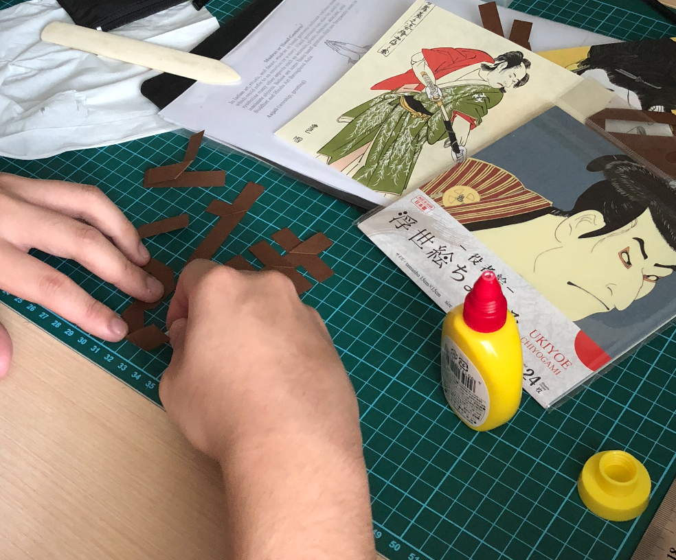
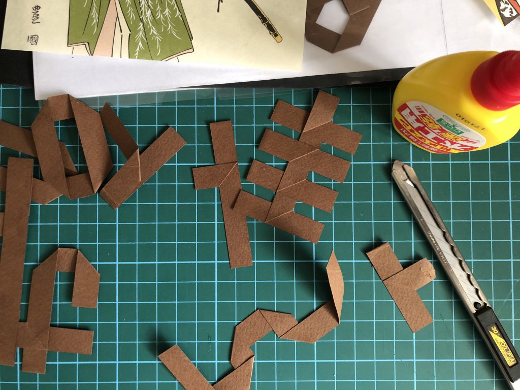
The only difficulty I faced is the consistency of the thickness for each folds. Initially I was to use brown paper against on origami patterns as a background. But the brown didn’t really stand out from the pattern.
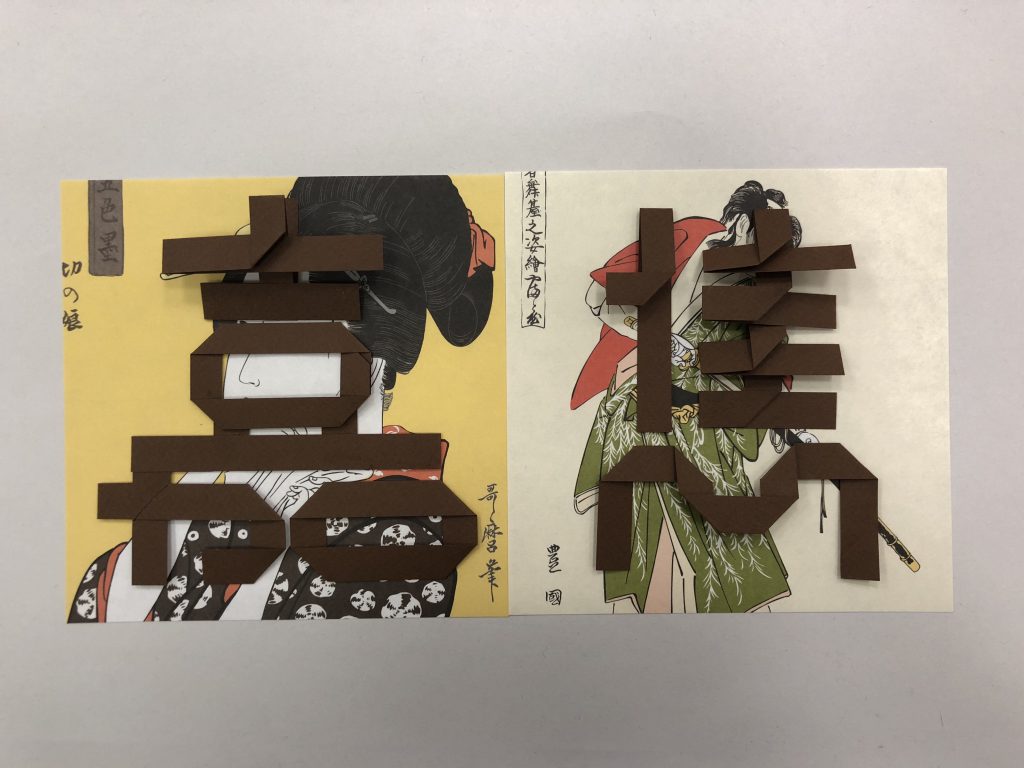
It was rather dull and not obvious. So instead of using the brown paper for my name, I changed into using the origami paper instead.
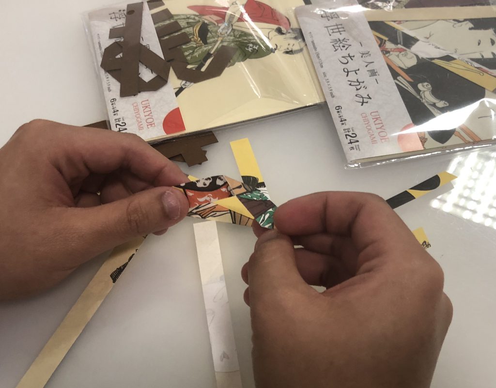
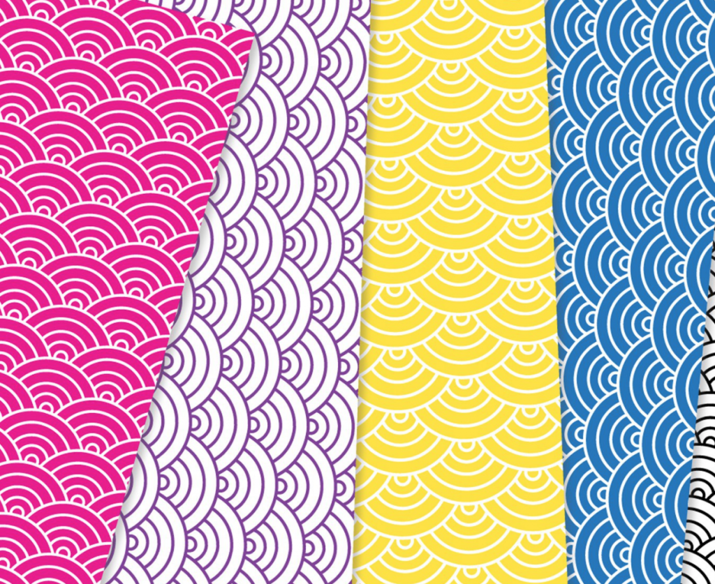
After deciding to use the origami paper to fold out my chinese name, I’ve created a seigaiha wave pattern as a background.
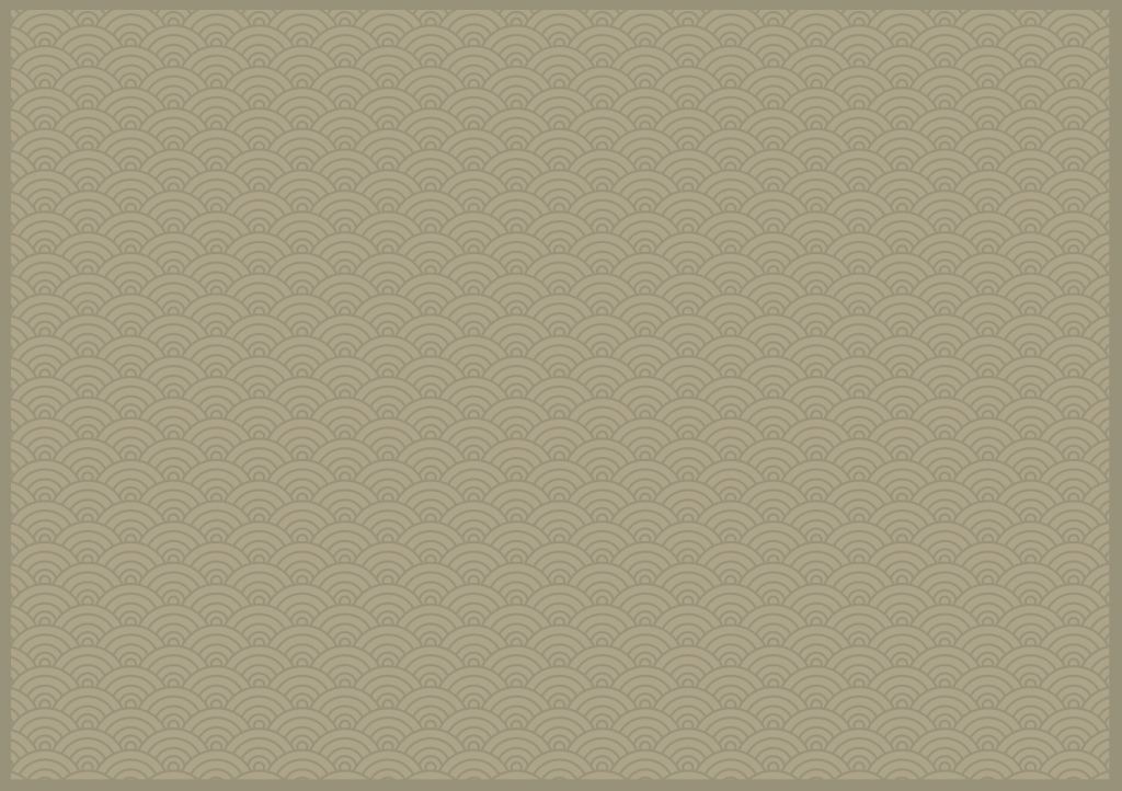
A slight darker green is used for the seigaiha wave background in order to bring out the emphasis on the chinese characters. Analogous colour is introduced in this occupation.
Willy wonka
Attributes; chocolate, chocolate bars, more chocolate

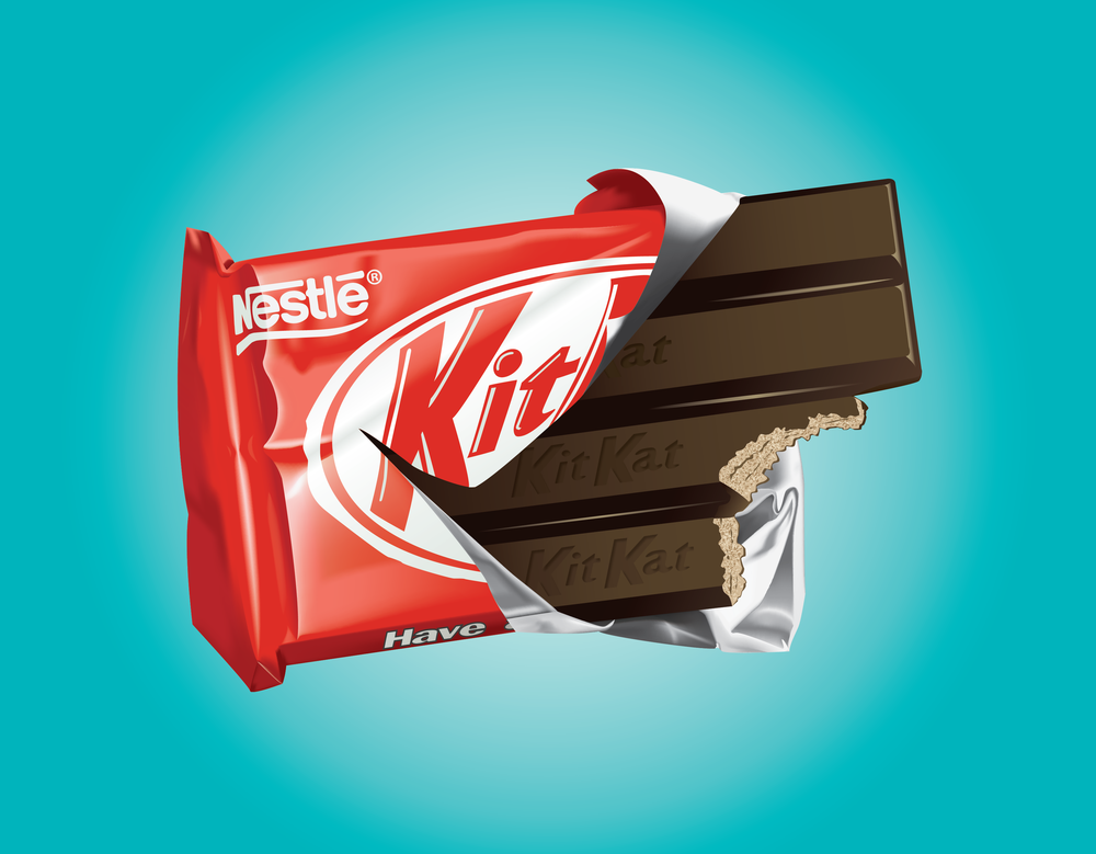
I’ve formed up my initials using some of the famous chocolate bars; snickers, mars and kit kat. I did not want the branding to be so obvious, so I merely used their iconic colours instead. I had the wrapper peeled off to have the personal touch to it.
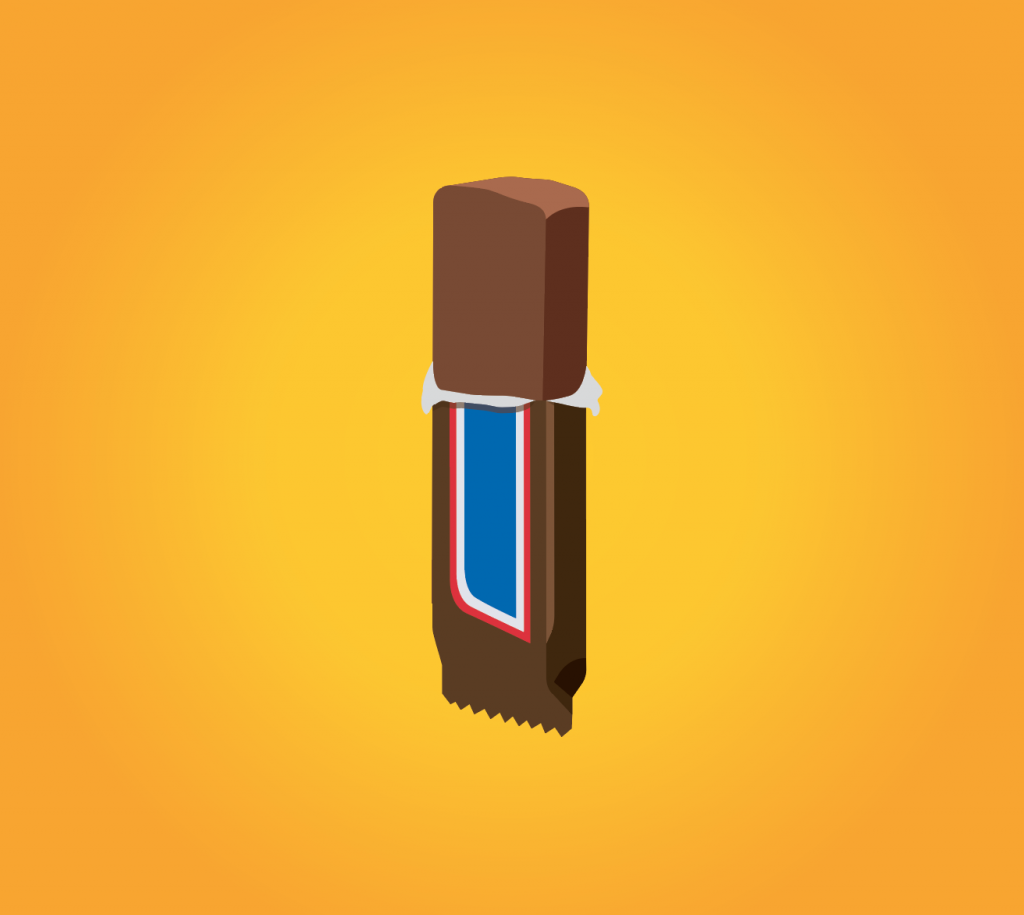
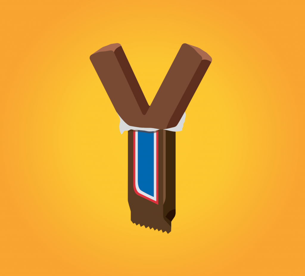
Two bars were integrated into one single packaging that creates the wholesomeness for the initials ‘Y’. Snickers were used for this design.
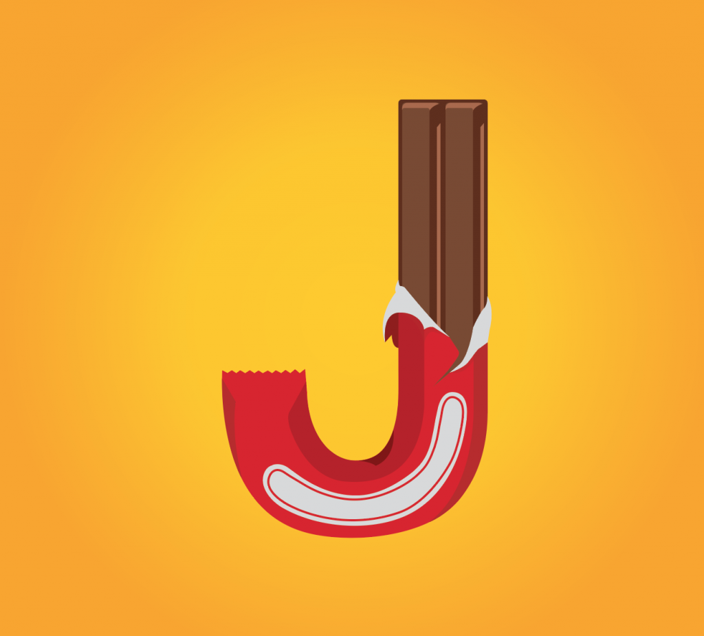
Kit kat bar is being used for this. The packaging followed through the arc of stem of the letter J.
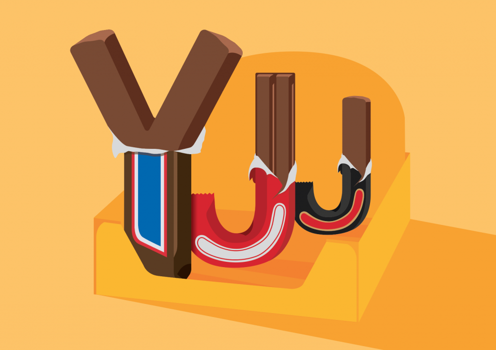
Initially I only had them placed side by side, with the same height and width. The composition wasn’t as exciting. The next thing came into my mind was to have a box to hold them all together. It is also seen commonly on supermarket shelves. So in the end I’ve added the box to my composition. I’ve also played with scale, from a large ‘Y’ gradually to a smaller ‘J’. That created the depth of field.
