![]()

Project 3 | Final

![]()
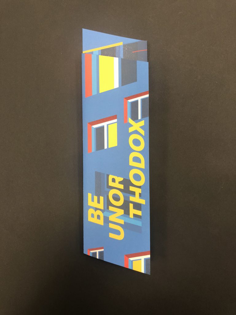
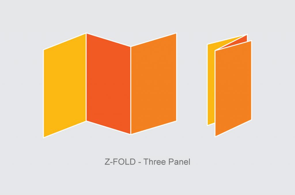
As much as there are so many different kind of paper folds out there, I personally chose a 3 panel z-fold for my final brochure design. Initially I thought we had to incorporate our whole poster in the brochure but turns out it is not necessary.
I didn’t want to exaggerate any of the folds or have any complicated die-cuts. I felt that the content within is much more important. But in order to make things interesting, I incorporated my skewed window shape the 3 panel z-fold to have a stronger relationship with my previous poster design.
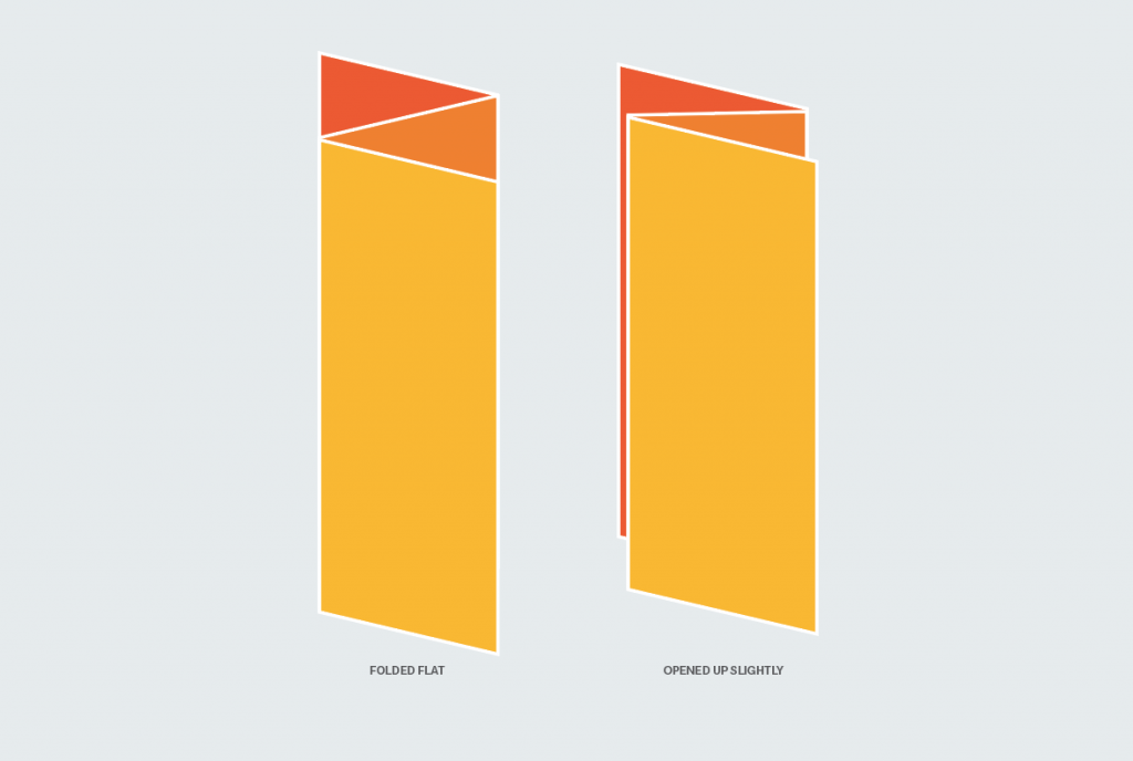
Having the shape of my window integrated into my brochure results in the protruding of inner page and the back page. Hence I tried to play with all the elements and try to have kinda like a sneak peak of the inner and back page.
Initially I thought of showing a sneak peak of a lit window for the inner page, but it kinda failed miserably. The window doesn’t really show much and the red colour is also feels out of place.
I had my title to purposely cut across the second page but when it is folded in, my title looks like an error instead of a purposeful treatment. The front page was seem too empty and quiet for a front cover of a brochure.
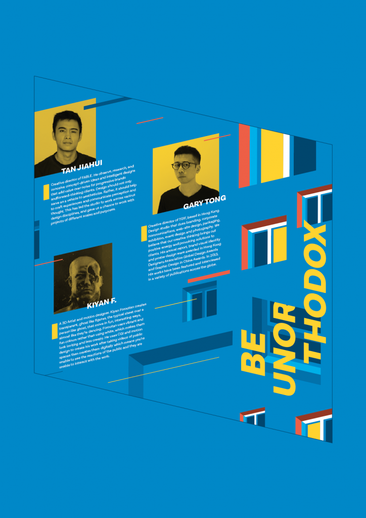
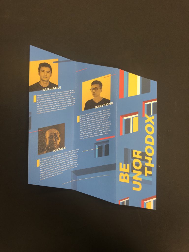
Initially I’ve muted the colours of the profiles and a border around the profile so that the lit windows would have more of the contrast. But after rounds of consultation, was told that there are too many empty gaps and spaces in between, there are too many windows, the names of the artists don’t really stand out from the body copy and the yellow border don’t really make emphasis of the profiles. Hence, everything was kinda scraped.
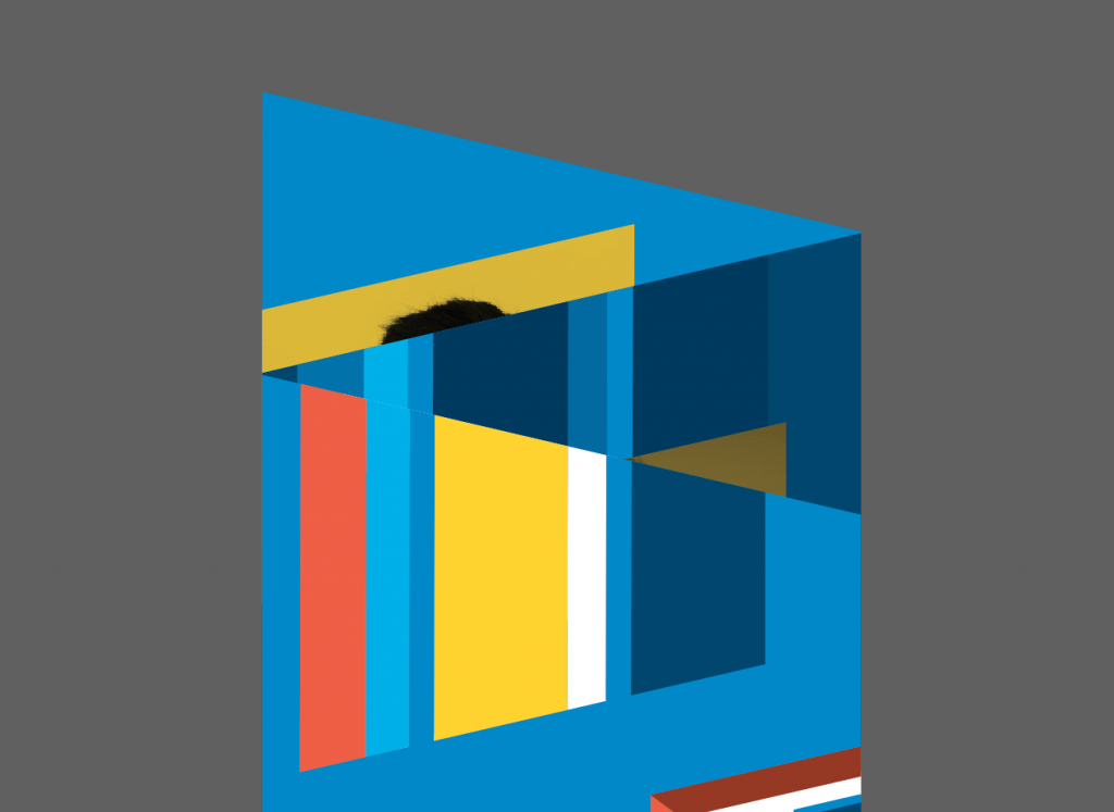
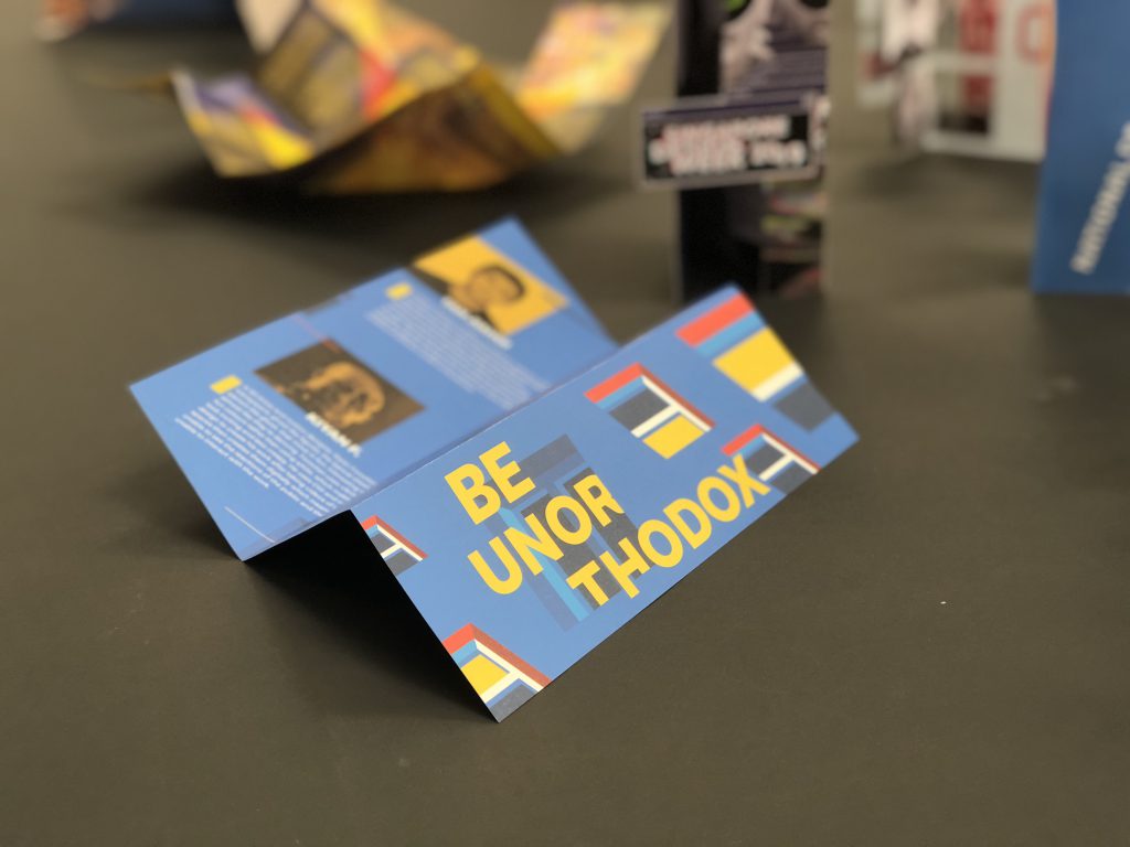
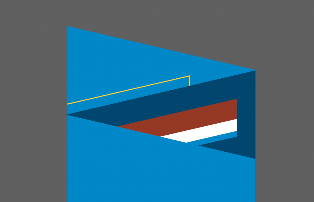
The sneak peak of the brochure is much more clearer now with the illusion of 3 layers of window being seamlessly joined together. This creates a more enticing experience for the reader without having to open the brochure fully yet.
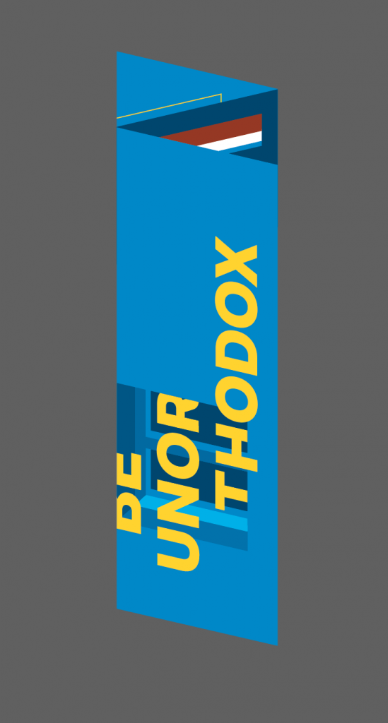
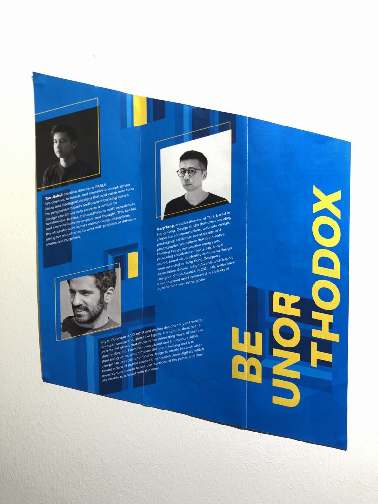
Instead of having the profiles in B&W, I’ve put a yellow filter on top of them so that now it has more relationship with the look and feel of the brochure. I’ve add the coloured windows at the front cover instead, and the title not cutting into the second page. I’ve also replaced windows with lines whereby the subtle hint of the windows are still kept remained. Small little yellow boxes beside each profile shows the emphasis as well. The artists names are taken out from the body copy and standing alone.
The information page are all in yellow to differentiate from the featured artists. Multiple lines with different weights cut across the page of the brochure to show the dynamics and also help to lead the readers’ eyes.
Overall it was quite an experience, and having only the basic technical skills wouldn’t bring me anywhere. Designing a brochure is not as simple as I thought it would be, the importance of the flow of information, the placement of the elements and especially the measurements. I’ve always try very best to break away from my comfort zone, my safest design style. Constantly reminding myself to break the grids, not to be afraid of exploring…. to BE UNORTHODOX.

My initial 3 concepts were rejected due to being too rigid, too literal and too educational. Where the taglines don’t really flow with my moodboard as well.
Final concept; I feel that we designers in Singapore are constantly being trapped, or very much restricted / having censorship due to politics. Hence most of us tend to obey the rules and not going off the grid, like myself, always trying to stay safe and not stepping up. We are constantly questioning ourselves, are we designers, or are we artists. How are we able to escape from our comfort zones and be different.

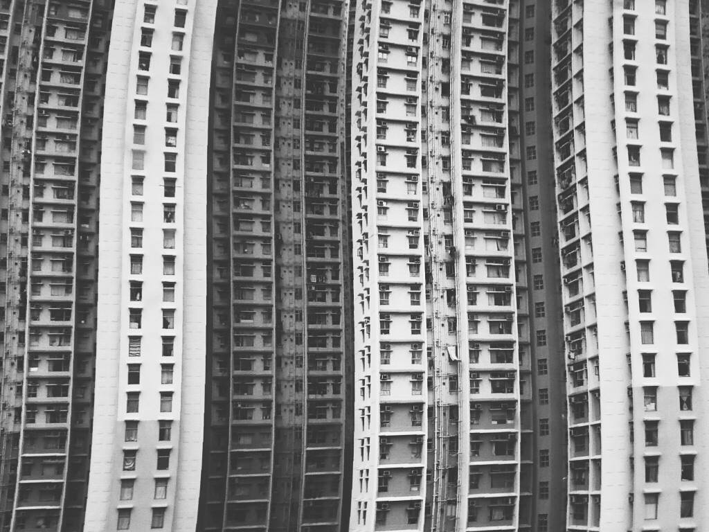
My initial concept was to have multiple buildings with windows to represent us living under HDB flats, implementing the way of us being trapped in boxes. HDBs are like boxes and boxes. The buildings are then being too straight in the face. I then slowly removed the buildings and only leaving the windows behind.
Initially I had one huge window smacked in the middle, opening halfway to represent a door-like structure also to show the opening to much more opportunities behind. Afterwards I thought having only a huge window doesn’t make any sense to my concept. This sketch is therefore being scrapped.
Having only the windows, in it’s very simplified form, on one whole background. The background represents one building with multiple windows on it. Having the illusion of multiple buildings stacking on top of one another.
I came up with a few taglines to go along with my concept;
“Boxed up” – this was my initial tagline, it was seen too literal and straight up forward.
“Are you boxed up” – edited from the previous to being like a open ended question instead, but it was rejected due to it being a question and not a tagline.

The colours on my 1st draft were a bit off, the “Singapore Design Week 2019” was also bigger my tagline. The tagline is too small and wasn’t as prominent and is also at a very awkward position.

I have updated my tagline to;
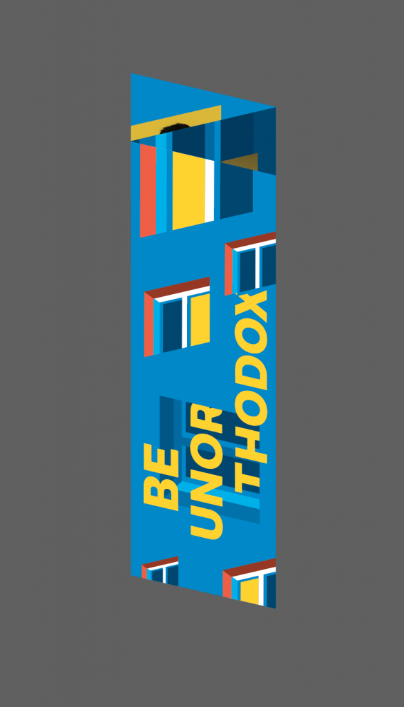
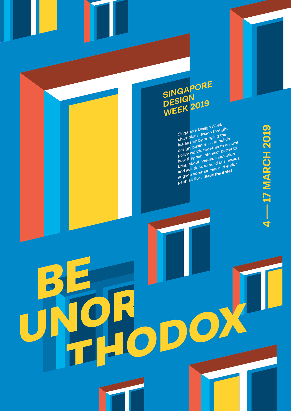
“Be unorthodox” – being said to be unusual and unconventional is what all we need nowadays to differentiate ourselves from the rest.
The lit windows are the ones that are stepping out of their comfort zones, or trying to be unusual than the rest. The colours of the background and the windows are much more muted so that the yellow would pop more than the rest. The tagline is being integrated into the windows to show more relationship with the elements.

I felt that the emphasis should be on the punch line instead of “Singapore Design Week 2019” as it is the first thing that catches peoples’ attention. Therefore the tagline is being enlarged. I also tried to lay it over the window to show the foreground and background.

I’ve tried to explore a different font after consultation but it doesn’t really work that well. So I’ll stick back to Draft 3‘s font.

After much consultations, were told to minimise windows; what they always say “Less is more”. The colours of the window frames were updated with a stronger red. Tagline being the most important one, I have it in yellow as well to really enhance the contrast. I cropped the tagline as well to have the illusion of it cutting in and out of the window. This final draft has a total of 4 layers, the top layer being the tagline, singapore design week 2019, date, 2nd layer being the information of the event, 3rd layer being the windows and last layer being the background.


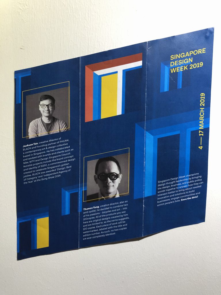
Thomas Yang | Local
100copies Bicycle Art is the brainchild of Singapore Creative Director Thomas Yang . An avid cyclist, he decided to combine two of his passions – bicycles and art – into 100copies. All of the products you see here are original designs created by him and are limited to, as the name suggests, 100 copies. Each piece of work will be watermarked, labeled with the title and edition number. As such, no two copies are ever completely identical.

Jackson Tan/PHUNK | Local
He is the creative director of BLACK, a multi-disciplinary creative agency (2002 – present) and founding partner of PHUNK, a contemporary art & design collective (1994 – present) based in Singapore. He has collaborated and worked with brands and clients such as Nike, MTV, The Rolling Stones, Asian Civilisations Museum, DesignSingapore Council, Herman Miller, UNIQLO, Levi’s and Tiger Beer. Notable projects include the brand concept and identity of SG50, a commissioned design created to celebrate Singapore’s golden jubilee, and the experience design of the Peranakan Museum. In 2013, BLACK was commissioned by the Bureau of Cultural Affairs of Kaohsiung City to curate and design ‘CREATIVE©ITIES’, an exhibition that “maps creativity in Asia-Pacific’s cities today”. BLACK was awarded ‘Design: Best of Category’ and ‘Independent Agency of the Year’ at the Gong Show 2014.

Tan Jiahui/FABLE | Local
Fable is a multi-disciplinary boutique creative agency based in the Republic of Singapore. We observe, research, and conceive concept-driven ideas and intelligent designs that add value over noise for progressive brands and forward-thinking clients.
I believe that in the discerning and crowded age we live in, design should not only serve as a vehicle to aestheticize. Rather, it should help to craft experiences and communicate perception and thought. This has led the studio to work across various design disciplines, and gave us a chance to work with projects of different scales and purposes.
![]()
Gary Tong /TGIF | Hong Kong-based
TGIF is a Hong Kong based graphic design studio founded by Gary Tong in 2010. We provide a full range of design services including branding, corporate communications, web-site design, marketing materials, packaging, exhibition, event design and photography. We believe that our creative thinking brings out positive energy and provoking solutions to clients. His annual report, brand visual identity and poster design were awarded in Hong Kong Designers Association Global Design Awards and Graphic Design in China Awards. In 2013, He was awarded to be 40 under 40 design talents from Perspective. Moreover, He and his works have been featured and interviewed in a variety of publications across the globe.

Kiyan Forootan | LA-based
Kiyan Forootan, a 3D Artist and motion designer. Kiyan Forootan creates transparent, ghost like figures – the typical sheet over a person like ghost – that move in fun, interesting ways, almost like they’re dancing or even walking in public. Forootan uses vibrant and fun colours rather than using white like myself, which makes them look inviting and not creepy like they would be if they were black or white. He uses CGI and motion design to create his work after taking videos of public spaces then creates them digitally which means you’re unable to see the reactions of the public and they are unable to interact with the work.
Arts + Culture


What is HOPE?
HOPE (my definition)
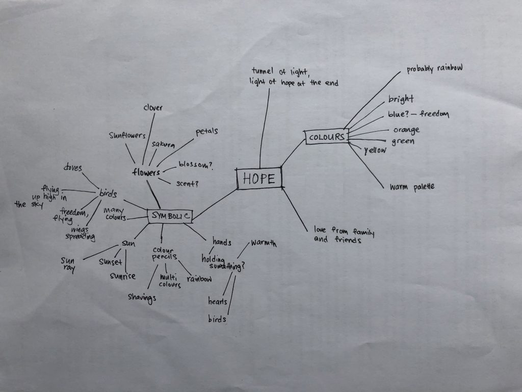
Initial Sketches
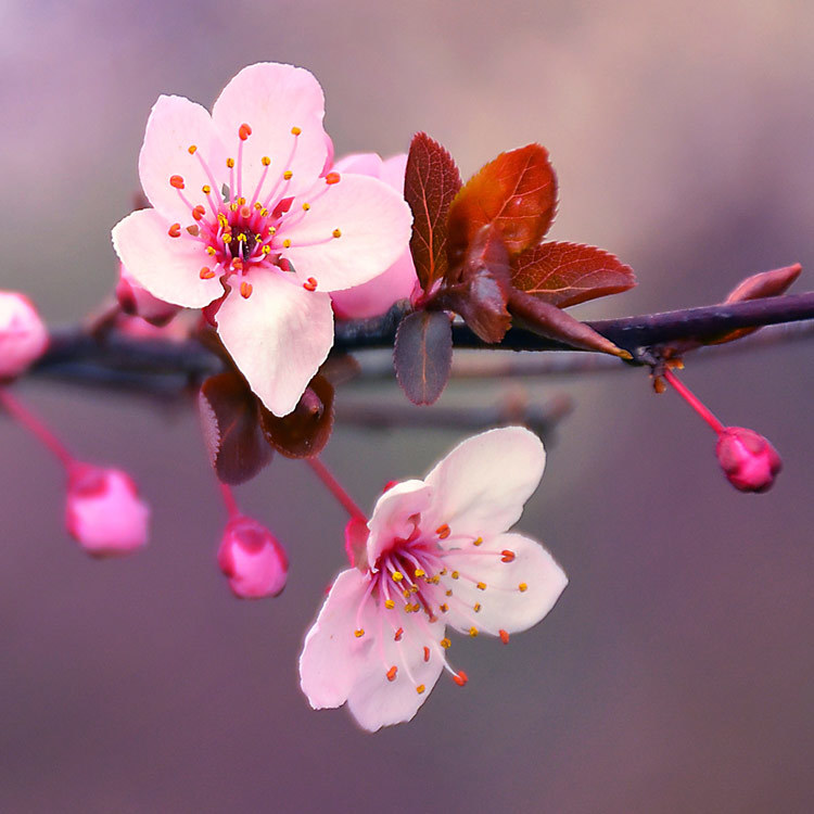
Sakura are also revered as a symbol of rebirth. The Japanese, believed that sakura represented the mountain deities that transformed into gods of rice paddies, hence cherry blossom trees signified agricultural reproduction.
Idea one; initially I wanted to emphasize only on one sakura, the simple form of a sakura. I wanted to portray hope by using the idea of flowers blooming in the sense of a rebirth, a new life. My first exploration was to have a part of a sakura tree growing out of the circle instead of containing them within it, sort of portraying it’s growing “out of the box”. Second exploration was to have a sakura within a sakura, where a flower is growing within another flower, to portray another new life is soon to blossom.
 Sunrise represents a start of a brand new day. A fresh new start, that gives hope for the person. A heartwarming sunrise, and looking at how the sky slowly changes colour.
Colours often represents like ‘adding life’ onto something dull be it drawings for kids or metaphorically.
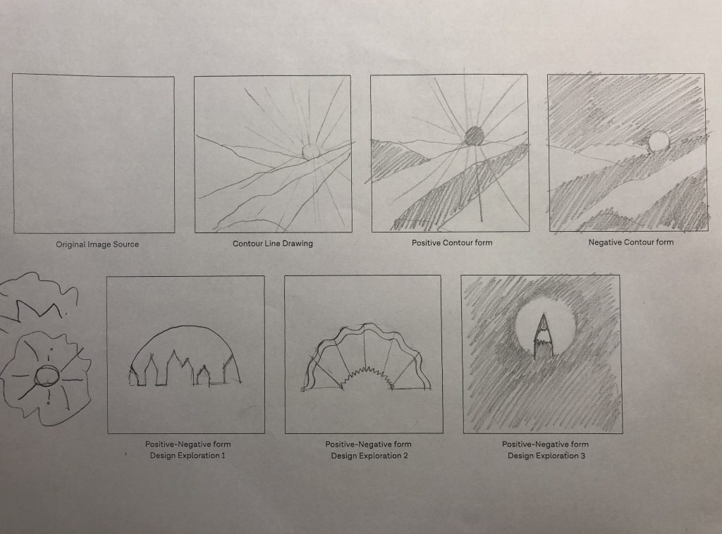
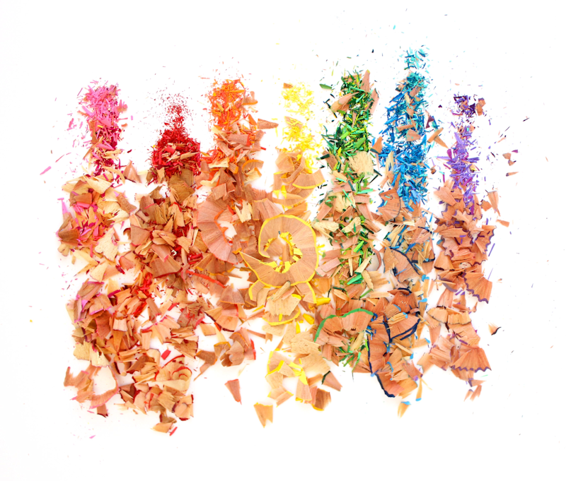
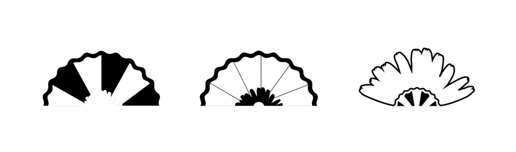
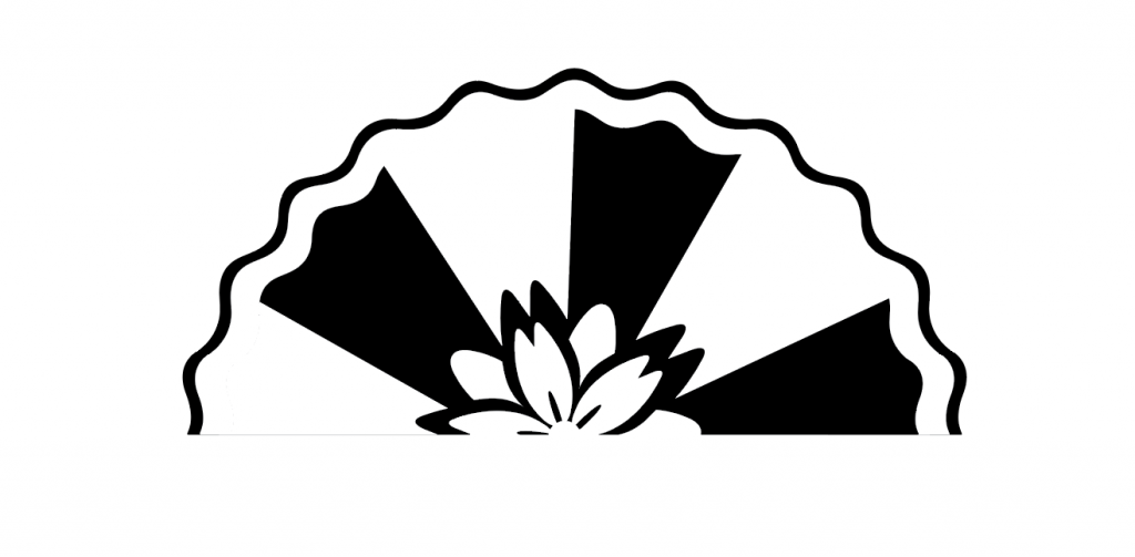
Idea two; initially I only thought of purely just sunrise and how to develop a simple form from it. While I was also exploring into colour pencil shavings, I realised the semi circle has the exact form of a sun viewed below the horizon. For the first exploration, I have tried integrating a the skyline into the sunrise to create the foreground and background effect. Second exploration was to have the colour pencil shavings in the form of a sunrise. Third exploration was to have the outline of a pencil inside of a circle which represents the sun.
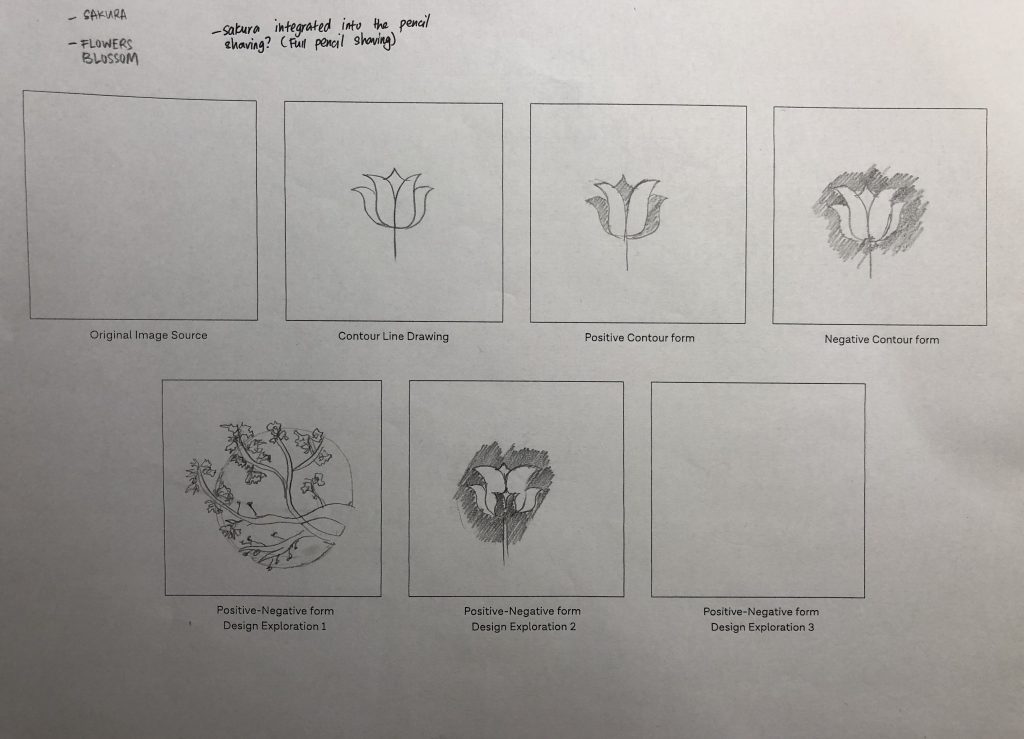
 I have tried exploring the sakura into the colour pencil shavings. Also different types of sakura motifs as well.
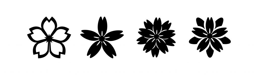 The fourth sakura motif was the most applicable out of the rest, and it fits really well into the pencil shavings.
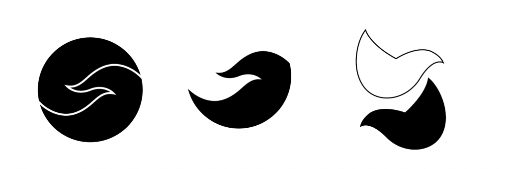
Idea three; I played with the simple form of flying doves. Birds soaring up in the sky defines freedom. First exploration was the idea of “yin and yang”, having to doves placed side by side and playing with the positive and negative space.
The feedback was to explore more of the doves and how they can be integrated together with the flowers instead of hanging on individually.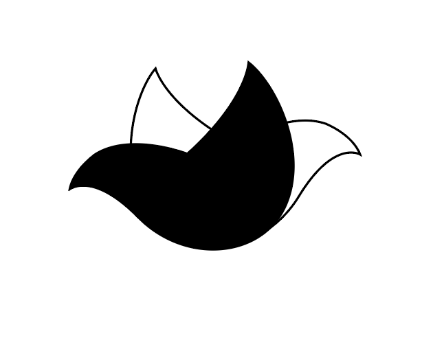
The doves were then even simplified into individual doves, black and white. As I was exploring with the placement, when the two individual doves comes flying together, they form into a flower. Also creating the foreground and background effect.
Colour explorations
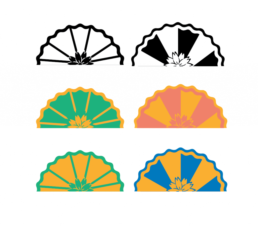
 The green and the orange didn’t really work out with the other two palettes. So in the end the final colours I chose was,
complementary colours of red and blue,
analogous colours whereby I explored the different shades of red and blue.
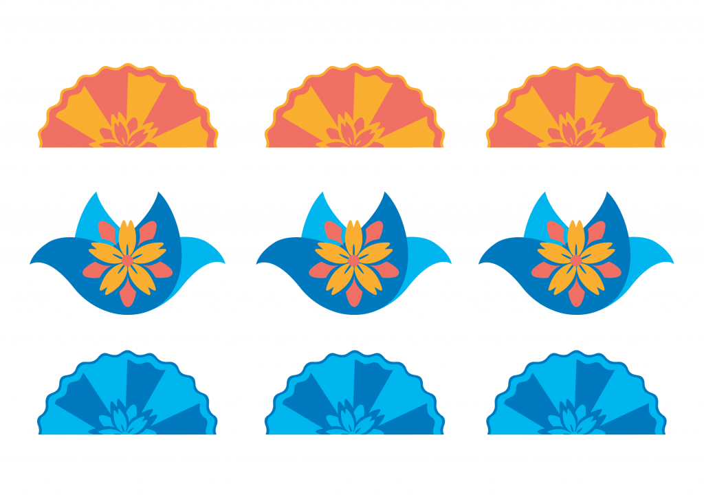
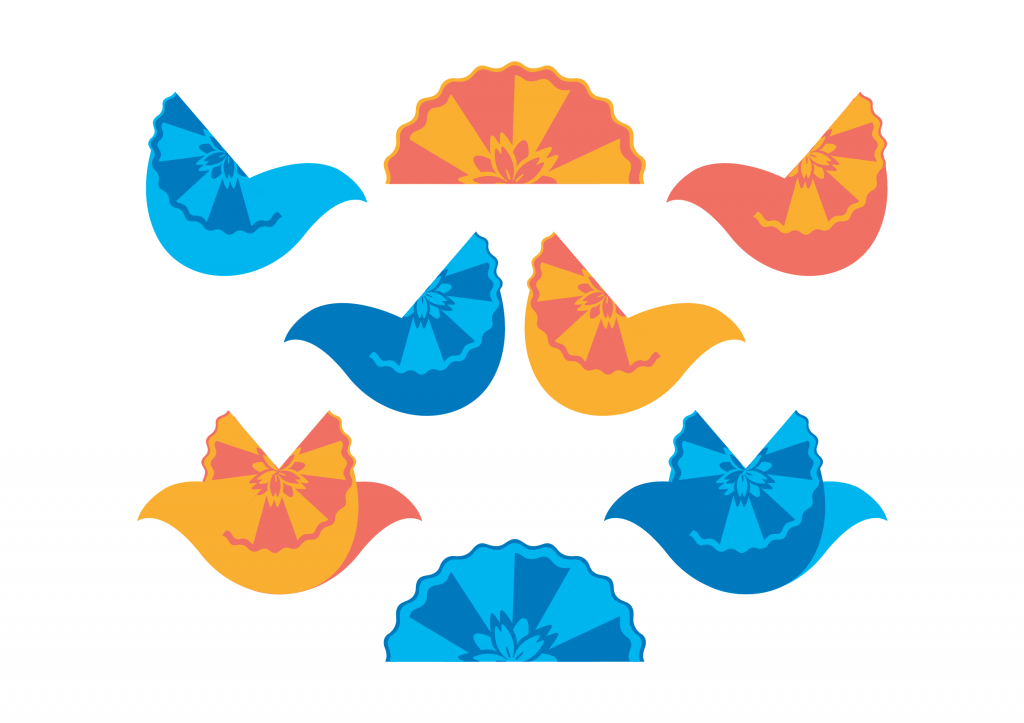
I integrated the sunrise pencil shavings into the doves as part of their wings as well.