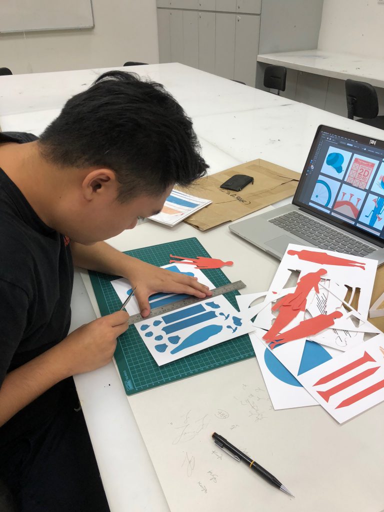
After a few consultations, my ideas were confirmed down. I was going for the paper cut medium for all my panels. I chose one complementary palette for all my panels as well to tie them all together as one category.
It’s kind of tricky for paper cut and layering, as I would have to plan ahead. I drafted out all my designs out on illustrator first in order to know which layer comes first and which comes after.
Rough sketches of some of my elements
I sorted out all my elements and lay them flat on the artboards. The only cons for paper cutting is that there is no room for error. Once you cut it wrongly means you’ll have to reprint again. Unlike doing digitally when you can undo as and when.
Final –
Basically me as a snail, slow and always procrastinating. Deadlines and submissions all piled up on the calendar, hence being a snail transformed into a fast moving shell rushing for all the deadlines and submission.
Basically me as a bicycle wheel, everything’s smooth sailing. Whenever at interviews or presentations, I would get super nervous, butterflies in my stomach. I’ll see the interviewers as sharp nails and puncturing my tyre at the end.
Basically me as a pufferfish, exhausted on my couch. Whenever I get into a super crowded place/situation I will get tensed up, suffocating hence puffed up around the crowd.
Basically me as a pig, loves foods. Buffets are like heaven, anything but mushrooms. Hence if I get to a mushroom buffet, I would slimmed down drastically.
Difficulties –
Tiny details are super tedious to manually cut it down, it may also tend to break easily. Positioning the each layers down right also takes up a lot time as it may get it right the first time.
Takeaways –
I have learnt to always organise my artboards as and when in order not to have any missing elements when handling with intricate details. Correct colour combination also plays a very important role, once you get the colours wrong, the design will not stand out.
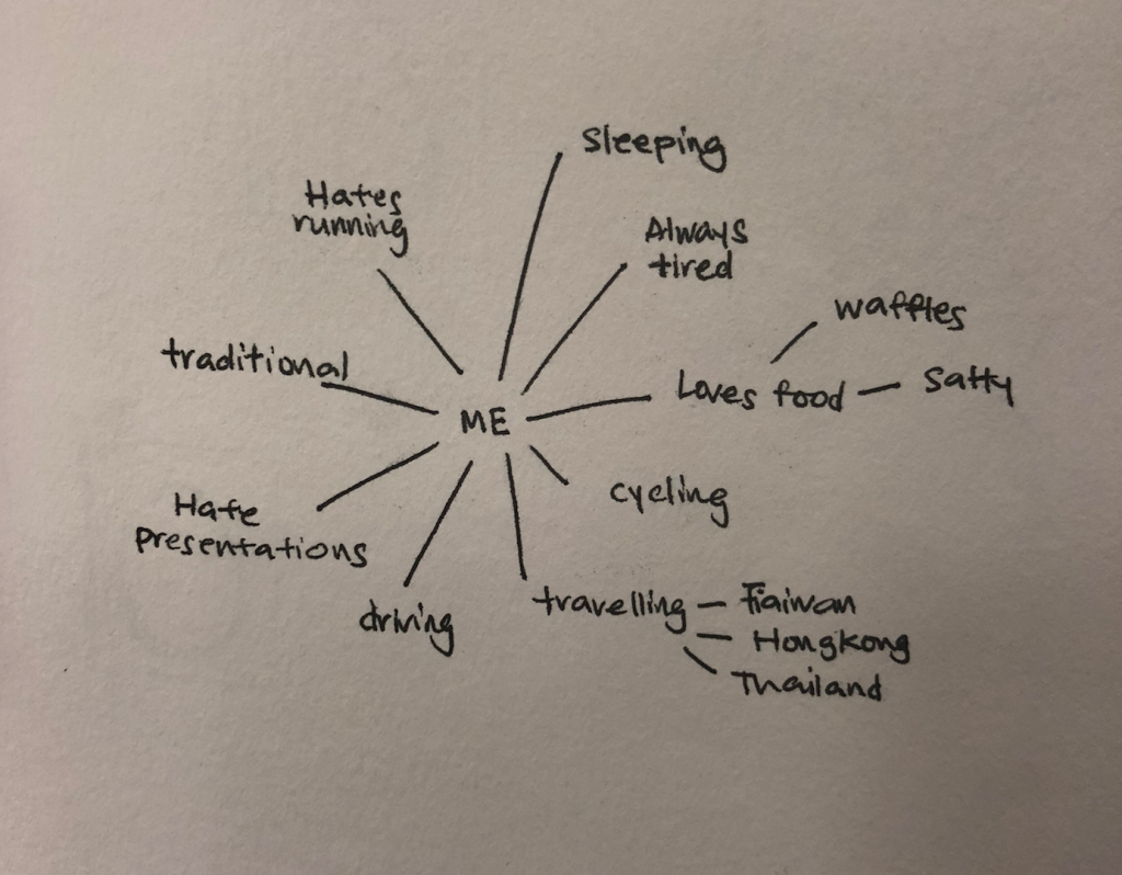
For this assignment, we will have to create 12 different compositions where it represent ourselves in different situations. We will also have to apply colour theory to the compositions.
Me + Situation = Outcome
We have to come up with a representative of ourselves instead of using a human form.
I really like how the artist uses complementary colour to bring contrast to the two different elements. I also like how he plays with shadows and depth to show the dynamics in the paper cuttings.
The animal paper cut is super clean and seamless. The clever usage of layerings to create the depth on a flat surface. The expressions on the animal looks very peaceful as well.
We designers are treated unfairly nowadays whereas our skillsets/ideas. So I kinda tie this idea back to the real design industry out there. The idea of using money birds is to portray that our creative ideas/ concepts are really valuable to us.
My 1st draft for this composition. I did not want to smack the person right in the middle. I placed the pliers coming in diagonally to create the leading eye towards the cage. I also played with the proportion of the pliers to create the surreal effect. During the consultation, was told the background was a bit too plain and to create more textures at the background to create more depth.
Final composition. I added the whimsical clouds at the back to add more depth also to increase the surrealism effect.
Madness, as you know is like gravity. All it takes is a little push.
You will never know what will happen until you push that person to their limits. Some of the keywords I extracted out from this quote would be madness, gravity and push. Pushing someone down into the deep ocean is like pushing someone to the very corner. I tie madness with the inner demons inside all of us , its only time that they would come out and play.
When people first think of gravity, they would image this kind of situation. So I kinda make the composition more interesting by inverting it instead.
It makes the whole composition more interesting and would make the viewers think of why the gravity looks like that instead of looking like the normal.
I’m not a monster, I’m just ahead of the curve.
Roller coaster came to my mind when I think of the curve. I perceive monster as the obstacles in life and therefore the curve would be something even massive to overcome it. When drafting on my first composition, I really had a hard time thinking of what creature that is as curvy as the roller coaster.
Second draft, I finally thought of octopus being the obstacles. I fuse the octopus into the roller coaster tracks, turning them into the tracks rather than them standing alone without connecting with the roller coaster. The background now seems to plain and making the the elements out of focus. So I have added a starry night background to make roller coaster and the octopus pop out.
Final composition.
I believe, whatever doesn’t kill you, simply makes you stranger.
Being the strongest, powerful man in the empire, many would want you dead. Or even Arrows piercing through one of the king’s face is not something that will happen in a normal situation. To make the whole composition more interesting and weirder, birds and butterflies protruding halfway out of the arrows, this suggests the different strange encounters/events happening around. All the arrows coming out from the back at an angle kind of portrays the backstabbers in life.
Silkscreen Experiment!
This might be the most tedious part but also all the fun comes out from here! I previously did silkscreen during my poly days but that’s like years back. So I’m kinda excited for how my design would turn out.
After coating our screens with emulsion, its time for exposing our design on the screen. I was being skeptical as my design has many tiny details which I’m afraid it won’t be able to expose nicely.
18 seconds of truth. It’s either death or happiness.
It’s always good to have happy friends waiting along
It’s time to see if my design turns out well enough! Fingers crossed!
First and second tries on paper. Too much ink went into the screen, resulting in just black. Third time’s the charm right?
And indeed it came out as a charm, I was quite happy for my third try!! Now’s the time to know my real destiny… silkscreening on the tote bag. 2 sides 2 tries.
Its always good to have a pair of hands pressing down the screen tight making sure no excess ink will slip through.
On paper, my design came out perfectly fine due to the finer pores on the paper. But on a tote bag, the pores are larger therefore its harder to capture the finest details from my design and resulting almost a pitch black design on the tote bag. The take away from this assignment is that, I have learnt to expect the unexpected. Nothing will always go the way we want things to be. What looks good on screen doesn’t mean it will turn out exactly on screen. Photoshop skills indeed freshen up.
Money birds – portrayed as our creative ideas, concepts
Pliers – portrayed as hell clients
Design principles:
Hierarchy, Contrast
For this composition, I’ve tied down the link between the life of a designer now. Having ridiculous clients trying to squeeze us designers dry they anything or everything. The cage being our minds, caging our precious creative ideas, concepts. Creative ideas, concepts are usually perceived as money therefore I interpreted them as money birds. The pliers coming down towards the cage, trying to pry open the cage and set free the money birds suggest the hell clients trying to get our ideas, concepts at a very low price or even free. They often call that exposure/experience. Therefore if you’re good at something never do it for free.
Elements:
Deep ocean creatures – portrayed as the demon inside us
Humans – portrayed as one person’s feelings/limits
Dark ocean background – portrayed as the level of a person’s limits can go
Design principles:
Hierarchy, Contrast
You will never know what is your limit until someone pushed you to very corner. For this composition I played around with the definition of gravity by inverting the composition as most of the people would not think of defying gravity when gravity first comes into their mind. The human floating towards the ocean creatures portraying the effects of pushing someone to their limits, releasing the inner demons within them.
Elements:
King of Arthur – portrayed as strongest man in the empire
Arrows – portrayed as killer weapon
Birds and butterflies – portrayed as strange encounters
Design principles:
Contrast, Rhythm, Emphasis
Being the strongest, powerful man in the empire, many would want you dead. Or even Arrows piercing through one of the king’s face is not something that will happen in a normal situation. To make the whole composition more interesting and weirder, birds and butterflies protruding halfway out of the arrows, this suggests the different strange encounters/events happening around. All the arrows coming out from the back at an angle kind of portrays the backstabbers in life.
Elements:
Roller coaster – portrayed as the curve
Octopus – portrayed as the monster/obstacles in life/inner demon
Starry night & island – portrayed as the support/distraction
Design principles:
Proportion, Movement
The first thing came into my mind when I first thought of curve was the roller coaster tracks. I fused the octopus into the tracks making them the tracks instead of a normal roller coaster ones is to portray them as the obstacles in life. Also to show the battle against our inner demons. Therefore the roller coaster train is running directly over the octopus is to show the success of fighting against the obstacles. The two islands in front portray either as the support or distraction in life.
Hmmmm movie quotes… The first thing came into my mind was The Mask, basically I grew up watching this particular movie over and over again. Second was The Dark Knight’s Joker.
SSSSSSMOKIN’!
The Mask, 1994
I believe, whatever doesn’t kill you, simply makes you…stranger
The Dark Knight, 2008
If you’re good at something never do it for free
The Dark Knight, 2008
Madness, as you know is like gravity. All it takes is a little push
Bliss depicts a burst of happiness/emotion. The paint splatter is to portray the explosion of feelings. The effect kinda reminds me of a fireworks.
Medium: toothbrush, acrylic paint mixed with water
Method: dip the toothbrush into the paint and flick the brush towards one direction
Love – Overwhelming, passionate affection
Love depicts overwhelming waves, warm and deep. From the beginning everything may seems complicated but it gets smoother along the way. The negatives spaces depicts the obstacles within the relationship.
Medium: acrylic paint mixed with water, scraps of paper
Method: drip the paint on the surface, curve the scraps of paper and scrape through the paint from left to right direction
Nervousness – Overlapping emotions, uneasy
Nervousness depicts overlapping emotions hence the overlapping effect shows how I am uncertain of my feelings. It feels like my heart is pounding up and down.
Medium: chinese ink, shower wash cloth, roller
Method: dip the roller into the chinese ink, imprint onto the wash cloth and lastly roll it onto a white cartridge paper.
Surprise – Sudden feeling through unexpectedness
Surprise depicts a sudden rush of emotion hence a thick brush stroke coming in very sharply from the left and stops right in the middle. It reminds me of being shocked, a temporary feeling.
Medium: toothbrush, acrylic paint mixed with water
Method: brush towards the direction of left to right, pulled off in between leaving a negative space.
Hurt – Damage, to feel mentality painful and suffer bodily
Hurt depicts mentality and bodily being damaged by someone. An obvious slit through the foam board portray the physical damage. The strands are to show the damage mentality, deep down the skin. There’s a outer layer as the ‘skin’ to cover the past injuries showing how time may heal physically but not mentally.
Medium: foam board, hot glue gun
Method: firstly to slit a big opening but still keeping the outer layer as the ‘skin’. Afterwards using the glue gun to kinda stick the both ends together. The strands portraying the tissue underneath the skin.
Pulling off the ‘outer’ layer
Torment – Agony, almost pulling apart
Torment depicts a very bad migraine. It is almost tearing apart within. The burning sensation is portrayed in the middle, about to break loose shows that the suffering is still on-going.
Medium: styrofoam board, wind proof lighter
Method: burn straight through the styrofoam board. Slowly and carefully not to burn through the entire styrofoam board.
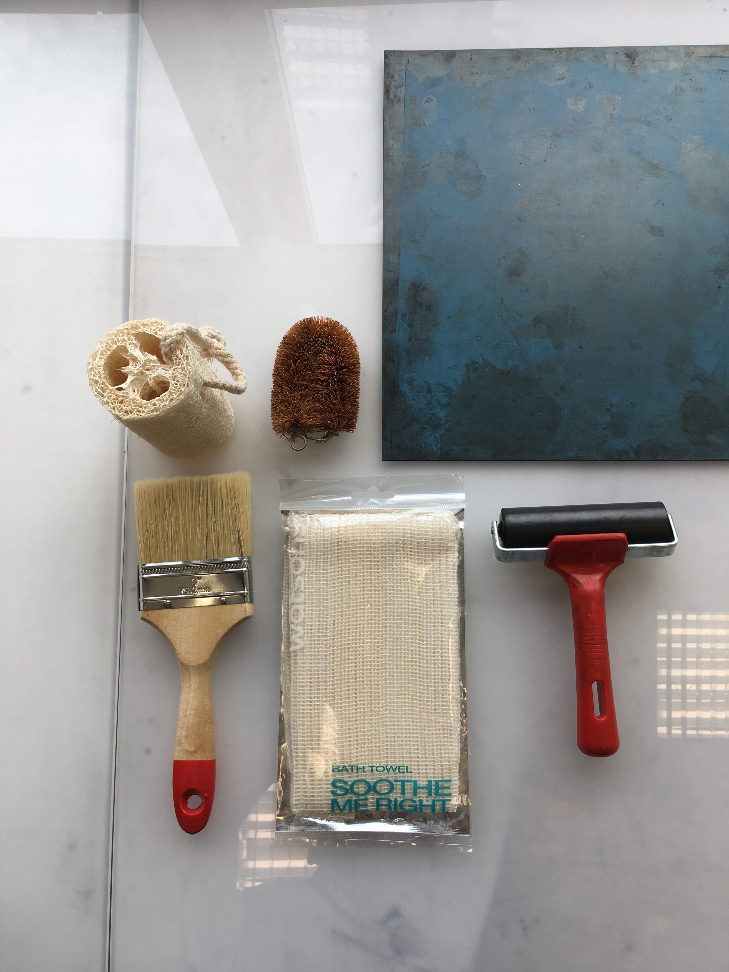
Week 2 was hella-fun cause we get to experiment with different types of tools to create different kind of texture/mood on paper. I used mainly chinese ink forall of the experiments.
Here are some of the tools I’ve broughtFirst contender
For this scrubbing brush, I wanted to create very harsh brush strokes. I was then able to achieve somehow explosion-like effect. After the ink dried up, I can feel the line textures. This could fall under the emotion of anger.
Second contender
I find the the shape of a loofah really interesting. The end results wasn’t what I expected to be. After I dipped the loofah into the chinese ink, it kinda soaked up most of the ink till I had to really press it down to achieve the effects.
Fail contender
Despite all the holes on the sponge, it didn’t came out really well. Turns out having a big fat blob of ink, only when the ink gets slightly used up, you will be able to see a slight pattern.
Third contender
I am able to create smooth/flowy strokes from the top and down with more more splits. The strokes kind of gives off the horror vibes.
Fourth contender
Possible emotion: Nervousness
After dipping the roller into chinese ink I rolled it straight onto the shower was cloth. I found the patterns on the wash cloth’s really interesting but did not expect how it will turn out after getting onto the paper. The after results were quite satisfying.
Week 3 – More experiments (Close to picking the final ones)
Possible emotion: Torment
Burning styrofoam… as toxic as it gets.. Using a wing proof lighter and burning through the styrofoam board gives people the effect of suffering. The final results were quite satisfying, there are strands of styrofoam still holding on together, some broken off.
Possible emotion: Hurt
Initially I slit an opening on the foam board and was thinking how do I incorporate the hot glue with the foam board. So I drag from one point to another to create strands of tissue-like texture.
Possible emotion: Bliss
Bliss is like a burst of emotion, like a fireworks. Initially I tried using normal paint brush and flicking it but the results came out quite a blob instead of the finer ones which came out perfectly using a tooth brush. The brushes on a tooth brush has a much bigger surface which spreads more evenly.
Possible emotion: Surprise
The first thing came into my mind was to portray something that appear out of a sudden.
Possible emotion: Love
This particular emotion was the hardest for me as the first thing came into my mind was full of heart shapes.
I really enjoyed this whole session of experiment and definitely will
What is mark making? Does it just mean dots, scribbles, and brushstrokes? What do expressive qualities add to the look and feel of an artwork?
Artists often use mark making and gestural qualities to express their feelings or emotions about something they have seen or experienced. Artists also use expressive mark making to create purely abstract artworks which do not necessarily refer to anything in the real world but are intuitive or respond to a defined set of rules.
Willem De Kooning Untitled 1966-7 Charcoal on tracing paper support: 476 x 610 mm
One of the techniques that I’m really intrigued by is Fumage / Smoke painting. Fumageis a surrealist art technique popularized by Wolfgang Paalen in which impressions are made by the smoke of a candle or kerosene lamp on a piece of paper or canvas.Flames/smoke are often associated with danger, who would have known using this technique can create such detailed and beautiful piece of artwork.
: an impression made on paper from glass or some equally smooth material (as celluloid or oilcloth) to which oil paint has been applied
https://www.pinterest.com/pin/329044316497751896/
This technique is kinda interesting because you either paint the image directly onto the plate which is known as the light field or you apply the ink first then remove the image which is known as the dark field. Each monoprint is different and unique and the artist may use one or more techniques to achieve the image that he or she want to create.
One of the technique that I might want to explore/experiment with is the Fumage. You will never know/expect what will turn out at the end. I guess mark making isn’t much on the technical side but rather a form of expression and experiment(?).


 Basically me as a snail, slow and always procrastinating. Deadlines and submissions all piled up on the calendar, hence being a snail transformed into a fast moving shell rushing for all the deadlines and submission.