

My initial 3 concepts were rejected due to being too rigid, too literal and too educational. Where the taglines don’t really flow with my moodboard as well.
Final concept; I feel that we designers in Singapore are constantly being trapped, or very much restricted / having censorship due to politics. Hence most of us tend to obey the rules and not going off the grid, like myself, always trying to stay safe and not stepping up. We are constantly questioning ourselves, are we designers, or are we artists. How are we able to escape from our comfort zones and be different.

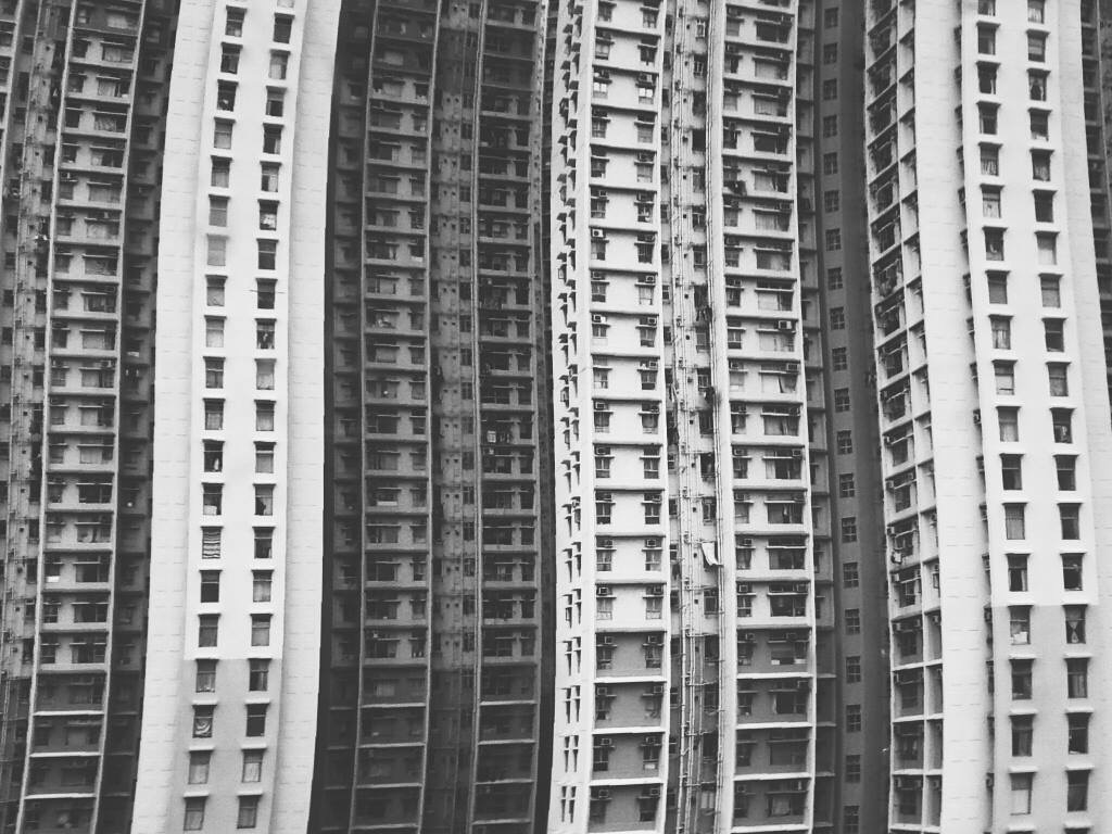
My initial concept was to have multiple buildings with windows to represent us living under HDB flats, implementing the way of us being trapped in boxes. HDBs are like boxes and boxes. The buildings are then being too straight in the face. I then slowly removed the buildings and only leaving the windows behind.
Initially I had one huge window smacked in the middle, opening halfway to represent a door-like structure also to show the opening to much more opportunities behind. Afterwards I thought having only a huge window doesn’t make any sense to my concept. This sketch is therefore being scrapped.
Having only the windows, in it’s very simplified form, on one whole background. The background represents one building with multiple windows on it. Having the illusion of multiple buildings stacking on top of one another.
I came up with a few taglines to go along with my concept;
“Boxed up” – this was my initial tagline, it was seen too literal and straight up forward.
“Are you boxed up” – edited from the previous to being like a open ended question instead, but it was rejected due to it being a question and not a tagline.

The colours on my 1st draft were a bit off, the “Singapore Design Week 2019” was also bigger my tagline. The tagline is too small and wasn’t as prominent and is also at a very awkward position.

I have updated my tagline to;
“Be unorthodox” – being said to be unusual and unconventional is what all we need nowadays to differentiate ourselves from the rest.
The lit windows are the ones that are stepping out of their comfort zones, or trying to be unusual than the rest. The colours of the background and the windows are much more muted so that the yellow would pop more than the rest. The tagline is being integrated into the windows to show more relationship with the elements.

I felt that the emphasis should be on the punch line instead of “Singapore Design Week 2019” as it is the first thing that catches peoples’ attention. Therefore the tagline is being enlarged. I also tried to lay it over the window to show the foreground and background.

I’ve tried to explore a different font after consultation but it doesn’t really work that well. So I’ll stick back to Draft 3‘s font.

After much consultations, were told to minimise windows; what they always say “Less is more”. The colours of the window frames were updated with a stronger red. Tagline being the most important one, I have it in yellow as well to really enhance the contrast. I cropped the tagline as well to have the illusion of it cutting in and out of the window. This final draft has a total of 4 layers, the top layer being the tagline, singapore design week 2019, date, 2nd layer being the information of the event, 3rd layer being the windows and last layer being the background.


