


Yuen Jia Jun
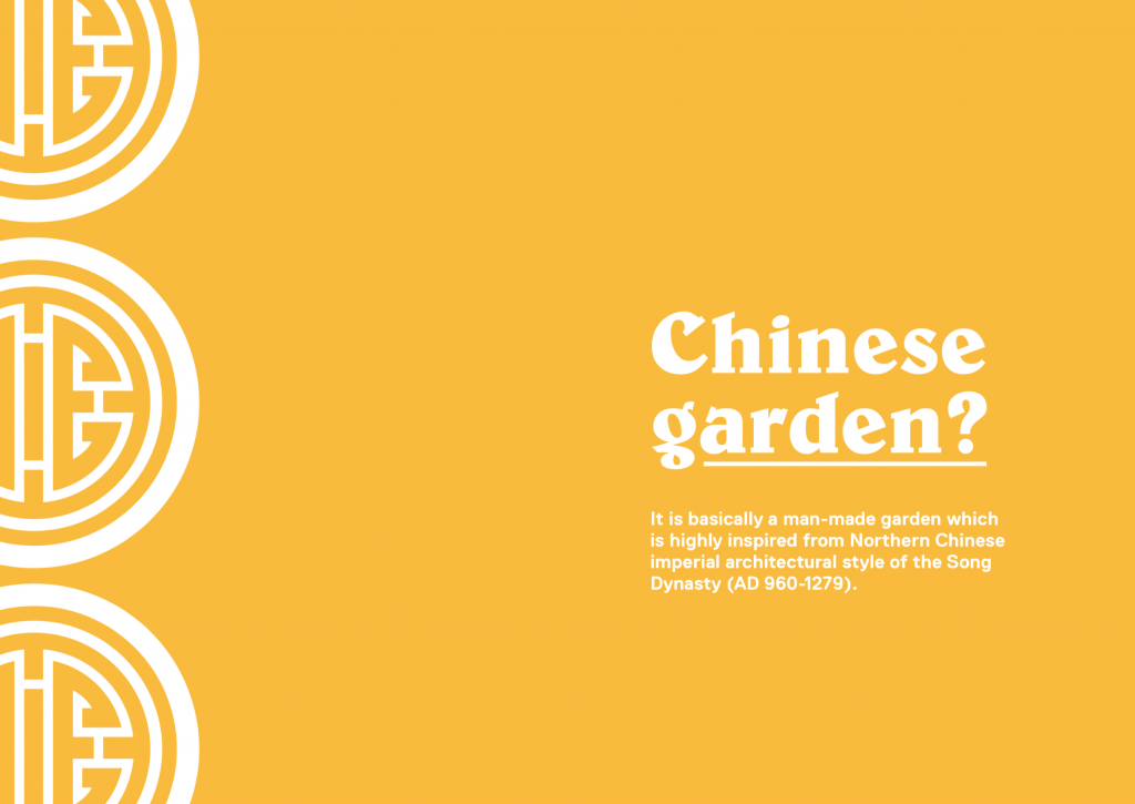
I have always wanted to explore designs that has the traditional chinese influences. Hence I have decided to work on Chinese Garden for this project.
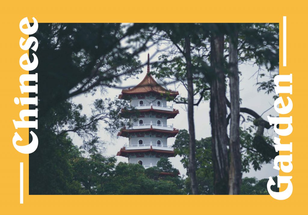
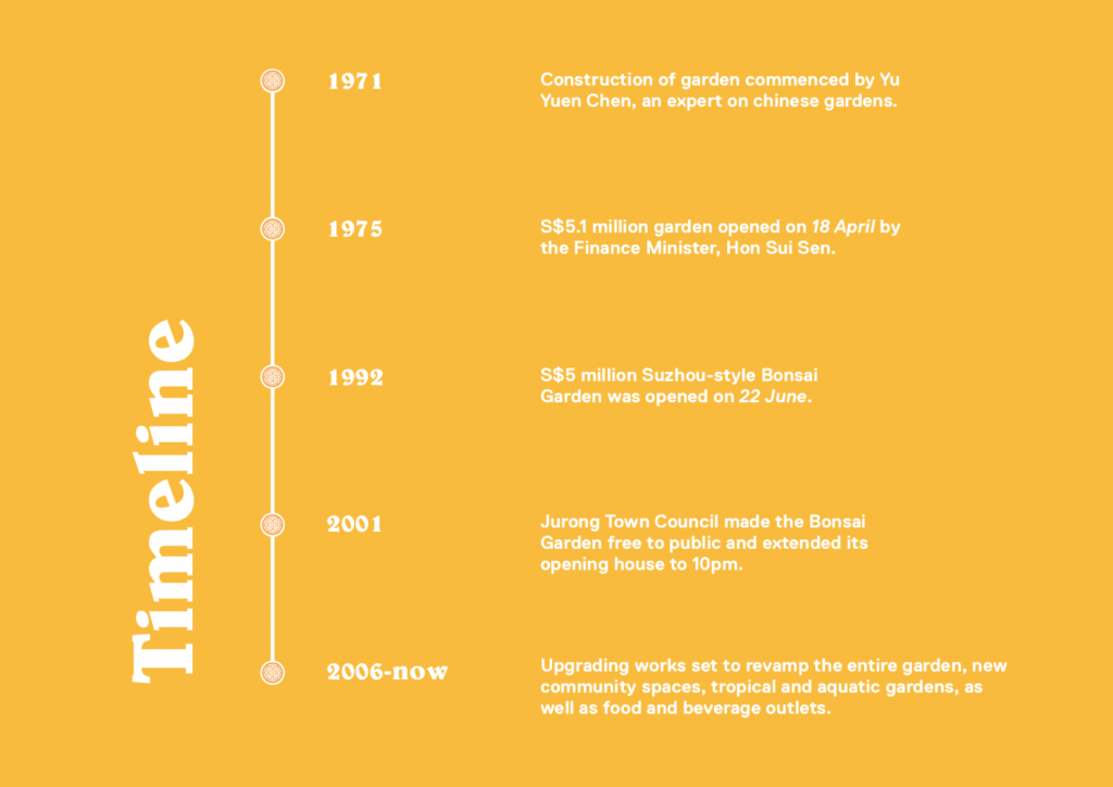
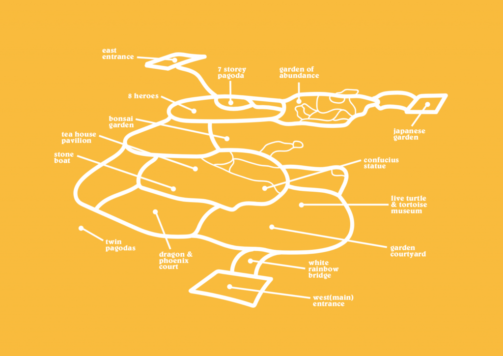
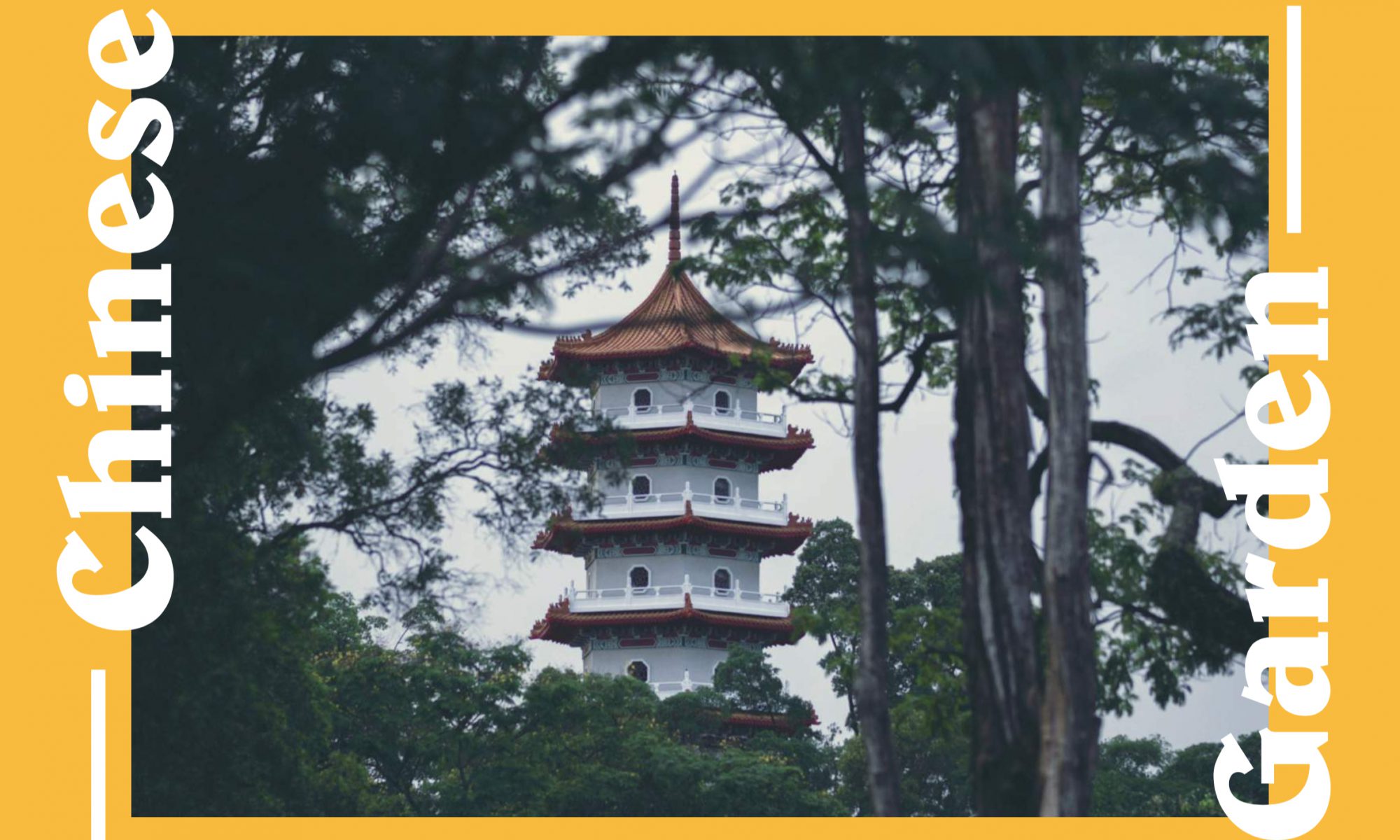
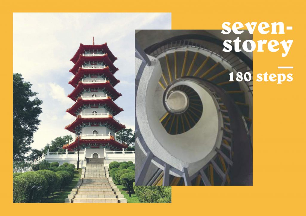
The moment I stepping into the entrance, I was greeted by the 7-storey pagoda. It is the most prominent building in the garden, it is noticeable even when you are in the train at chinese garden station. Out of curiosity, I went up the tower and counted the steps along the way. It has total of 180 steps!!
Walking away from the pagoda, eight statues placed along the pathway. Each statues has it’s very own significances, eight different heroes for that very point of time.

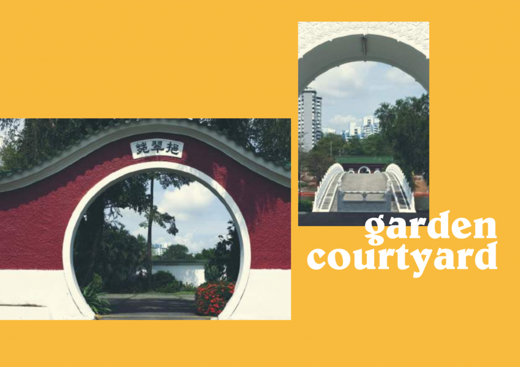
Aside from the 7-storey pagoda, here are 2 miniature pagodas. They have the identical look, as if there is a mirror placed in front of them. Fortunately, the steps are much much lesser than the 7-storey pagoda. As I noticed the opposite’s view when I viewed through the window inside the pagoda, it… was… spectacular…

Moving on to the bonsai garden, the windows are more prominent here. The bonsai reflected from the windows replicates like a piece of painting on the wall.

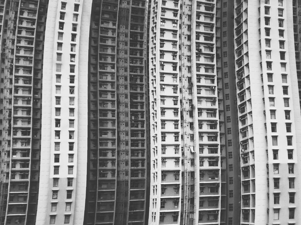
Apart from all the old chinese buildings, large numbers of lattice patterned windows can be seen all around chinese garden.
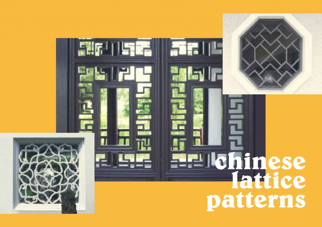
The patterns on the windows really intrigued me as like I am viewing Chinese Garden in a different way. It is like looking through a pinhole camera, looking a far to the scenery. Capturing and framing the scenery like a real-life painting.
References
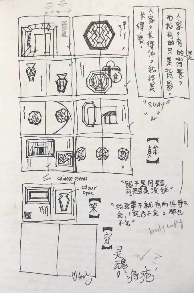
The style I will be exploring is a fusion of chinese and english text. My initial idea was to extract all the lattice windows and create long continuation throughout the whole zine and a tiny character following through. But I scraped the idea after multiple consultations and lastly I came into conclusion of doing up a poetry book.
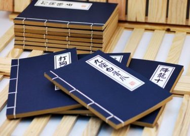
I explored towards a parody poem book instead of having a serious feel to it. I wanted my poetry book to replicate the old chinese kungfu book. With the tradition blue cover with a huge chinese title at the right corner.
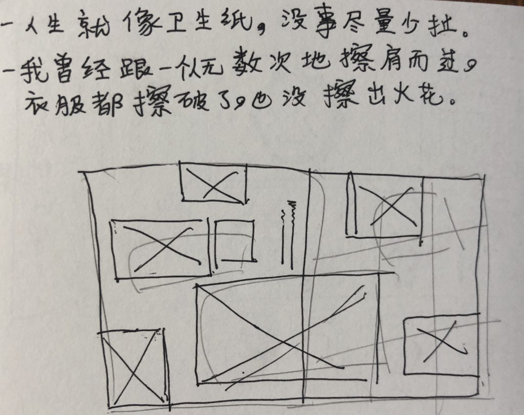
Some of the parody poems;
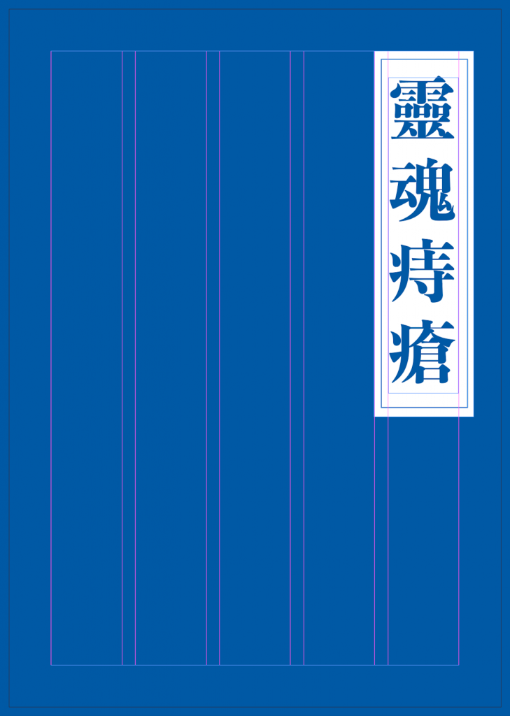
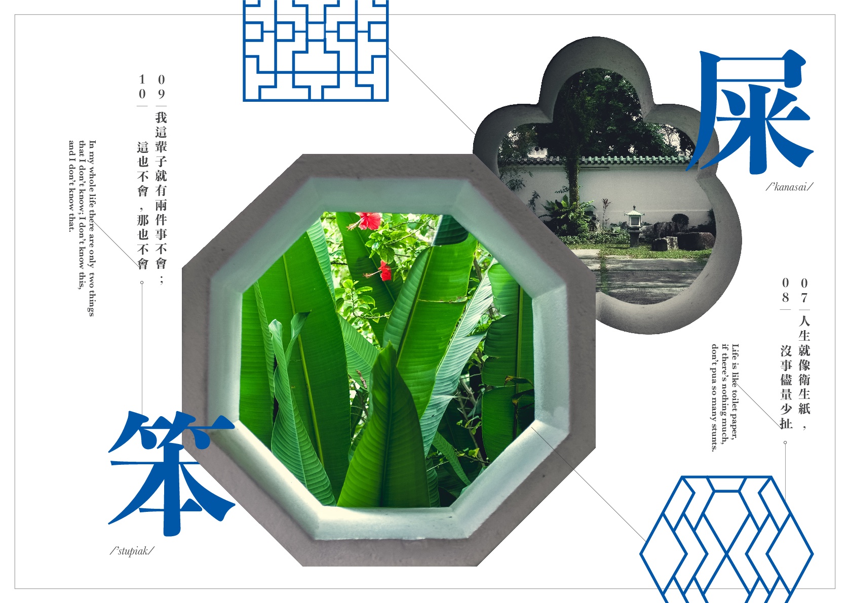
Replicating the old chinese kungfu book, I did up my cover looking exactly like it. I have titled my book as ‘Window to you soul’. But to tie down with my parody theme of a chinese poem book, I have tweaked the chinese translation of windows into hemorrhoids instead. The chinese pronunciation of 之窗 and 痔疮 is very similar.
After much consultation, it was said to be a little too boring and predictable for the cover. Hence I tried to incorporate the lattice patterns into the cover and explore a different positioning for my title.
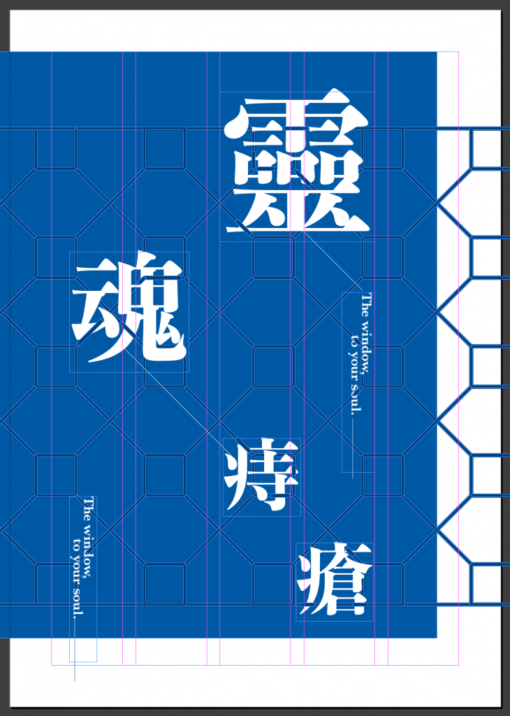
The title is being interlocked with the patterns and the different in size which creates the visual hierarchy. As for my inner spreads, I chose the best of the few from my initial sketches.
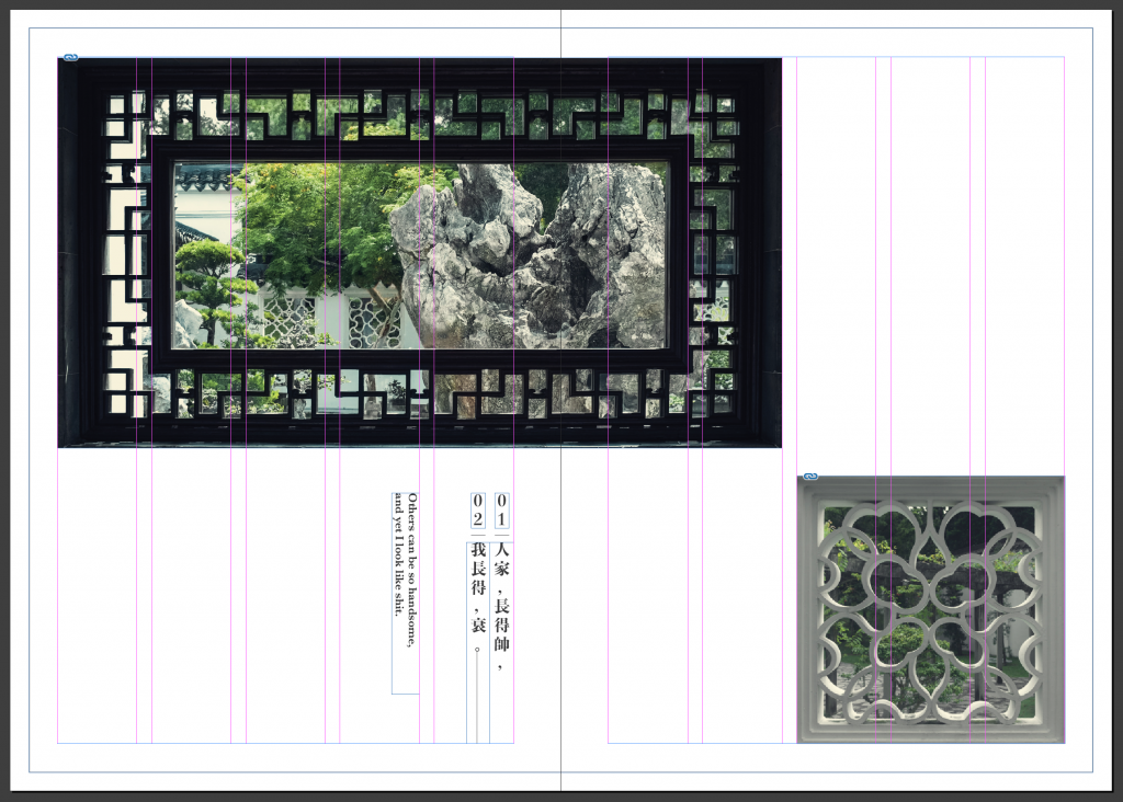
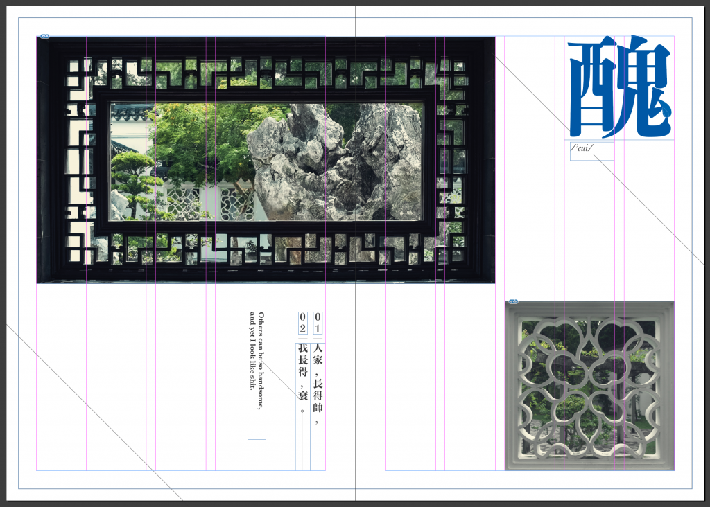
Instead of having a static; one window per page, I spread the one of the window across the next spread. The different in sizes of the window creates the emphasis on the window that I want to focus on.
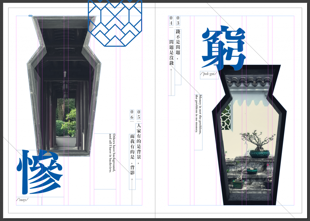
A title of the poem is introduced for every poem in the spread. It ties in very well with the poems. Diagonal lines were introduced as well. It leads the eye of the reader on how the flow of the spread goes. I still feel the spread has too much of a white space that I have to add some window shapes into it.
I positioned my english text vertical to match up with my chinese text.
I have contrast of the two very identical window in a yin and yang position. This layout is also somewhat asymmetrical.
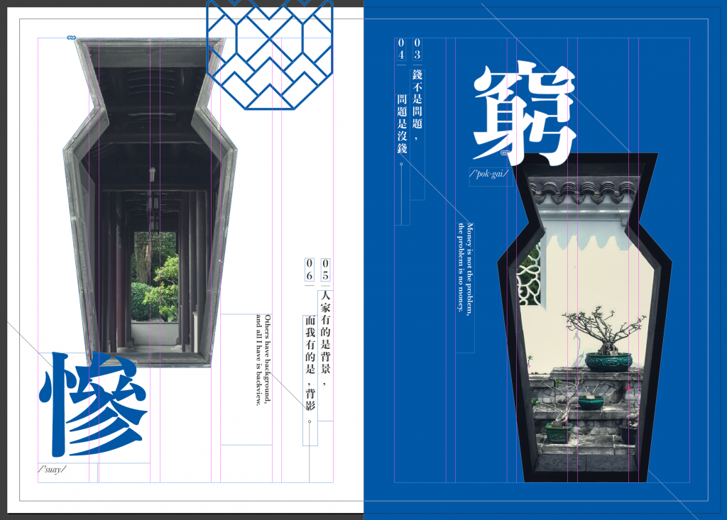
The blue added on the right page gives a higher contrast on both of the windows.
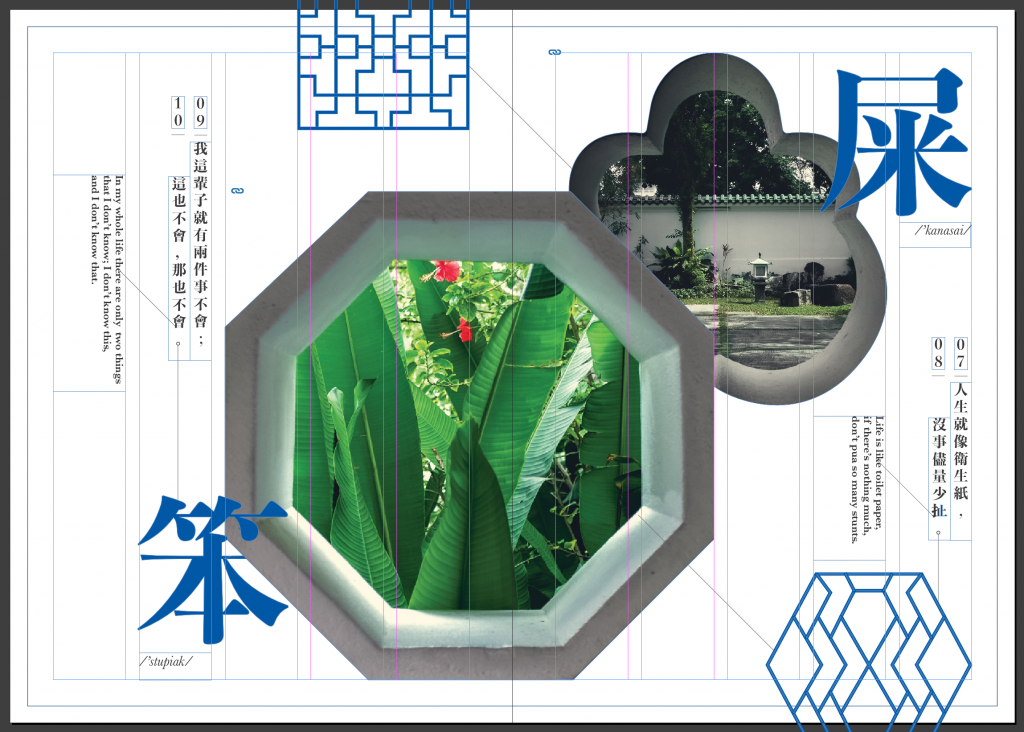
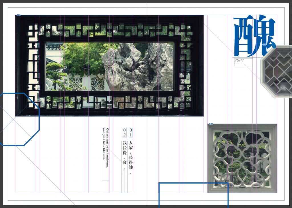
The overlapped windows gives the layout a foreground and background instead of plain flat. The main octagon window is positioned across the next page. It is also slightly off centred which breaks away from the norm. The numbering of the poems are intentionally placed from right to left to replicate the olden chinese way of reading. Windows outlines are constantly appearing in every spread to keep the consistency.
All in all, this zine project taught me to always stay away from my comfort zone and trying out new stuffs. And always to pay attention to really small details. Constantly checking for errors here and there.