Project 1: Research & Process

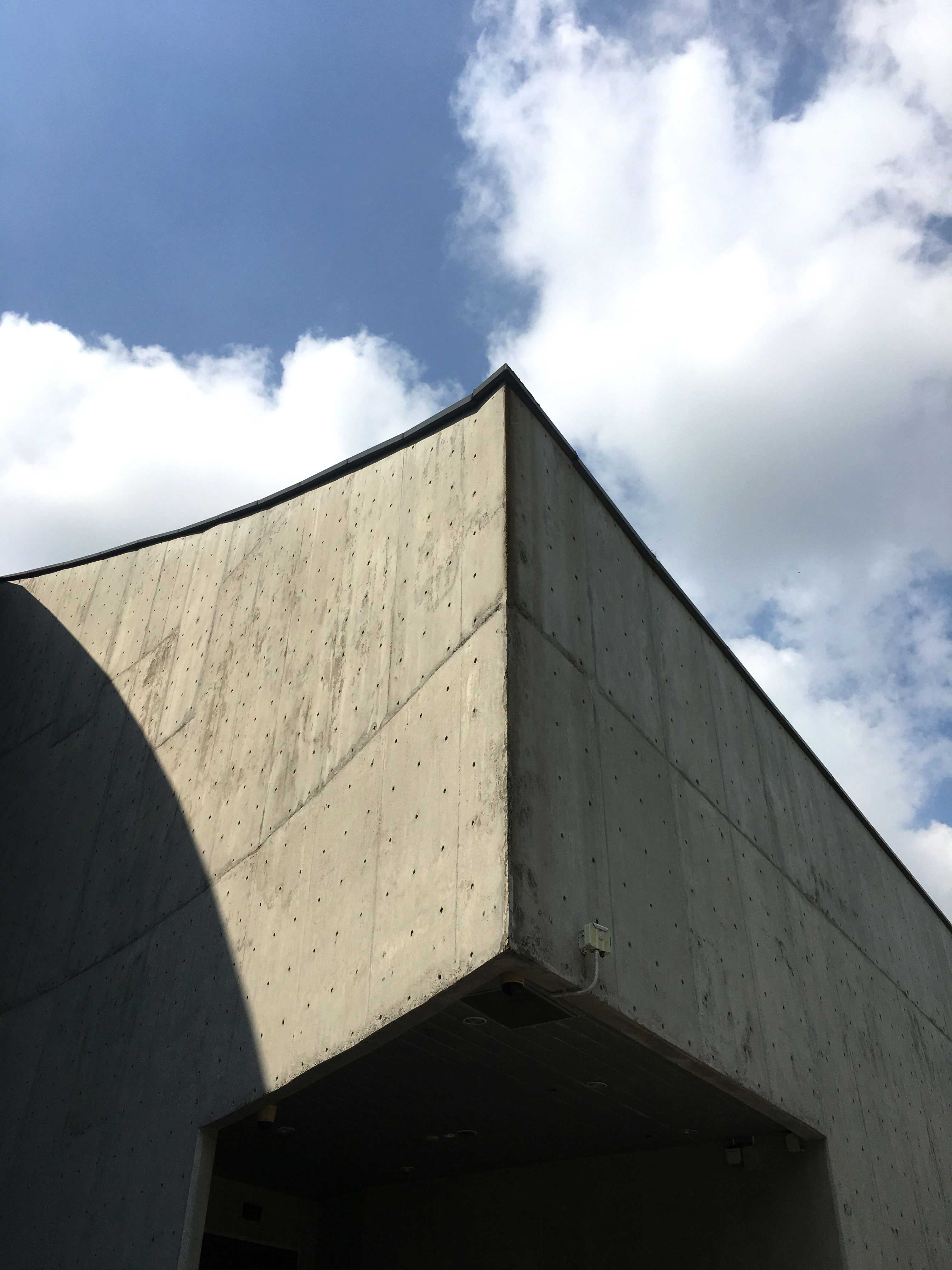
The location was the first to hit right into me. It is ITE CC Tampines, this place is highly significant to me as this place really helped shaped me into what I am today. Initially I thought of using Temasek Polytechnic for my location but I thought of never forget where my roots are from. The idea of using a pencil then slowly floats up.

Possible colour palette: B&W, Neutral

Using B&W might not be very ideal as the emphasis on the red pencil may just fades away from the focal point and making the whole set of photos looking flat.

Using a neutral tone is more of a better choice in bringing out the essence of the red pencil and pulling this whole set of photos together. The neutral tone gives out the raw/sketchy feel to the photos.


Close-up

At first I was trying to focus on the tip of the pencil(most left), but it did not really capture the essence of it. So I tried various holding methods and did a few positionings to which I get my final shot of the pencil(most right). 

Full-figure

Test shots of a full-figure with the object. I find this shot did not really work as well, not capturing the essence of the pencil. The object instantly fades away from the focal point. So in the end I decided to drop this full-figure shot. Also this shot gives off the funeral vibe.

Rejected shot

Mid-range

This shot was nonetheless my top pick for my mid-range shot. But somehow the pencil loses the focal point within the shot. It kind of dissolves away compared to the other mid-range shot I picked.

Selected shot

Location

I feel that this set of colour photos didn’t really bring out the emotion I wanted to portray. With the colours it may seem just like a normal day.

Possible colour palette: B&W(Top pick), sepia

Using a sepia tone; it will give more of a brownish look to the set and will give off the vintage vibe, still ongoing and which might portray the wrong emotions to others.

Using B&W; truly portrays the emotion of sadness towards the photos. And also brings out back story of the set.

Side gate

Initial shot of the side gate was really straight forward and looks too flat. It does not show much perspective in this shot. Vertical shots also does not seem to really show what I really want to portray. 


I wanted to emphasize on one of the cracked windows up at the building, but it was too far to be obvious/seen. The trees are also very distracting to the eyes.

Initially I wanted to emphasize on the chained up gate with the STATE PROPERTY sign board but it doesn’t have much personality. It does not reveal any form of information that this is the campus. So I feel that this photo does not really have much meaning compared to the other gate photo.

Colours did not really work for task 2 as I would want to portray that the campus is already closed down. Hence B&W is being used to show how a part of life has ended. Putting a full stop to it.

Project 1: Curating Self

Task 1 – Object and representation of self

Pencil is the very first tool I encountered in my design journey.  Or even when I started learning how to doodle. Like how everything starts from a dot, when a dot goes for a walk, it becomes a line. It’s like how we all started using a pencil, slowly involving into using pens and then into the digital world. A pencil also depicts on how it will get blunt when time goes by and we will have to constantly sharpen it. Like how we are constantly learning, constantly improving our skill sets no matter how much we have learnt in the past.

The power of the pencil. We nowadays tend to move towards the digital side,  slowly fading away from the basics. We must never forget our basics. Hence the position of the pencil tip facing vertically to show how powerful the pencil is.

The pencil above my lips is one of my thinking position. Whenever I am out of ideas or creative brain juices dried up, I would place a pencil above my lips. Subconsciously to me this position kind of helped me a lot through my thinking process. 

The reason why I emphasize on the red-2B among the rest is to show how I am uniquely me. Everyone is different/unique, be it their backstory, thinking or ideas.  In this modern society, we should always be uniquely us and not try to be someone that we are not.

Task 2 – My World

The first location came into my mind was ITE College Central Tampines. This is also the place I first started my relationship with design or rather where I found a familiar place where I really fit into. At first I was skeptical about studying in ITE as there are plenty of stereotypes about people studying in ITE are bound to fail in their lives or mixing into bad companies. Studying in ITE also kind of pulled my confidence down a bit. It is a place where I know I’m bound to meet people with very different backgrounds be it with arts or without. As for me little did I know what I have signed up for as I have zero knowledge about design.  

The first class really hit me hard in the face, I was introduced to drawing, design elements and adobe softwares. For all this while I have thought studying in a design course was as simple as doodling/sketching. A love/hate relationship started forming at the point of time. Love is that I have plenty of room to explore/improve and learn more in depth of design rather than hate is that I have rush for deadlines.

Throughout this 2 fulfilling years, I am really thankful to meet a bunch of encouraging/helpful friends and a lecturer who is really willing to teach and who shaped all of us into really good people and most importantly good aspiring designers.

Now that the campus have been closed down, it feels like a part of life has ended. It is like a full stop to this part of the timeline. And how I could still kind of want to access my ‘past’ but I can’t do anything about it. This  journey was truly the best decision I have made for what I am here now versus the one I am heading nowhere.

“Forget the former things; do not dwell on the past.”

F3D Week 1: 2D Analysis

…OM…

This amulet was the first thing that came into my mind when was told to bring an object which is 3D-interesting to me.

The organic/unique shape of this amulet interests me a lot, whereas the more common shapes for amulets would be either in ovals or squares. From the front view it may seem flat but in fact there are protruding shapes on the amulet itself. There is a contrast of colours within the amulet where the middle part has more hues of red which makes the buddha stands out even more.

The object is symmetrical from left to right. However the top half has a bigger proportion compared to the bottom half. Taking the black stone and the rice grain as a base unit to divide the amulet into 6 parts as shown.

The protruding shapes on the amulet are more prominent on the top view. Also from here you are able to see how symmetrical this amulet can get.

As well as the bottom view. The curves which can’t be seen on the top view could be seen clearly here. The overall colour palette for this amulet falls under earthy tones, which presented as a whole despite having the black stone and the grain within the amulet.

Mark Making (Research)

What is mark making? Does it just mean dots, scribbles, and brushstrokes? What do expressive qualities add to the look and feel of an artwork?

Artists often use mark making and gestural qualities to express their feelings or emotions about something they have seen or experienced. Artists also use expressive mark making to create purely abstract artworks which do not necessarily refer to anything in the real world but are intuitive or respond to a defined set of rules.

Willem De Kooning
Untitled 1966-7
Charcoal on tracing paper
support: 476 x 610 mm

One of the techniques that I’m really intrigued by is Fumage / Smoke painting. Fumage is a surrealist art technique popularized by Wolfgang Paalen in which impressions are made by the smoke of a candle or kerosene lamp on a piece of paper or canvas. Flames/smoke are often associated with danger, who would have known using this technique can create such detailed and beautiful piece of artwork.

http://madeinshoreditch.co.uk/2016/02/17/fumage-steven-spazuk/

Monoprint

  • :  an impression made on paper from glass or some equally smooth material (as celluloid or oilcloth) to which oil paint has been applied
https://www.pinterest.com/pin/329044316497751896/

This technique is kinda interesting because you either paint the image directly onto the plate which is known as the light field or you apply the ink first then remove the image which is known as the dark field. Each monoprint is different and unique and the artist may use one or more techniques to achieve the image that he or she want to create.

One of the technique that I might want to explore/experiment with is the Fumage. You will never know/expect what will turn out at the end. I guess mark making isn’t much on the technical side but rather a form of expression and experiment(?).