

featured image: Selfie in Prague with Frank Gehry’s Dancing House (Fred and Ginger), my all-time favorite rule-breaking, building-bending architect.
Kim Goodwin’s introduction to the book serves as a point of departure for us all to embark on a design process in digital media, by laying out some frameworks that we may find useful. Although I personally tend to find parts of the reading a little ‘dry’ (possibly because I don’t enjoy rules when it comes to producing creative content), there are still some insights to be gleaned.
In the opening pages, Kim Goodwin expertly sorts out some issues in taxonomy to clarify the difference between Interaction Design and Human-Computer-Interaction (HCI). This brings us to ‘Goal-Directed Design’, a framework developed by the inventor Alan Cooper. This involves creating personas, often fictitious, to play-test how they would use the designed product or service, for designers to evaluate that interaction for themselves. This is especially important as we start to think about designing in digital media. However, HCI and many other related disciplines are often confused still. But seeing ‘Goal-Directed Design’ as a fitting framework for Interaction Design helps to direct and focus our attention as designers on “visualizing concrete solutions to human problems”, and this makes clear the sort of thought processes we should engage in.
I read a course in User-Interface Design (UID) at Hochschule der Medien whilst I was in Germany and we had to do exactly these sort of evaluations to play-test the interface that we created for an Augment Reality interface design. Thinking back to that short journey from ideation to realisation for our UID, I certainly couldn’t agree more with Goodwin’s assertion that ‘Goal-Directed Design’ ensures critical evaluation and implementation across all components, as well as the promise of working towards a high-fidelity product. The processes are, of course, further expounded in a flowchart from ‘project planning’ to ‘implementation support’, moving through each phase in great detail. I think that that is a great way to be more organised especially when working in a group. My UID group might have benefitted in terms of time management had we took reference from such a workflow, instead of mixing up the order at the inappropriate junctures, in hindsight.
I am not quite a big fan of principles and patterns though. In that respect, I certainly think more as a visual artist than a designer. I do not feel ashamed of that, but sometimes I think it could be helpful to excise reasonable restraint. Which is why I enjoy design that has a nuanced sort of rule-breaking. It doesn’t throw everything away yet it still surprises and excites us by providing the unexpected and threading possibly uncharted waters.
Keeping that thought in mind and looking at Interaction Design for the web, I would like to share this inspiring hub of ideas and inspiration: https://www.awwwards.com/. Awwwards is open to entries worldwide to be judged for website design. Here, there is always a constant influx of creative solutions toward interactivity on the web. Let’s look at the website-of-the-day and see what we might chance upon.
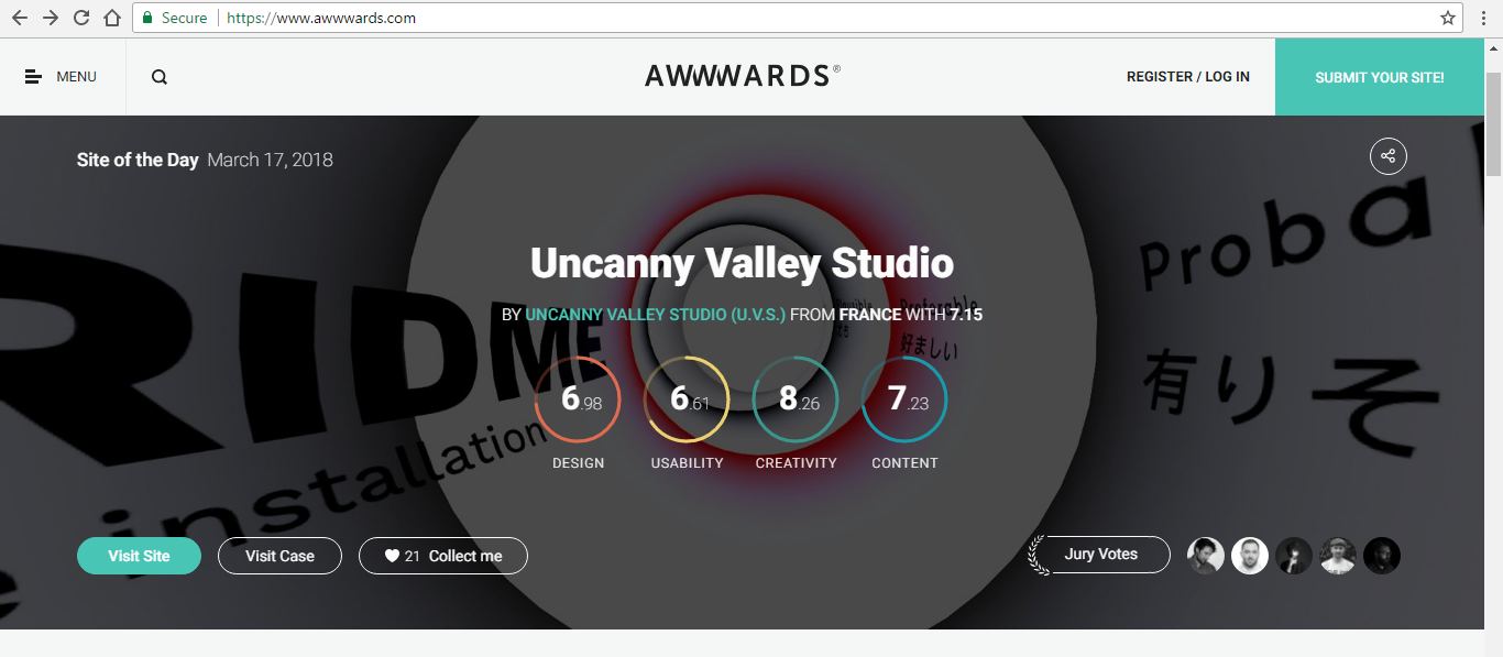
You should visit this site briefly too: https://uncannyvalley.studio/
I have not seen the webpage before and I am pleasantly surprised to be introduced today to this interactive media studio, Uncanny Valley, in this way. The first thing I did was to scroll down with the mouse scroller. I like Uncanny Valley’s twist in our conditioned notion of how scrolling should work. A simple function on the mouse generates an unexpected motion as we see ourselves almost moving through a tunnel of text and graphic elements which serves as the site’s menu. There is also a kind of wavy effect going on in the menu tunnels as we move the mouse around the screen. Each page that showcases the projects the studio has been working on, comes with a mini-interactive-panel which help us to get an actual feel of key features of the physical installation designs. Overall, it is an engaging portfolio for the studio and comfortable to navigate around in. This certainly lays outside of some principles and patterns of web design yet it still fits and is usable as we recognize enough of the new features to not be heavily unaccustomed or handicapped.
So the couple of the questions I was thinking about while reading and exploring Awwwards today, are (1) how much rules can we break in terms of design principles and patterns, as well as (2) shouldn’t design be for everyone, how strict and exclusive should we be with ‘target audiences’ we have in mind?
At this juncture, I’d like to give some preliminary responses to my own doubts. I think I sort of responded myself, towards my first question. But perhaps I really need to expose myself more to what people around the world are creating and learn from experience in order to really have a more confident judgement on that issue. As for the second question, it just bugs me that sometimes we design things to be used in a certain way and then when an unexpected user turns up and fumbles in vain with our design, it is almost like the whole system crashes into failure. During my experience in creating our UID in Germany, I learnt from a study in User Experiences that the optimum number of people to have at an evaluation is 5. We should evaluate the experiences given by these people or created personas in detail. Any more than that number will throw us off the course in determining how to improve our design, as there will be too much insignificant or overlapping feedback to cloud the important design issues that need attention.
Pardon me, for I can’t not formulate questions without having tried to answer them myself. But of course, doubts still linger as I believe there remain unresolved issues in my attempt. I hope that I might have better answers learnt from others or rethought for myself in due course.
Leave a Reply
You must be logged in to post a comment.