Category: Project Development and Planning

FYP Project Proposal

Point of Departure

“Film is like origami, it folds into itself from itself”

I wrote this manifesto on film a year earlier, very much inspired by Dziga Vertov’s The Man With A Movie Camera (1929). The manifesto presents itself as an origami camera. I believe that the medium of Moving Images really create this unique experience for the viewer because of the folding of time and space. Hence, for FYP I’d like to explore Projection as the act of unfolding and what sort of interaction that can ensue.

Central Concept

The central idea is to allow participants to experience the very act of Projection itself and experience an alternative mode of receiving Moving Image content from their Smartphones.

This will be achieved by a dark room installation space in which participants will run an application on their Smartphones and place them onto an analogue projection device which will project using only the brightness of the screens themselves.


Links to the full proposal and workplan are below:

Full Proposal – https://drive.google.com/open?id=1GffqQMdowDDGd-41jknOP9o4kCIp0jXy 

Workplan – https://drive.google.com/open?id=1AHs9hyqXnx0WGu9wnV5a5fNgcrfQCEdi

FYP Proof of Concept


This is my initial Proof of Concept. The Shoeboxes create a fully darkened and enclosed space for the light of the Smartphone alone to travel through the entire device and eventually project outward. The Mirror and Biconcave Lens serve to correct the rotation of the image from the user’s Smartphone as he/she places it onto the device. This set-up will be further developed during the course of the FYP.

FYP Ideas 2

Having attended much of the presentations for the seminar Emergent Visions Adjacency and Urban Screens, I had many takeaways that would definitely inspire the development of my FYP project. Here are some notes on that experience and the thoughts connecting back to my FYP ideations.

In particular, I was most inspired by Kimchi and Chips presentation by Elliot Wood, which I also talked a little about in class. It was an eye opener hearing him speak about his ‘projector hack’ where he looked at the digital projector not as a media device but from the standpoint of physics, and came up with a scientific solution to make the light way brighter than a low-cost projector should be able to. I watched his tutorial on the ‘projector hack’ and I certainly believe that light and projection is really physics that needs figuring out and I am totally excited with what I might be able to develop in the coming months.

Also, Erkki Huhtamo’s presentation on the mediated city was really fascinating, how he delved into history and cityplanning and the different stratas of media within the complex jungle of the modern cityscape. I was particularly inspired by this and thinking of how it might drive the subject matter for the pen drawings i will do for the sort of backdrop for my projection installation. It is certainly an area of research that is intriguing. I borrowed Erkki Huhtamo’s book Media archaeology : approaches, applications, and implications from the ADM library and will proceed to read into it and see what ideas come up.

I was also really fascinated by the sort of guerrilla movement of Manifest.AR which Tamiko Thiel introduced. I think invasion into MOMA was really great fun. So I was thinking like how AR is really an overlap of the real world as in captured by the phone camera and the virtual as in the content provided by the AR app. So what if I sort of extend this idea of overlapping the digital content and physical into a configuration where I project onto my drawings. That is essentially not so dissimmilar to how AR works. My drawings are physical traditional media and the projected animations are digital manifestations overlapped onto the physical and thus possibly creating an interesting interaction.

Also I must say that Refik Anadol’s energy and innovations were really so infectious and I greatly enjoyed his presentation. I don’t think my FYP will be anywhere near the scale of his aesthetic and architectural endeavors but it was really great to see someone so brilliantly bringing huge architectural spaces to life by the effects of light and projection. I enjoyed the urban screens that he presented and would certainly like to see them myself should I ever be in any of those cities.

I might be sidetracking in the next section … but just more thoughts …

I also enjoyed the projection mapping that other ADM students did with Rose Bond for the Chinese Heritage Center.

It was also wonderful to catch up with Marc Glode whom I had the great fortune to attend his course on Experimental Filmmaking last year. He invited me to come to this wonderful informal film screening curate by him on the rooftop of Grey Projects in Tiong Bahru. I greatly enjoyed the experience for its informality and Marc’s choice of the series of films was great as usual. In particular I really liked Une Homme Qui Dort  (1974) by Bernard Queysanne, that stream of conciousness black and white film really bringing us into the psyche of the modern understanding and feeling loneliness in big metropolitan city. During the event we just moved around, chatted, drank while in the midst of each film. The informal context and the sort of small community feeling in the heartland of busy Singapore was profound. I wonder if I might be able to create this sort of community atmosphere in my FYP? Because I also do this informal gathering of coursemates to watch obscure films together in the school auditorium and really to me that is the best feeling to watch a film and experience it together.

WEEK 9: Blast Theory Talk

Of course I was greatly impressed, like everyone else was, with Matt Adam’s compressed account of Blast Theory’s journey and some future plans in the pipeline.

It is interesting to see the progression the group made over the years (in parallel to the advances we’ve had in digital technology). From the very much dramatically stage-driven performance of Gunmen Kill Three (1991) where participants were invited up to ‘shoot’ at two other participants in an improvised live-situation, to the entering into the VR world of Dessert Rain (1999) where participants first play a virtual mission and are afterwards confronted with the real world events of the Gulf War.

While the graphics and technology may appear dated given today’s standards, those designed experiences still remain very profound as we can see in the documentation of the various projects. They really draw people into a theatrical experience which is at the same time opening up the discourse into many real world issues and the human psyche.

My favorite work was 2097: We Made Ourselves Over (2017). The core concept was this world in the future where young girls will govern the world and the many problems that people will come to face in the futuristic hybrid city of Aarhull. They made 5 short films to showcase this world and its people from the future. These were very effectively screened on moving vans around Hull, UK. These mobile platforms delivered the story rapidly to the people of Hull as they were short to watch and easy to comprehend. The films were also available on a smartphone app. And then the magic happened on 1 Oct when every phone-box in the city rang out all at once. The people of Hull scrambled to answer the call from the future. A lucky few even getting the chance to get on an electric car that drove right up the street and on the vehicles they met a member of the cast from the future.

What surprised me is that people interacted as an entire populace and they each had a unique experience and connection to this futuristic city of  Aarhull. I wonder how this would’ve panned out in Singapore? I enjoy how these lines between fiction and reality can be broken down and the suspension of disbelief that participants are willing to invest in a successful immense work of interactive media. Getting introduced to this work and hearing Matt Adam’s thoughts about it all was the highlight of the night for me.

I normally don’t really enjoy Q&As because they sometime get very sidetracked and all that. But this one was really engaging as some of the questions raised by members of the audience were really tricky issues like the ethical and societal concerns surrounding Blast Theory’s work and I think Matt Adams addressed these extremely well. It made me feel like legalities aside, the works were very well-thought out for everyone’s unique experience and I’d definitely like to be part of one of their works someday.

Also another case in point, during the Q&A, I was very impressed by Matt Adam’s clear understanding and distinction in where he situates his intent for the works even though the team as a whole pretty much sit on the crossroads of a diverse range of media. Mark Adams asserts that he started out with Blast Theory in a creative endeavor towards theatrical design and direction. And that has always been his intent and input ever since. He pointed out that the talk would have been much different if it were to be given by Ju Row Farr or Nick Tandavanitj. He sees the works as theater performances, albeit working in very much unconventional and expanded theatrical spaces. That really reminded me of the honest truth of any collaboration. Every member should bring a different perspective into the project, all can be equally valid and instrumental. After all, collaboration is the coming together of parts to a whole.

I think that the talk was extremely inspiring and I hope that these notes that I’ve written will help push me forward in my aesthetic endeavors.

FYP Ideas 1


searching for an

F. Y. P

idea … inspiration …  interest…


The advent of the camera and the projector is over. Feels like they’ve been around like in forever. Our cinematic experience is a numbing sensory saturation of gross entertainment.

I am still, however, currently stuck somewhere in the 70s, watching what most people will deem to be ‘crazy-crap’. On the other hand, I could say I have special interest in experimental film and the workings their awe-inspiring machinery.

So to my potential audience: I’d like to invite you into a carefully designed and programmed projection space. An installation that will explore the wonder of projection itself as a medium.

I think the act of receiving a film should be made surprising, once again.

- Stream of wonder-machines that intrigue -

a sort of picture essay here, with some small thoughts, to track
the development of machines / presentations
of moving images that I think hold possibilities
to explore myself as an artistic endeavor

1891

Kinetoscope, invented by Thomas A. Edison and William Dickson. A first real personal projection space. I like the mechanics behind it.

1900s

Hale’s Tours of the World, Projections in a Bus-like theatreInteresting that vehicle simulators started way before our times and people went to these for entertainment.

1927

Napoleon, Abel Gance, Black & White Film shot on 3 cameras, Cinerama Projection. Kind of shared this in class but I forgot the title and the director, so to refresh my memory again.


1970s

Drive-in Cinemas, Jurong, Singapore. I wanted to see if there was anything interesting closer to home.


1970

The Invisible Cinema, Peter Kubelka. This is a really subtle move into altering the usual cinematic setting.

1971

A Clockwork Orange, Stanley Kubrick. I thought it was interesting to find “projection machines” portrayed in film as well, like in this cult classic example, albeit placed in a really horrifying sensory attack.

1920s

Clavilux, Thomas Wilfred, ‘Lumina’ Compositions  installations of light played by keys like the melody of an organ except visually. 1948 recorded ‘Lumina’ performance below. This is certainly an amazing aesthetic phenomena but it is very much scientifically constructed. Visual Music! (although the artist was always adamant about an auditory aspect to the pieces)


1920s

Furgue, Hans Richter long format sequenced paintings and later animation work like Rhythmus 21


2010

Quasi-cinema, Lucas Simone, sequential photographs folded and stuck together with wooden sticks. Like Hans Richter’s work, the images are projected in our mind’s eye as we physically move across the room, alongside the sequence.

1973


Three Transitions, Peter Campus. A play on the idea of projected images and superimposed video, with the advent of the green-screen concept.


I think that these images and visuals provide many possible starting points for me in terms of the kind of wonder I wish to engineer with my work. I think that it is interesting how everything digital always has references to something analog.

The advent of projection is only lost because people take these screens for granted. Everything from TV to Movie Theaters, to huge advertising Billboards, we expect everything to be a seamless download of images. And these things flash past our eyes without any question.

I want to research more on what can I construct and how to create surprise from a simple mechanic.

WEEK 5: Response to Designing for the Digital Age

featured image: Selfie in Prague with Frank Gehry’s Dancing House (Fred and Ginger), my all-time favorite rule-breaking, building-bending architect.


Kim Goodwin’s introduction to the book serves as a point of departure for us all to embark on a design process in digital media, by laying out some frameworks that we may find useful. Although I personally tend to find parts of the reading a little ‘dry’ (possibly because I don’t enjoy rules when it comes to producing creative content), there are still some insights to be gleaned.

In the opening pages, Kim Goodwin expertly sorts out some issues in taxonomy to clarify the difference between Interaction Design and Human-Computer-Interaction (HCI). This brings us to ‘Goal-Directed Design’, a framework developed by the inventor Alan Cooper. This involves creating personas, often fictitious, to play-test how they would use the designed product or service, for designers to evaluate that interaction for themselves. This is especially important as we start to think about designing in digital media. However, HCI and many other related disciplines are often confused still. But seeing ‘Goal-Directed Design’ as a fitting framework for Interaction Design helps to direct and focus our attention as designers on “visualizing concrete solutions to human problems”, and this makes clear the sort of thought processes we should engage in.

I read a course in User-Interface Design (UID) at Hochschule der Medien whilst I was in Germany and we had to do exactly these sort of evaluations to play-test the interface that we created for an Augment Reality interface design. Thinking back to that short journey from ideation to realisation for our UID, I certainly couldn’t agree more with Goodwin’s assertion that ‘Goal-Directed Design’ ensures critical evaluation and implementation across all components, as well as the promise of working towards a high-fidelity product. The processes are, of course, further expounded in a flowchart from ‘project planning’ to ‘implementation support’, moving through each phase in great detail. I think that that is a great way to be more organised especially when working in a group. My UID group might have benefitted in terms of time management had we took reference from such a workflow, instead of mixing up the order at the inappropriate junctures, in hindsight.

I am not quite a big fan of principles and patterns though. In that respect, I certainly think more as a visual artist than a designer. I do not feel ashamed of that, but sometimes I think it could be helpful to excise reasonable restraint. Which is why I enjoy design that has a nuanced sort of rule-breaking. It doesn’t throw everything away yet it still surprises and excites us by providing the unexpected and threading possibly uncharted waters.

Keeping that thought in mind and looking at Interaction Design for the web, I would like to share this inspiring hub of ideas and inspiration: https://www.awwwards.com/. Awwwards is open to entries worldwide to be judged for website design. Here, there is always a constant influx of creative solutions toward interactivity on the web. Let’s look at the website-of-the-day and see what we might chance upon.


You should visit this site briefly too: https://uncannyvalley.studio/ 


I have not seen the webpage before and I am pleasantly surprised to be introduced today to this interactive media studio, Uncanny Valley, in this way. The first thing I did was to scroll down with the mouse scroller. I like Uncanny Valley’s twist in our conditioned notion of how scrolling should work. A simple function on the mouse generates an unexpected motion as we see ourselves almost moving through a tunnel of text and graphic elements which serves as the site’s menu. There is also a kind of wavy effect going on in the menu tunnels as we move the mouse around the screen. Each page that showcases the projects the studio has been working on, comes with a mini-interactive-panel which help us to get an actual feel of key features of the physical installation designs. Overall, it is an engaging portfolio for the studio and comfortable to navigate around in. This certainly lays outside of some principles and patterns of web design yet it still fits and is usable as we recognize enough of the new features to not be heavily unaccustomed or handicapped.

So the couple of the questions I was thinking about while reading and exploring Awwwards today, are (1) how much rules can we break in terms of design principles and patterns, as well as (2) shouldn’t design be for everyone, how strict and exclusive should we be with ‘target audiences’ we have in mind?

At this juncture, I’d like to give some preliminary responses to my own doubts. I think I sort of responded myself, towards my first question. But perhaps I really need to expose myself more to what people around the world are creating and learn from experience in order to really have a more confident judgement on that issue. As for the second question, it just bugs me that sometimes we design things to be used in a certain way and then when an unexpected user turns up and fumbles in vain with our design, it is almost like the whole system crashes into failure. During my experience in creating our UID in Germany, I learnt from a study in User Experiences that the optimum number of people to have at an evaluation is 5. We should evaluate the experiences given by these people or created personas in detail. Any more than that number will throw us off the course in determining how to improve our design, as there will be too much insignificant or overlapping feedback to cloud the important design issues that need attention.

Pardon me, for I can’t not formulate questions without having tried to answer them myself. But of course, doubts still linger as I believe there remain unresolved issues in my attempt. I hope that I might have better answers learnt from others or rethought for myself in due course.

WEEK 2: The Oceanic Closing Ceremony

6 Mar 2018 at NTU CCA


More than year ago, I visited Amar Kanwar’s solo artist exhibition Sovereign Forest (30 Jul – 9 Oct, 2016) at the CCA. Since 2011, the New Delhi filmmaker has been committed to this ongoing research project, where he presents glimpses into the Odisha environmental conflicts.

“What happens if many kinds of silences come close to each other? Then how to listen (and) how to see?”    (Kanwar, 2012)


Amar Kanwar’s Sovereign Forest was really one of the first experience I had attending an  art exhibition that had a scientific approach to research. That show was very well curated. It was an atmospheric aesthetic experience that opened my mind to the kind of outcomes that art research projects could arrive at. Hence, I was really looking forward to visiting The Oceanic, as my coursemates told me a little about what I’d missed, when I just returned from my exchange to Germany.

Indeed, The Oceanic moved me equally. The featured artists are collectively known as The Current Fellows and they have been on at least one voyage on the TBA21’s vessel Dardenella. This is part of an ongoing research initiative. Visiting the exhibition was a great opportunity to experience their artistic interpretations and concerns for the oceanic environment.

I certainly regret not being able to attend the The Current Convening event. But going to the closing ceremony was a really inspiring experience. Curator Prof. Ute Meta Bauer, representatives from organisers TBA21 and Conservation International made some insightful points on the power of artists and the importance of conflict resolution in environmental sustainability. The highlight of the night really was Mr. Anote Tong sharing and dialogue. The former President of Kiribati spoke of his concerns for his country which comprised of small islands that have unfortunately been experiencing the direct effects of Global Warming and rising sea levels over the past decades.


After the talks, I walked the exhibition again with possibly some newfound responses to the works. There is one work from the exhibition that I would like to briefly relook at now. Apart from being prominently right at the entrance, Tue Greenfort’s Tamoya Obboya (2017) was the one that really intrigued me from the start. This live installation was inspired by The Current Fellows voyage to the Kula Ring off Papua New Guinea. The artist observed how these Jellyfishes have swum oceans in a mass-migration due to the warming waters in the original geographical habitats.


On one end of the steel table, live Jellyfishes bob round and round in a circular water tank, almost like an aquatic hamster wheel of sorts. The title of the work identifies the species in Latin. They are also known as the Bonaire banded box Jellyfish and they have been around for 500 million years. Florescent lights illuminate the tank, making the translucent forms of the flailing creatures visible. On the other end of the table is a screen with footage of the Jellyfishes in their ocean habitat.

Buddha, 1989, by Nam June Paik

It is a rather surreal arrangement. Somehow, it reminds me of a work by Nam June Paik called TV Buddha (1976) where the Korean artist made a sitting Buddha statute watch itself on TV. Buddha’s interaction with the television creates a mysterious tension, where the formless meditative state looks towards the virtual world and back again. While in Greenfort’s work, the Jellyfishes are facing their natural habitat, even attempting to swim towards it. You can think of the relation of distance to be as close as a screen away or geographically hundreds of miles apart. So close yet so far. Are these memories of home, inevitably lost? There is a kind of tranquil haunting in seeing the Jellyfishes constantly swimming towards a home they were forced out of.

In Greenfort’s work, the Jellyfishes are on tour, far from their natural environment. Filters and regulatory mechanisms work continuously to keep their display tank as habitable as possible during the exhibition. Yet it doesn’t really care? Its biological makeup informs it that the temperature is optimal, the light is optimal, etc. Everything is in an optimal state for survival. There is nothing else they need.

The Jellyfish’s choice to migrate for survival is a biological one. It is what separates us humans from animals. Mr. Anote Tong’s sharing about what his administration has been doing and how the people of Kiribati feel so strongly about staying put in their islands is something that is very human. They choose to face the ever-worsening situation of global warming and rising sea-levels because

I believe that the speakers at the closing ceremony made many of these points that other artists from The Current Fellows expressed through their work more or less verbalised as well. I admire both parties. These artists for how they push beyond pure aesthetic to advocate and empower. And the work of environmental NPOs like Conservation International or politicians and advocates like Mr. Anote Tong are essential forces to change the world for the better. But sometimes the artists’ medium can be very much as powerful in driving change. It was an eye-opener to see both sides in action that night.

Kiribati - abandoned house


On the other hand, Mr. Anote Tong also mentioned his “100-year island theory”. He says that he has tried his best during his 13 years of presidency. Some things worked out, many other things didn’t. But he certainly doesn’t give up. In 2014, Mr. Tong finalised the purchase of 20 sq km of land on Vanua Levu, Fiji. His idea is that that area will be a last resort for his people to leave their islands and seek refuge when the time comes, so that Kiribati will not have a refugee crisis. It is a place where Kiribati will still have for the next 100-years. Enough time such that, hopefully, the solutions for the irreparable damage to the environment will be found.

All these issues that gave people like Mr. Anote Tong many a sleepless night, really kept me up for quite a bit that evening (the wine wasn’t drowsy enough). While I  knew I couldn’t possibly think up a solution, it became all clearer to me that what we doing now really is just losing time. The Jellyfishes have chosen migration to solve their crisis. What will humans come up with? And when?


Bibliography

Caramel, Laurence. “Besieged by the rising tides of climate change, Kiribati buys land in Fiji.” Guardian, 1 Jul 2014. https://www.theguardian.com/environment/2014/jul/01/kiribati-climate-change-fiji-vanua-levu. (Accessed 15 March 2018)

Kanwar, Amar and Stahel, Urs. Amar Kanwar: Evidence. Gottingen, Germany: Steidl, 2012.

Searle, Adrian. “Nam June Paik: Watch with Buddha.” Guardian, 19 December 2010. https://www.theguardian.com/artanddesign/2010/dec/19/nam-june-paik. (Accessed 15 March 2018)

“Tidalectis.” TBA21 Press Office, 28 April 2017. http://press.tba21.org/News_Detail.aspx?id=48763&menueid=9361. (Accessed 15 March 2018)

The Oceanic Exhibition Guide, produced by NTU CCA Singapore in collaboration with TBA21 – Academy The Current.


WEEK 3: Response to Thoughtful Interaction Design

From the Frustrating Design …

The concept of ‘Thoughtful Interaction Design’ is rather self-explanatory. It may difficult to achieve but it can be as simple as it sounds. ‘Thoughtful Interaction Design’ is as simple as resolving frustration. Simply, finding the solutions to the many ‘Norman Doors’ of everyday life.

“Yes. I push doors that are meant to be pulled, pull doors that are meant to be pushed, and walk into doors that should be slid. […] The answers should be given by the design, without any need for words or symbols, certainly without any need for trial and error.” The Design of Everyday Things (1988), Don Norman.

In the case of a plausible ‘Norman Door’ solution: flat panel to indicate push and handle bar to indicate pull (as in the featured image above). A simple problem is solved by creating visibility. ‘Thoughtfulness’ comes from ensuring the design does not cause misinterpretation of the form and/or deliberation on its function. The design has to make itself visible. The reason why we are irked by ‘Norman Doors’, that we stumble upon in our everyday lives, is that they cause us to question even for that split second, “what were they thinking when they made this?” And that, screws up usability, interaction and satisfaction.

So, how do we resolve this frustrations? The opening chapter of Thoughtful Interaction Design gives us the broad strokes of how the book intends to go ahead in the discussion of what ‘Thoughtfulness’ really is and how designers can prepare themselves in applying it. Jonas Löwgren and Erik Stolterman have also expertly helped us to unpack a few broad, ambiguous terms like design process, design theory and digital artefacts. I appreciate how they enter the topics from more of a philosophical and even ethical standpoint, with emphasis on “the relation between what can be done and what ought to be done.” What we can design is decided by the willpower to realize a sketch, an idea, a cause. I will attempt to use what I think I’ve learnt from the reading to analyse what I consider to be effective Interaction Design in the area of ‘Thoughtfulness’.

… on to the Amazing Design!

From 2009 – 2011, Volkswagen Sweden and DDB Stockholm introduced an innovative campaign Rolighetsterorin (“The Fun Theory”). This was an initiative aimed at generating design ideas that would encourage positive behaviour in the general public in everyday spaces. The philosophy is simple – society can improve its behaviour if you make it fun for everyone.


Firstly, I’d like to share here the Piano Staircase (2009). Even if you have not heard of “The Fun Theory”, it is highly possible that you come across this one on some social media platform. It went rather viral that year.

Basically, the plan here was to see if interactive design could make people choose to take the stairs instead of the escalator when exiting Odenplan subway station in Stockholm. The staircase was transformed into a life-size piano, each step fitted with sensors that play different musical notes activated.


Kevin Richardson’s idea is also an equally whacky one. His award-winning project, The Speed Camera Lottery (2010), was installed on a public road in Stockholm, aims at promoting road safety by encouraging drivers to obey the speed limit. The contraption recognizes who is speeding and who isn’t. Speeders were fined and the non-speeders then got themselves registered into a lottery to win money from those speeding tickets. (Random Thought: When I came across this, I was thinking whether it is possible to make paying for our ERP fun too?)


In those two examples we have seen how “The Fun Theory” proves itself. But more than attesting to the fact that fun in design can effectively convey the design concept and induce satisfactory interaction, I feel that what made the design thoughtful is the ability to address human needs. The Piano Staircase employs the ‘bystander effect’ in which people tend to follow the patterns of other people in new or unfamiliar situations, in this case arriving at a surprising ‘delighter’ of hearing the musical notes tingle underneath their very feet. Also, whether or not we are musicians, tapping piano keys and creating ‘our own music’ satisfies the human need for autonomy. And people do realize that they choose the healthier option for themselves at the end of the day. The Speed Camera Lottery employs ‘gamification’ to satisfy the human be possibly rewarded for sticking to the rules. We never get recognize for doing good because perhaps being law-abiding is taken for granted and maybe punishment doesn’t hurt enough.

These are just some of the aspects and strategies in the design concepts that show how human-centred design can drive a connection from designer to user through the designed artefact. There are no ‘Norman Doors’ here to create complications. No second-guessing. People understood how the design functioned and they responded accordingly. Piano Staircase saw 66% more people using the staircase rather than the escalator, while The Speed Camera Lottery saw a reduction in average driving speed by 22%. Because the designs understood human behaviour and was thoughtful about human needs, they successfully met their aims of encouraging change for the better.

Design is indisputably rooted in pragmatism. Even “The Fun Theory” projects have to show documentation and statistics to prove its ‘fun-ness’. Balance has to be found. Certainly, like what Löwgren and Stolterman have stressed in their introduction, “design can be both amazing and frustrating”. I will definitely want to delve into this further to learn more about how interaction can be better articulated through the language of design for the user. All in all, ‘Thoughtfulness’ is a quality of design that any user can and will appreciate. The gratification may not always be openly expressed but this is how designers can change the world and put meaning into the everyday.

Bibliography

Löwgren, Jonas and Stolterman, Erik. “Introduction”. In Thoughtful Interaction Design A Design Perspective on Information Technology, Massachusetts, United States: MIT Press, 2007.

Norman, Donald A.  “The Psychopathology of Everyday Things”. In The Design of Everyday Things, New York: Doubleday Publishing, 1990.

Volkswagen Sweden. The Fun Theory. http://www.thefuntheory.com/. (Accessed 10 March, 2018).

WEEK 4: Cinerama Exhibition Review

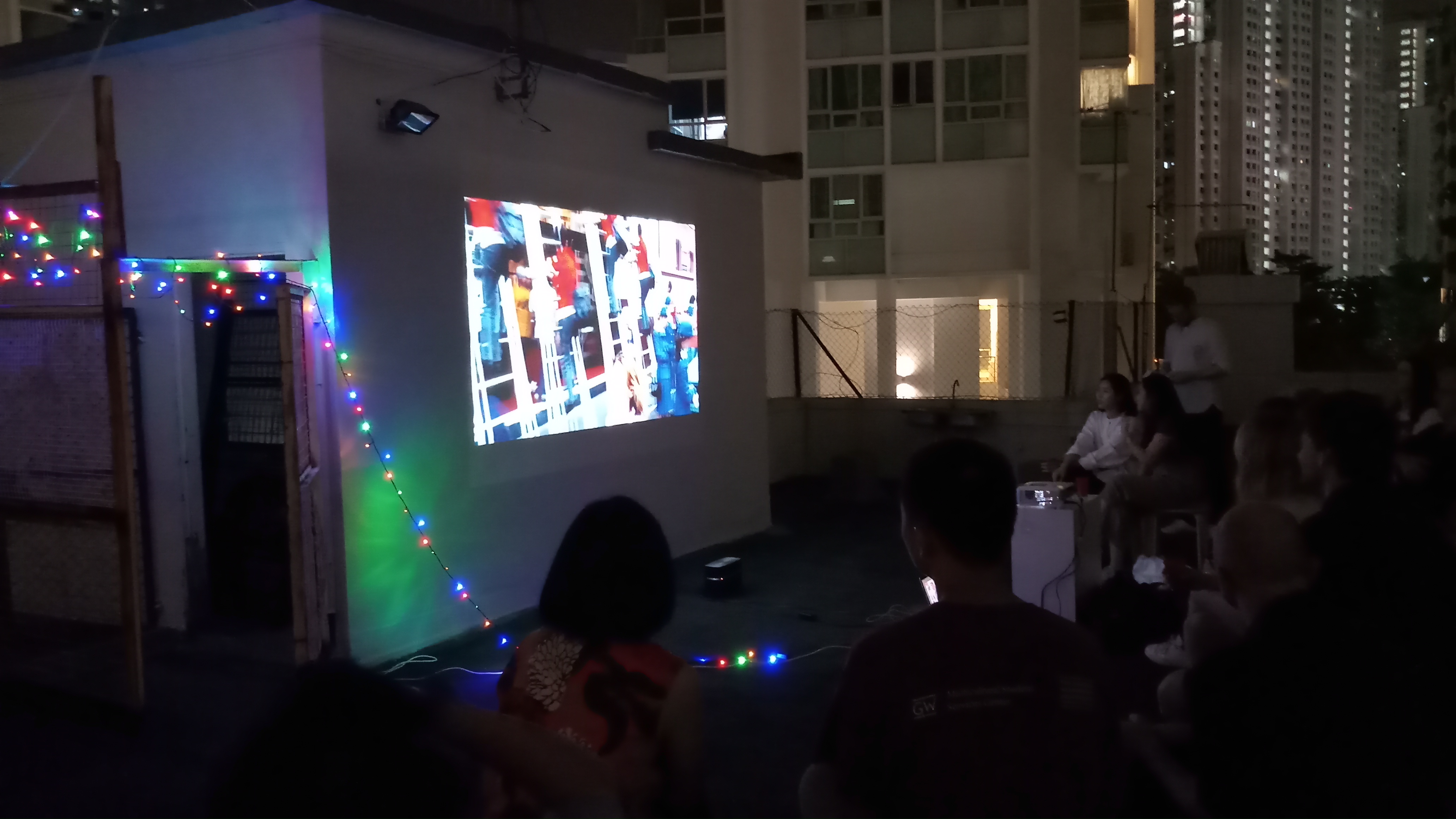
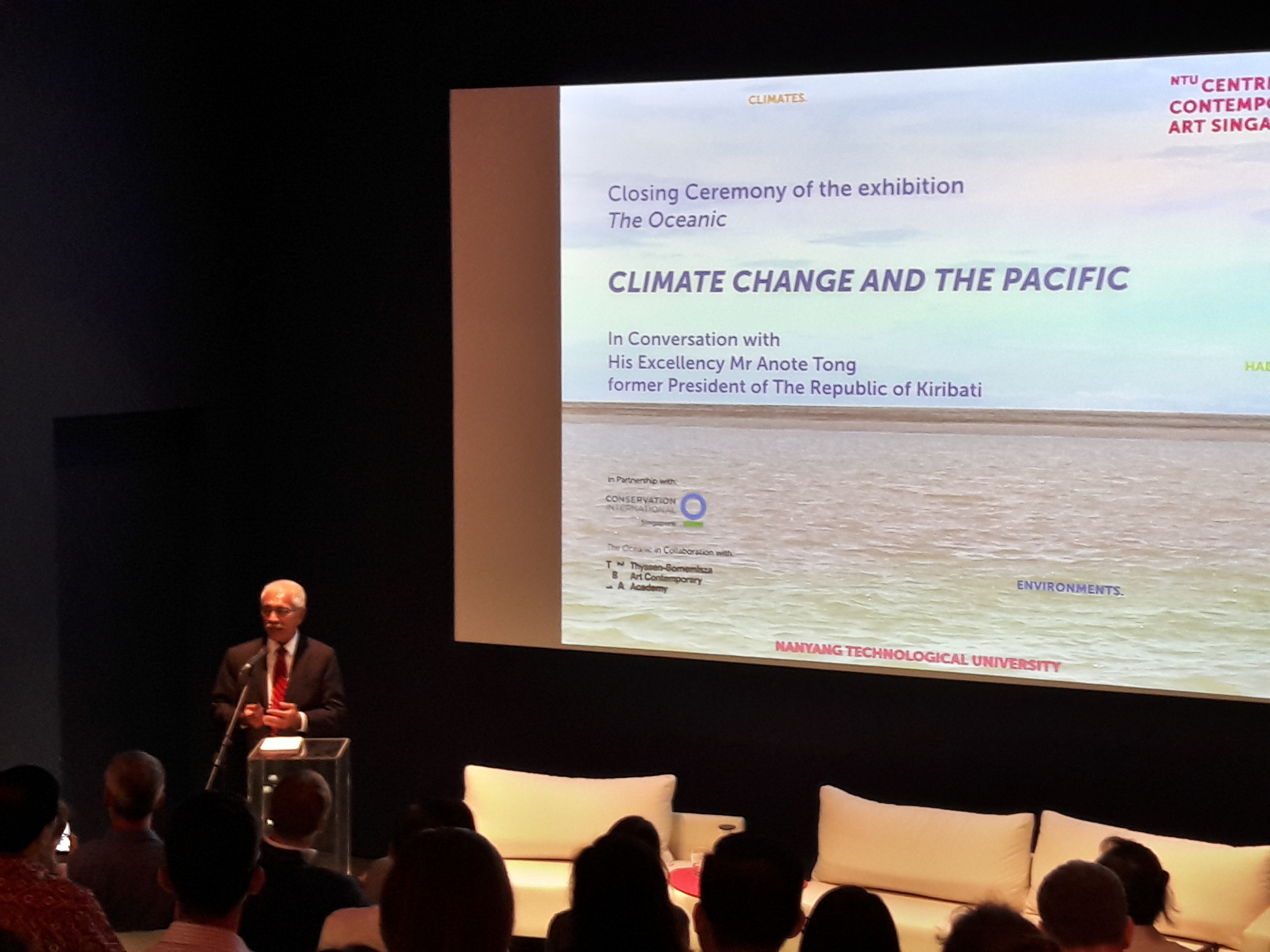
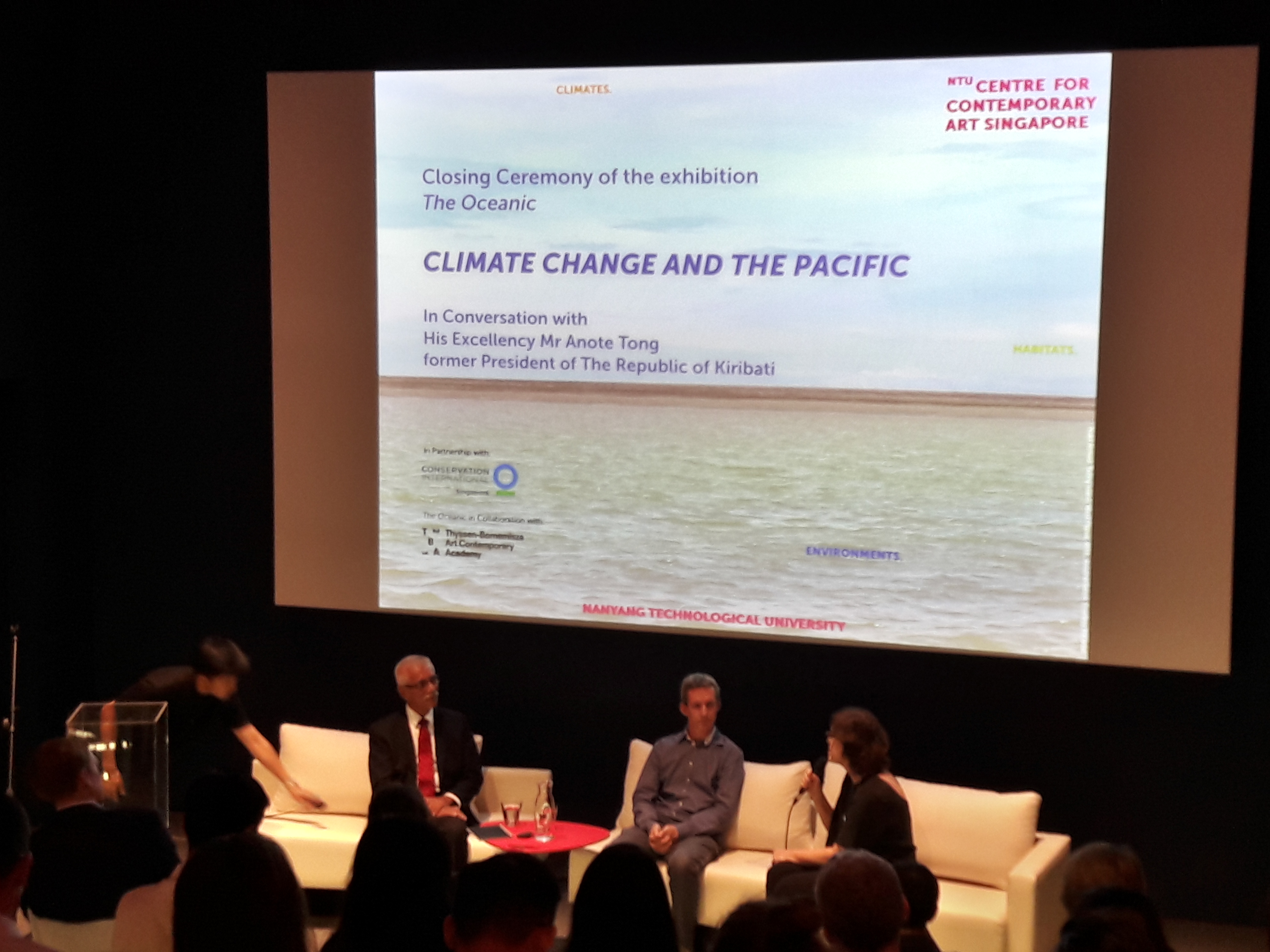
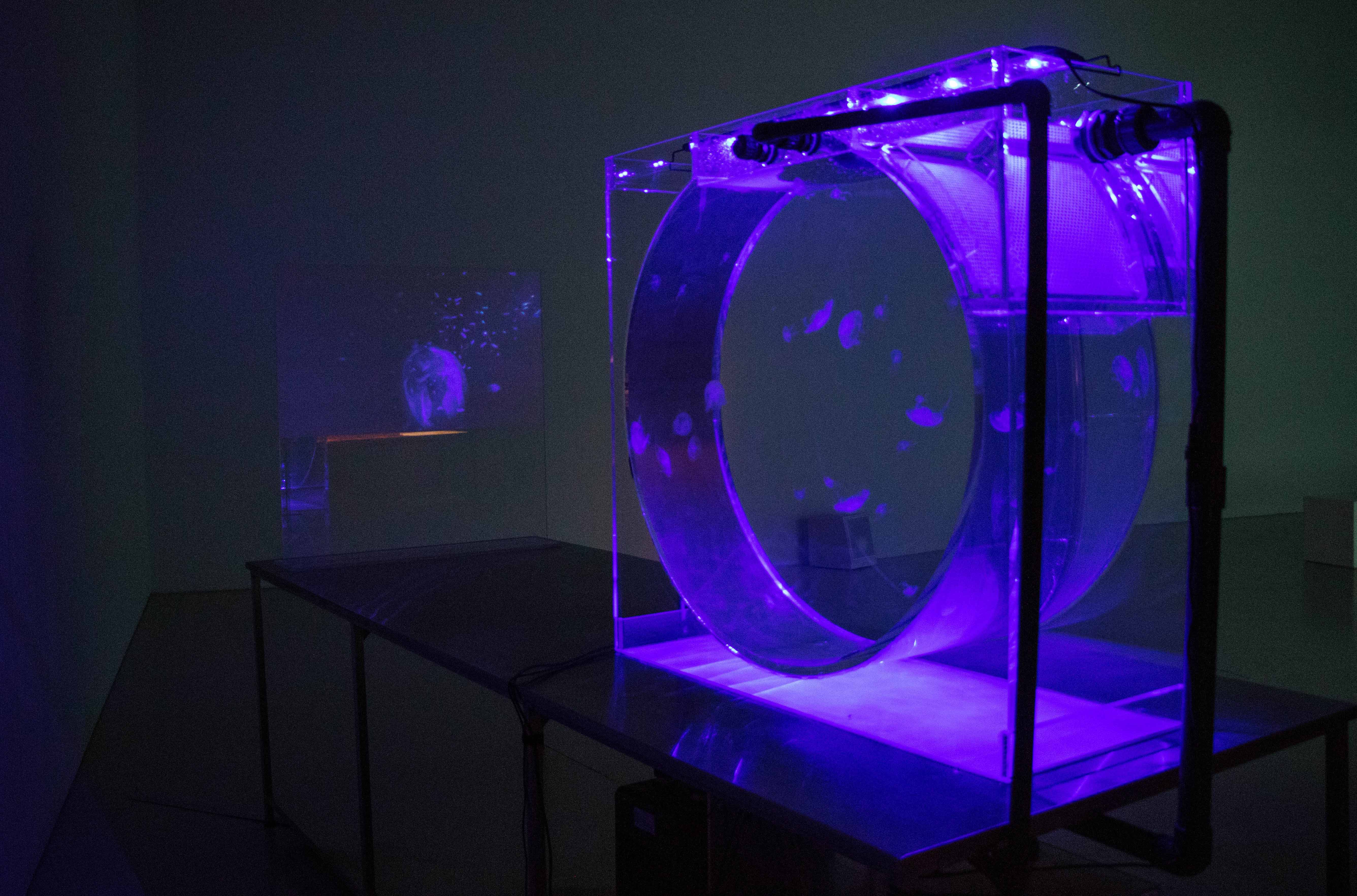
While still awaiting SAM’s revamp to be completed in 2021, transforming itself to better meet the demands of a contemporary art space, it is wonderful to see that SAM at 8Q continues to provide meaningful contemporary art experiences. Cinerama is no exception. What I generally liked about the show is, that it showcases the diversity of culture and media in our South-east Asian region and that curating for moving images is such a great challenge that I found to be very well-placed.

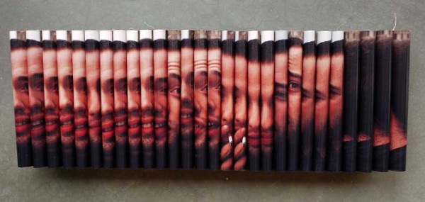
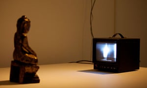
Victor Balanon’s The Man Who (2017) was one work that stood out for me, perhaps due to my special interest in experimental film studies. It was captivating. A chord struck on the first viewing. I stood watching it re-run twice upon entering the gallery and once more before I left (although the clamor of the school kids in the adjacent room was rather irritating).

Film-making-Essayists

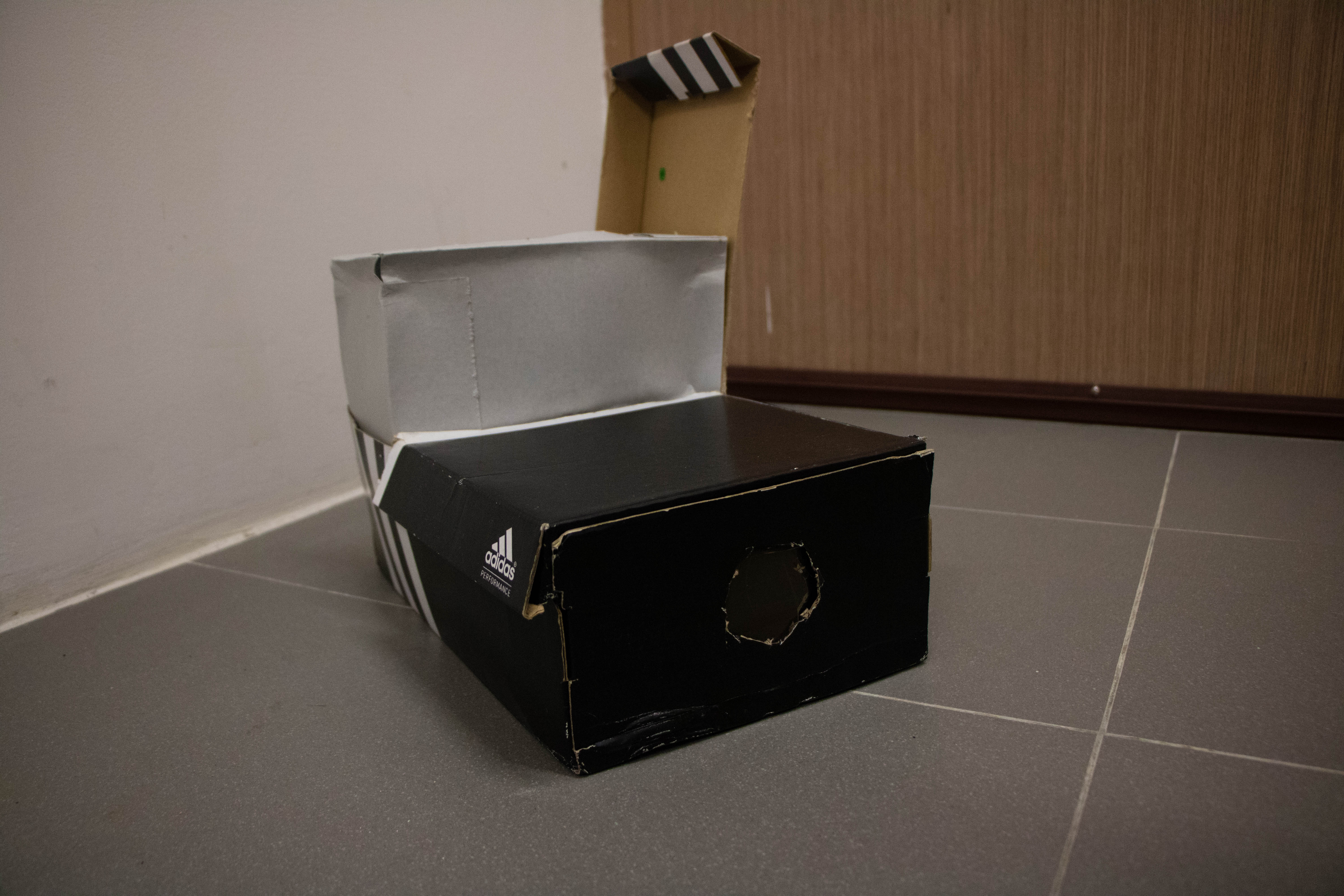
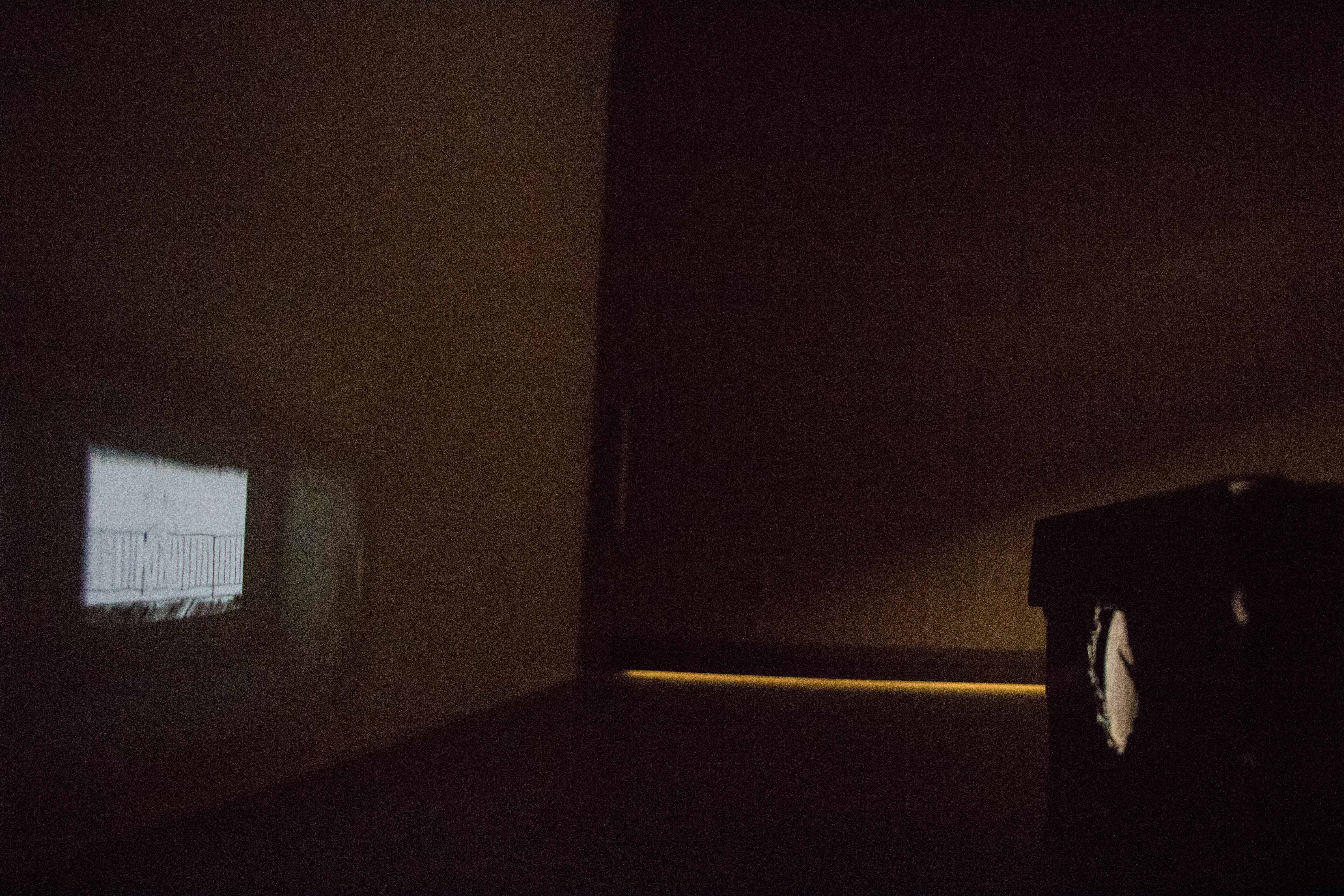
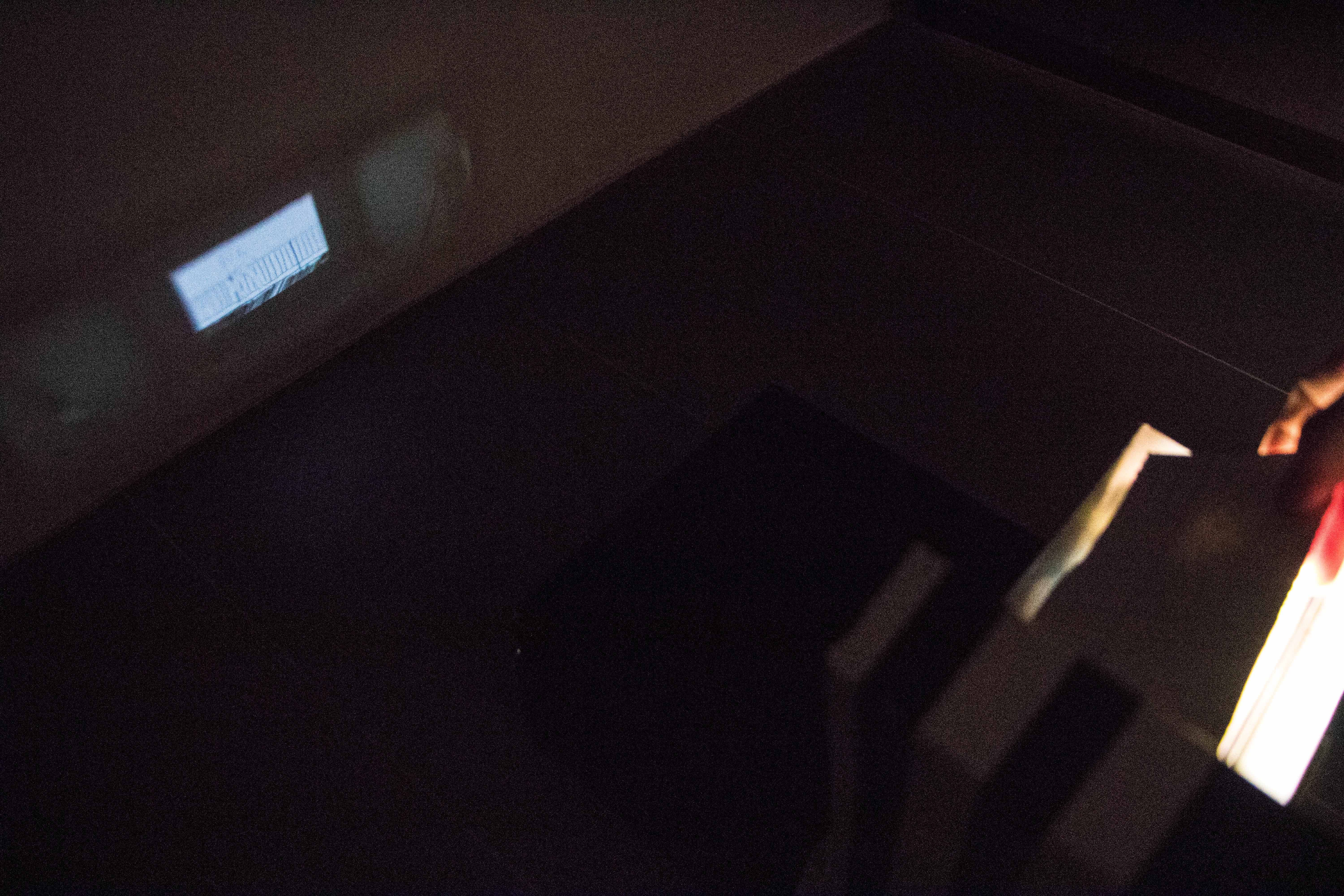
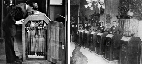
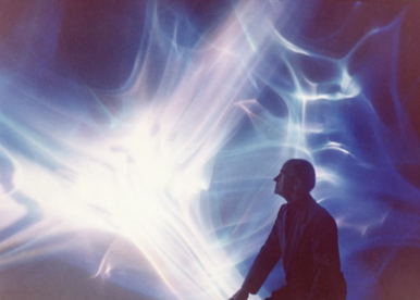
The Man Who is a silent black-and-white short film. Entering the space halfway through that 7 minutes, brings us a somewhat disjointed look and feel, but enough to be intrigued. Staying on for a re-run would allow us to see that for the most part there is an overarching narrative of the loneliness of working in a film studio. We follow an unnamed character and his process, both physically and mentally, of working alone in the space as the unnamed man behind the film. This melancholy is juxtaposed with the excitement of filmmaking itself. The film is visually energetic. A wide range of techniques are presented, including stop-motion, jump-cuts, time-lapse, etc.

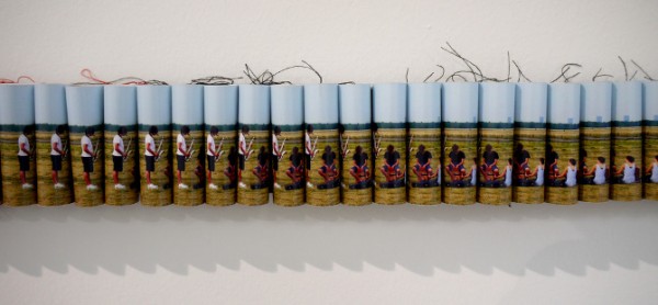
I almost immediately identified Balanon’s work as a homage to Dziga Vertov’s The Man with the Movie Camera (1929). Not because of the somewhat connected titles, but because of the discourse they bring to the idea of filmmaking and the film medium. Vertov’s masterpiece is certainly an interesting case in point for film history as he makes film become almost self-aware of its own processes and materiality as a medium of moving images. In Man with the Movie Camera we see the film capturing itself on camera, editing itself and eventually projecting itself on the screen. It is the making-of the making-of films. Vertov throws at us a dizzying spellbound encounter with film. We proceed to ponder about the whole machinery behind the camera as we review the endless possibilities of the medium itself.


Image result for dziga vertov man with a movie camera

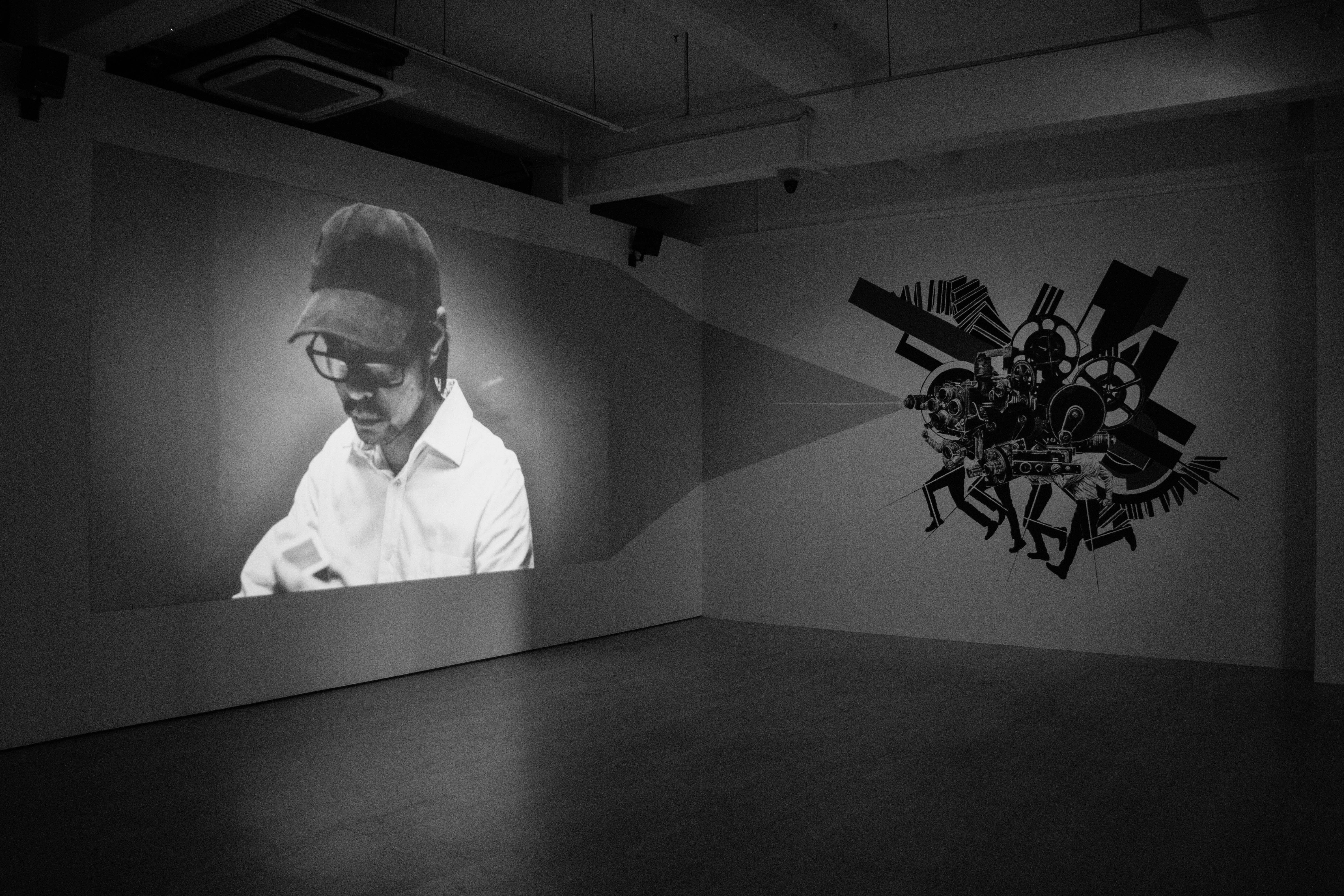
Stills from Banalon's The Man Who and Vertov's The Man with a Movie Camera


Jean-Louis Baudry wrote extensively on the film apparatus, such discursive systems and arrangements of culture that present film to direct the viewer into a certain mode of spectatorship. This is achieved by the illusion of the absence of the machinery that makes film. The camera is not apparently perceived. Baudry’s reference to Freudian psychoanalysis, quotes the Interpretation of Dreams, to liken the ideological effects of the film apparatus on the passive spectator to the way dreams operate for the dreamer, in the way that they both achieve a ‘decentralisation’ of the human universe.

Balanon and Vertov’s work both echo this same sentiment. They conjure up illusions, dive into the ‘decentralistation, but they however throw a curved ball and actively capture the film apparatus at work. Making no magic and mystery out of it all, they celebrate what the camera is. But between the processes leading from film to projection, I think that Banalon picks up on Vertov’s point of departure and brings in his special interest in the production aspect. Film is not made alone. It is not just the film-maker as auteur, but a whole team of unnamed people, just like the character form his narrative, all contributing to the process. These two film-making-essayists each have made their response to film using the sensibilities of the medium itself. Their works have this unique quality of self-reflexivity. We will continue to explore Balanon’s take on the film apparatus and what can be further unpacked from The Man Who.

Drawing, Film and What’s Behind It All

Spinning away from the film itself, the drawing adjacent to it, is also a significant element to consider. We see a kind of camera machinery drawn on the wall next to the projection area. You could almost believe that the drawing is projecting the film, had you not remind yourself seconds later how projectors work. The artist forces us to actively think about camera and projection; the film apparatus brought to the fore, prominently and permanently displayed, if you may.

What Banalon is attempting to get at here, however, is not so much the finished drawing on the wall but the act of drawing and what that involves with film-making as an artform. Drawing and film are closely related in their pursuit of the aesthetics of movement and perspective. We see in the jump-cut already, the facets of Cubism, the multi-perspective that Braque sought to recognise in his ‘painted montages’ of the viaduct, houses and roads at l’Estaque. Coupled with the futurists’ dynamism, their dogs on leashes, the whizzing trains and cyclists, as well, and even more so alive! Perhaps only Marcel Duchamp realised the closest representation achievable in oils, when he unveiled the Nude Descending a Staircase, No. 2 (1912).  Film is an amalgamation of the many diverse aesthetic endeavours from the Modern times. What The Man Who does here is to remind us of these processes that extend beyond just the film apparatus.

The act of drawing, of course, points toward the person performing the act, already announced by the apt title, The Man Who. For me, the film starts and ends with this site-specific illustration. The character arc of the undermentioned film studio production guy comes full circle – we see the film and the machinery that operates it, yet we never see the people who are behind it all. Names on the credit crawl, names that we cannot put a face on. We hear Balanon’s personal voice in his work. For Balanon, it was definitely an important turning point when the artist made the decision to forgo dental practice to pursue an artistic career. But whilst he was working for a Japanese company, he had been one of those unnamed warriors battling against time and expectations to be a small piece of a huge production. Film needs the human touch. The reel-world may always be essentially fiction but the human aspect in production never lies. Banalon gives us a timely reminder as we join his gaze back to the advant-gardists.

I certainly have enjoyed The Man Who. You could say the drawing completes the film or vice-versa, yet they both stand for their own. It is this sort of connection that makes me appreciate great works when I see them. A resonance. I look forward to more great experiences like Cinerama.

Bibliography

Baudry, Jean-Louis and Williams, Alan. “Ideological Effects of the Basic Cinematographic Apparatus.” Film Quarterly, Vol. 28, No. 2, (Winter, 1974-1975): pp. 39-47. http://www.jstor.org/stable/1211632. (Accessed 1 March, 2018).

Bradshaw, Peter. “Man With a Movie Camera review – visionary, transformative 1929 experimental film.” Guardian, July 30, 2015. https://www.theguardian.com/film/2015/jul/30/man-with-a-movie-camera-review.  (Accessed 26 February, 2018).

Martin, Mayo and Chan, Luo Er. “Singapore Art Museum to get S$90 million facelift”, Channel News Asia, 01 Apr 2017. https://www.channelnewsasia.com/news/singapore/singapore-art-museum-to-get-s-90-million-facelift-8709154. (Accessed 26 February, 2018).

Man with a Movie Camera (Chelovek s kinoapparatom). Dir. Dziga Vertov. 1929. Ukraine: All-Ukrainian Photo Cinema Administration, 1929, b / w 35mm, 68mins.

Vertov, Dziga.  “WE: Variant of A Manifesto.” In Film Theory: Critical Concepts in Media and Cultural Studies, ed. Philip, Utterson, Andrew, and Shepherdson, Karen J., pp 138 – 141. United Kingdom: Taylor & Francis, 2004.

WEEK 1: Resume and Bio

Bio and Resume

As part of a small self-curated exhibition I did for my drawings in London back in June of 2016, I actually launched my artist website www.fabiankang.com roughly a week before the private view.

I had been away on exchange and upon rejoining ADM for this Project Development course, I took the great opportunity to revise and update my bio and resume as well as the portfolio I present on this website.  I think I will be still wanting to do more reorganization, but here is what I have for now:


one of my works:

Ich verstehe nur Bahnhof, Fabian Kang, 2018, Digital Photo-series


I present here a fairly recent work which I made during exchange to Germany this Winter’s past.

Ich verstehe nur Bahnhof is a German idiom I learnt which translates directly into “I only understand Train Stations”.  The original context of the phrase came from soldiers returning from the war and train stations were the only thing they could comprehend because it was the way home.

In this Photo-series, I was playing with long exposure and literally playing in the train stations because I was very much amazed by how beautiful they were. So as a ‘tourist’ / ‘foreigner’ coming into Germany, my understanding or translation of the phrase Ich verstehe nur Bahnhof took on a different meaning and thus a different presentation in the photography.

But, there was also a small text behind these images that I wrote in my newly-learnt German:

Ich verstehe nur Bahnhof … … und wie man Spaß in ihnen hat!

Aber die Zeit kommt schnell zu Ende. Ich muss steige die Bahn ein.

( I only understand train stations … … and how to have fun in them!

But the time comes quickly to an end. I must get on the train now. )

This work also shows my liking for improvisation, as I was taking long pictures and doing random stunts in a crowded area, which does produce many unexpected results. Even got me striking struggling conversations with local commuters who’d stop-by. I also of course enjoy that I could learn a new language and explore.


one artist that inspires me

Most people try to show or find or explain the connection between their artist inspirations and their own work. I am confident you will find very little of that with the artist I’d like to briefly write about here.

Charlotte ‘Lotte’ Reiniger (1899 – 1981) pioneered an avant-garde style of Silhouette Animation, inspired by fairy tales. Reiniger’s oeuvre of more than 40 films have seen her employing her rare talent with the scissors to transform plain black cardboard into extraordinary characters, objects and sceneries. Her most significant work is “The Adventures of Prince Achmed” (1926) which remains the world’s earliest surviving feature-length animation. (Pre-dating Disney’s Snow White!!!)

a still from Prince Achmed

I am a great fan of Reiniger’s silhouette films and the innovations behind their production. I admire the fanatic discipline she has in creating each of the characters, objects and scenery which are all hand-cut by scissors. Her meticulousness and tactile quality in her work is something that is so valuable in our internet age.

I think that she is such an inspiration. Although I am very unlikely to produce an animation of her caliber, I enjoy writing and sharing about her work. I feel that she is terribly underrated and I want to introduce her to as many people as I can.