

So the brief of the project is to design and do up a brief based on an assigned location
After getting the brief for the project, I was pretty thrilled with the project as I get to do one of my favourite pass times – exploring. I also thought that I could do photography. Then we got to know that we cannot focus too much on the photography side, but that is fine too.
After a random draw lots from my group, I got assigned Kampong Glam as a location for the Zine. Despite going there before and quite often, I would start the project with some research.
Where is Kampong Glam?
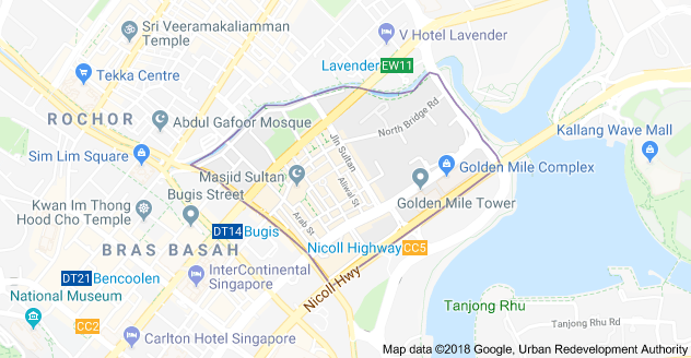 It is the area of shophouses between Bugis and Lavender MRT stations. It’s not hard to spot as it is the only shophouses in the area surrounded by high rise buildings.
Research of Kampong Glam
Before going to the site itself, I would definitely want to know more about the place first.
The History
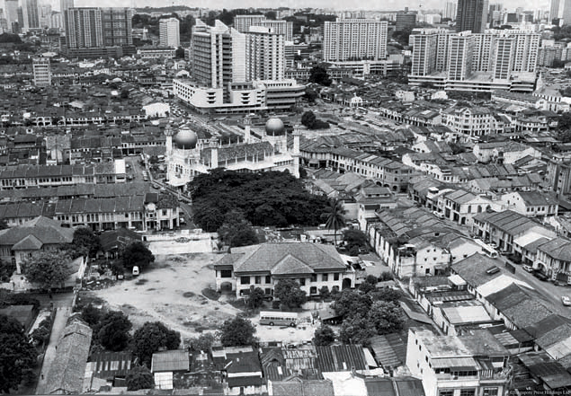
Old photo of Kampong Glam (https://www.silverkris.com/singapores-kampong-glam-arts-and-malay-heritage/)
Kampong Glam (originally spelt “Campong Gelam” when it was named around 1830) is one of 10 subzones of the Rochor area located in the central region. The road names in Kampong Glam such as Bussorah, Muscat and Kandahar streets – named after places in the Muslim world.
Kampong Glam was land set aside for the Sultan and 600 family members after he signed the treaty to the East India Company. The Sultan also instructed the Temenggong, a governor to the Sultan, to build his palace there.
Aside from the royal family, there were many other ethnicities living there too, such as the Bugis, Arabs, Boyanese, Javanese and Muslim immigrants. All these different groups set up their own mini-kampungs, which created Kampong Bugis, Kampong Melaka & Kampong Java.
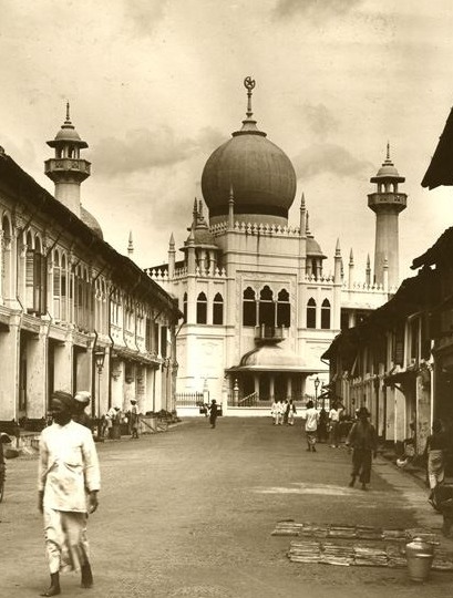
Sultan Mosque, 1928 (http://www.nlb.gov.sg/donors/denis-santry/)
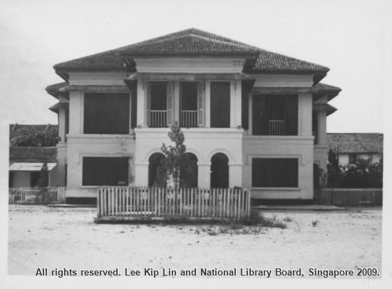
Temenggong’s Palace now the Malay Heritage Centre (https://thoughtmoments.me/tag/kampong-glam/)
Further research
Many would think that Kampung Glam is just a place full of hipster cafes, boutiques and filled with Arab and Malay influence. So knowing this, I would try to avoid doing up something based on that, … but what?
I started asking what people know about Kampong Glam, aside from the mentioned above.
The trades of Kampong Glam
Before it is known for its hipster cafes and graffiti walls, Kampong Glam is known for its different trades. From the old days, many cultures live amongst each other bringing in culture and items for trade to make a living.
Some of the trades that are frequently mentioned in my research include fabrics, carpets, and fragrances. Some of the shops that you see at Kampong Glam now has been there for a long time.
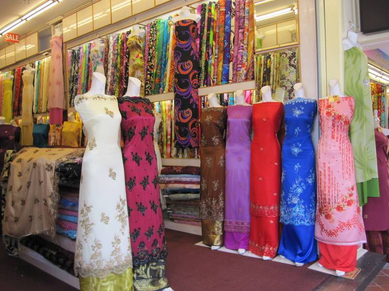
A fabric shop in Kampong Glam (http://sarah1404954h.blogspot.sg/2015/05/my-field-trip-to-kampong-glam.html)
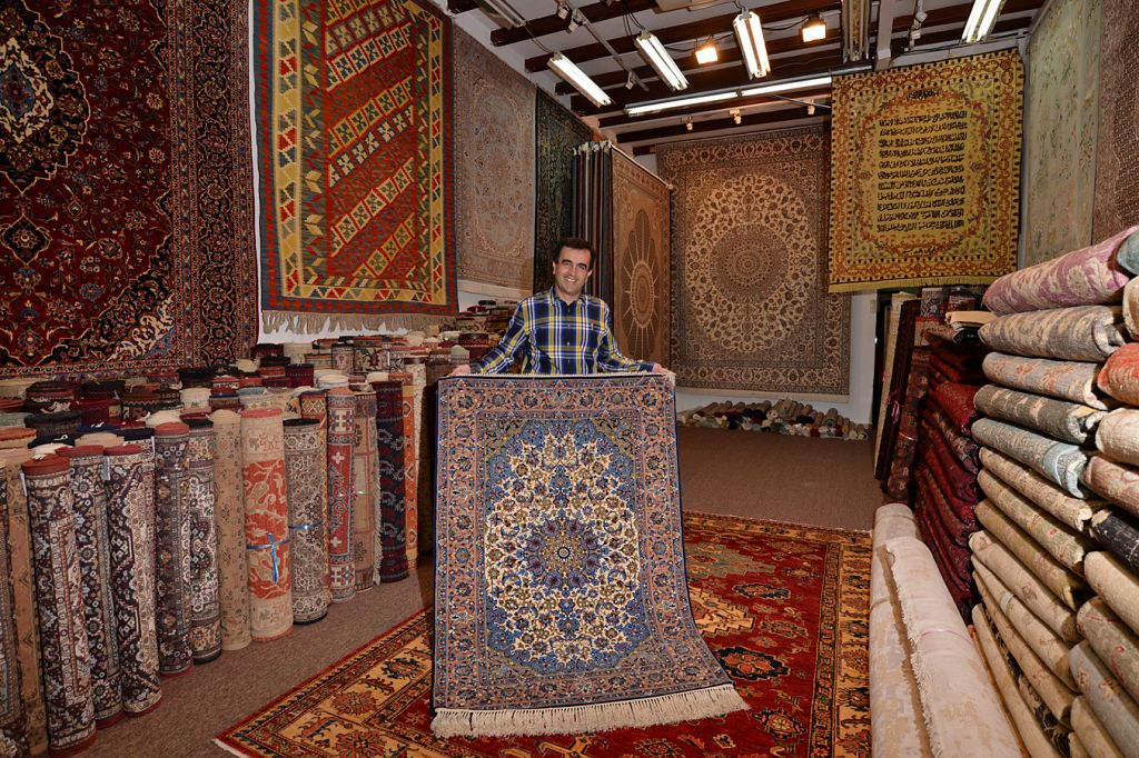
Carpet shop (https://www.todayonline.com/singapore/national-day-special-2016-fishing-village-hipster-hangout)

Perfume shop (https://www.tripadvisor.com.au/LocationPhotoDirectLink-g294265-d317436-i132795963-Kampong_Glam-Singapore.html)
Other crafts are also available, such as rattan and cane furniture, and also other intricate handicrafts.
The architecture
Through my research, I also found out that Kampong Glam has been gazetted into a conservation area in 1989, where the buildings in the area have to stick to certain guidelines, like retaining and restoring the exterior of the buildings.
Meaning to say, the buildings that you see today at Kampong Glam could have possibly looked like that ever since it was built! With the exception of the colours and modern pipes of course.
And the shophouses all come in 4 different types of shophouses:

Early shophouse style (https://www.ura.gov.sg/sales/kglam28sep04/text/kglam28sep04shophousestyles.html)
First transitional shophouse style (https://www.ura.gov.sg/sales/kglam28sep04/text/kglam28sep04shophousestyles.html)
Late shophouse style (https://www.ura.gov.sg/sales/kglam28sep04/text/kglam28sep04shophousestyles.html)

Art deco shophouse style (https://www.ura.gov.sg/sales/kglam28sep04/text/kglam28sep04shophousestyles.html)


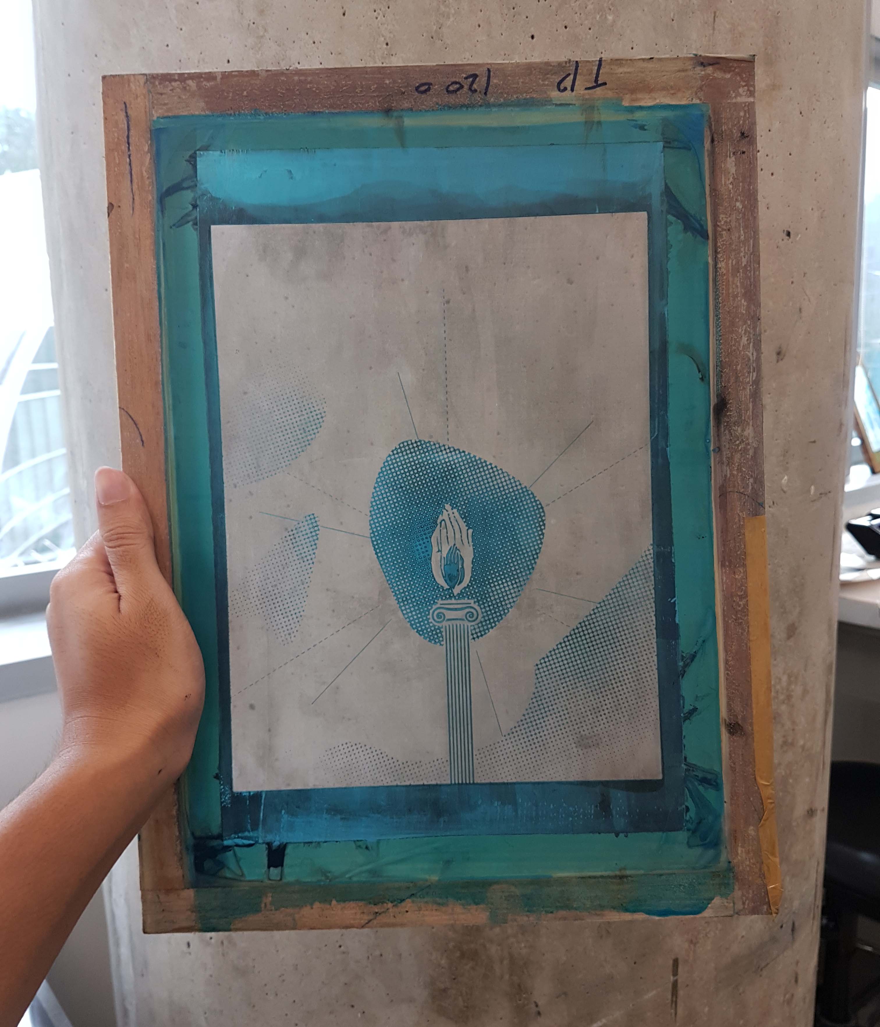

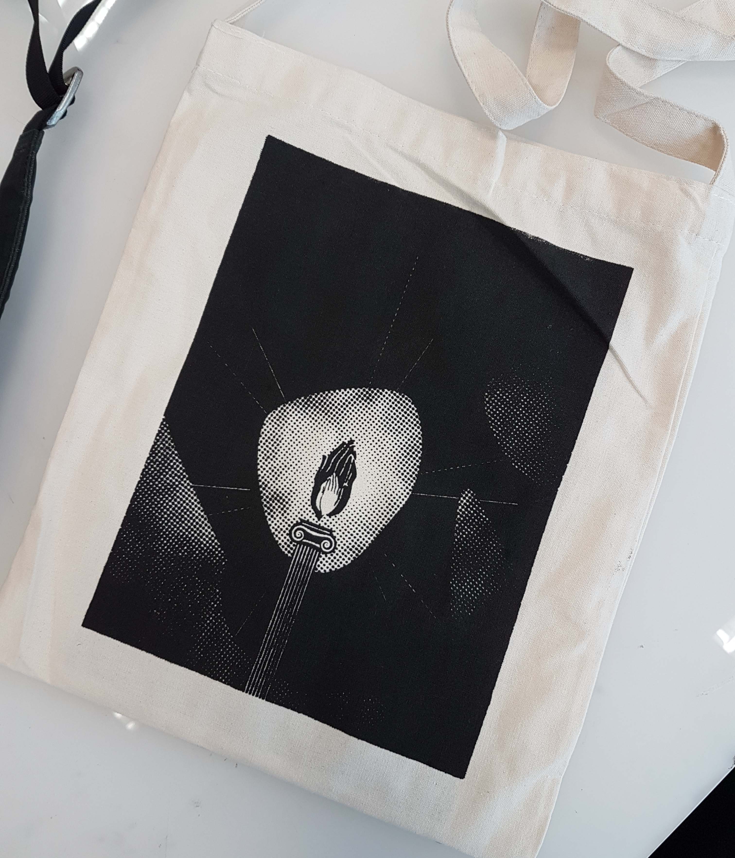


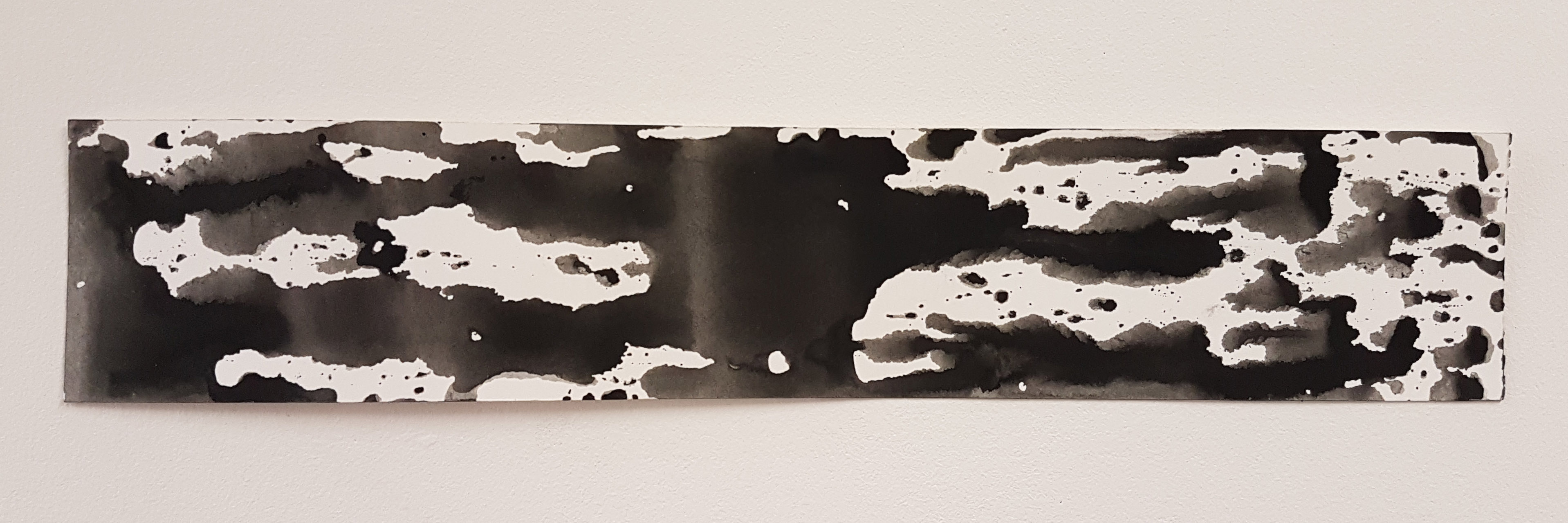
 The feeling of great fascination, somehow creates explosions and fireworks in your head, in a literal sense: mind blown. (Would have used that word instead but its not in the list.)