About the artists
Music Hackspace is a London based community for innovators and hobbyists passionate about music technology and sound art. Organises regular DIY workshops and events. Tim Murray-Brown, who led his team to create The Cave of Sounds, is a composer in residence at the Music Hackspace as a part of Sound and Music’s embedded composer scheme. His work focuses on interactive sound, particularly public installations that provide people with a space to explore and discover without being told what to do (musichackspace, 2018).
Interactivity, as described, is the reciprocal exchange between the viewer and the artwork, the ability to manipulate media and objects intuitively and with immediacy. In this Hyperessay, the main topic focuses on interactive media and participation and I will be analysing the relationship of movement to sound, using interactive media to recreate historical experiences and the idea of indeterminacy.
The Cave of Sounds (2012), a collaboration between eight artists from Music Hackspace and by Tim Murray-Browne, is an interactive sound installation exploring the power of music to bind individuals together and the visceral urge to use technology to broadcast our identity. Inspired by the prehistoric origins of music, the work is formed of eight original musical instruments, arranged in a circle facing inwards, each of which can be played by intuition and by the audience itself.
In this unique piece, each instrument has been designed and created by an individual (from the team) as an embodiment of their own artistic practice, but also to exist together as a new ensemble. The eight instruments are as follows (via The Cave of Sounds):
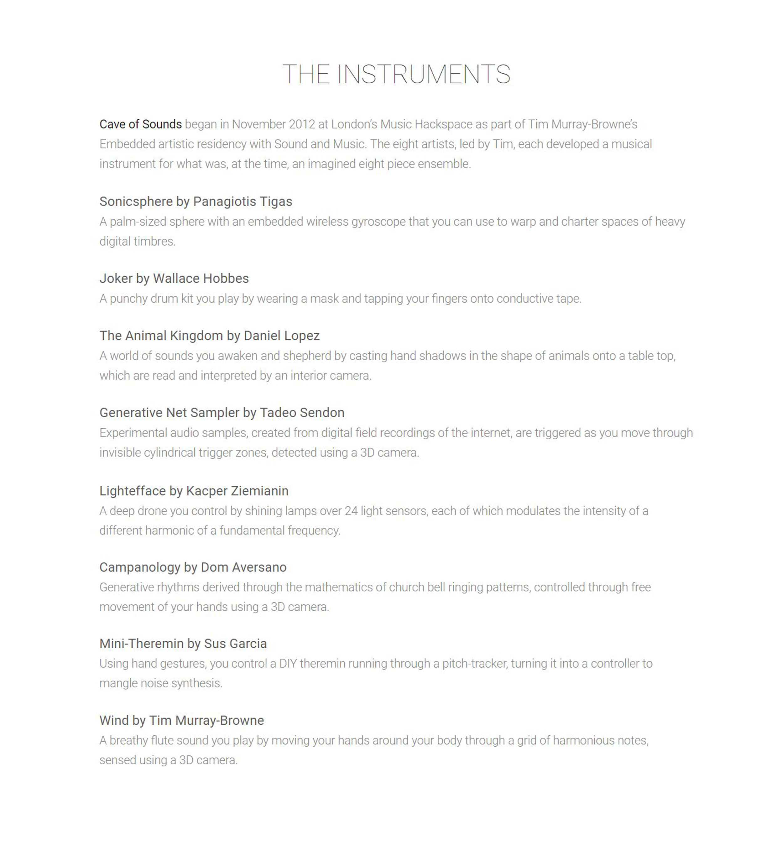
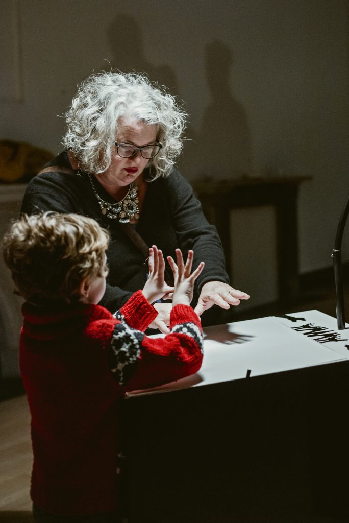

The Animal Kingdom (top) & Lightefface (bottom) via caveofsounds.com.
The Relationship from Movement to Sound
In the hands of the audience, the work is crafted to provoke participants to connect and resonate with each other through musical expression. Software linking the instruments gently adjusts their sounds to converge musically as well as detecting musical connections between participants and visualising them onto a central projection (thecaveofsounds, 2012).
With the instruments, there are endless possibilities as participants are given the freedom to choose any instrument and play it as and when they like. With that, this piece of work becomes an ultimate collaborative ensemble and transcends traditional methods of music making – from movement to sound, from technology to prehistoric sounds. The sound translated from the movement of the audience broadcasts their identity and reflects the behaviouristic qualities of them – the choice of instrument, the method in which they play the instrument and the duration they play it for. The boundaries between instrument creator, composer, performer and audience are increasingly blurred as the audience have now, the highest control over the ensemble, determining the outcome. The audiences’ role are paramount as, without them, there is no ensemble and this sort of interactivity is similar to a dialogue, where it shows reciprocal exchange and immediacy initiated from their actions.
Using Interactive Media to Recreate Historical Experiences
The Cave of Sounds also explores the juxtaposition of prehistoric music and interactive media. It uses both to connect the audiences within the space, providing an immersive and new experience. It is ironic, yet unique, that an ensemble of prehistoric sounds can be replicated, reimagined and re-experienced in a whole new modern context with technology. Who would have ever thought that hitting wooden drums or playing an old flute can be translated into buttons, sensors and actions? Thus, The Cave of Sounds is one interactive piece which explores sounds that strongly replicates an era far from today. The advancement of technology has enabled us to bring us to the past and has enabled us to familiarize and experience concept almost impossible to be realized and heard (music from the prehistoric era).
Indeterminacy & Entropy
As we all know, interactive media with participation is no musical or ordinary staged performance – it is very real, intimidating, personal, chaotic and free. The Cave of Sounds is exemplary as it involves the audience to create an ensemble as they play their chosen instrument amongst the other participants. A preceding example of such interactive media would be Jon Cage’s Variation V (1965), where, in this audio-visual performance, sounds created are affected by movement. The dancers’ movements are triggered by photocells, which triggers waves of sounds and also the projections on-screen (medienkunstnetz, 2018).

Variation V (1965) by Jon Cage (via medienkunstnetz)
Similar to Jon Cage’s Variation V (1965), chance techniques are used to avoid the habitual tendencies of deterministic musical composition. This embraces entropy. Although both artists have chosen the types of sounds, textures and objects, the specific musical sequence of sounds was left to chance. This degree of interactivity in the musical composition process enables a shift of control and creative decision from the artist to the audience and process. Both Variation V and The Cave of Sounds demonstrates the idea of indeterminacy by creating unpredictable, indeterminate relationships between music, dance, image and movement. And because of this indeterminacy, these interactive pieces are always in a continuous state of transformation, never finished, always changing and not an absolute finality in its realization.
It is also apparent from both examples, that there is a continuum, or in fact, an evolution in interactive media. In Variation V, as much as the performers were also the artists, composers and dancers that make up the entire performance, typical audiences lacked the freedom to be in it. Thus, this separates it from The Cave of Sounds, where audiences can freely include themselves in the piece, creating more entropy. Tadeo Sendon, a sound a digital artist, responses to this aspect, saying, “Although music plays a greater role in our lives than ever before, creating music is an activity often limited to trained professionals. Made up of a set of newly conceived musical instruments, The Cave of Sounds seeks to disrupt the boundaries between performer and audience. Regardless of training, visitors are invited to actively participate and experiment with new ways of creating and connecting with each other through sound.” (Sendon, 2018). This form of participation is more commonly seen today with interactive media artists, as our technology today has made ideas more concise and user-friendly. From Roy Ascott’s “Behavioral Art and the Cybernetic Vision,” he mentioned that the aspect of creative participation is an inclusive form of art, with a basic principle of “feedback. And this loop makes the artist/artwork/observer an integral whole. This important quality of participation and interaction is exemplary in The Cave of Sounds.
References:
http://timmb.com/pdf/murray-browne2014cave-of-sounds.pdf
http://caveofsounds.com/
http://www.tadeosendon.com/cave-of-sounds-tim-murray-browne-1/
http://www.medienkunstnetz.de/works/variations-v/
http://musichackspace.org/author/timmb/
https://oss.adm.ntu.edu.sg/17s2-ap9044-sem-1/wp-content/uploads/sites/2276/2018/01/ascott-behavioral-art.pdf