Tag Archives: type

Review: Talking Type by Jessica Hische

Choosing the right font can sometimes be very difficult as there are so many beautiful typefaces out there. With Jessica Hische’s article, we can explore a myriad of beautiful typefaces and understand when to use them. In the article, Hische mentions, “Remember that just because a giant headline is the first thing your reader sees, that doesn’t mean it should be the first typeface you choose.” And for our next project, I think it is apt to consider this to establish a good visual hierarchy in our pages. Also, I think I have always been putting a great emphasis on titles and headlines but Hische’s points have made me reflect and think about the most minute details in type.

I have been using Gotham for ages (damn beautiful font, I must say) but I can’t really put into words why it is so aesthetically pleasing. Is it because it is a sans-serif font? A grotesque font? Today, Hische’s article enlightened me.


Gotham in 8 different weights.


Comparison of x-height (Gotham and Mr. Eaves)

With more variations in type weight, there is more flexibility and cohesion in choosing how bold or light you want your text to be. And I think I love using Gotham as the 8 different weights allow me to be “bold” with my text, yet not too bold and overpowering like some fonts with one choice of bold. Sometimes, as I choose a different font size, I would change up the weights as well. For example, for smaller fonts, Gotham Book or Medium might be a better choice than Light or Bold for readability.

Next, a generous x-height is very important when choosing a text face. If the x-height is too low, the typeface will appear smaller overall and the caps will have too much emphasis which interrupts smooth reading. If the x-height is way too high, your eye won’t be able to distinguish quickly between caps and lowercase, which can make you lose your place while reading. A generous x-height allows you to set type at small sizes and have it still be very legible. Gotham has a great x-height, as juxtaposed in the comparison. The comparison shows evidently how we focus on the cap letters in Mr. Eaves and not in Gotham. In Gotham, it is smooth and pleasing to the eye (No doubt, easier to read for me).


Comparison of letter-spacing (Helvetica vs. Avenir)

Spacing is as important as well when choosing type. If the letter-spacing it too tight, it’ll be bad for the paragraph and the eyes too.

MORE FLEXIBILITY = GREATER TYPOGRAPHY

Other than looking at these physical attributes of what makes a type work, the context behind the choice of font is key as well. All fonts can convey certain emotions, create a mood or even portray certain characteristics – using their curves, geometrical shapes, decorative elements and so on. So, other than ensuring that there is no weird letter spacing or a bad x-height and type weight, the type has to encapsulate your context/content visually. How Hische describes it as is, “to add an extra layer of oomph to your design”


An example of how historical context can influence the type chosen to “add a layer of oomph to your design”. The type will not work as well if it was in Avenir or Helvetica.


Letter B shown in its Skeleton, Meat and Clothes (left to right).

After learning more in-depth typography terminologies and analogies like x-height, true italics, using super-families to pair typefaces and breaking down type to the “Skeleton, Meat and Clothes”, I am definitely more aware of my design choices. With that, I am able to consciously think about these important aspects which make great typography even greater. Looking forward to up my type game!

Reference:
http://jessicahische.is/talkingtype

In Class Activity: Haiku

In Class Activity

5, 7, 5 Haiku: 
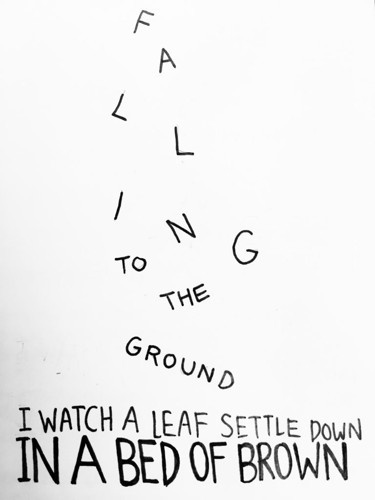
Falling to the ground
I watch a leaf settle down
In a bed of brown

01020304

Some thoughts:

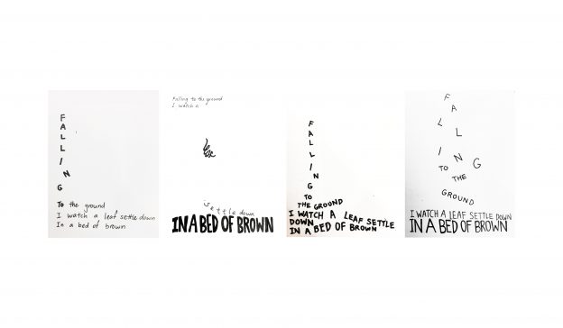
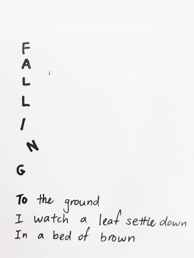
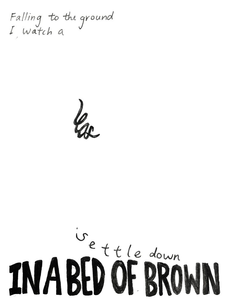
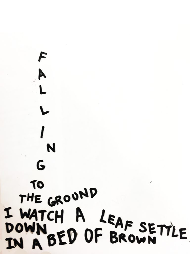
Overall, this activity was interesting and enjoyable as we had to as though, made the haiku come to life through type. In the 4 designs, I had to consider factors such as scale, balance emphasis, harmony. Also, the 5, 7, 5 haiku had a number of words which was a challenge – which line should be emphasised or which ones should be scaled down? For the final piece, I chose the second one as I felt that the use of more negative space makes the “leaf” isolated and thus, was emphasized more. Also, the last line, “in a bed of brown”, was heavily bolded to suggests the ground and create harmony in the composition.

In Class Activity: Expressive words Opposing pairs

In Class Activity

These are the vectorized sketches of the opposing pairs of words I chose from the list.

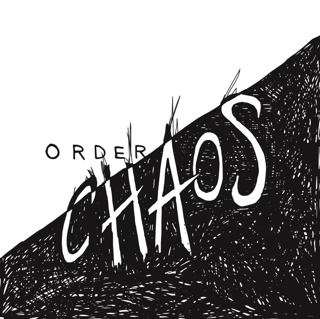
01. Order & Chaos

This is the final piece which I refined and chose for the class critique. In terms of design principles, I largely focused on balance in this piece. To give a sense of disorder and chaos, I disrupted the neatness of the white areas, with the black scribbles creeping into the other half of the canvas.

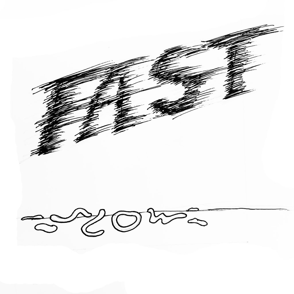
02. Fast and Slow

My this sketch, I mainly played with the strokes, varying the thickness to create a motion effect for fast. As for slow, I felt that blob-like, flowy lines were more suitable as it looks more organic rather that sharp.

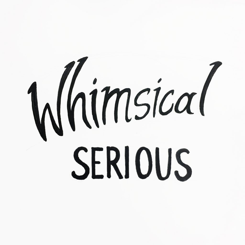
03. Whimsical and Serious

This was my first sketch attempt out of the three. To show the juxtaposition of meanings, I used contrasting strokes, a curvy and italic type vs a sans serif bold type.

Some thoughts:

After the critique in class, I saw the variations of opposing words and there are certainly some words which are more difficult to express. With that being said, there were many clever type compositions which portrayed the opposing words well. For example, the “open and closed” one where letters from “open” were falling out of the letter O from closed. The examples really portrayed how placement and even scale could drastically change the dynamics of type.

Review: Type Speaks

After watching the video, I was glad that I did not have to go through such painstaking and meticulous lengths in order to create type. Although I knew that the revolution of type had tremendously changed throughout the years, I wasn’t aware of the tedious steps and mechanical processes required. Now that I have seen them, I am amazed by the level of skill and precision they had at that point in time. Today, with our available technology and software, we are blessed with “Ctrl-Z”s, computer calculations and grids; without all the tedious and complicated processes. I also felt that these designers from the past are knowledgeable about the entire printing process; especially the mechanism of the machines and the processes. Ironically, I think I myself could barely get a printer to work sometimes.


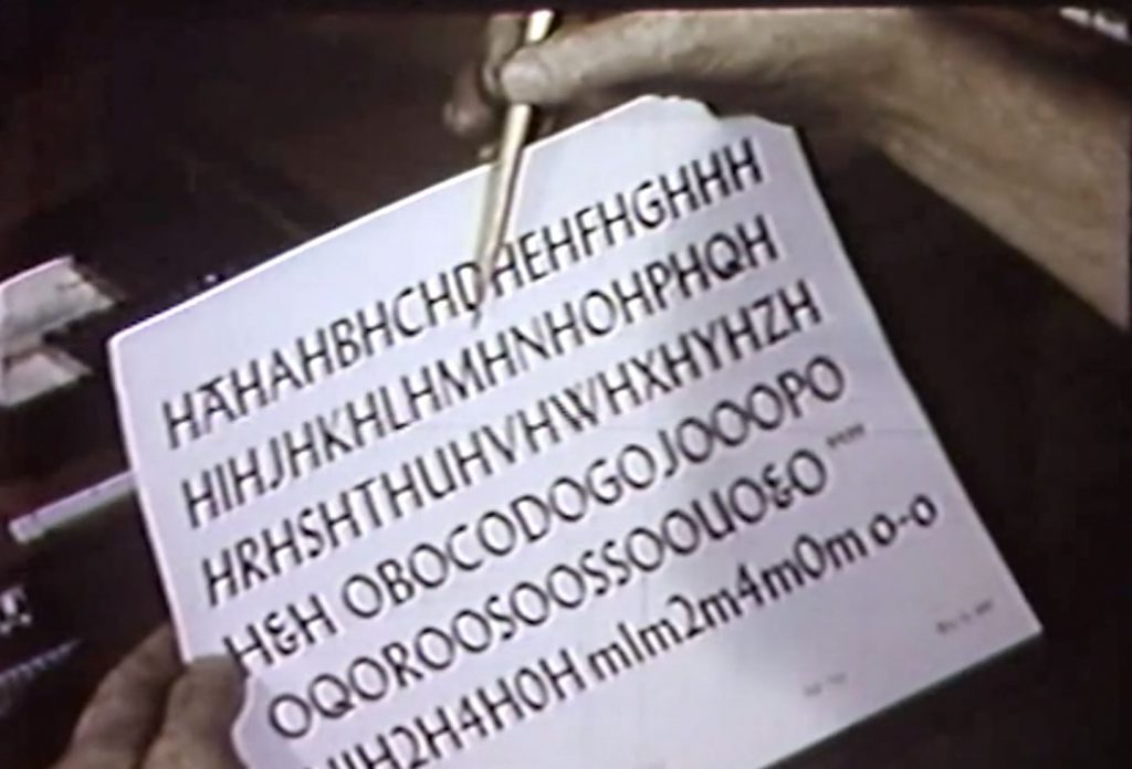
Designer checking every character in “Typespeaks” 1948

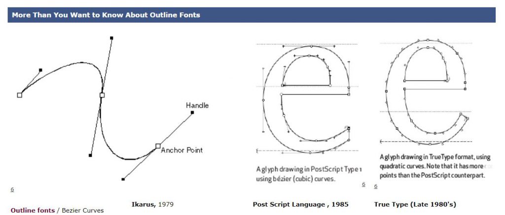
With that being said, I do feel that creating a font from scratch even with the help of computers and software might not be as easy as I thought. So, I went to read about the start of digital fonts. Apparently, there was a time where the fonts were created in bitmap or using outlines. As much as it saves much more time, money and labour creating a set of font is still meticulous work. Even with digital, designers are to ensure that fonts look optically similar and readable. The characteristics of the font have to also be consistent and neat. I guess, there isn’t a shortcut to create a good type, is there?


Bitmap and outline fonts by www.designhistory.org 


Digi Grotesk, the first digital font type designed by the Hell Design Studios (left) and bitmap fonts (right). 

References:

http://www.designhistory.org/Digital_Revolution_pages/EarlyDigType.html

01 Image Making Through Type: Final

Here’s the final outcome of project 1!

To view the design process and research, you can click on the links below:

01 Image Making Through Type: Artist Research

01 Image Making Through Type: Ideation and Process

01 Image Making Through Type: Final (this post)


THE JOURNEY OF DREAM JOBS

Tone: Positive

Sometimes, dream jobs are seemingly impossible due to constrictions and practicality. Nonetheless, going through this identity crisis of being conflicted with what we want is mandatory to find ourselves; in hopes that everything will eventually work out.


THE PATISSIER


In this design, I selected “K” and “T” as my initials. The letterform is mostly incorporated into objects of greater significance, such as, the cracked plate and plastic utensils made for kids.

Due to the angularity of both letterforms, I felt that it is more appropriate to deliberately incorporate them into those objects. As for the choice of case, “K” and “T” had not much of a difference but I went ahead with an upper case “K” and lower case “T” to make the placement of objects more natural. I used counter spaces/positive and negative spaces as form for the letter “K”.


THE ARCHITECT


Atavistic Vestiges After the Rain (1934) by Salvador Dali

In my second design, my creation of an “impossible architecture” was greatly inspired by Salvador Dali’s paintings, which consists of organic shapes. I chose the upper case “K” and lower case “T” in this design. As my letterforms were incorporated into the sticks at the bottom of the structure, to look as though it is barely supporting it, the angularity of both “K” and “T” had helped formed the shape easily. If these letters were curvy instead, the end results would differ quite a bit.

I also used the symmetrical properties of these selected letterforms to create a reflection which says “Kt”. This also ties in with my concept of being in someone else’s shadow as I am blindly following someone else’s dream.


THE TATTOO ARTIST


For this piece, I illustrated a mix of line drawings, a reference from line art tattoos, and vectors. By using contrasting styles, I wanted to portray this dream job as something far from reality and unattainable.

Inspired by Ukiyo-e prints, I used more organic shapes to create my vectors and letterforms. My letterforms, as seen in the red patch of blood and the chain, represents the cultural constrictions this job has. The chain, made using a pattern brush, signifies the constrictions, as though the tattoo artist’s hands are restricted.  By using a pattern brush, it helps to make an angular letterform more organic and natural. For the letter “K”, I played with the boldness/thickness of the letterform as it is an organic shape.


THE PACKAGING DESIGNER


This piece was inspired by the memphis art style. It adopts a great a sense of movement it in as I wanted to this piece to look fun and quirky.  I particularly picked candies as objects to be packaged as I wanted a similar motif which links to my first dream job – the patissier. The positive message from this is that things will eventually work out and this “Journey of Dream Jobs” is something mandatory so that we are able to find ourselves. Thus, reminding us that even though we might not be able to have that “ridiculous” job we wanted when we were young, it does not mean that you cant work your way around it and do something within your interests.

The letterforms, portrayed in the ribbons, started off looking geometrical. After a few versions, I decided to make the letter “K” look more organic and that it follows the curves of the ribbons which wraps around the box nicely. Altogether, I really wanted to capture the moment of having a job you love; although messy with the tapes still around, it is still bursting with joy and excitement.


Some comments from Joy and my peers:

  • colour choices were great and appealing
  • nice narrative and vector style
  • maybe centralise certain letterforms
  • 1st and last composition could have been less distracting
  • 2nd composition is good

I had met several challenges while doing this project. Firstly, incorporating the letterforms with consideration was tougher than I thought as I tend to lean towards a more illustrative way to express myself rather than in typography. I also struggled with trying to make the letterform more visible as initially, it was subtle and small in size. All in all, I enjoyed this project as I have learnt many useful illustrating techniques and also learnt about the properties of a letterform on a deeper level.