This is my final post for Project 1: My Line is Emo! Here are some links to my process and research.
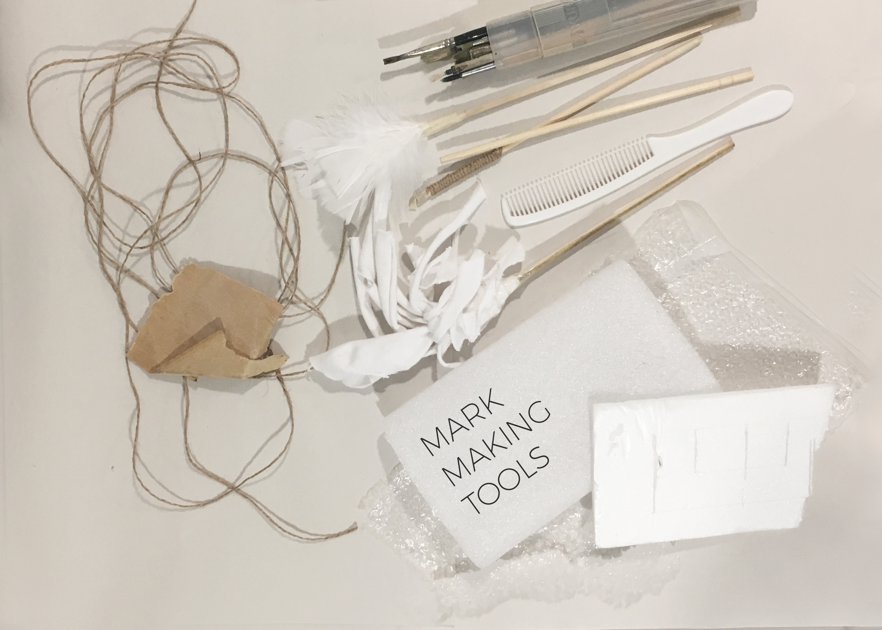
Part (1/3) Mark Making Research
Part (2/3) Process/Experimental Stage
Part (3/3) Final Outcome (This post)
After the consultation, I worked on my theme and my 6 chosen emotions.
L O V E
C O N T E N T M E N T
F E A R
I N S E C U RI T Y
R A G E
S U R P R I S E
VIVID DREAMS
I named my project “Vivid Dreams” as my concept was to explore and understand how dreams and the subconscious mind can relate to emotions. I picked significant moments in my life which was impactful to the point where I actually dreamt about them.
“Dreams” is an interesting theme. By studying how the subconscious mind and dreams work, I hope to be able to amplify certain emotions and express myself even better – conceptually and visually.


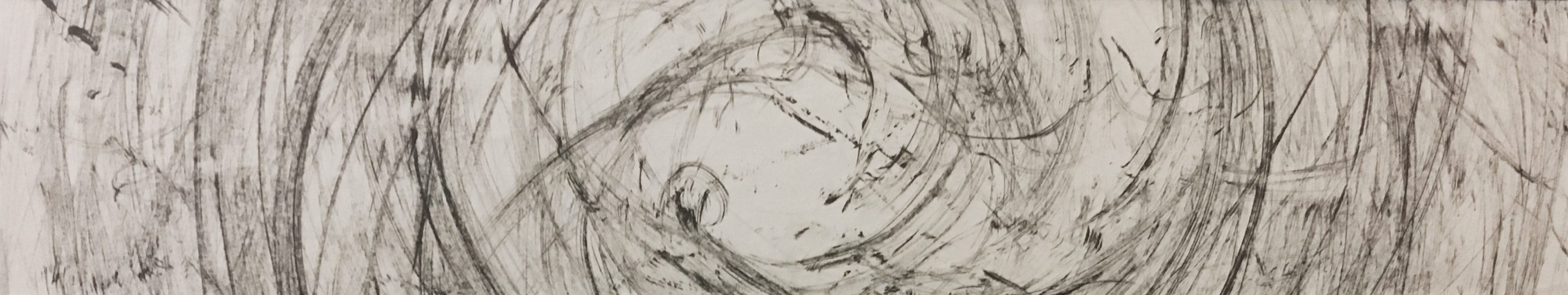
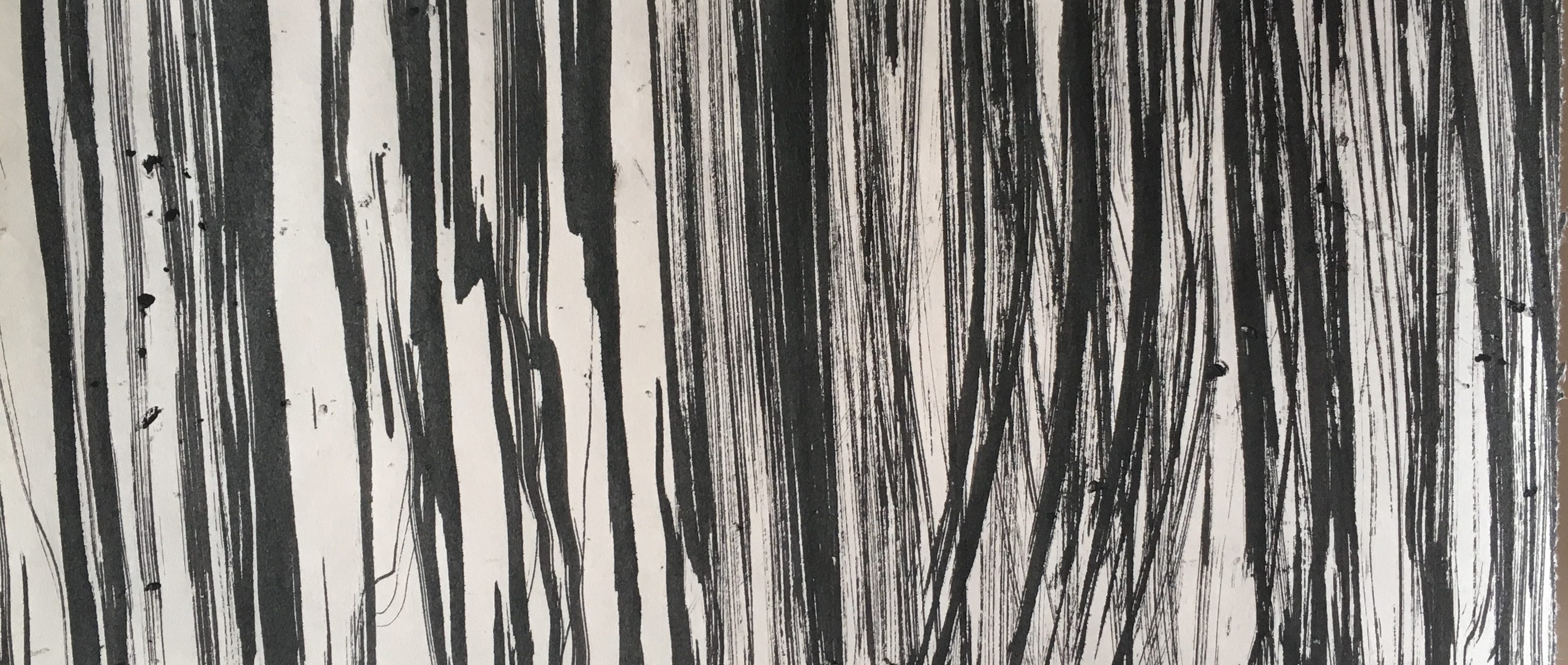
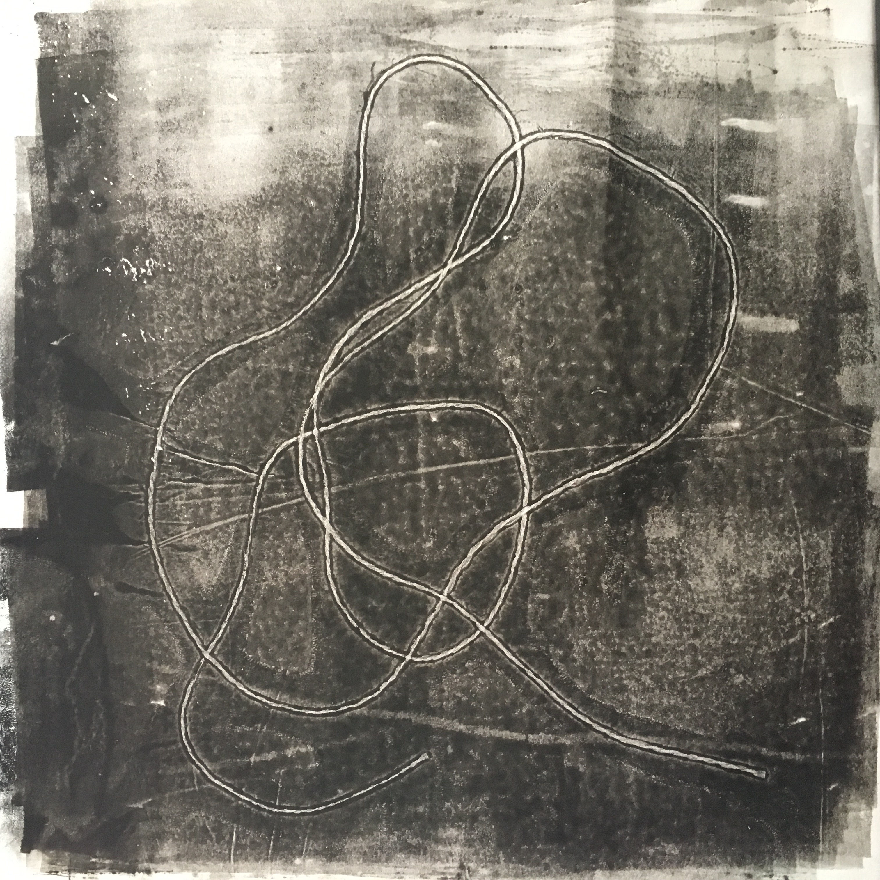
LOVE ; they say ‘love is like a drug’, I say that’s true.
With the use of paintbrushes and diluted ink, I drew thin and light brush strokes intersecting. It looks like strings intertwined, a symbol of love, and that they are floating rhythmically. I used pen and pencils to draw over the water colour brush strokes to accentuate the direction. These lines altogether, guide the eyes – left being the starting point and to the right, where it seems as though it is floating freely. In my opinion, love and happiness coincide. One can view this as love and the feeling of ecstasy because you’re in love.
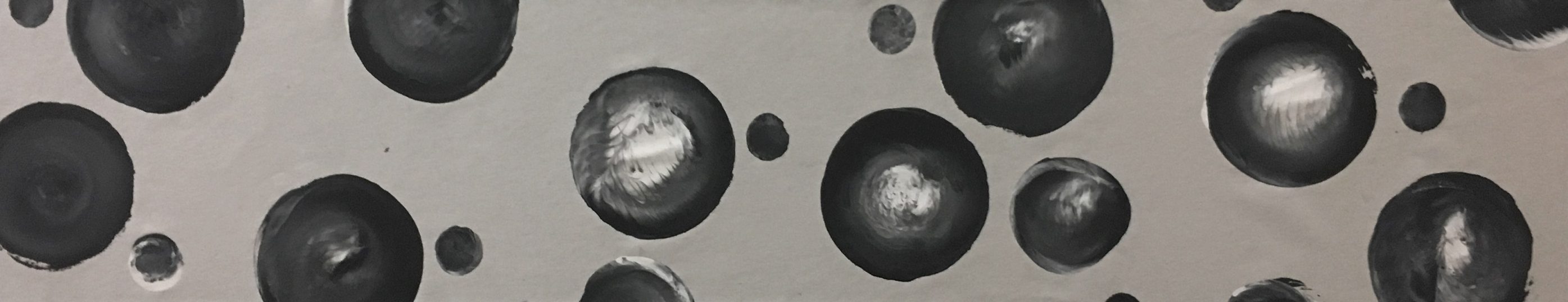
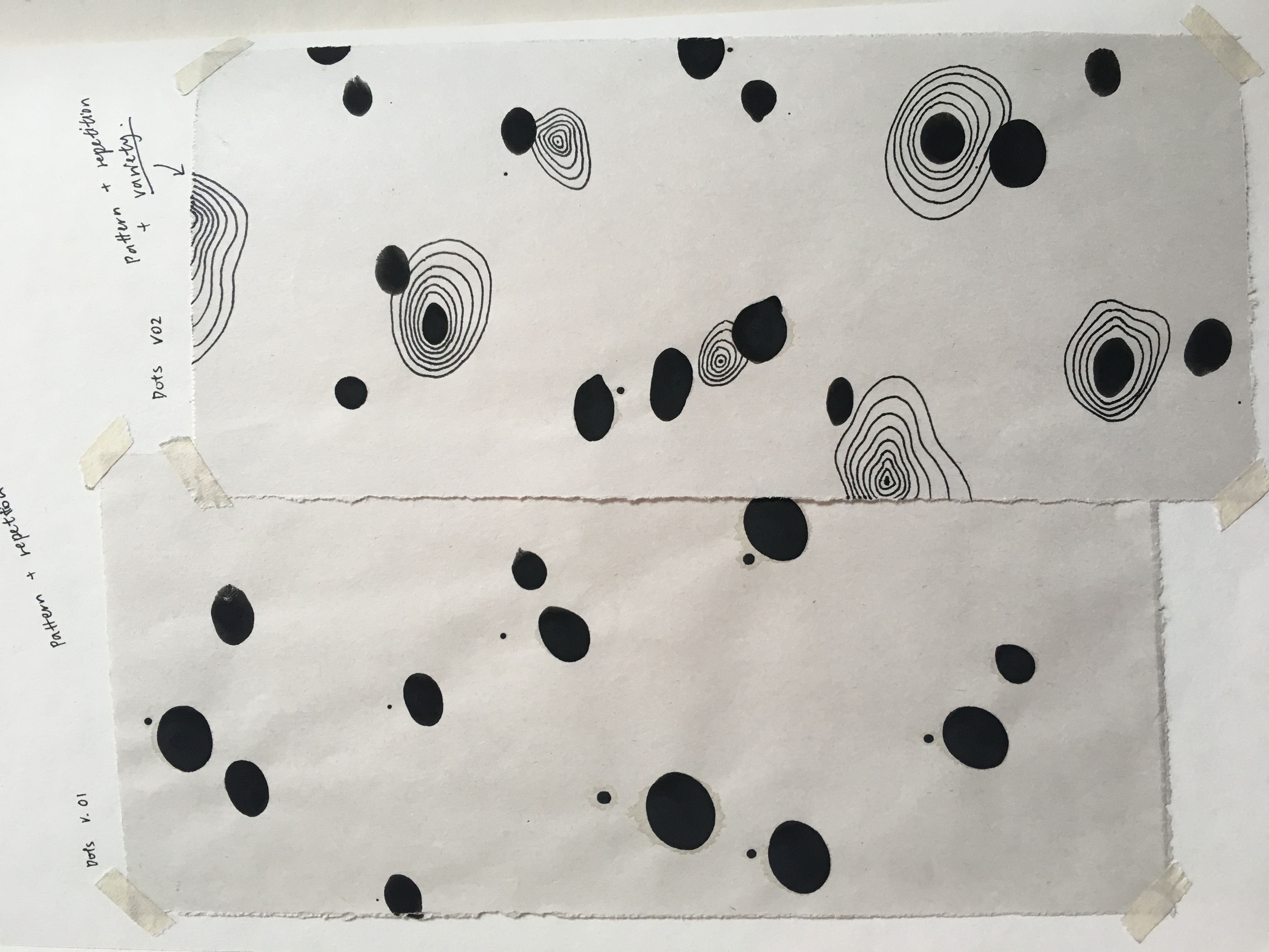
CONTENTMENT ; I found happiness in the simplest things in life.
Sometimes, it’s the small things in life that truly brings us happiness. If we keep wanting more, then there will never be an end to when we will be satisfied with what we have. I portrayed contentment as full circles of different sizes and gradients – representing how individuals perceive contentment differently. Rounder shapes tend to give off a lighter and happier mood. Mixed with shapes of different scales, it creates a sense of depth, movement and unity.
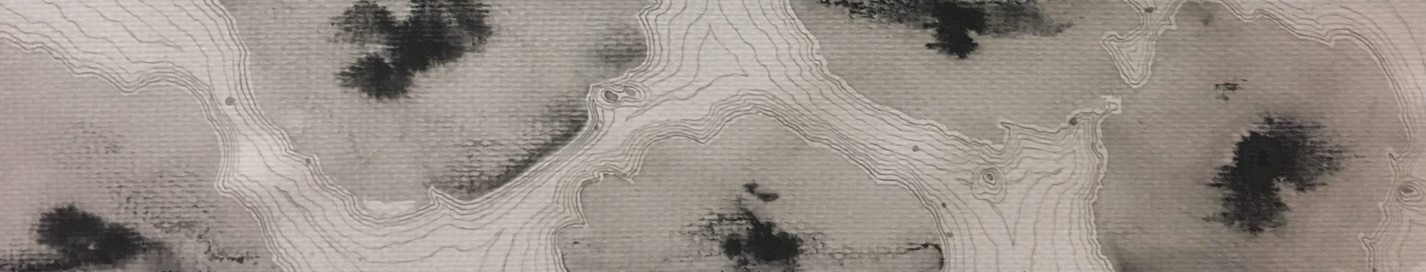
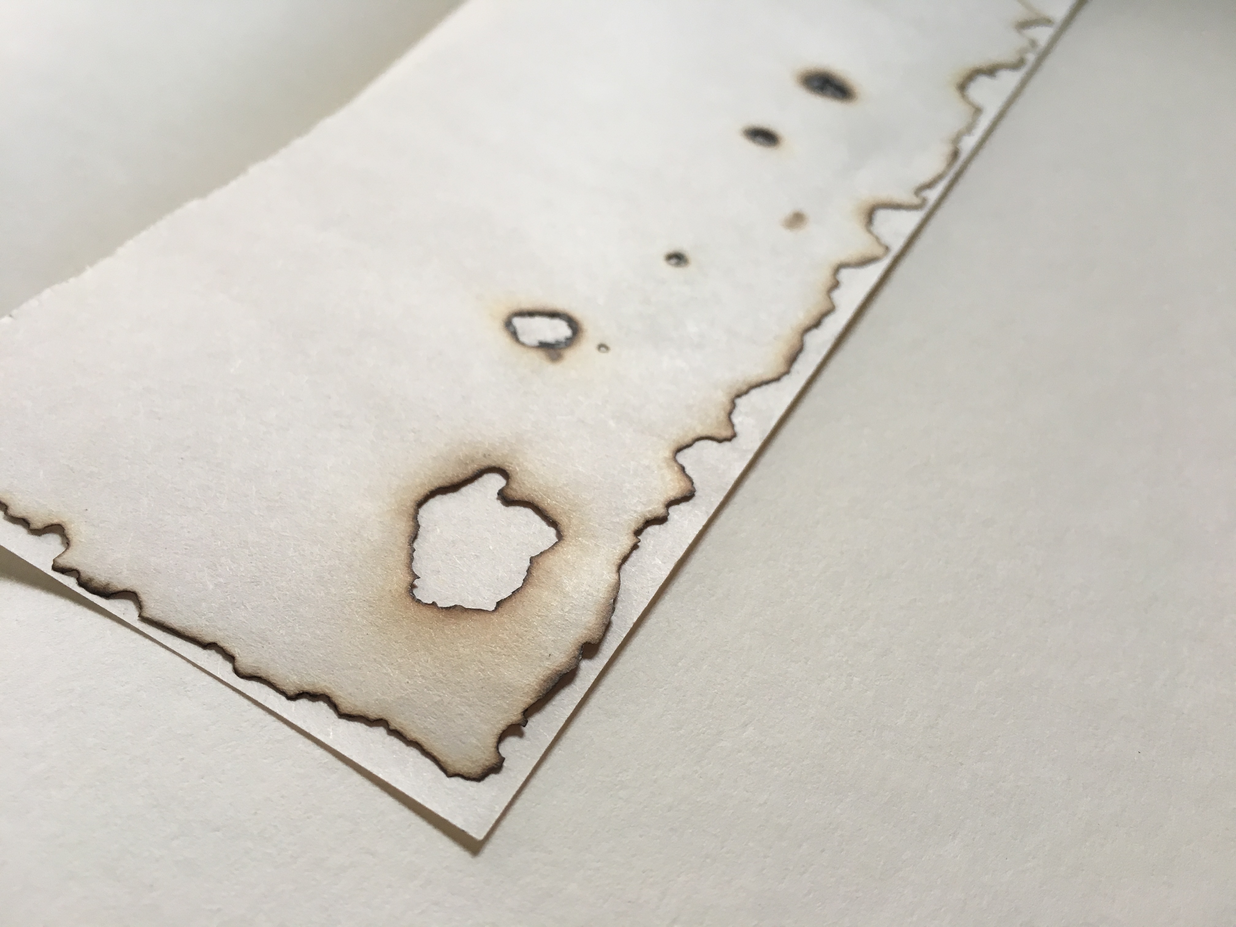
FEAR ; I fear losing my happiness.
Although I do not show what I fear, deep down inside, I am constantly worried about the unfortunate things that might happen. Being jaded, I would want to cling onto my happiness as much as possible – but life is never fair. I represent my fear with rounder and softer shapes as compared to distinctive sharp ones as I feel that my kind of fear is subtle yet it can accumulate to become overwhelming. Although I used more organic shapes, which may sometimes contradict the emotion of fear, the uneven edges of the watercolour patches and lines represent uncertainty and uneasiness. The water colour spreads out on the paper unevenly with a gradient, representing the fear (the darkest portion) and how it slowly gets to me (represented by the thin contour lines, showing a spreading movement as well), until I hit the point of extreme anxiety.
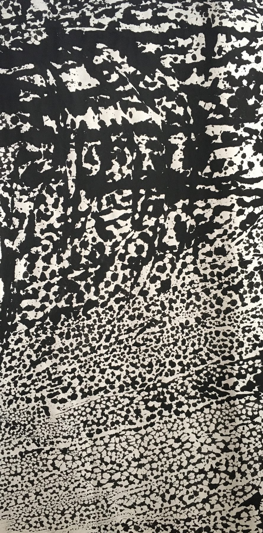
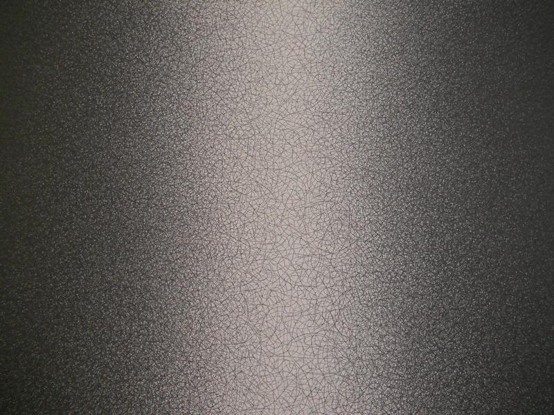
INSECURITY ; Trapped in an abyss of negative thoughts, when will I ever get out?
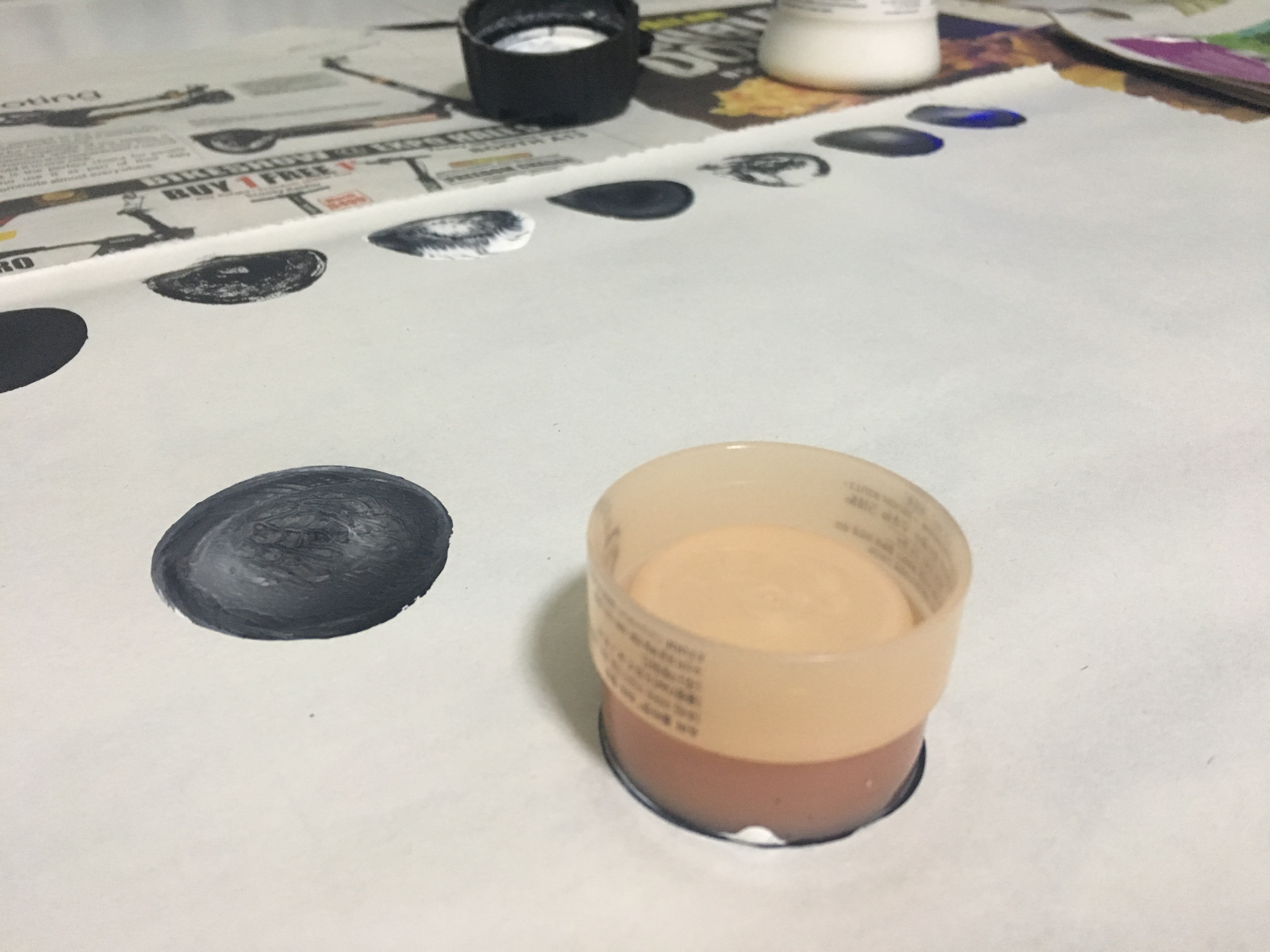
To portray insecurity, the act of repetitive negatives thoughts, I used brushes and circled them on the paper, creating layers. In this particular emotion, I felt that the cropping was extremely important – whether to centralise the circular patterns or not. I finally decided on centralizing it as it was more balanced and that it gave a sense of direction inwards.
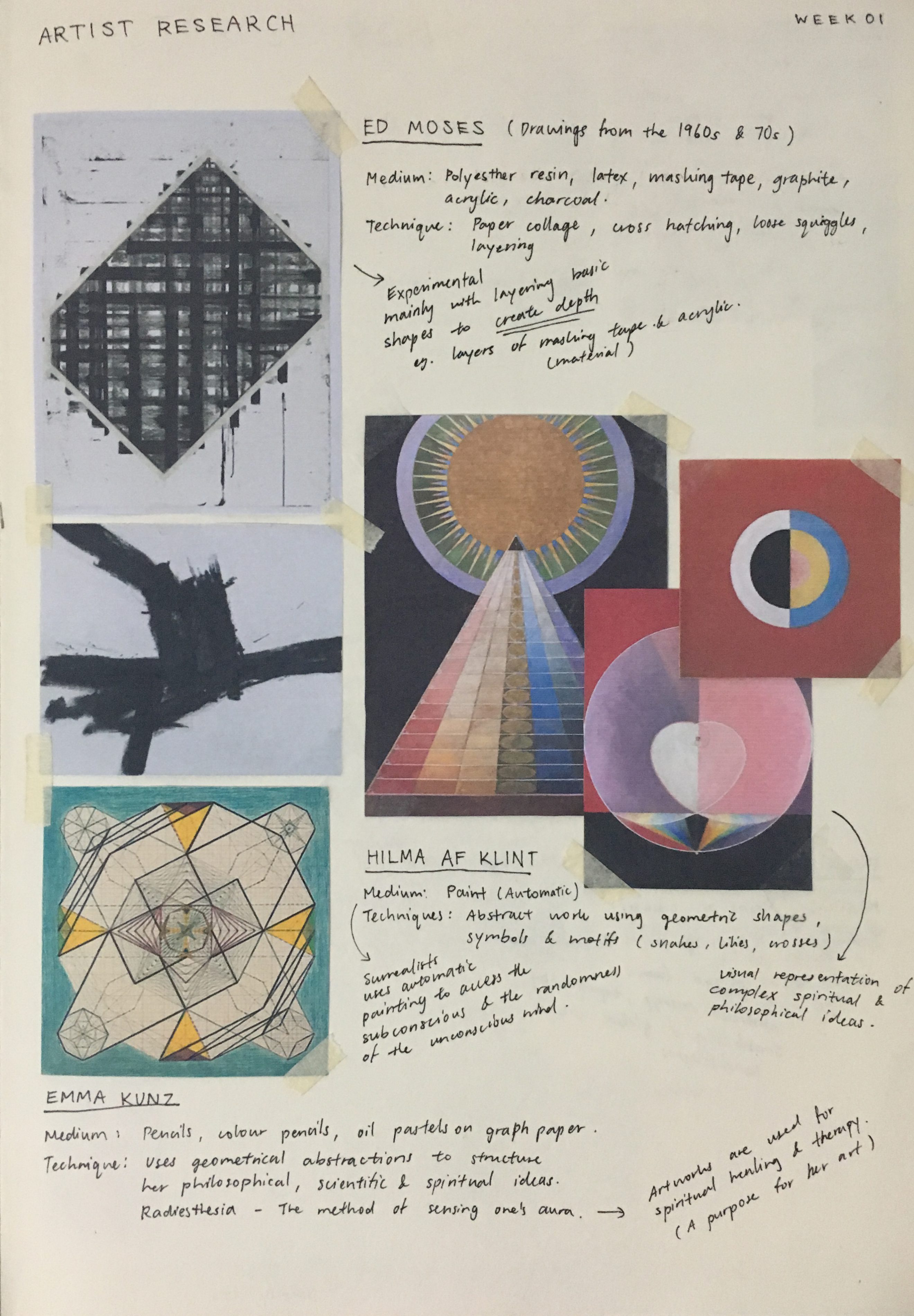
Inspired by Sol Lewitt’s Scribbles, I felt that insecurity and the automatic technique used with different densities go well together.

Earlier versions: Made with brushes, crushed paper and crushed news paper. (Left to right)
My earlier versions of insecurity were mainly experimenting with layers of paint, using crushed paper, tissue paper, etc. My aim was to create a radial gradient that showed layers of ink.
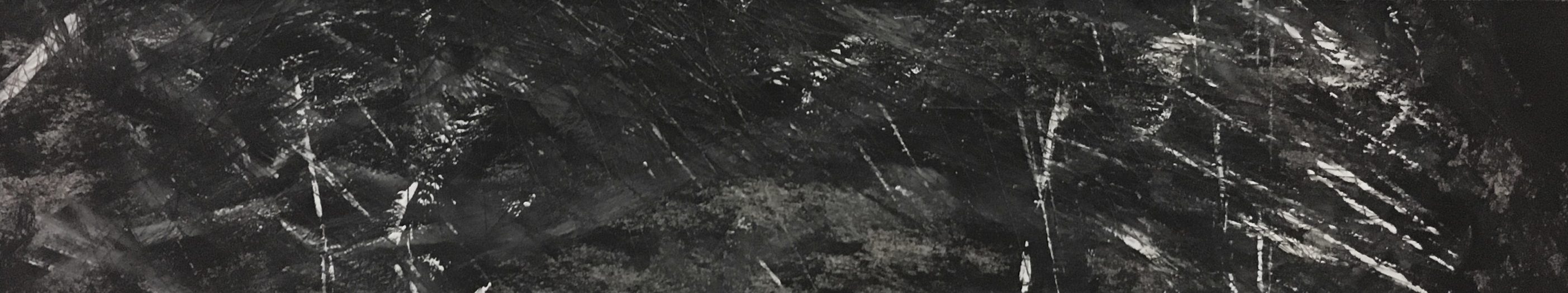
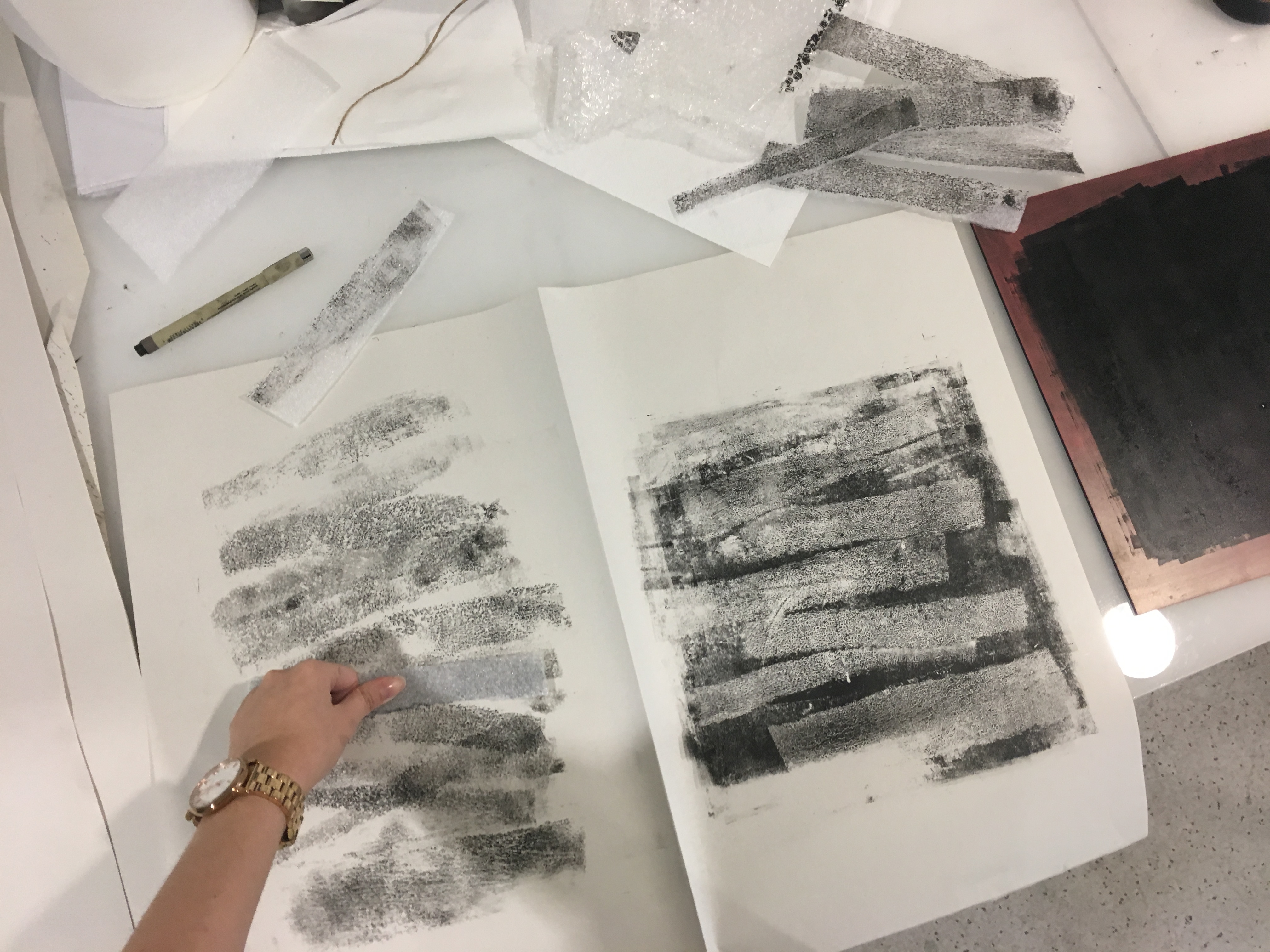
RAGE ; Chaos from within.
These marks started off as experimental marks made with knives/sharp carving tools on paper. I liked the cuts on the paper because of its texture and how expressive and meaningful the marks were. I made several versions and finally decided on one with had more depth. I painted the background black and made scratch marks by using different kinds of sharp tools, some with white paint on them. If you were to look (or feel) closely, the final piece had a horizontal gradient of black in the background and also in the textures (top being the most concentrated).
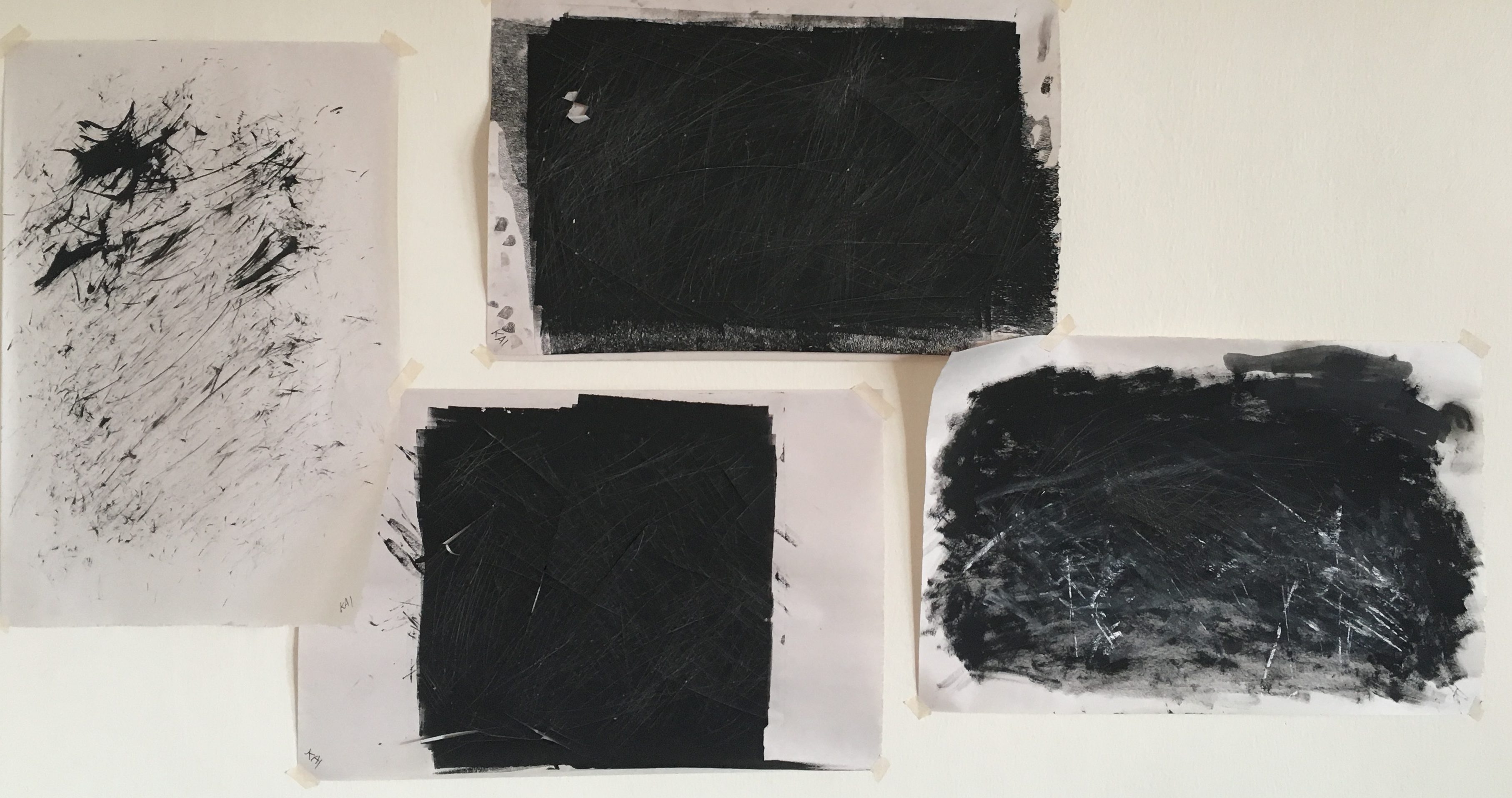
Earlier versions: Black ink on white paper, black ink on black background (2nd and 3rd) and black and white ink on black background. (Left to right)
I started of scratching up the white paper with black ink, but I felt that it lacked expression. Thus, I made more versions with a black background and played with different sharp tools.
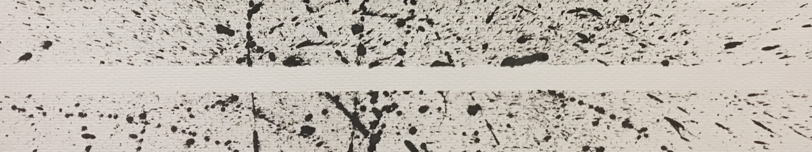
SURPRISE ; Expect the unexpected.
Inspired by the masking tape layering technique by Ed Moses, I used masking tape in the middle as I splattered paint onto the paper. I wanted to emphasise on the contrast between the blank space and the marks – representing ambiguity. It was also interesting to me as the focus point was actually the blank space, rather than the marks.
Feedback
Comments from Joy:
Overall, it was good
- how I considered using different types of paper to create the marks
- how I emphasized cropping (for insecurity)
- how I used lines, contour lines (even though subtle), in my work (love & fear) and explained it with how it had a sense of direction and flow.
- if I were to split my emotions into 2 boards (love, happiness, fear & insecurity, rage, surprise) – one has more deliberate shapes, the other has more of an automatic approach.
Comments from my classmates:
- Nicely done and well thought through.
- Loved the explanation and emotions
- Liked the compositions
- Some mentioned favorites were fear, surprise, contentment and insecurity.
Reflection
Upon completing “My Line is Emo”, I felt that this project had a great potential to explore how I am able to express my emotions on paper – using various mediums, tools and materials. Although these may seem insignificant at the start (I mean, black paint and black water colour, newsprint paper and watercolour paper, how much can they differ right?), but the varied results surprised me. Through the experimental stage, I had the opportunity to explore the properties and therefore, I was able to push myself further to create lines with meaning and how the interaction of design elements can bring about a certain expressive quality/emotion.
This project led me to discover more about myself and assessed my emotions and translate them into visuals – something which I found difficult to do before this project. If I were to recall, I could barely express how I feel most of the time.
Looking at the rest of my classmate’s projects has also shown me that with just 6 different emotions, we are able to come up with so many different ideas and expressions. Overall, this project was fruitful and very enjoyable.


