


2D Presentation: Meaning of Colour by Kai Ting & Claire
Leave a reply

A walk-through of the projects during this semester in Graphic Form.
The Journey of Dream Jobs is a set illustration which talks about my evolution of dream jobs, from 7-21 years old. In each illustration, the typography of my initials, “KT”, is incorporated in it. The placement and properties of a typeface are considered as they bring a focal point to the composition; each revealing an important aspect of the narrative.
Here are the links to my previous posts on this project:
01 Image Making Through Type: Artist Research
01 Image Making Through Type: Ideation and Process
01 Image Making Through Type: Final


Uniquely, Tiong Bahru, is an infographic which was derived from my research on Tiong Bahru. Comprising of consolidated information from both primary and secondary research, this infographic tells you about the brief history of Tiong Bahru, mainly related to the SIT (Singapore Improvement Trust) flats, and more importantly, focuses on the activities within Tiong Bahru today. It reveals some trends and insights which I have found and lastly, it consists the voices of Tiong Bahru.
Here are the links to my previous posts on this project:
02 Locale: Research
02 Locale: Infographics
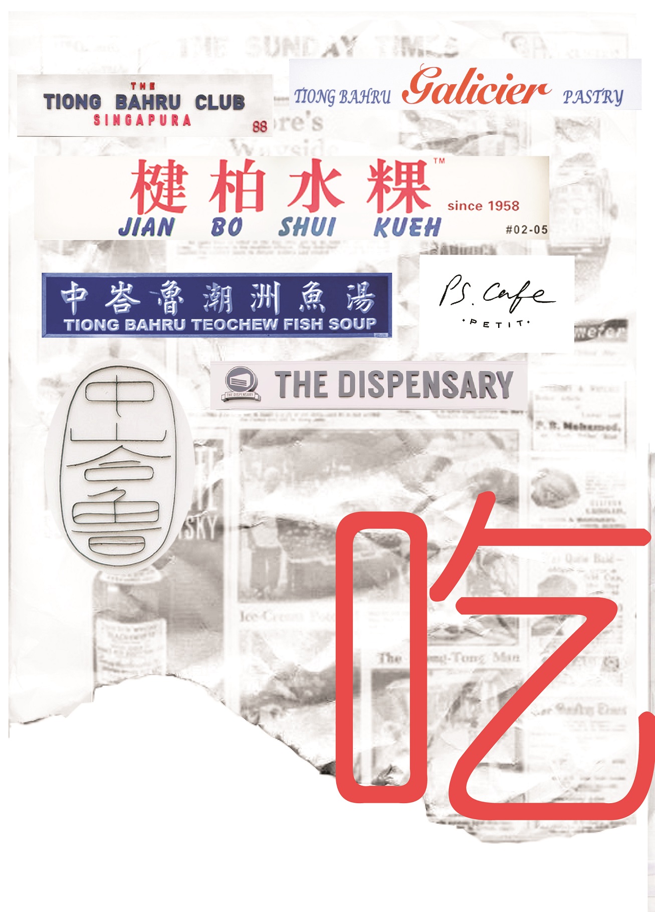
中峇鲁, is an 8-page zine which focuses on the abstract visual qualities of the site, Tiong Bahru. Using photo manipulation, soundscapes and light leaks, the zine looks into the nostalgia and fragility of Tiong Bahru by depicting memorable areas and a juxtaposition of the new and old – a continuation of the first part of my Locale project.
Here are the links to my previous posts on this project:
03 Zine: Locale Process
03 Zine: Locale (Final)


This is the final post of my zine!
To view the earlier parts of my Locale project, you can click on the links below:
Locale: Research
Locale: Infographics
Locale: Process


Pictures I took at Tiong Bahru in my other visits

ZINE LOCALE
After MANY changes, I decided to mainly use photos and soundscape to bring about the experience in Tiong Bahru. Instead of using the previous “eat, drink and play” idea (which was too informative), I will be using the nostalgic and fragility aspect of Tiong Bahru – something which I will not expect if I were to take a quick stroll along.
Nostalgia and fragility
Something which I thought about during this project was the conservation of this area – whether this charming estate will eventually disappear or not. Thus, I created this zine with this central focus in mind.
Cover page (right) and Back page (left).
In this spread, I used an ordinary photo of Tiong Bahru (b&w and grainy). It is unlike my other spreads where it is saturated with hints of warm colours – red, orange and yellow to suggest vibrancy. To me, this was my first impression of Tiong Bahru. It was just an “old estate” which I came to know about because of the hipster cafes. I split the typography in half because I wanted to reveal only half of Tiong Bahru’s name in Chinese characters as one will only see the other half when he/she finishes flipping through the zine – only seen as a whole or complete when one reaches to the final page.
First spread
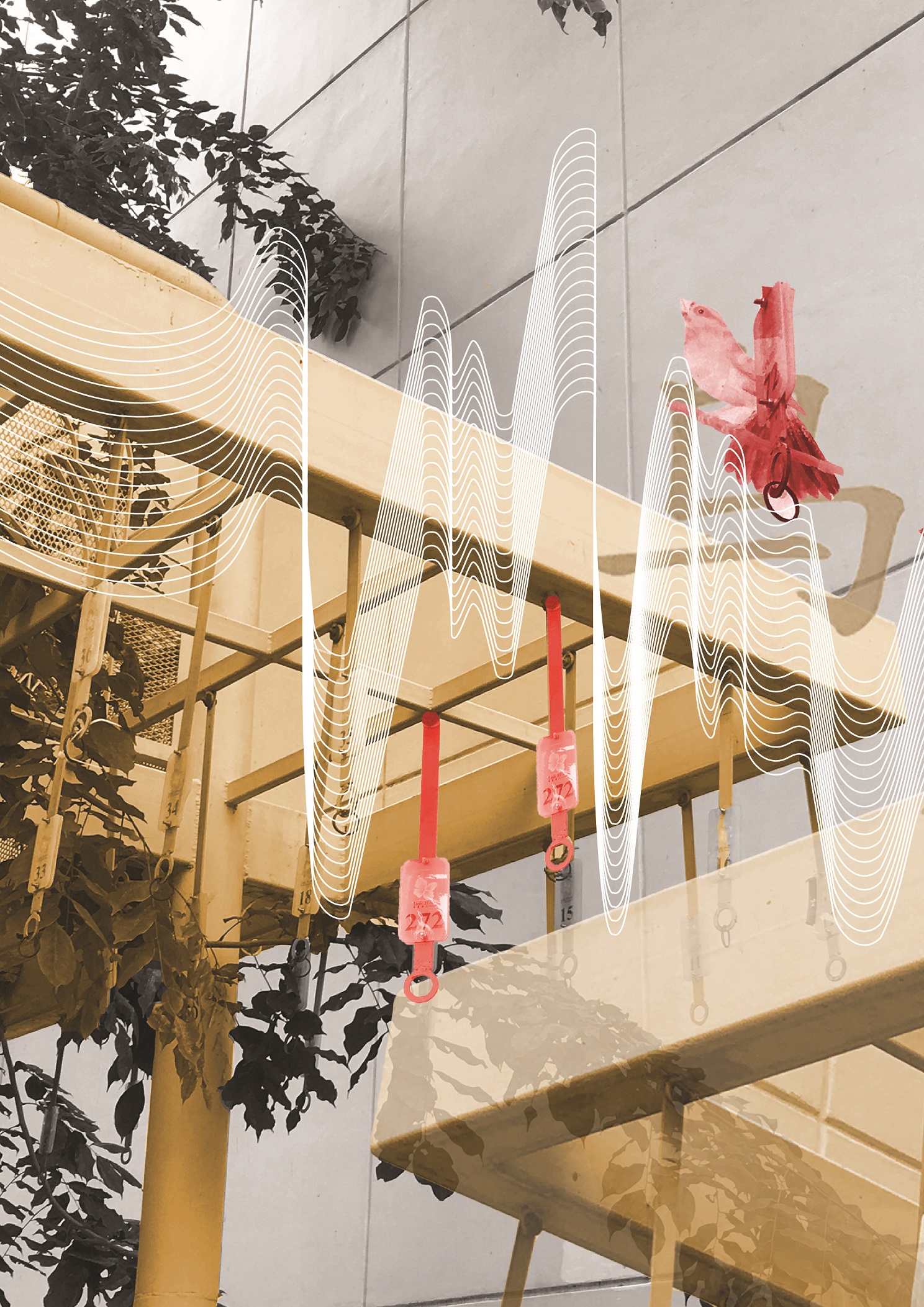
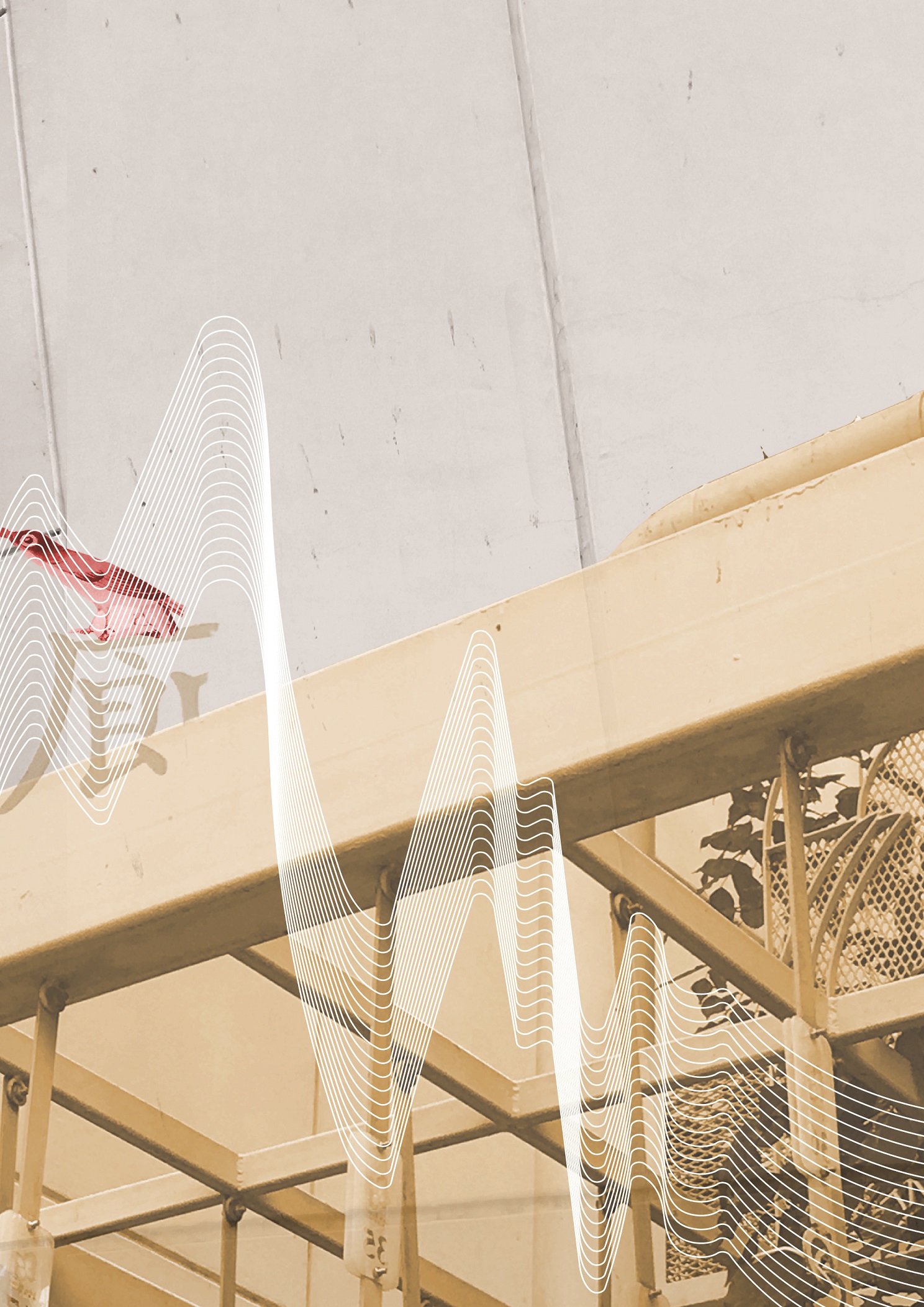
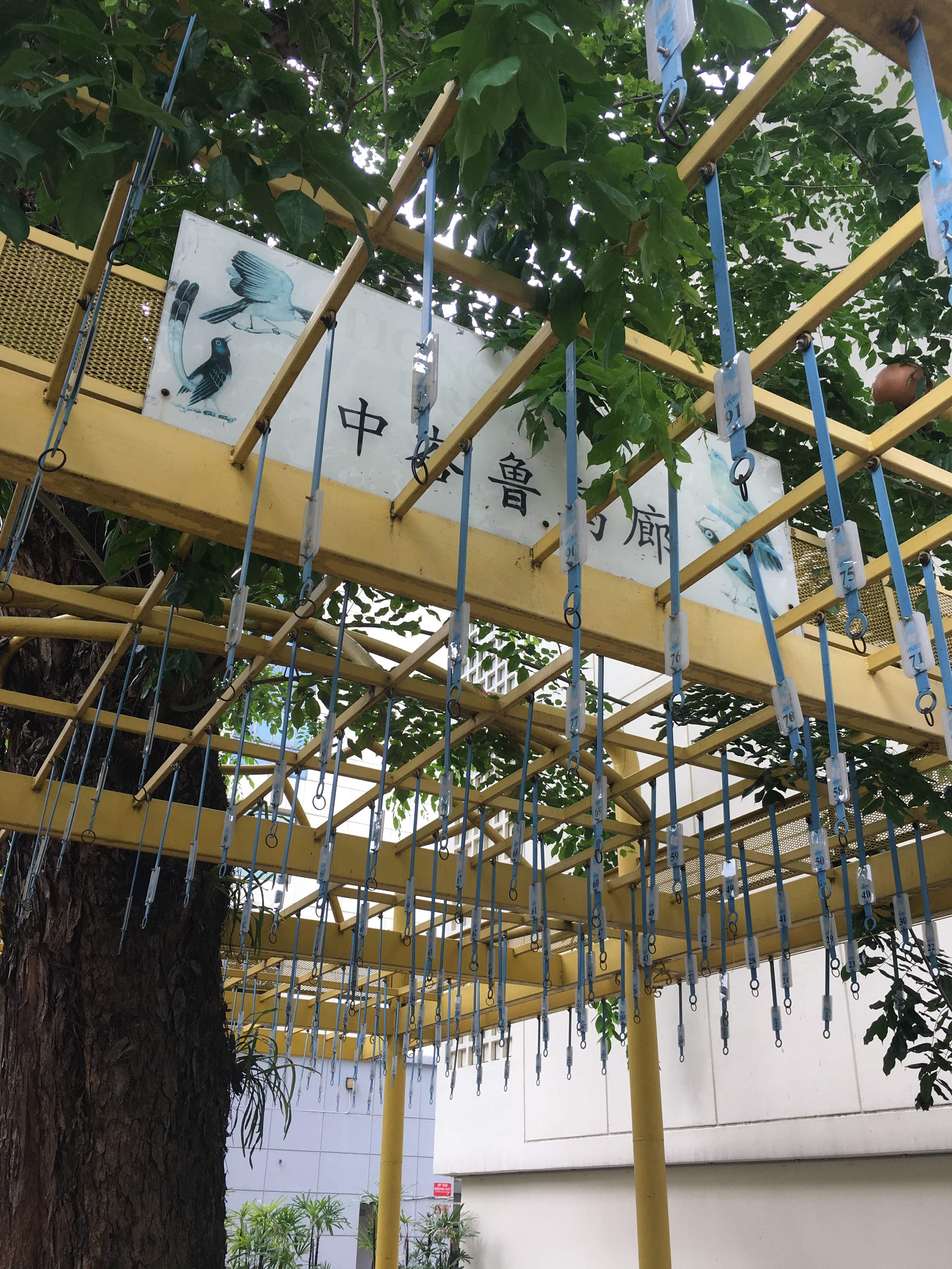
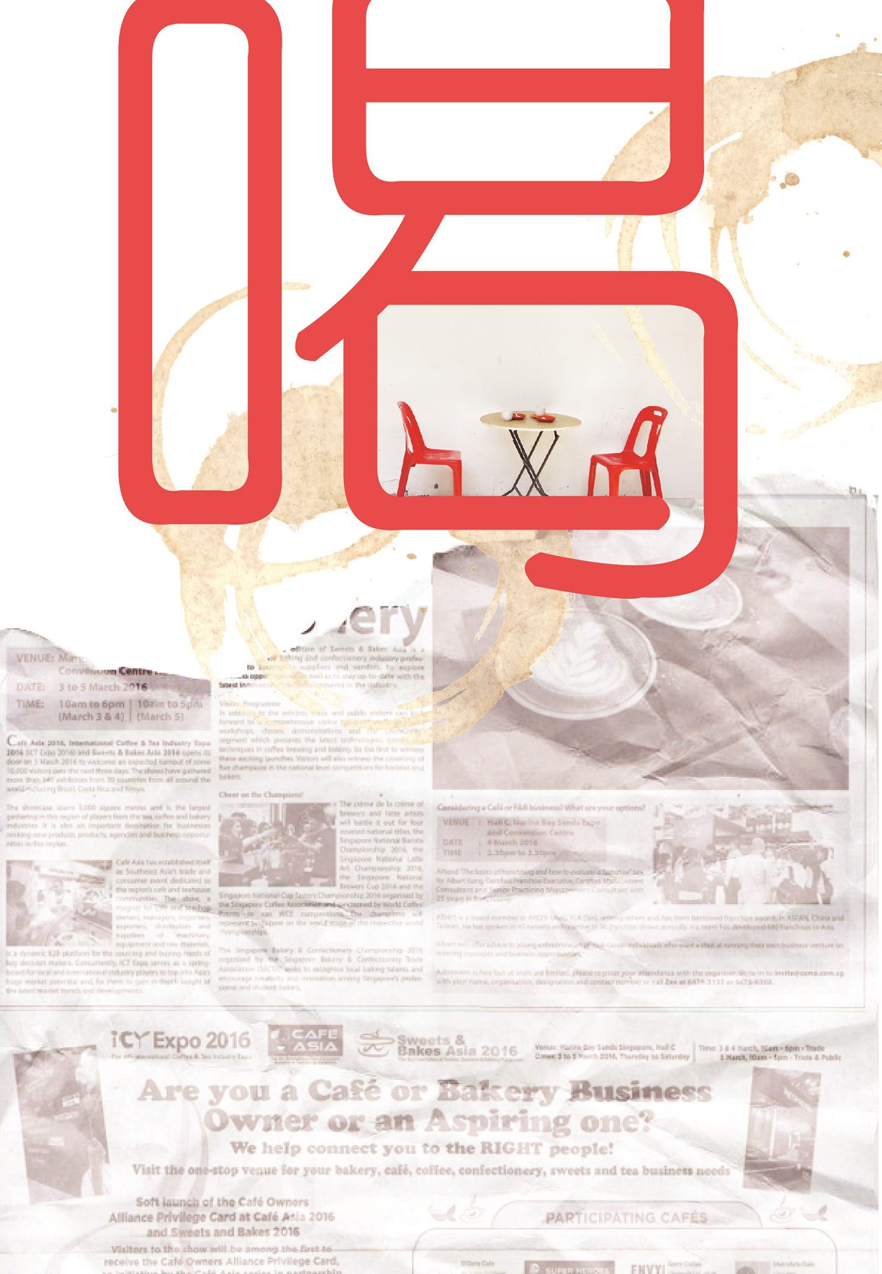
A bird singing corner with no birds, no chirping, only noises from bustling cars. These noises are translated into the soundscape, which clashes with the bird visuals and typography, Barely recognizable without bird cages, this area is often overlooked by many. But, it contains a rich history of Tiong Bahru as people used to enjoy watching these birds sing. I could only extract the birds and typography from the faded sign, the only remnants that made me recognise that this place was once a vibrant bird singing corner.
Second(middle) spread
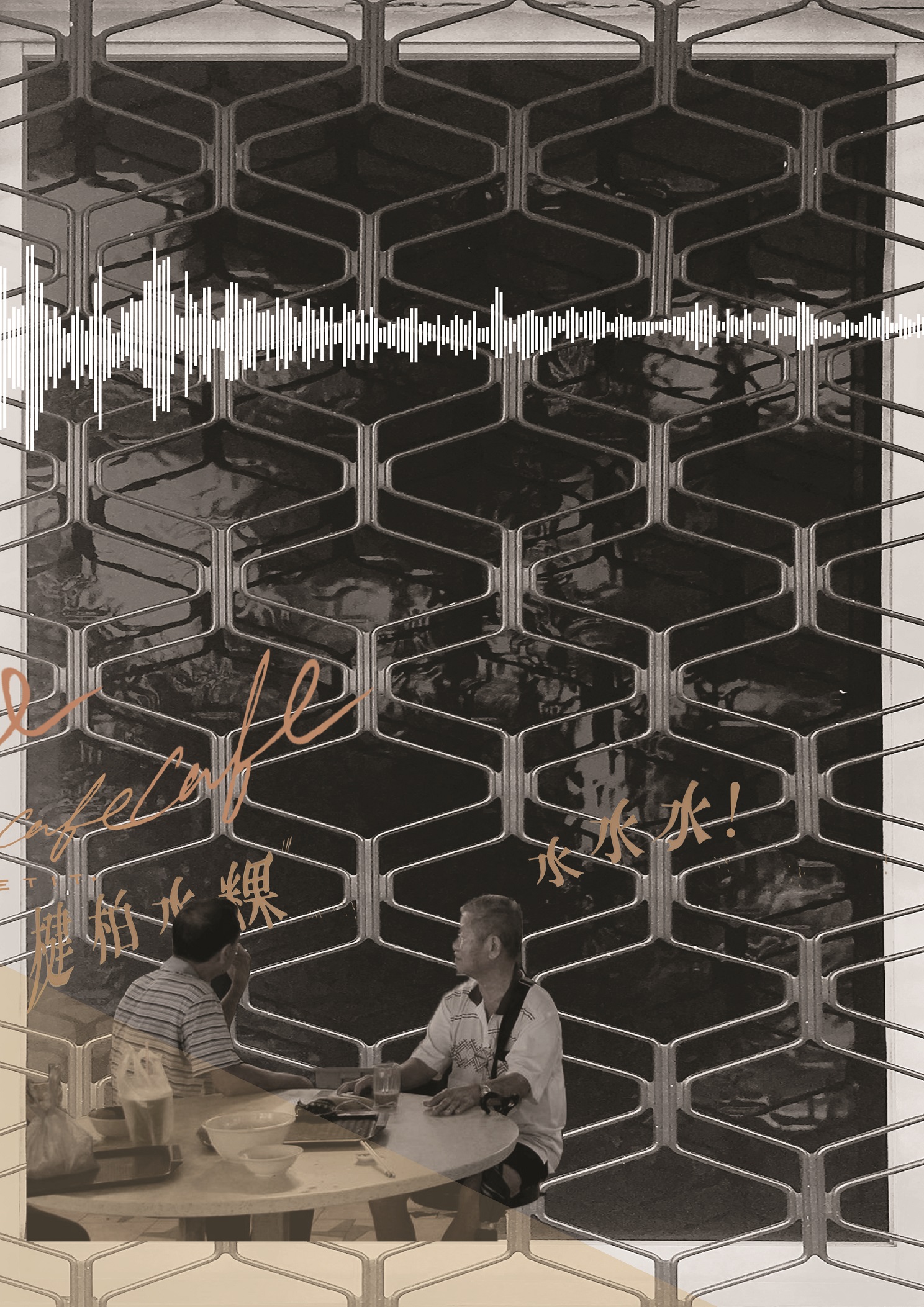
The juxtaposition of new and old, of bustling and tranquil. I used a full picture across this spread. To show the contrast, I colourized the cafe area in the picture, and manipulated some typography above it. Looking across the spread, the soundscape compliments the visuals, reflecting soundwaves which depict a noisier to a quiet environment. The main warm colours, red, orange and yellow, were used in order to bring focus to the spread. Also, to play with the light intensity of the photo, I added light leaks to intensify the colours. More importantly, by this colour manipulation and adjusting of exposure (against the black and white side), I wanted to show the fragility of Tiong Bahru, like an old photo fading away.
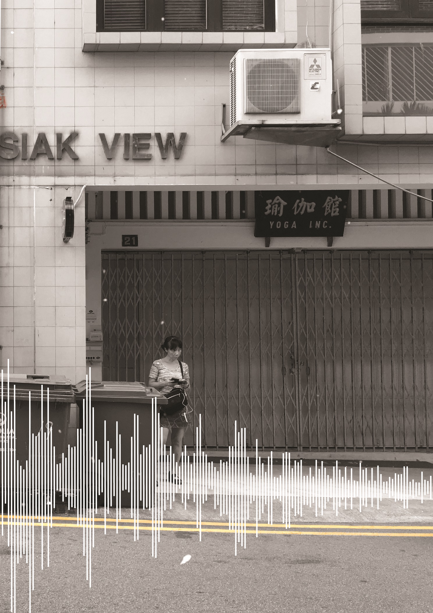
Third spread
The alleys in Tiong Bahru are either filled with people or absolutely empty and quiet. In terms of the environment, there is a stark difference in the light. I feel that these crowded alleys, mostly filled with cafes along the side, are brightly lit and out in open junctions. But as I turn into a corner around the SIT flats, it is normally darker and still. Which brings me to this spread where two pages show interaction with the use of the soundscape as a transition and the overlays of extracted typography from signboards (around the middle). Two different kinds of people are shown here, the tourists/outgoing residents and the older generation, mostly overshadowed by all the new things being introduced into this estate. They look as if they are interacting, but are in two entirely different backgrounds.
Overall, this zine has really pushed me in terms of style as mentioned earlier, I was more comfortable with vectors and illustrations. Nonetheless, the several trips to Tiong Bahru and figuring out what I interpreted from the site was an interesting experience. Having said that, because I had 2 entirely different drafts before this, I had the opportunity to explore possible textures, typography and photo manipulation. I look forward to learning even more new styles in the future.

Moving on from part one of Locale, I will be focusing on the artist research and process of creating my zine here.
To view the first part of my Locale project, you can click on the links below:
Locale: Research
Locale: Infographics
I drew some visual references which I took from the site itself and worked from here onwards.

Some pictures I took @ Tiong Bahru
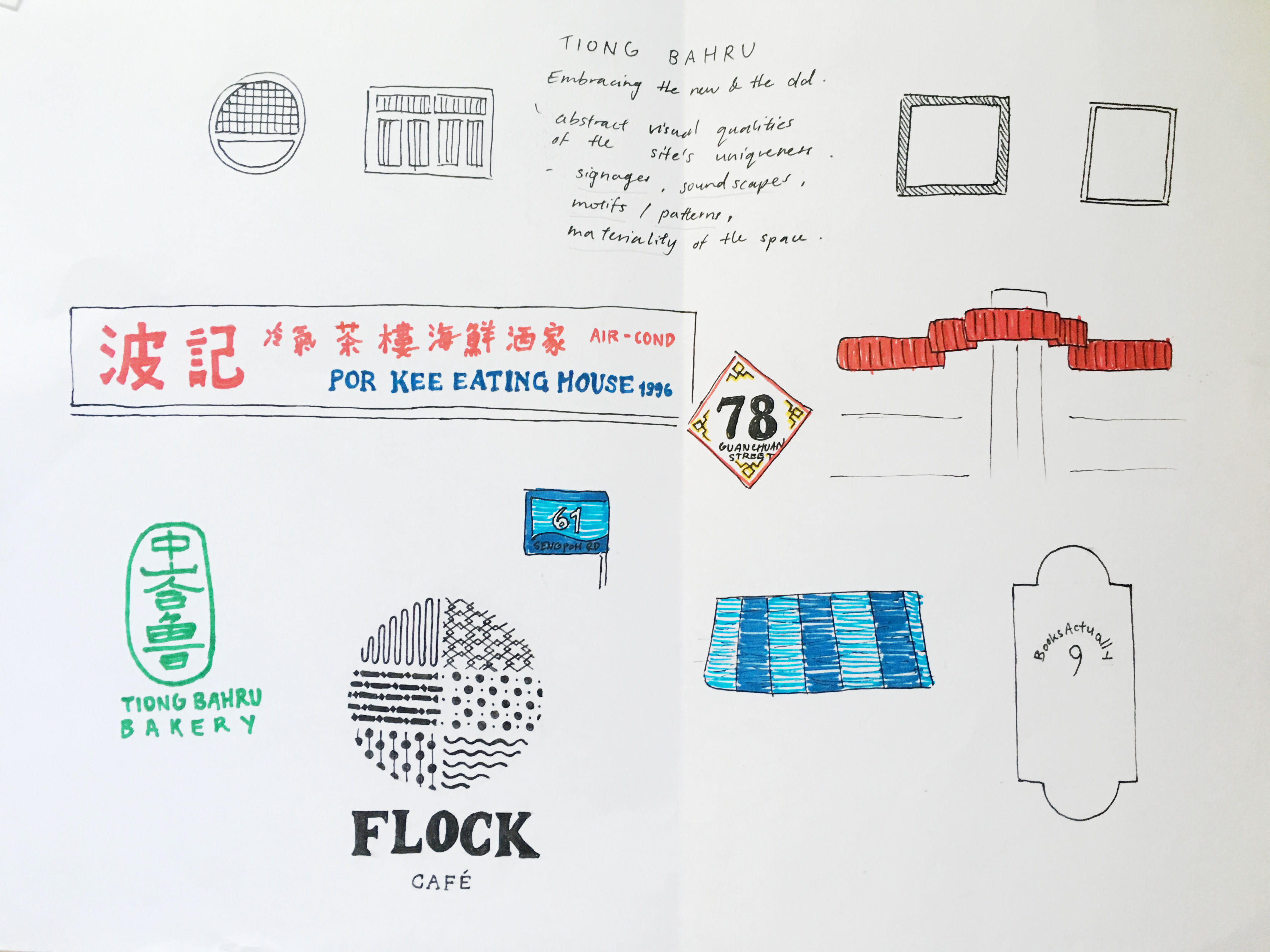
I tried looking for motifs which could be simplified or abstracted but due to the nature of the Art Deco style in Tiong Bahru, I realised that I would end up working with simple geometrical shapes if I were to choose a vector approach in terms of my art direction.
Thus, I drafted the cover page and 2 spreads, inspired by circular motifs and soundscape.
Here are some soundscapes which I was inspired by.
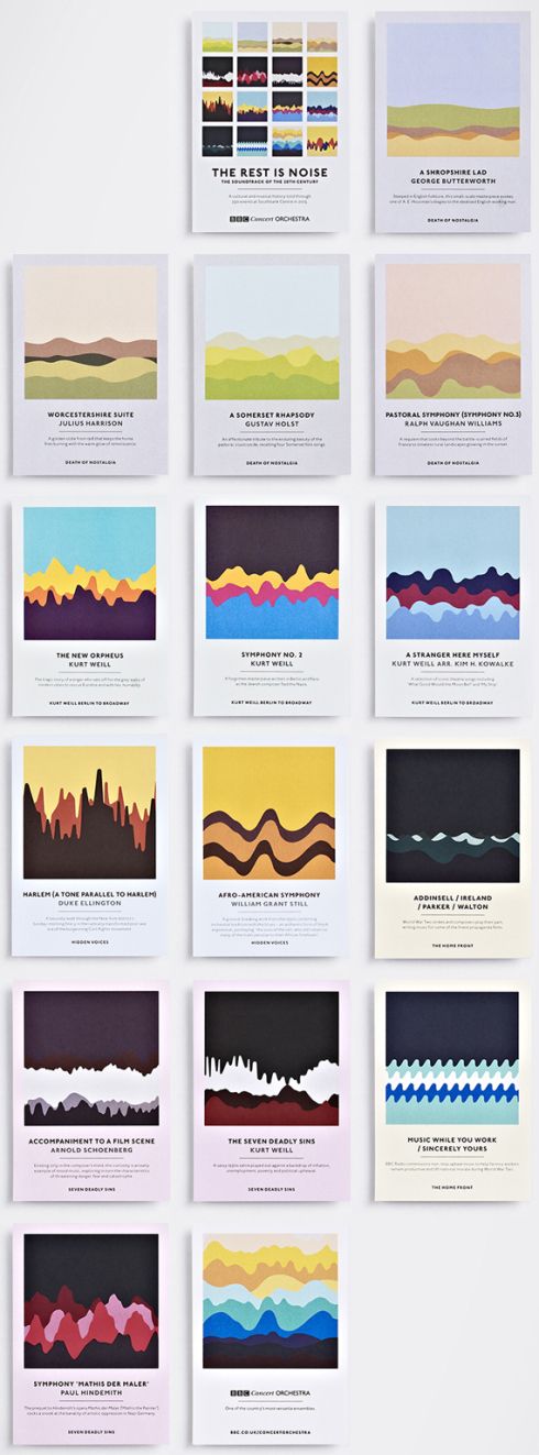
Studio Output’s set of graphic postcards for London’s Southbank Centre.
I would be exploring with soundscapes and forms which reflects the activity within Tiong Bahru. As my unique selling point is “Embracing the new and the old”, the overarching theme to show activities of the new and old would be through a simple Chinese idiom, “吃喝玩乐” (Translation: Eat, drink, play, enjoy).

My first 2 spreads were minimalist. I mainly used basic shapes to convey the activities in Tiong Bahru. The four pages are representative of “吃喝玩乐”,
吃
Relaxed, fulfilment, happiness. I associate eating with these based on what I have observed. Whether is it at the market or the cafes, everyone was pretty relaxed and happy.
喝
Coffee talks; something which stood out to me the most as I was at the site. A cup of kopi or a cup of cappuccino, young or old, the scene of them chatting always warms my heart. Relating to the soundscape, the soundscape represents a conversation of something telling a story, where it is calm at the start and it slowly peaks to the climax of the story.
玩
Although the meaning of “play” here is disappearing as everyone nowadays are fixated on their phone screens, I still do see kids at the playground once in awhile, screaming and having fun. Thus, these higher frequencies of soundscape to represent them.
乐
To me, enjoyment within Tiong Bahru gives a nostalgic vibe. When I interviewed some residents, they mentioned how they used to play with fire, rear chickens, have a bird corner and how they remember that the newspaper uncle could throw the newspaper all the way up from the ground floor to the third. These are small nostalgic moments which I would like to capture.
However, I felt that this vector and minimalist approach limits the visual quality of portraying Tiong Bahru. Other than the signature red and blue colour, the motifs are too minimalistic to be an abstract representation of the site. As mentioned in my consultation, some aspects which I can explore are textures, motifs, patterns and typography.
MY SECOND IDEA
As I have always worked with vector illustrations, I find it hard to bring out visual qualities of a site using anything but vectors. So, in my second (failed) attempt, I tried incorporating some textures and marks I found in that area, such as newspaper and coffee stains. However, it ended up looking messy and with no focal point. Also, because I took the signs and collaged them, it added on to the chaoticness of the spread. So I scraped this eventually.
Some points to note:
Maybe I could extract the typography on the signs.
Use pictures instead.
References:
Studio Output’s soundwave concert postcards

To view my research process, click here.
Upon gathering information through quantitative and qualitative research about my site, Tiong Bahru, I have created an infographic which sums up the insights that I have gathered and shown the unique selling point of Tiong Bahru.

To start off project 2, here’s the research I’ve conducted, primary and secondary, to find out more about my chosen site: Tiong Bahru.
ETHNOGRAPHIC RESEARCH (QUALITATIVE)
01 Site Observations
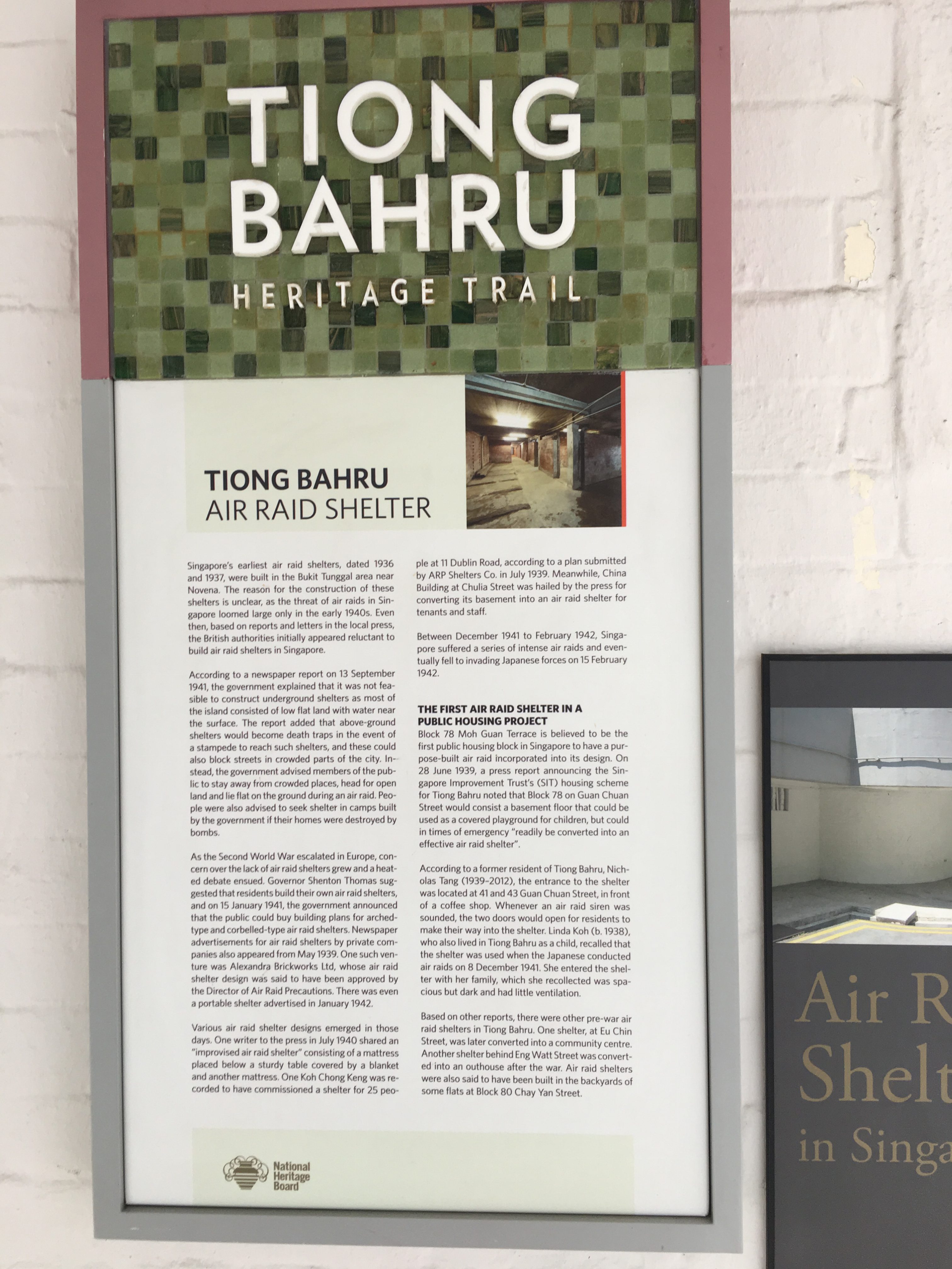
Firstly, to know more about the place itself, I visited the site and explored around Tiong Bahru. I went ahead to observe things up close which I normally don’t, such as, the architecture, the shops, the housing areas, the courtyards outside the Singapore Improvement Trust (SIT) flats an even the bomb shelter located at the old estate.
As I walked around the area, I took down some notes using the POEMS framework; a design thinking framework useful for ethnographic research.

02 Ethnographic Interviews
Other than observations, I interviewed the people around the area – residents and passers-by. To obtain more holistic information through the interviews, I ensured that I interviewed a range of people, especially from teens to elderly as I felt that their varying responses were key to finding good insights about this place.
Here’s a sample of the interview questions.

WEBSITE AND ARTICLES (QUANTITATIVE)
As for the secondary research, I looked up useful information which substantiates the information that I have gathered through the primary research. I found reliable information from government websites, such as the Urban Redevelopment Authority (URA), the Tiong Bahru: Heritage trail by the Singapore National Heritage Board and the Straits Times.
 Source: Urban Redevelopment Authority (URA)
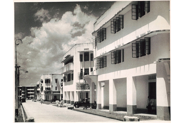
Singapore Improvement Trust flats in the Tiong Bahru estate. (c. 1953. Image from National Museum of Singapore.)
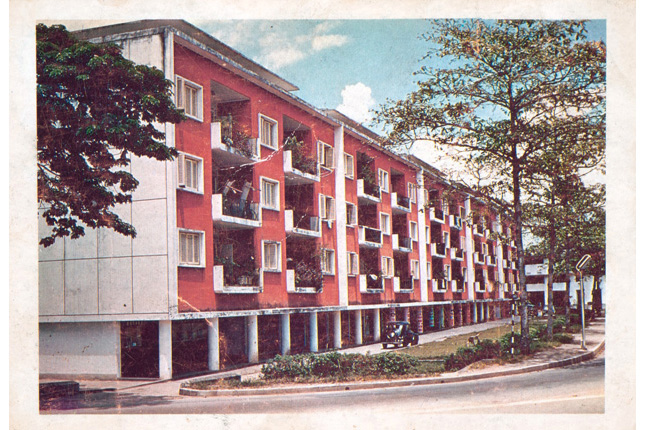 Singapore Improvement Trust flats in the Tiong Bahru estate. (c. 1953. Image from National Museum of Singapore.)
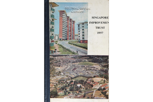 Singapore Improvement Trust flats in the Tiong Bahru estate. (c. 1953. Image from National Museum of Singapore.)
From these sources, I have found out many interesting facts and the rich history of Tiong Bahru regarding the estate. Information such as when was the first block built and who were the people living in the block and even the following developments. Basically, Tiong Bahru’s timeline as an estate. One of the most iconic blocks of the estate to me was the one with a purpose-built air raid shelter, which I visited during my site visit as well. I was pretty surprised when I found it as it was really in the middle of all the flats. Some interviewees also pointed out the bird singing corner (which I couldn’t find during this visit). Without getting to see it, I just googled it to know more about it. (But, in the end, I went back to Tiong Bahru again to take a look at things which I have missed out, like the bird singing corner.)


References:
http://eresources.nlb.gov.sg/infopedia/articles/SIP_1700_2010-08-11.html
https://www.challenge.gov.sg/print/life-style/tiong-bahru-tales
https://www.ura.gov.sg/-/media/User%20Defined/URA%20Online/Guidelines/Conservation/Tiong%20Bahru%20General%20Guidelines%20240913.pdf
http://www.tiongbahru.sg/tiong-bahru-estate/
http://www.visitsingapore.com/see-do-singapore/architecture/historical/sit-flats/

Here’s the final outcome of project 1!
To view the design process and research, you can click on the links below:
01 Image Making Through Type: Artist Research
01 Image Making Through Type: Ideation and Process
01 Image Making Through Type: Final (this post)
THE JOURNEY OF DREAM JOBS
Tone: Positive
–
Sometimes, dream jobs are seemingly impossible due to constrictions and practicality. Nonetheless, going through this identity crisis of being conflicted with what we want is mandatory to find ourselves; in hopes that everything will eventually work out.


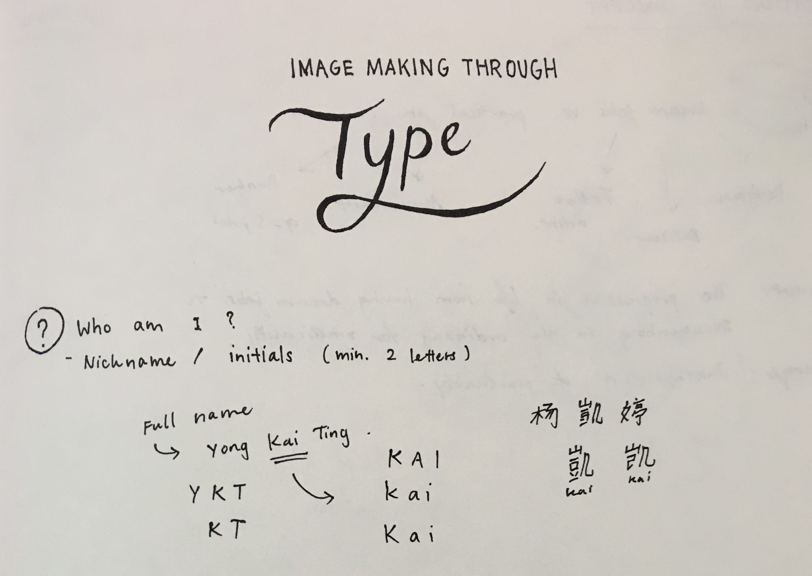
In this design, I selected “K” and “T” as my initials. The letterform is mostly incorporated into objects of greater significance, such as, the cracked plate and plastic utensils made for kids.
Due to the angularity of both letterforms, I felt that it is more appropriate to deliberately incorporate them into those objects. As for the choice of case, “K” and “T” had not much of a difference but I went ahead with an upper case “K” and lower case “T” to make the placement of objects more natural. I used counter spaces/positive and negative spaces as form for the letter “K”.


Atavistic Vestiges After the Rain (1934) by Salvador Dali
In my second design, my creation of an “impossible architecture” was greatly inspired by Salvador Dali’s paintings, which consists of organic shapes. I chose the upper case “K” and lower case “T” in this design. As my letterforms were incorporated into the sticks at the bottom of the structure, to look as though it is barely supporting it, the angularity of both “K” and “T” had helped formed the shape easily. If these letters were curvy instead, the end results would differ quite a bit.
I also used the symmetrical properties of these selected letterforms to create a reflection which says “Kt”. This also ties in with my concept of being in someone else’s shadow as I am blindly following someone else’s dream.


For this piece, I illustrated a mix of line drawings, a reference from line art tattoos, and vectors. By using contrasting styles, I wanted to portray this dream job as something far from reality and unattainable.
Inspired by Ukiyo-e prints, I used more organic shapes to create my vectors and letterforms. My letterforms, as seen in the red patch of blood and the chain, represents the cultural constrictions this job has. The chain, made using a pattern brush, signifies the constrictions, as though the tattoo artist’s hands are restricted. By using a pattern brush, it helps to make an angular letterform more organic and natural. For the letter “K”, I played with the boldness/thickness of the letterform as it is an organic shape.

This piece was inspired by the memphis art style. It adopts a great a sense of movement it in as I wanted to this piece to look fun and quirky. I particularly picked candies as objects to be packaged as I wanted a similar motif which links to my first dream job – the patissier. The positive message from this is that things will eventually work out and this “Journey of Dream Jobs” is something mandatory so that we are able to find ourselves. Thus, reminding us that even though we might not be able to have that “ridiculous” job we wanted when we were young, it does not mean that you cant work your way around it and do something within your interests.
The letterforms, portrayed in the ribbons, started off looking geometrical. After a few versions, I decided to make the letter “K” look more organic and that it follows the curves of the ribbons which wraps around the box nicely. Altogether, I really wanted to capture the moment of having a job you love; although messy with the tapes still around, it is still bursting with joy and excitement.

Some comments from Joy and my peers:
I had met several challenges while doing this project. Firstly, incorporating the letterforms with consideration was tougher than I thought as I tend to lean towards a more illustrative way to express myself rather than in typography. I also struggled with trying to make the letterform more visible as initially, it was subtle and small in size. All in all, I enjoyed this project as I have learnt many useful illustrating techniques and also learnt about the properties of a letterform on a deeper level.

I began my ideation with the basics,
I wrote down as many variations of my name, which I felt that will be helpful later on, when I have to decide which name/initials will be more suitable for my letter form.
Concept (process):
As we have to come up with 4 different designs, I felt that maybe I could link them up and tell a story. I started with looking into my dream jobs and these are some jobs which I listed out:
Architect
Interior designer
Packaging designer
Brand identity designer
UIUX/User experience designer
Goldsmith/jeweller (jewel crafter)
Pastry chef/pâtissier
Tattoo artist
Spiritual healer (shaman/witch/enchanter)
Fragrance chemist (Alchemist)
Adventurer
Eventually, I narrowed down the list and got my 4 jobs.
The Journey of Dream Jobs
Tone: Positive
Message: Sometimes, dream jobs are seemingly impossible due to constrictions and practicality. Nonetheless, going through this identity crisis of being conflicted with what we want is mandatory to find ourselves; in hopes that everything will eventually work out.
In chronological order,
Patissier
Architect
Tattoo artist
Packaging designer
As this project was to incorporate the letterform which reflects a particular job, I found these examples really interesting and useful: how they managed to visualise both letterforms and shapes and make sense out of it.

Chineasy by ShaoLan Hsueh

Moonshine poster by Jon Klassen

Mariano Pascual’s 36 Days of Type (click to see the rest)
36 Days of Type by Shiffa
PATISSIER

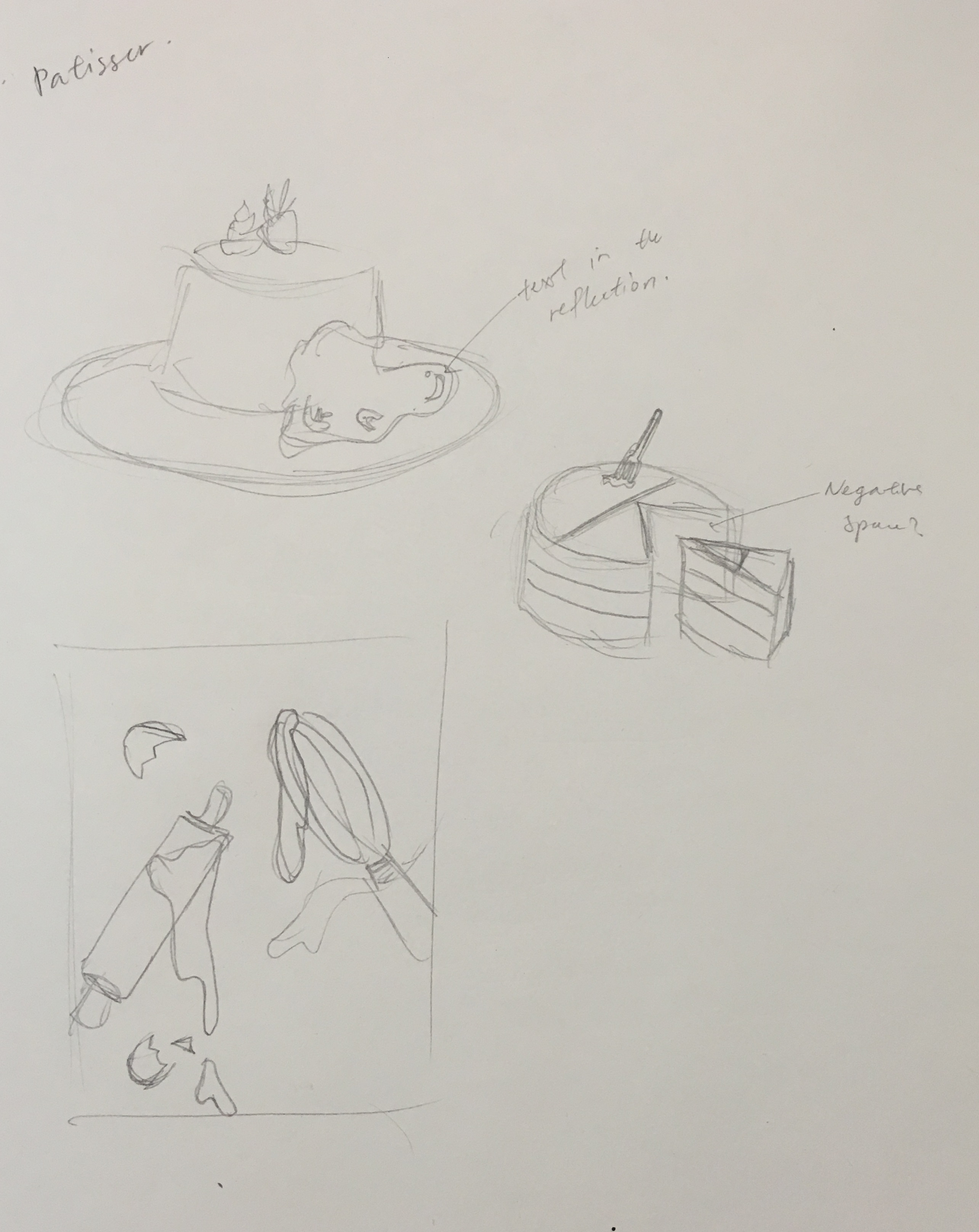


To show this impossible dream of mine, I portrayed a dessert to be pretty-looking on the outside and disgusting on the inside.
Initially, I wanted to use solely complementary colours but subsequently, I felt that it was lacking colours and vibrancy.
Also, in the composition with the green background, my letterforms were incorporated into the reflection of the slime (k a i). However, after consultations, Joy mentioned that the letterforms could be incorporated into something more significant to my story/dream job.
So, I have made some changes, like the colours used. I included a range of analogous colours instead. The letterform, K, is in a form of the crack seen on the plate instead: showing how impossible this dream is and that is a bad choice for me to do so.
As compared to the letterforms in the slime, I found it slightly easier to incorporate the letter K as a crack as it is angular. Whereas, the slime took on an organic shape and fitting angular letterforms would cause it to warp even further, losing their readability.
ARCHITECT


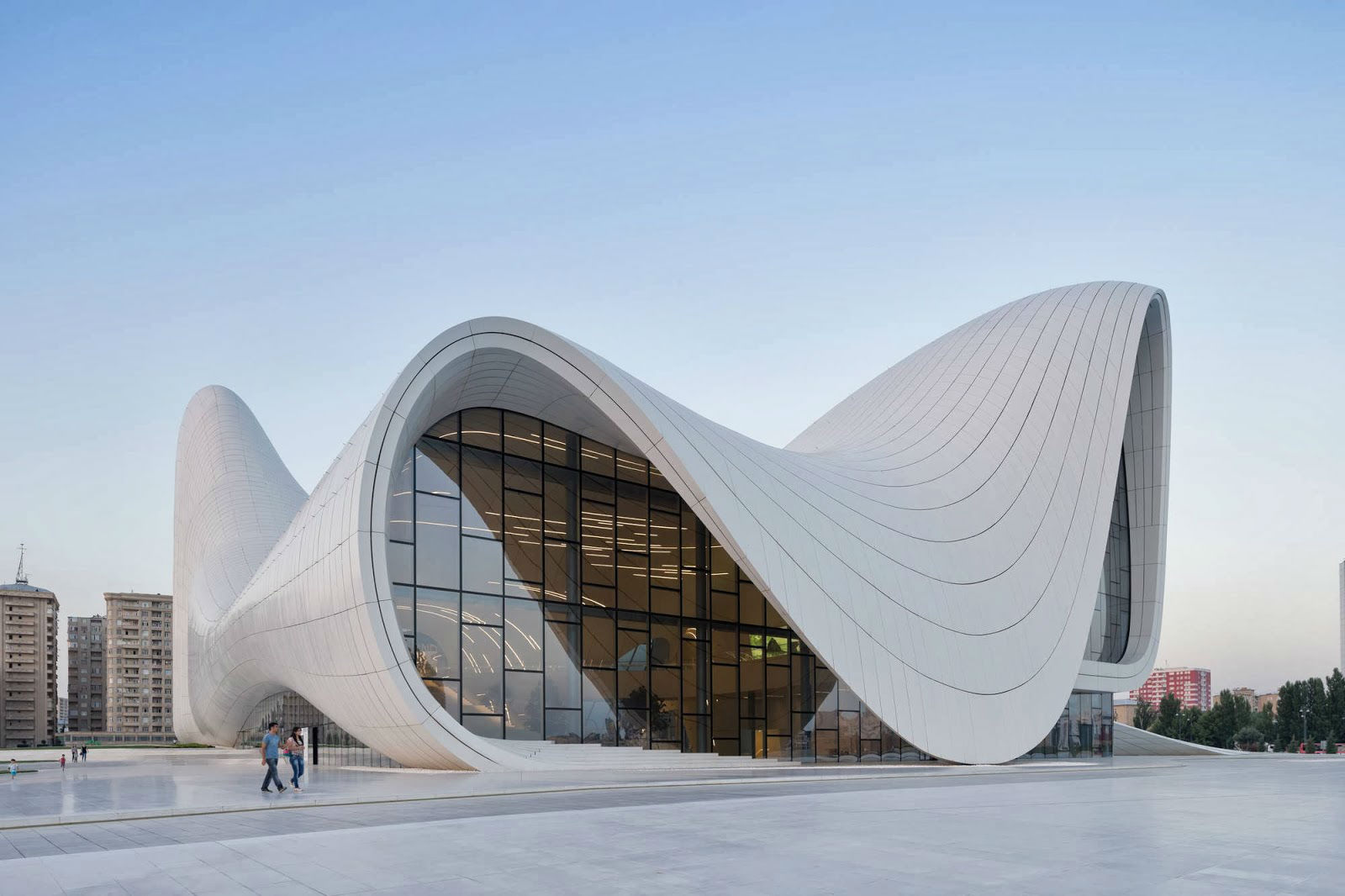
I was Inspired by Zaha Hadid, an Iraqi-British architect. Known as the “Queen of Curves”, her architecture style is advanced and sleek.


In this design, I wanted to illustrate impossible architecture through exaggerating the structure and subtracting the basics of what makes a building foundationally sound and strong. In my sketches, I tried creating this structure using geometrical and organic shapes, or a mix of both. Depending on my choice, the letterforms chosen varies. My initials, “KT”, as compared to “KAI” seemed more appropriate as the angularity of it is an advantage. The letterforms are illustrated as sticks which are trying to support the structure but from consultations, Joy suggested to make this structure look “even more impossible”.
For the last design, I added texture to it so that it looks more dynamic.
TATTOO ARTIST


Inspired by the Ukiyo-e art movement, I wanted to design something which reflected a rebellious phase of mine, and also the practicality of being a tattoo artist due to cultural constrictions. I started off experimenting with the neon-sign look as it reminds of shady places that bad and messed up people visit. Also, the tattoo artist is drawn in lines, unlike the person getting tattooed, as it represents this dream job of mine does not even exist at all; an impossible vision.
However, I couldn’t think of how should my letterforms be in this composition as the line work illustrations are a little distracting.
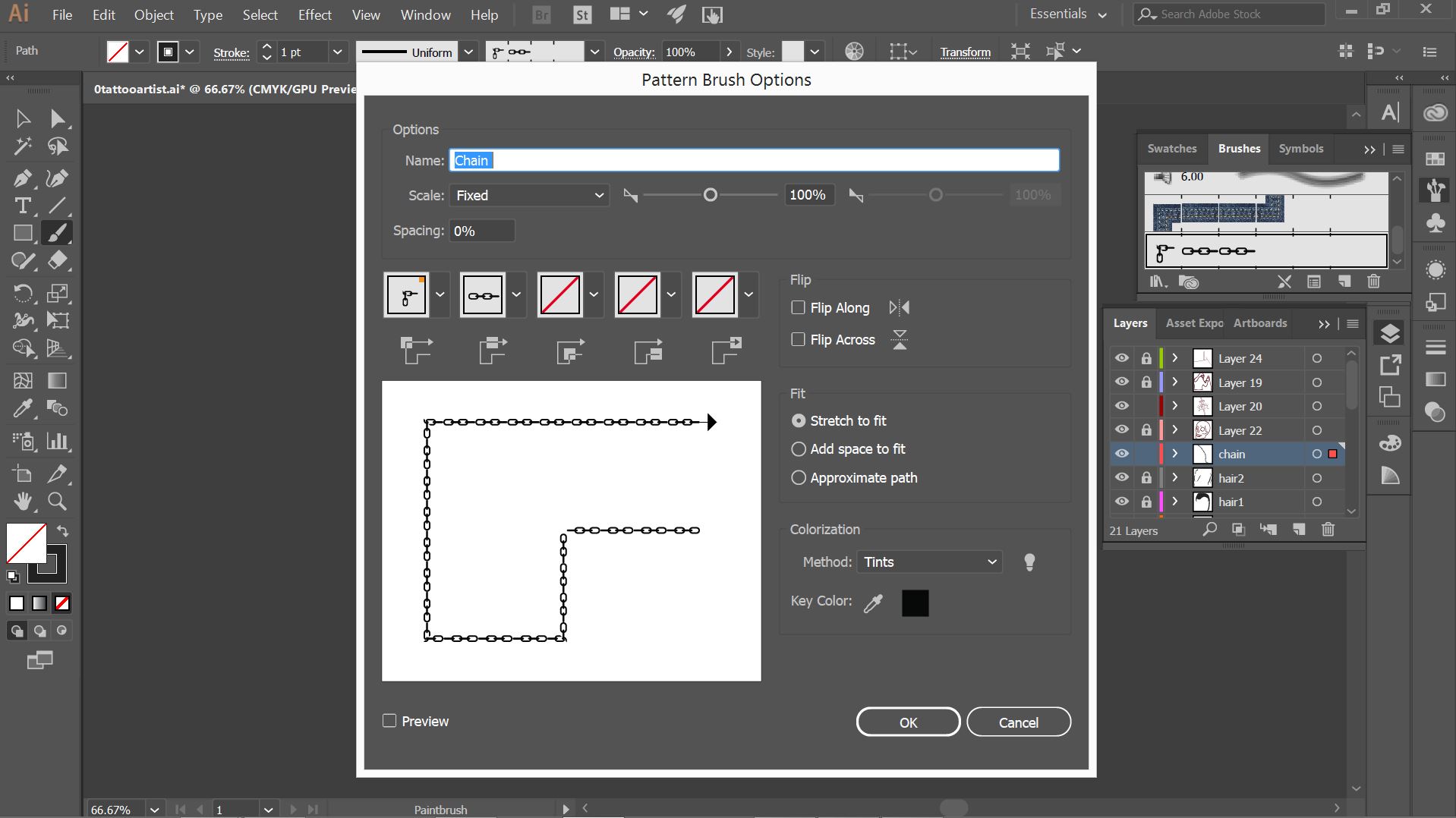
In the last picture, I experimented with the brush tool that I have learnt in class. Instead of illustrating the chain manually, I made a pattern brush, using chains. Most probably, I would include this chain element in my letterform as it represents the cultural restrictions of being a tattoo artist.
PACKAGING DESIGNER


Memphis artist, Peter Judson,
with his vivid isometric illustrations.


In my final design, I played with basic shapes as I was inspired by memphis art style. By utilising this art style, I felt that the placement of elements and colours used played a great part in creating a dynamic composition; one that looks playful and joyful.
References
https://www.behance.net/gallery/16735099/36-Days-of-Type
http://www.mariano-pascual.com/36-Days-of-type
http://www.nathanfowkesart.com/
https://www.kickstarter.com/projects/shaolanchineasy/chineasy-begins-
https://www.pinterest.com/pin/192599321539037000/
https://www.pinterest.com/pin/463378249133358484/

After the lectures and my classmate’s presentations, I went to research more about some art movements and key artists in that movement.
Kazimir Malevich (1879- 1935) is a Russian Avant-garde artist, a Russian painter, sculptor and art theoretician. He was a pioneer of geometric abstract art and the originator of the Avant-garde Suprematist movement. Malevich worked in a variety of styles, but his most important and famous works concentrated on the exploration of pure geometric forms (squares, triangles, and circles) and their relationships to each other and within the pictorial space.
Ilya Chashnik (1902-1929), a Russian suprematist, has a similar style to Malevich, which I really love. As this project’s aim was to create an image while incorporating letterforms, I thought it would be appropriate to extend my research to these art styles which used basic shapes in their composition.

Aeroplane Flying (1915) by Malevich , Suprematistische Komposition (1920–1922) by Ilya Chashnik
Another notable artist is El Lissitzky (1890-1941), a Russian artist, designer, photographer, typographer, polemicist and architect. He was a key figure of the Russian avant-garde, who designed numerous exhibition displays and propaganda works for the Soviet Union and greatly influenced the Bauhaus and constructivist movements.

Part of the Show Machinery (1923) El Lissitzky
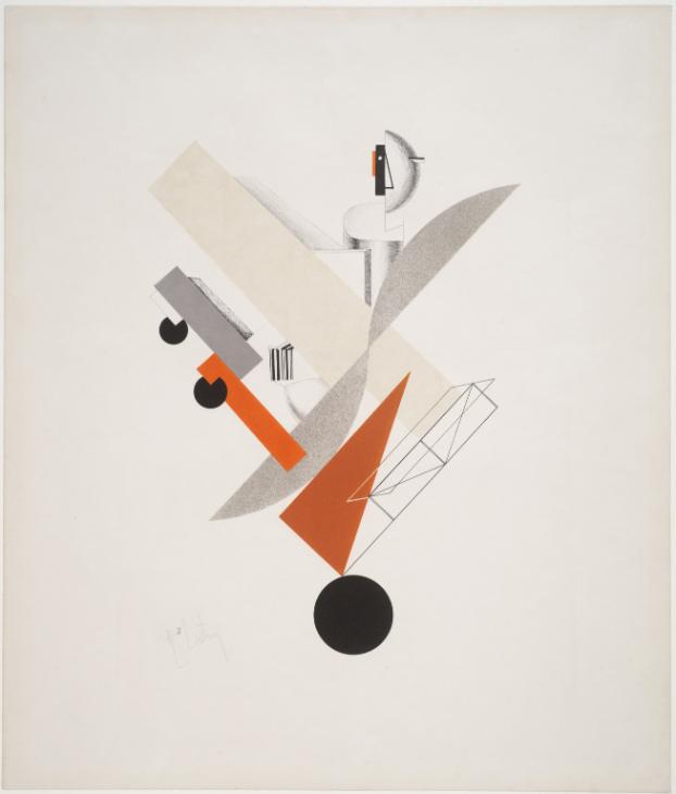
Globetrotter (in Time) (1923) by El Lissitzky
Alphonse Mucha (1860-1939), was a Czech Art Nouveau painter and decorative artist, known best for his distinct style. He produced many paintings, illustrations, advertisements, postcards, and designs. His style is known to be rich in natural forms and decorative.
Mucha’s style and those of the Russian Constructivism and Suprematism are unlike and opposing; one focuses on purely basic shapes whereas the other, embraces the organic form of shapes and pushes them further, creating stunningly beautiful paintings.
![]()
Job Cigarette Papers (1896) by Alphonse Mucha
Ukiyo-e means “Pictures of the Floating World” and this art movement refers to a style of Japanese woodblock print and painting from the Edo period (1639–1858) depicting famous theater actors, beautiful courtesans, city life, travel in romantic landscapes, and erotic scenes. As Japanese art flourished from the 17th to 19th century, Japonism, the study of Japanese art and artistic talent, affected fine arts, sculpture, architecture, performing arts and decorative arts throughout Western culture. Early impressionist, such as van Gogh, was influenced by Ukiyo-e.

Onoe Eisaburo I, Toyokuni, c. 1800

Princess Takiyasha Summons a Skeleton Spectre to Frighten Mitsukuni, Kuniyoshi, c. 1844

Portrait of Père Tanguy (1887) by Vincent van Gogh
Ukiyo-e is an interesting art movement to learn about, especially its power of influence. Overall, these are the art movements which were key to understanding and appreciating how these artists incorporate thought in shapes, forms, colours and even culture.
References
https://www.moma.org/collection/works/7926
http://www.tate.org.uk/art/artists/el-lissitzky-1519
http://www.artnet.com/WebServices/images/ll00067lld8FTGFgoSECfDrCWQFHPKcQFPC/ilya-chashnik-suprematistische-komposition.jpg
https://commons.wikimedia.org/wiki/File:Alphonse_Mucha_-_Job_Cigarettes_1.jpg
https://en.wikipedia.org/wiki/Ukiyo-e
Here’s the final outcome of my Ego project!
To view the design process and research, you can click on the links below:
03 Ego: Final (this post)
What would I be?
–
There are millions of objects in this world. Some are of importance, some are of no worth and some are redundant. It all depends on the person who’s looking at the object. If I were to ask everyone to list 10 objects that are most significant to them, the outcomes will be infinite. So, here are some objects that represent me.
TRIAD
![]()
![]()
![]()
I used triadic colours as it seemed more dynamic as compared to using 2 colours – complementary or split complementary. Overall, (pink and blue) pastel colours were dominant but I used tints and shades to add the lights and shadow, making the objects seemed more 3D. I’ve also added essence of yellows to bring focus to a certain object.
I used pink – representation of feminity (myself) and playfulness
blue – to portray calmness, sadness or peace
yellow – to portray joy and warmth
 |
 |
 |
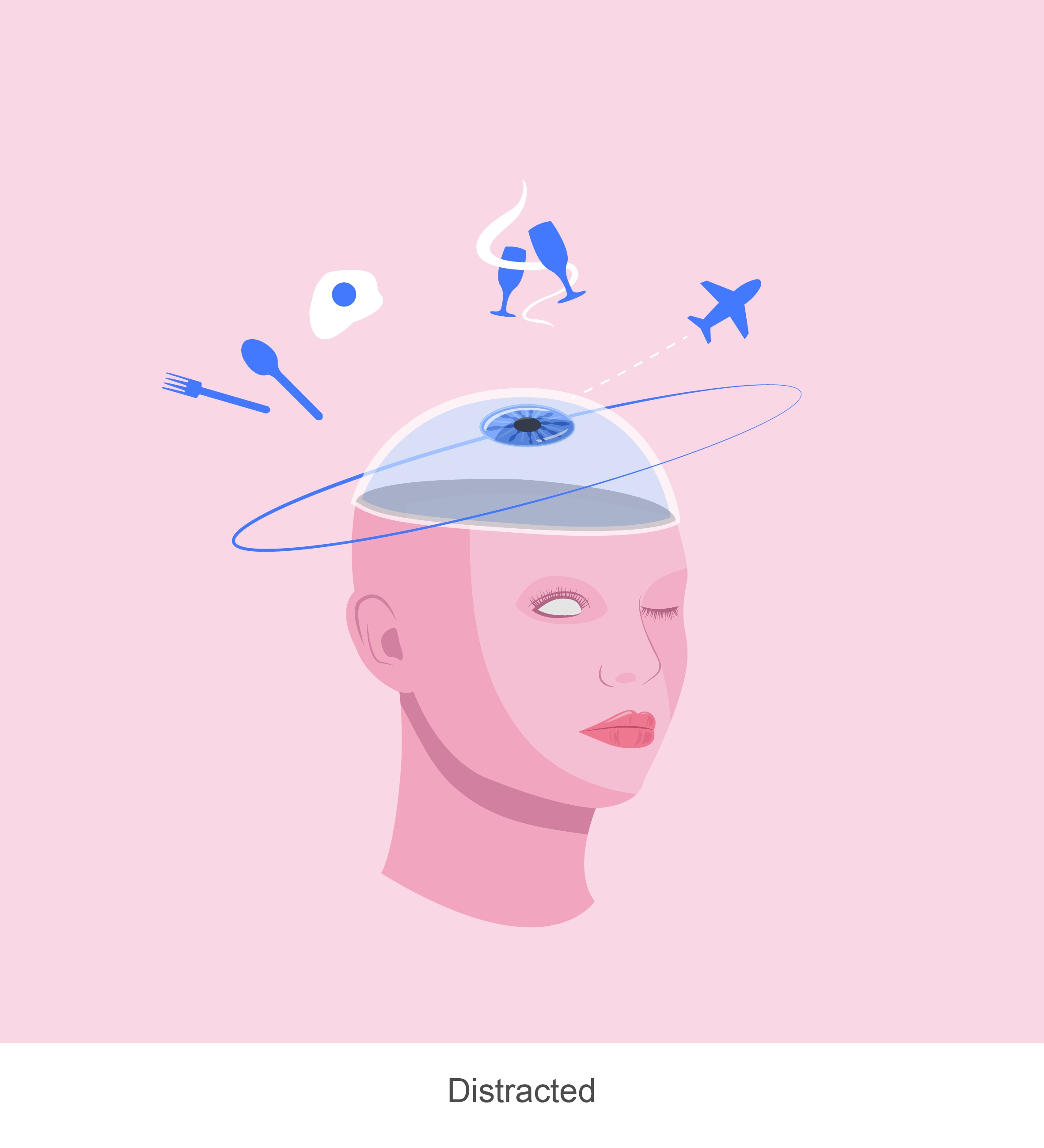
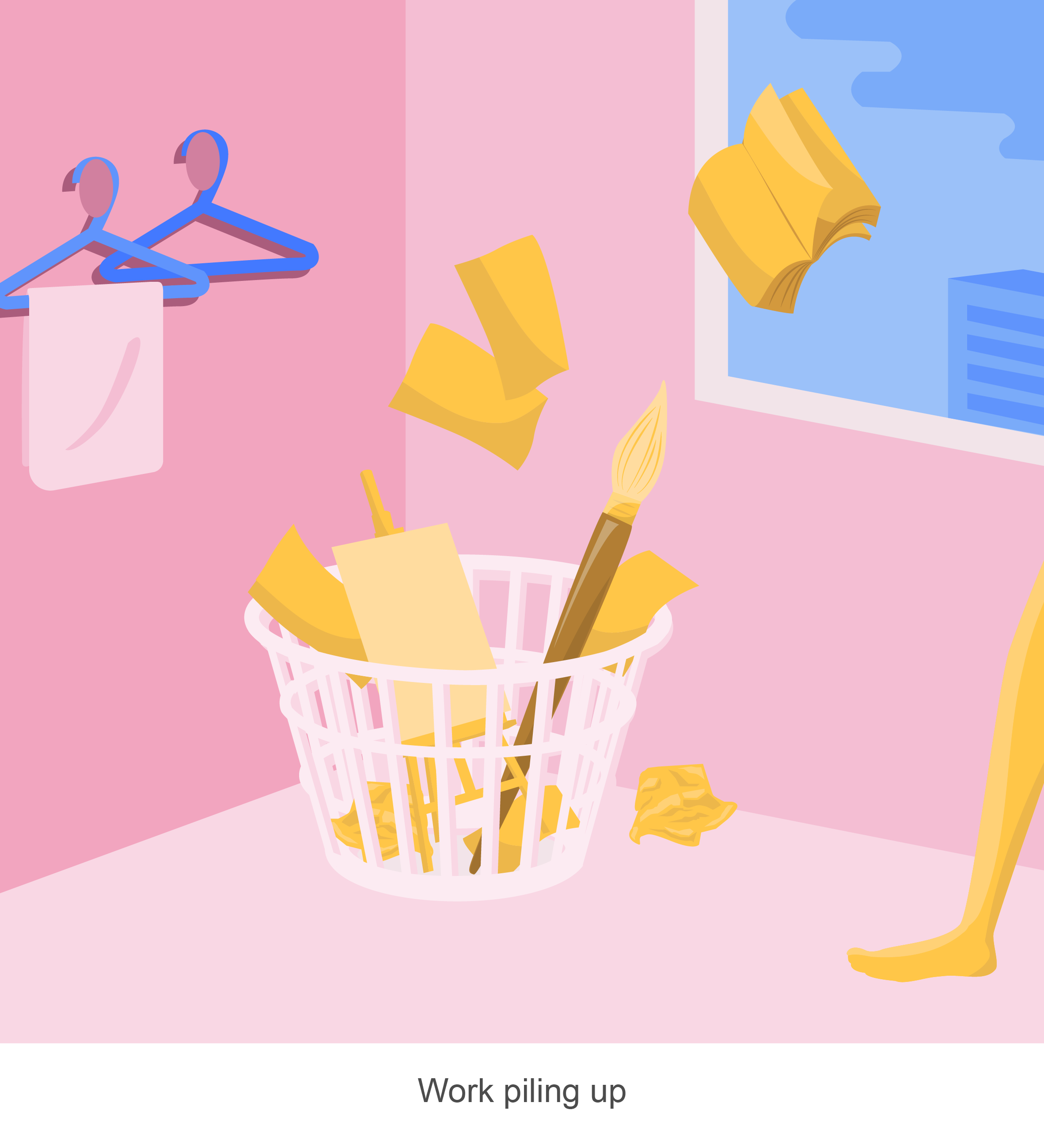
Just like how laundry is being piled up in the laundry basket at days, I felt that it goes the same way for my work, piling up as time goes by because I am distracted or procrastinating. As a result, I’m drowning in my work, along with my mixed emotions that overwhelm me – stressed, sad, anxious and angsty, all at once.
 |
 |
 |
Naive me once believed that I could do anything in this world, with the people I love. But, growing up and life experiences have taught me the opposite – to be practical and set realistic goals.
The chopsticks represent a perfect pair and the tentacles represent the bad things in the world that are to come. My first love had me believe that anything is possible, regardless of what others say. It is just “us against the world”.
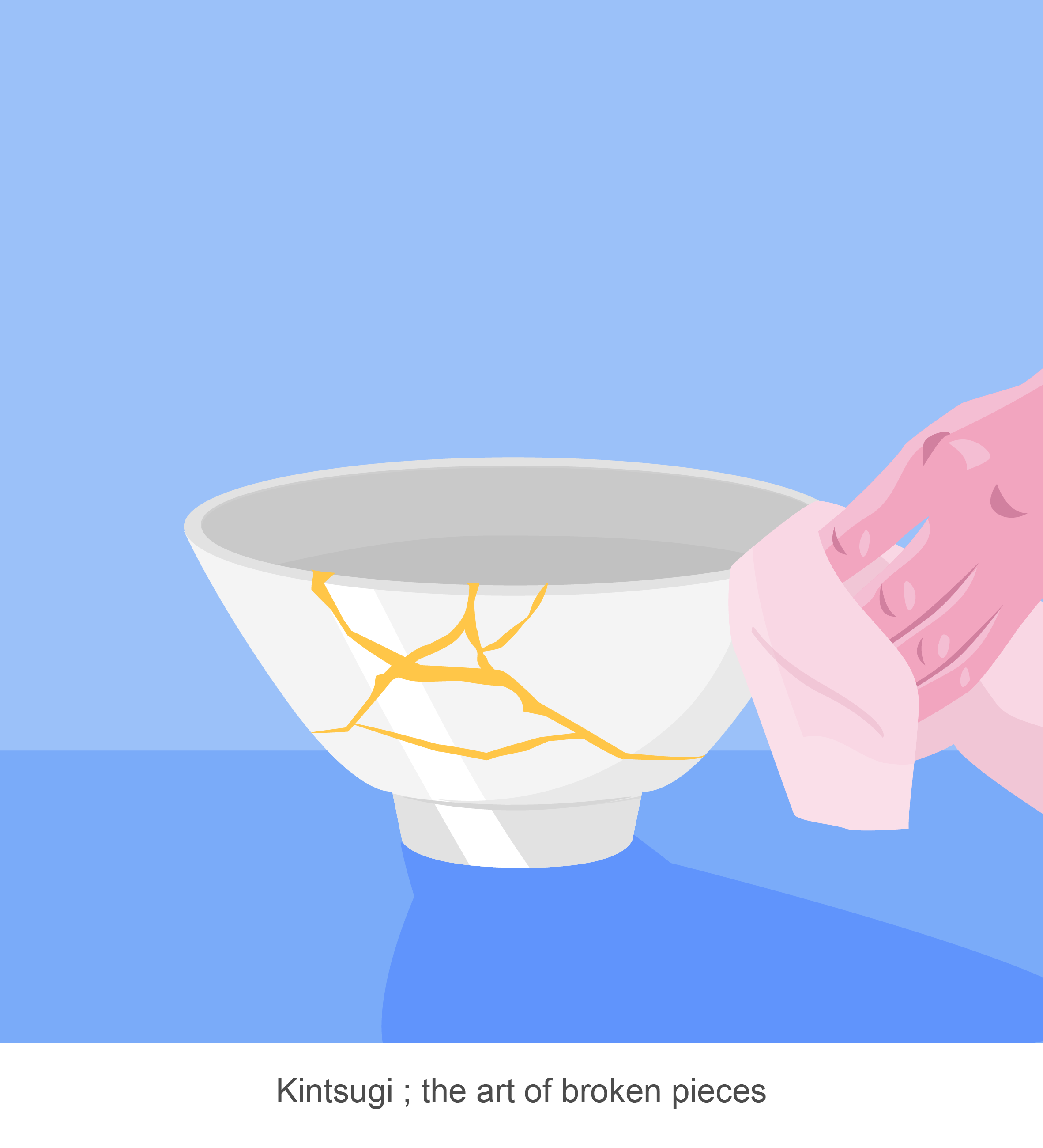
But, good things won’t last forever and I believe that Kintsugi, the art of broken pieces, is a perfect representation of experiences like this. Kintsugi is a Japanese art form that repairs ceramics with lacquer and liquid gold. They believe that there is greater beauty in the broken pieces and this refers back to life, where the things that happen, which you deem as “bad”, will end up teaching you a valuable life lesson.
 |
 |
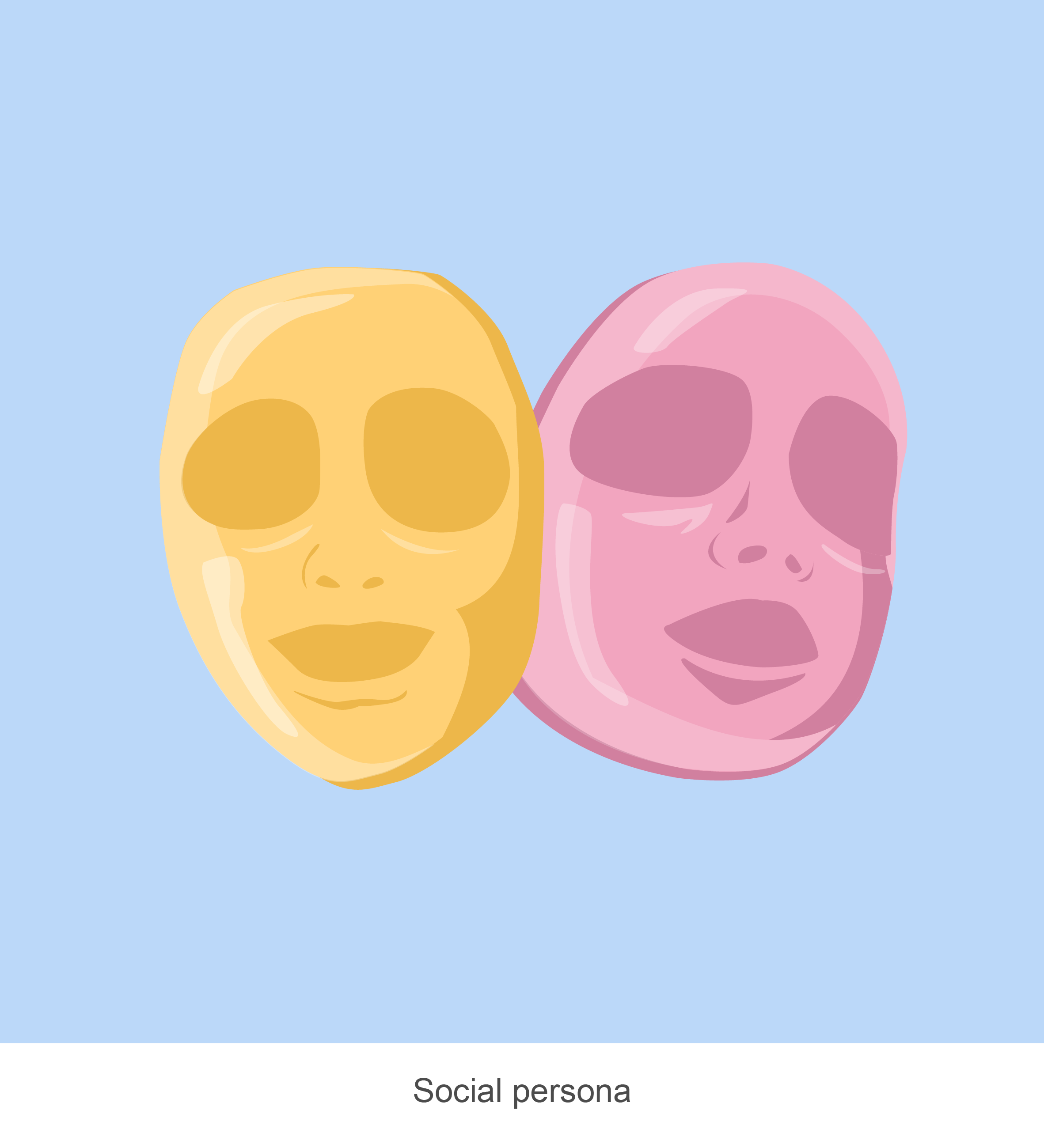 |
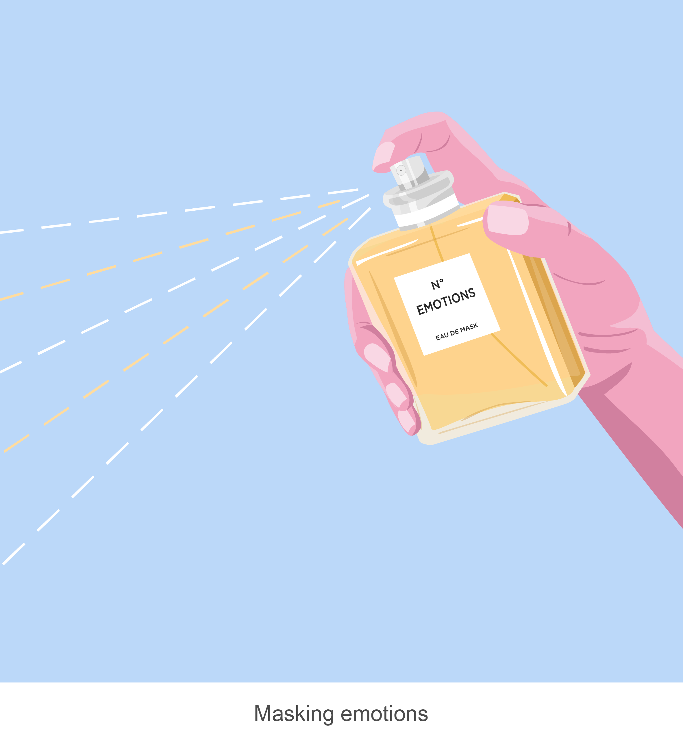
To me, masking emotions is just like spraying perfume, covering ourselves with a scent, but in this case, with a particular emotion. Conforming to society’s expectations is a norm and for every different setting, I adopt a different persona – be it work, school, or with my family.
 |
|
 |
“You’ll never know if you never try”.
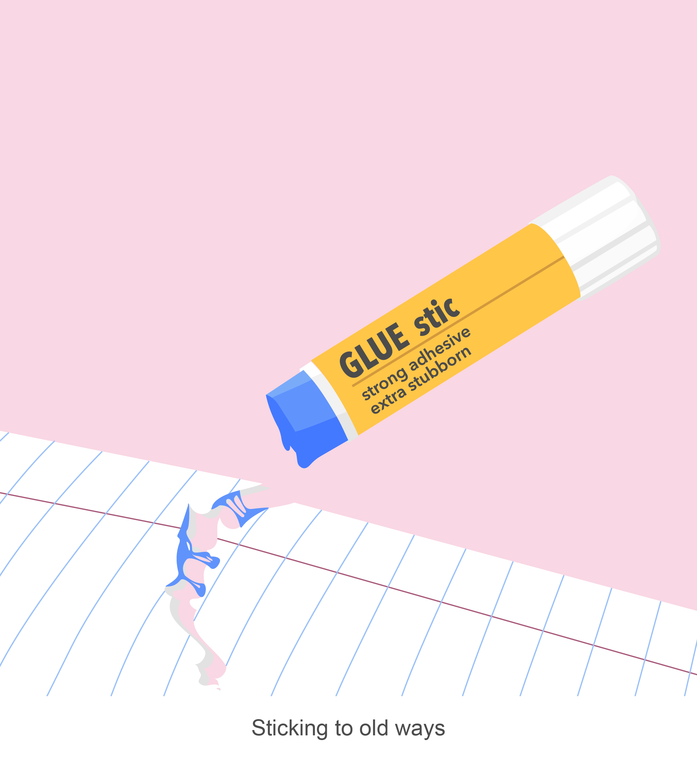
This is such a common saying but it never gets into my head. I’ve come to realise that on many occasions, I tend to stick to my old and stubborn ways of doing things – which is really bad. Portrayed using the famous UHU glue stick that all design students should be very familiar with, is how I see my stubborn self – trying to glue the torn paper when it’s clearly not working out.
Life isn’t that cruel. There are actually many opportunities out there. And maybe, just maybe, life has been dispensing these opportunities like the tape dispenser but stubborn me failed to grasp it. So, I pondered about what chances I felt that I’ve missed out. These “could have” moments are illustrated in golden village tickets, as scenes that I think about from time to time, but never happened.
In the end, these “could have”s became regrets and wasted opportunities.
Ego has been an enjoyable project for me as I could explore myriad ways to illustrate myself. Initially, I thought it would’ve been easier if I could choose the medium which I’m most comfortable with. Turns out that curating a series of illustrations that made sense conceptually and visually appealing in terms of design and colours weren’t that easy after all as there are still many aspects to consider. As for myself, I tend to get swayed with my preferences. Thus, being able to balance my personal aesthetic choices vs. colour rules was challenging.
All in all, the entire journey of this module has gained me the skills to convey my concepts visually. From the very start, which is “My line is emo”, where it focused on design elements in only black and white to “Ego”, which largely focused on colour theory, 2D has taught me every reason why what I see is “aesthetically pleasing” or not.