Category Archives: Final Project

Y1S2 Graphic Form Gallery

A walk-through of the projects during this semester in Graphic Form.

01 IMAGE MAKING THROUGH TYPE

The Journey of Dream Jobs is a set illustration which talks about my evolution of dream jobs, from 7-21 years old. In each illustration, the typography of my initials, “KT”, is incorporated in it. The placement and properties of a typeface are considered as they bring a focal point to the composition; each revealing an important aspect of the narrative.

Here are the links to my previous posts on this project:
01 Image Making Through Type: Artist Research
01 Image Making Through Type: Ideation and Process
01 Image Making Through Type: Final

02 LOCALE (PART 1)

Uniquely, Tiong Bahru, is an infographic which was derived from my research on Tiong Bahru. Comprising of consolidated information from both primary and secondary research, this infographic tells you about the brief history of Tiong Bahru, mainly related to the SIT (Singapore Improvement Trust) flats, and more importantly, focuses on the activities within Tiong Bahru today. It reveals some trends and insights which I have found and lastly, it consists the voices of Tiong Bahru.

Here are the links to my previous posts on this project:
02 Locale: Research
02 Locale: Infographics

03 ZINE: LOCALE (PART 2)

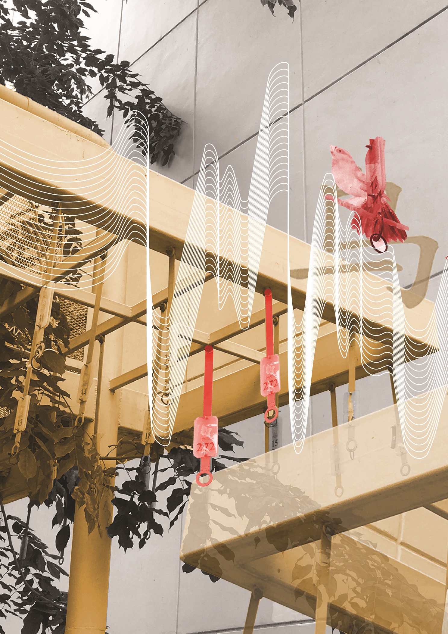
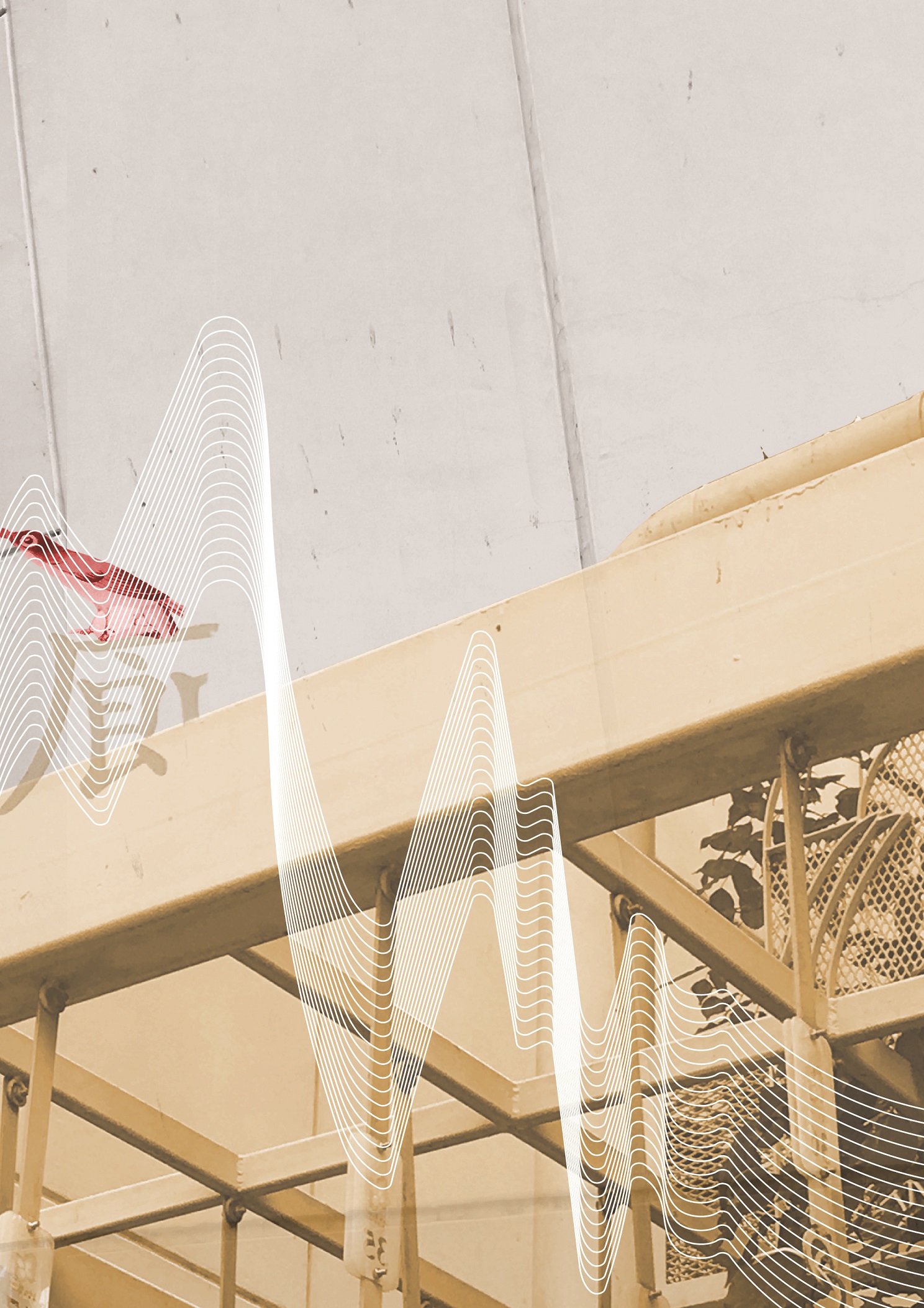
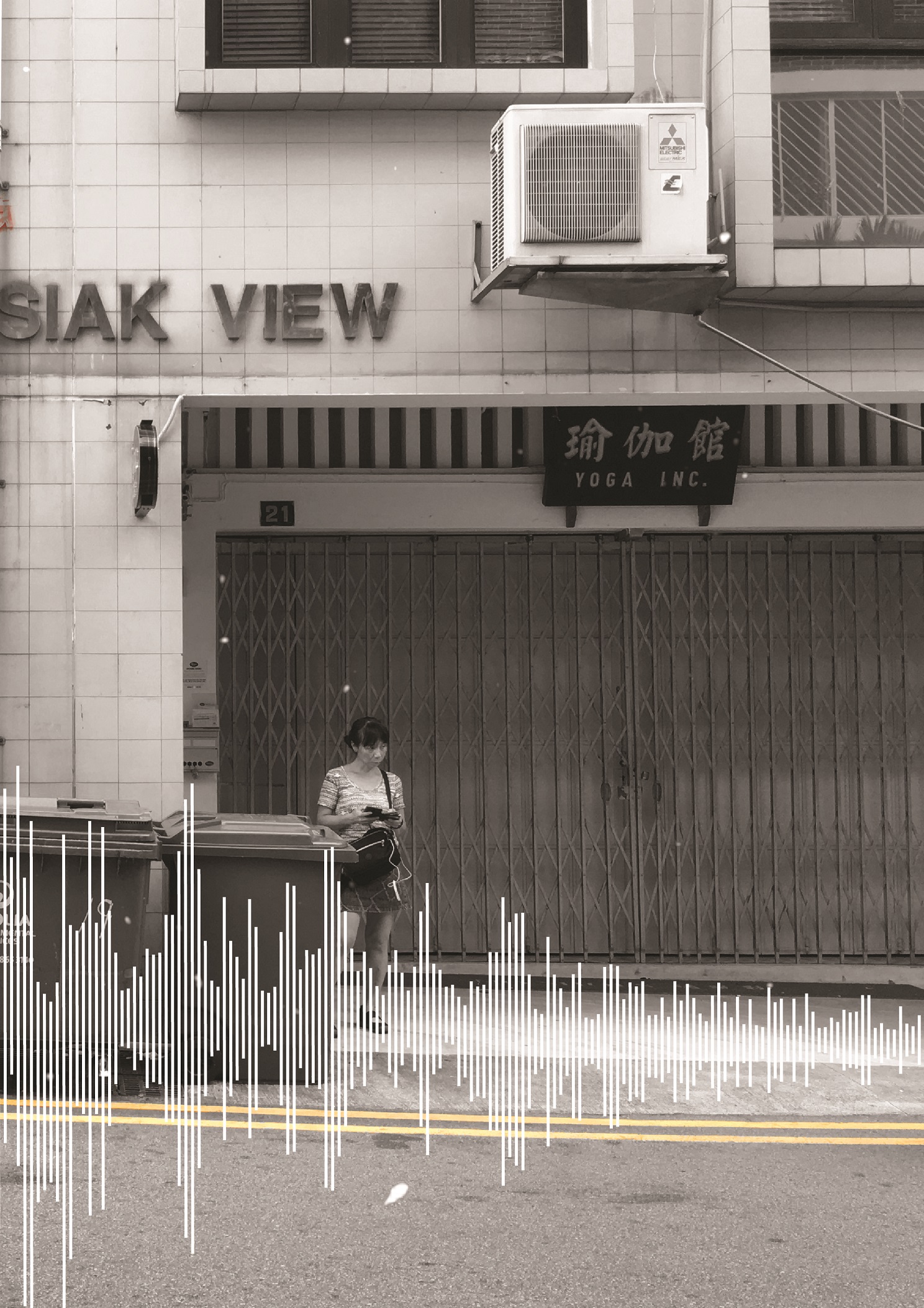
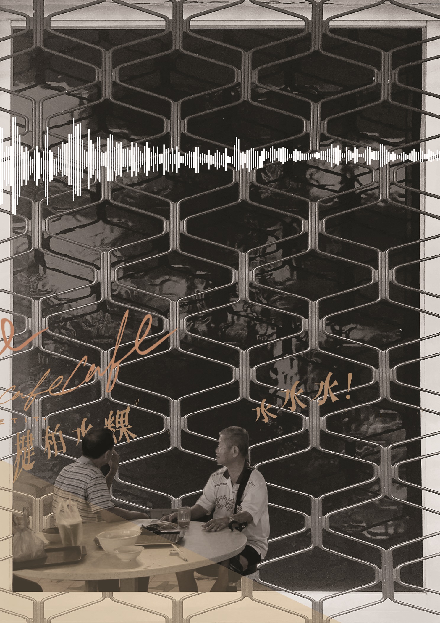
中峇鲁, is an 8-page zine which focuses on the abstract visual qualities of the site, Tiong Bahru. Using photo manipulation, soundscapes and light leaks, the zine looks into the nostalgia and fragility of Tiong Bahru by depicting memorable areas and a juxtaposition of the new and old – a continuation of the first part of my Locale project.

Here are the links to my previous posts on this project:
03 Zine: Locale Process
03 Zine: Locale (Final)

03 Zine: Locale (Final)

This is the final post of my zine!

To view the earlier parts of my Locale project, you can click on the links below:
Locale: Research
Locale: Infographics
Locale: Process


Pictures I took at Tiong Bahru in my other visits


ZINE LOCALE

After MANY changes, I decided to mainly use photos and soundscape to bring about the experience in Tiong Bahru. Instead of using the previous “eat, drink and play” idea (which was too informative), I will be using the nostalgic and fragility aspect of Tiong Bahru – something which I will not expect if I were to take a quick stroll along.

Nostalgia and fragility 
Something which I thought about during this project was the conservation of this area – whether this charming estate will eventually disappear or not. Thus, I created this zine with this central focus in mind.


Cover page (right) and Back page (left).

In this spread, I used an ordinary photo of Tiong Bahru (b&w and grainy). It is unlike my other spreads where it is saturated with hints of warm colours – red, orange and yellow to suggest vibrancy. To me, this was my first impression of Tiong Bahru. It was just an “old estate” which I came to know about because of the hipster cafes. I split the typography in half because I wanted to reveal only half of Tiong Bahru’s name in Chinese characters as one will only see the other half when he/she finishes flipping through the zine – only seen as a whole or complete when one reaches to the final page.


First spread

A bird singing corner with no birds, no chirping, only noises from bustling cars. These noises are translated into the soundscape, which clashes with the bird visuals and typography, Barely recognizable without bird cages, this area is often overlooked by many. But, it contains a rich history of Tiong Bahru as people used to enjoy watching these birds sing. I could only extract the birds and typography from the faded sign, the only remnants that made me recognise that this place was once a vibrant bird singing corner.

Second(middle) spread

The juxtaposition of new and old, of bustling and tranquil. I used a full picture across this spread. To show the contrast, I colourized the cafe area in the picture, and manipulated some typography above it. Looking across the spread, the soundscape compliments the visuals, reflecting soundwaves which depict a noisier to a quiet environment. The main warm colours, red, orange and yellow, were used in order to bring focus to the spread. Also, to play with the light intensity of the photo, I added light leaks to intensify the colours. More importantly, by this colour manipulation and adjusting of exposure (against the black and white side), I wanted to show the fragility of Tiong Bahru, like an old photo fading away.

Third spread 

The alleys in Tiong Bahru are either filled with people or absolutely empty and quiet. In terms of the environment, there is a stark difference in the light. I feel that these crowded alleys, mostly filled with cafes along the side, are brightly lit and out in open junctions. But as I turn into a corner around the SIT flats, it is normally darker and still. Which brings me to this spread where two pages show interaction with the use of the soundscape as a transition and the overlays of extracted typography from signboards (around the middle). Two different kinds of people are shown here, the tourists/outgoing residents and the older generation, mostly overshadowed by all the new things being introduced into this estate. They look as if they are interacting, but are in two entirely different backgrounds.

Overall, this zine has really pushed me in terms of style as mentioned earlier, I was more comfortable with vectors and illustrations. Nonetheless, the several trips to Tiong Bahru and figuring out what I interpreted from the site was an interesting experience. Having said that, because I had 2 entirely different drafts before this, I had the opportunity to explore possible textures, typography and photo manipulation. I look forward to learning even more new styles in the future.


01 Image Making Through Type: Final

Here’s the final outcome of project 1!

To view the design process and research, you can click on the links below:

01 Image Making Through Type: Artist Research

01 Image Making Through Type: Ideation and Process

01 Image Making Through Type: Final (this post)


THE JOURNEY OF DREAM JOBS

Tone: Positive

Sometimes, dream jobs are seemingly impossible due to constrictions and practicality. Nonetheless, going through this identity crisis of being conflicted with what we want is mandatory to find ourselves; in hopes that everything will eventually work out.


THE PATISSIER


In this design, I selected “K” and “T” as my initials. The letterform is mostly incorporated into objects of greater significance, such as, the cracked plate and plastic utensils made for kids.

Due to the angularity of both letterforms, I felt that it is more appropriate to deliberately incorporate them into those objects. As for the choice of case, “K” and “T” had not much of a difference but I went ahead with an upper case “K” and lower case “T” to make the placement of objects more natural. I used counter spaces/positive and negative spaces as form for the letter “K”.


THE ARCHITECT


Atavistic Vestiges After the Rain (1934) by Salvador Dali

In my second design, my creation of an “impossible architecture” was greatly inspired by Salvador Dali’s paintings, which consists of organic shapes. I chose the upper case “K” and lower case “T” in this design. As my letterforms were incorporated into the sticks at the bottom of the structure, to look as though it is barely supporting it, the angularity of both “K” and “T” had helped formed the shape easily. If these letters were curvy instead, the end results would differ quite a bit.

I also used the symmetrical properties of these selected letterforms to create a reflection which says “Kt”. This also ties in with my concept of being in someone else’s shadow as I am blindly following someone else’s dream.


THE TATTOO ARTIST


For this piece, I illustrated a mix of line drawings, a reference from line art tattoos, and vectors. By using contrasting styles, I wanted to portray this dream job as something far from reality and unattainable.

Inspired by Ukiyo-e prints, I used more organic shapes to create my vectors and letterforms. My letterforms, as seen in the red patch of blood and the chain, represents the cultural constrictions this job has. The chain, made using a pattern brush, signifies the constrictions, as though the tattoo artist’s hands are restricted.  By using a pattern brush, it helps to make an angular letterform more organic and natural. For the letter “K”, I played with the boldness/thickness of the letterform as it is an organic shape.


THE PACKAGING DESIGNER


This piece was inspired by the memphis art style. It adopts a great a sense of movement it in as I wanted to this piece to look fun and quirky.  I particularly picked candies as objects to be packaged as I wanted a similar motif which links to my first dream job – the patissier. The positive message from this is that things will eventually work out and this “Journey of Dream Jobs” is something mandatory so that we are able to find ourselves. Thus, reminding us that even though we might not be able to have that “ridiculous” job we wanted when we were young, it does not mean that you cant work your way around it and do something within your interests.

The letterforms, portrayed in the ribbons, started off looking geometrical. After a few versions, I decided to make the letter “K” look more organic and that it follows the curves of the ribbons which wraps around the box nicely. Altogether, I really wanted to capture the moment of having a job you love; although messy with the tapes still around, it is still bursting with joy and excitement.


Some comments from Joy and my peers:

  • colour choices were great and appealing
  • nice narrative and vector style
  • maybe centralise certain letterforms
  • 1st and last composition could have been less distracting
  • 2nd composition is good

I had met several challenges while doing this project. Firstly, incorporating the letterforms with consideration was tougher than I thought as I tend to lean towards a more illustrative way to express myself rather than in typography. I also struggled with trying to make the letterform more visible as initially, it was subtle and small in size. All in all, I enjoyed this project as I have learnt many useful illustrating techniques and also learnt about the properties of a letterform on a deeper level.