Tag Archives: colours

03 Ego: Final

Here’s the final outcome of my Ego project!

To view the design process and research, you can click on the links below:

03 Ego: Artist Research

03 Ego: Design Process

03 Ego: Final (this post)


IF MY EGO WERE OBJECTS

What would I be?

There are millions of objects in this world. Some are of importance, some are of no worth and some are redundant. It all depends on the person who’s looking at the object. If I were to ask everyone to list 10 objects that are most significant to them, the outcomes will be infinite. So, here are some objects that represent me.


TRIAD

I used triadic colours as it seemed more dynamic as compared to using 2 colours – complementary or split complementary. Overall, (pink and blue) pastel colours were dominant but I used tints and shades to add the lights and shadow, making the objects seemed more 3D. I’ve also added essence of yellows to bring focus to a certain object.

I used pink – representation of feminity (myself) and playfulness

blue – to portray calmness, sadness or peace

yellow – to portray joy and warmth


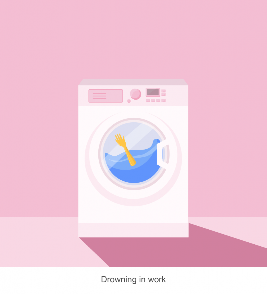
01 “School life” in a laundry context
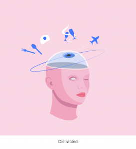
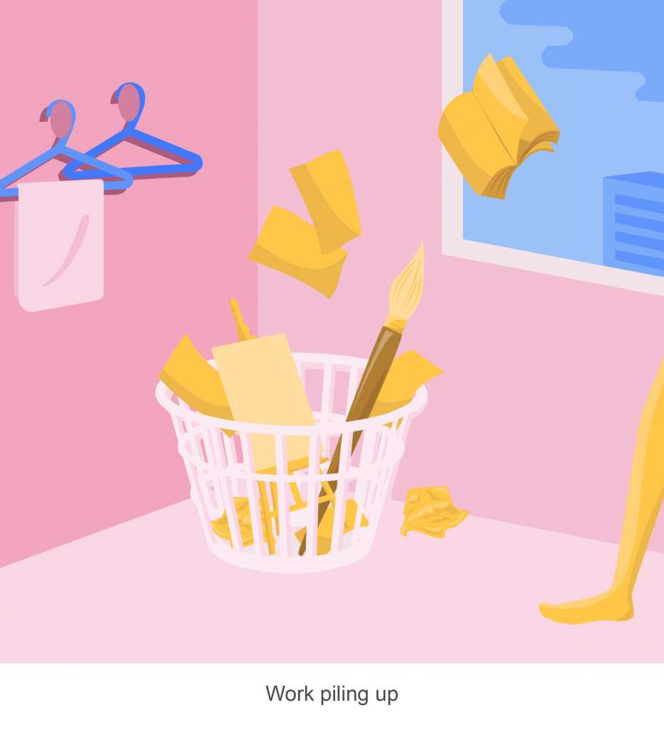
Just like how laundry is being piled up in the laundry basket at days, I felt that it goes the same way for my work, piling up as time goes by because I am distracted or procrastinating. As a result, I’m drowning in my work, along with my mixed emotions that overwhelm me – stressed, sad, anxious and angsty, all at once.

02 “My first love” portrayed as utensils
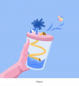

Naive me once believed that I could do anything in this world, with the people I love. But, growing up and life experiences have taught me the opposite – to be practical and set realistic goals.

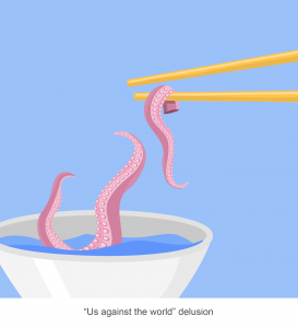
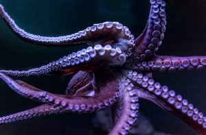
The chopsticks represent a perfect pair and the tentacles represent the bad things in the world that are to come. My first love had me believe that anything is possible, regardless of what others say. It is just “us against the world”.

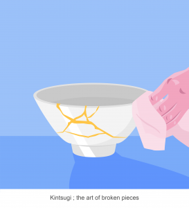
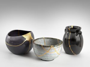
But, good things won’t last forever and I believe that Kintsugi, the art of broken pieces, is a perfect representation of experiences like this. Kintsugi is a Japanese art form that repairs ceramics with lacquer and liquid gold. They believe that there is greater beauty in the broken pieces and this refers back to life, where the things that happen, which you deem as “bad”, will end up teaching you a valuable life lesson.

03 “How we mask ourselves” portrayed as cosmetics

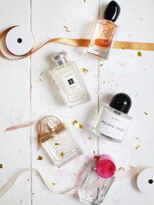
To me, masking emotions is just like spraying perfume, covering ourselves with a scent, but in this case, with a particular emotion. Conforming to society’s expectations is a norm and for every different setting, I adopt a different persona – be it work, school, or with my family.

04 “Missing out life opportunities” portrayed as stationery 

“You’ll never know if you never try”.

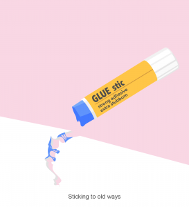
This is such a common saying but it never gets into my head. I’ve come to realise that on many occasions, I tend to stick to my old and stubborn ways of doing things – which is really bad. Portrayed using the famous UHU glue stick that all design students should be very familiar with, is how I see my stubborn self – trying to glue the torn paper when it’s clearly not working out.

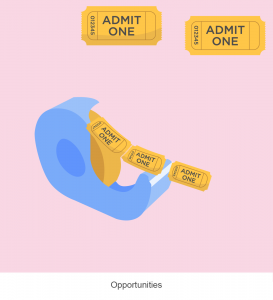
Life isn’t that cruel.  There are actually many opportunities out there. And maybe, just maybe, life has been dispensing these opportunities like the tape dispenser but stubborn me failed to grasp it. So, I pondered about what chances I felt that I’ve missed out. These “could have” moments are illustrated in golden village tickets, as scenes that I think about from time to time, but never happened.

In the end, these “could have”s became regrets and wasted opportunities.

Ego has been an enjoyable project for me as I could explore myriad ways to illustrate myself. Initially, I thought it would’ve been easier if I could choose the medium which I’m most comfortable with. Turns out that curating a series of illustrations that made sense conceptually and visually appealing in terms of design and colours weren’t that easy after all as there are still many aspects to consider. As for myself, I tend to get swayed with my preferences. Thus, being able to balance my personal aesthetic choices vs. colour rules was challenging.

All in all, the entire journey of this module has gained me the skills to convey my concepts visually. From the very start, which is “My line is emo”, where it focused on design elements in only black and white to “Ego”, which largely focused on colour theory, 2D has taught me every reason why what I see is “aesthetically pleasing” or not.


03 Ego: Design Process

As mentioned in the previous post on my artist research, I was inspired by the manipulation of daily objects into something quirky and fun. As this project allowed the freedom of using any medium to portray myself as an equation, “Me + Environment = _________”, I thought that it would be fun to create illustrations with a tinge of lightheartedness.

IDEATION OF EQUATIONS

Me + Environment = __________

  1. Distracted + Work piling up = Drowning in work
Work piling up Drowning in work


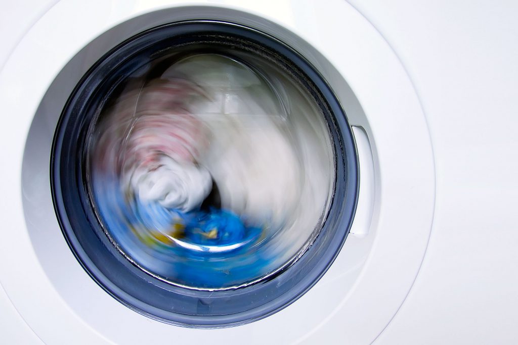
For this equation, I’ve placed my current state into a “laundry/home” context. Just like how the laundry is being piled up at days, I wanted to portray how my work (especially during this submission week), is being piled up and there can never be an end to it. “Drowning in work” in the last box refers to myself, having to juggle so many things in life, to cope with my work and to also have a life. The mixed emotions are whatever that’s in the washing machine, spinning round and round, and overall, depicting me overwhelmed by work.

TRIAD


Initially, I planned to use these 2 colours just because I personally preferred it. However, after consultation, Joy mentioned that although it may fall into the split complementary colour rule, it might be even better to use another colour – to create triad colours – so as to bring focus to come objects in the composition as well.


Thus, I’ve added yellow. As seen in the first row, the second and 3rd design had yellows in them, bringing focus to the sheets of paper in the laundry basket and also the hand in the washing machine.


2. Naive + “Us against the world” delusion = Kintsugi ; the art of broken pieces


Naive “Us against the world” delusion  Kintsugi ;
the art of broken pieces

This equation is entirely inspired by Kintsugi, a Japanese art form which mixed liquid gold and lacquer to repair broken ceramic pieces. They believed that there is beauty in the broken pieces being repaired. And true enough, the pieces after being repaired are breathtaking.

Naive me once believed that I could do anything in this world, with the people I love. But, growing up and life experiences have taught me the opposite – to be practical and set realistic goals. Thus, I came up with this equation to portray the falls in life as a beginning of something even better.

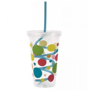
For the first design, Naive, I took an ordinary child’s cup with a swirly straw and replaced it with a water slide. By adding a beach landscape to it, I felt that it changed the entire dynamics of the cup as it is now, a playground. Being young and naive tends to also be associated with an imaginative and cheerful mindset – something which I want to incorporate in the design.

The first thought that came into my mind for the second design was a “me vs. monsters” kind of idea. As seen in games, or in surrealistic images, I want to portray myself being in that non-fictional/delusional state, where all these “monsters” refers to the bad things in life. Thus, the octopus reaching out to the chopsticks.

Lastly, an image of a repaired bowl and a hand wiping it shows the aftermath of the first 2 images – everything that happens in life, will make you better. Those cracks aren’t flaws but it symbolizes the experiences that one has gone through.

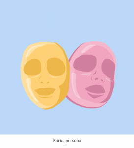
3. Masking emotions + Society = Social persona

Masking emotions Society Social persona

For this equation, I’ve used cosmetics as a theme.

Masking emotions, to me, is just like spraying perfume, where we cover ourselves with a scent, but in this case, with a particular emotion.

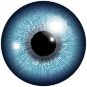
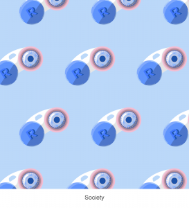
For the second design, society is being portrayed as multiple contact lenses. The idea of this is to objectify the ordinary masses views and perceptions as I feel that in today’s society, there are many redundant and ridiculous views which are made by the public. As a result, people have to conform to society’s expectations.

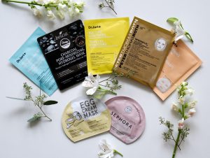
By conforming to society’s expectations, my very own social persona is created. Portrayed by different facial masks, I adopt a different persona in different settings. For example, when I am working, when I am with my family, or when I am in school.

After consulting Joy, she mentioned that the words “calm”, “poised” and “impassive”, made the design too literal and I should work towards it having more space for viewer’s own interpretation of it.

4. Sticking to old ways + Opportunities = Seized opportune moment (Work in progress)

I used stationery items to portray this equation. However, I felt that this equation seemed a little off as “sticking to old ways” contradicts with “seized opportune moments”, because, as a result of me being stubborn, I wouldn’t seize any opportunities. Also, from the consultation, the paper for the 1st box is not very apparent. The tickets in the 2nd box could also add a local context to it as compared to a generic “admit one” ticket as it does not entirely represent the opportunities which I want to portray.


03 Ego: Artist Research

To start off this project, I would be mostly looking into how these artists used colours and put them together harmoniously.

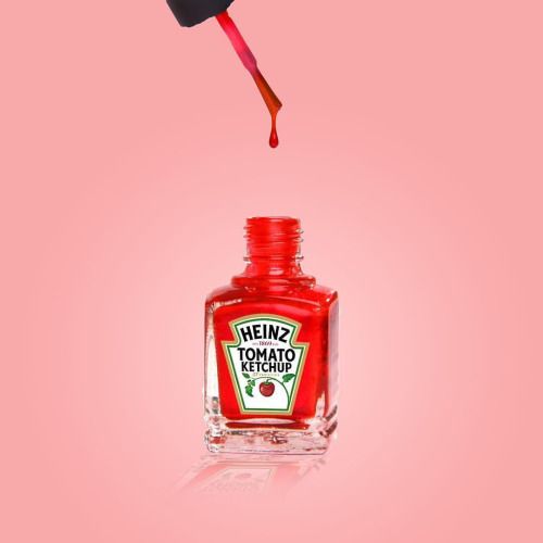
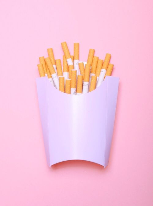
Vanessa McKeown

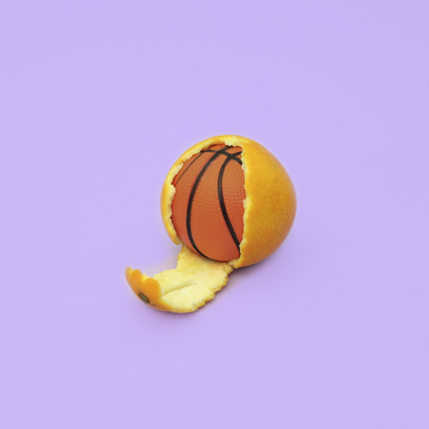
McKeown photographs ordinary daily objects and manipulates them into quirky photo illustrations. The colour schemes used were mostly pastel as it gives off a softer look. The lightheartedness in the photos is a perfect combination of the quirky and fun interpretations of the objects.

Other than the use of colours, my illustrations were inspired by her as well. My overarching concept would be to make ordinary, daily objects relatable to my experiences and memories, which will make up my equation of “Me+Environment=______”


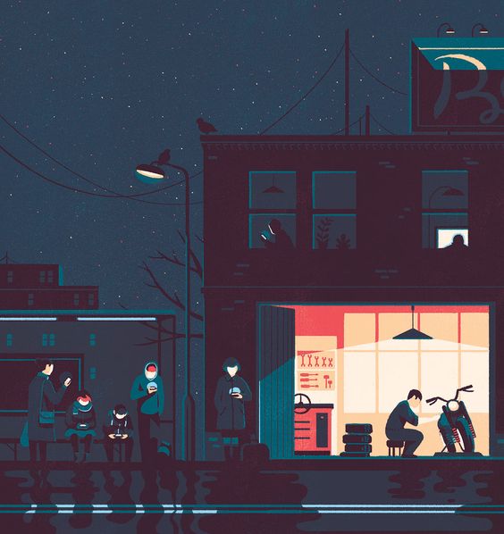
Tom Haugomat

Tom Haugomat is an illustrator based in Paris, France. The use of light and a pastel cooler palette in Tom’s work is reminiscent of American illustration from the 1950’s and ’60s.

The evident use of light and colours made his work seem beautifully in harmony, whether is it using shades and tints, or analogous and complementary colours.


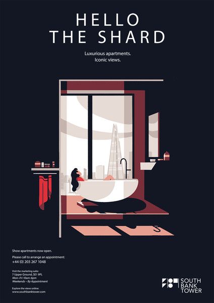
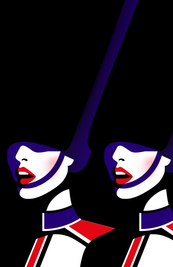
Malika Favre

Malika Favre is a French graphic designer and her distinct and often very sexy style has made her one of the world’s most sought-after. Her works are bold, minimalist, and instantly recognisable.


Overall, I found these artists extremely helpful in terms of visualizing how colours can be utilized to create a certain mood or to set a contrast in a composition. Although not all of their works fall under the typical colour rule, as some might be split complementary etc, it is interesting to see how these colours can be put together harmoniously.