Tag Archives: forrest gump

02 Forrest Gump: Final

These are my final designs! I’ve made the most changes to the 3rd and 4th design. Here are links to my research and process.

Part (1/3) Artist Research

Part (2/3) Design Process

Part (3/3) Final (This post)

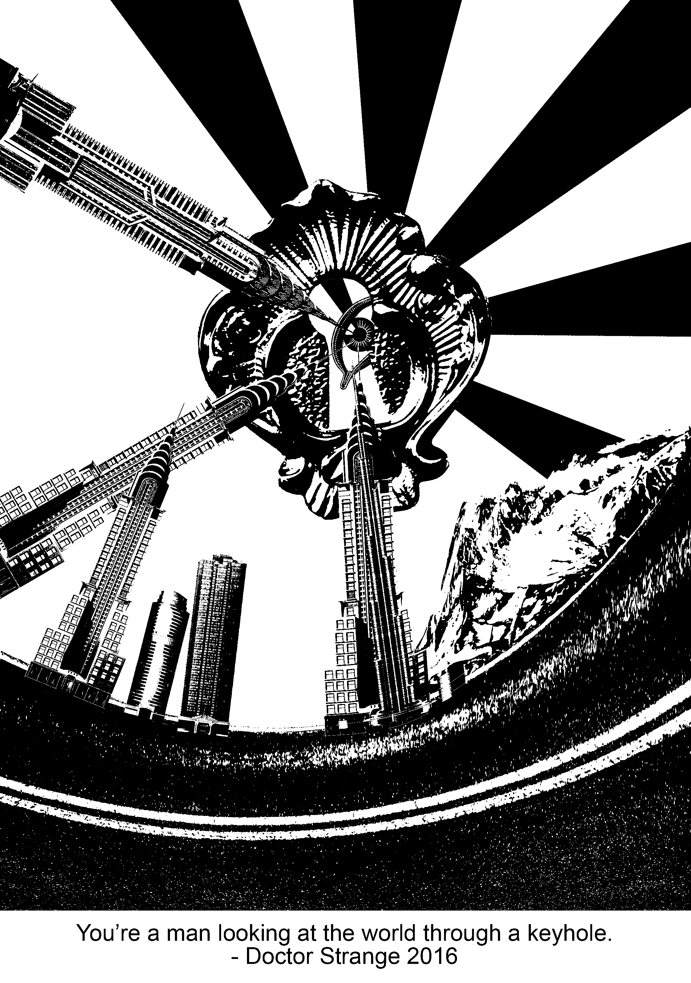
For this piece, it’s all about perspective and looking at the world in a new light. I chose common elements which we see on a daily basis, such as the buildings and the landscape, and manipulated them. The warped effect especially, allows the viewers to experience how looking in a new perspective looks like visually – different and surreal. Even for the buildings that I chose, they have their stories. I wanted to show that these “common elements” could actually reflect political and social issues in a particular country.

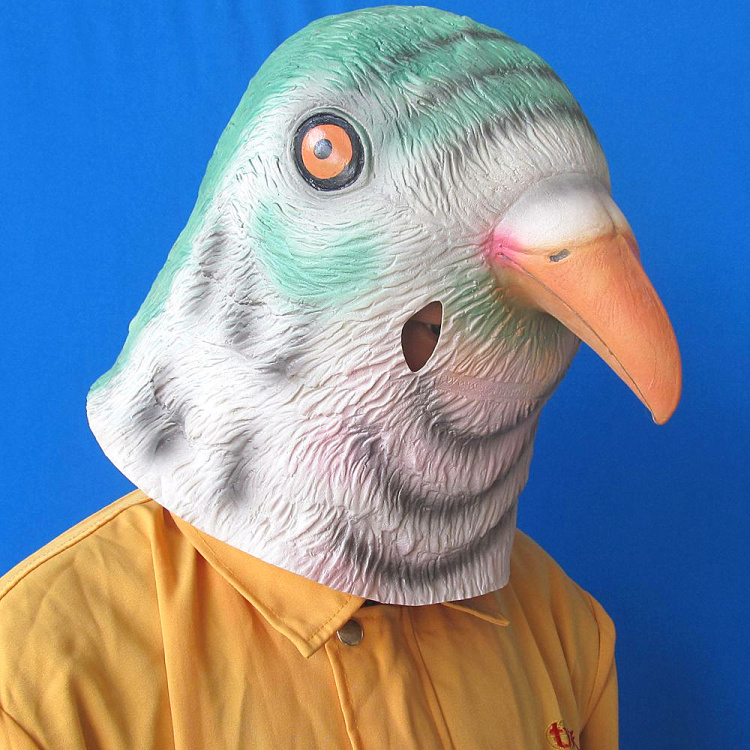
“You’re a bird brain!” 

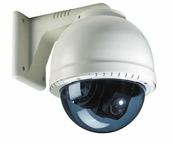
This is an insult that uses an animal’s natural characteristic to portray it in a human context. Similarly, when I researched about anthropomorphism, I felt that using this approach to portray certain characteristics would be useful and interesting. Not only is it not literal, but it exaggerates the persona in a fun way. Therefore, I used the head of a bird on a human body. The whole idea is to poke fun of consumerism. Humans are so obsessed with keeping up with the latest technology that it is redundant and that they fail to notice their surroundings. The unrealistic scale of the iPhone also exaggerates how the figure intently looks at the screen, without realising the surveillance camera lurking in the background.

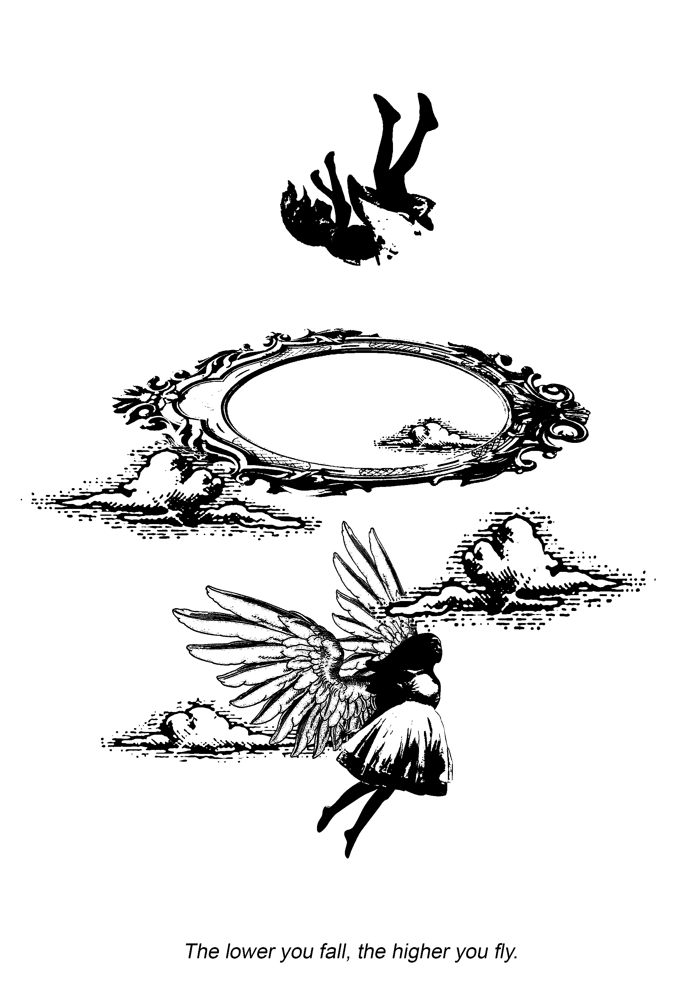
草莓族 ; The strawberry generation. 

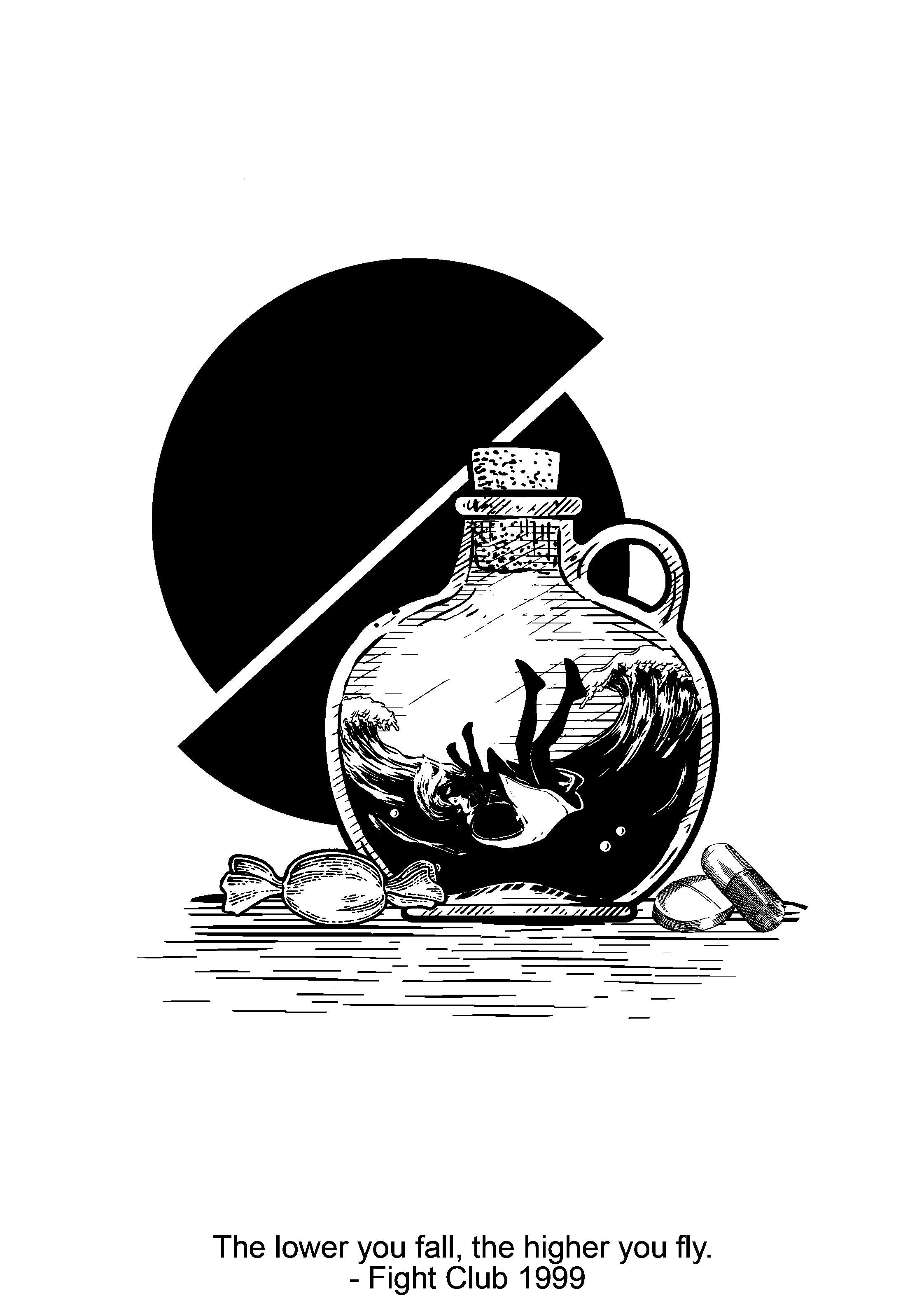
The third design explores how youths in this generation are vulnerable and weaker. There is a stereotype of how 21st century teens are, the “strawberry generation”. When troubled teens are being tackled with a problem, some might turn to a substance abuse to escape reality. Being addicted to this destructive lifestyle would be an endless pit of no return, portrayed by the waves that surround the girl and the rope attached to the leg.

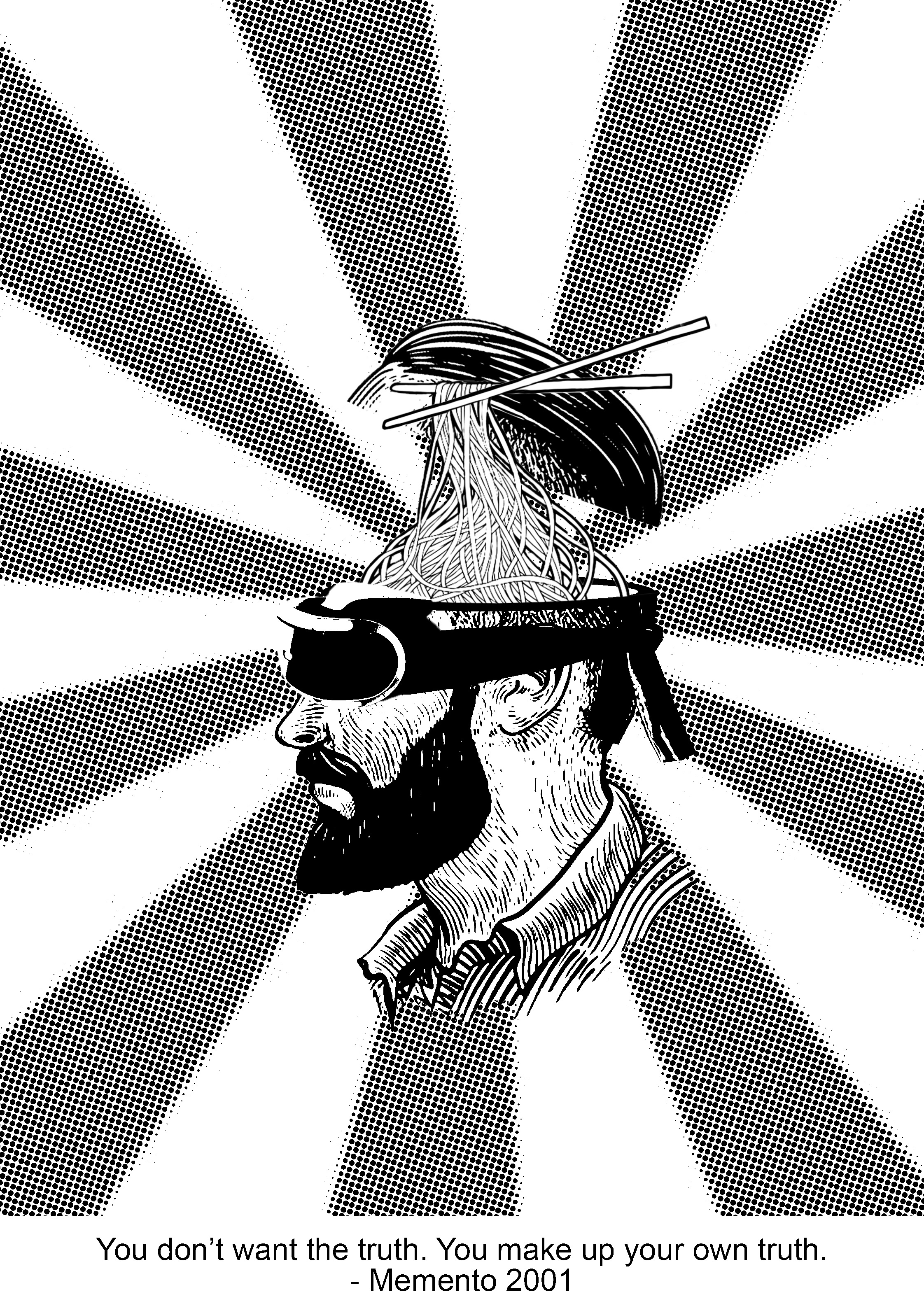
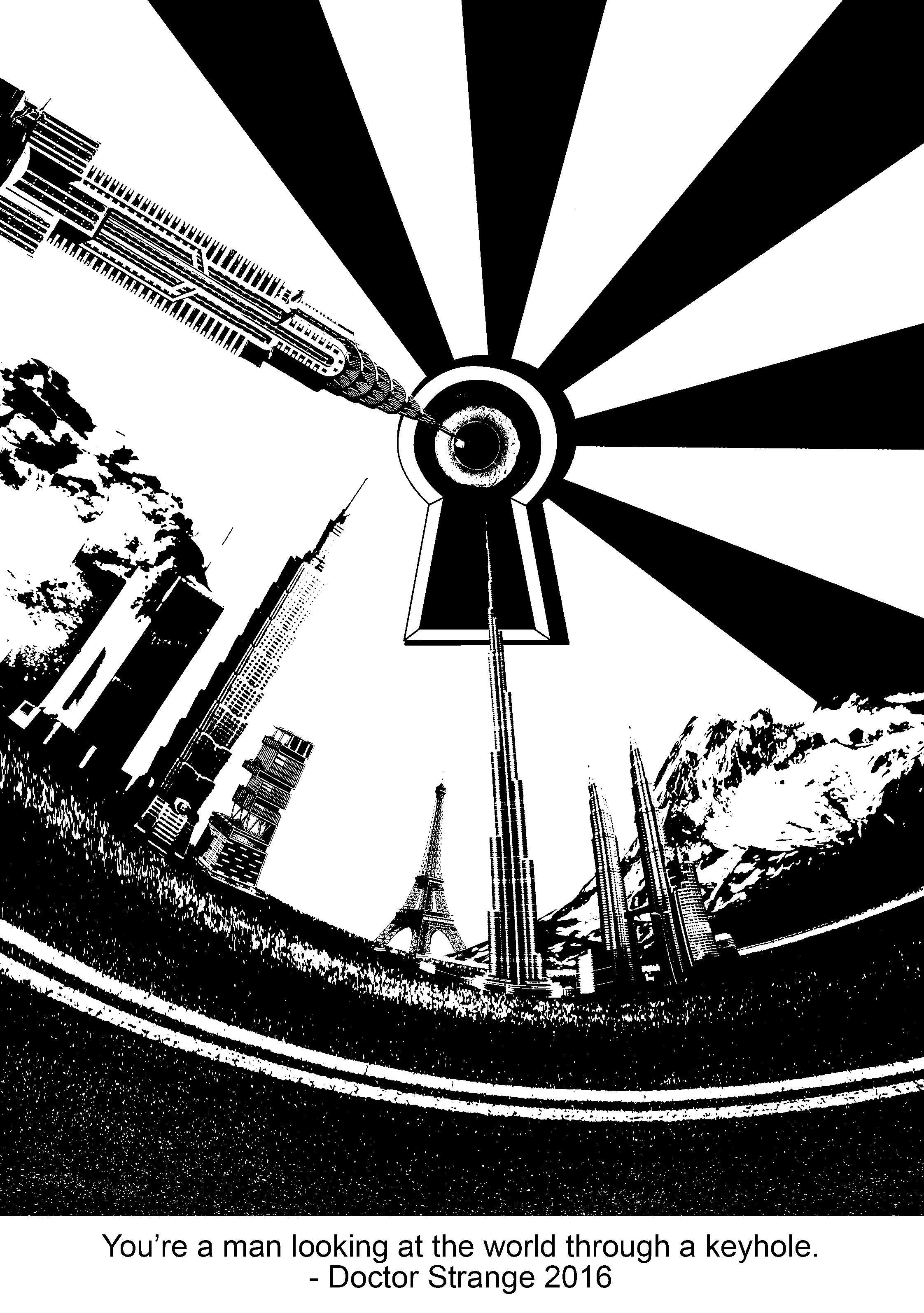
For the last design, the first half of the quote which says “You don’t want the truth” is being portrayed through the VR goggles that he is wearing and it suggests that he is living in denial, living in his own world. The second part “you make up your own truth”, is being portrayed through the noodles and chopsticks and the interpretation was that “making up the truth” is a nonsensical thing and that it has no grounds. Thus, his brain matter is being replaced by noodles, something without cognitive thoughts.

Feedback

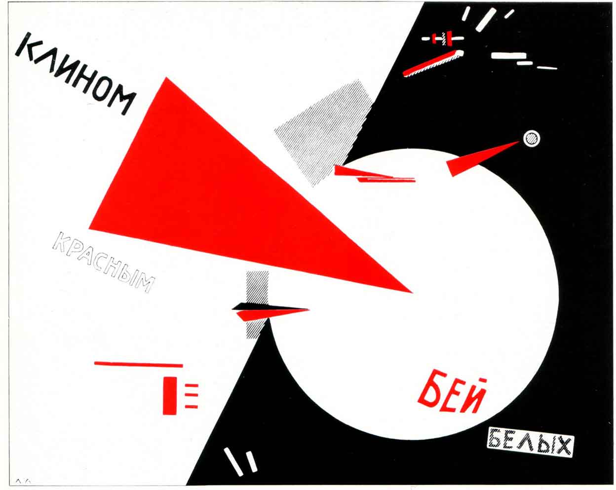
The comments which I’ve gotten was that the effort in the research before choosing individual elements was good. Also, it was apparent on how my designs were inspired by certain art movements, such as Russian constructivism and suprematism, and that it ties in with my designs. However, some changes which I could’ve made to the designs were that:

  • 2nd design: maybe show more signs of struggle. eg, the wires tangled him in a more suffocated way, maybe adding another one from the other side.
  • 3rd design: The candy wrapper was not very clear and I should replace it with a candy and the wrapper beside instead.
  • 4th design: Make the VR goggles more apparent. eg. add wires, use a more boxy VR goggle instead.

Comments from my classmates:

  • The composition of the design is good.
  • Consistency shown through the designs.
  • Balanced use of black and white.
  • Like the concept and style.

Reflection

All in all, I felt that this project has pushed how I conceptualise even further. From using quotes, it was not as easy to have new interpretations and meanings to them. As this project lasted for a few weeks, I could also see the gradual progress and improvement of the concepts and design composition of my works after the consultations. The silkscreen part was an eye-opening experience for me and it wasn’t that easy after all. For my case, some intricate details got lost along the way, either because the inked has smudged or that there was too much ink. Other than these experimental moments, the nature of the project, stemmed from movie quotes – something which I felt that we could all personally relate to or are interested in.

02 Forrest Gump: Design Process

Link to design research: Part (1/3) Artist Research

First and foremost, to start of the next part of my project, I searched for quotes which intrigued me or left an impact on me. They were mostly from movies which I personally like.

Quotes:

  1. You’re a man looking at the world through a keyhole. – Doctor Strange, 2016.
  2. The things you used to own, now they own you. – Fight Club, 1999.
  3. The lower you fall, the higher you fly. – Fight Club, 1999.
  4. You don’t want the truth. You make up your own truth. – Memento, 2001.

Methodology/approach

Basically, I broke down the quotes to identify the key points which lead to an overarching focus. Words such as, “looking”, for example, suggests perspective. Things which I could directly relate to are eyes, sight, light and direction. From there, I searched images which suits the threshold/halftone effect, without compromising the details after the effect was placed.

For this quote, I wanted it to suggest a different perspective of seeing the world. Firstly, the keyhole was a starting point. As an element that constricts the “view of the world”, I thought that it would be good to work around it, thus, the warped buildings and scenery around it. I was inspired by the Russian constructivism art movement and I used the starburst effect to lead the viewers’ eye to the keyhole and eventually, towards the eye.

However, the buildings seem randomly placed. Also, the overall balance seemed heavier on the right as the values are darker towards that direction. Hence, I made some minor changes to it:

I have replaced the buildings into iconic and controversial buildings. The Petronas twin towers, the Eiffel tower, Taipei 101, Burk Khalifa, Antilia and the World Trade Centre. These building ties in with the concept behind this design, which is – looking at the world in a whole new perspective, where even each iconic building has its own story. Many issues in this world are being masked, such as political issues. The media tends to be biased and it overrides issues which they do not wish to show the world.

Buildings from left to right: World Trade Centre (NYC, United States), Taipei 101 (Taiwan), Antilla (South Mumbai, India), Eiffel Tower (Paris, France), Burj Khalifa (Dubai, United Arab Emirates) and Petronas Twin Tower (Kuala Lumpur, Malaysia).

Upon researching about which buildings to use, I thought that it would be good to include these skyscrapers as they are iconic to their countries. They compete for the title of the worlds tallest building and currently, the Burj Khalifa, stands the tallest at 828m high.

Other than these skyscrapers being a symbol and reflection of the city’s wealth and ascendency through the economy and rich history, some of them do have an interesting story.

For example, Antilla. Antilla is a private home in South Mumbai, India, and is owned by Mukesh Ambani.  It is the world’s most expensive private residential property, valued over $1 billion. Its controversial design and ostentatious use by a single family has made it famous across the world, with severe criticism in the architectural press and mockery in popular media. The home consists of 27 floors and 600 staff to mend it 24/7.

After researching about this particular building, I understood the irony that the media conveyed. Antilla was referred to be “Soaring Above India’s Poverty”. This phrase was extremely impactful to me as although I knew that slums existed in India, I didn’t know the controversy which a single building can cause.


In this design, I used a combination of threshold images and a flat circle as the background. The main element and message was portrayed through anthropomorphism, the showing or treating of animals as if they are human in appearance. I felt that this was a unique approach to portray certain characteristics which I did not want to make it seem too literal. By adding animals’ natural characteristics or perceived characteristics to humans, it exaggerates the persona in a “fun” way. I used the head of a bird on a human body, and it pokes fun on consumerism. It can be also be interpreted as “bird brain” and that humans are so obsessed with keeping up with the latest technology that it is redundant and that they fail to notice their surroundings. The unrealistic scale of the iPhone also exaggerates how the figure intently looks at the screen, without realising the surveillance camera lurking in the background.

Generally, there were not many changes made to this design. I’ve only edited the end of the cable as the original shape of it looks like a wine bottle due to the shadows and threshold effect. Instead of having the wires to dangle from the top, I made a one of it strangle around the figure, suggesting the unnoticed tension and lack of awareness by the figure. I felt that this additional element strengthens the narrative behind this design.


My initial design for this quote came off very literal. Although I liked the contradiction of the quote itself, I felt that this design needed a deeper interpretation of it – not just a girl flying and a girl falling.

The second design was ironic and can be perceived as both flying and falling. With the flipped landscape at the back, it seemed like the girl is falling. But, with the hand and the rope, it seemed like the girl is levitating instead.


The third design compromises of an entirely new interpretation of the quote. It explores how youths in this generation are vulnerable and weaker. There is a stereotype of how 21st-century teens are, the “strawberry generation”. When troubled teens are being tackled with a problem, some might turn to a substance abuse to escape reality. The lower they fall, the higher they get. Drugs are being associated with candy, or as such, is seen as “candies” to the youths. Being addicted to this destructive lifestyle would be an endless pit of no return, portrayed by the waves that surround the girl.

Some feedback which I’ve gotten from Joy and my peers were that the 2 halved circles stole the emphasis of the girl, instead of placing the focus on her. The play of basic shapes also coincidentally looked like a pill. The use of the candy can be more subtle as well.

For my last design, I experimented with the use of typography. I deconstructed some words to the point where they became incomprehensible and made use of vowels. Essentially, these are what makes the spoken truth.

However, a major flaw in this piece would be that it lacked emphasis as the values of all the elements are dark. Thus, I felt that it lacked unity and harmony in the overall composition.


I made drastic changes to the next version but it didn’t seem to work. For this piece, poppies and the snake were representing the toxicity which making up your own truth can lead to. Similarly, the sense of direction of the words did not work well with the snake and poppies.

That’s about it for my design process! I will be making more changes to the 3rd and 4th design which will be posted in the final post.

02 Forrest Gump: Artist Research

To start off project 2, I’m going to share about some artists or art movements that inspire me.

SURREALISM

Salvador Dali (1904-1989), a Spanish surrealist, is a highly imaginable individual who enjoys indulging in unusual and grandiose behaviour. It is said that he evoked his dreams and hallucinations in unforgettable images, as seen in many of his works.

The Persistence of Memory by Salvador Dali.

Rene Magritte (1898-1967), a Belgium surrealist, is known for his witty and provoking images. He depicts ordinary objects in an unusual context, challenging the observer’s preconditional perceptions of reality.

The Therapist (1937) by Rene Magritte.

Both surrealist exemplifies the great lengths that creativity can reach. We normally perceive an ordinary object as normal and dull looking. But, having to challenge our perception would be the next step to obtaining new and interesting interpretations of the same object – which is what I look forward to for this project.

RUSSIAN CONSTRUCTIVISM


Russian constructivism is a movement that was active from 1913 to the 1940s. It was a movement created by the Russian avant-garde, but quickly spread to the rest of the continent. Constructivist art is committed to complete abstraction with a devotion to modernity, where themes are often geometric, experimental and rarely emotional. Constructivist themes are also quite minimal, where the artwork is broken down to its most basic elements.

I found this artistic style effective and aesthetically pleasing to the eye. As mentioned, having new and different interpretations of an object would be what I am looking forward to and utilizing basic elements would create a sense of unity and harmony in my designs. There would be a balance of flat basic elements and detailed threshold/halftone images, thus, neutralizing the complexity.

Other than Russian constructivism, I have also chanced upon a similar art movement which inspires me.

SUPREMATISM


Suprematism focuses on basic geometric forms, such as circles, squares, lines, and rectangles, painted in a limited range of colors.

Both movements mentioned above are interested in the abstract design and the self-containment of a specific work, however, because Russian Constructivism was acknowledged after the Revolution in 1917, it carries an overtly political manifesto as well as a practical application of the arts for worldwide revolution.

Personally, I felt that these artists and art movements served as a really good starting point for this project. It shows a great play of ideas and how simple shapes can be translated into an artwork.

https://uploads5.wikiart.org/images/salvador-dali/the-persistence-of-memory-1931.jpg

https://www.renemagritte.org/the-therapist.jsp

http://www.arthistoryarchive.com/arthistory/constructivism/

Modernism and Russian Constructivism