Tag Archives: haiku

In Class Activity: Haiku

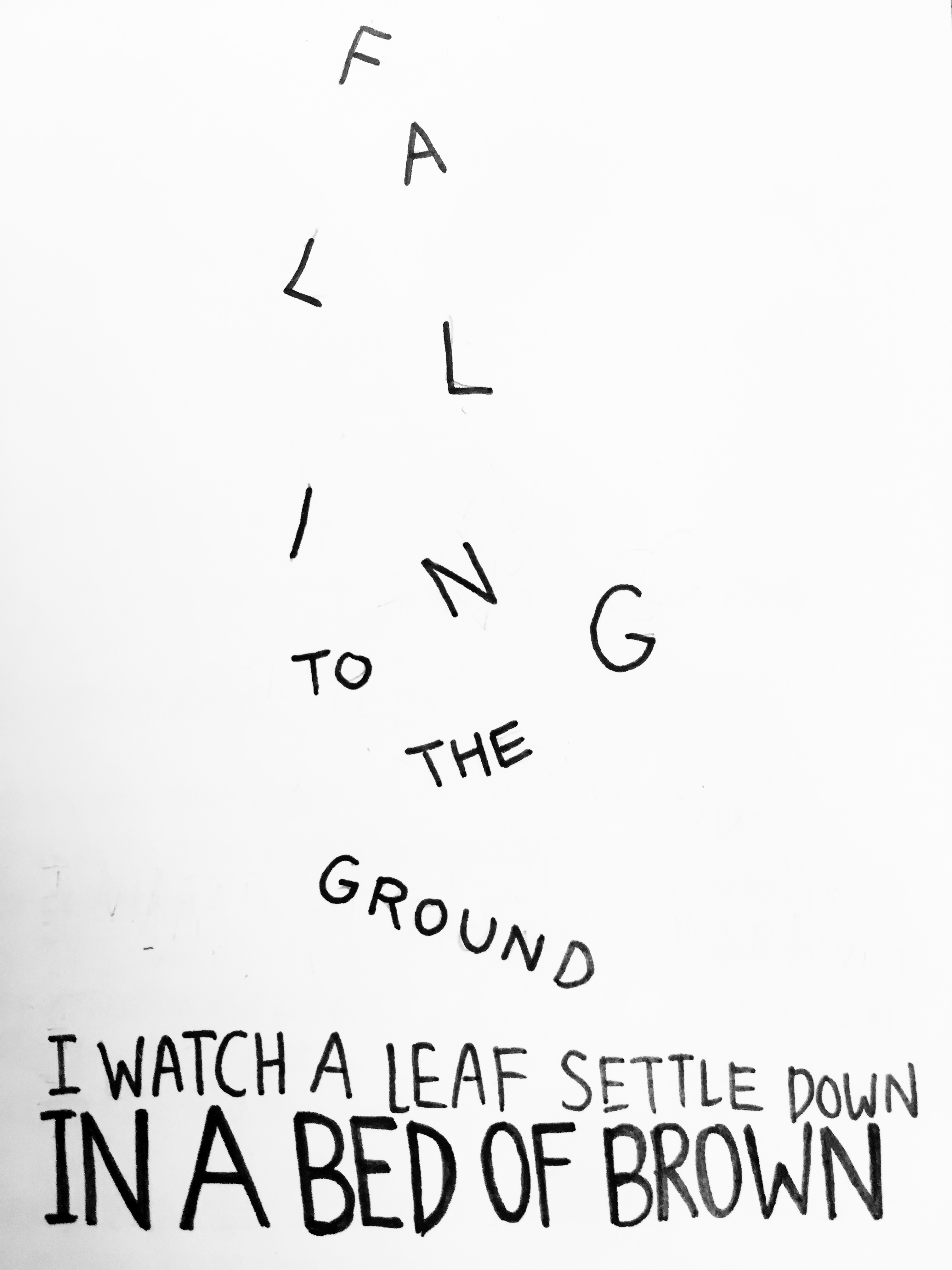
A digitalized version of my haiku.

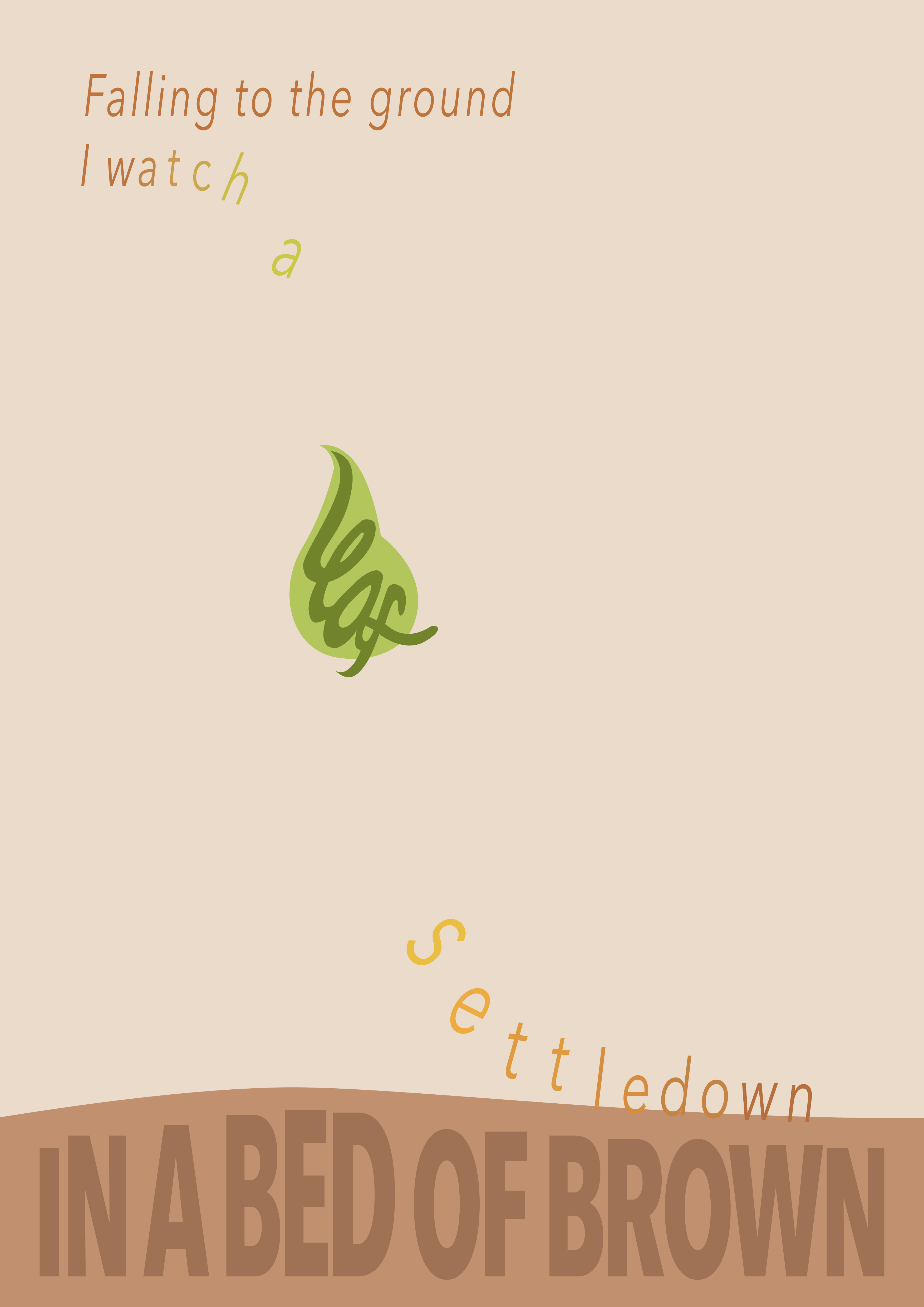
I felt that my haiku is serene and soft, as words such as “settle down” suggests a gradually slow movement and peacefulness. Along with the feedback, I made the words flow downwards, which follows the falling leaf. I also chose an autumn/warm palette to compliment with the haiku. I mainly used one font, Avenir, but I varied the typefaces – bold for the ground, italics for the falling words. All in all, I could see the effects of variating typefaces and how it impacts a composition – how our focus is naturally drawn to bolder and bigger text, and how softness is subtly shown in italics and thin fonts. As such, it was fun to illustrate a haiku like this.

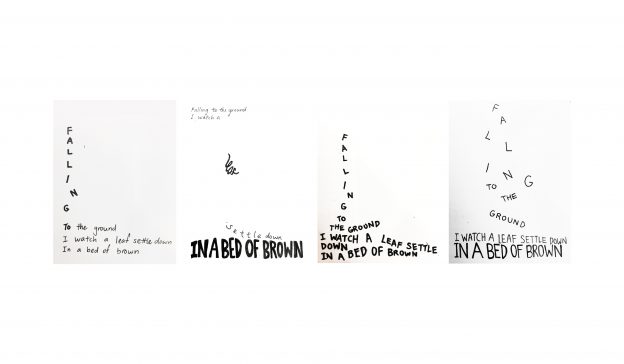
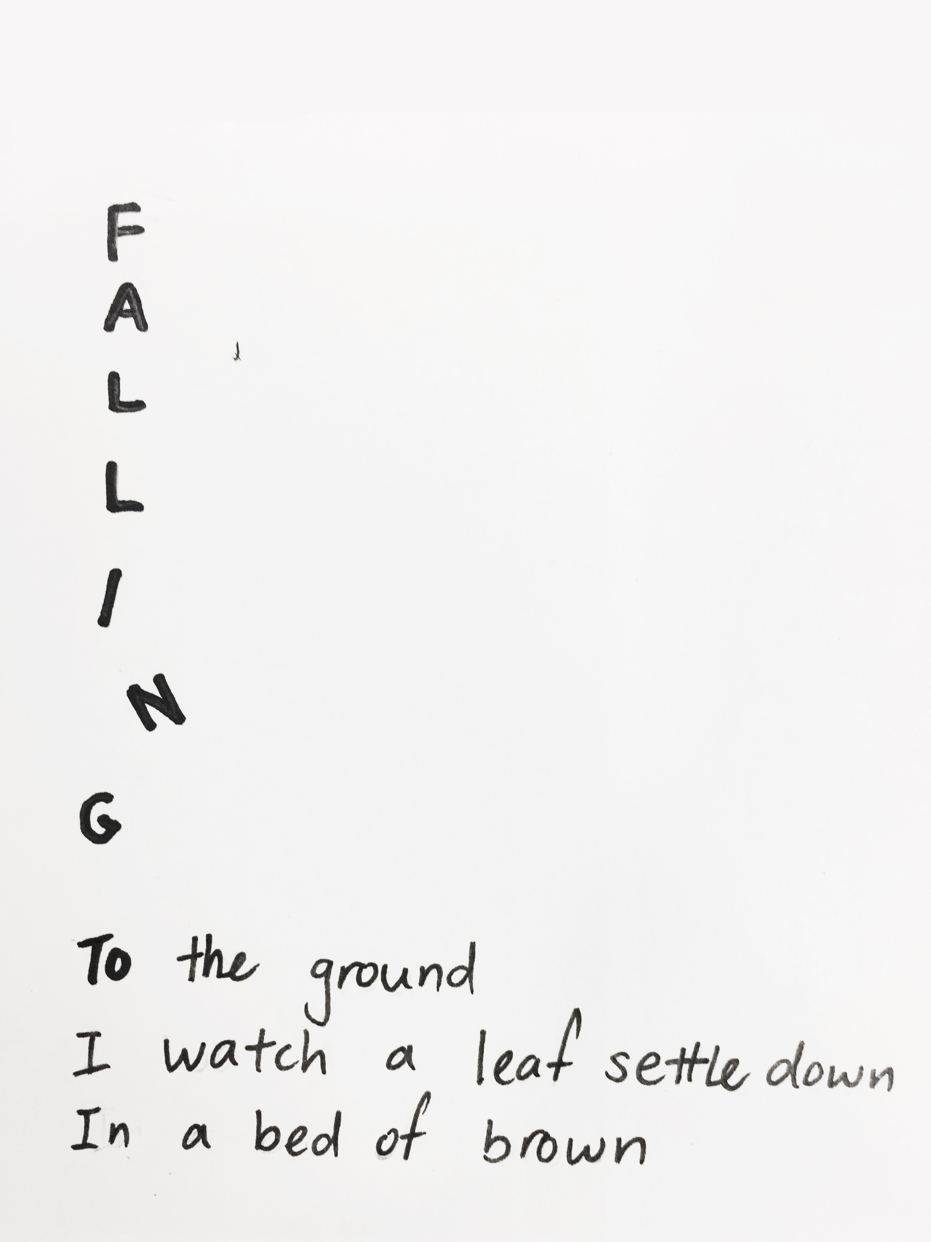
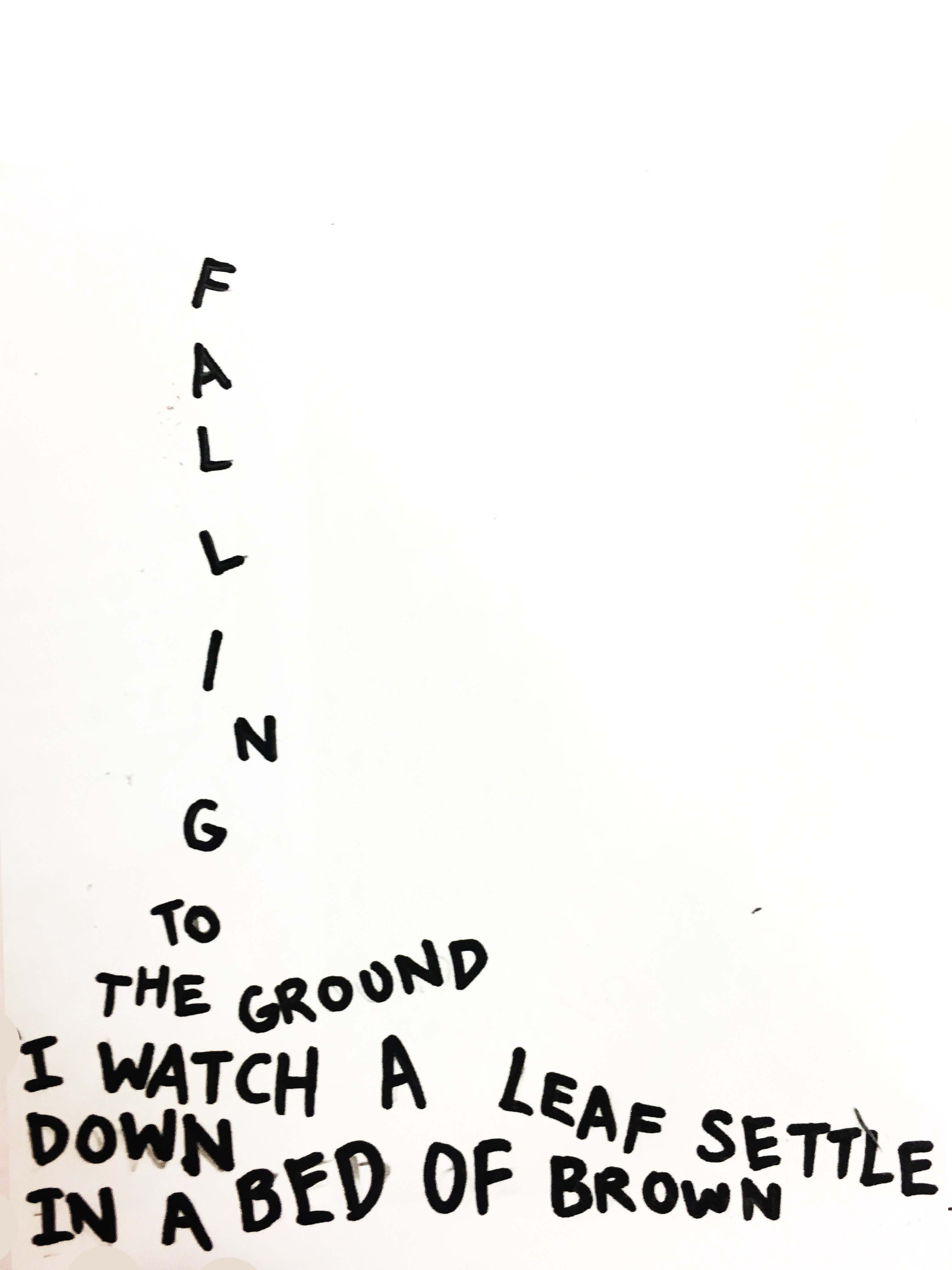
Sketches are in this post: https://oss.adm.ntu.edu.sg/kyong009/in-class-activity-haiku/ 

In Class Activity: Haiku

In Class Activity

5, 7, 5 Haiku: 
Falling to the ground
I watch a leaf settle down
In a bed of brown

01020304

Some thoughts:

Overall, this activity was interesting and enjoyable as we had to as though, made the haiku come to life through type. In the 4 designs, I had to consider factors such as scale, balance emphasis, harmony. Also, the 5, 7, 5 haiku had a number of words which was a challenge – which line should be emphasised or which ones should be scaled down? For the final piece, I chose the second one as I felt that the use of more negative space makes the “leaf” isolated and thus, was emphasized more. Also, the last line, “in a bed of brown”, was heavily bolded to suggests the ground and create harmony in the composition.