
A customised drop cap “A”.

A customised drop cap “A”.

Very very very basic menu using grids and tables. Lesson learnt: Do not use a baseline grid.
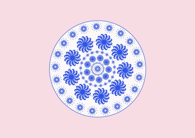
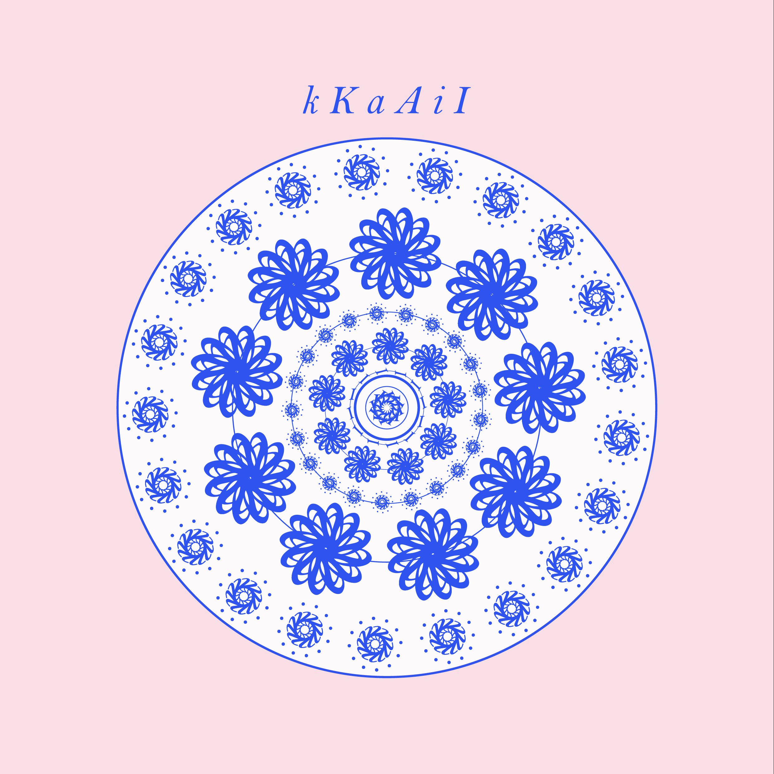
Letters used for this pattern: K, k, A, a, I, i


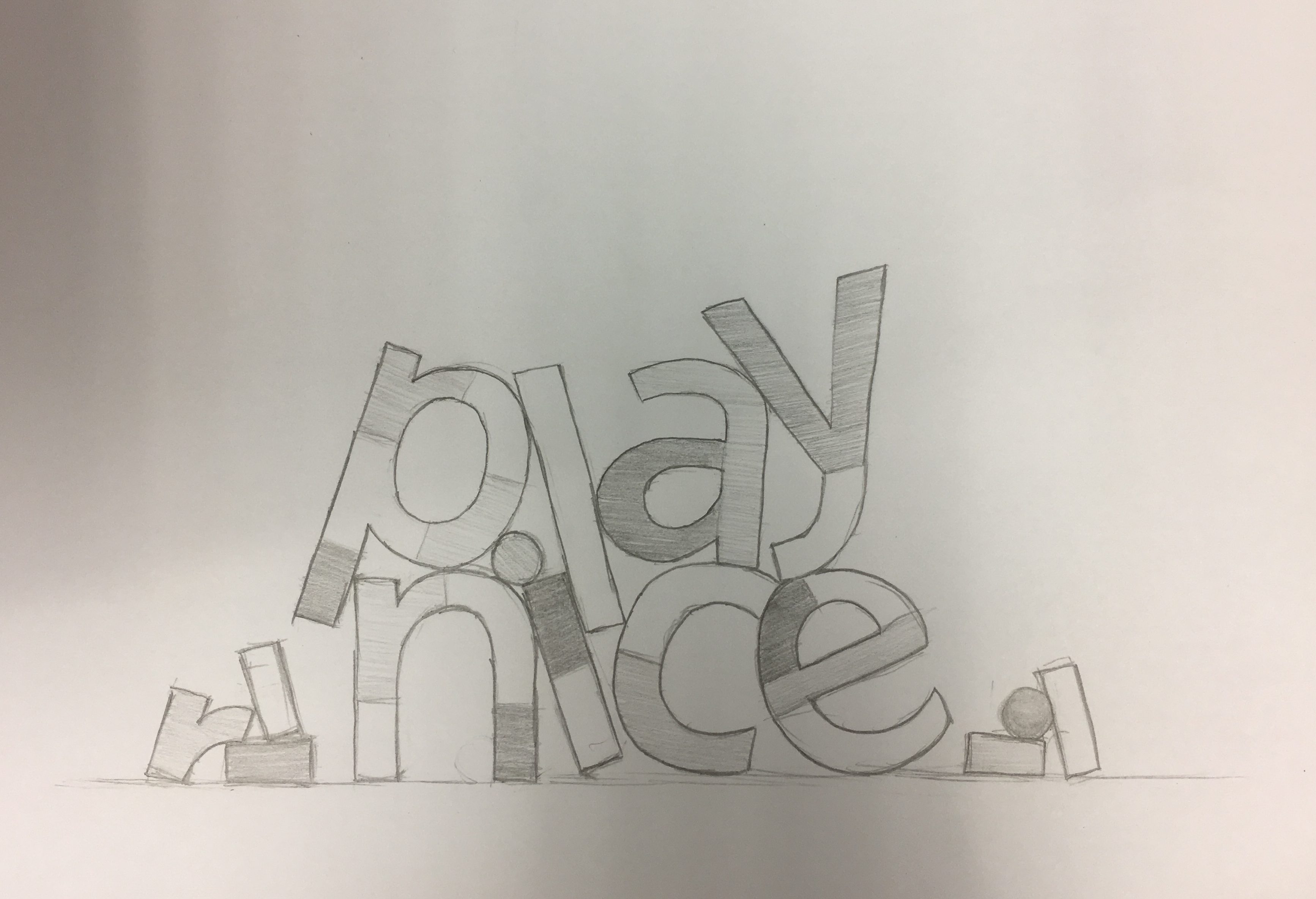

For this activity, I focused on adding a sense of movement to the word “play nice” by tilting the elements in the composition. The type was segmented to look like block pieces placed together, like a building brick/lego concept. Along with the triadic/tetradic colours, I wanted to suggest a sense of (nice) playfulness.

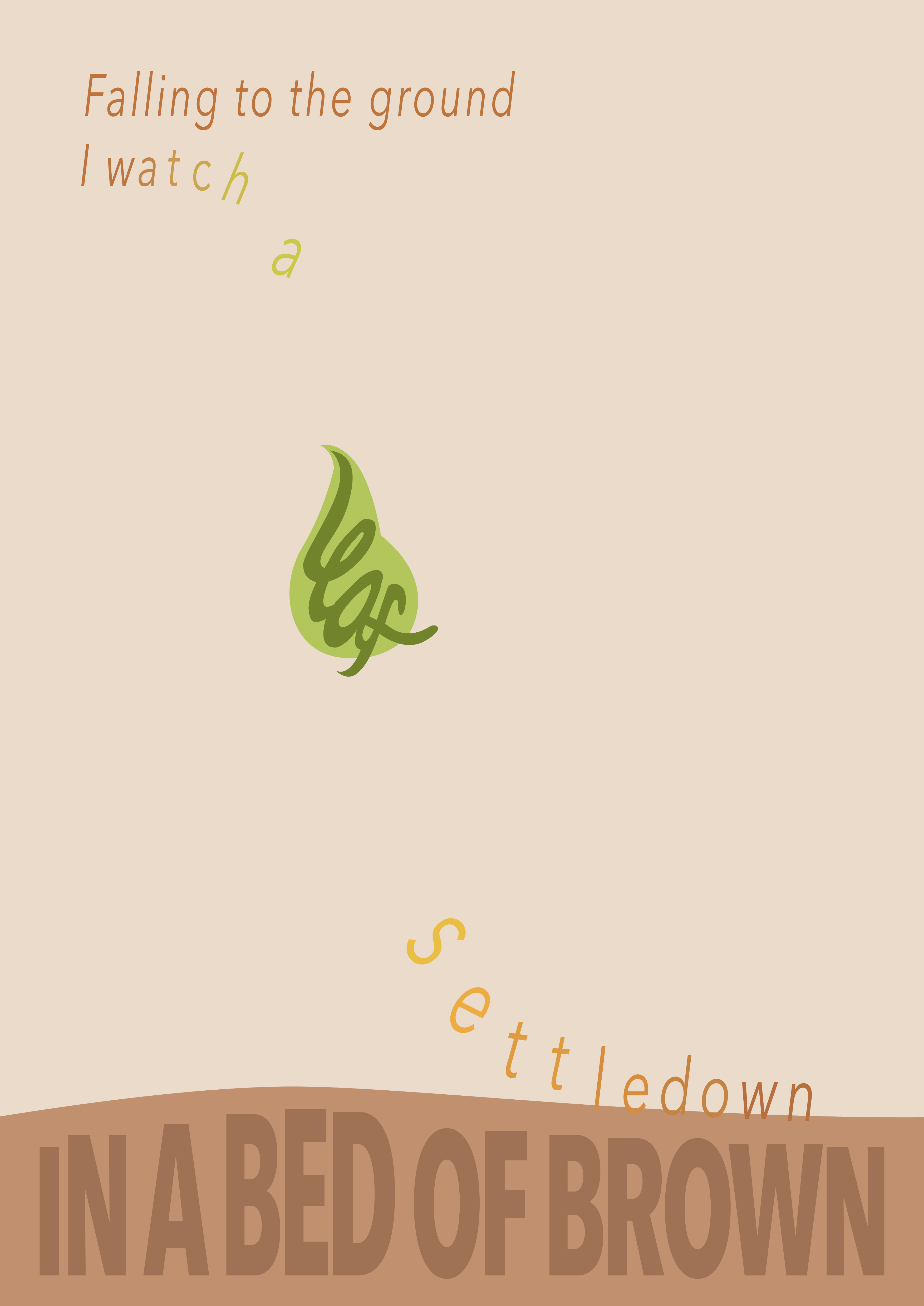
A digitalized version of my haiku.
I felt that my haiku is serene and soft, as words such as “settle down” suggests a gradually slow movement and peacefulness. Along with the feedback, I made the words flow downwards, which follows the falling leaf. I also chose an autumn/warm palette to compliment with the haiku. I mainly used one font, Avenir, but I varied the typefaces – bold for the ground, italics for the falling words. All in all, I could see the effects of variating typefaces and how it impacts a composition – how our focus is naturally drawn to bolder and bigger text, and how softness is subtly shown in italics and thin fonts. As such, it was fun to illustrate a haiku like this.
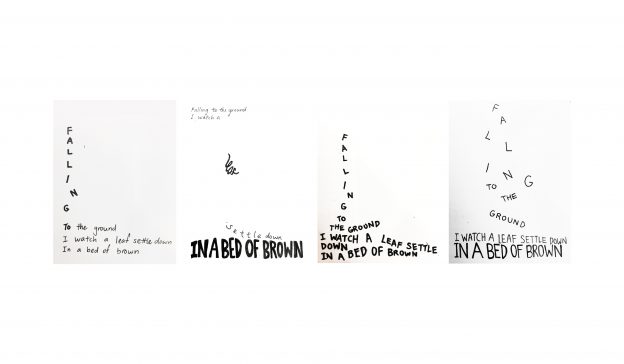
Sketches are in this post: https://oss.adm.ntu.edu.sg/kyong009/in-class-activity-haiku/
In Class Activity
5, 7, 5 Haiku:
Falling to the ground
I watch a leaf settle down
In a bed of brown
01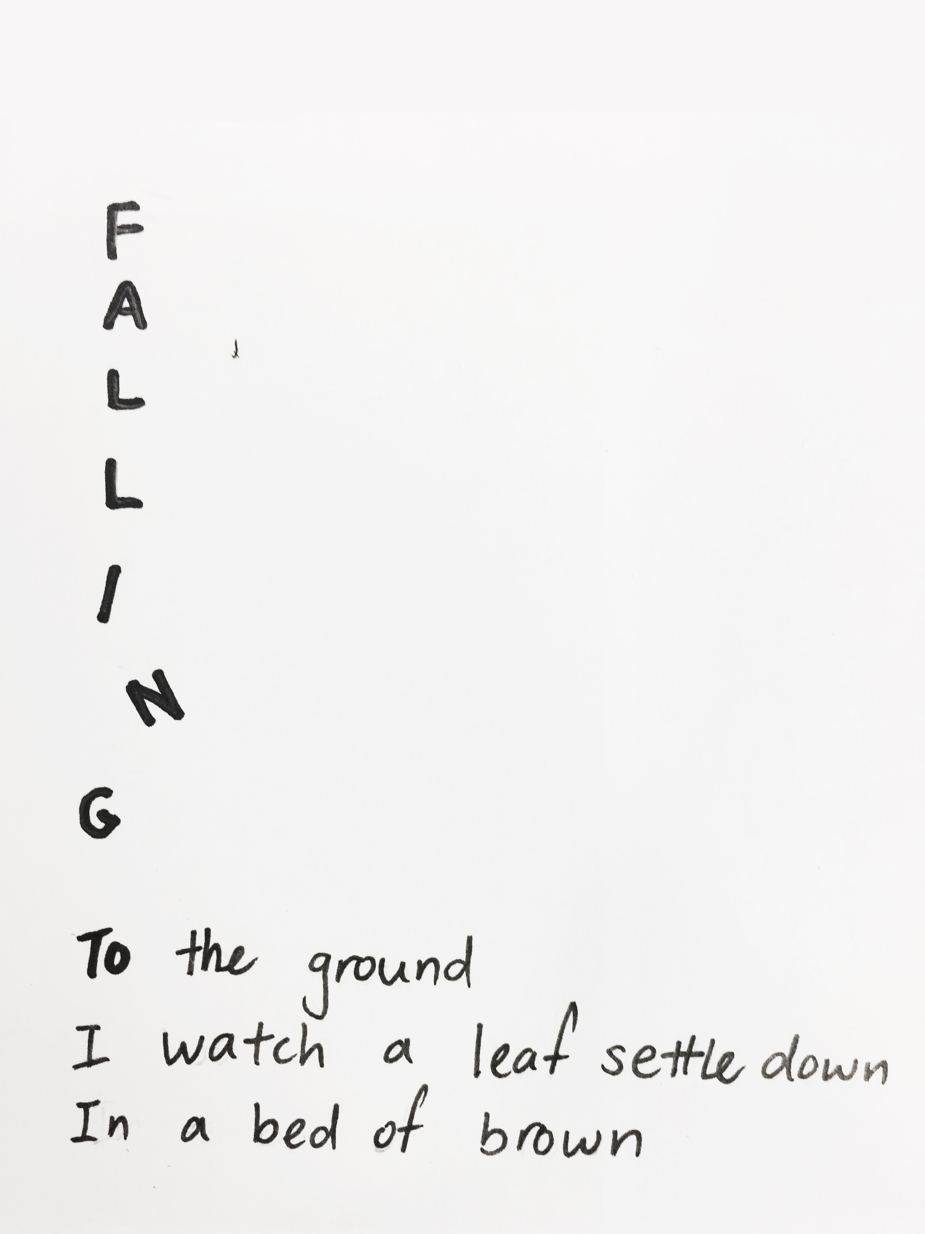 02
02 03
03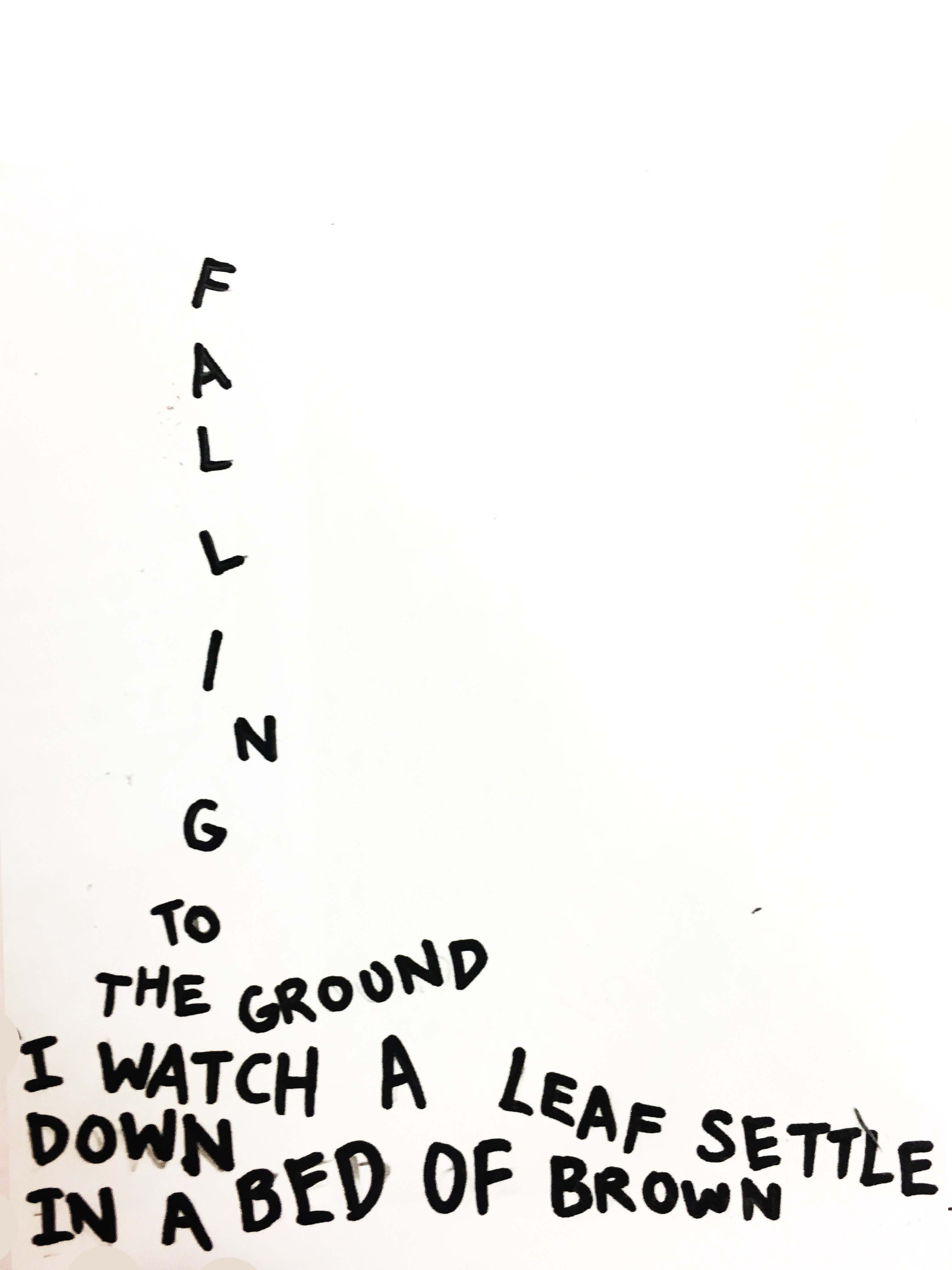 04
04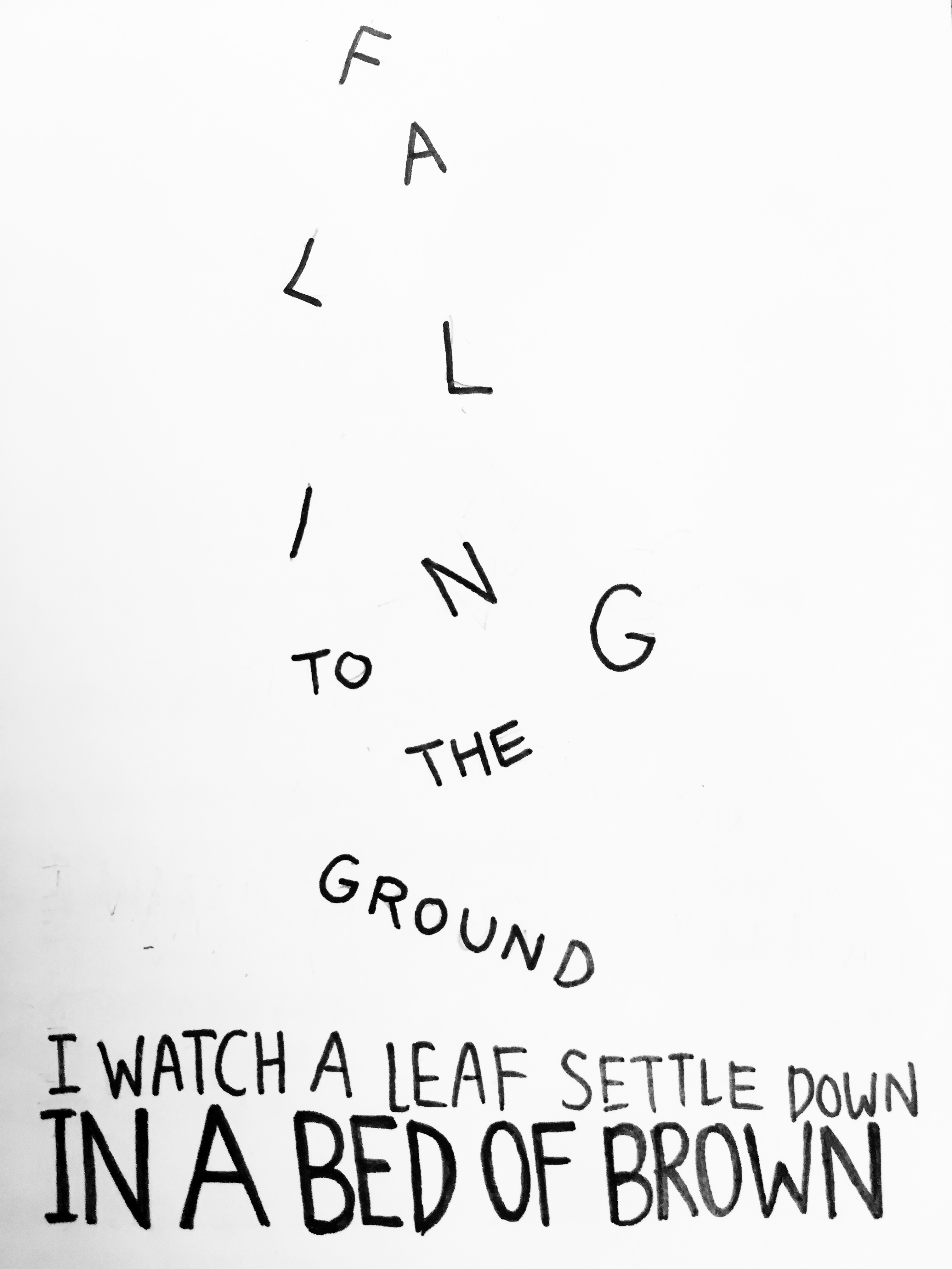
Some thoughts:
Overall, this activity was interesting and enjoyable as we had to as though, made the haiku come to life through type. In the 4 designs, I had to consider factors such as scale, balance emphasis, harmony. Also, the 5, 7, 5 haiku had a number of words which was a challenge – which line should be emphasised or which ones should be scaled down? For the final piece, I chose the second one as I felt that the use of more negative space makes the “leaf” isolated and thus, was emphasized more. Also, the last line, “in a bed of brown”, was heavily bolded to suggests the ground and create harmony in the composition.

In Class Activity
These are the vectorized sketches of the opposing pairs of words I chose from the list.
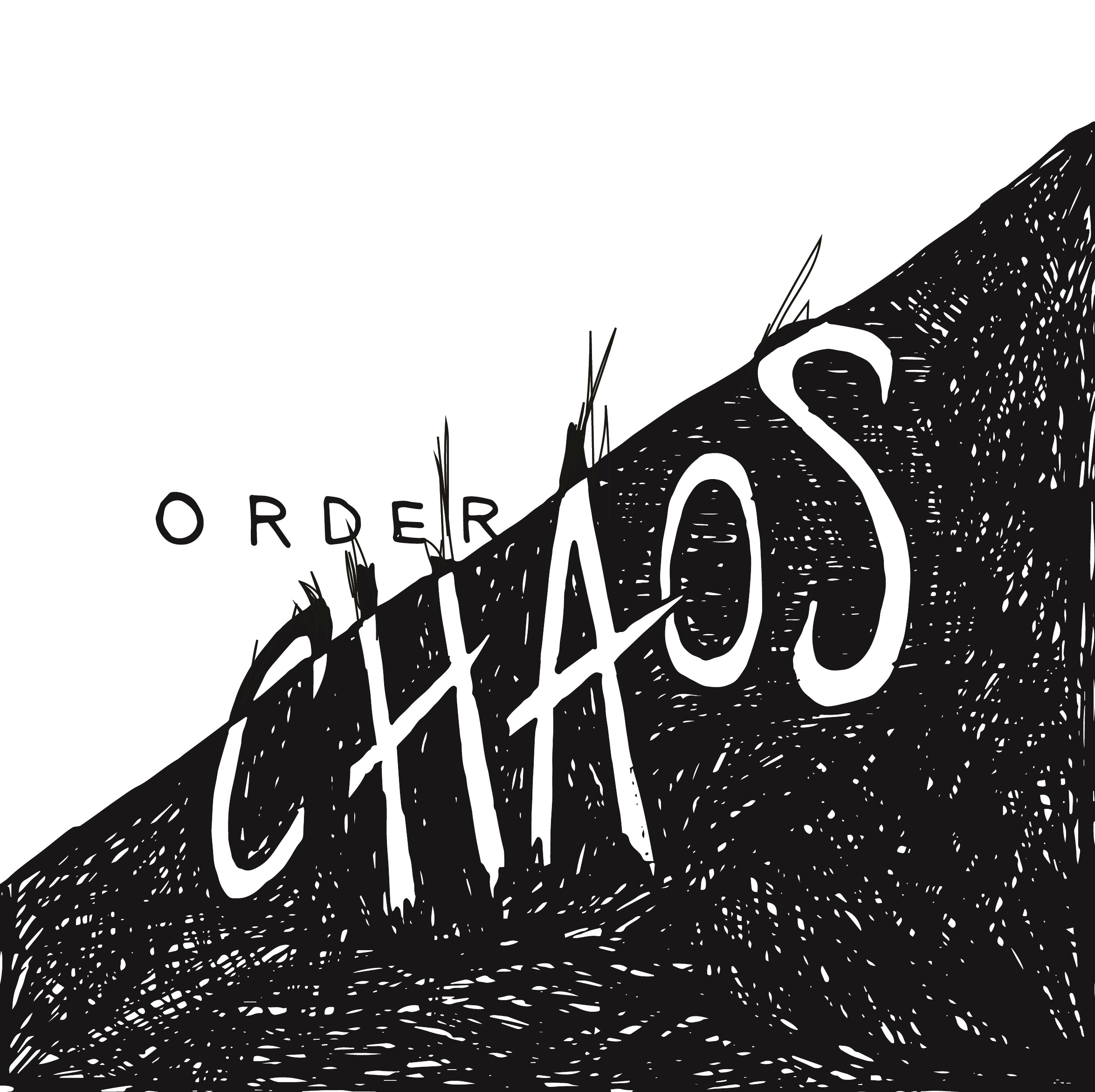
01. Order & Chaos
This is the final piece which I refined and chose for the class critique. In terms of design principles, I largely focused on balance in this piece. To give a sense of disorder and chaos, I disrupted the neatness of the white areas, with the black scribbles creeping into the other half of the canvas.

02. Fast and Slow
My this sketch, I mainly played with the strokes, varying the thickness to create a motion effect for fast. As for slow, I felt that blob-like, flowy lines were more suitable as it looks more organic rather that sharp.

03. Whimsical and Serious
This was my first sketch attempt out of the three. To show the juxtaposition of meanings, I used contrasting strokes, a curvy and italic type vs a sans serif bold type.
Some thoughts:
After the critique in class, I saw the variations of opposing words and there are certainly some words which are more difficult to express. With that being said, there were many clever type compositions which portrayed the opposing words well. For example, the “open and closed” one where letters from “open” were falling out of the letter O from closed. The examples really portrayed how placement and even scale could drastically change the dynamics of type.