Monthly Archives: March 2018

Micro-project 06: A Day in the Life of Super-Participation

In this project, my group (Myself, Melo, Bryan, Samantha and Nikki), were tasked to publish posts on Facebook during our recess week. Firstly, we did not set any rules but we agreed to start posting on Wednesday, 7 March, 8am for 24 hours.

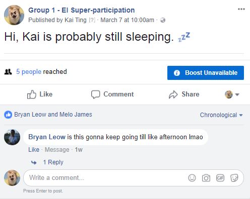
To be honest, at the start, I did not know what to post. And knowing that I slept late the night before, I used the schedule option to schedule my posts at 8-10am. And yupp, when I woke up at 10am,everyone was already active on the Facebook page, posting about their daily activities, what they had for breakfast and there I was, still on my bed.

As the day went by, I got the hang of posting more things. However, I tend to not share too personal information online as I fear being judged. Afterall, the internet can be a scary place. So, I posted things which I only felt comfortable sharing, some trivial, but mostly about my daily activities and probably things that interest me, such as food. Also, I realised that throughout the day, I tend to forget to post certain things when I am busy with work or occupied at the moment. Because of this, some of my posts are not posted in real-time but are lagging behind an hour or so.

This micro-project motivated me to explore my digital identity in just 24 hours. I realised that as I was influenced and obliged to post, there are certain aspects about me that would not change, such as the type of posts or my attitude towards social media and perception of myself while using an online platform. Yes, I might have great control over what I can post and can entirely fake an identity if I wanted to. But because this was a closed group and that we knew everyone we were sharing our posts to, we naturally let our guards down and be comfortable with our posted content. From here, it is evident that the type of audience who have access to my information played a vital role in my content posted.

It was also an interesting journey as I get to understand each other’s persona through what we share.
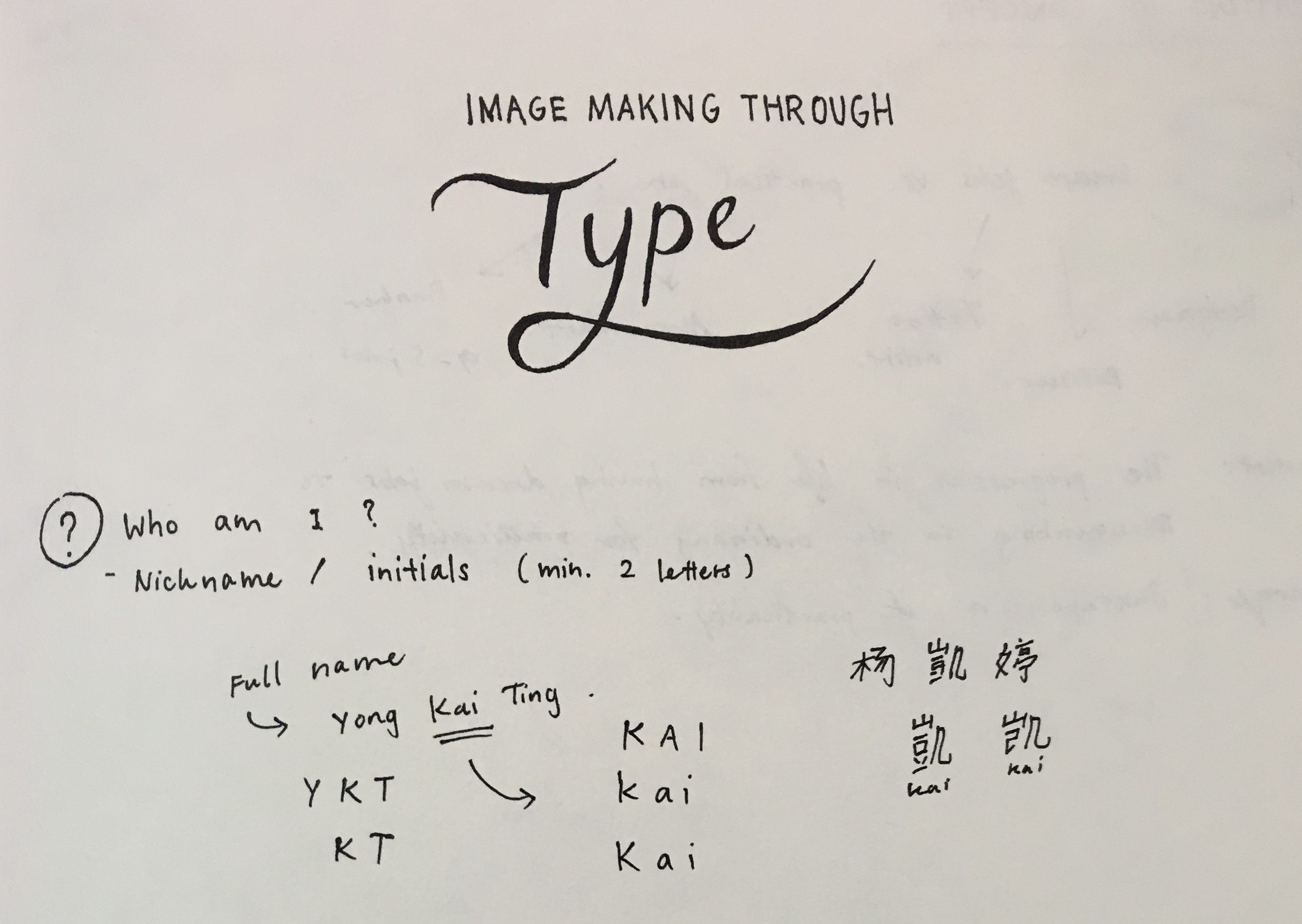
Kai; The Chill One

I, myself, was identified as a person who is very chill, and sleepy (literally, as I woke up the latest and scheduled posts while I was asleep). My posts later on in the day learn towards more of a chill and relaxed vibe. All of these are in fact true to my real personality.

Melo; The Meticulous

As for my group member, Melo, we concluded that she is a meticulous person when it comes to aesthetics. Her posts have to be edited before she can post it online. Perhaps, as a person who enjoys looking at aesthetically pleasing photos, she would do the same when it comes to her as well. Nowadays, online content can be extremely influential to a person.

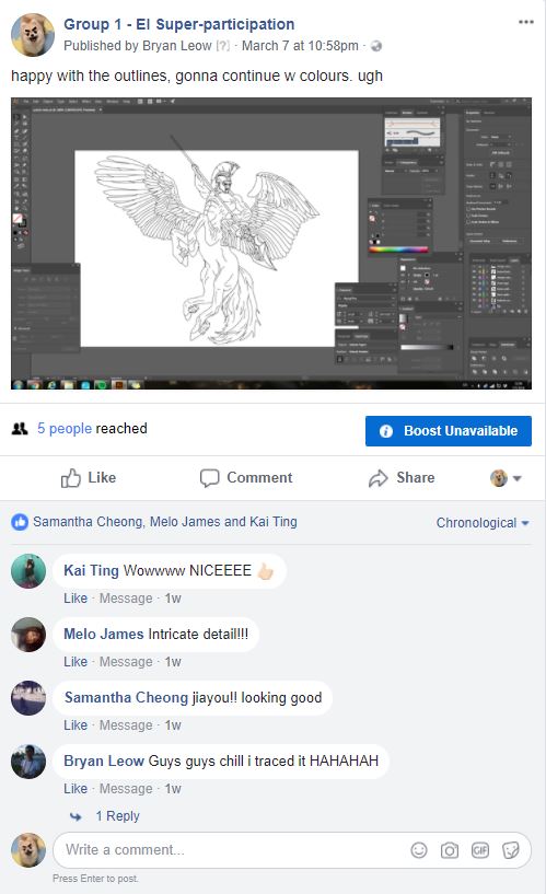
Bryan; The Workaholic

As for Bryan, we concluded that he was definitely the most hardworking group member out of all of us as he was already doing work early in the morning (while I was STILL asleep). Throughout the day, his photos about his work were posted consistently. To encourage one another, every one of us liked one another’s posts and gave nice comments – something which I felt, encompasses social media activities. “Likes”, “Favourites” and “Share”. All of these functions are extended ways we could express ourselves, rather than just words. This is also a unique aspect of online social media.

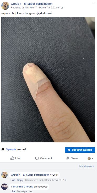
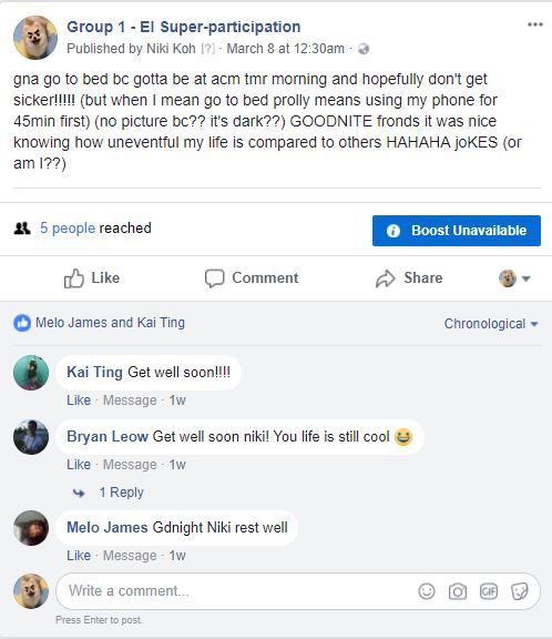
Niki; The “Trouble” Magnet

“Trouble” magnet not in terms of a bad way, by the way! Speaking of nice comments, what we remembered from Niki was that she was always in some sort of a “trouble” – whether if she was sick, or injured her finger. Mostly, we commented something encouraging, such as, “Get well soon!” etc.

Samantha; The Bubbly One

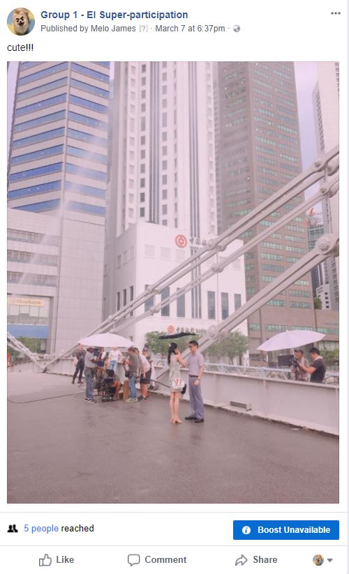
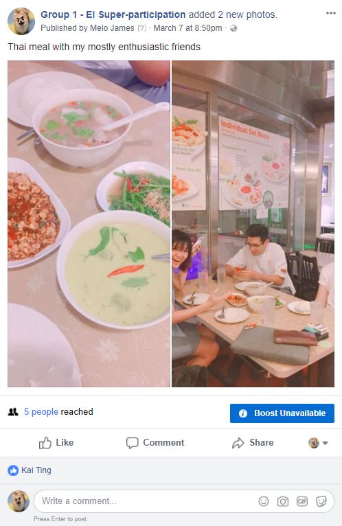
Lastly, as for Samantha, I felt that her posts were a mix of work and fun, like the video she posted of herself helping her friend to film. I also recalled that she posted a picture of food early in the morning and that definitely made me want to get breakfast too. The persona for her seemed to be a bubbly and active person.

Through super-participation in this micro-project, I have learnt that there are many intrinsic and extrinsic factors which influence the motivation of our actions on a social media platform. By analysing how we shape this online persona via our posts, we are able to uncover key behavioural insights from a person and indeed, we try to create a persona of how we want others to perceive us. However, in my opinion, there is a fine line between the degree of control we have; it all depends on the intent and aim. The example from Amalia Ulman proves us otherwise. Excellences & Perfections (2014), was an interesting example which displayed utmost control in creating a digital identity. It is a four month durational performance taking place directly on her personal Instagram. The artist fabricated a fictional character with the intention was to prove how easy an audience can be manipulated through the use of mainstream archetypes and characters they’ve seen before. Surely, no one went that far while creating a fake identity.

All in all, the exercise and the examples shown in class allowed me to see an array of personas and digital identify created (a range from actual self to perceived self).


Research Critique 3: Glitch & The Art of Destruction

For micro-project 5, my group’s (Myself, Bryan, Si Hui, Reuben and Ying Hui) concept revolved around capturing the destruction of art through performance art and media. First, we printed a photo of one of world’s most famous artwork – Mona Lisa by Leonardo Da vinci. This renaissance artwork is highly regarded, thus, belonging to the “high renaissance” period, a period of grandmasters with impeccable skills. Then, we set the printed photo of the painting on fire and recorded it.

The art of destruction. The destruction of art.

By burning this artwork down to ashes, we wanted to bring about the notion of seeing the destruction of art as a form of art. We “embrace accidents”, or even, we create them.

One may see it as literally destroying art, but the element of deconstruction in the destruction process was that we wanted to highlight. We wanted to highlight that destruction could even be in something which everyone admired and thought highly of. We also wanted to show a deviation from the norms of “art”. As art is usually thought of as classy and placed in a museum, or even a bulletproof glass (for the Mona Lisa), we wanted to rebel against this perfectionist mindset. Instead of cutting or tearing the paper apart, we decided to burn it to create a duration-based artwork; a performance which the audience could watch us burn the picture. Through this, the Mona Lisa transforms from a static piece of artwork into something new, such as an experience or a performance.

As a performance art, the deterioration of the artwork, from paper to ashes, creates a new quality through the destruction. Media Burn by the Ant Farm from the Interview with Chip Lord is a great example of such artworks, where it “exemplifies fascination with the automobile and television as cultural artifacts through looking at the impact of mass media in American culture.” It was their bold act which brought about their statement uniquely and in a new light. And what we challenge here, with our artwork, is to see beyond the act of “destroying” a beautiful piece of artwork. Instead, looking at the destruction in a whole new way and to defy the rules of art.

As mentioned in  Menkman, R. (2009) “Glitch Studies Manifesto”, “Glitch art is often about relaying the membrane of the normal, to create a new protocol after shattering an earlier one. The perfect glitch shows how destruction can change into the creation of something original.” With this, we wanted to set the world’s most famous painting on fire; a statement of defying the general rules of art. Thus, by shifting this perspective at how we look at destruction, it is the start of creating something original as the mass audience are used to looking at funnelled out content from the media.

Another example mentioned by Lei was Ai Wei Wei’s, dropping a Han Dynasty Urn (1995), where Ai dropped an authentic antiquity. He was thinking about the themes of transformation and destruction. He embarked on collecting ancient vessels with the aim of converting them into contemporary art pieces. This is my first time coming across this piece and I found it really interesting how this artwork considered a form of consumer culture and heritage preservation.

Lastly, In Randall Packer’s Conversation with Jon Cates (2014) Hyperallergic , Cates mentioned, “there is a poetic embrace of noise and error.” and the whole geist of learning about glitch is as what he mentioned. Through the previous project where we created glitch and the most recent one, the art of destruction, it has brought me to rethink about “aesthetics”. Both glitch and destruction are artistic expressions which embrace flaws and errors. In my opinion, the element of deconstruction is what makes these glitches and destruction something way more than it is. Glitch is just more than just dead/flawed pixels or destructed matter, the beauty of it is that, it could be organic glitches, such as glitches during performances. As we commonly associate glitches with the errors we see on screen and technical errors, this case of demonstrating glitch through performance art brought out the flexibility of glitch art as it can be, very organic, occuring during a live performance as well.


Micro-Project 5: The Art Of Destruction

For micro-project 5, my group’s (Myself, Bryan, Si Hui, Reuben and Ying Hui) concept revolved around capturing the destruction of art through performance art and media. First, we printed a photo of one of world’s most famous artwork – Mona Lisa by Leonardo Da vinci. This renaissance artwork is highly regarded, thus, belonging to the “high renaissance” period, a period of grandmasters with impeccable skills. Then, we set the printed photo of the painting on fire and recorded it.

The art of destruction. The destruction of art.

By burning this artwork down to ashes, we wanted to bring about the notion of seeing the destruction of art as a form of art. We “embrace accidents”, or even, we create them.

One may see it as literally destroying art, but the element of deconstruction in the destruction process was that we wanted to highlight. We wanted to highlight that destruction could even be in something which everyone admired and thought highly of. We also wanted to show a deviation from the norms of “art”. As art is usually thought of as classy and placed in a museum, or even a bulletproof glass (for the Mona Lisa), we wanted to rebel against this perfectionist mindset. Instead of cutting or tearing the paper apart, we decided to burn it to create a duration-based artwork; a performance which the audience could watch us burn the picture. Through this, the Mona Lisa transforms from a static piece of artwork into something new, such as an experience or a performance.

The outcome of the artwork surprised me a little as the ashes looked different from what I normally see. (Lei says that it is brown because of the carbon).


01 Image Making Through Type: Final

Here’s the final outcome of project 1!

To view the design process and research, you can click on the links below:

01 Image Making Through Type: Artist Research

01 Image Making Through Type: Ideation and Process

01 Image Making Through Type: Final (this post)


THE JOURNEY OF DREAM JOBS

Tone: Positive

Sometimes, dream jobs are seemingly impossible due to constrictions and practicality. Nonetheless, going through this identity crisis of being conflicted with what we want is mandatory to find ourselves; in hopes that everything will eventually work out.


THE PATISSIER


In this design, I selected “K” and “T” as my initials. The letterform is mostly incorporated into objects of greater significance, such as, the cracked plate and plastic utensils made for kids.

Due to the angularity of both letterforms, I felt that it is more appropriate to deliberately incorporate them into those objects. As for the choice of case, “K” and “T” had not much of a difference but I went ahead with an upper case “K” and lower case “T” to make the placement of objects more natural. I used counter spaces/positive and negative spaces as form for the letter “K”.


THE ARCHITECT


Atavistic Vestiges After the Rain (1934) by Salvador Dali

In my second design, my creation of an “impossible architecture” was greatly inspired by Salvador Dali’s paintings, which consists of organic shapes. I chose the upper case “K” and lower case “T” in this design. As my letterforms were incorporated into the sticks at the bottom of the structure, to look as though it is barely supporting it, the angularity of both “K” and “T” had helped formed the shape easily. If these letters were curvy instead, the end results would differ quite a bit.

I also used the symmetrical properties of these selected letterforms to create a reflection which says “Kt”. This also ties in with my concept of being in someone else’s shadow as I am blindly following someone else’s dream.


THE TATTOO ARTIST


For this piece, I illustrated a mix of line drawings, a reference from line art tattoos, and vectors. By using contrasting styles, I wanted to portray this dream job as something far from reality and unattainable.

Inspired by Ukiyo-e prints, I used more organic shapes to create my vectors and letterforms. My letterforms, as seen in the red patch of blood and the chain, represents the cultural constrictions this job has. The chain, made using a pattern brush, signifies the constrictions, as though the tattoo artist’s hands are restricted.  By using a pattern brush, it helps to make an angular letterform more organic and natural. For the letter “K”, I played with the boldness/thickness of the letterform as it is an organic shape.


THE PACKAGING DESIGNER


This piece was inspired by the memphis art style. It adopts a great a sense of movement it in as I wanted to this piece to look fun and quirky.  I particularly picked candies as objects to be packaged as I wanted a similar motif which links to my first dream job – the patissier. The positive message from this is that things will eventually work out and this “Journey of Dream Jobs” is something mandatory so that we are able to find ourselves. Thus, reminding us that even though we might not be able to have that “ridiculous” job we wanted when we were young, it does not mean that you cant work your way around it and do something within your interests.

The letterforms, portrayed in the ribbons, started off looking geometrical. After a few versions, I decided to make the letter “K” look more organic and that it follows the curves of the ribbons which wraps around the box nicely. Altogether, I really wanted to capture the moment of having a job you love; although messy with the tapes still around, it is still bursting with joy and excitement.


Some comments from Joy and my peers:

  • colour choices were great and appealing
  • nice narrative and vector style
  • maybe centralise certain letterforms
  • 1st and last composition could have been less distracting
  • 2nd composition is good

I had met several challenges while doing this project. Firstly, incorporating the letterforms with consideration was tougher than I thought as I tend to lean towards a more illustrative way to express myself rather than in typography. I also struggled with trying to make the letterform more visible as initially, it was subtle and small in size. All in all, I enjoyed this project as I have learnt many useful illustrating techniques and also learnt about the properties of a letterform on a deeper level.

01 Image Making Through Type: Ideation and Process

IDEATION

I began my ideation with the basics,

“My name is…”

I wrote down as many variations of my name, which I felt that will be helpful later on, when I have to decide which name/initials will be more suitable for my letter form.

Concept (process):
As we have to come up with 4 different designs, I felt that maybe I could link them up and tell a story. I started with looking into my dream jobs and these are some jobs which I listed out:

Architect
Interior designer
Packaging designer
Brand identity designer
UIUX/User experience designer
Goldsmith/jeweller (jewel crafter)
Pastry chef/pâtissier
Tattoo artist
Spiritual healer (shaman/witch/enchanter)  
Fragrance chemist (Alchemist)
Adventurer


Eventually, I narrowed down the list and got my 4 jobs.

The Journey of Dream Jobs
Tone: Positive
Message: Sometimes, dream jobs are seemingly impossible due to constrictions and practicality. Nonetheless, going through this identity crisis of being conflicted with what we want is mandatory to find ourselves; in hopes that everything will eventually work out.


In chronological order,

Patissier
Architect
Tattoo artist
Packaging designer


As this project was to incorporate the letterform which reflects a particular job, I found these examples really interesting and useful: how they managed to visualise both letterforms and shapes and make sense out of it.


Chineasy by ShaoLan Hsueh


Moonshine poster by Jon Klassen


Mariano Pascual’s 36 Days of Type (click to see the rest)

36 Days of Type by Shiffa


PROCESS

PATISSIER


To show this impossible dream of mine, I portrayed a dessert to be pretty-looking on the outside and disgusting on the inside.

Initially, I wanted to use solely complementary colours but subsequently, I felt that it was lacking colours and vibrancy.

Also, in the composition with the green background, my letterforms were incorporated into the reflection of the slime (k a i). However, after consultations, Joy mentioned that the letterforms could be incorporated into something more significant to my story/dream job.

So, I have made some changes, like the colours used. I included a range of analogous colours instead. The letterform, K, is in a form of the crack seen on the plate instead: showing how impossible this dream is and that is a bad choice for me to do so.

As compared to the letterforms in the slime, I found it slightly easier to incorporate the letter K as a crack as it is angular. Whereas, the slime took on an organic shape and fitting angular letterforms would cause it to warp even further, losing their readability.

ARCHITECT


I was Inspired by Zaha Hadid, an Iraqi-British architect. Known as the “Queen of Curves”, her architecture style is advanced and sleek.


In this design, I wanted to illustrate impossible architecture through exaggerating the structure and subtracting the basics of what makes a building foundationally sound and strong. In my sketches, I tried creating this structure using geometrical and organic shapes, or a mix of both. Depending on my choice, the letterforms chosen varies. My initials, “KT”, as compared to “KAI” seemed more appropriate as the angularity of it is an advantage. The letterforms are illustrated as sticks which are trying to support the structure but from consultations, Joy suggested to make this structure look “even more impossible”.

For the last design, I added texture to it so that it looks more dynamic.

TATTOO ARTIST


Inspired by the Ukiyo-e art movement, I wanted to design something which reflected a rebellious phase of mine, and also the practicality of being a tattoo artist due to cultural constrictions. I started off experimenting with the neon-sign look as it reminds of shady places that bad and messed up people visit. Also, the tattoo artist is drawn in lines, unlike the person getting tattooed, as it represents this dream job of mine does not even exist at all; an impossible vision.

However, I couldn’t think of how should my letterforms be in this composition as the line work illustrations are a little distracting.

In the last picture, I experimented with the brush tool that I have learnt in class. Instead of illustrating the chain manually, I made a pattern brush, using chains. Most probably, I would include this chain element in my letterform as it represents the cultural restrictions of being a tattoo artist.

PACKAGING DESIGNER


Memphis artist, Peter Judson,
with his vivid isometric illustrations.


In my final design, I played with basic shapes as I was inspired by memphis art style. By utilising this art style, I felt that the placement of elements and colours used played a great part in creating a dynamic composition; one that looks playful and joyful.

References

https://www.behance.net/gallery/16735099/36-Days-of-Type
http://www.mariano-pascual.com/36-Days-of-type
http://www.nathanfowkesart.com/
https://www.kickstarter.com/projects/shaolanchineasy/chineasy-begins-
https://www.pinterest.com/pin/192599321539037000/
https://www.pinterest.com/pin/463378249133358484/

01 Image Making Through Type: Artist Research

After the lectures and my classmate’s presentations, I went to research more about some art movements and key artists in that movement.

RUSSIAN CONSTRUCTIVISM/SUPREMATISM

Kazimir Malevich (1879- 1935) is a Russian Avant-garde artist, a Russian painter, sculptor and art theoretician. He was a pioneer of geometric abstract art and the originator of the Avant-garde Suprematist movement. Malevich worked in a variety of styles, but his most important and famous works concentrated on the exploration of pure geometric forms (squares, triangles, and circles) and their relationships to each other and within the pictorial space.

Ilya Chashnik (1902-1929), a Russian suprematist, has a similar style to Malevich, which I really love. As this project’s aim was to create an image while incorporating letterforms, I thought it would be appropriate to extend my research to these art styles which used basic shapes in their composition.


Aeroplane Flying (1915) by Malevich , Suprematistische Komposition (1920–1922) by Ilya Chashnik 

Another notable artist is El Lissitzky (1890-1941), a Russian artist, designer, photographer, typographer, polemicist and architect. He was a key figure of the Russian avant-garde, who designed numerous exhibition displays and propaganda works for the Soviet Union and greatly influenced the Bauhaus and constructivist movements.

Part of the Show Machinery (1923) El Lissitzky 

Globetrotter (in Time) (1923) by El Lissitzky 

ART NOUVEAU

Alphonse Mucha (1860-1939), was a Czech Art Nouveau painter and decorative artist, known best for his distinct style. He produced many paintings, illustrations, advertisements, postcards, and designs. His style is known to be rich in natural forms and decorative.

Mucha’s style and those of the Russian Constructivism and Suprematism are unlike and opposing; one focuses on purely basic shapes whereas the other, embraces the organic form of shapes and pushes them further, creating stunningly beautiful paintings.


Job Cigarette Papers (1896) by Alphonse Mucha

UKIYO-E

Ukiyo-e means “Pictures of the Floating World” and this art movement refers to a style of Japanese woodblock print and painting from the Edo period (1639–1858) depicting famous theater actors, beautiful courtesans, city life, travel in romantic landscapes, and erotic scenes. As Japanese art flourished from the 17th to 19th century, Japonism, the study of Japanese art and artistic talent, affected fine arts, sculpture, architecture, performing arts and decorative arts throughout Western culture. Early impressionist, such as van Gogh, was influenced by Ukiyo-e.


Onoe Eisaburo I, Toyokuni, c. 1800


Princess Takiyasha Summons a Skeleton Spectre to Frighten Mitsukuni, Kuniyoshi, c. 1844


Portrait of Père Tanguy (1887) by Vincent van Gogh

Ukiyo-e is an interesting art movement to learn about, especially its power of influence. Overall, these are the art movements which were key to understanding and appreciating how these artists incorporate thought in shapes, forms, colours and even culture.

References

https://www.moma.org/collection/works/7926
http://www.tate.org.uk/art/artists/el-lissitzky-1519
http://www.artnet.com/WebServices/images/ll00067lld8FTGFgoSECfDrCWQFHPKcQFPC/ilya-chashnik-suprematistische-komposition.jpg
https://commons.wikimedia.org/wiki/File:Alphonse_Mucha_-_Job_Cigarettes_1.jpg
https://en.wikipedia.org/wiki/Ukiyo-e