
A customised drop cap “A”.

A customised drop cap “A”.

Very very very basic menu using grids and tables. Lesson learnt: Do not use a baseline grid.

PROCESS
Artist references


Mitsuo Katsui


Giulio Confalonieri

Heinz Kröhl — Kinderverkehrsgarten (1962)

Letterpress & Wood Type Series Published by Maan Ali

Giovedi poster (via Pinterest)
For most of the posters, I found repetition a key design element which made the poster even more dynamic – giving a sense of movement and for some, creating beautiful patterns. I came across Mitsuo Katsui’s works and found it extremely unique and dynamic. I think the colours are extremely beautiful with the opacities but sadly, I wont be working with that many colours. Nonetheless, the overlapping opacities created a psychedelic effect which I really love and would try it out in my posters.
As for my quotes, I have chosen the following 3:
1.
Are you drunk?
No, I’m not?
But I think you’re drunk, you look like you are drunk.
No, I’m just standing here.
2.
How much are you left with?
$40.
Didn’t you get your pay 2 days ago? Where did your money go?
Honestly, I don’t know, it just disappear like magic.
3.
I always come here and eat the prawn mee. The soup is damn good but sometimes it can be quite inconsistent.
SKETCHES
Here are some sketches which I drew which helped me to visualise my layout and which design element I wanted to portray – whether it as hierarchy, balance, scale, repetition, symmetry. I tried using repetition, cropping and tilting some text to create my compositions.


DRAFTS
These are the drafts which I tried to use different design elements – cropping, repetition, scale, emphasis. I also played with varying opacities for many of my posters and I feel that that repetition makes a really nice pattern. At the same time, the word which I want to bring focus to can be at the highest opacity. With this, I think it places emphasis on the word which I want it to, yet the repetition of low opacity words make a nice pattern, do not steal the main focus and also leads the viewers’ eyes to the rest of the words in the sentence.


Some feedback:
– Margins could be wider, more negative space
– inconsistent looks too consistent
– maybe could add 1 more colour to the b/w posters
Final posters

Lastly, I think in all the posters, the hierarchy and emphasis is extremely important for all as there are a couple of words in the quote. Thus, the decision to emphasize on certain word/words is crucial to keep a good hierarchy for the viewers as they look at the posters.

“Fonts turn words into stories”
Hyndman’s impactful storytelling with 15 different fonts epitomised her words.

All the examples of how a font is able to tell a story.
Many times, type communicates with our subconscious. Although we might not look into every detail around us, we are subconsciously paying attention to type around us. They communicate to us through their forms. Hyndman did an interesting experiment, where she gave 100 people 2 jelly beans, one with round edges type and other with sharp edges. The results have shown that the rounder typeface made the audience think that what they ate was sweeter, whereas, the other one, more sour. It is all in our heads, that type conveys certain emotions and characteristics to us. I also enjoyed other examples, like how she used 15 different typefaces for “story” to tell a story, which I found was impactful and straightforward. Understanding which type of typeface to use will get your message and story across stronger, and I hope that it will be something that I will be better in with time.
Her TEDtalk has also reminded me of a book, Brandwashed, by Martin Lindstrom. In the book, it explains how we as consumers get manipulated by all the products that we see and even use, hence, being “Brandwashed” by them. And I do agree with Hyndman that even if we know the many ways in which brands brainwash us, and yet, we will still fall for their gimmicks.
In relation to the new project, I think Hyndman’s approach to typography, bringing the characteristics of the typeface out to tell a story, would be extremely helpful in expressing different characteristics of the archetypes.
References:

Erik Spiekermann is an author, information designer and typographer. Spiekermann is an influential individual in the typography industry, creating several typefaces such as, FF Meta and ITC Officina, which are considered as classics until today.

In his video, he elaborates more on his take on fonts. Many of Spiekermann’s font choices or even creations have to serve its function of being readable. For instance, fonts used on screen and displays, fonts used on newspaper (with bad quality paper) and even fonts used on glossy paper, all has its purpose in relation to where it is being viewed or printed on.
To him, brand = function. Having to design many specific typefaces for brands and companies, such as Bosch and Nokia, a typeface accentuates a brand’s character. He designed Nokia’s typeface in 2001, seen on the handphones produced back then. However, Nokia claimed that the typeface had ‘too much character’ for its brand. Spiekermann rebuts, “It’s BRAND, not BLAND.” He also redesigned many web interfaces and apps for brands. He highlighted that typography can be used to brand a brand. Eg, Volkswagen is branded by Futura and their blue colour. He applies this to his works as well, achieving brand consistency and giving a sense of identity to the website or application.

Redbull Music Academy App.
Overall, it is interesting to see how many typographers of the week were more focused with logos, brand identity and even collaterals. From this week’s typographer of the week, Erik Spiekermann, I’ve definitely learned more about how typography and digital interfaces can work together to create a stronger and impressionable brand identity.
References:
https://spiekermann.com/en/

Jonathan Barnbrook is one of the most celebrated graphic designer and typographer in the industry. He has created countless works for influential people – Stanley Kubrick and David Bowie.


Somerset House: Daydreaming with Stanley Kubrick by Jonathan Barnbrook (Photo: Barnbrook.net)
An exhibition that features many works from artists inspired by the master filmmaker, Stanley Kubrick. Personally, I love how the entire identity of the exhibition is consistent, sleek yet dreamy. Barnbrook mentions, that typography provides a tone for the text. He says, “The reason why I want to continue to draw letterforms and typefaces is because I want to speak in a voice that has never been spoken before.” Barnbook has been experimental with many of his works, creating unique and interesting works with graphic design and typography.


Album cover for David Bowie’s final album by Jonathan Barnbrook (Photo: Barnbrook.net)
With that being said, his personal website has many works considered as experimental, less corporate and even satirical. Created for “Tomorrow’s Truth” an exhibition of Jonathan Barnbrook’s political work in South Korea in 2004 at Seoul Art Center. These works use a much simplified form to mix consumerist pop imagery of the west with the classic stalinist propaganda of North Korea (Barnbrook, 2004).
Like mentioned, Barnbrook emphasised on providing a tone for a text and it is interesting how he manages to create graphics of different tones as well. As designers, I think we have our own styles, which might be experimental and unique – one that might not fit a corporate branding/identity. But from Barnbrook, something which I have learnt is knowing when to use a certain tone to provide that important message to convey as a brand.


References:
https://www.itsnicethat.com/features/review-of-the-year-2016-graphic-design-jonathan-barnbrook-151216

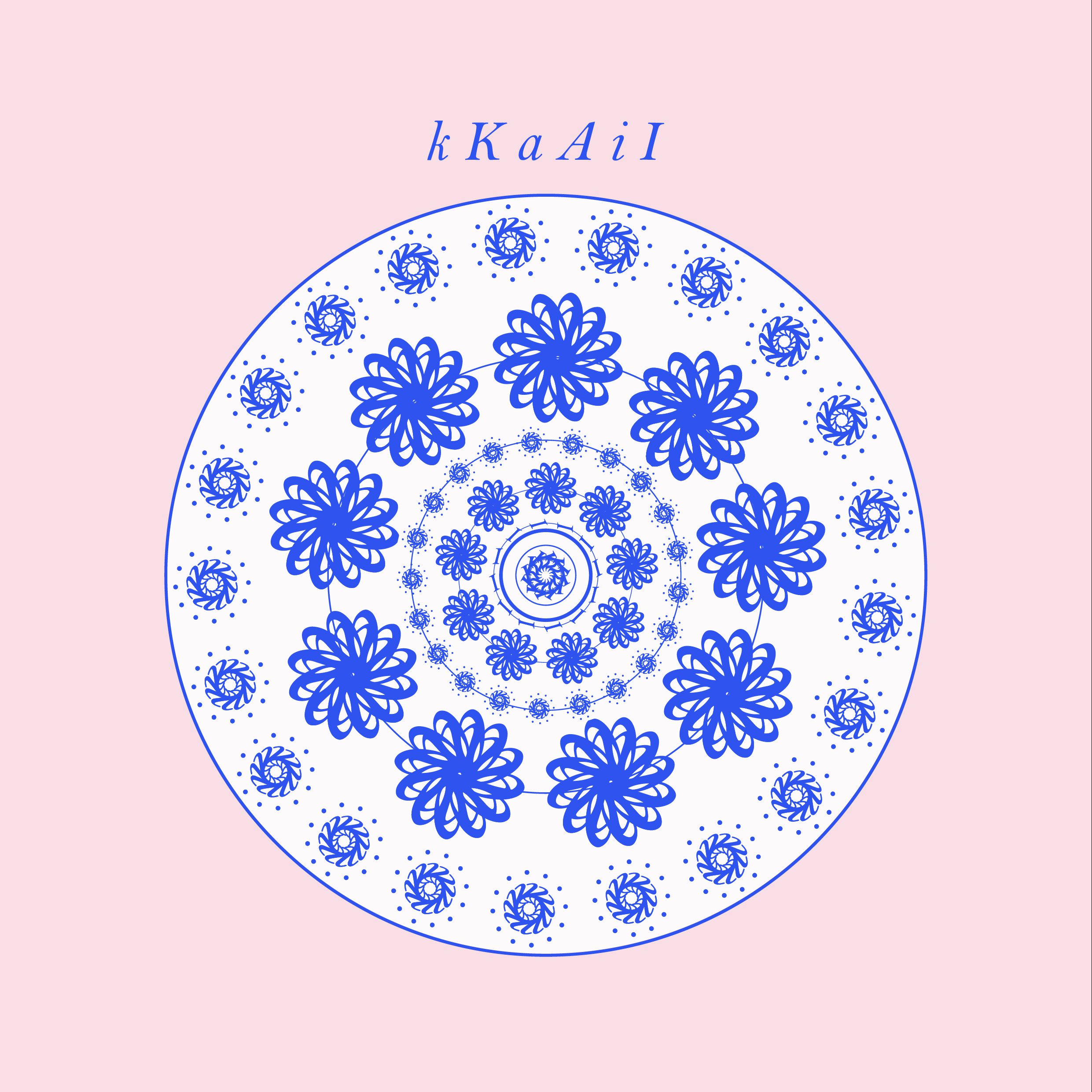
Letters used for this pattern: K, k, A, a, I, i


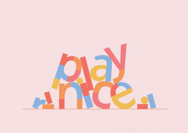
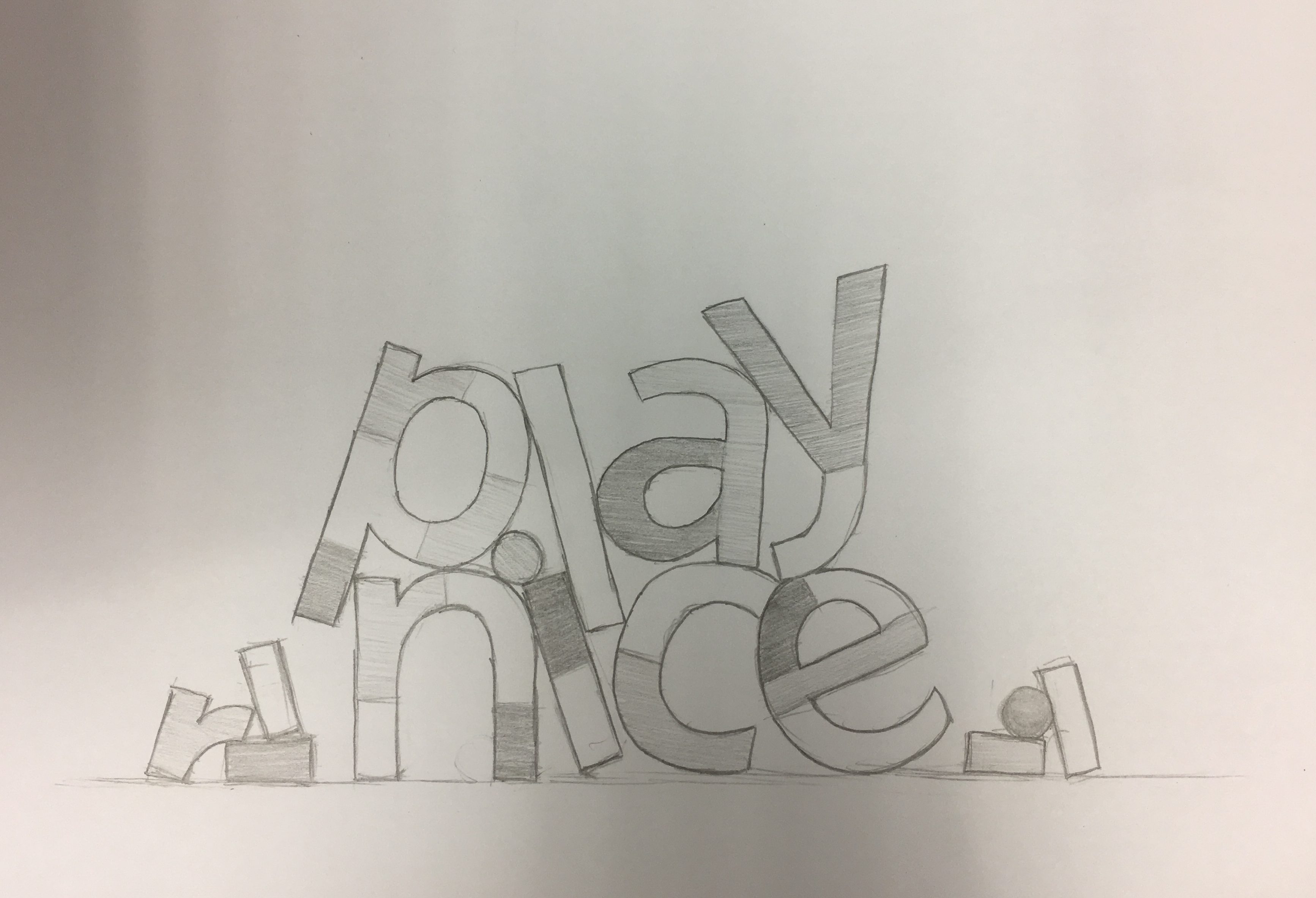

For this activity, I focused on adding a sense of movement to the word “play nice” by tilting the elements in the composition. The type was segmented to look like block pieces placed together, like a building brick/lego concept. Along with the triadic/tetradic colours, I wanted to suggest a sense of (nice) playfulness.
In the book, Robert Bringhurst shares many great principles about design, many of which I couldn’t agree with more. Bringhurst mentions, “typography must often draw attention to itself before it will be read. Yet in order to be read, it must relinquish the attention it has drawn.” A little too much or too little won’t work in typography. Typography has to have this harmonious balance which in my opinion, is always difficult to achieve. Legibility was emphasised as one of the important principles of durable typography. He goes on by saying that these principles apply in different ways, to the typography of business cards, instruction sheets and postage stamps, as well as books – basically anything that needs to convey a certain message or information.
Letterforms have tone, timbre, character, just as words and sentences do. “The moment a text and a typeface are chosen, two streams of thought, two rhythmical systems, two sets of habits, or if you like, two personalities, intersect. They need not live together contentedly forever, but they must not as a rule collide.” A quote which serves as an apt reminder for the current project as we consider different typefaces and how we match them within a composition.
Having to look at good examples of good typography practices, here are some which I myself will (try my best) to uphold.
References:
https://alejandrocarpintero.files.wordpress.com/2016/08/02_the_elements_of_typographic_style.pdf