Tag Archives: final

03 Zine: Locale (Final)

This is the final post of my zine!

To view the earlier parts of my Locale project, you can click on the links below:
Locale: Research
Locale: Infographics
Locale: Process


Pictures I took at Tiong Bahru in my other visits


ZINE LOCALE

After MANY changes, I decided to mainly use photos and soundscape to bring about the experience in Tiong Bahru. Instead of using the previous “eat, drink and play” idea (which was too informative), I will be using the nostalgic and fragility aspect of Tiong Bahru – something which I will not expect if I were to take a quick stroll along.

Nostalgia and fragility 
Something which I thought about during this project was the conservation of this area – whether this charming estate will eventually disappear or not. Thus, I created this zine with this central focus in mind.


Cover page (right) and Back page (left).

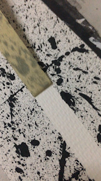
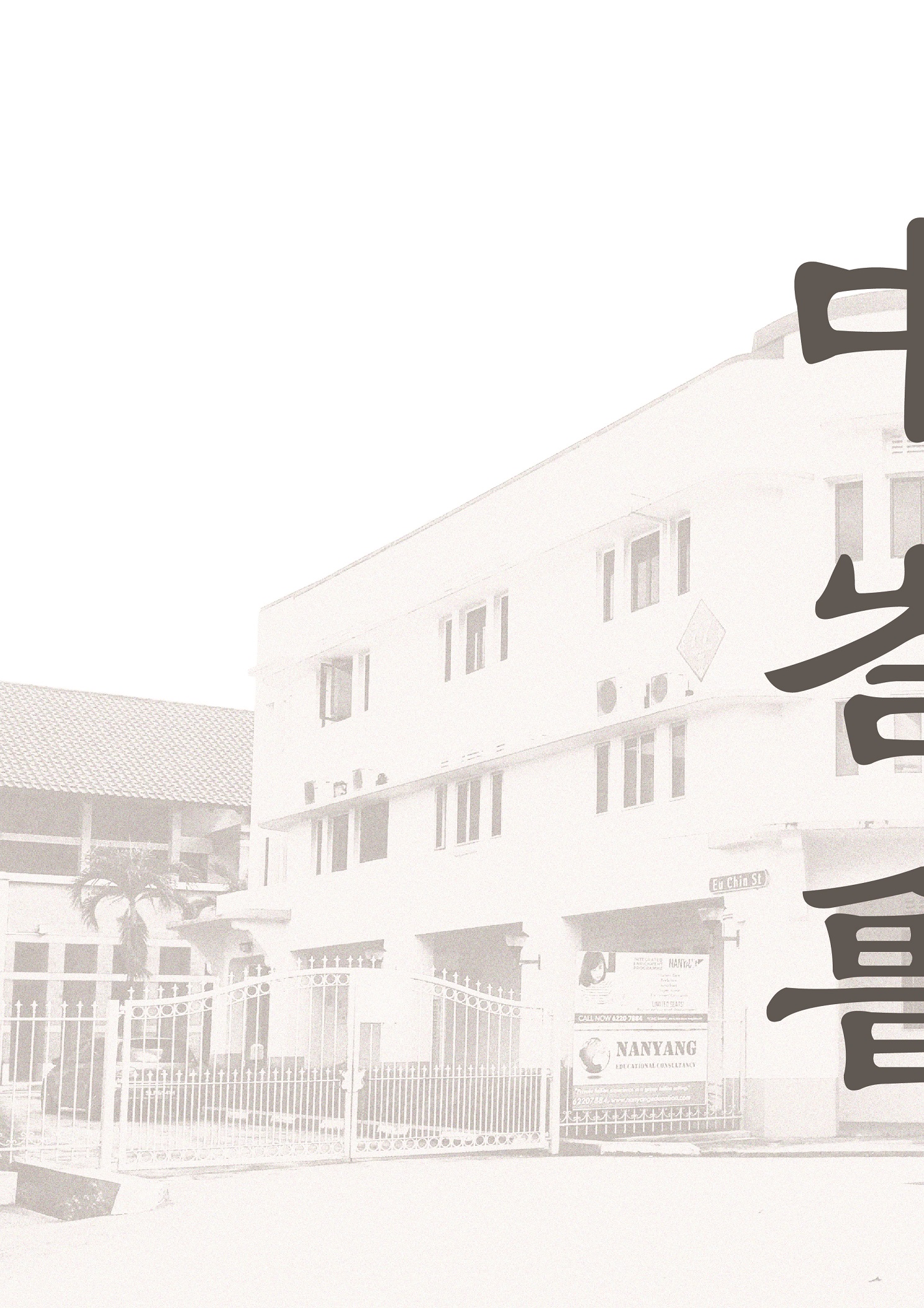
In this spread, I used an ordinary photo of Tiong Bahru (b&w and grainy). It is unlike my other spreads where it is saturated with hints of warm colours – red, orange and yellow to suggest vibrancy. To me, this was my first impression of Tiong Bahru. It was just an “old estate” which I came to know about because of the hipster cafes. I split the typography in half because I wanted to reveal only half of Tiong Bahru’s name in Chinese characters as one will only see the other half when he/she finishes flipping through the zine – only seen as a whole or complete when one reaches to the final page.


First spread

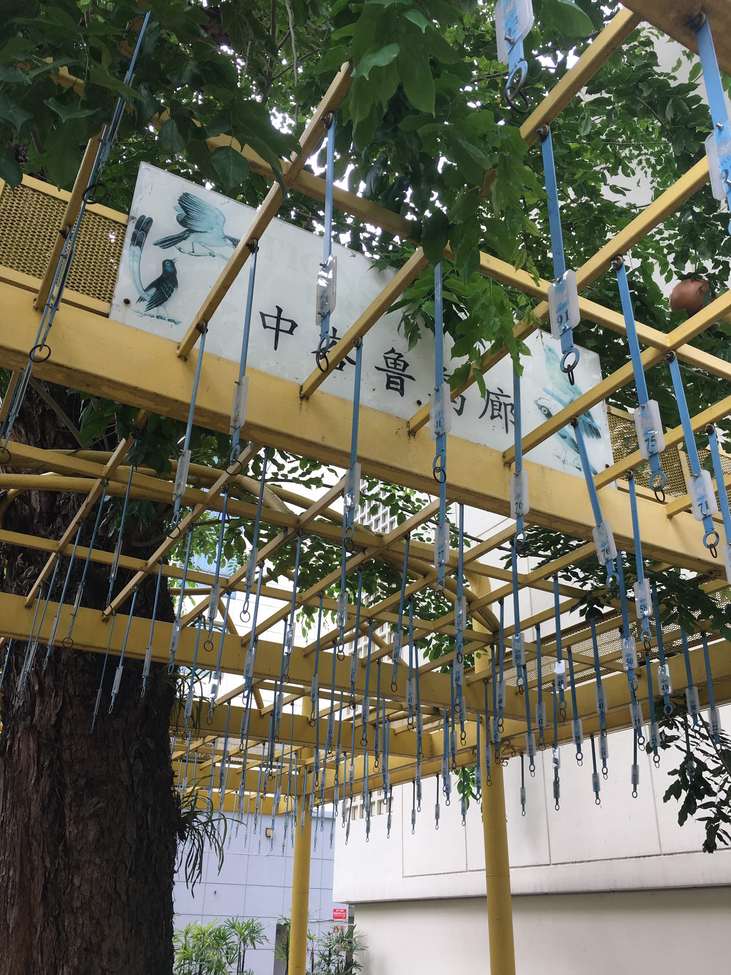
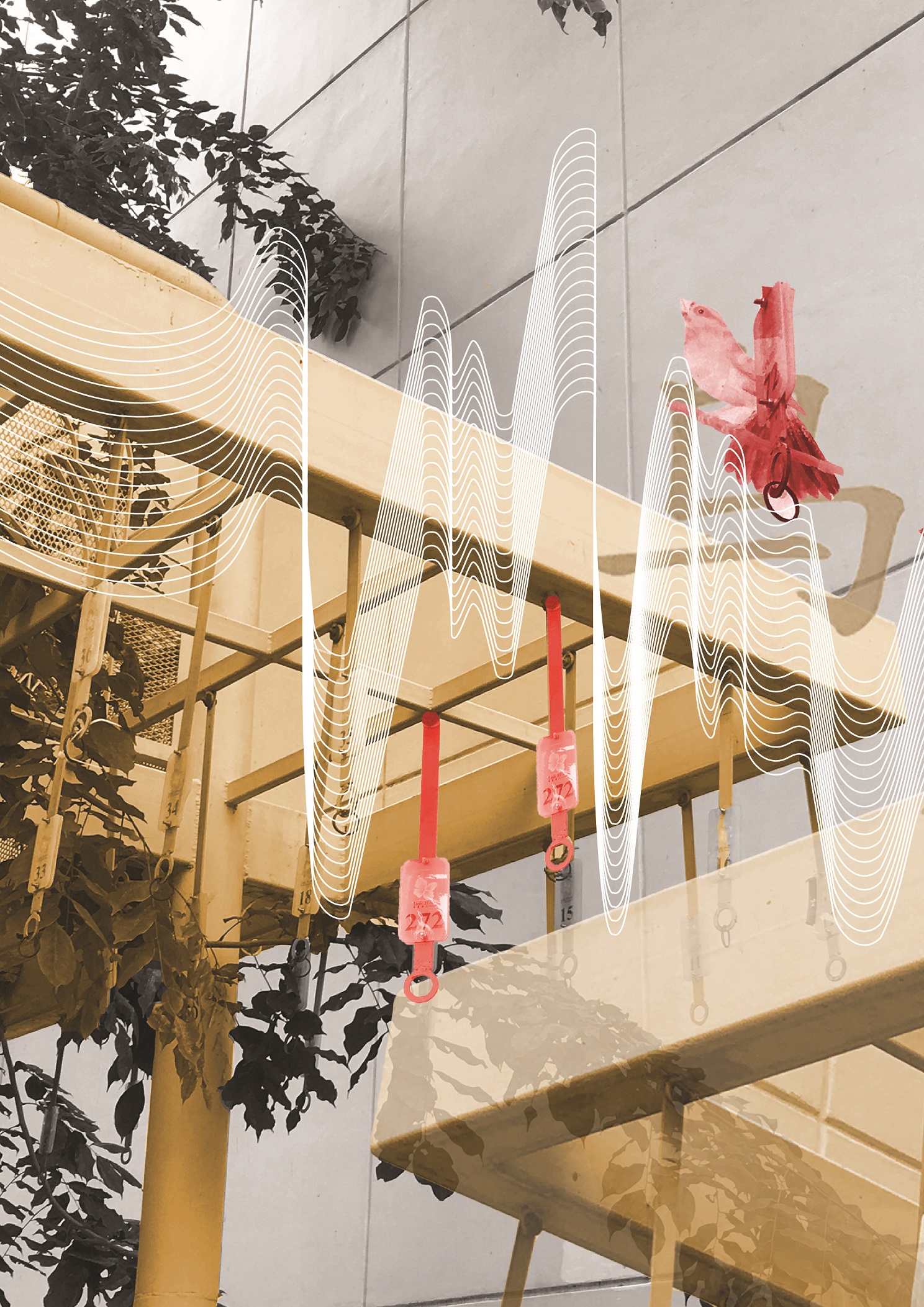
A bird singing corner with no birds, no chirping, only noises from bustling cars. These noises are translated into the soundscape, which clashes with the bird visuals and typography, Barely recognizable without bird cages, this area is often overlooked by many. But, it contains a rich history of Tiong Bahru as people used to enjoy watching these birds sing. I could only extract the birds and typography from the faded sign, the only remnants that made me recognise that this place was once a vibrant bird singing corner.

Second(middle) spread

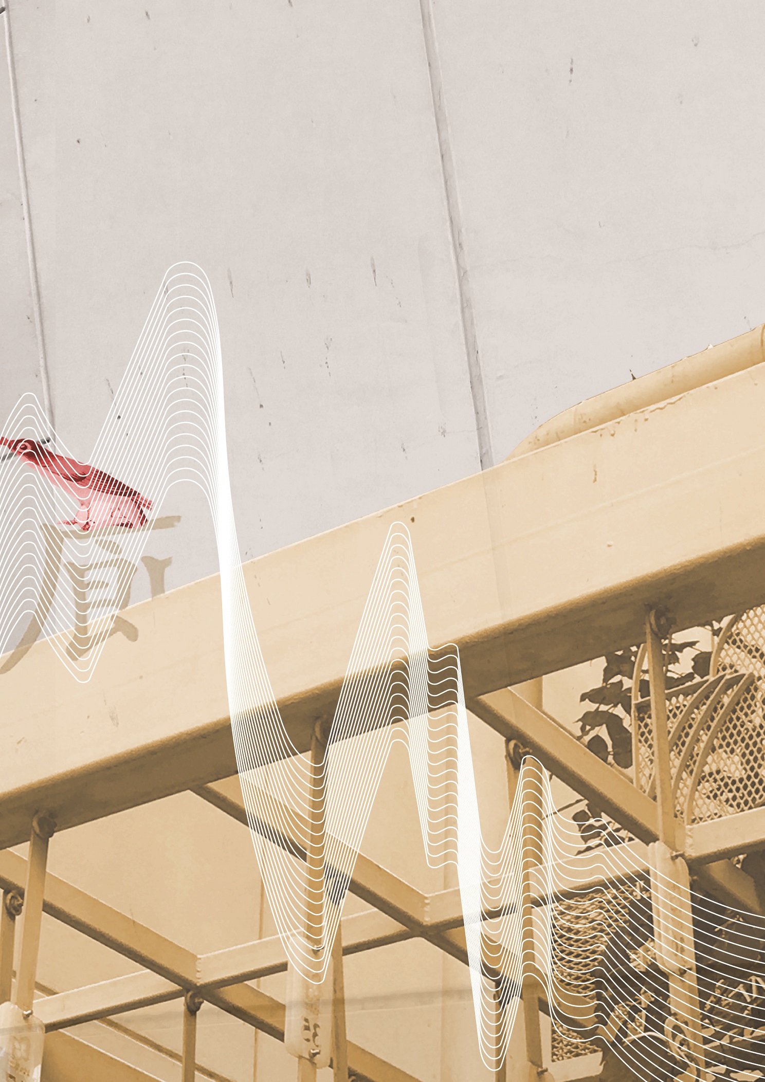
The juxtaposition of new and old, of bustling and tranquil. I used a full picture across this spread. To show the contrast, I colourized the cafe area in the picture, and manipulated some typography above it. Looking across the spread, the soundscape compliments the visuals, reflecting soundwaves which depict a noisier to a quiet environment. The main warm colours, red, orange and yellow, were used in order to bring focus to the spread. Also, to play with the light intensity of the photo, I added light leaks to intensify the colours. More importantly, by this colour manipulation and adjusting of exposure (against the black and white side), I wanted to show the fragility of Tiong Bahru, like an old photo fading away.

Third spread 

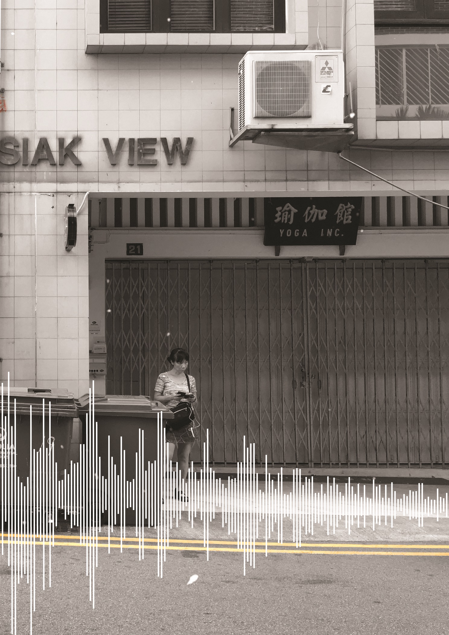
The alleys in Tiong Bahru are either filled with people or absolutely empty and quiet. In terms of the environment, there is a stark difference in the light. I feel that these crowded alleys, mostly filled with cafes along the side, are brightly lit and out in open junctions. But as I turn into a corner around the SIT flats, it is normally darker and still. Which brings me to this spread where two pages show interaction with the use of the soundscape as a transition and the overlays of extracted typography from signboards (around the middle). Two different kinds of people are shown here, the tourists/outgoing residents and the older generation, mostly overshadowed by all the new things being introduced into this estate. They look as if they are interacting, but are in two entirely different backgrounds.

Overall, this zine has really pushed me in terms of style as mentioned earlier, I was more comfortable with vectors and illustrations. Nonetheless, the several trips to Tiong Bahru and figuring out what I interpreted from the site was an interesting experience. Having said that, because I had 2 entirely different drafts before this, I had the opportunity to explore possible textures, typography and photo manipulation. I look forward to learning even more new styles in the future.


01 Image Making Through Type: Final

Here’s the final outcome of project 1!

To view the design process and research, you can click on the links below:

01 Image Making Through Type: Artist Research

01 Image Making Through Type: Ideation and Process

01 Image Making Through Type: Final (this post)


THE JOURNEY OF DREAM JOBS

Tone: Positive

Sometimes, dream jobs are seemingly impossible due to constrictions and practicality. Nonetheless, going through this identity crisis of being conflicted with what we want is mandatory to find ourselves; in hopes that everything will eventually work out.


THE PATISSIER


In this design, I selected “K” and “T” as my initials. The letterform is mostly incorporated into objects of greater significance, such as, the cracked plate and plastic utensils made for kids.

Due to the angularity of both letterforms, I felt that it is more appropriate to deliberately incorporate them into those objects. As for the choice of case, “K” and “T” had not much of a difference but I went ahead with an upper case “K” and lower case “T” to make the placement of objects more natural. I used counter spaces/positive and negative spaces as form for the letter “K”.


THE ARCHITECT


Atavistic Vestiges After the Rain (1934) by Salvador Dali

In my second design, my creation of an “impossible architecture” was greatly inspired by Salvador Dali’s paintings, which consists of organic shapes. I chose the upper case “K” and lower case “T” in this design. As my letterforms were incorporated into the sticks at the bottom of the structure, to look as though it is barely supporting it, the angularity of both “K” and “T” had helped formed the shape easily. If these letters were curvy instead, the end results would differ quite a bit.

I also used the symmetrical properties of these selected letterforms to create a reflection which says “Kt”. This also ties in with my concept of being in someone else’s shadow as I am blindly following someone else’s dream.


THE TATTOO ARTIST


For this piece, I illustrated a mix of line drawings, a reference from line art tattoos, and vectors. By using contrasting styles, I wanted to portray this dream job as something far from reality and unattainable.

Inspired by Ukiyo-e prints, I used more organic shapes to create my vectors and letterforms. My letterforms, as seen in the red patch of blood and the chain, represents the cultural constrictions this job has. The chain, made using a pattern brush, signifies the constrictions, as though the tattoo artist’s hands are restricted.  By using a pattern brush, it helps to make an angular letterform more organic and natural. For the letter “K”, I played with the boldness/thickness of the letterform as it is an organic shape.


THE PACKAGING DESIGNER


This piece was inspired by the memphis art style. It adopts a great a sense of movement it in as I wanted to this piece to look fun and quirky.  I particularly picked candies as objects to be packaged as I wanted a similar motif which links to my first dream job – the patissier. The positive message from this is that things will eventually work out and this “Journey of Dream Jobs” is something mandatory so that we are able to find ourselves. Thus, reminding us that even though we might not be able to have that “ridiculous” job we wanted when we were young, it does not mean that you cant work your way around it and do something within your interests.

The letterforms, portrayed in the ribbons, started off looking geometrical. After a few versions, I decided to make the letter “K” look more organic and that it follows the curves of the ribbons which wraps around the box nicely. Altogether, I really wanted to capture the moment of having a job you love; although messy with the tapes still around, it is still bursting with joy and excitement.


Some comments from Joy and my peers:

  • colour choices were great and appealing
  • nice narrative and vector style
  • maybe centralise certain letterforms
  • 1st and last composition could have been less distracting
  • 2nd composition is good

I had met several challenges while doing this project. Firstly, incorporating the letterforms with consideration was tougher than I thought as I tend to lean towards a more illustrative way to express myself rather than in typography. I also struggled with trying to make the letterform more visible as initially, it was subtle and small in size. All in all, I enjoyed this project as I have learnt many useful illustrating techniques and also learnt about the properties of a letterform on a deeper level.

02 Forrest Gump: Final

These are my final designs! I’ve made the most changes to the 3rd and 4th design. Here are links to my research and process.

Part (1/3) Artist Research

Part (2/3) Design Process

Part (3/3) Final (This post)

For this piece, it’s all about perspective and looking at the world in a new light. I chose common elements which we see on a daily basis, such as the buildings and the landscape, and manipulated them. The warped effect especially, allows the viewers to experience how looking in a new perspective looks like visually – different and surreal. Even for the buildings that I chose, they have their stories. I wanted to show that these “common elements” could actually reflect political and social issues in a particular country.

“You’re a bird brain!” 

This is an insult that uses an animal’s natural characteristic to portray it in a human context. Similarly, when I researched about anthropomorphism, I felt that using this approach to portray certain characteristics would be useful and interesting. Not only is it not literal, but it exaggerates the persona in a fun way. Therefore, I used the head of a bird on a human body. The whole idea is to poke fun of consumerism. Humans are so obsessed with keeping up with the latest technology that it is redundant and that they fail to notice their surroundings. The unrealistic scale of the iPhone also exaggerates how the figure intently looks at the screen, without realising the surveillance camera lurking in the background.

草莓族 ; The strawberry generation. 

The third design explores how youths in this generation are vulnerable and weaker. There is a stereotype of how 21st century teens are, the “strawberry generation”. When troubled teens are being tackled with a problem, some might turn to a substance abuse to escape reality. Being addicted to this destructive lifestyle would be an endless pit of no return, portrayed by the waves that surround the girl and the rope attached to the leg.

For the last design, the first half of the quote which says “You don’t want the truth” is being portrayed through the VR goggles that he is wearing and it suggests that he is living in denial, living in his own world. The second part “you make up your own truth”, is being portrayed through the noodles and chopsticks and the interpretation was that “making up the truth” is a nonsensical thing and that it has no grounds. Thus, his brain matter is being replaced by noodles, something without cognitive thoughts.

Feedback

The comments which I’ve gotten was that the effort in the research before choosing individual elements was good. Also, it was apparent on how my designs were inspired by certain art movements, such as Russian constructivism and suprematism, and that it ties in with my designs. However, some changes which I could’ve made to the designs were that:

  • 2nd design: maybe show more signs of struggle. eg, the wires tangled him in a more suffocated way, maybe adding another one from the other side.
  • 3rd design: The candy wrapper was not very clear and I should replace it with a candy and the wrapper beside instead.
  • 4th design: Make the VR goggles more apparent. eg. add wires, use a more boxy VR goggle instead.

Comments from my classmates:

  • The composition of the design is good.
  • Consistency shown through the designs.
  • Balanced use of black and white.
  • Like the concept and style.

Reflection

All in all, I felt that this project has pushed how I conceptualise even further. From using quotes, it was not as easy to have new interpretations and meanings to them. As this project lasted for a few weeks, I could also see the gradual progress and improvement of the concepts and design composition of my works after the consultations. The silkscreen part was an eye-opening experience for me and it wasn’t that easy after all. For my case, some intricate details got lost along the way, either because the inked has smudged or that there was too much ink. Other than these experimental moments, the nature of the project, stemmed from movie quotes – something which I felt that we could all personally relate to or are interested in.

01 My Line is Emo: Final

This is my final post for Project 1: My Line is Emo! Here are some links to my process and research.

Part (1/3) Mark Making Research 

Part (2/3) Process/Experimental Stage

Part (3/3) Final Outcome (This post)

After the consultation, I worked on my theme and my 6 chosen emotions.

L O V E
C O N T E N T M E N T
F E A R
I N S E C U RI T Y
R A G E
S U R P R I S E

VIVID DREAMS

I named my project “Vivid Dreams” as my concept was to explore and understand how dreams and the subconscious mind can relate to emotions. I picked significant moments in my life which was impactful to the point where I actually dreamt about them.

“Dreams” is an interesting theme. By studying how the subconscious mind and dreams work, I hope to be able to amplify certain emotions and express myself even better – conceptually and visually.


LOVE ; they say ‘love is like a drug’, I say that’s true.

With the use of paintbrushes and diluted ink, I drew thin and light brush strokes intersecting. It looks like strings intertwined, a symbol of love, and that they are floating rhythmically. I used pen and pencils to draw over the water colour brush strokes to accentuate the direction. These lines altogether, guide the eyes – left being the starting point and to the right, where it seems as though it is floating freely. In my opinion, love and happiness coincide. One can view this as love and the feeling of ecstasy because you’re in love.


CONTENTMENT ; I found happiness in the simplest things in life.

Sometimes, it’s the small things in life that truly brings us happiness. If we keep wanting more, then there will never be an end to when we will be satisfied with what we have. I portrayed contentment as full circles of different sizes and gradients – representing how individuals perceive contentment differently. Rounder shapes tend to give off a lighter and happier mood. Mixed with shapes of different scales, it creates a sense of depth, movement and unity.


FEAR ; I fear losing my happiness.

Although I do not show what I fear, deep down inside, I am constantly worried about the unfortunate things that might happen. Being jaded, I would want to cling onto my happiness as much as possible – but life is never fair. I represent my fear with rounder and softer shapes as compared to distinctive sharp ones as I feel that my kind of fear is subtle yet it can accumulate to become overwhelming. Although I used more organic shapes, which may sometimes contradict the emotion of fear, the uneven edges of the watercolour patches and lines represent uncertainty and uneasiness. The water colour spreads out on the paper unevenly with a gradient, representing the fear (the darkest portion) and how it slowly gets to me (represented by the thin contour lines, showing a spreading movement as well), until I hit the point of extreme anxiety.


INSECURITY ; Trapped in an abyss of negative thoughts, when will I ever get out?

To portray insecurity, the act of repetitive negatives thoughts, I used brushes and circled them on the paper, creating layers. In this particular emotion, I felt that the cropping was extremely important – whether to centralise the circular patterns or not. I finally decided on centralizing it as it was more balanced and that it gave a sense of direction inwards.

Inspired by Sol Lewitt’s Scribbles, I felt that insecurity and the automatic technique used with different densities go well together.

Earlier versions: Made with brushes, crushed paper and crushed news paper. (Left to right)

My earlier versions of insecurity were mainly experimenting with layers of paint, using crushed paper, tissue paper, etc. My aim was to create a radial gradient that showed layers of ink.


RAGE ; Chaos from within.

These marks started off as experimental marks made with knives/sharp carving tools on paper. I liked the cuts on the paper because of its texture and how expressive and meaningful the marks were. I made several versions and finally decided on one with had more depth. I painted the background black and made scratch marks by using different kinds of sharp tools, some with white paint on them. If you were to look (or feel) closely, the final piece had a horizontal gradient of black in the background and also in the textures (top being the most concentrated).

Earlier versions: Black ink on white paper, black ink on black background (2nd and 3rd) and black and white ink on black background. (Left to right)

I started of scratching up the white paper with black ink, but I felt that it lacked expression. Thus, I made more versions with a black background and played with different sharp tools.


SURPRISE ; Expect the unexpected.          

Inspired by the masking tape layering technique by Ed Moses, I used masking tape in the middle as I splattered paint onto the paper. I wanted to emphasise on the contrast between the blank space and the marks – representing ambiguity. It was also interesting to me as the focus point was actually the blank space, rather than the marks.


Feedback

Comments from Joy:

Overall, it was good

  • how I considered using different types of paper to create the marks
  • how I emphasized cropping (for insecurity)
  • how I used lines, contour lines (even though subtle), in my work (love & fear) and explained it with how it had a sense of direction and flow.
  • if I were to split my emotions into 2 boards (love, happiness, fear & insecurity, rage, surprise) – one has more deliberate shapes, the other has more of an automatic approach.

Comments from my classmates:

  • Nicely done and well thought through.
  • Loved the explanation and emotions
  • Liked the compositions
  • Some mentioned favorites were fear, surprise, contentment and insecurity.


Reflection 

Upon completing “My Line is Emo”, I felt that this project had a great potential to explore how I am able to express my emotions on paper – using various mediums, tools and materials. Although these may seem insignificant at the start (I mean, black paint and black water colour, newsprint paper and watercolour paper, how much can they differ right?), but the varied results surprised me. Through the experimental stage, I had the opportunity to explore the properties and therefore, I was able to push myself further to create lines with meaning and how the interaction of design elements can bring about a certain expressive quality/emotion.

This project led me to discover more about myself and assessed my emotions and translate them into visuals – something which I found difficult to do before this project. If I were to recall, I could barely express how I feel most of the time.

Looking at the rest of my classmate’s projects has also shown me that with just 6 different emotions, we are able to come up with so many different ideas and expressions. Overall, this project was fruitful and very enjoyable.