Monthly Archives: September 2018

Typographer of the Week: Paula Scher

Known as the “titan of postmodern design”, Paula Scher is a highly influential graphic design who has done countless of groundbreaking projects with notable brands and even important government agencies.


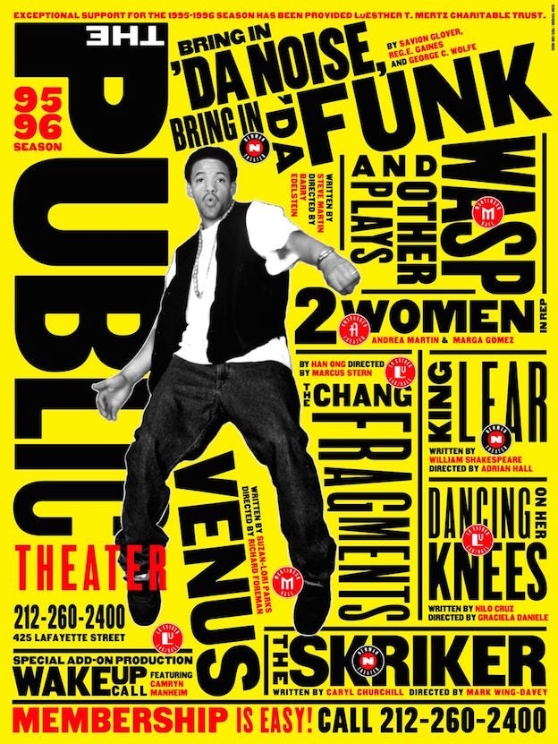
Scher is responsible for both the polished corporate-ness of the Citibank logo and the loudly expressive poster designs of historic Public Theater productions like Bring in ‘Da Noise, Bring in ‘Da Funk. Despite the disparate nature of the designs and their messages, Scher executes them perfectly. She mentions, “I think all design matters and all design deserves to be intelligent.” – referring to not just designing for the “public good” but for all designs.

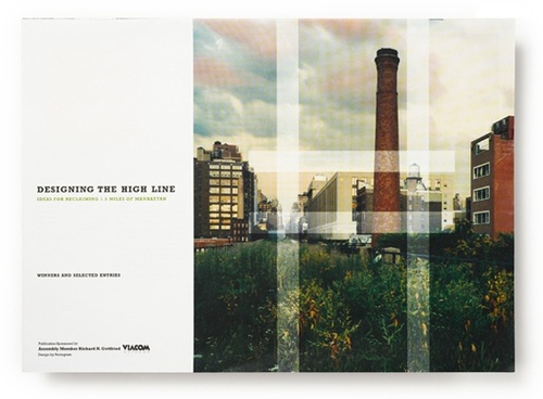
In the video, What Design Can Do 2012, Scher tells many interesting stories about how her massive projects have begun (mostly by pro bono logos). One of her projects was “The High Line”, where Scher herself, had almost zero faith that the project would take off. Nonetheless, she did the logo for the High Line, where they gradually implemented her design into the area and collateral designs. She mentioned, “the logo, when combined with a terrific activity, product or service, it begins to resonate.” Like the High Line, before it was built, the logo was just a logo.

The High Line

Madison Square Park

This is another project by Scher. In the rebranding of Madison Square Park, what stood out the most to me was the choice of using “MAD. SQ. PK.” as their logo. Her rationale was that NYC loves abbreviations – SoHo (South of Houston), NoMad (North of Madison Square Park) and so on. Scher identified a significant and unique aspect of the NYC culture and incorporated it into Madison Square Park. As people easily get confused with Madison Square Park with Madison Park, they do not have a strong impression and think that this park is rather ordinary and dull. This really shows that as designers, we are never only subjected to the visuals. Today, designers are more like “problem solvers”, conceptualising and then conveying ideas to the public.
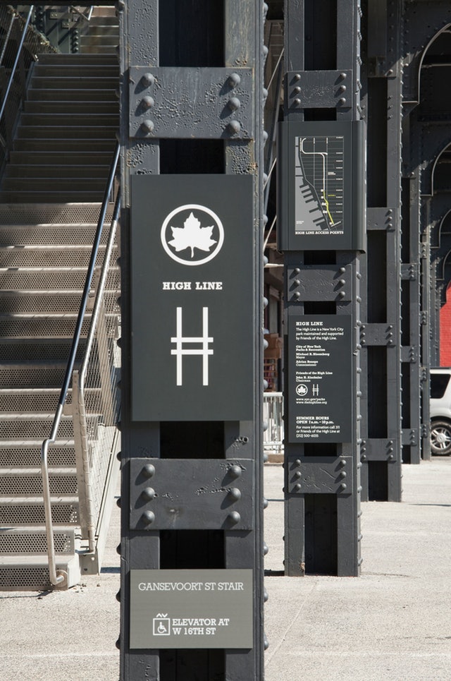
NYC Parks

Lastly, Scher has worked with NYC Parks, with a condition that she was allowed to redesign the signages of the parks. The previous signages were cluttered and inconsistent (and an eyesore to Scher). With Scher’s design, a modular system was adopted, which made the entire design system extremely consistent and neat. She even emphasized on the guidelines for the workers to follow as there are many parks all around NYC to ensure consistency. Even though Scher was known as a “graphic designer”, I felt that her roles were expanded as she had to consider the user experience for several of her projects.

Overall, Scher is an extremely influential and skilled creative. As seen in the video and her projects, she is critical and logical in her thinking and consistent in her works – attributes which all designers aspire to be.

References:
https://www.pentagram.com/news/paula-scher-works
https://99designs.com.sg/blog/famous-design/paula-scher-titan-of-postmodern-design/

https://fontsinuse.com/designers/369/paula-scher

In Class Activity: Haiku

In Class Activity

5, 7, 5 Haiku: 
Falling to the ground
I watch a leaf settle down
In a bed of brown

01020304

Some thoughts:

Overall, this activity was interesting and enjoyable as we had to as though, made the haiku come to life through type. In the 4 designs, I had to consider factors such as scale, balance emphasis, harmony. Also, the 5, 7, 5 haiku had a number of words which was a challenge – which line should be emphasised or which ones should be scaled down? For the final piece, I chose the second one as I felt that the use of more negative space makes the “leaf” isolated and thus, was emphasized more. Also, the last line, “in a bed of brown”, was heavily bolded to suggests the ground and create harmony in the composition.

In Class Activity: Expressive words Opposing pairs

In Class Activity

These are the vectorized sketches of the opposing pairs of words I chose from the list.

01. Order & Chaos

This is the final piece which I refined and chose for the class critique. In terms of design principles, I largely focused on balance in this piece. To give a sense of disorder and chaos, I disrupted the neatness of the white areas, with the black scribbles creeping into the other half of the canvas.

02. Fast and Slow

My this sketch, I mainly played with the strokes, varying the thickness to create a motion effect for fast. As for slow, I felt that blob-like, flowy lines were more suitable as it looks more organic rather that sharp.

03. Whimsical and Serious

This was my first sketch attempt out of the three. To show the juxtaposition of meanings, I used contrasting strokes, a curvy and italic type vs a sans serif bold type.

Some thoughts:

After the critique in class, I saw the variations of opposing words and there are certainly some words which are more difficult to express. With that being said, there were many clever type compositions which portrayed the opposing words well. For example, the “open and closed” one where letters from “open” were falling out of the letter O from closed. The examples really portrayed how placement and even scale could drastically change the dynamics of type.

Thinking With Type: Letter

This particular reading gave many insights about the characteristics of letter, typefaces and also compatibility between different typefaces. After listening to several lectures by Lisa, I felt that the content in this reading was a whole lot easier to understand and the concepts were easier to grasp.

As we begin our project, these are some notable information mentioned in the reading which I felt that is important.

Choosing the right fonts isnt an easy task. However, I think we can all agree that there are some visual properties of a font which influences a particular emotion/trait. The power of X-height shows how different x-heights can affect the overall “look” of a text. Some fonts have a smaller x-heights, thus, the texts in the same font size appear to be more delicate or sleek. Hence, we should think deeper and in terms of these characteristics, select what is suitable for each text.

Mcsweeney’s Magazine cover, 2002. Design: Dave Eggers. This magazine cover uses the Garamond 3 typeface family in various sizes. Although the typeface is classical and conservative, the obsessive, slightly deranged layout is distinctly contemporary.

As for this magazine cover mentioned in the reading, I felt that it is relatable to our project as they used 3 typefaces of Garamond. The variation in scale and typefaces made this piece dynamic. I’m pretty sure variating the scale of the texts like how he did will seem like a type crime to many. WE READ THINGS IN A CONSISTENT MANNER and a disruption like this will definitely break the flow of the reader.  Nonetheless, the slightly deranged layout is contemporary and experimental. 


the word: new york magazine Design: Chris Dixon, 2010

This example of mixing fonts is also a good one. The ability to mix fonts tastefully is extremely important. Staying with only one font can be rather boring sometimes. Thus, I like how this reading gives additional information on how the properties of a typeface and be suitable for each other and establishes a good visual hierarchy. Eg. thin strokes vs thicker strokes as titles for body text.


Little Lessons From Swiss Style Graphic Design by http://deconstructed.org.uk 


Typography posters by Kellie Manchester

These are some posters I found online and thought that the play of scale was rather interesting and done well. As seen, the difference in scale can lead the readers’ eye and guide a logical and readable flow for them. All in all, I think myriad of different characteristics allows one to push the boundaries of typography and be experimental. It also allows one to convey a certain look and feel to the readers just by choosing a typeface, a type classification and adjusting the scale and size.

References:
https://kmanchesterdesign.myportfolio.com/typography-poster
http://thinkingwithtype.com/letter/

Swiss Style Graphic Design

Typographer of the Week: Neville Brody

Neville Brody is an English graphic designer, typographer and art director. Brody is extremely versatile in his outstanding works. His well-known works include his contribution to The Face and Arena magazines. He had also established his own design practice, Research Studios, in London in partnership with Fwa Richards. The company is best known for its ability to create new visual languages for a variety of applications ranging from publishing to film. It also creates innovative packaging and website design for clients such as Kenzo, corporate identity for clients such as Homechoice, and on-screen graphics for clients such as Paramount Studios, makers of the Mission Impossible films. Also, Brody is one of the founding members of Fontworks and the leading website the FontShop. He designed numerous notable typefaces for the website.

Being a versatile designer, Brody has definitely contributed greatly to the design industry. I took a look at Fontshop and found many great fonts. My personal favourites are these: Industria, FF Pop and Arcadia. Industria is a sleek and cool san serif and FF Pop reminds me of a theatrical look and Saul Bass’s title sequence from Ocean Eleven.

In the website, I could also hover to preview the different typefaces.

https://www.fontshop.com/families/industria 

Ocean Eleven’s title sequence by Saul Bass (1960)
https://www.youtube.com/watch?time_continue=57&v=xnG3OjIcN8M 

In the video, he mentioned,

“We play a lot. We experiment a lot. We like when things go wrong. You get new thoughts, ideas and expressions and possibilities.”

Which explains the fresh ideas in his work.


Tokyo posters by Neville Brody, experimenting with tribal elements and culture.


GQ magazine cover by Neville Brody, experimenting with shapes and precision.

He also mentions about design being multidisciplinary, and that as a designer, one might be making visuals, designing sounds or installations; which doesn’t involve making at all but it involves thinking and strategy. In the end, everything is a design problem. I feel that after having to read many articles on notable artists, many of them adopt a rather similar methodology; design is problem-solving.

References:
http://www.famousgraphicdesigners.org/neville-brodyhttp://www.historygraphicdesign.com/the-age-of-information/postmodern-design/531-neville-brodyhttps://vimeo.com/97413622
http://www.fontshop.com

Typographer of the Week: Massimo Vignelli

Massimo Vignelli is a famous designer who has practising design in New York for nearly 50 years, during which time he has made a big impact on all forms of design, from graphic design, to furniture, to clothing. What I find most prominent from all of Vignelli’s work is the methodology that he adopted. Firstly, it is structured and logical. There are many reasons why designs don’t appeal and make the cut for readability but for Vignelli, he ensures that he solves all of that.


Massimo Vignelli’s 1972 NYC subway map

Vignelli is known for his outstanding works. One of them is the NYC subway map which he redesigned. Although geographically inaccurate, he simplified the forms and enhanced legibility in the map. The subway map is commonly referred by the public throughout the day and the transportation in NYC is rather complex. As such, Vignelli realised the need to create a clear and concise design which people could refer without a hassle. His take on information design is that designers are just like architects, constructing information for the users. I find this really true and it made me rethink about visual materials presented to us all the time; do they actually consider a structural and logical way of communicating visually? or are they just infomation filling up a blank canvas?


Taylor’s Guides, designed by Vignelli in 1986 and published by Houghton Mifflin, is a series of eleven 400-page visual encyclopedias that provide horticultural information organized by plant group.

Vignelli defined “quality” as, “Things that are done with knowledge. I am interested in work that is grounded in semiotics, the science or philosophy of communications. Semiotics has three levels: semantics, syntactics, and pragmatics. Semantics relates to how information is expressed. Syntactics relates to the structure, discipline, the coherence of elements, the continuity.”

The way Taylor’s Guide was designed, in which photographs of plants are arranged by colour, size, light requirements, evidently exemplifies the excellent application of his methodology.

Vignelli’s 1994 identity and publications system for the American Center in Paris

In this series of work, Vignelli explains, “good doesn’t have to have exactly these elements. But it has to be logical. The information itself provides the graphics. This is what we call civilized graphics. The content, not the designer, is what is screaming for attention. Still, there is a lot of personal expression.” From here, it is clear that Vignelli is ingrained with a strong sense of design, structure and logic. All designs have its purpose, whether abstract or not. It is never just about the aesthetics. Vignelli’s approach to design should be what aspiring or current designers consider in their design process. I think many people today are jaded by “pretty designs” and overlook its intended purpose. With a motivation to improve using design, I hope that more people would appreciate visual materials beyond their aesthetics.

References:

Massimo Vignelli: Creator of Timeless Design and Fearless Critic of “Junk”


http://www.designculture.it/interview/massimo-vignelli.html

Review: Type Speaks

After watching the video, I was glad that I did not have to go through such painstaking and meticulous lengths in order to create type. Although I knew that the revolution of type had tremendously changed throughout the years, I wasn’t aware of the tedious steps and mechanical processes required. Now that I have seen them, I am amazed by the level of skill and precision they had at that point in time. Today, with our available technology and software, we are blessed with “Ctrl-Z”s, computer calculations and grids; without all the tedious and complicated processes. I also felt that these designers from the past are knowledgeable about the entire printing process; especially the mechanism of the machines and the processes. Ironically, I think I myself could barely get a printer to work sometimes.


Designer checking every character in “Typespeaks” 1948

With that being said, I do feel that creating a font from scratch even with the help of computers and software might not be as easy as I thought. So, I went to read about the start of digital fonts. Apparently, there was a time where the fonts were created in bitmap or using outlines. As much as it saves much more time, money and labour creating a set of font is still meticulous work. Even with digital, designers are to ensure that fonts look optically similar and readable. The characteristics of the font have to also be consistent and neat. I guess, there isn’t a shortcut to create a good type, is there?


Bitmap and outline fonts by www.designhistory.org 


Digi Grotesk, the first digital font type designed by the Hell Design Studios (left) and bitmap fonts (right). 

References:

http://www.designhistory.org/Digital_Revolution_pages/EarlyDigType.html

Review: The Modernist Era

After reading different takes on modernism by the artists, what intrigued me was this sentence by Milton Glaser, “So Modernism became a wonderful way for detoxifying dirty people and dirty ideas.” He then explains how Modernism rejects the emotional ideal and is lacking in passion and sexuality. And that is why corporate identities find themselves aligned with Modernism as he refers Modernism to great progression, endless frontiers and ceaseless developments.

While Glaser might believe so, I feel that there are many angles to look at this. Reducing things to its simpler forms does not always take away the meaning of it. In the case of Modernism, many art movements were experimental and looked at ways of expression. Simplicity was some of their ways to express; it does not mean that they are lacking thereof.

From Rudolph deHarak, he also mentioned, “These Modernists breathed new life into design, cutting away all unnecessary graphics appendages and leaving only the essentials.” Many artists during that time, Max Bill, Josef Muller-Brockmann and Max Huber and many more, had works manifested into a timeless style which were thoughtful and systematic. The works were bold, intensely creative and dynamic and perhaps, this is the beauty of Modernism which Glaser overlooked.


Review: The Age of Information

“We brought discipline to design.’ 
‘We are systematic, logical and objective – not trendy.
Trends kill the soul of design.

This quote, by Massimo Vignelli, piqued my interest and I adore how designers like him use a modern approach to solve design problems. Massimo Vignelli is a famous designer who has practising design in New York for nearly 50 years, during which time he has made a big impact on all forms of design, from graphic design, to furniture, to clothing; all thanks to his design methodology. Vignelli paved the way for visual communication with his methodology. Having to reject the idea of trendy IS design and design should be a change motivated from within.

Vignelli has countless outstanding works; corporate identity works for Gilette, Knoll Associates, American Airlines and New York Transit Authority. 


Piccolo Teatro di Milano 1964

  
American Airlines logo (left), Knoll Associates (right).

Another quote from him is, “We want to make it clear that we are not commercial artists, illustrators or advertising designers. We are information architects who structure information. Like architecture, what we do is not only structural but it is also appearance and visual form.”

He explains “information design” clearly and establishes his stand on the roles of a designer. What he said, made a lot of sense to me. And I think many people, and even designers, overlook the significance of how information is being constructed so concisely with thought and meticulously. For Vignelli, the focus was never on the aesthetics, It was about solving problems and recognizing the needs of people.

The next article, focusing on the rise of corporate identity, evidently shows Vignelli’s design-with-purpose methodology and how his way of thinking aligns with the creation of corporate identity. The “visual image” we get from a brand can be affected by many factors; society, media, brand consistency and identity etc. Very likely, brands with consistent and good brand identity, are successful or at least, on their way to becoming successful. These visual materials are what consumers feed on; they see, they observe and they retain information. The better the companies are in “constructing” their information and their brand identity, the stronger the impact.

References:
http://www.eyemagazine.com/feature/article/reputations-massimo-vignelli
http://www.designishistory.com/1960/corporate-id/

Review: Art Nouveau Piece


Poster advertising Tropon, Henri Van de Velde, 1898, Belgium. Museum no. CIRC.992-1967. © Victoria and Albert Museum, London

This features a packaging by Van de Velde for the German food manufacturer Tropon and to create publicity. Amongst all the art pieces, this is my favourite one as I greatly appreciate the Art Nouveau style. This advertisement for egg whites adopts an abstract form rather than a realistic one. It illustrates the graceful yet structural elements of Art Nouveau; organic shapes, sweeping curves and decorative features. His design also evokes the shapes and colours of the egg. Even though it is highly stylized and abstract, main elements such as the colour of the egg, the roundness of the egg, is still incorporated subtly.

References:
https://www.vam.ac.uk/articles/art-nouveau-an-international-style