Tag Archives: typographer of the week

Typographer of the Week: Erik Spiekermann

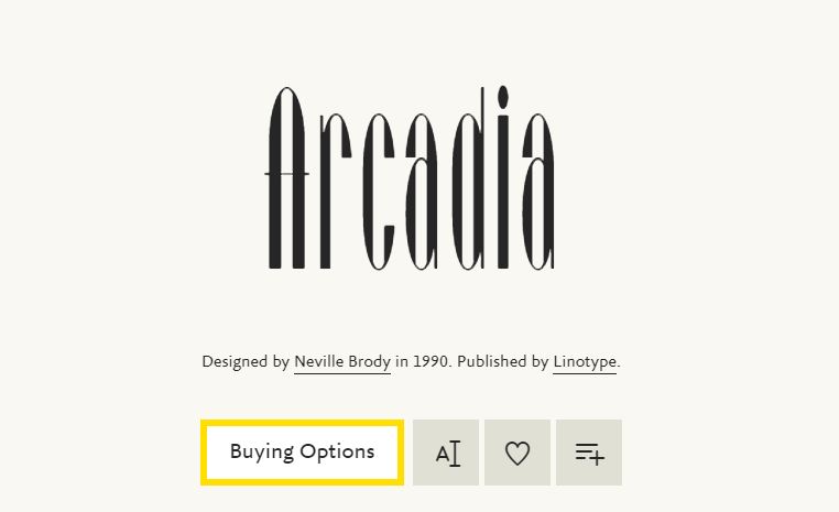
Erik Spiekermann is an author, information designer and typographer. Spiekermann is an influential individual in the typography industry, creating several typefaces such as, FF Meta and ITC Officina, which are considered as classics until today.

In his video, he elaborates more on his take on fonts. Many of Spiekermann’s font choices or even creations have to serve its function of being readable. For instance, fonts used on screen and displays, fonts used on newspaper (with bad quality paper) and even fonts used on glossy paper, all has its purpose in relation to where it is being viewed or printed on.

To him, brand = function. Having to design many specific typefaces for brands and companies, such as Bosch and Nokia, a typeface accentuates a brand’s character. He designed Nokia’s typeface in 2001, seen on the handphones produced back then. However, Nokia claimed that the typeface had ‘too much character’ for its brand. Spiekermann rebuts, “It’s BRAND, not BLAND.” He also redesigned many web interfaces and apps for brands. He highlighted that typography can be used to brand a brand. Eg, Volkswagen is branded by Futura and their blue colour. He applies this to his works as well, achieving brand consistency and giving a sense of identity to the website or application.


Redbull Music Academy App. 

Overall, it is interesting to see how many typographers of the week were more focused with logos, brand identity and even collaterals. From this week’s typographer of the week, Erik Spiekermann, I’ve definitely learned more about how typography and digital interfaces can work together to create a stronger and impressionable brand identity.

References:

Getting to Know Erik Spiekermann


https://spiekermann.com/en/

Typographer of the Week: Jonathan Barnbrook

Jonathan Barnbrook is one of the most celebrated graphic designer and typographer in the industry. He has created countless works for influential people – Stanley Kubrick and David Bowie.


Somerset House: Daydreaming with Stanley Kubrick by Jonathan Barnbrook (Photo: Barnbrook.net)

An exhibition that features many works from artists inspired by the master filmmaker, Stanley Kubrick. Personally, I love how the entire identity of the exhibition is consistent, sleek yet dreamy. Barnbrook mentions, that typography provides a tone for the text. He says, The reason why I want to continue to draw letterforms and typefaces is because I want to speak in a voice that has never been spoken before.” Barnbook has been experimental with many of his works, creating unique and interesting works with graphic design and typography.


Album cover for David Bowie’s final album by Jonathan Barnbrook (Photo: Barnbrook.net)

With that being said, his personal website has many works considered as experimental, less corporate and even satirical. Created for “Tomorrow’s Truth” an exhibition of Jonathan Barnbrook’s political work in South Korea in 2004 at Seoul Art Center. These works use a much simplified form to mix consumerist pop imagery of the west with the classic stalinist propaganda of North Korea (Barnbrook, 2004).

Like mentioned, Barnbrook emphasised on providing a tone for a text and it is interesting how he manages to create graphics of different tones as well. As designers, I think we have our own styles, which might be experimental and unique – one that might not fit a corporate branding/identity. But from Barnbrook, something which I have learnt is knowing when to use a certain tone to provide that important message to convey as a brand.

References:
https://www.itsnicethat.com/features/review-of-the-year-2016-graphic-design-jonathan-barnbrook-151216

North Korea: Series II – Tomorrow’s Truth

Home

Typographer of the Week: Paula Scher

Known as the “titan of postmodern design”, Paula Scher is a highly influential graphic design who has done countless of groundbreaking projects with notable brands and even important government agencies.


Scher is responsible for both the polished corporate-ness of the Citibank logo and the loudly expressive poster designs of historic Public Theater productions like Bring in ‘Da Noise, Bring in ‘Da Funk. Despite the disparate nature of the designs and their messages, Scher executes them perfectly. She mentions, “I think all design matters and all design deserves to be intelligent.” – referring to not just designing for the “public good” but for all designs.

In the video, What Design Can Do 2012, Scher tells many interesting stories about how her massive projects have begun (mostly by pro bono logos). One of her projects was “The High Line”, where Scher herself, had almost zero faith that the project would take off. Nonetheless, she did the logo for the High Line, where they gradually implemented her design into the area and collateral designs. She mentioned, “the logo, when combined with a terrific activity, product or service, it begins to resonate.” Like the High Line, before it was built, the logo was just a logo.

The High Line

Madison Square Park

This is another project by Scher. In the rebranding of Madison Square Park, what stood out the most to me was the choice of using “MAD. SQ. PK.” as their logo. Her rationale was that NYC loves abbreviations – SoHo (South of Houston), NoMad (North of Madison Square Park) and so on. Scher identified a significant and unique aspect of the NYC culture and incorporated it into Madison Square Park. As people easily get confused with Madison Square Park with Madison Park, they do not have a strong impression and think that this park is rather ordinary and dull. This really shows that as designers, we are never only subjected to the visuals. Today, designers are more like “problem solvers”, conceptualising and then conveying ideas to the public.

NYC Parks

Lastly, Scher has worked with NYC Parks, with a condition that she was allowed to redesign the signages of the parks. The previous signages were cluttered and inconsistent (and an eyesore to Scher). With Scher’s design, a modular system was adopted, which made the entire design system extremely consistent and neat. She even emphasized on the guidelines for the workers to follow as there are many parks all around NYC to ensure consistency. Even though Scher was known as a “graphic designer”, I felt that her roles were expanded as she had to consider the user experience for several of her projects.

Overall, Scher is an extremely influential and skilled creative. As seen in the video and her projects, she is critical and logical in her thinking and consistent in her works – attributes which all designers aspire to be.

References:
https://www.pentagram.com/news/paula-scher-works
https://99designs.com.sg/blog/famous-design/paula-scher-titan-of-postmodern-design/

https://fontsinuse.com/designers/369/paula-scher

Typographer of the Week: Neville Brody

Neville Brody is an English graphic designer, typographer and art director. Brody is extremely versatile in his outstanding works. His well-known works include his contribution to The Face and Arena magazines. He had also established his own design practice, Research Studios, in London in partnership with Fwa Richards. The company is best known for its ability to create new visual languages for a variety of applications ranging from publishing to film. It also creates innovative packaging and website design for clients such as Kenzo, corporate identity for clients such as Homechoice, and on-screen graphics for clients such as Paramount Studios, makers of the Mission Impossible films. Also, Brody is one of the founding members of Fontworks and the leading website the FontShop. He designed numerous notable typefaces for the website.

Being a versatile designer, Brody has definitely contributed greatly to the design industry. I took a look at Fontshop and found many great fonts. My personal favourites are these: Industria, FF Pop and Arcadia. Industria is a sleek and cool san serif and FF Pop reminds me of a theatrical look and Saul Bass’s title sequence from Ocean Eleven.

In the website, I could also hover to preview the different typefaces.

https://www.fontshop.com/families/industria 

Ocean Eleven’s title sequence by Saul Bass (1960)
https://www.youtube.com/watch?time_continue=57&v=xnG3OjIcN8M 

In the video, he mentioned,

“We play a lot. We experiment a lot. We like when things go wrong. You get new thoughts, ideas and expressions and possibilities.”

Which explains the fresh ideas in his work.


Tokyo posters by Neville Brody, experimenting with tribal elements and culture.


GQ magazine cover by Neville Brody, experimenting with shapes and precision.

He also mentions about design being multidisciplinary, and that as a designer, one might be making visuals, designing sounds or installations; which doesn’t involve making at all but it involves thinking and strategy. In the end, everything is a design problem. I feel that after having to read many articles on notable artists, many of them adopt a rather similar methodology; design is problem-solving.

References:
http://www.famousgraphicdesigners.org/neville-brodyhttp://www.historygraphicdesign.com/the-age-of-information/postmodern-design/531-neville-brodyhttps://vimeo.com/97413622
http://www.fontshop.com

Typographer of the Week: Massimo Vignelli

Massimo Vignelli is a famous designer who has practising design in New York for nearly 50 years, during which time he has made a big impact on all forms of design, from graphic design, to furniture, to clothing. What I find most prominent from all of Vignelli’s work is the methodology that he adopted. Firstly, it is structured and logical. There are many reasons why designs don’t appeal and make the cut for readability but for Vignelli, he ensures that he solves all of that.


Massimo Vignelli’s 1972 NYC subway map

Vignelli is known for his outstanding works. One of them is the NYC subway map which he redesigned. Although geographically inaccurate, he simplified the forms and enhanced legibility in the map. The subway map is commonly referred by the public throughout the day and the transportation in NYC is rather complex. As such, Vignelli realised the need to create a clear and concise design which people could refer without a hassle. His take on information design is that designers are just like architects, constructing information for the users. I find this really true and it made me rethink about visual materials presented to us all the time; do they actually consider a structural and logical way of communicating visually? or are they just infomation filling up a blank canvas?


Taylor’s Guides, designed by Vignelli in 1986 and published by Houghton Mifflin, is a series of eleven 400-page visual encyclopedias that provide horticultural information organized by plant group.

Vignelli defined “quality” as, “Things that are done with knowledge. I am interested in work that is grounded in semiotics, the science or philosophy of communications. Semiotics has three levels: semantics, syntactics, and pragmatics. Semantics relates to how information is expressed. Syntactics relates to the structure, discipline, the coherence of elements, the continuity.”

The way Taylor’s Guide was designed, in which photographs of plants are arranged by colour, size, light requirements, evidently exemplifies the excellent application of his methodology.

Vignelli’s 1994 identity and publications system for the American Center in Paris

In this series of work, Vignelli explains, “good doesn’t have to have exactly these elements. But it has to be logical. The information itself provides the graphics. This is what we call civilized graphics. The content, not the designer, is what is screaming for attention. Still, there is a lot of personal expression.” From here, it is clear that Vignelli is ingrained with a strong sense of design, structure and logic. All designs have its purpose, whether abstract or not. It is never just about the aesthetics. Vignelli’s approach to design should be what aspiring or current designers consider in their design process. I think many people today are jaded by “pretty designs” and overlook its intended purpose. With a motivation to improve using design, I hope that more people would appreciate visual materials beyond their aesthetics.

References:

Massimo Vignelli: Creator of Timeless Design and Fearless Critic of “Junk”


http://www.designculture.it/interview/massimo-vignelli.html

Typographer of the Week: Jan Tschichold

I have to admit, I have never heard of Jan Tschichold before. With that being said, the readings were astounding to me; to know that this artist has left such a great impression on typography and a legacy behind in the typography world.

Jan Tschichold
Jan Tschichold is an influential German author and typographer. He was vital in the development of typography in the 20th century, most notably because of advocating the beauty of sans serif fonts, set principles of typography and also developing the page canons.

Notable works 

1. Die Neue Typographie by Jan Tschichold

Following the success and intrigue of his manifesto, Tschichold focused his attention on dealing with this idea of ‘modern typography’.  He wrote ‘Die Neue Typographie’ and had it published in Berlin. People described it as sympathising with the philosophy of the communist revolution. In Die Neue Typographie, Tschicold also provided a set of rules that standardized the practices relating to modern typography.

2. Page Canons

In one of his books, he wrote, “Asymmetry is the rhythmic expression of functional design.”  He found the way to design a harmonious page. A perfect page. There were many rules, guides and ratio which he has set in order to create the perfect page he desired. Every single detail matters. Some of the guides are the Van de Graaf Canon and Tschichold’s recommended 2:3 page-size ratio. Many of these guides are still evident in today’s design.

   
Sonderheft Typographische Mitteilungen (1925) by Jan Tschichold


ABC of Hermes Crafts


Kinfolk Magazine

Some thoughts:


A poster by Jan Tschicold 

His way of creating is definitely something worth remembering and learning. The different ways in which he played with typography, space, layout – very experimental yet essential. He was bored of seeing the same type layouts over and over again and it motivated him to be experimental with typography and layout. This experimental mindset is what will set an artist apart from the rest.

One thing which I really love about his works is the perfect page harmony. The canons of page construction can basically turn a page into something so aesthetically beautiful and pleasing to the eye, as the reader reads the text or admires a picture in a book. I have learnt that in typography, there is a fine line between order and disorder. Underlying the what (might seem) disorderly or asymmetrical text might be the typography guides that these designers have been using since then.

References:

The Secret Law of Page Harmony


https://thecharnelhouse.org/wp-content/uploads/2016/11/jan-tschichold-the-new-typography-1928.pdf