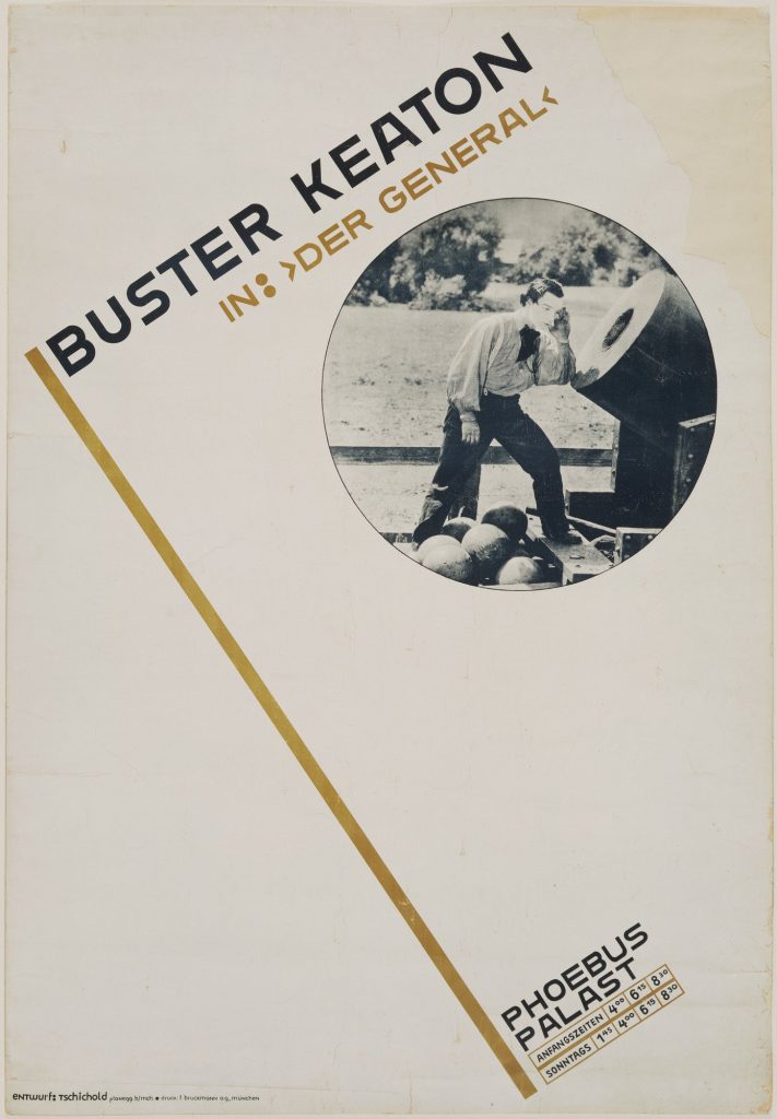
I have to admit, I have never heard of Jan Tschichold before. With that being said, the readings were astounding to me; to know that this artist has left such a great impression on typography and a legacy behind in the typography world.
Jan Tschichold
Jan Tschichold is an influential German author and typographer. He was vital in the development of typography in the 20th century, most notably because of advocating the beauty of sans serif fonts, set principles of typography and also developing the page canons.
Notable works
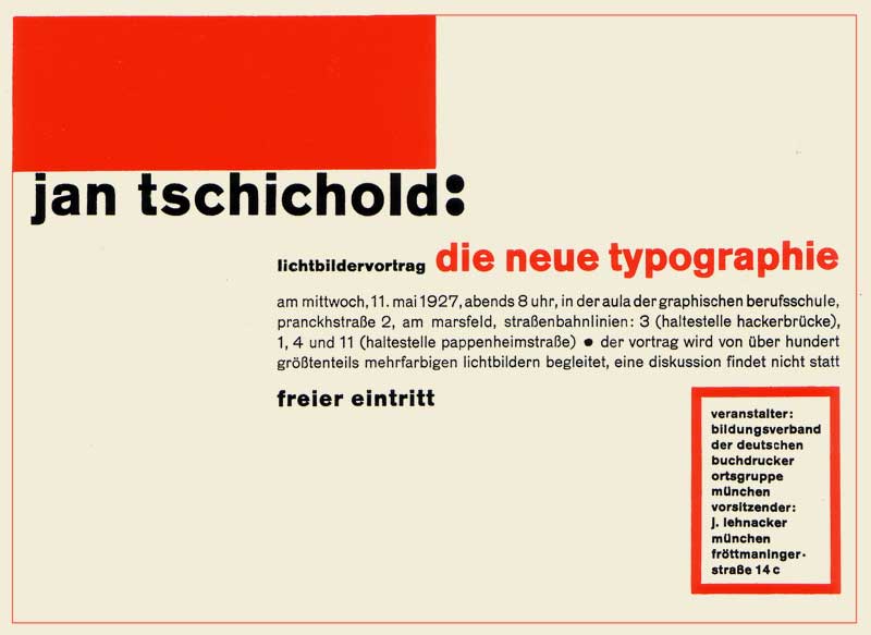
1. Die Neue Typographie by Jan Tschichold
Following the success and intrigue of his manifesto, Tschichold focused his attention on dealing with this idea of ‘modern typography’. He wrote ‘Die Neue Typographie’ and had it published in Berlin. People described it as sympathising with the philosophy of the communist revolution. In Die Neue Typographie, Tschicold also provided a set of rules that standardized the practices relating to modern typography.
2. Page Canons
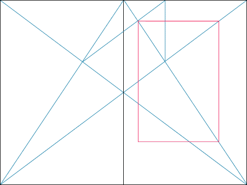
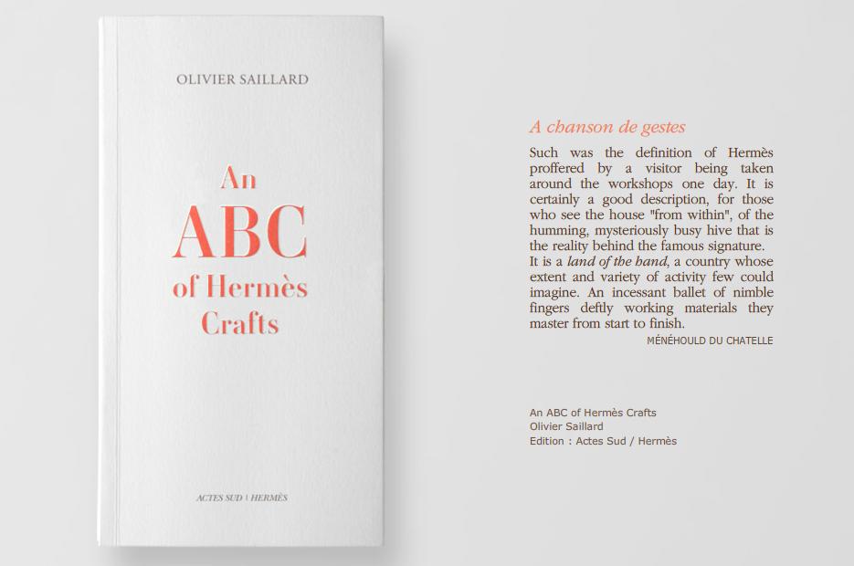
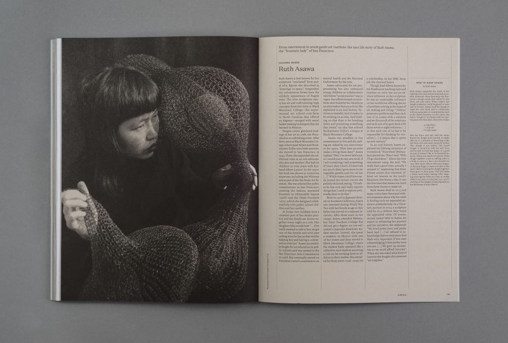
In one of his books, he wrote, “Asymmetry is the rhythmic expression of functional design.” He found the way to design a harmonious page. A perfect page. There were many rules, guides and ratio which he has set in order to create the perfect page he desired. Every single detail matters. Some of the guides are the Van de Graaf Canon and Tschichold’s recommended 2:3 page-size ratio. Many of these guides are still evident in today’s design.

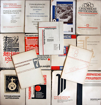
Sonderheft Typographische Mitteilungen (1925) by Jan Tschichold
Some thoughts:
His way of creating is definitely something worth remembering and learning. The different ways in which he played with typography, space, layout – very experimental yet essential. He was bored of seeing the same type layouts over and over again and it motivated him to be experimental with typography and layout. This experimental mindset is what will set an artist apart from the rest.
One thing which I really love about his works is the perfect page harmony. The canons of page construction can basically turn a page into something so aesthetically beautiful and pleasing to the eye, as the reader reads the text or admires a picture in a book. I have learnt that in typography, there is a fine line between order and disorder. Underlying the what (might seem) disorderly or asymmetrical text might be the typography guides that these designers have been using since then.
References:
https://thecharnelhouse.org/wp-content/uploads/2016/11/jan-tschichold-the-new-typography-1928.pdf
