Category Archives: Project 2 – Locale

Y1S2 Graphic Form Gallery

A walk-through of the projects during this semester in Graphic Form.

01 IMAGE MAKING THROUGH TYPE

The Journey of Dream Jobs is a set illustration which talks about my evolution of dream jobs, from 7-21 years old. In each illustration, the typography of my initials, “KT”, is incorporated in it. The placement and properties of a typeface are considered as they bring a focal point to the composition; each revealing an important aspect of the narrative.

Here are the links to my previous posts on this project:
01 Image Making Through Type: Artist Research
01 Image Making Through Type: Ideation and Process
01 Image Making Through Type: Final

02 LOCALE (PART 1)

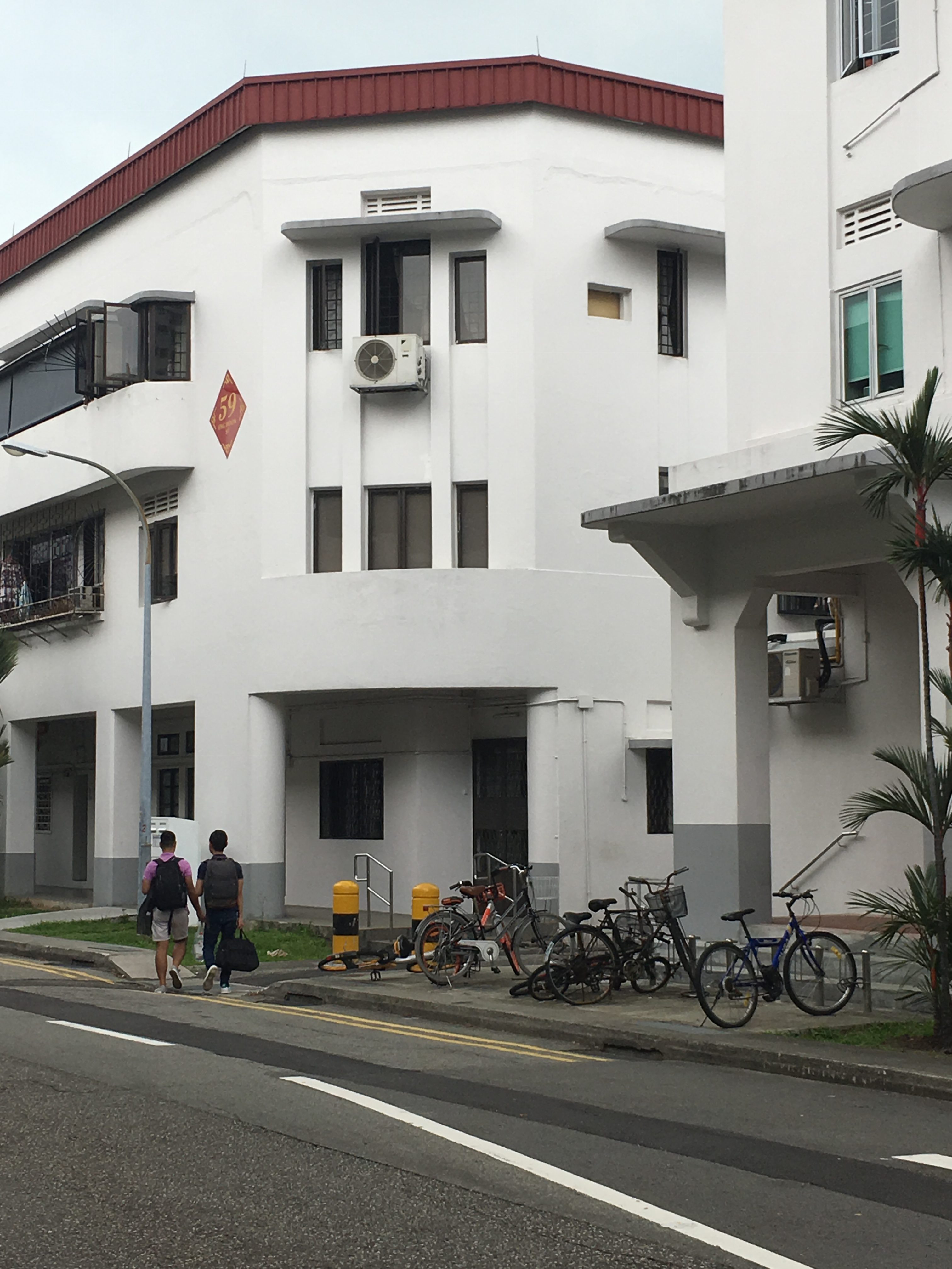
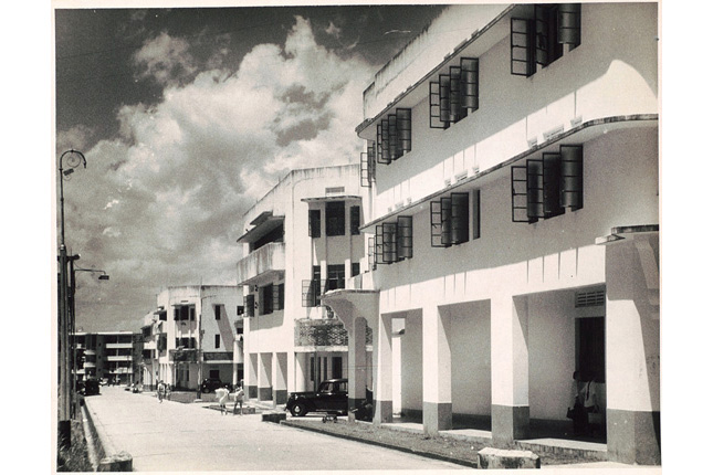
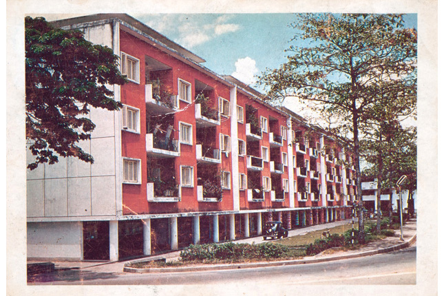
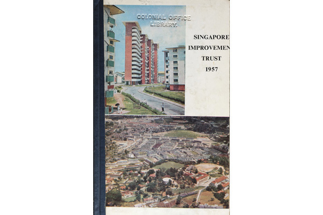
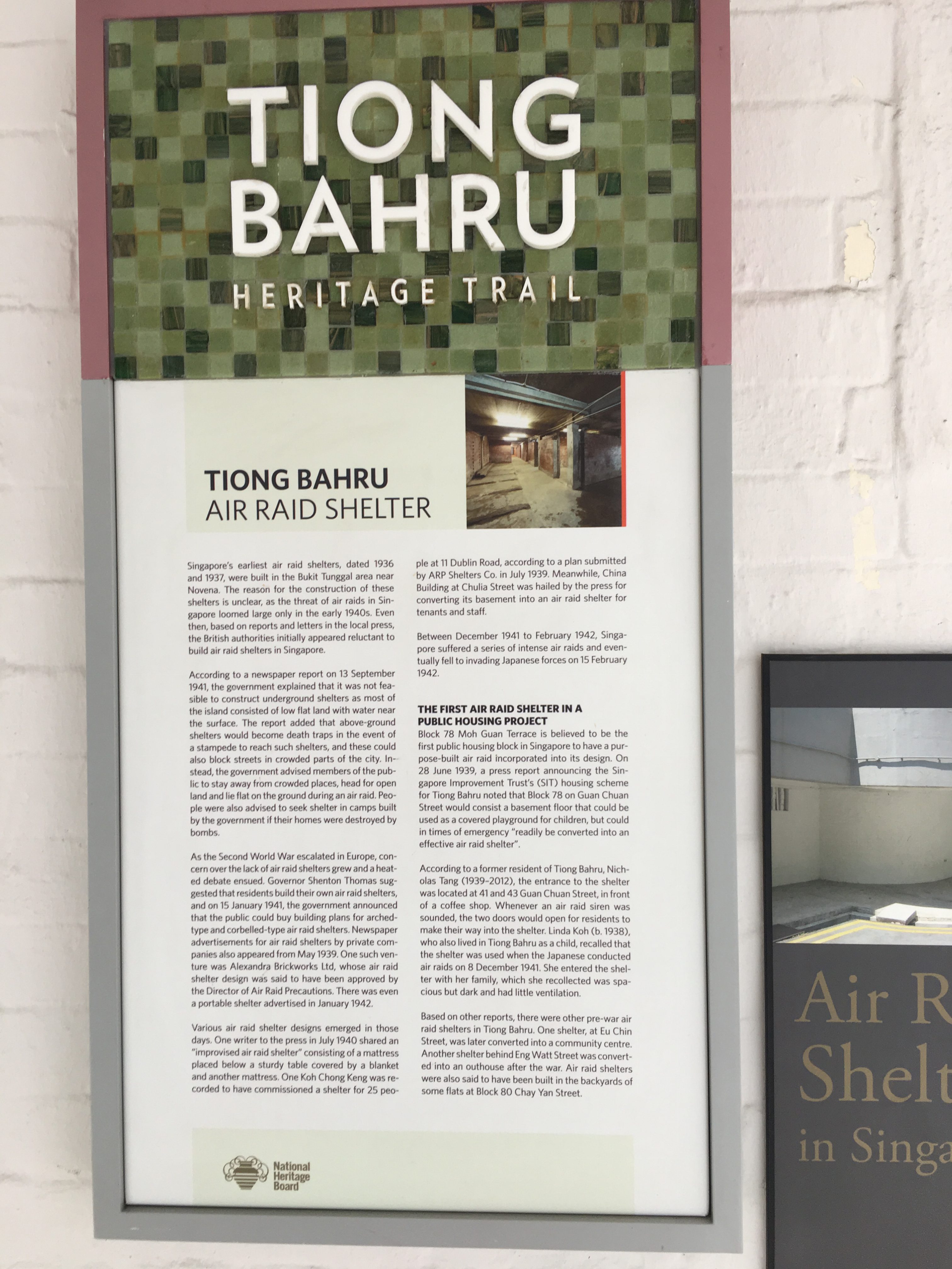
Uniquely, Tiong Bahru, is an infographic which was derived from my research on Tiong Bahru. Comprising of consolidated information from both primary and secondary research, this infographic tells you about the brief history of Tiong Bahru, mainly related to the SIT (Singapore Improvement Trust) flats, and more importantly, focuses on the activities within Tiong Bahru today. It reveals some trends and insights which I have found and lastly, it consists the voices of Tiong Bahru.

Here are the links to my previous posts on this project:
02 Locale: Research
02 Locale: Infographics

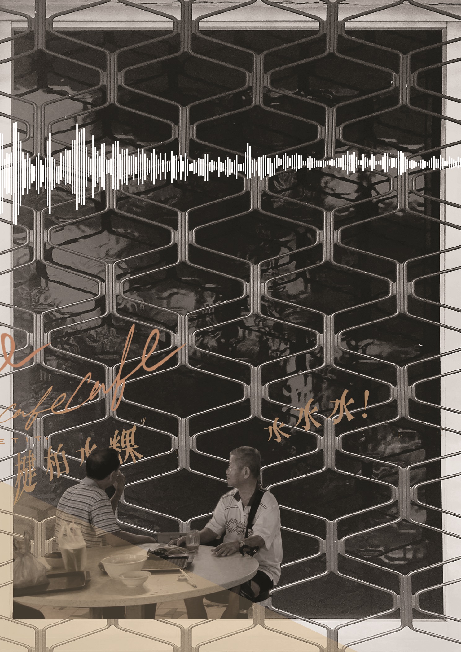
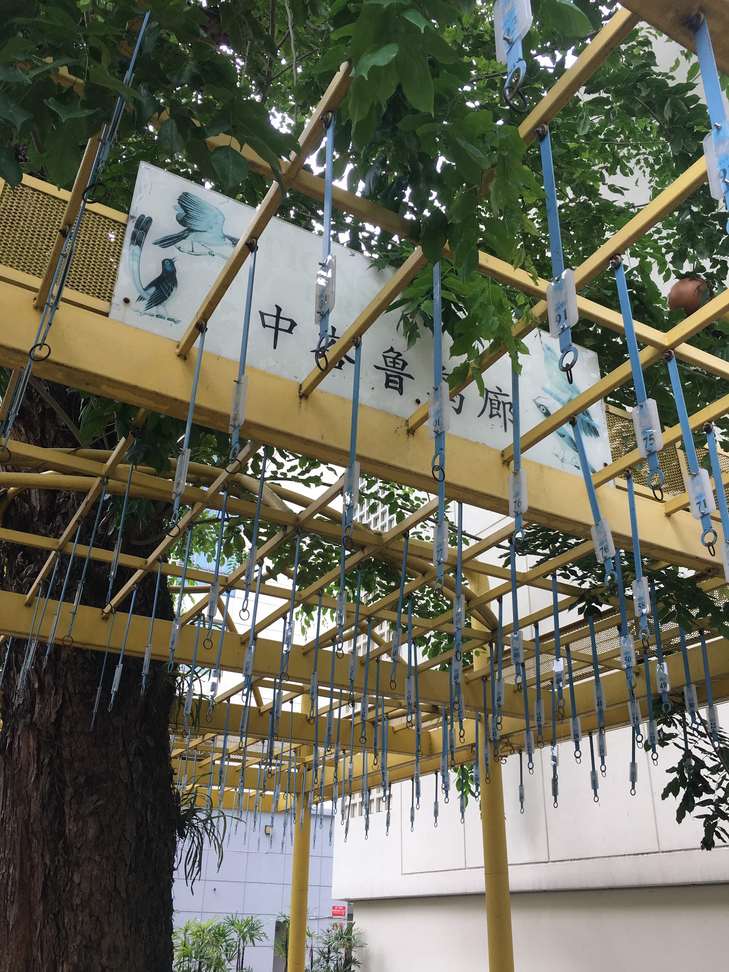
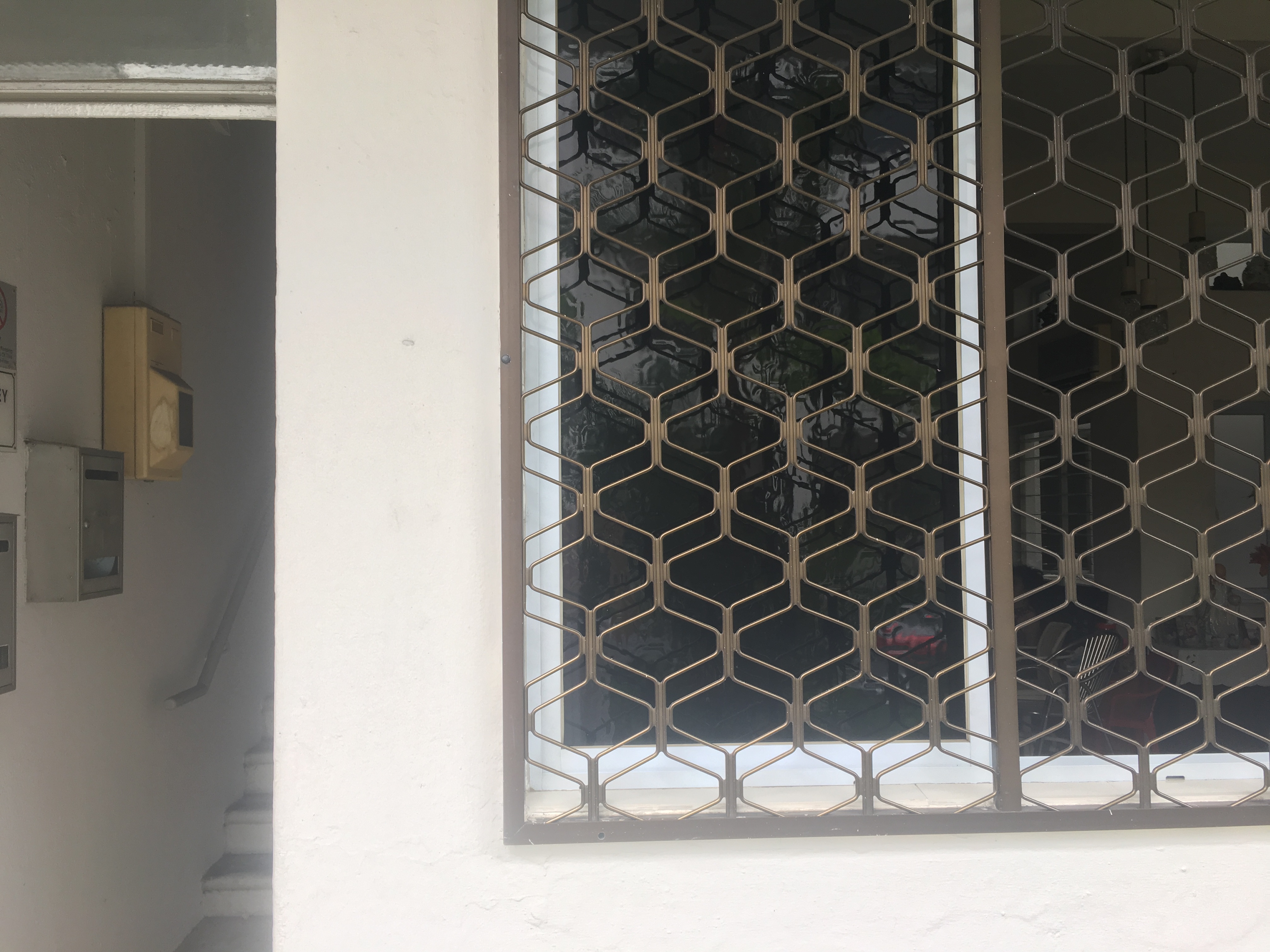
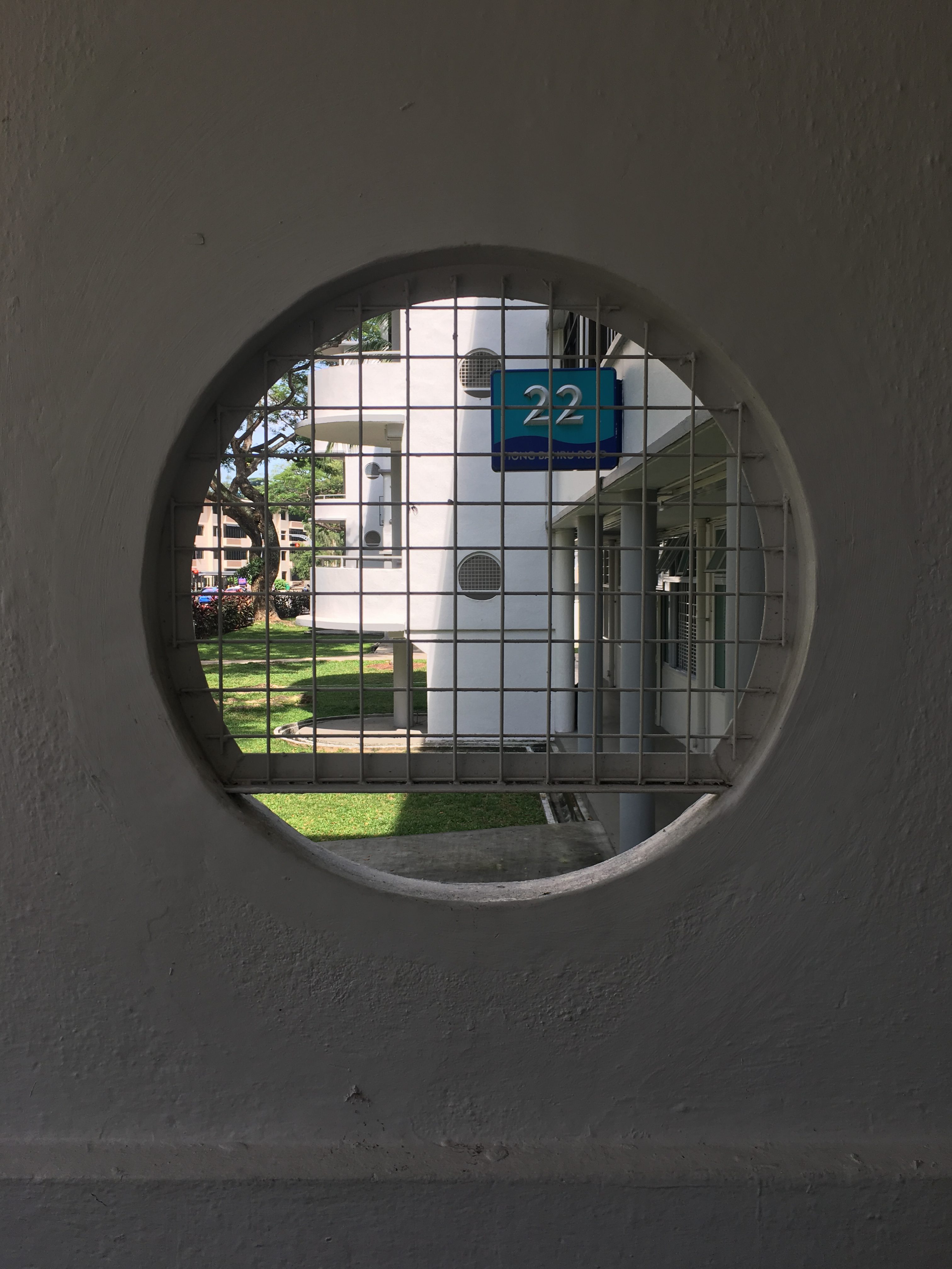
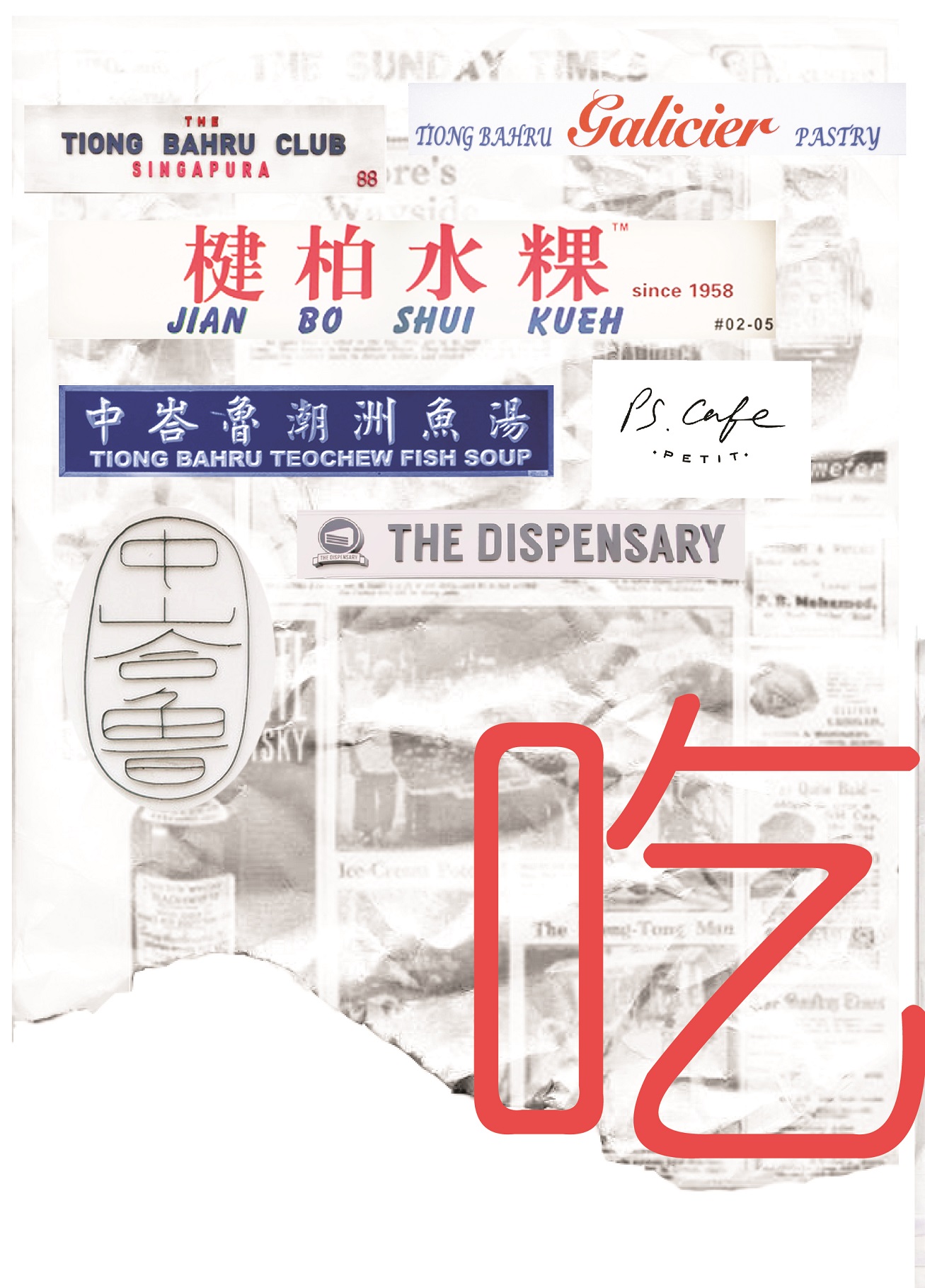
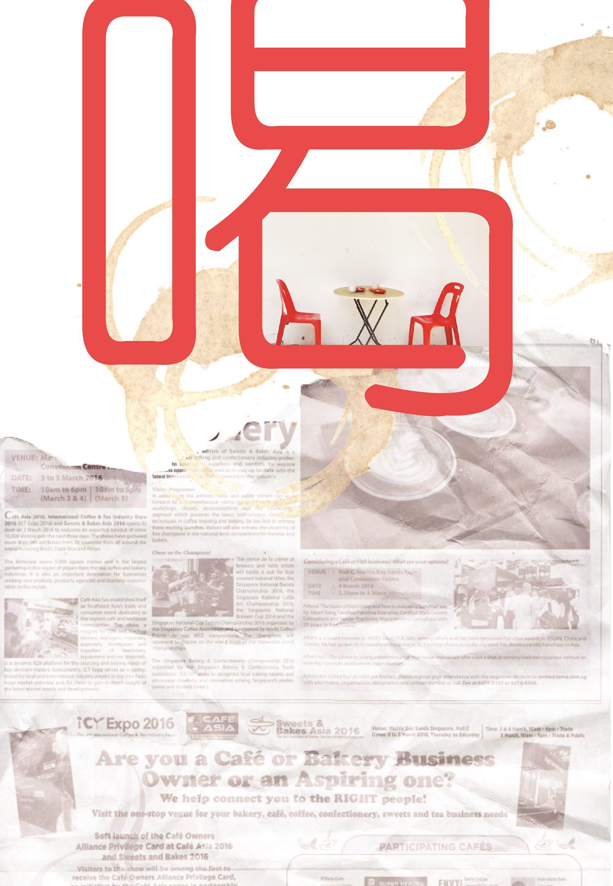
03 ZINE: LOCALE (PART 2)

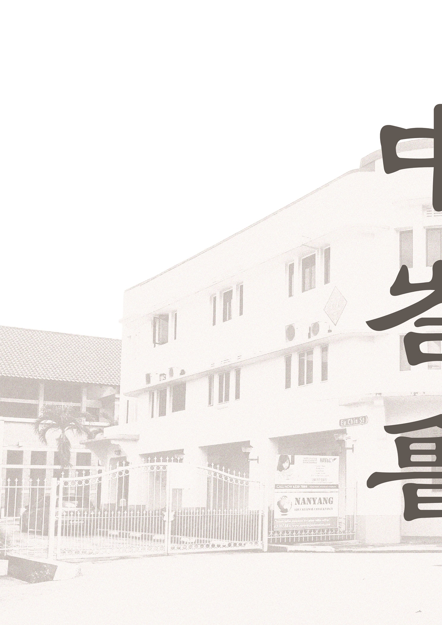
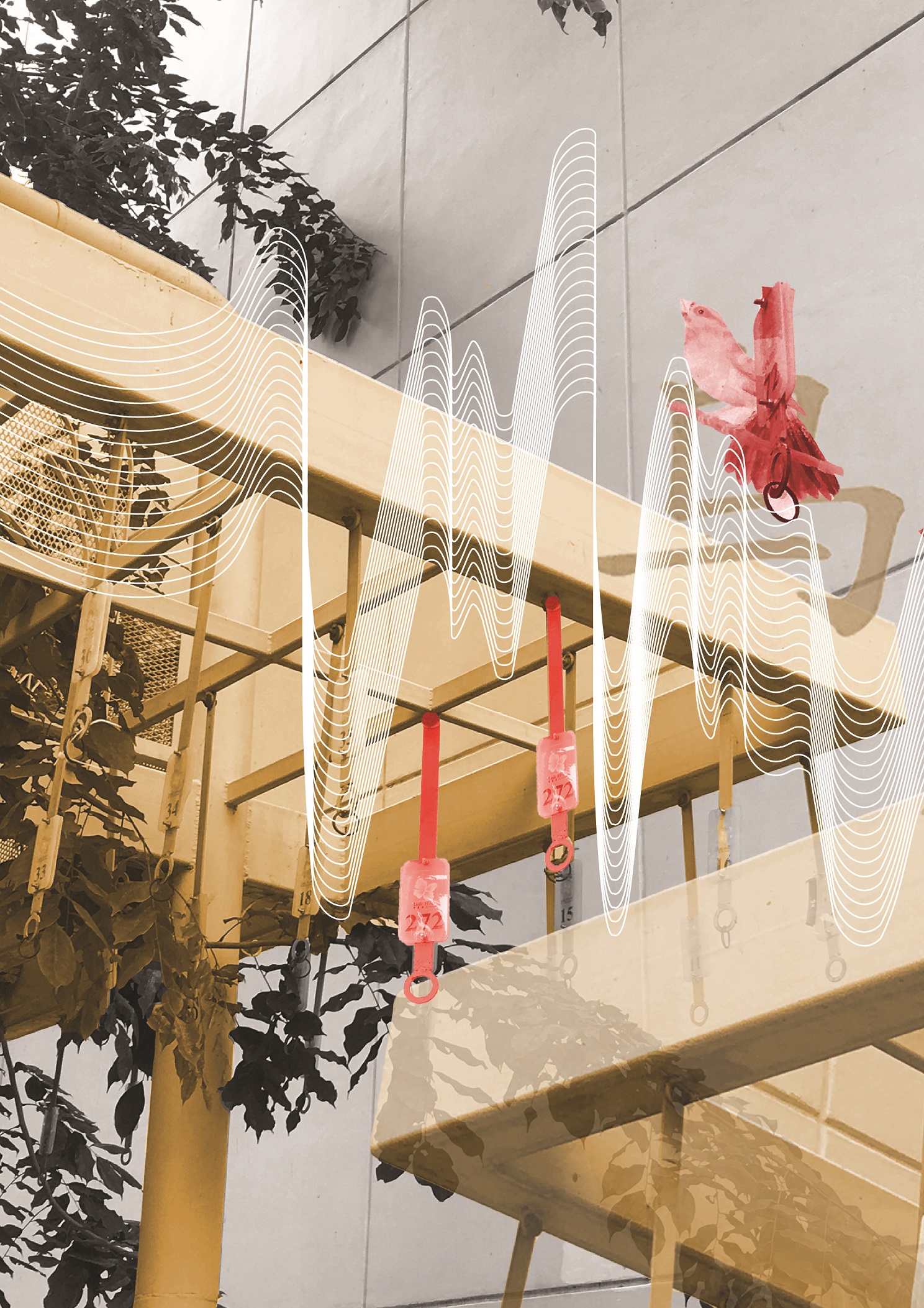
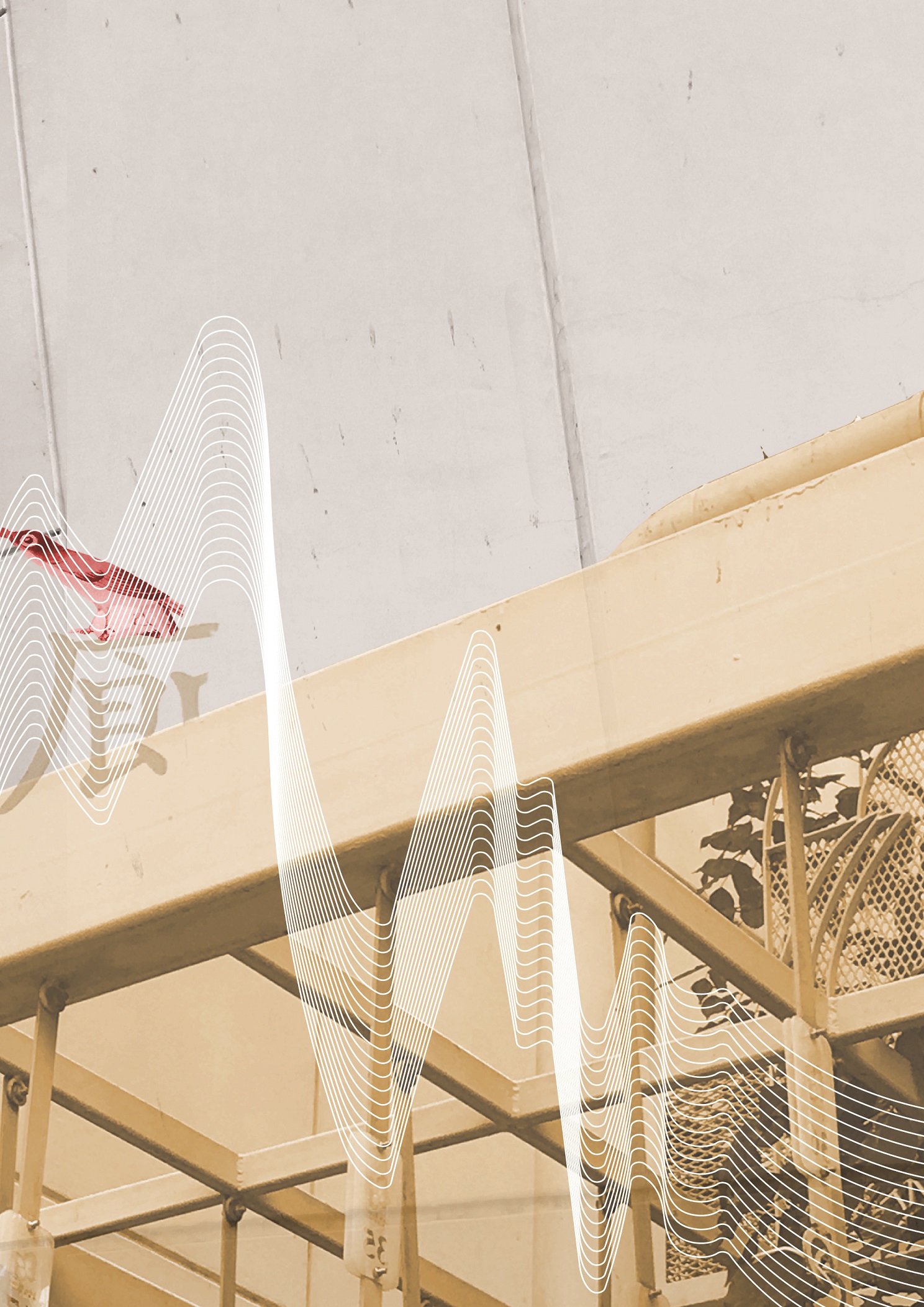
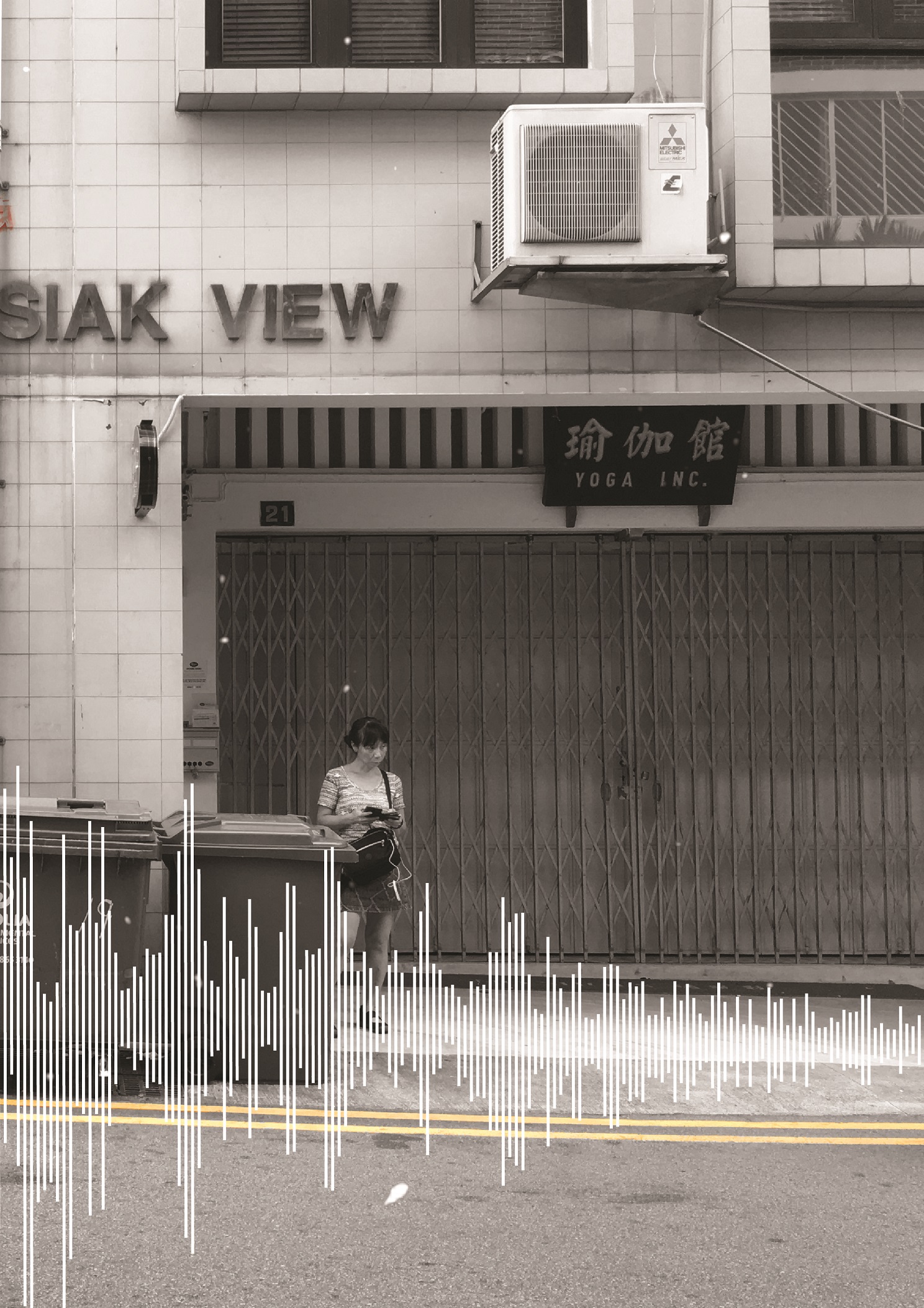
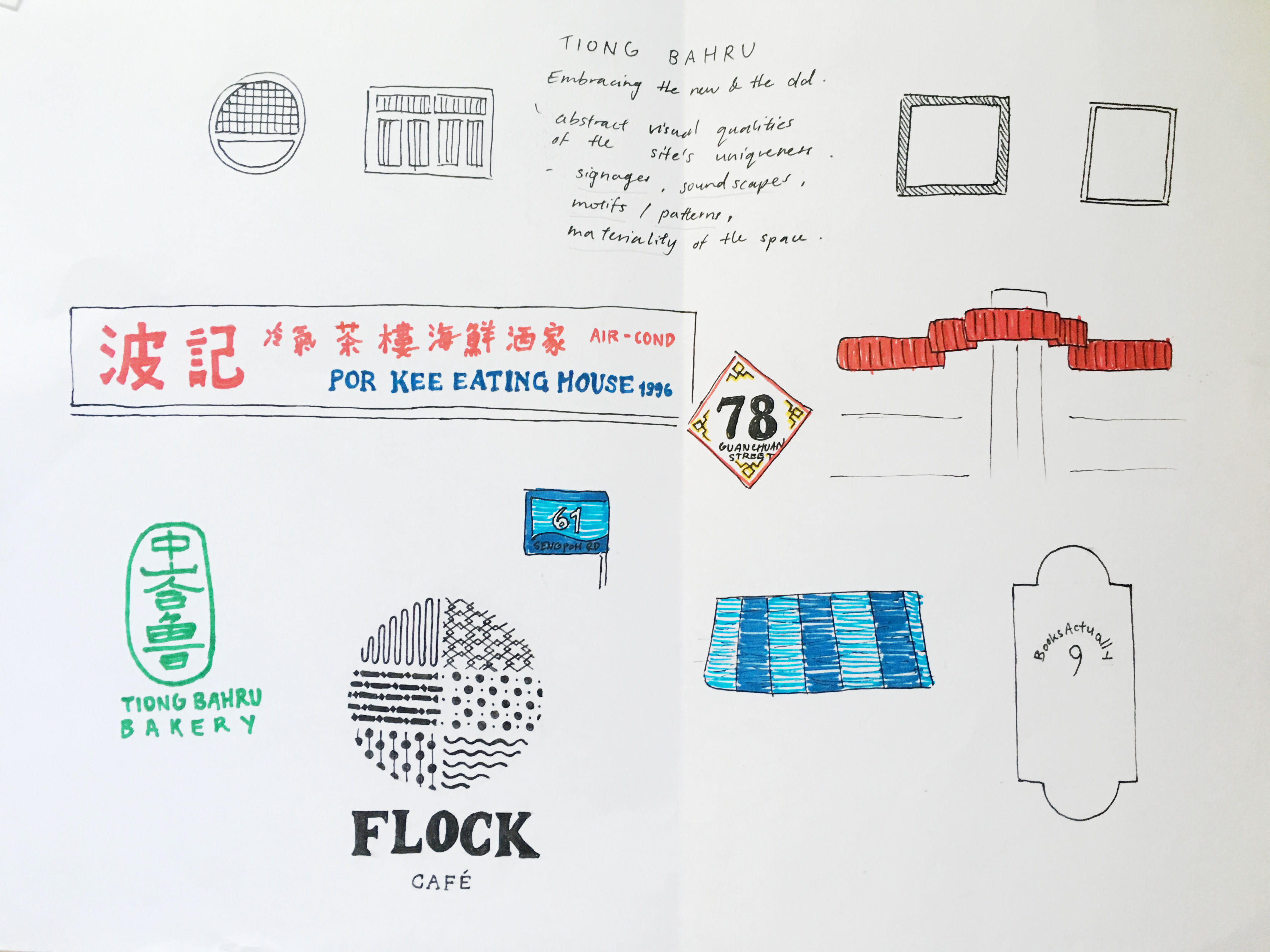
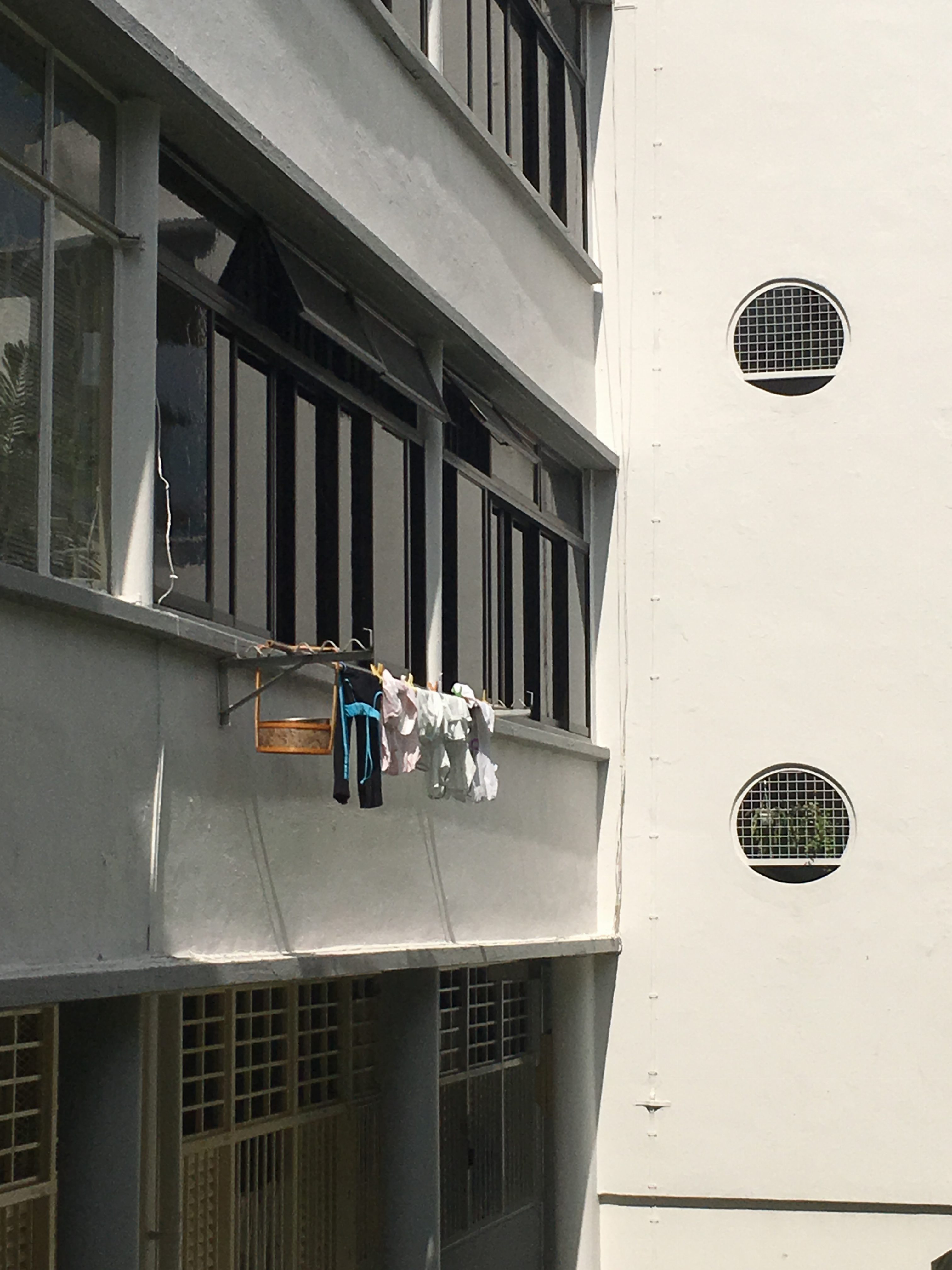
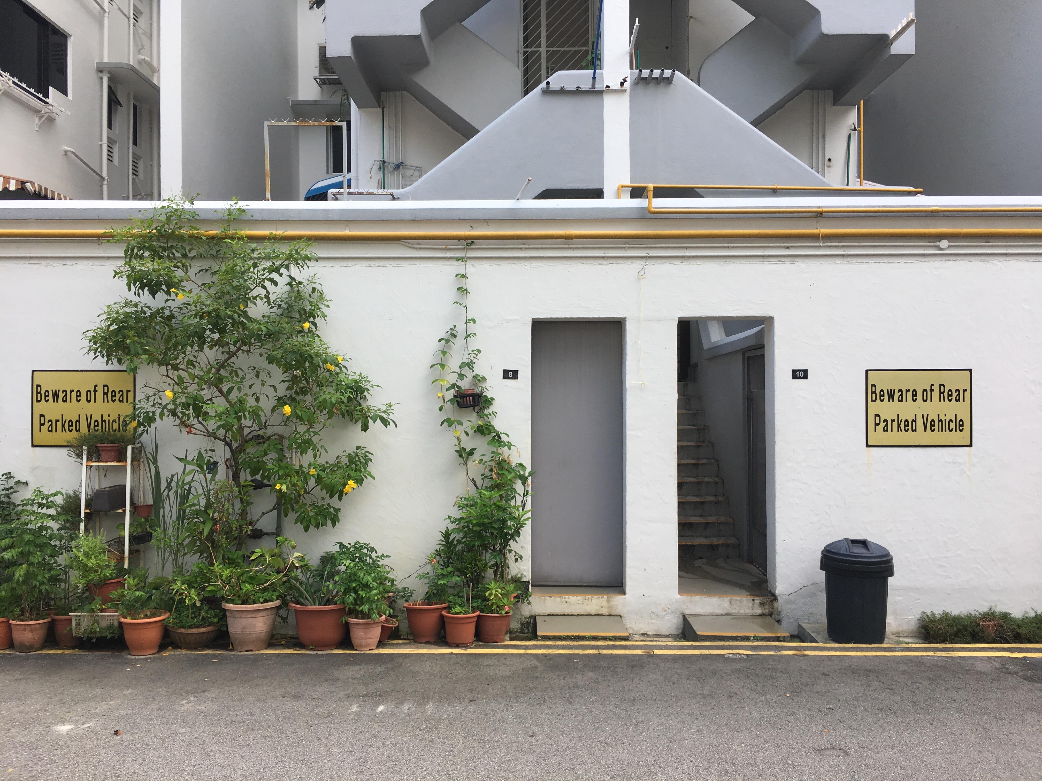
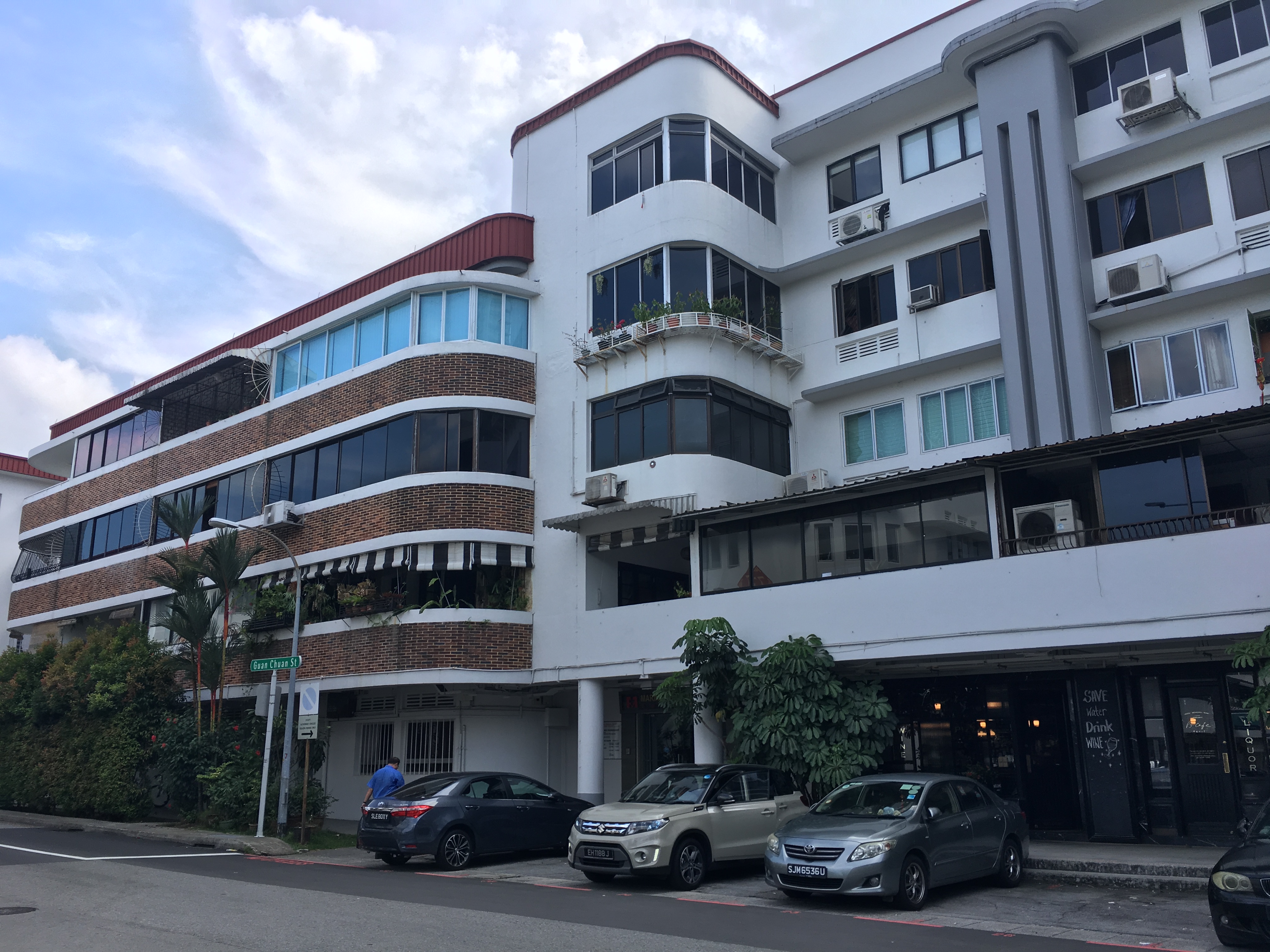
中峇鲁, is an 8-page zine which focuses on the abstract visual qualities of the site, Tiong Bahru. Using photo manipulation, soundscapes and light leaks, the zine looks into the nostalgia and fragility of Tiong Bahru by depicting memorable areas and a juxtaposition of the new and old – a continuation of the first part of my Locale project.

Here are the links to my previous posts on this project:
03 Zine: Locale Process
03 Zine: Locale (Final)

03 Zine: Locale (Final)

This is the final post of my zine!

To view the earlier parts of my Locale project, you can click on the links below:
Locale: Research
Locale: Infographics
Locale: Process


Pictures I took at Tiong Bahru in my other visits


ZINE LOCALE

After MANY changes, I decided to mainly use photos and soundscape to bring about the experience in Tiong Bahru. Instead of using the previous “eat, drink and play” idea (which was too informative), I will be using the nostalgic and fragility aspect of Tiong Bahru – something which I will not expect if I were to take a quick stroll along.

Nostalgia and fragility 
Something which I thought about during this project was the conservation of this area – whether this charming estate will eventually disappear or not. Thus, I created this zine with this central focus in mind.


Cover page (right) and Back page (left).

In this spread, I used an ordinary photo of Tiong Bahru (b&w and grainy). It is unlike my other spreads where it is saturated with hints of warm colours – red, orange and yellow to suggest vibrancy. To me, this was my first impression of Tiong Bahru. It was just an “old estate” which I came to know about because of the hipster cafes. I split the typography in half because I wanted to reveal only half of Tiong Bahru’s name in Chinese characters as one will only see the other half when he/she finishes flipping through the zine – only seen as a whole or complete when one reaches to the final page.


First spread

A bird singing corner with no birds, no chirping, only noises from bustling cars. These noises are translated into the soundscape, which clashes with the bird visuals and typography, Barely recognizable without bird cages, this area is often overlooked by many. But, it contains a rich history of Tiong Bahru as people used to enjoy watching these birds sing. I could only extract the birds and typography from the faded sign, the only remnants that made me recognise that this place was once a vibrant bird singing corner.

Second(middle) spread

The juxtaposition of new and old, of bustling and tranquil. I used a full picture across this spread. To show the contrast, I colourized the cafe area in the picture, and manipulated some typography above it. Looking across the spread, the soundscape compliments the visuals, reflecting soundwaves which depict a noisier to a quiet environment. The main warm colours, red, orange and yellow, were used in order to bring focus to the spread. Also, to play with the light intensity of the photo, I added light leaks to intensify the colours. More importantly, by this colour manipulation and adjusting of exposure (against the black and white side), I wanted to show the fragility of Tiong Bahru, like an old photo fading away.

Third spread 

The alleys in Tiong Bahru are either filled with people or absolutely empty and quiet. In terms of the environment, there is a stark difference in the light. I feel that these crowded alleys, mostly filled with cafes along the side, are brightly lit and out in open junctions. But as I turn into a corner around the SIT flats, it is normally darker and still. Which brings me to this spread where two pages show interaction with the use of the soundscape as a transition and the overlays of extracted typography from signboards (around the middle). Two different kinds of people are shown here, the tourists/outgoing residents and the older generation, mostly overshadowed by all the new things being introduced into this estate. They look as if they are interacting, but are in two entirely different backgrounds.

Overall, this zine has really pushed me in terms of style as mentioned earlier, I was more comfortable with vectors and illustrations. Nonetheless, the several trips to Tiong Bahru and figuring out what I interpreted from the site was an interesting experience. Having said that, because I had 2 entirely different drafts before this, I had the opportunity to explore possible textures, typography and photo manipulation. I look forward to learning even more new styles in the future.


03 Zine: Locale Process

Moving on from part one of Locale, I will be focusing on the artist research and process of creating my zine here.

To view the first part of my Locale project, you can click on the links below:
Locale: Research
Locale: Infographics

I drew some visual references which I took from the site itself and worked from here onwards.

 
Some pictures I took @ Tiong Bahru

I tried looking for motifs which could be simplified or abstracted but due to the nature of the Art Deco style in Tiong Bahru, I realised that I would end up working with simple geometrical shapes if I were to choose a vector approach in terms of my art direction.

Thus, I drafted the cover page and 2 spreads, inspired by circular motifs and soundscape.
Here are some soundscapes which I was inspired by.

Studio Output’s set of graphic postcards for London’s Southbank Centre.

I would be exploring with soundscapes and forms which reflects the activity within Tiong Bahru. As my unique selling point is “Embracing the new and the old”, the overarching theme to show activities of the new and old would be through a simple Chinese idiom, “吃喝玩乐” (Translation: Eat, drink, play, enjoy).

My first 2 spreads were minimalist. I mainly used basic shapes to convey the activities in Tiong Bahru. The four pages are representative of “吃喝玩乐”,

Relaxed, fulfilment, happiness. I associate eating with these based on what I have observed. Whether is it at the market or the cafes, everyone was pretty relaxed and happy.

Coffee talks; something which stood out to me the most as I was at the site. A cup of kopi or a cup of cappuccino, young or old, the scene of them chatting always warms my heart. Relating to the soundscape, the soundscape represents a conversation of something telling a story, where it is calm at the start and it slowly peaks to the climax of the story.

Although the meaning of “play” here is disappearing as everyone nowadays are fixated on their phone screens, I still do see kids at the playground once in awhile, screaming and having fun. Thus, these higher frequencies of soundscape to represent them.

To me, enjoyment within Tiong Bahru gives a nostalgic vibe. When I interviewed some residents, they mentioned how they used to play with fire, rear chickens, have a bird corner and how they remember that the newspaper uncle could throw the newspaper all the way up from the ground floor to the third. These are small nostalgic moments which I would like to capture.

However, I felt that this vector and minimalist approach limits the visual quality of portraying Tiong Bahru. Other than the signature red and blue colour, the motifs are too minimalistic to be an abstract representation of the site. As mentioned in my consultation, some aspects which I can explore are textures, motifs, patterns and typography.

MY SECOND IDEA

As I have always worked with vector illustrations, I find it hard to bring out visual qualities of a site using anything but vectors. So, in my second (failed) attempt, I tried incorporating some textures and marks I found in that area, such as newspaper and coffee stains. However, it ended up looking messy and with no focal point. Also, because I took the signs and collaged them, it added on to the chaoticness of the spread. So I scraped this eventually.

Some points to note:

Maybe I could extract the typography on the signs.
Use pictures instead.

References:
Studio Output’s soundwave concert postcards

02 Locale: Research

To start off project 2, here’s the research I’ve conducted, primary and secondary, to find out more about my chosen site: Tiong Bahru.

PRIMARY RESEARCH

ETHNOGRAPHIC RESEARCH (QUALITATIVE)

01 Site Observations

Firstly, to know more about the place itself, I visited the site and explored around Tiong Bahru. I went ahead to observe things up close which I normally don’t, such as, the architecture, the shops, the housing areas, the courtyards outside the Singapore Improvement Trust (SIT) flats an even the bomb shelter located at the old estate.

As I walked around the area, I took down some notes using the POEMS framework; a design thinking framework useful for ethnographic research.


02 Ethnographic Interviews

Other than observations, I interviewed the people around the area – residents and passers-by. To obtain more holistic information through the interviews, I ensured that I interviewed a range of people, especially from teens to elderly as I felt that their varying responses were key to finding good insights about this place.

Here’s a sample of the interview questions.


SECONDARY RESEARCH

WEBSITE AND ARTICLES (QUANTITATIVE)

As for the secondary research, I looked up useful information which substantiates the information that I have gathered through the primary research. I found reliable information from government websites, such as the Urban Redevelopment Authority (URA), the Tiong Bahru: Heritage trail by the Singapore National Heritage Board and the Straits Times.

Source: Urban Redevelopment Authority (URA)

Singapore Improvement Trust flats in the Tiong Bahru estate. (c. 1953. Image from National Museum of Singapore.)

Singapore Improvement Trust flats in the Tiong Bahru estate. (c. 1953. Image from National Museum of Singapore.)Singapore Improvement Trust flats in the Tiong Bahru estate. (c. 1953. Image from National Museum of Singapore.)

From these sources, I have found out many interesting facts and the rich history of Tiong Bahru regarding the estate. Information such as when was the first block built and who were the people living in the block and even the following developments. Basically, Tiong Bahru’s timeline as an estate.  One of the most iconic blocks of the estate to me was the one with a purpose-built air raid shelter, which I visited during my site visit as well. I was pretty surprised when I found it as it was really in the middle of all the flats. Some interviewees also pointed out the bird singing corner (which I couldn’t find during this visit). Without getting to see it, I just googled it to know more about it. (But, in the end, I went back to Tiong Bahru again to take a look at things which I have missed out, like the bird singing corner.)

References:
http://eresources.nlb.gov.sg/infopedia/articles/SIP_1700_2010-08-11.html
https://www.challenge.gov.sg/print/life-style/tiong-bahru-tales
https://www.ura.gov.sg/-/media/User%20Defined/URA%20Online/Guidelines/Conservation/Tiong%20Bahru%20General%20Guidelines%20240913.pdf
http://www.tiongbahru.sg/tiong-bahru-estate/
http://www.visitsingapore.com/see-do-singapore/architecture/historical/sit-flats/

MAP OF TIONG BAHRU FOR SIT FLATS, c.1920