Tag Archives: process

03 Zine: Locale Process

Moving on from part one of Locale, I will be focusing on the artist research and process of creating my zine here.

To view the first part of my Locale project, you can click on the links below:
Locale: Research
Locale: Infographics

I drew some visual references which I took from the site itself and worked from here onwards.

 
Some pictures I took @ Tiong Bahru

I tried looking for motifs which could be simplified or abstracted but due to the nature of the Art Deco style in Tiong Bahru, I realised that I would end up working with simple geometrical shapes if I were to choose a vector approach in terms of my art direction.

Thus, I drafted the cover page and 2 spreads, inspired by circular motifs and soundscape.
Here are some soundscapes which I was inspired by.

Studio Output’s set of graphic postcards for London’s Southbank Centre.

I would be exploring with soundscapes and forms which reflects the activity within Tiong Bahru. As my unique selling point is “Embracing the new and the old”, the overarching theme to show activities of the new and old would be through a simple Chinese idiom, “吃喝玩乐” (Translation: Eat, drink, play, enjoy).

My first 2 spreads were minimalist. I mainly used basic shapes to convey the activities in Tiong Bahru. The four pages are representative of “吃喝玩乐”,

Relaxed, fulfilment, happiness. I associate eating with these based on what I have observed. Whether is it at the market or the cafes, everyone was pretty relaxed and happy.

Coffee talks; something which stood out to me the most as I was at the site. A cup of kopi or a cup of cappuccino, young or old, the scene of them chatting always warms my heart. Relating to the soundscape, the soundscape represents a conversation of something telling a story, where it is calm at the start and it slowly peaks to the climax of the story.

Although the meaning of “play” here is disappearing as everyone nowadays are fixated on their phone screens, I still do see kids at the playground once in awhile, screaming and having fun. Thus, these higher frequencies of soundscape to represent them.

To me, enjoyment within Tiong Bahru gives a nostalgic vibe. When I interviewed some residents, they mentioned how they used to play with fire, rear chickens, have a bird corner and how they remember that the newspaper uncle could throw the newspaper all the way up from the ground floor to the third. These are small nostalgic moments which I would like to capture.

However, I felt that this vector and minimalist approach limits the visual quality of portraying Tiong Bahru. Other than the signature red and blue colour, the motifs are too minimalistic to be an abstract representation of the site. As mentioned in my consultation, some aspects which I can explore are textures, motifs, patterns and typography.

MY SECOND IDEA

As I have always worked with vector illustrations, I find it hard to bring out visual qualities of a site using anything but vectors. So, in my second (failed) attempt, I tried incorporating some textures and marks I found in that area, such as newspaper and coffee stains. However, it ended up looking messy and with no focal point. Also, because I took the signs and collaged them, it added on to the chaoticness of the spread. So I scraped this eventually.

Some points to note:

Maybe I could extract the typography on the signs.
Use pictures instead.

References:
Studio Output’s soundwave concert postcards

02 Locale: Research

To start off project 2, here’s the research I’ve conducted, primary and secondary, to find out more about my chosen site: Tiong Bahru.

PRIMARY RESEARCH

ETHNOGRAPHIC RESEARCH (QUALITATIVE)

01 Site Observations

Firstly, to know more about the place itself, I visited the site and explored around Tiong Bahru. I went ahead to observe things up close which I normally don’t, such as, the architecture, the shops, the housing areas, the courtyards outside the Singapore Improvement Trust (SIT) flats an even the bomb shelter located at the old estate.

As I walked around the area, I took down some notes using the POEMS framework; a design thinking framework useful for ethnographic research.


02 Ethnographic Interviews

Other than observations, I interviewed the people around the area – residents and passers-by. To obtain more holistic information through the interviews, I ensured that I interviewed a range of people, especially from teens to elderly as I felt that their varying responses were key to finding good insights about this place.

Here’s a sample of the interview questions.


SECONDARY RESEARCH

WEBSITE AND ARTICLES (QUANTITATIVE)

As for the secondary research, I looked up useful information which substantiates the information that I have gathered through the primary research. I found reliable information from government websites, such as the Urban Redevelopment Authority (URA), the Tiong Bahru: Heritage trail by the Singapore National Heritage Board and the Straits Times.

Source: Urban Redevelopment Authority (URA)

Singapore Improvement Trust flats in the Tiong Bahru estate. (c. 1953. Image from National Museum of Singapore.)

Singapore Improvement Trust flats in the Tiong Bahru estate. (c. 1953. Image from National Museum of Singapore.)Singapore Improvement Trust flats in the Tiong Bahru estate. (c. 1953. Image from National Museum of Singapore.)

From these sources, I have found out many interesting facts and the rich history of Tiong Bahru regarding the estate. Information such as when was the first block built and who were the people living in the block and even the following developments. Basically, Tiong Bahru’s timeline as an estate.  One of the most iconic blocks of the estate to me was the one with a purpose-built air raid shelter, which I visited during my site visit as well. I was pretty surprised when I found it as it was really in the middle of all the flats. Some interviewees also pointed out the bird singing corner (which I couldn’t find during this visit). Without getting to see it, I just googled it to know more about it. (But, in the end, I went back to Tiong Bahru again to take a look at things which I have missed out, like the bird singing corner.)

References:
http://eresources.nlb.gov.sg/infopedia/articles/SIP_1700_2010-08-11.html
https://www.challenge.gov.sg/print/life-style/tiong-bahru-tales
https://www.ura.gov.sg/-/media/User%20Defined/URA%20Online/Guidelines/Conservation/Tiong%20Bahru%20General%20Guidelines%20240913.pdf
http://www.tiongbahru.sg/tiong-bahru-estate/
http://www.visitsingapore.com/see-do-singapore/architecture/historical/sit-flats/

MAP OF TIONG BAHRU FOR SIT FLATS, c.1920

01 Image Making Through Type: Ideation and Process

IDEATION

I began my ideation with the basics,

“My name is…”

I wrote down as many variations of my name, which I felt that will be helpful later on, when I have to decide which name/initials will be more suitable for my letter form.

Concept (process):
As we have to come up with 4 different designs, I felt that maybe I could link them up and tell a story. I started with looking into my dream jobs and these are some jobs which I listed out:

Architect
Interior designer
Packaging designer
Brand identity designer
UIUX/User experience designer
Goldsmith/jeweller (jewel crafter)
Pastry chef/pâtissier
Tattoo artist
Spiritual healer (shaman/witch/enchanter)  
Fragrance chemist (Alchemist)
Adventurer


Eventually, I narrowed down the list and got my 4 jobs.

The Journey of Dream Jobs
Tone: Positive
Message: Sometimes, dream jobs are seemingly impossible due to constrictions and practicality. Nonetheless, going through this identity crisis of being conflicted with what we want is mandatory to find ourselves; in hopes that everything will eventually work out.


In chronological order,

Patissier
Architect
Tattoo artist
Packaging designer


As this project was to incorporate the letterform which reflects a particular job, I found these examples really interesting and useful: how they managed to visualise both letterforms and shapes and make sense out of it.


Chineasy by ShaoLan Hsueh


Moonshine poster by Jon Klassen


Mariano Pascual’s 36 Days of Type (click to see the rest)

36 Days of Type by Shiffa


PROCESS

PATISSIER


To show this impossible dream of mine, I portrayed a dessert to be pretty-looking on the outside and disgusting on the inside.

Initially, I wanted to use solely complementary colours but subsequently, I felt that it was lacking colours and vibrancy.

Also, in the composition with the green background, my letterforms were incorporated into the reflection of the slime (k a i). However, after consultations, Joy mentioned that the letterforms could be incorporated into something more significant to my story/dream job.

So, I have made some changes, like the colours used. I included a range of analogous colours instead. The letterform, K, is in a form of the crack seen on the plate instead: showing how impossible this dream is and that is a bad choice for me to do so.

As compared to the letterforms in the slime, I found it slightly easier to incorporate the letter K as a crack as it is angular. Whereas, the slime took on an organic shape and fitting angular letterforms would cause it to warp even further, losing their readability.

ARCHITECT


I was Inspired by Zaha Hadid, an Iraqi-British architect. Known as the “Queen of Curves”, her architecture style is advanced and sleek.


In this design, I wanted to illustrate impossible architecture through exaggerating the structure and subtracting the basics of what makes a building foundationally sound and strong. In my sketches, I tried creating this structure using geometrical and organic shapes, or a mix of both. Depending on my choice, the letterforms chosen varies. My initials, “KT”, as compared to “KAI” seemed more appropriate as the angularity of it is an advantage. The letterforms are illustrated as sticks which are trying to support the structure but from consultations, Joy suggested to make this structure look “even more impossible”.

For the last design, I added texture to it so that it looks more dynamic.

TATTOO ARTIST


Inspired by the Ukiyo-e art movement, I wanted to design something which reflected a rebellious phase of mine, and also the practicality of being a tattoo artist due to cultural constrictions. I started off experimenting with the neon-sign look as it reminds of shady places that bad and messed up people visit. Also, the tattoo artist is drawn in lines, unlike the person getting tattooed, as it represents this dream job of mine does not even exist at all; an impossible vision.

However, I couldn’t think of how should my letterforms be in this composition as the line work illustrations are a little distracting.

In the last picture, I experimented with the brush tool that I have learnt in class. Instead of illustrating the chain manually, I made a pattern brush, using chains. Most probably, I would include this chain element in my letterform as it represents the cultural restrictions of being a tattoo artist.

PACKAGING DESIGNER


Memphis artist, Peter Judson,
with his vivid isometric illustrations.


In my final design, I played with basic shapes as I was inspired by memphis art style. By utilising this art style, I felt that the placement of elements and colours used played a great part in creating a dynamic composition; one that looks playful and joyful.

References

https://www.behance.net/gallery/16735099/36-Days-of-Type
http://www.mariano-pascual.com/36-Days-of-type
http://www.nathanfowkesart.com/
https://www.kickstarter.com/projects/shaolanchineasy/chineasy-begins-
https://www.pinterest.com/pin/192599321539037000/
https://www.pinterest.com/pin/463378249133358484/

02 Forrest Gump: Design Process

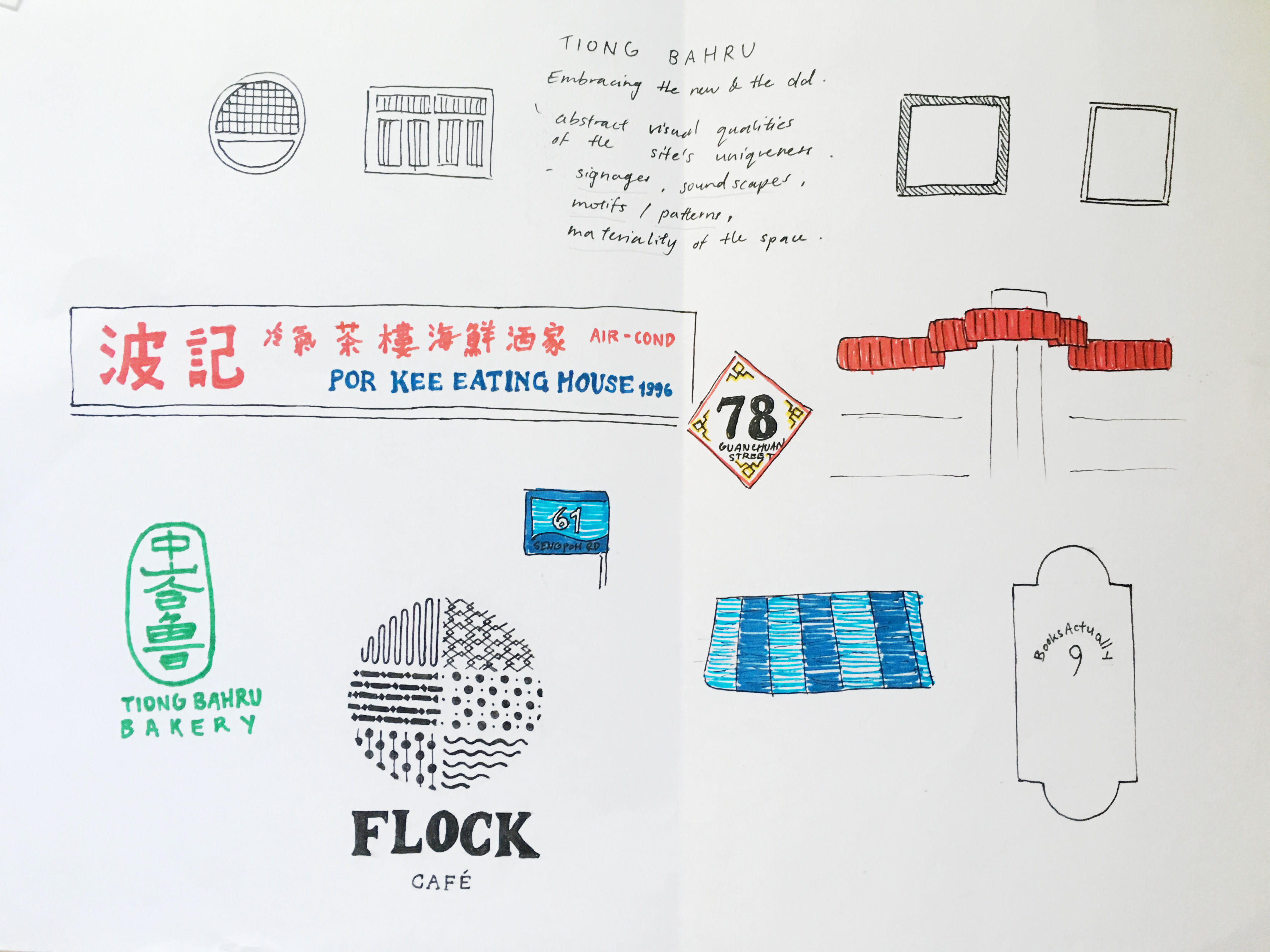
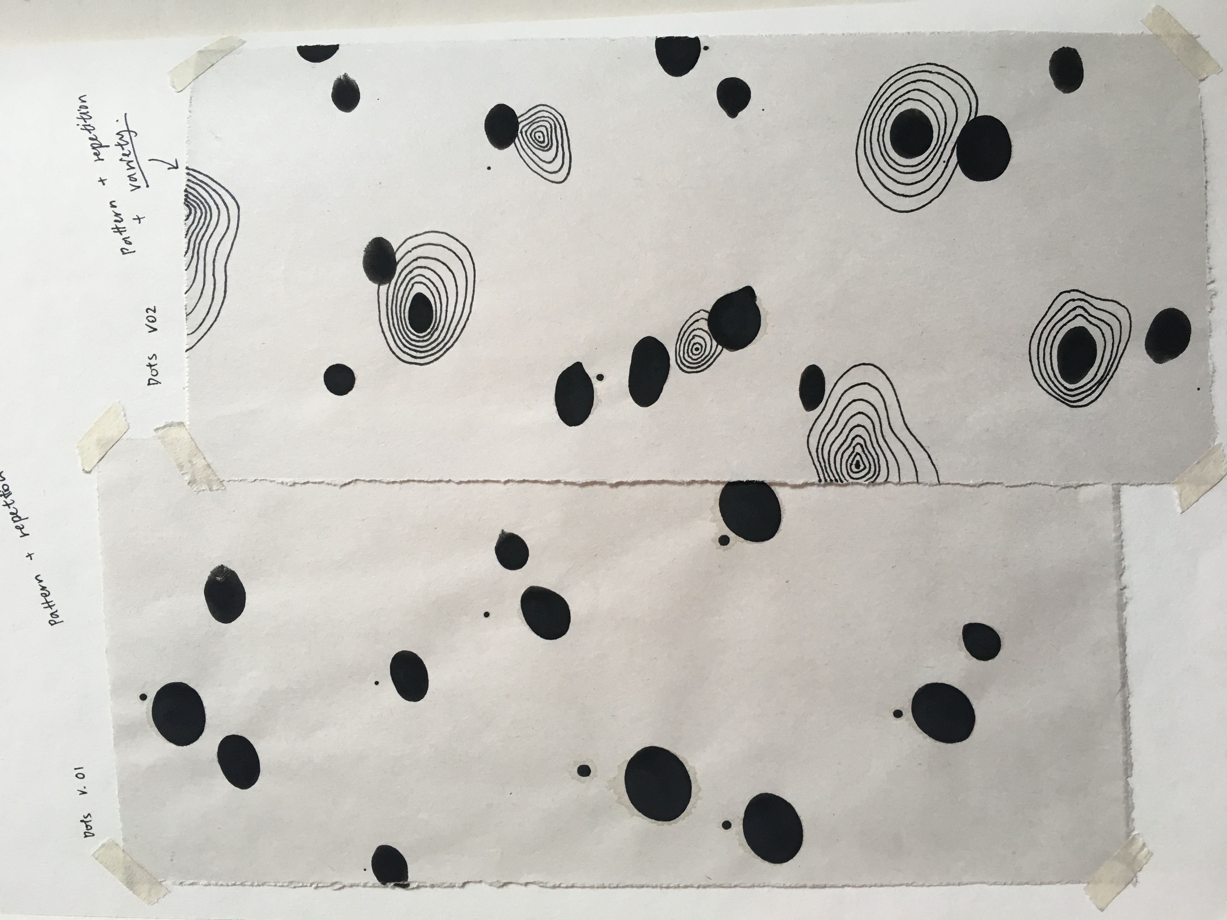
Link to design research: Part (1/3) Artist Research

First and foremost, to start of the next part of my project, I searched for quotes which intrigued me or left an impact on me. They were mostly from movies which I personally like.

Quotes:

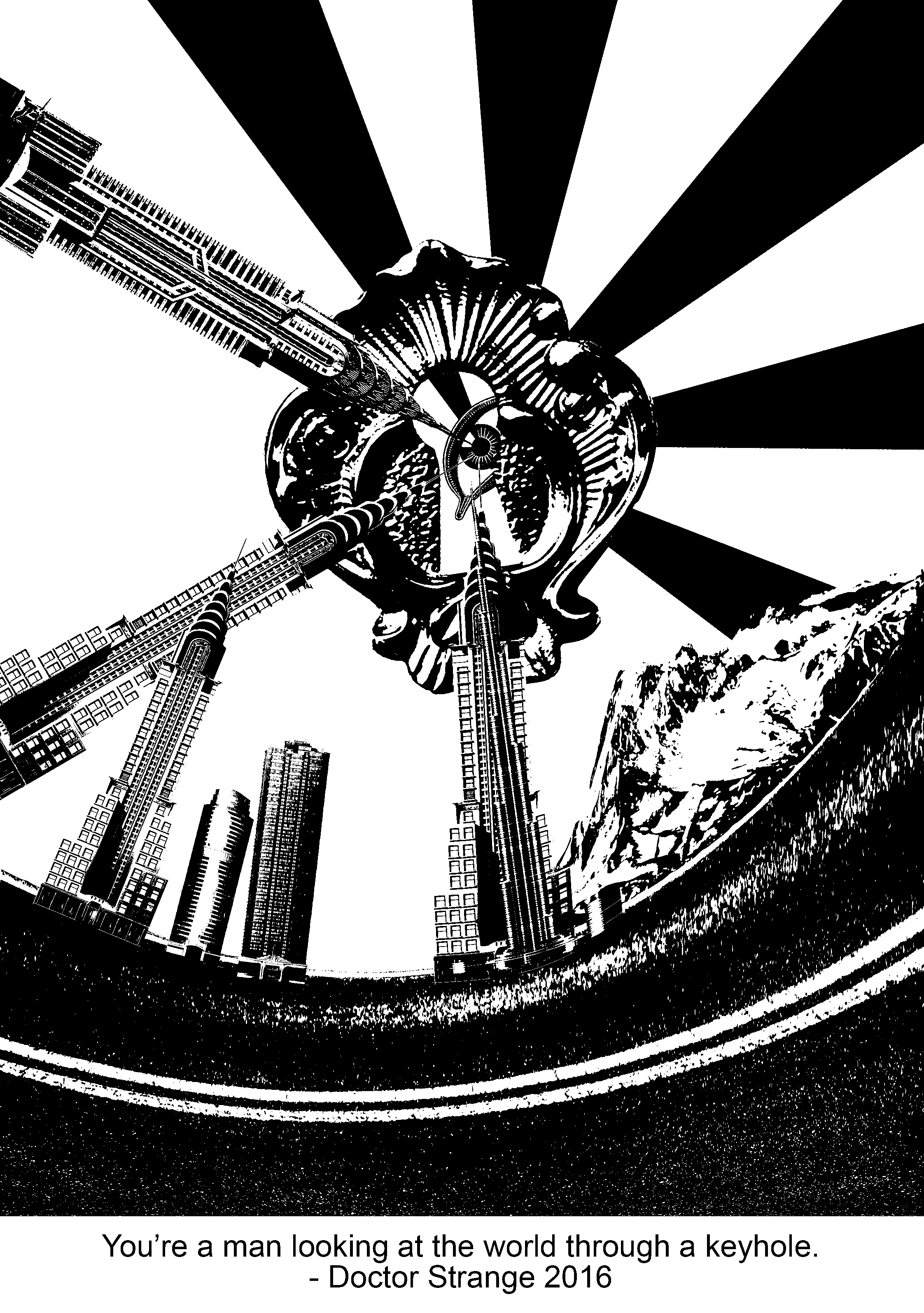
  1. You’re a man looking at the world through a keyhole. – Doctor Strange, 2016.
  2. The things you used to own, now they own you. – Fight Club, 1999.
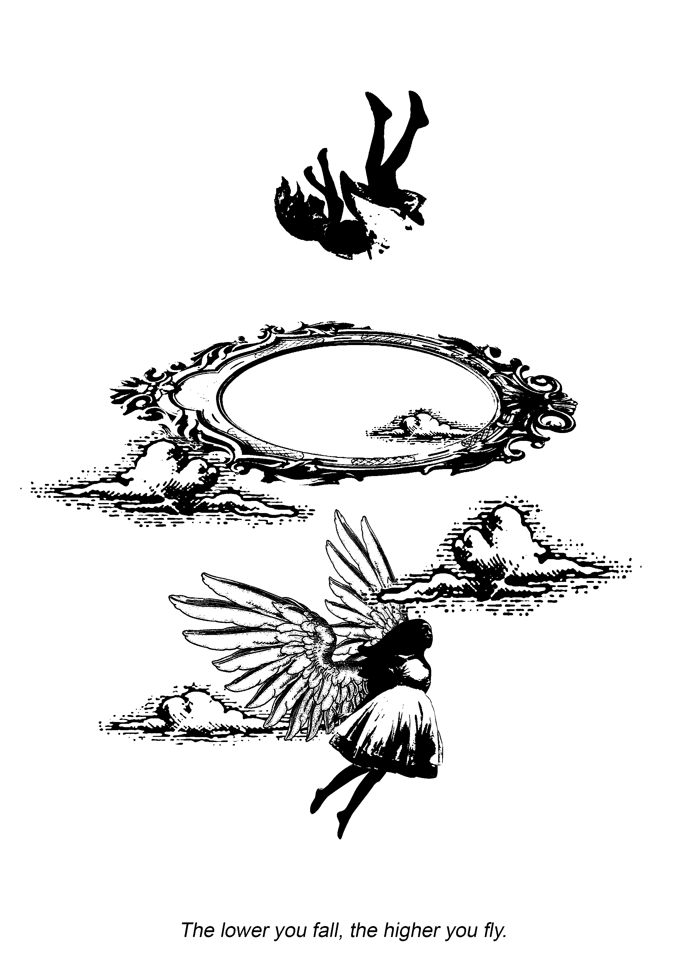
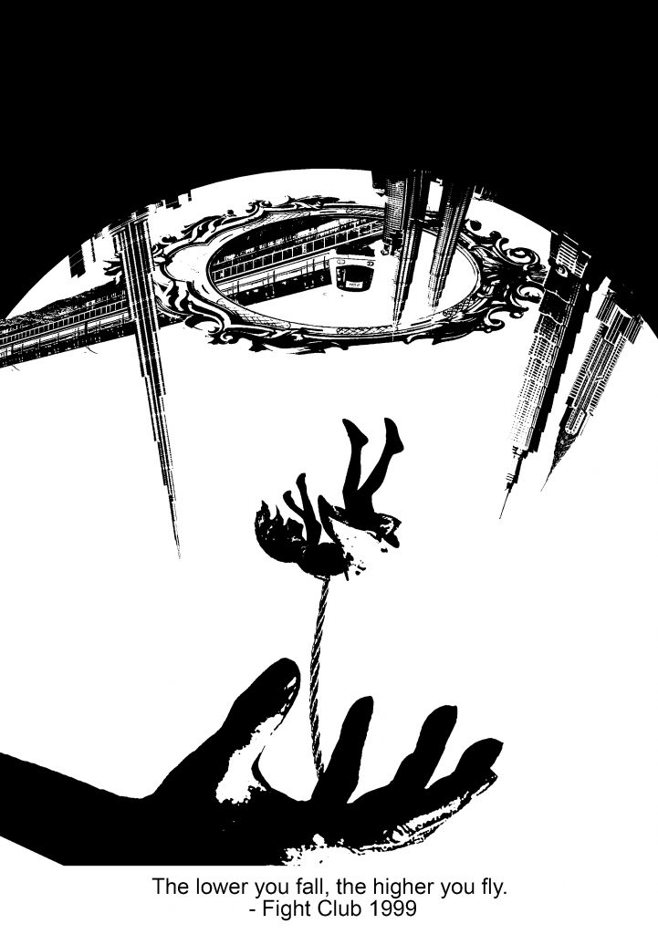
  3. The lower you fall, the higher you fly. – Fight Club, 1999.
  4. You don’t want the truth. You make up your own truth. – Memento, 2001.

Methodology/approach

Basically, I broke down the quotes to identify the key points which lead to an overarching focus. Words such as, “looking”, for example, suggests perspective. Things which I could directly relate to are eyes, sight, light and direction. From there, I searched images which suits the threshold/halftone effect, without compromising the details after the effect was placed.

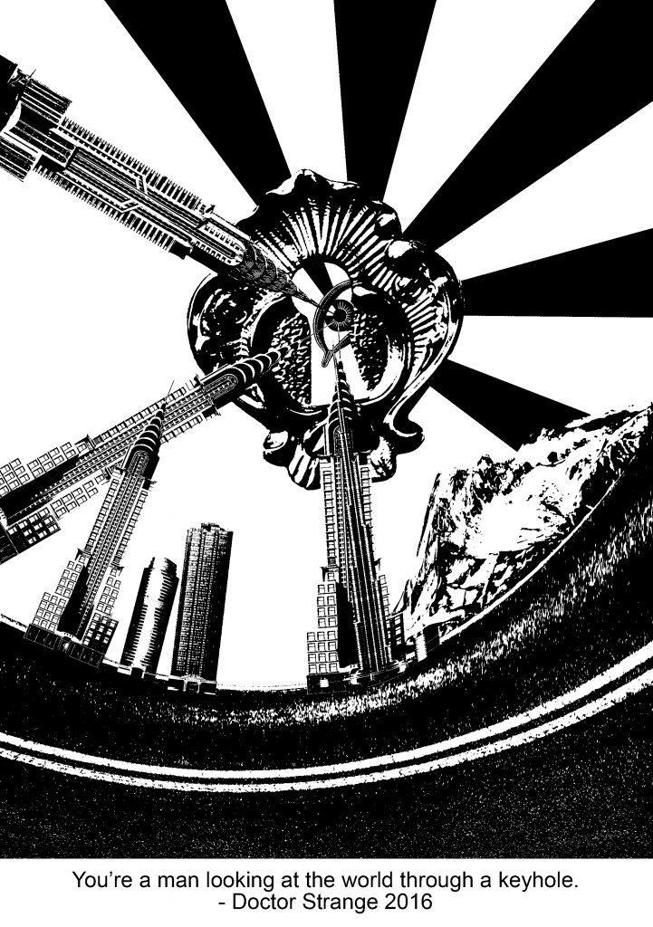
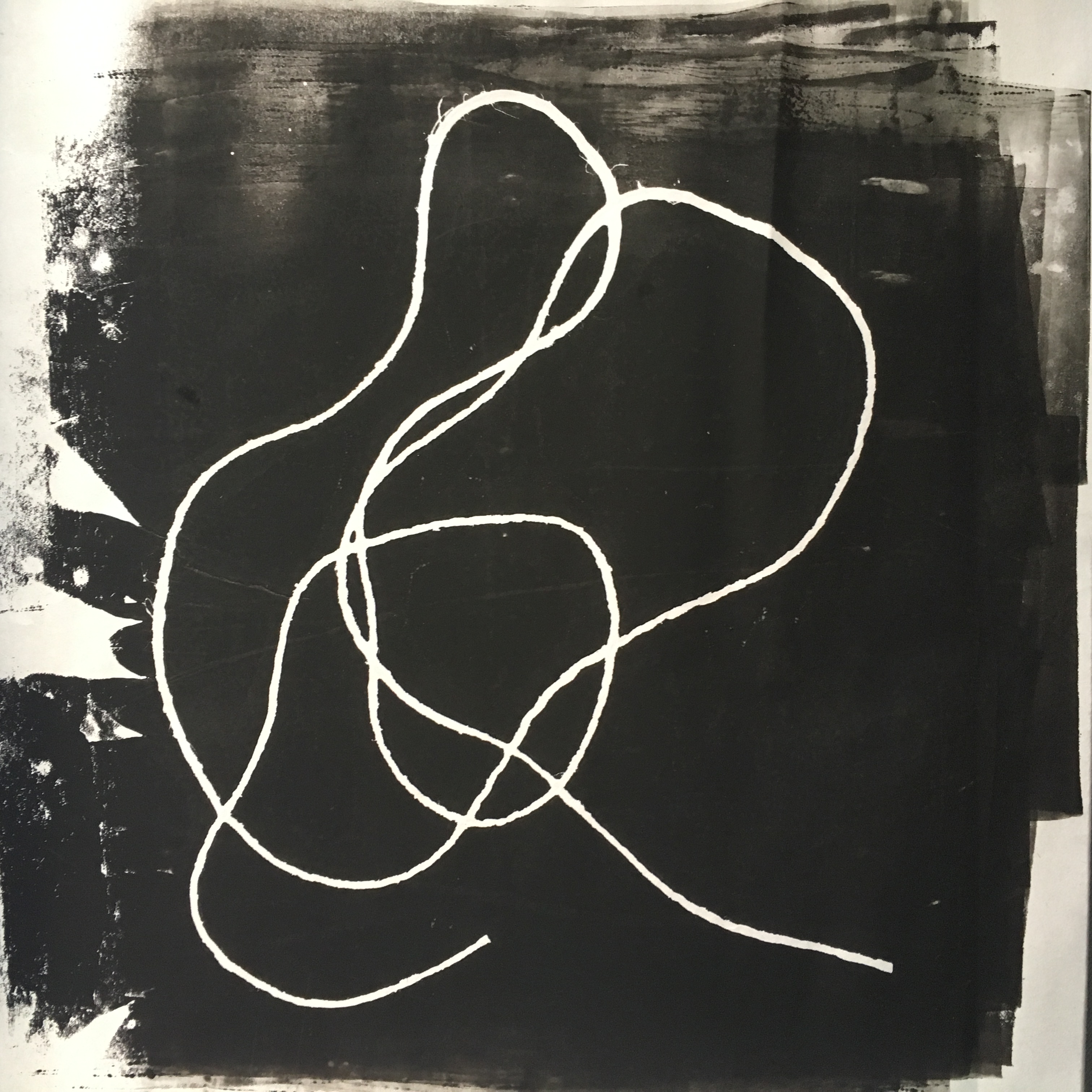
For this quote, I wanted it to suggest a different perspective of seeing the world. Firstly, the keyhole was a starting point. As an element that constricts the “view of the world”, I thought that it would be good to work around it, thus, the warped buildings and scenery around it. I was inspired by the Russian constructivism art movement and I used the starburst effect to lead the viewers’ eye to the keyhole and eventually, towards the eye.

However, the buildings seem randomly placed. Also, the overall balance seemed heavier on the right as the values are darker towards that direction. Hence, I made some minor changes to it:

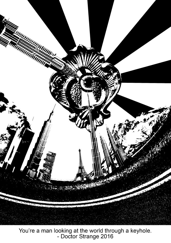
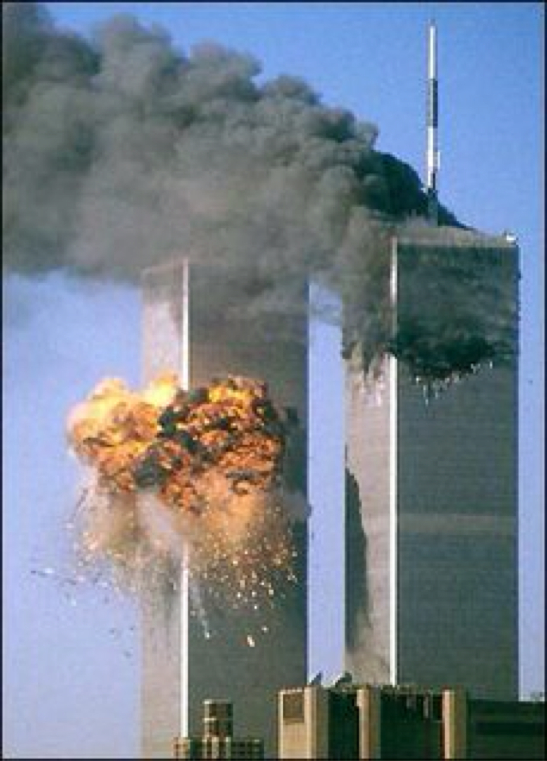
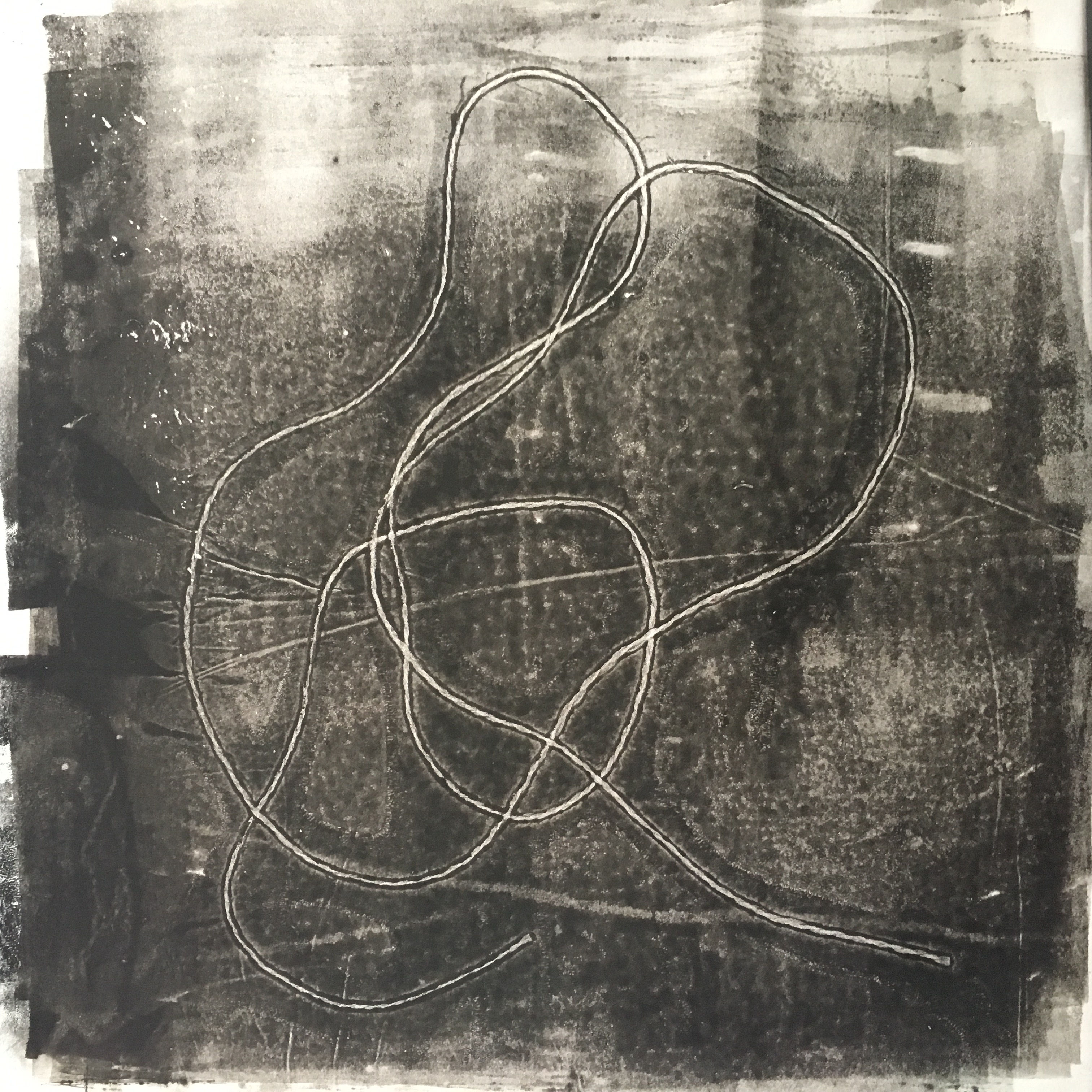
I have replaced the buildings into iconic and controversial buildings. The Petronas twin towers, the Eiffel tower, Taipei 101, Burk Khalifa, Antilia and the World Trade Centre. These building ties in with the concept behind this design, which is – looking at the world in a whole new perspective, where even each iconic building has its own story. Many issues in this world are being masked, such as political issues. The media tends to be biased and it overrides issues which they do not wish to show the world.

Buildings from left to right: World Trade Centre (NYC, United States), Taipei 101 (Taiwan), Antilla (South Mumbai, India), Eiffel Tower (Paris, France), Burj Khalifa (Dubai, United Arab Emirates) and Petronas Twin Tower (Kuala Lumpur, Malaysia).

Upon researching about which buildings to use, I thought that it would be good to include these skyscrapers as they are iconic to their countries. They compete for the title of the worlds tallest building and currently, the Burj Khalifa, stands the tallest at 828m high.

Other than these skyscrapers being a symbol and reflection of the city’s wealth and ascendency through the economy and rich history, some of them do have an interesting story.

For example, Antilla. Antilla is a private home in South Mumbai, India, and is owned by Mukesh Ambani.  It is the world’s most expensive private residential property, valued over $1 billion. Its controversial design and ostentatious use by a single family has made it famous across the world, with severe criticism in the architectural press and mockery in popular media. The home consists of 27 floors and 600 staff to mend it 24/7.

After researching about this particular building, I understood the irony that the media conveyed. Antilla was referred to be “Soaring Above India’s Poverty”. This phrase was extremely impactful to me as although I knew that slums existed in India, I didn’t know the controversy which a single building can cause.


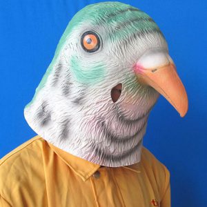
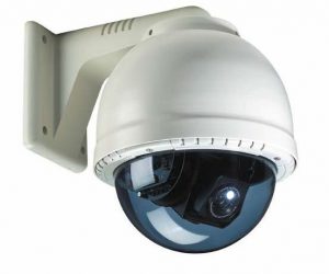
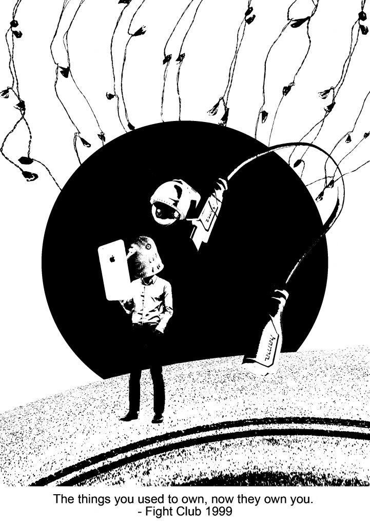
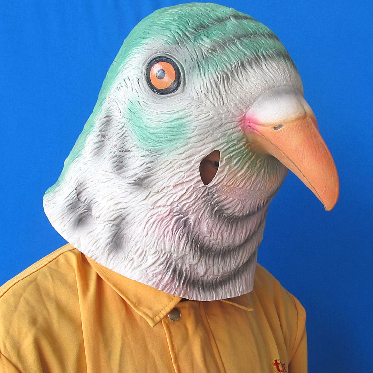
In this design, I used a combination of threshold images and a flat circle as the background. The main element and message was portrayed through anthropomorphism, the showing or treating of animals as if they are human in appearance. I felt that this was a unique approach to portray certain characteristics which I did not want to make it seem too literal. By adding animals’ natural characteristics or perceived characteristics to humans, it exaggerates the persona in a “fun” way. I used the head of a bird on a human body, and it pokes fun on consumerism. It can be also be interpreted as “bird brain” and that humans are so obsessed with keeping up with the latest technology that it is redundant and that they fail to notice their surroundings. The unrealistic scale of the iPhone also exaggerates how the figure intently looks at the screen, without realising the surveillance camera lurking in the background.

Generally, there were not many changes made to this design. I’ve only edited the end of the cable as the original shape of it looks like a wine bottle due to the shadows and threshold effect. Instead of having the wires to dangle from the top, I made a one of it strangle around the figure, suggesting the unnoticed tension and lack of awareness by the figure. I felt that this additional element strengthens the narrative behind this design.


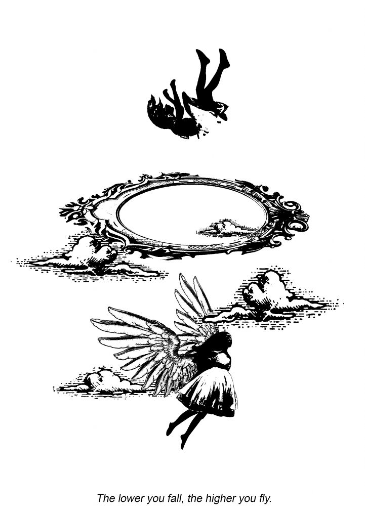
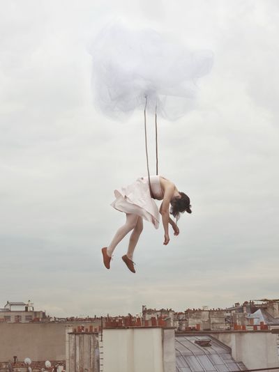
My initial design for this quote came off very literal. Although I liked the contradiction of the quote itself, I felt that this design needed a deeper interpretation of it – not just a girl flying and a girl falling.

The second design was ironic and can be perceived as both flying and falling. With the flipped landscape at the back, it seemed like the girl is falling. But, with the hand and the rope, it seemed like the girl is levitating instead.


The third design compromises of an entirely new interpretation of the quote. It explores how youths in this generation are vulnerable and weaker. There is a stereotype of how 21st-century teens are, the “strawberry generation”. When troubled teens are being tackled with a problem, some might turn to a substance abuse to escape reality. The lower they fall, the higher they get. Drugs are being associated with candy, or as such, is seen as “candies” to the youths. Being addicted to this destructive lifestyle would be an endless pit of no return, portrayed by the waves that surround the girl.

Some feedback which I’ve gotten from Joy and my peers were that the 2 halved circles stole the emphasis of the girl, instead of placing the focus on her. The play of basic shapes also coincidentally looked like a pill. The use of the candy can be more subtle as well.

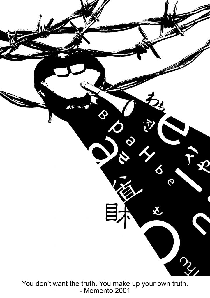
For my last design, I experimented with the use of typography. I deconstructed some words to the point where they became incomprehensible and made use of vowels. Essentially, these are what makes the spoken truth.

However, a major flaw in this piece would be that it lacked emphasis as the values of all the elements are dark. Thus, I felt that it lacked unity and harmony in the overall composition.


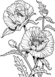
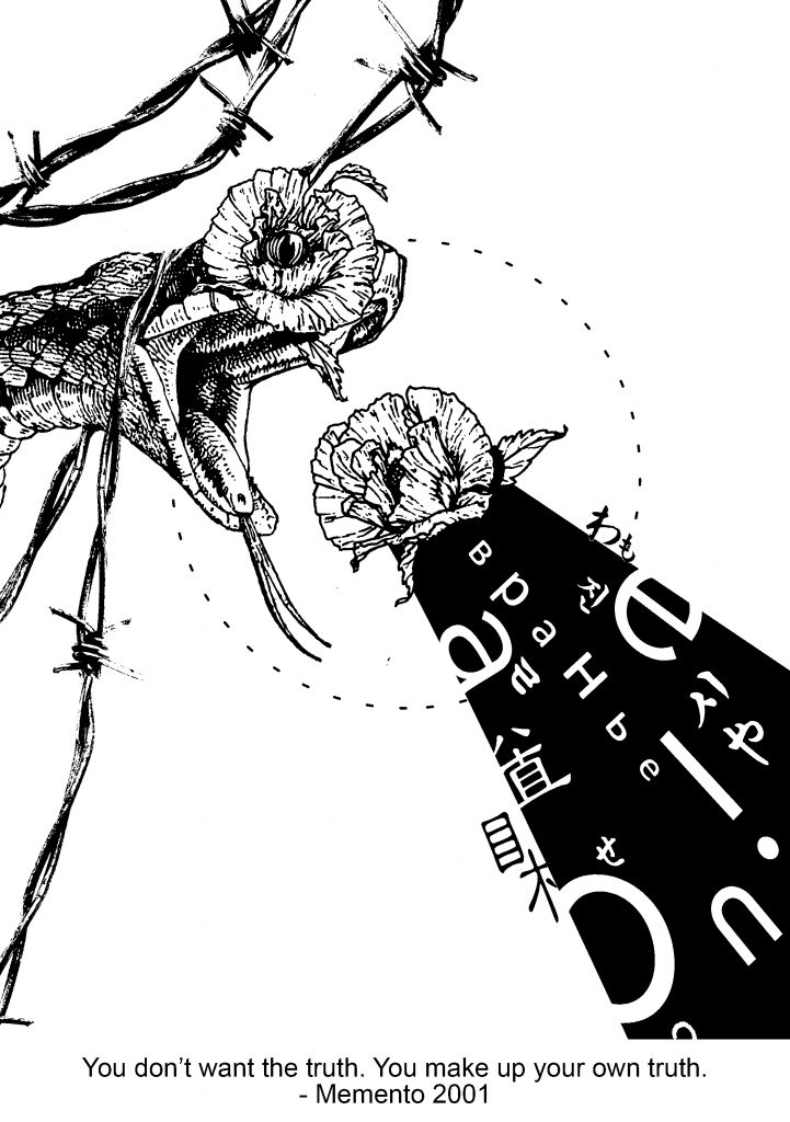
I made drastic changes to the next version but it didn’t seem to work. For this piece, poppies and the snake were representing the toxicity which making up your own truth can lead to. Similarly, the sense of direction of the words did not work well with the snake and poppies.

That’s about it for my design process! I will be making more changes to the 3rd and 4th design which will be posted in the final post.

01 My Line is Emo: Process/Experimental Stage

After I have done my research, I was given more time to experiment and explore as many mark making techniques as possible during the subsequent classes.

In this stage, I was primarily trying out different and unique methods of mark making. To achieve as many different results as possible, I varied the medium used, the type of paper and the mark making tools. With every variable changed, there was a great difference. For example, a brush with normal black paint on paper as compared to a brush with diluted calligraphy Chinese ink (less viscous/thick) on water colour paper would differ. (As shown in the next 4 pictures)

1 Brushes

I started with very basic tools, such as brushes of different bristle hardness. I used brush strokes of different density and directions.

These were created using soft calligraphy brushes. I diluted the ink to allow the paint to flow freely onto the paper and to achieve a softer look to it. As I noticed that the diluted ink crumpled the paper, I tried the same technique onto water colour paper instead.

The water colour paper gave way better results and I really love how the ink spreads out with a gradient. Materials really DO MATTER.

2 Knives and Sharp Tools

In this piece, I wanted to portray anger. I started off with slicing up and scratching the surface of the paper. However, the results were not that good – a bunch of holes and torn up edges. In my other versions, I applied black paint for the background and then scratched up the surface. Surprisingly, when the paint dried up, the cuts and scratches made an interesting texture and an aesthetically pleasing yet chaotic look, which I really loved. Perhaps, for my future versions, I would like to consider more about what design elements I could deliberately relate this to so that it would not just be a random scratched up piece of paper.

3 Playing with Fire

For this piece, I was just curious and started playing with fire. Although I did not have much consideration of what emotion this would be, I thought that maybe “Longing” would be something interesting to think about.

4 Cling Wrap

I happened to chance upon the cling wrap in the classroom so I went about experimenting with what I could do with it. I applied paint with different viscosity and got many results – the more diluted ones had this “web” effect while dryer and thicker paint had almost no effect. From the top to the bottom in this picture, I applied a decreasing amount of pressure on my brush.

5 Strings & Press Machine

This was made using ink and the press machine. I always make 2 versions whenever I placed my mark making materials into the machine as I felt that the positive and negative outcome was very interesting and both had its own unique look. One seemed clear, with higher contrast, while the other one, made by pressing it the second time on the paper after it went through the machine, had an x-ray look to it, with gradient patches around.

6 Styrofoam

This is similar to the one above, where I used the press machine. I did a little pressed marks manually as well.

7 Round Objects

For my “happiness” emotion, I wanted to make round, circular marks that looked as if they were floating. Thus, I tried different container sizes and pressed them down with some paint. I mixed white paint onto the containers to break off the monotonous black circle pattern.

———————————————————————————————-

Some patterns made by my mark making tools did not turn out the way I expected it to be. This could be both good and bad – It is good because interesting marks can be made but it is also bad because the marks may contradict the intended emotion that I wish to convey. Another interesting thing that I realised through various experimental methods was that these emotions overlap and coincide with one another. Perhaps, this was why some emotions looked similar or gave the same kind of “feel”.  This was a challenge to me as I wanted each emotion to be expressed clearly with just the use of visual qualities.

Here are some examples of contradictory marks.

8 Fingers

For “happiness”, I tried using my fingers to create these round ovals. However, I felt that the scale was not suitable for the emotion strip as they were too small and would result in a very congested look when being seen from afar. In addition, if the circles were to be further apart, it may come across as “sadness, isolation, neglected” instead of “happiness”.

In this piece, I drew contour lines using a pen to break off the monotonous look. Although I loved the mix medium idea, it did not bring much meaning to this piece as “happiness”.

9 Bubble Wrap

The bubble wrap was intended to create round circles and a bubbly effect, suggesting “happiness”. However, if I were to manipulate it, dragging it across the paper and blurring it, the marks made would come across as “fear” or “sadness” to me due to the distortions and lack of clarity.

This sums up most of my mark making during the experimental stage. Moving forward, I would like to come up with a concept that links up the 6 emotions which I chose.