A customised drop cap “A”.

A customised drop cap “A”.

Very very very basic menu using grids and tables. Lesson learnt: Do not use a baseline grid.
In branding, an archetype is:
“The role, immediately recognizable and subconsciously familiar, a brand plays in the market due to its offer, communications strategy, identity, and customer experience.”
In an archetype-based brand strategy, the brand’s personality, attributes, and beliefs is featured in a human form and characterized. This personification of a character has a clear personality that informs the way it looks, behaves, and speaks, making the brand easier to understand and the strategy more actionable, influencing all outputs and establishing stronger consistency across execution and implementation. Things that we think about while using this strategy are: How will it behave? How will it appear? How will it speak? What mood does it have? These will then translate to the visuals of the brand that communicates with the consumers.
In my opinion, I think this is a good strategy and it brings a brand closer to their consumers. Their humanized characteristics are more relatable, compared to a brand which doesn’t “brand” themselves into any category (selling something just for the sake of it & their brand is just a name).
The Lover: Sensuality, romance, intimacy.
The Warrior; strength, power, confidence.
With a brand archetype, the brand speaks to you – if done consistently. We, as consumers, subconsciously pick up these visual cues and form a impression of the brand. However, as good as these strategies may sound to brand a company, there is a downside to it (in my own opinion).
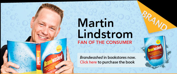
Branding done too well “brainwashes” consumers – this is where many people fall into the consumerism trap (just some brands!). In the book, Brandwashed by Martin Linstrom, it reveals how companies use human psychology to their advantage to market their products. Selling fear, using sexual appeal, using nostalgia, using celebrities, marketing to kids and marketing health are some ways that get us, consumers, to keep on purchasing. For instance, the brand archetype, “The Lover”, uses sexual appeal to create desire. Sometimes, it includes the use of celebrity endorsements as well and it is extremely effective as consumers desire to be like them. Even if we are conscious of these tactics brands use, the impression of the brand stays desirable in our eyes – and that is how powerful branding can be.
Other categories such as selling fear and marketing health create paranoia and “not wanting to lose out”. For example, pharmacies or security-related companies might use the selling fear approach to consumers – medicines or health-safety related products to prevent certain sickness, security objects to ensure safety and protection. Similarly, marketing health, for example, using “all natural/GMO free/organic/sugar free” labels, would allow consumers to think that they are consuming healthier products. In fact, it is known that the “sugar free” label is not entirely true.
In conclusion, this article has shown how strong using the brand archetype strategy can be. With regards to how brand market themselves, it is important to stay genuine and true to their products. As much as marketing and branding help in boosting their sales, being genuine would ultimately reflect the brand in a good light and in the long run. Not saying that using archetypes and ensuring that good brand consistently is bad, but there are products in the market that oversell.
References:
Archetypes in branding: How to build a consistent archetype-based brand strategy

Choosing the right font can sometimes be very difficult as there are so many beautiful typefaces out there. With Jessica Hische’s article, we can explore a myriad of beautiful typefaces and understand when to use them. In the article, Hische mentions, “Remember that just because a giant headline is the first thing your reader sees, that doesn’t mean it should be the first typeface you choose.” And for our next project, I think it is apt to consider this to establish a good visual hierarchy in our pages. Also, I think I have always been putting a great emphasis on titles and headlines but Hische’s points have made me reflect and think about the most minute details in type.
I have been using Gotham for ages (damn beautiful font, I must say) but I can’t really put into words why it is so aesthetically pleasing. Is it because it is a sans-serif font? A grotesque font? Today, Hische’s article enlightened me.

Gotham in 8 different weights.

Comparison of x-height (Gotham and Mr. Eaves)
With more variations in type weight, there is more flexibility and cohesion in choosing how bold or light you want your text to be. And I think I love using Gotham as the 8 different weights allow me to be “bold” with my text, yet not too bold and overpowering like some fonts with one choice of bold. Sometimes, as I choose a different font size, I would change up the weights as well. For example, for smaller fonts, Gotham Book or Medium might be a better choice than Light or Bold for readability.
Next, a generous x-height is very important when choosing a text face. If the x-height is too low, the typeface will appear smaller overall and the caps will have too much emphasis which interrupts smooth reading. If the x-height is way too high, your eye won’t be able to distinguish quickly between caps and lowercase, which can make you lose your place while reading. A generous x-height allows you to set type at small sizes and have it still be very legible. Gotham has a great x-height, as juxtaposed in the comparison. The comparison shows evidently how we focus on the cap letters in Mr. Eaves and not in Gotham. In Gotham, it is smooth and pleasing to the eye (No doubt, easier to read for me).

Comparison of letter-spacing (Helvetica vs. Avenir)
Spacing is as important as well when choosing type. If the letter-spacing it too tight, it’ll be bad for the paragraph and the eyes too.
MORE FLEXIBILITY = GREATER TYPOGRAPHY
Other than looking at these physical attributes of what makes a type work, the context behind the choice of font is key as well. All fonts can convey certain emotions, create a mood or even portray certain characteristics – using their curves, geometrical shapes, decorative elements and so on. So, other than ensuring that there is no weird letter spacing or a bad x-height and type weight, the type has to encapsulate your context/content visually. How Hische describes it as is, “to add an extra layer of oomph to your design”.

An example of how historical context can influence the type chosen to “add a layer of oomph to your design”. The type will not work as well if it was in Avenir or Helvetica.

Letter B shown in its Skeleton, Meat and Clothes (left to right).
After learning more in-depth typography terminologies and analogies like x-height, true italics, using super-families to pair typefaces and breaking down type to the “Skeleton, Meat and Clothes”, I am definitely more aware of my design choices. With that, I am able to consciously think about these important aspects which make great typography even greater. Looking forward to up my type game!
Reference:
http://jessicahische.is/talkingtype

PROCESS
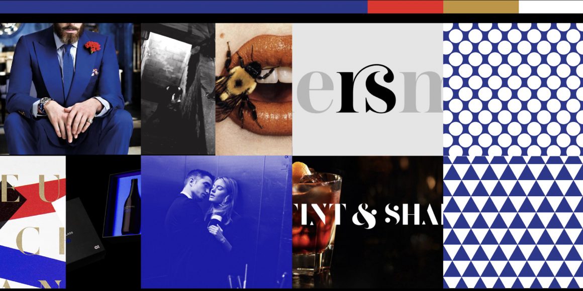
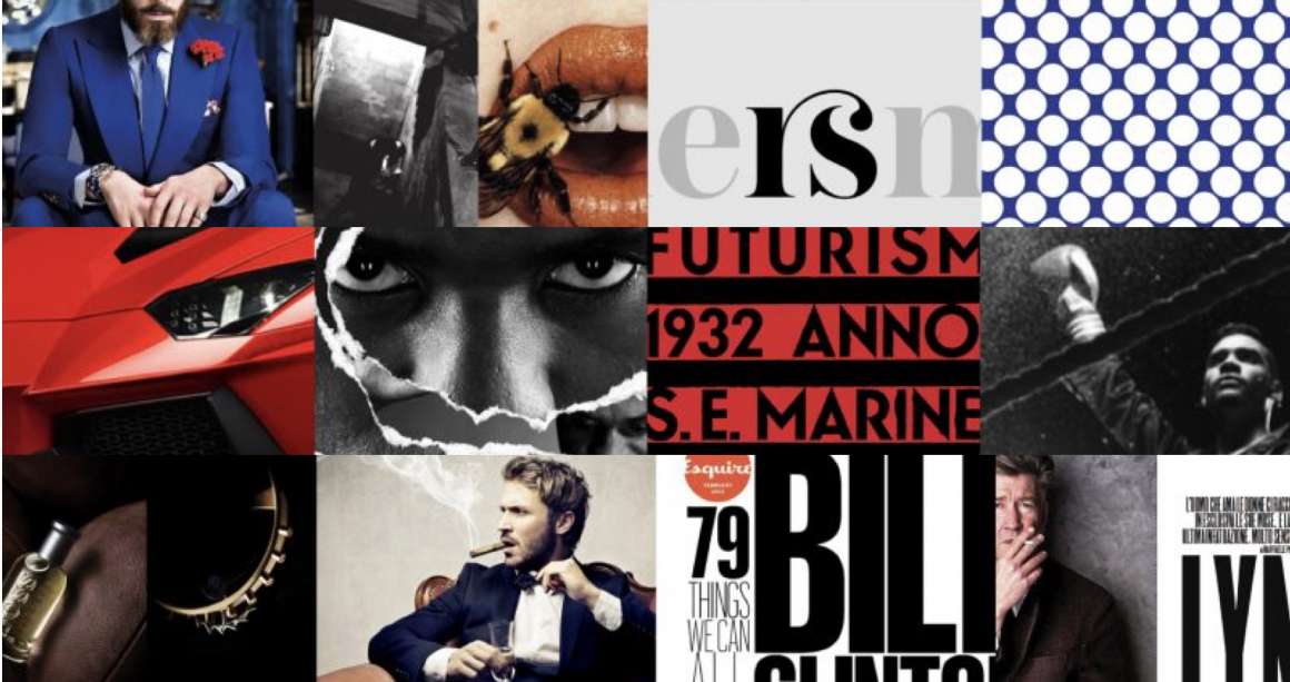
Artist references


Mitsuo Katsui


Giulio Confalonieri

Heinz Kröhl — Kinderverkehrsgarten (1962)

Letterpress & Wood Type Series Published by Maan Ali

Giovedi poster (via Pinterest)
For most of the posters, I found repetition a key design element which made the poster even more dynamic – giving a sense of movement and for some, creating beautiful patterns. I came across Mitsuo Katsui’s works and found it extremely unique and dynamic. I think the colours are extremely beautiful with the opacities but sadly, I wont be working with that many colours. Nonetheless, the overlapping opacities created a psychedelic effect which I really love and would try it out in my posters.
As for my quotes, I have chosen the following 3:
1.
Are you drunk?
No, I’m not?
But I think you’re drunk, you look like you are drunk.
No, I’m just standing here.
2.
How much are you left with?
$40.
Didn’t you get your pay 2 days ago? Where did your money go?
Honestly, I don’t know, it just disappear like magic.
3.
I always come here and eat the prawn mee. The soup is damn good but sometimes it can be quite inconsistent.
SKETCHES
Here are some sketches which I drew which helped me to visualise my layout and which design element I wanted to portray – whether it as hierarchy, balance, scale, repetition, symmetry. I tried using repetition, cropping and tilting some text to create my compositions.


DRAFTS
These are the drafts which I tried to use different design elements – cropping, repetition, scale, emphasis. I also played with varying opacities for many of my posters and I feel that that repetition makes a really nice pattern. At the same time, the word which I want to bring focus to can be at the highest opacity. With this, I think it places emphasis on the word which I want it to, yet the repetition of low opacity words make a nice pattern, do not steal the main focus and also leads the viewers’ eyes to the rest of the words in the sentence.


Some feedback:
– Margins could be wider, more negative space
– inconsistent looks too consistent
– maybe could add 1 more colour to the b/w posters
Final posters

Lastly, I think in all the posters, the hierarchy and emphasis is extremely important for all as there are a couple of words in the quote. Thus, the decision to emphasize on certain word/words is crucial to keep a good hierarchy for the viewers as they look at the posters.

“Fonts turn words into stories”
Hyndman’s impactful storytelling with 15 different fonts epitomised her words.

All the examples of how a font is able to tell a story.
Many times, type communicates with our subconscious. Although we might not look into every detail around us, we are subconsciously paying attention to type around us. They communicate to us through their forms. Hyndman did an interesting experiment, where she gave 100 people 2 jelly beans, one with round edges type and other with sharp edges. The results have shown that the rounder typeface made the audience think that what they ate was sweeter, whereas, the other one, more sour. It is all in our heads, that type conveys certain emotions and characteristics to us. I also enjoyed other examples, like how she used 15 different typefaces for “story” to tell a story, which I found was impactful and straightforward. Understanding which type of typeface to use will get your message and story across stronger, and I hope that it will be something that I will be better in with time.
Her TEDtalk has also reminded me of a book, Brandwashed, by Martin Lindstrom. In the book, it explains how we as consumers get manipulated by all the products that we see and even use, hence, being “Brandwashed” by them. And I do agree with Hyndman that even if we know the many ways in which brands brainwash us, and yet, we will still fall for their gimmicks.
In relation to the new project, I think Hyndman’s approach to typography, bringing the characteristics of the typeface out to tell a story, would be extremely helpful in expressing different characteristics of the archetypes.
References:

Erik Spiekermann is an author, information designer and typographer. Spiekermann is an influential individual in the typography industry, creating several typefaces such as, FF Meta and ITC Officina, which are considered as classics until today.

In his video, he elaborates more on his take on fonts. Many of Spiekermann’s font choices or even creations have to serve its function of being readable. For instance, fonts used on screen and displays, fonts used on newspaper (with bad quality paper) and even fonts used on glossy paper, all has its purpose in relation to where it is being viewed or printed on.
To him, brand = function. Having to design many specific typefaces for brands and companies, such as Bosch and Nokia, a typeface accentuates a brand’s character. He designed Nokia’s typeface in 2001, seen on the handphones produced back then. However, Nokia claimed that the typeface had ‘too much character’ for its brand. Spiekermann rebuts, “It’s BRAND, not BLAND.” He also redesigned many web interfaces and apps for brands. He highlighted that typography can be used to brand a brand. Eg, Volkswagen is branded by Futura and their blue colour. He applies this to his works as well, achieving brand consistency and giving a sense of identity to the website or application.

Redbull Music Academy App.
Overall, it is interesting to see how many typographers of the week were more focused with logos, brand identity and even collaterals. From this week’s typographer of the week, Erik Spiekermann, I’ve definitely learned more about how typography and digital interfaces can work together to create a stronger and impressionable brand identity.
References:
https://spiekermann.com/en/

Jonathan Barnbrook is one of the most celebrated graphic designer and typographer in the industry. He has created countless works for influential people – Stanley Kubrick and David Bowie.


Somerset House: Daydreaming with Stanley Kubrick by Jonathan Barnbrook (Photo: Barnbrook.net)
An exhibition that features many works from artists inspired by the master filmmaker, Stanley Kubrick. Personally, I love how the entire identity of the exhibition is consistent, sleek yet dreamy. Barnbrook mentions, that typography provides a tone for the text. He says, “The reason why I want to continue to draw letterforms and typefaces is because I want to speak in a voice that has never been spoken before.” Barnbook has been experimental with many of his works, creating unique and interesting works with graphic design and typography.


Album cover for David Bowie’s final album by Jonathan Barnbrook (Photo: Barnbrook.net)
With that being said, his personal website has many works considered as experimental, less corporate and even satirical. Created for “Tomorrow’s Truth” an exhibition of Jonathan Barnbrook’s political work in South Korea in 2004 at Seoul Art Center. These works use a much simplified form to mix consumerist pop imagery of the west with the classic stalinist propaganda of North Korea (Barnbrook, 2004).
Like mentioned, Barnbrook emphasised on providing a tone for a text and it is interesting how he manages to create graphics of different tones as well. As designers, I think we have our own styles, which might be experimental and unique – one that might not fit a corporate branding/identity. But from Barnbrook, something which I have learnt is knowing when to use a certain tone to provide that important message to convey as a brand.


References:
https://www.itsnicethat.com/features/review-of-the-year-2016-graphic-design-jonathan-barnbrook-151216
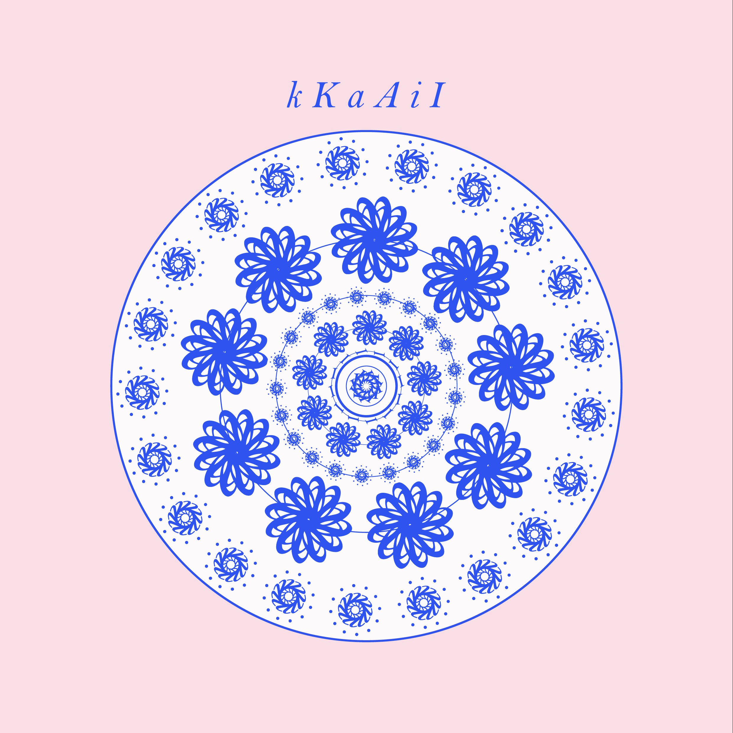
Letters used for this pattern: K, k, A, a, I, i