Tag Archives: review

Review: Archetypes in Branding by Landor (Good or bad?)

In branding, an archetype is:
“The role, immediately recognizable and subconsciously familiar, a brand plays in the market due to its offer, communications strategy, identity, and customer experience.”

In an archetype-based brand strategy, the brand’s personality, attributes, and beliefs is featured in a human form and characterized. This personification of a character has a clear personality that informs the way it looks, behaves, and speaks, making the brand easier to understand and the strategy more actionable, influencing all outputs and establishing stronger consistency across execution and implementation. Things that we think about while using this strategy are: How will it behave? How will it appear? How will it speak? What mood does it have? These will then translate to the visuals of the brand that communicates with the consumers.

In my opinion, I think this is a good strategy and it brings a brand closer to their consumers. Their humanized characteristics are more relatable, compared to a brand which doesn’t “brand” themselves into any category (selling something just for the sake of it & their brand is just a name).


The Lover: Sensuality, romance, intimacy.


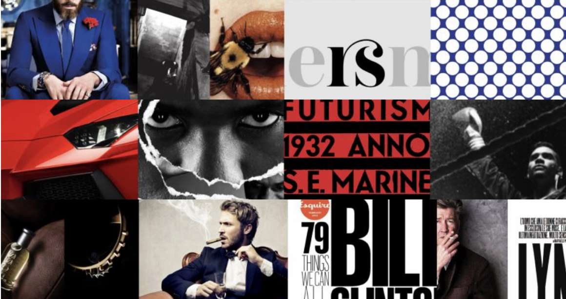
The Warrior; strength, power, confidence.

With a brand archetype, the brand speaks to you – if done consistently. We, as consumers, subconsciously pick up these visual cues and form a impression of the brand. However, as good as these strategies may sound to brand a company, there is a downside to it (in my own opinion).

Branding done too well “brainwashes” consumers – this is where many people fall into the consumerism trap (just some brands!). In the book, Brandwashed by Martin Linstrom, it reveals how companies use human psychology to their advantage to market their products. Selling fear, using sexual appeal, using nostalgia, using celebrities, marketing to kids and marketing health are some ways that get us, consumers, to keep on purchasing. For instance, the brand archetype, “The Lover”, uses sexual appeal to create desire. Sometimes, it includes the use of celebrity endorsements as well and it is extremely effective as consumers desire to be like them. Even if we are conscious of these tactics brands use, the impression of the brand stays desirable in our eyes – and that is how powerful branding can be.

Other categories such as selling fear and marketing health create paranoia and “not wanting to lose out”. For example, pharmacies or security-related companies might use the selling fear approach to consumers – medicines or health-safety related products to prevent certain sickness, security objects to ensure safety and protection. Similarly, marketing health, for example, using “all natural/GMO free/organic/sugar free” labels, would allow consumers to think that they are consuming healthier products. In fact, it is known that the “sugar free” label is not entirely true.

In conclusion, this article has shown how strong using the brand archetype strategy can be. With regards to how brand market themselves, it is important to stay genuine and true to their products. As much as marketing and branding help in boosting their sales, being genuine would ultimately reflect the brand in a good light and in the long run. Not saying that using archetypes and ensuring that good brand consistently is bad, but there are products in the market that oversell.

References:

Archetypes in branding: How to build a consistent archetype-based brand strategy

Book summary: Brandwashed by Martin Lindstorm

Review: Talking Type by Jessica Hische

Choosing the right font can sometimes be very difficult as there are so many beautiful typefaces out there. With Jessica Hische’s article, we can explore a myriad of beautiful typefaces and understand when to use them. In the article, Hische mentions, “Remember that just because a giant headline is the first thing your reader sees, that doesn’t mean it should be the first typeface you choose.” And for our next project, I think it is apt to consider this to establish a good visual hierarchy in our pages. Also, I think I have always been putting a great emphasis on titles and headlines but Hische’s points have made me reflect and think about the most minute details in type.

I have been using Gotham for ages (damn beautiful font, I must say) but I can’t really put into words why it is so aesthetically pleasing. Is it because it is a sans-serif font? A grotesque font? Today, Hische’s article enlightened me.


Gotham in 8 different weights.


Comparison of x-height (Gotham and Mr. Eaves)

With more variations in type weight, there is more flexibility and cohesion in choosing how bold or light you want your text to be. And I think I love using Gotham as the 8 different weights allow me to be “bold” with my text, yet not too bold and overpowering like some fonts with one choice of bold. Sometimes, as I choose a different font size, I would change up the weights as well. For example, for smaller fonts, Gotham Book or Medium might be a better choice than Light or Bold for readability.

Next, a generous x-height is very important when choosing a text face. If the x-height is too low, the typeface will appear smaller overall and the caps will have too much emphasis which interrupts smooth reading. If the x-height is way too high, your eye won’t be able to distinguish quickly between caps and lowercase, which can make you lose your place while reading. A generous x-height allows you to set type at small sizes and have it still be very legible. Gotham has a great x-height, as juxtaposed in the comparison. The comparison shows evidently how we focus on the cap letters in Mr. Eaves and not in Gotham. In Gotham, it is smooth and pleasing to the eye (No doubt, easier to read for me).


Comparison of letter-spacing (Helvetica vs. Avenir)

Spacing is as important as well when choosing type. If the letter-spacing it too tight, it’ll be bad for the paragraph and the eyes too.

MORE FLEXIBILITY = GREATER TYPOGRAPHY

Other than looking at these physical attributes of what makes a type work, the context behind the choice of font is key as well. All fonts can convey certain emotions, create a mood or even portray certain characteristics – using their curves, geometrical shapes, decorative elements and so on. So, other than ensuring that there is no weird letter spacing or a bad x-height and type weight, the type has to encapsulate your context/content visually. How Hische describes it as is, “to add an extra layer of oomph to your design”


An example of how historical context can influence the type chosen to “add a layer of oomph to your design”. The type will not work as well if it was in Avenir or Helvetica.


Letter B shown in its Skeleton, Meat and Clothes (left to right).

After learning more in-depth typography terminologies and analogies like x-height, true italics, using super-families to pair typefaces and breaking down type to the “Skeleton, Meat and Clothes”, I am definitely more aware of my design choices. With that, I am able to consciously think about these important aspects which make great typography even greater. Looking forward to up my type game!

Reference:
http://jessicahische.is/talkingtype

Review: TEDtalk | Wake up & I smell fonts by Sarah Hyndman

“Fonts turn words into stories”

Hyndman’s impactful storytelling with 15 different fonts epitomised her words.


All the examples of how a font is able to tell a story.

Many times, type communicates with our subconscious. Although we might not look into every detail around us, we are subconsciously paying attention to type around us. They communicate to us through their forms. Hyndman did an interesting experiment, where she gave 100 people 2 jelly beans, one with round edges type and other with sharp edges. The results have shown that the rounder typeface made the audience think that what they ate was sweeter, whereas, the other one, more sour. It is all in our heads, that type conveys certain emotions and characteristics to us. I also enjoyed other examples, like how she used 15 different typefaces for “story” to tell a story, which I found was impactful and straightforward. Understanding which type of typeface to use will get your message and story across stronger, and I hope that it will be something that I will be better in with time.

Her TEDtalk has also reminded me of a book, Brandwashed, by Martin Lindstrom. In the book, it explains how we as consumers get manipulated by all the products that we see and even use, hence, being “Brandwashed” by them. And I do agree with Hyndman that even if we know the many ways in which brands brainwash us, and yet, we will still fall for their gimmicks.

In relation to the new project, I think Hyndman’s approach to typography, bringing the characteristics of the typeface out to tell a story, would be extremely helpful in expressing different characteristics of the archetypes.

References:

Review: The Elements of Typographic Style

In the book, Robert Bringhurst shares many great principles about design, many of which I couldn’t agree with more. Bringhurst mentions, “typography must often draw attention to itself before it will be read. Yet in order to be read, it must relinquish the attention it has drawn.” A little too much or too little won’t work in typography. Typography has to have this harmonious balance which in my opinion, is always difficult to achieve. Legibility was emphasised as one of the important principles of durable typography. He goes on by saying that these principles apply in different ways, to the typography of business cards, instruction sheets and postage stamps, as well as books – basically anything that needs to convey a certain message or information.

Letterforms have tone, timbre, character, just as words and sentences do. “The moment a text and a typeface are chosen, two streams of thought, two rhythmical systems, two sets of habits, or if you like, two personalities, intersect. They need not live together contentedly forever, but they must not as a rule collide.” A quote which serves as an apt reminder for the current project as we consider different typefaces and how we match them within a composition.

Having to look at good examples of good typography practices, here are some which I myself will (try my best) to uphold.

  • Typography can be beautiful and decorative but it must never lose its message
  • There is no bad typography; only inappropriate ones
  • Choose a typeface that will honour the character of the text
  • Pay attention to the smallest details and be meticulous about it


References:
https://alejandrocarpintero.files.wordpress.com/2016/08/02_the_elements_of_typographic_style.pdf

Review: The Crystal Goblet, or Printing Should Be Invisible by Beatrice Warde

In this article, Warde shares her opinion of good typography using a flowery metaphor; using wine vessels. She lays out 2 choices: a crystal-clear wine glass and a solid gold goblet. If the clear glass was chosen – everything about it is calculated to reveal rather than hide the beautiful thing which it was meant to contain. She mentions, the virtues of the perfect wine-glass have a parallel in typography – and that is type well used is invisible as type. Initially, I was confused by her statement because of how today’s design articles have framed my mindset on typography. And those articles go on by saying how type can be decorative as a form and how manipulation of the form of type has been widely used and so on.

I have always seen type as a form, not invisible. But Warde’s opinion has given me a new perspective on how good type should be legible and not overly decorated in order to convey its message. Warde explains further,  “that is not objectionable, because of a
very important fact which has to do with the psychology of the subconscious mind. That is
that the mental eye focuses through type and not upon it”. We focus heavily on the elements on a page, but never the lack of it. What Warde made me ponder about was really to read between the lines. Arbitrary warping of design is bad type. Excess of colour, which gets in the way of the mental picture is bad type. Tight spacing, too wide unleaded lines lead to bad type. All of these, to Warde, mean subconscious squinting and loss of mental focus. Which was why print should be transparent and a transparent page is never too simple or dull. Sometimes, it is more difficult to achieve simplicity, leaving the essence of what’s needed and throwing whatever’s not.

Warde’s other point is that anyone who chooses glass over clay or metal to hold his or her wine is a “modernist”. Reason being that the first thing that comes to a modernist’s mind when being asked of a particular object would never be ‘How should it look?’ but ‘What must it do?’. And to that extent, I myself agree with Warde, that all good typography is modernist. Form over function is evident in typography as well. The main function of a book is to inform and educate and by reading the content. How effective the main function of the book will then be dependent on readability and legibility. After peeling layers and layers of metaphors, it is as simple as that.

However, with Warde’s opinion, it is sure that typographers will argue that type can never be invisible. Although the metaphor does make sense, Warde’s opinion might only be applicable in printed typography, and mainly books. In today’s typography where there is a myriad of experimental and decorative form and type, it is impossible to only agree that type is invisible. Neville Brody’s fascinating and experimental work might have just thrown Warde’s opinion out the glass window. All in all, this article is still justifiable and now, we get to look at type in both ways – whether invisible or not.

Review: My Life in Typefaces by Matthew Carter

Having to experience a transitional period where technology is evolving, Matthew Carter shared many stories and insights about typography and his own experience as a typographer. Carter is renown and even if one has never come across his name, they will have definitely seen his works before. Carter is the man behind typefaces such as Verdana, Georgia and Bell Centennial. One of the video’s highlight was the problem where fonts used to require large data back in the days. As such, Carter “solved” the problem by adjusting the points on a serif font – just that the problem was already solved by engineers 2 weeks before Carter found them the solution.


“What had started out as a technical exercise became an aesthetic exercise. “

Regardless of Carter’s redundant solution, he grew to like the aesthetics of his creation. Him misunderstanding the technology has offered doors to innovative designs. In my opinion, it was a good thing even though his solution flopped, as he created something of value to himself as a designer. Today, designers create everything with a purpose, an intention. Creating another Charter like this would be rather rare, and that was the beauty that Carter saw in the type.

References:

Thinking With Type: Letter

This particular reading gave many insights about the characteristics of letter, typefaces and also compatibility between different typefaces. After listening to several lectures by Lisa, I felt that the content in this reading was a whole lot easier to understand and the concepts were easier to grasp.

As we begin our project, these are some notable information mentioned in the reading which I felt that is important.

Choosing the right fonts isnt an easy task. However, I think we can all agree that there are some visual properties of a font which influences a particular emotion/trait. The power of X-height shows how different x-heights can affect the overall “look” of a text. Some fonts have a smaller x-heights, thus, the texts in the same font size appear to be more delicate or sleek. Hence, we should think deeper and in terms of these characteristics, select what is suitable for each text.

Mcsweeney’s Magazine cover, 2002. Design: Dave Eggers. This magazine cover uses the Garamond 3 typeface family in various sizes. Although the typeface is classical and conservative, the obsessive, slightly deranged layout is distinctly contemporary.

As for this magazine cover mentioned in the reading, I felt that it is relatable to our project as they used 3 typefaces of Garamond. The variation in scale and typefaces made this piece dynamic. I’m pretty sure variating the scale of the texts like how he did will seem like a type crime to many. WE READ THINGS IN A CONSISTENT MANNER and a disruption like this will definitely break the flow of the reader.  Nonetheless, the slightly deranged layout is contemporary and experimental. 


the word: new york magazine Design: Chris Dixon, 2010

This example of mixing fonts is also a good one. The ability to mix fonts tastefully is extremely important. Staying with only one font can be rather boring sometimes. Thus, I like how this reading gives additional information on how the properties of a typeface and be suitable for each other and establishes a good visual hierarchy. Eg. thin strokes vs thicker strokes as titles for body text.


Little Lessons From Swiss Style Graphic Design by http://deconstructed.org.uk 


Typography posters by Kellie Manchester

These are some posters I found online and thought that the play of scale was rather interesting and done well. As seen, the difference in scale can lead the readers’ eye and guide a logical and readable flow for them. All in all, I think myriad of different characteristics allows one to push the boundaries of typography and be experimental. It also allows one to convey a certain look and feel to the readers just by choosing a typeface, a type classification and adjusting the scale and size.

References:
https://kmanchesterdesign.myportfolio.com/typography-poster
http://thinkingwithtype.com/letter/

Swiss Style Graphic Design

Typographer of the Week: Neville Brody

Neville Brody is an English graphic designer, typographer and art director. Brody is extremely versatile in his outstanding works. His well-known works include his contribution to The Face and Arena magazines. He had also established his own design practice, Research Studios, in London in partnership with Fwa Richards. The company is best known for its ability to create new visual languages for a variety of applications ranging from publishing to film. It also creates innovative packaging and website design for clients such as Kenzo, corporate identity for clients such as Homechoice, and on-screen graphics for clients such as Paramount Studios, makers of the Mission Impossible films. Also, Brody is one of the founding members of Fontworks and the leading website the FontShop. He designed numerous notable typefaces for the website.

Being a versatile designer, Brody has definitely contributed greatly to the design industry. I took a look at Fontshop and found many great fonts. My personal favourites are these: Industria, FF Pop and Arcadia. Industria is a sleek and cool san serif and FF Pop reminds me of a theatrical look and Saul Bass’s title sequence from Ocean Eleven.

In the website, I could also hover to preview the different typefaces.

https://www.fontshop.com/families/industria 

Ocean Eleven’s title sequence by Saul Bass (1960)
https://www.youtube.com/watch?time_continue=57&v=xnG3OjIcN8M 

In the video, he mentioned,

“We play a lot. We experiment a lot. We like when things go wrong. You get new thoughts, ideas and expressions and possibilities.”

Which explains the fresh ideas in his work.


Tokyo posters by Neville Brody, experimenting with tribal elements and culture.


GQ magazine cover by Neville Brody, experimenting with shapes and precision.

He also mentions about design being multidisciplinary, and that as a designer, one might be making visuals, designing sounds or installations; which doesn’t involve making at all but it involves thinking and strategy. In the end, everything is a design problem. I feel that after having to read many articles on notable artists, many of them adopt a rather similar methodology; design is problem-solving.

References:
http://www.famousgraphicdesigners.org/neville-brodyhttp://www.historygraphicdesign.com/the-age-of-information/postmodern-design/531-neville-brodyhttps://vimeo.com/97413622
http://www.fontshop.com

Review: Type Speaks

After watching the video, I was glad that I did not have to go through such painstaking and meticulous lengths in order to create type. Although I knew that the revolution of type had tremendously changed throughout the years, I wasn’t aware of the tedious steps and mechanical processes required. Now that I have seen them, I am amazed by the level of skill and precision they had at that point in time. Today, with our available technology and software, we are blessed with “Ctrl-Z”s, computer calculations and grids; without all the tedious and complicated processes. I also felt that these designers from the past are knowledgeable about the entire printing process; especially the mechanism of the machines and the processes. Ironically, I think I myself could barely get a printer to work sometimes.


Designer checking every character in “Typespeaks” 1948

With that being said, I do feel that creating a font from scratch even with the help of computers and software might not be as easy as I thought. So, I went to read about the start of digital fonts. Apparently, there was a time where the fonts were created in bitmap or using outlines. As much as it saves much more time, money and labour creating a set of font is still meticulous work. Even with digital, designers are to ensure that fonts look optically similar and readable. The characteristics of the font have to also be consistent and neat. I guess, there isn’t a shortcut to create a good type, is there?


Bitmap and outline fonts by www.designhistory.org 


Digi Grotesk, the first digital font type designed by the Hell Design Studios (left) and bitmap fonts (right). 

References:

http://www.designhistory.org/Digital_Revolution_pages/EarlyDigType.html

Review: The Modernist Era

After reading different takes on modernism by the artists, what intrigued me was this sentence by Milton Glaser, “So Modernism became a wonderful way for detoxifying dirty people and dirty ideas.” He then explains how Modernism rejects the emotional ideal and is lacking in passion and sexuality. And that is why corporate identities find themselves aligned with Modernism as he refers Modernism to great progression, endless frontiers and ceaseless developments.

While Glaser might believe so, I feel that there are many angles to look at this. Reducing things to its simpler forms does not always take away the meaning of it. In the case of Modernism, many art movements were experimental and looked at ways of expression. Simplicity was some of their ways to express; it does not mean that they are lacking thereof.

From Rudolph deHarak, he also mentioned, “These Modernists breathed new life into design, cutting away all unnecessary graphics appendages and leaving only the essentials.” Many artists during that time, Max Bill, Josef Muller-Brockmann and Max Huber and many more, had works manifested into a timeless style which were thoughtful and systematic. The works were bold, intensely creative and dynamic and perhaps, this is the beauty of Modernism which Glaser overlooked.