Category Archives: Process

03 Ego: Design Process

As mentioned in the previous post on my artist research, I was inspired by the manipulation of daily objects into something quirky and fun. As this project allowed the freedom of using any medium to portray myself as an equation, “Me + Environment = _________”, I thought that it would be fun to create illustrations with a tinge of lightheartedness.

IDEATION OF EQUATIONS

Me + Environment = __________

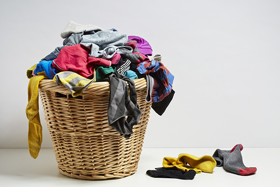
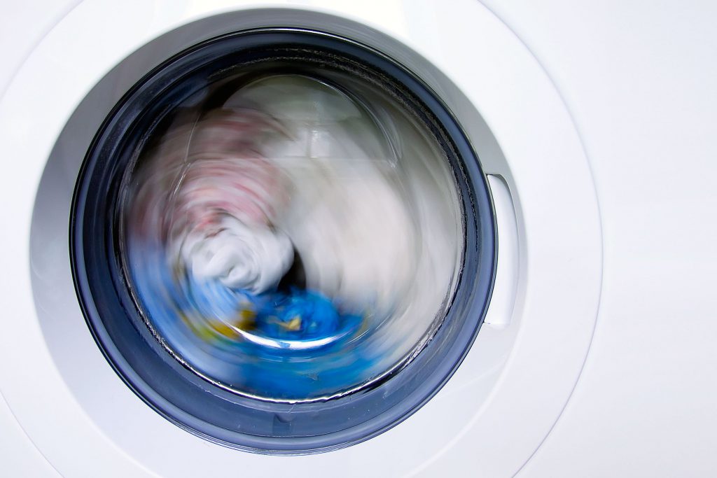
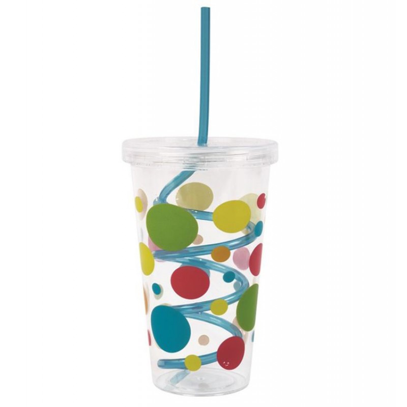
  1. Distracted + Work piling up = Drowning in work
Work piling up Drowning in work


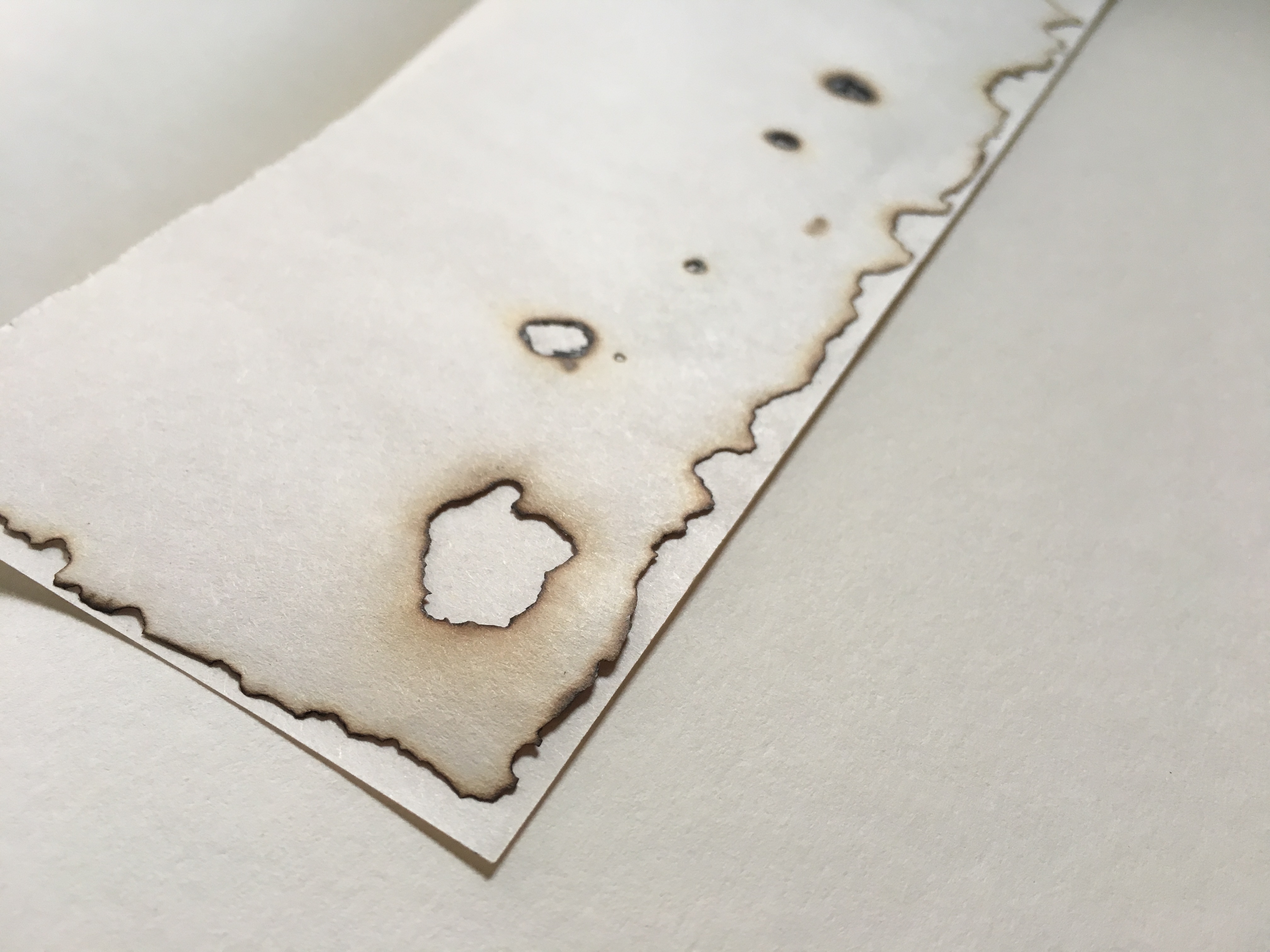
For this equation, I’ve placed my current state into a “laundry/home” context. Just like how the laundry is being piled up at days, I wanted to portray how my work (especially during this submission week), is being piled up and there can never be an end to it. “Drowning in work” in the last box refers to myself, having to juggle so many things in life, to cope with my work and to also have a life. The mixed emotions are whatever that’s in the washing machine, spinning round and round, and overall, depicting me overwhelmed by work.
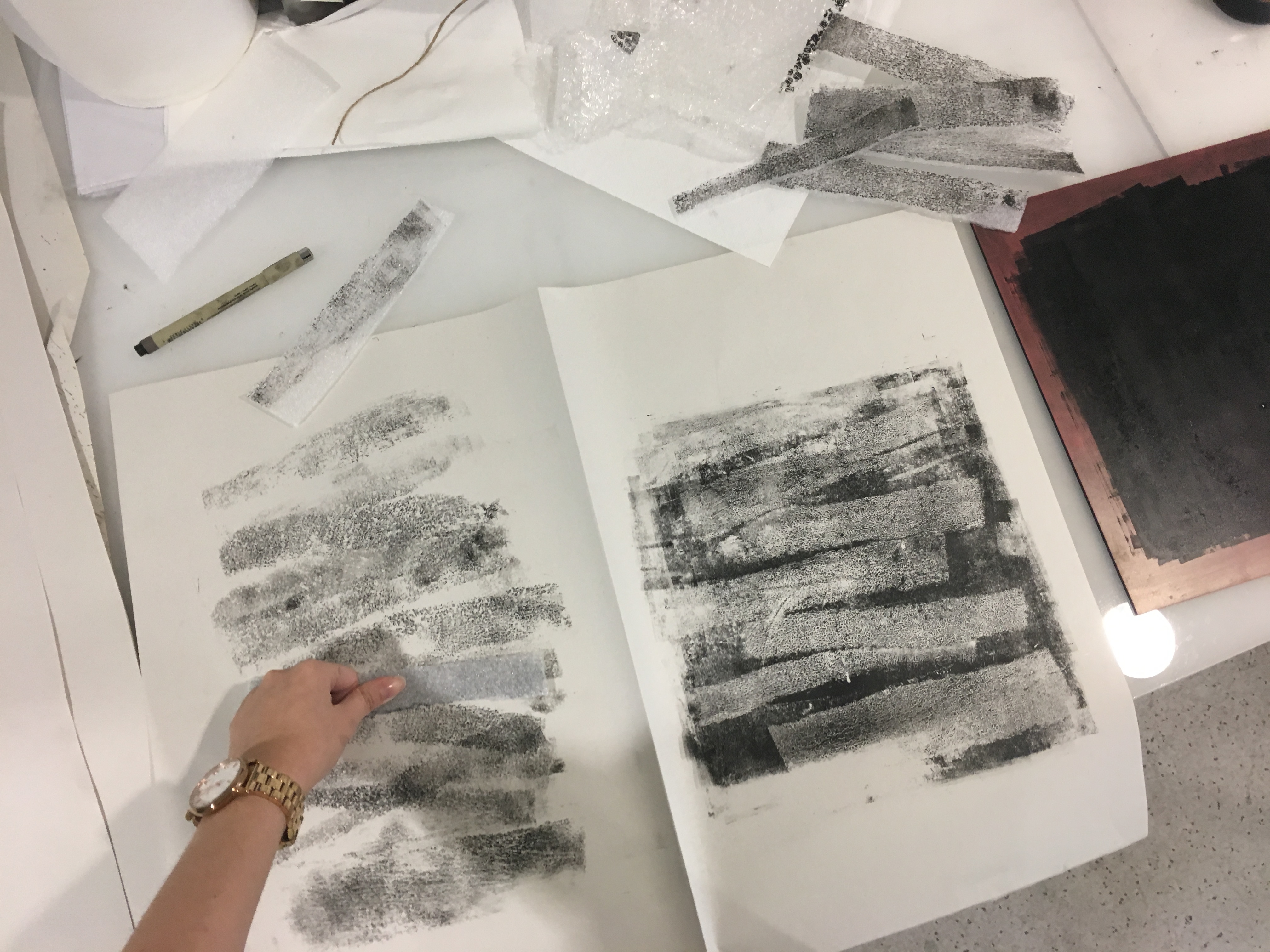
TRIAD


Initially, I planned to use these 2 colours just because I personally preferred it. However, after consultation, Joy mentioned that although it may fall into the split complementary colour rule, it might be even better to use another colour – to create triad colours – so as to bring focus to come objects in the composition as well.


Thus, I’ve added yellow. As seen in the first row, the second and 3rd design had yellows in them, bringing focus to the sheets of paper in the laundry basket and also the hand in the washing machine.


2. Naive + “Us against the world” delusion = Kintsugi ; the art of broken pieces


Naive “Us against the world” delusion  Kintsugi ;
the art of broken pieces

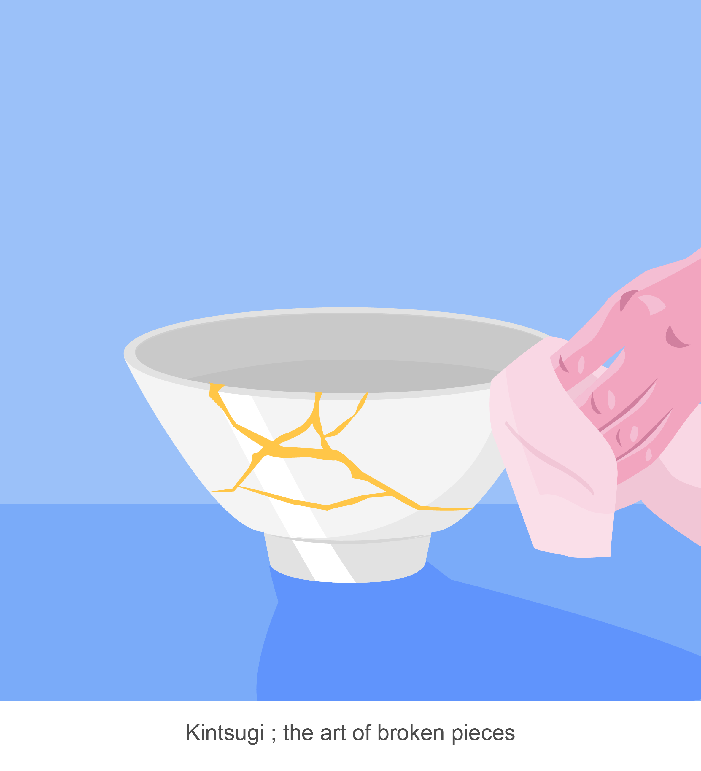
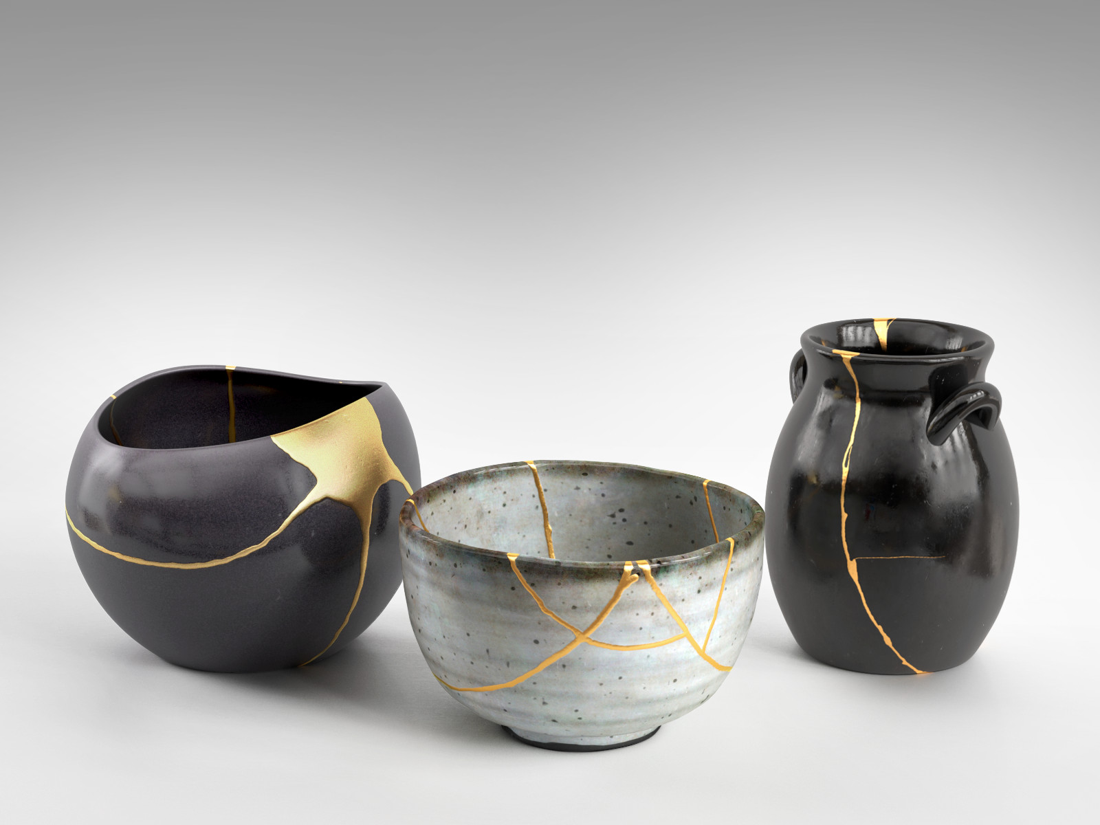
This equation is entirely inspired by Kintsugi, a Japanese art form which mixed liquid gold and lacquer to repair broken ceramic pieces. They believed that there is beauty in the broken pieces being repaired. And true enough, the pieces after being repaired are breathtaking.

Naive me once believed that I could do anything in this world, with the people I love. But, growing up and life experiences have taught me the opposite – to be practical and set realistic goals. Thus, I came up with this equation to portray the falls in life as a beginning of something even better.

For the first design, Naive, I took an ordinary child’s cup with a swirly straw and replaced it with a water slide. By adding a beach landscape to it, I felt that it changed the entire dynamics of the cup as it is now, a playground. Being young and naive tends to also be associated with an imaginative and cheerful mindset – something which I want to incorporate in the design.

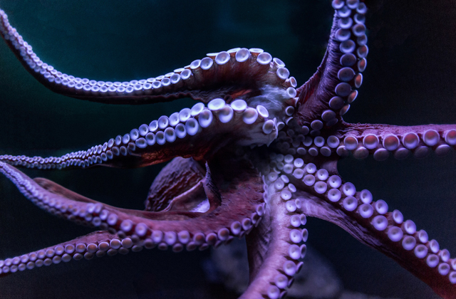
The first thought that came into my mind for the second design was a “me vs. monsters” kind of idea. As seen in games, or in surrealistic images, I want to portray myself being in that non-fictional/delusional state, where all these “monsters” refers to the bad things in life. Thus, the octopus reaching out to the chopsticks.

Lastly, an image of a repaired bowl and a hand wiping it shows the aftermath of the first 2 images – everything that happens in life, will make you better. Those cracks aren’t flaws but it symbolizes the experiences that one has gone through.

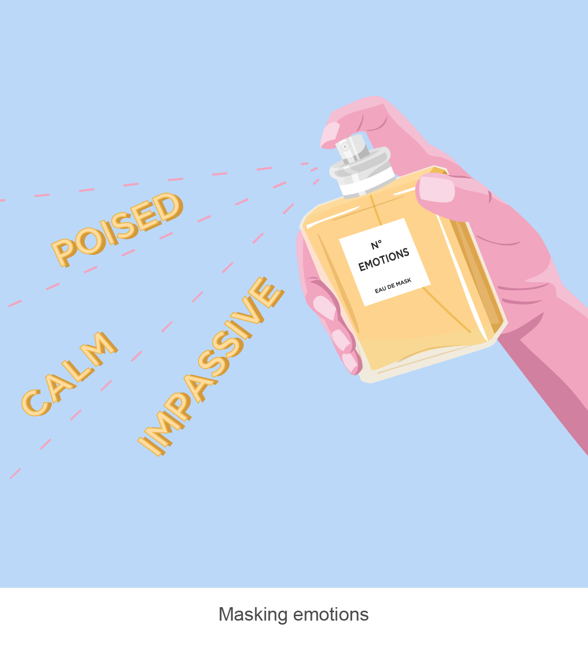
3. Masking emotions + Society = Social persona

Masking emotions Society Social persona

For this equation, I’ve used cosmetics as a theme.

Masking emotions, to me, is just like spraying perfume, where we cover ourselves with a scent, but in this case, with a particular emotion.

For the second design, society is being portrayed as multiple contact lenses. The idea of this is to objectify the ordinary masses views and perceptions as I feel that in today’s society, there are many redundant and ridiculous views which are made by the public. As a result, people have to conform to society’s expectations.

By conforming to society’s expectations, my very own social persona is created. Portrayed by different facial masks, I adopt a different persona in different settings. For example, when I am working, when I am with my family, or when I am in school.

After consulting Joy, she mentioned that the words “calm”, “poised” and “impassive”, made the design too literal and I should work towards it having more space for viewer’s own interpretation of it.

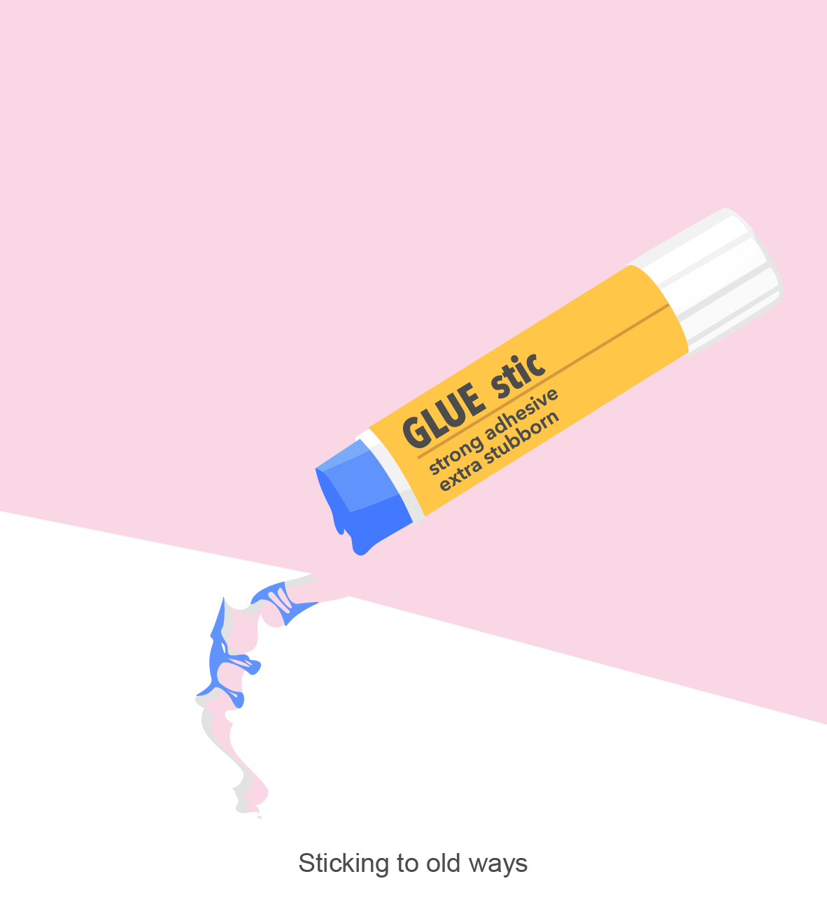
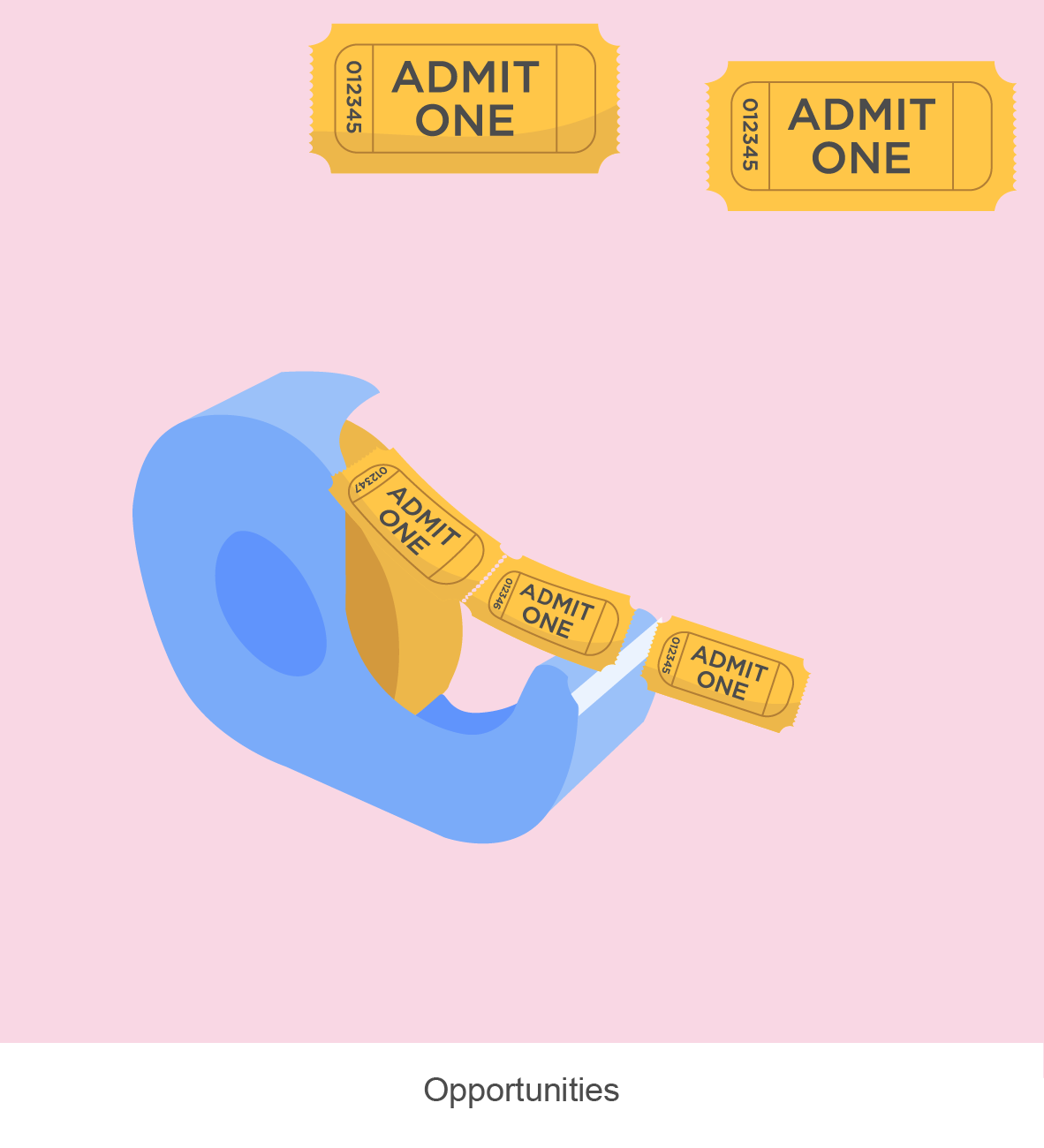
4. Sticking to old ways + Opportunities = Seized opportune moment (Work in progress)

I used stationery items to portray this equation. However, I felt that this equation seemed a little off as “sticking to old ways” contradicts with “seized opportune moments”, because, as a result of me being stubborn, I wouldn’t seize any opportunities. Also, from the consultation, the paper for the 1st box is not very apparent. The tickets in the 2nd box could also add a local context to it as compared to a generic “admit one” ticket as it does not entirely represent the opportunities which I want to portray.


02 Forrest Gump: Design Process

Link to design research: Part (1/3) Artist Research

First and foremost, to start of the next part of my project, I searched for quotes which intrigued me or left an impact on me. They were mostly from movies which I personally like.

Quotes:

  1. You’re a man looking at the world through a keyhole. – Doctor Strange, 2016.
  2. The things you used to own, now they own you. – Fight Club, 1999.
  3. The lower you fall, the higher you fly. – Fight Club, 1999.
  4. You don’t want the truth. You make up your own truth. – Memento, 2001.

Methodology/approach

Basically, I broke down the quotes to identify the key points which lead to an overarching focus. Words such as, “looking”, for example, suggests perspective. Things which I could directly relate to are eyes, sight, light and direction. From there, I searched images which suits the threshold/halftone effect, without compromising the details after the effect was placed.

For this quote, I wanted it to suggest a different perspective of seeing the world. Firstly, the keyhole was a starting point. As an element that constricts the “view of the world”, I thought that it would be good to work around it, thus, the warped buildings and scenery around it. I was inspired by the Russian constructivism art movement and I used the starburst effect to lead the viewers’ eye to the keyhole and eventually, towards the eye.

However, the buildings seem randomly placed. Also, the overall balance seemed heavier on the right as the values are darker towards that direction. Hence, I made some minor changes to it:

I have replaced the buildings into iconic and controversial buildings. The Petronas twin towers, the Eiffel tower, Taipei 101, Burk Khalifa, Antilia and the World Trade Centre. These building ties in with the concept behind this design, which is – looking at the world in a whole new perspective, where even each iconic building has its own story. Many issues in this world are being masked, such as political issues. The media tends to be biased and it overrides issues which they do not wish to show the world.

Buildings from left to right: World Trade Centre (NYC, United States), Taipei 101 (Taiwan), Antilla (South Mumbai, India), Eiffel Tower (Paris, France), Burj Khalifa (Dubai, United Arab Emirates) and Petronas Twin Tower (Kuala Lumpur, Malaysia).

Upon researching about which buildings to use, I thought that it would be good to include these skyscrapers as they are iconic to their countries. They compete for the title of the worlds tallest building and currently, the Burj Khalifa, stands the tallest at 828m high.

Other than these skyscrapers being a symbol and reflection of the city’s wealth and ascendency through the economy and rich history, some of them do have an interesting story.

For example, Antilla. Antilla is a private home in South Mumbai, India, and is owned by Mukesh Ambani.  It is the world’s most expensive private residential property, valued over $1 billion. Its controversial design and ostentatious use by a single family has made it famous across the world, with severe criticism in the architectural press and mockery in popular media. The home consists of 27 floors and 600 staff to mend it 24/7.

After researching about this particular building, I understood the irony that the media conveyed. Antilla was referred to be “Soaring Above India’s Poverty”. This phrase was extremely impactful to me as although I knew that slums existed in India, I didn’t know the controversy which a single building can cause.


In this design, I used a combination of threshold images and a flat circle as the background. The main element and message was portrayed through anthropomorphism, the showing or treating of animals as if they are human in appearance. I felt that this was a unique approach to portray certain characteristics which I did not want to make it seem too literal. By adding animals’ natural characteristics or perceived characteristics to humans, it exaggerates the persona in a “fun” way. I used the head of a bird on a human body, and it pokes fun on consumerism. It can be also be interpreted as “bird brain” and that humans are so obsessed with keeping up with the latest technology that it is redundant and that they fail to notice their surroundings. The unrealistic scale of the iPhone also exaggerates how the figure intently looks at the screen, without realising the surveillance camera lurking in the background.

Generally, there were not many changes made to this design. I’ve only edited the end of the cable as the original shape of it looks like a wine bottle due to the shadows and threshold effect. Instead of having the wires to dangle from the top, I made a one of it strangle around the figure, suggesting the unnoticed tension and lack of awareness by the figure. I felt that this additional element strengthens the narrative behind this design.


My initial design for this quote came off very literal. Although I liked the contradiction of the quote itself, I felt that this design needed a deeper interpretation of it – not just a girl flying and a girl falling.

The second design was ironic and can be perceived as both flying and falling. With the flipped landscape at the back, it seemed like the girl is falling. But, with the hand and the rope, it seemed like the girl is levitating instead.


The third design compromises of an entirely new interpretation of the quote. It explores how youths in this generation are vulnerable and weaker. There is a stereotype of how 21st-century teens are, the “strawberry generation”. When troubled teens are being tackled with a problem, some might turn to a substance abuse to escape reality. The lower they fall, the higher they get. Drugs are being associated with candy, or as such, is seen as “candies” to the youths. Being addicted to this destructive lifestyle would be an endless pit of no return, portrayed by the waves that surround the girl.

Some feedback which I’ve gotten from Joy and my peers were that the 2 halved circles stole the emphasis of the girl, instead of placing the focus on her. The play of basic shapes also coincidentally looked like a pill. The use of the candy can be more subtle as well.

For my last design, I experimented with the use of typography. I deconstructed some words to the point where they became incomprehensible and made use of vowels. Essentially, these are what makes the spoken truth.

However, a major flaw in this piece would be that it lacked emphasis as the values of all the elements are dark. Thus, I felt that it lacked unity and harmony in the overall composition.


I made drastic changes to the next version but it didn’t seem to work. For this piece, poppies and the snake were representing the toxicity which making up your own truth can lead to. Similarly, the sense of direction of the words did not work well with the snake and poppies.

That’s about it for my design process! I will be making more changes to the 3rd and 4th design which will be posted in the final post.

01 My Line is Emo: Process/Experimental Stage

After I have done my research, I was given more time to experiment and explore as many mark making techniques as possible during the subsequent classes.

In this stage, I was primarily trying out different and unique methods of mark making. To achieve as many different results as possible, I varied the medium used, the type of paper and the mark making tools. With every variable changed, there was a great difference. For example, a brush with normal black paint on paper as compared to a brush with diluted calligraphy Chinese ink (less viscous/thick) on water colour paper would differ. (As shown in the next 4 pictures)

1 Brushes

I started with very basic tools, such as brushes of different bristle hardness. I used brush strokes of different density and directions.

These were created using soft calligraphy brushes. I diluted the ink to allow the paint to flow freely onto the paper and to achieve a softer look to it. As I noticed that the diluted ink crumpled the paper, I tried the same technique onto water colour paper instead.

The water colour paper gave way better results and I really love how the ink spreads out with a gradient. Materials really DO MATTER.

2 Knives and Sharp Tools

In this piece, I wanted to portray anger. I started off with slicing up and scratching the surface of the paper. However, the results were not that good – a bunch of holes and torn up edges. In my other versions, I applied black paint for the background and then scratched up the surface. Surprisingly, when the paint dried up, the cuts and scratches made an interesting texture and an aesthetically pleasing yet chaotic look, which I really loved. Perhaps, for my future versions, I would like to consider more about what design elements I could deliberately relate this to so that it would not just be a random scratched up piece of paper.

3 Playing with Fire

For this piece, I was just curious and started playing with fire. Although I did not have much consideration of what emotion this would be, I thought that maybe “Longing” would be something interesting to think about.

4 Cling Wrap

I happened to chance upon the cling wrap in the classroom so I went about experimenting with what I could do with it. I applied paint with different viscosity and got many results – the more diluted ones had this “web” effect while dryer and thicker paint had almost no effect. From the top to the bottom in this picture, I applied a decreasing amount of pressure on my brush.

5 Strings & Press Machine

This was made using ink and the press machine. I always make 2 versions whenever I placed my mark making materials into the machine as I felt that the positive and negative outcome was very interesting and both had its own unique look. One seemed clear, with higher contrast, while the other one, made by pressing it the second time on the paper after it went through the machine, had an x-ray look to it, with gradient patches around.

6 Styrofoam

This is similar to the one above, where I used the press machine. I did a little pressed marks manually as well.

7 Round Objects

For my “happiness” emotion, I wanted to make round, circular marks that looked as if they were floating. Thus, I tried different container sizes and pressed them down with some paint. I mixed white paint onto the containers to break off the monotonous black circle pattern.

———————————————————————————————-

Some patterns made by my mark making tools did not turn out the way I expected it to be. This could be both good and bad – It is good because interesting marks can be made but it is also bad because the marks may contradict the intended emotion that I wish to convey. Another interesting thing that I realised through various experimental methods was that these emotions overlap and coincide with one another. Perhaps, this was why some emotions looked similar or gave the same kind of “feel”.  This was a challenge to me as I wanted each emotion to be expressed clearly with just the use of visual qualities.

Here are some examples of contradictory marks.

8 Fingers

For “happiness”, I tried using my fingers to create these round ovals. However, I felt that the scale was not suitable for the emotion strip as they were too small and would result in a very congested look when being seen from afar. In addition, if the circles were to be further apart, it may come across as “sadness, isolation, neglected” instead of “happiness”.

In this piece, I drew contour lines using a pen to break off the monotonous look. Although I loved the mix medium idea, it did not bring much meaning to this piece as “happiness”.

9 Bubble Wrap

The bubble wrap was intended to create round circles and a bubbly effect, suggesting “happiness”. However, if I were to manipulate it, dragging it across the paper and blurring it, the marks made would come across as “fear” or “sadness” to me due to the distortions and lack of clarity.

This sums up most of my mark making during the experimental stage. Moving forward, I would like to come up with a concept that links up the 6 emotions which I chose.