Category Archives: Creative Response – VC

Review: The Modernist Era

After reading different takes on modernism by the artists, what intrigued me was this sentence by Milton Glaser, “So Modernism became a wonderful way for detoxifying dirty people and dirty ideas.” He then explains how Modernism rejects the emotional ideal and is lacking in passion and sexuality. And that is why corporate identities find themselves aligned with Modernism as he refers Modernism to great progression, endless frontiers and ceaseless developments.

While Glaser might believe so, I feel that there are many angles to look at this. Reducing things to its simpler forms does not always take away the meaning of it. In the case of Modernism, many art movements were experimental and looked at ways of expression. Simplicity was some of their ways to express; it does not mean that they are lacking thereof.

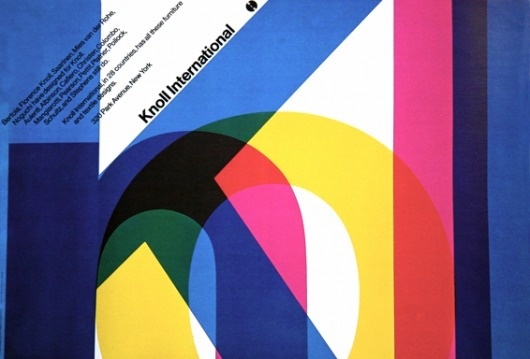
From Rudolph deHarak, he also mentioned, “These Modernists breathed new life into design, cutting away all unnecessary graphics appendages and leaving only the essentials.” Many artists during that time, Max Bill, Josef Muller-Brockmann and Max Huber and many more, had works manifested into a timeless style which were thoughtful and systematic. The works were bold, intensely creative and dynamic and perhaps, this is the beauty of Modernism which Glaser overlooked.


Review: The Age of Information

“We brought discipline to design.’ 
‘We are systematic, logical and objective – not trendy.
Trends kill the soul of design.

This quote, by Massimo Vignelli, piqued my interest and I adore how designers like him use a modern approach to solve design problems. Massimo Vignelli is a famous designer who has practising design in New York for nearly 50 years, during which time he has made a big impact on all forms of design, from graphic design, to furniture, to clothing; all thanks to his design methodology. Vignelli paved the way for visual communication with his methodology. Having to reject the idea of trendy IS design and design should be a change motivated from within.

Vignelli has countless outstanding works; corporate identity works for Gilette, Knoll Associates, American Airlines and New York Transit Authority. 


Piccolo Teatro di Milano 1964

  
American Airlines logo (left), Knoll Associates (right).

Another quote from him is, “We want to make it clear that we are not commercial artists, illustrators or advertising designers. We are information architects who structure information. Like architecture, what we do is not only structural but it is also appearance and visual form.”

He explains “information design” clearly and establishes his stand on the roles of a designer. What he said, made a lot of sense to me. And I think many people, and even designers, overlook the significance of how information is being constructed so concisely with thought and meticulously. For Vignelli, the focus was never on the aesthetics, It was about solving problems and recognizing the needs of people.

The next article, focusing on the rise of corporate identity, evidently shows Vignelli’s design-with-purpose methodology and how his way of thinking aligns with the creation of corporate identity. The “visual image” we get from a brand can be affected by many factors; society, media, brand consistency and identity etc. Very likely, brands with consistent and good brand identity, are successful or at least, on their way to becoming successful. These visual materials are what consumers feed on; they see, they observe and they retain information. The better the companies are in “constructing” their information and their brand identity, the stronger the impact.

References:
http://www.eyemagazine.com/feature/article/reputations-massimo-vignelli
http://www.designishistory.com/1960/corporate-id/

Review: Art Nouveau Piece


Poster advertising Tropon, Henri Van de Velde, 1898, Belgium. Museum no. CIRC.992-1967. © Victoria and Albert Museum, London

This features a packaging by Van de Velde for the German food manufacturer Tropon and to create publicity. Amongst all the art pieces, this is my favourite one as I greatly appreciate the Art Nouveau style. This advertisement for egg whites adopts an abstract form rather than a realistic one. It illustrates the graceful yet structural elements of Art Nouveau; organic shapes, sweeping curves and decorative features. His design also evokes the shapes and colours of the egg. Even though it is highly stylized and abstract, main elements such as the colour of the egg, the roundness of the egg, is still incorporated subtly.

References:
https://www.vam.ac.uk/articles/art-nouveau-an-international-style

Week 5: Bauhaus Shapes & Colour

The Little Red Dot? Where? All I see is a blue circle.

All Singaporeans should know that “the Little Red Dot” refers to Singapore. It is a nickname often used in the media, as a reference to Singapore. It refers to how the nation is depicted on many maps as a tiny red dot. The concept behind this piece is about Singapore, as a small country, being able to achieve immense growth throughout the years since independence in 1965. Today, this thriving city is the result of many generations’ of hard work.

Inspired by the Bauhaus art movement, I used the “ideal” colours of the square, triangle and circle to create a harmonious piece. The different shapes represent many different aspects of Singapore. When I explored the relationship between the colours and shapes, I felt that the red square looked rigid and intense, suitable for an aspect such as political power and political stability. The yellow triangle, looked warm yet edgy, which reminded me of how Singapore is uniquely multicultural and that this fusion has made the Singapore society and community exuberant. Lastly, the blue circle, which is the largest in proportion, represents the growth of Singapore, technologically and as a smart nation. Even though a circle may look dull, the blue gave it its vibrancy. Just like how Singapore may be a really small country, but it is developed and advanced for its size. Known for being a smart nation, I felt blue was the most suitable colour; a colour of intelligence, wisdom and trust. Rather than keeping the shapes straight, I arranged and intersected them, representing the harmonious, good balance in all aspects Singapore has. Regardless of being recognised as a “red dot”, this country is definitely more than just that.

Week 4: DADA

“CHOPE”
This is the Dada poster which I have created using a collage technique and typography. In this piece, there is no perfect sense as to why those objects were chosen or placed where they are. I used an element of chance to determine the placement and as for the objects, they were the first few things in my mind when I thought of “Singapore”. Some of them randomly appeared in my google search while I was searching for those in mind and I included them in as well. The essence of this piece is about the extent of absurdity Singapore’s “Chope” culture is and I wanted to show this through my poster using the nonsensical, satirical elements from Dadaism.

Chope

  1. (Singapore, informal) To reserve a place, such as a seat in a fast food restaurant, sometimes by placing a packet of tissue paper on it. (Definition by Wiktionary)

Singaporeans, known for being “kiasu” (translation: scared to lose) and living in an extremely fast-paced city, can literally chope anything or do anything so as to be the first. For example, Singaporeans can queue HOURS for the gongcha bubble tea, or rush and snatch for anything that’s free. The way that our people live, is in such a way where we “cannot lose out” and must excel in every aspect (or for many people). Although these traits are unique to Singaporeans, I do feel that it also reveals the negative side of society when it is to the extreme. Nonetheless, I think it is quite funny how people use satire to respond to this culture and how we all culturally understand “chope” as Singaporeans.

PROCESS

Attempts using an element of chance.


2nd GIF was a fail though.

ABCD (Self-portrait) A photomontage from 1923–24 by Raoul Hausmann (Left)
Cut with the Kitchen Knife Dada through the Beer-Belly of the Weimar Republic, 1919 by Hannah Höch (Right)

I was inspired by these two Dada artists. Many of their works are nonsensical and satirical; either towards the government, about the society or a certain issue. Hausmann is a founder member of the Berlin Dada group and portrayed satire and political protest in his works. He is known for his criticism through his art and I adored how he incorporated his message in his works. As for Hoch, her key themes are: political issues and the switch of gender roles and she is well known for her collaging technique.

References:
https://www.tate.org.uk/art/artworks/hausmann-the-art-critic-t01918
https://www.britannica.com/biography/Hannah-Hoch

Week 3: William Morris Research


by eQuilter

Merton Fabric by William Morris

Beautiful decorative depiction of chrysanthemums in garnet which I felt was culturally appreciated by Singaporeans due to its vibrant red and the chrysanthemums; which are common and recognisable in Asia. They are very similar to the chinese oriental patterns as well, which I believe many people in Singapore love. (Probably can see them on carpets, cushion covers, bed sheets, etc. and they’re lovely!)