PROCESS
Artist references


Mitsuo Katsui


Giulio Confalonieri

Heinz Kröhl — Kinderverkehrsgarten (1962)

Letterpress & Wood Type Series Published by Maan Ali

Giovedi poster (via Pinterest)
For most of the posters, I found repetition a key design element which made the poster even more dynamic – giving a sense of movement and for some, creating beautiful patterns. I came across Mitsuo Katsui’s works and found it extremely unique and dynamic. I think the colours are extremely beautiful with the opacities but sadly, I wont be working with that many colours. Nonetheless, the overlapping opacities created a psychedelic effect which I really love and would try it out in my posters.
As for my quotes, I have chosen the following 3:
1.
Are you drunk?
No, I’m not?
But I think you’re drunk, you look like you are drunk.
No, I’m just standing here.
2.
How much are you left with?
$40.
Didn’t you get your pay 2 days ago? Where did your money go?
Honestly, I don’t know, it just disappear like magic.
3.
I always come here and eat the prawn mee. The soup is damn good but sometimes it can be quite inconsistent.
SKETCHES
Here are some sketches which I drew which helped me to visualise my layout and which design element I wanted to portray – whether it as hierarchy, balance, scale, repetition, symmetry. I tried using repetition, cropping and tilting some text to create my compositions.


DRAFTS
These are the drafts which I tried to use different design elements – cropping, repetition, scale, emphasis. I also played with varying opacities for many of my posters and I feel that that repetition makes a really nice pattern. At the same time, the word which I want to bring focus to can be at the highest opacity. With this, I think it places emphasis on the word which I want it to, yet the repetition of low opacity words make a nice pattern, do not steal the main focus and also leads the viewers’ eyes to the rest of the words in the sentence.


Some feedback:
– Margins could be wider, more negative space
– inconsistent looks too consistent
– maybe could add 1 more colour to the b/w posters
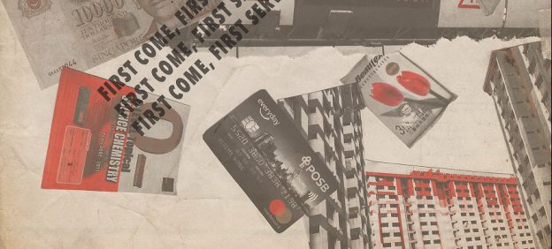
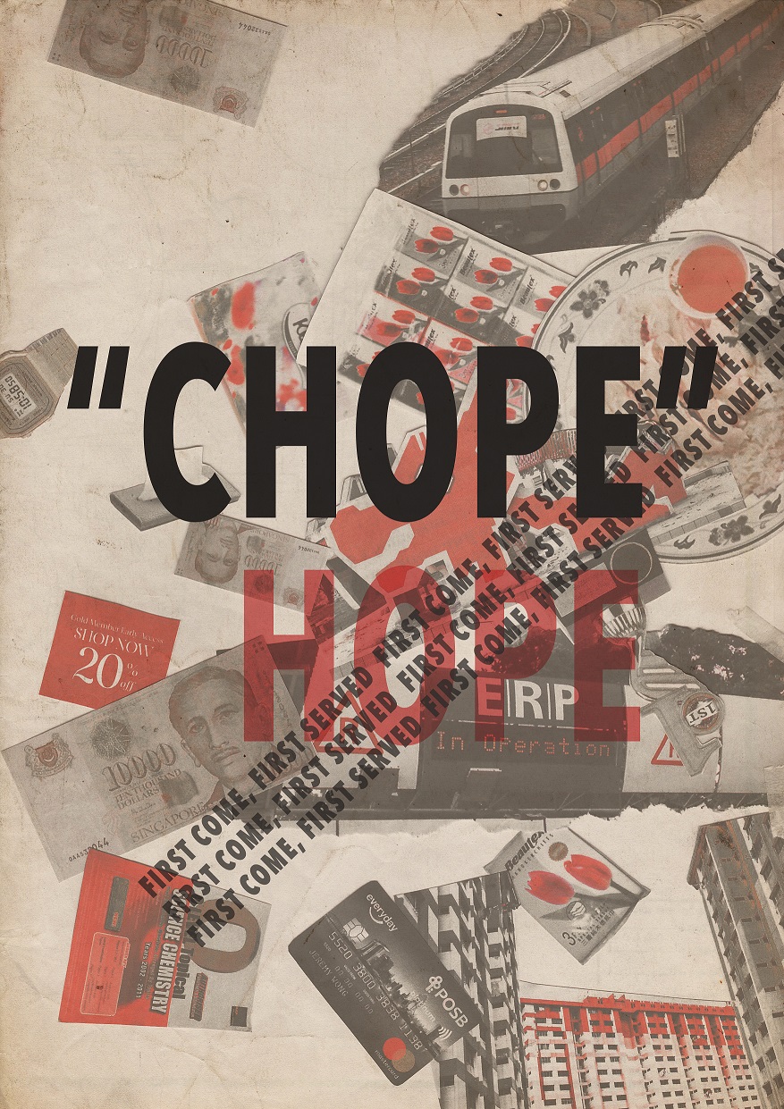
Final posters

- Used repetition and varied opacities to create a pattern. This psychedelic-like pattern emphasizes the word “drunk”, almost replicating the dizziness of a drunken state.
- Used repetition, varied opacities and different weight of the type. From the strongest bold to the thinnest hairline san serif, the repetition of words look like it is slowly fading and disappearing.
- Used design elements that are totally different from the previous ones (literally inconsistent if you put all 3 together). Unlike the other 2, which have stricter use of the grid and symmetry, the last one does not follow any – it is free-flowing and organic, rotated in all sorts of angle and even used upper and lower case to give the word inconsistent a less rigid and consistent look. Scale is most prominently used in this composition as I had to consider how the letters flow from one to the other as I rotate them in all angles.
Lastly, I think in all the posters, the hierarchy and emphasis is extremely important for all as there are a couple of words in the quote. Thus, the decision to emphasize on certain word/words is crucial to keep a good hierarchy for the viewers as they look at the posters.