Category Archives: Process

03 Zine: Locale Process

Moving on from part one of Locale, I will be focusing on the artist research and process of creating my zine here.

To view the first part of my Locale project, you can click on the links below:
Locale: Research
Locale: Infographics

I drew some visual references which I took from the site itself and worked from here onwards.

 
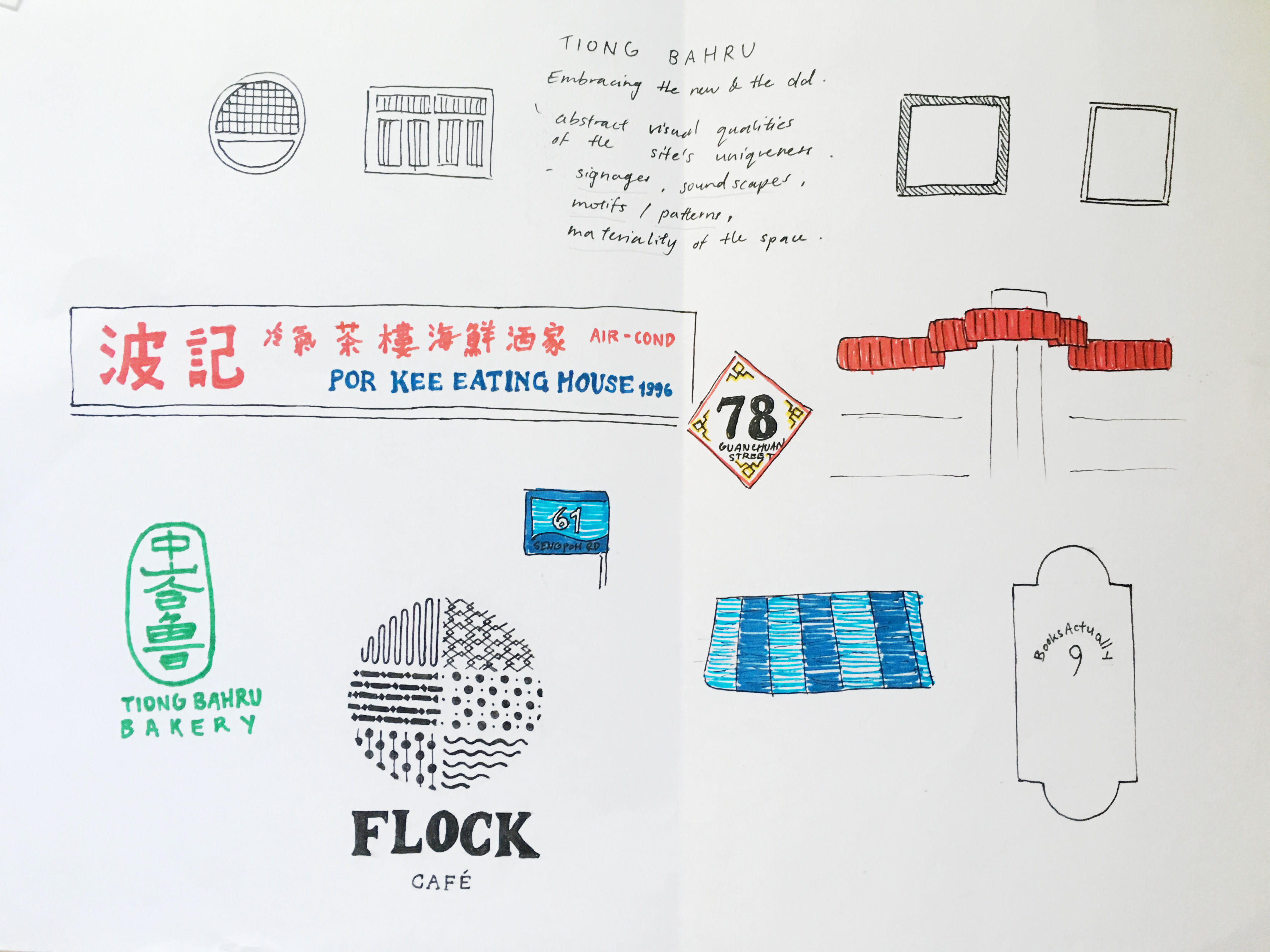
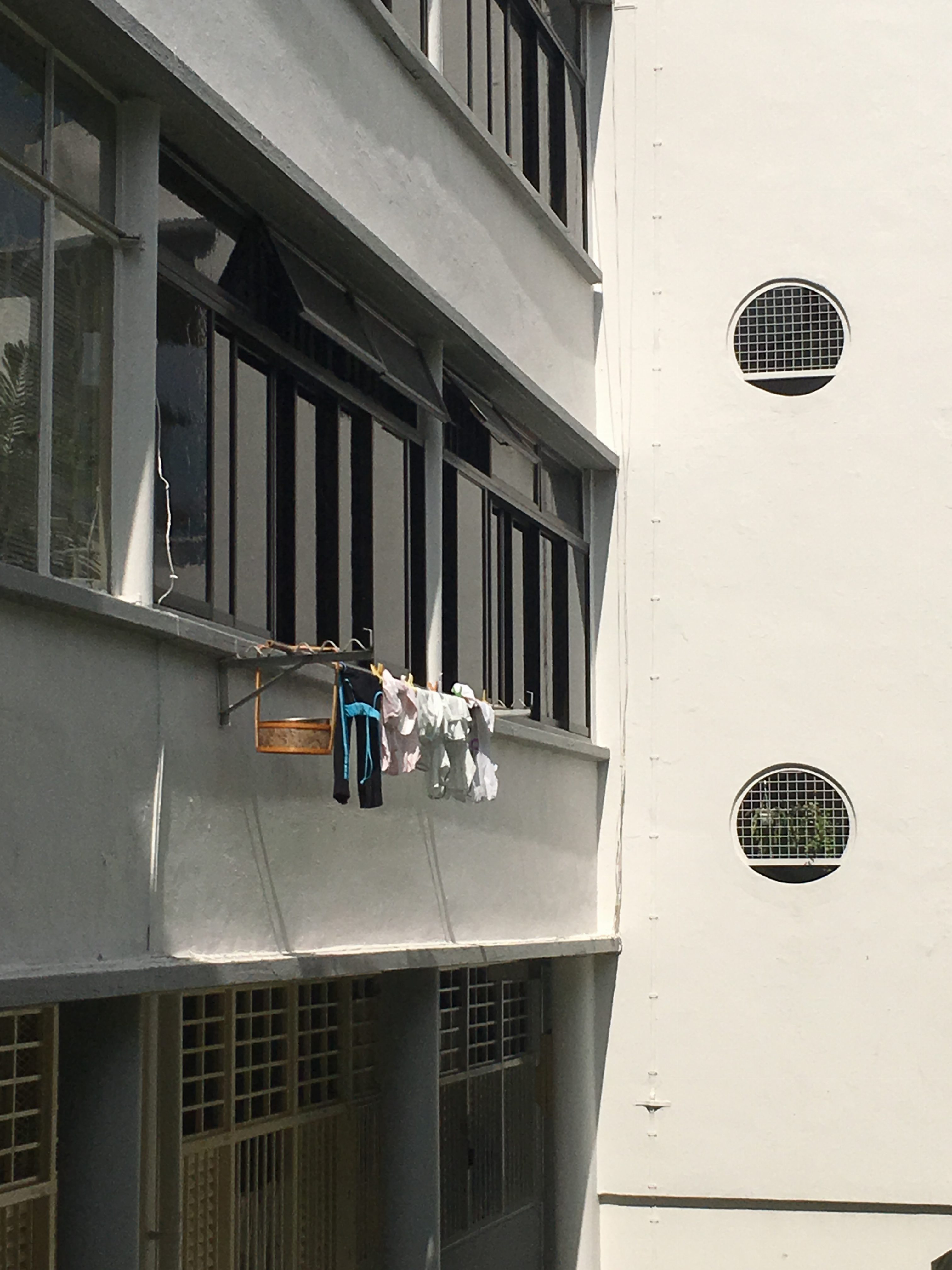
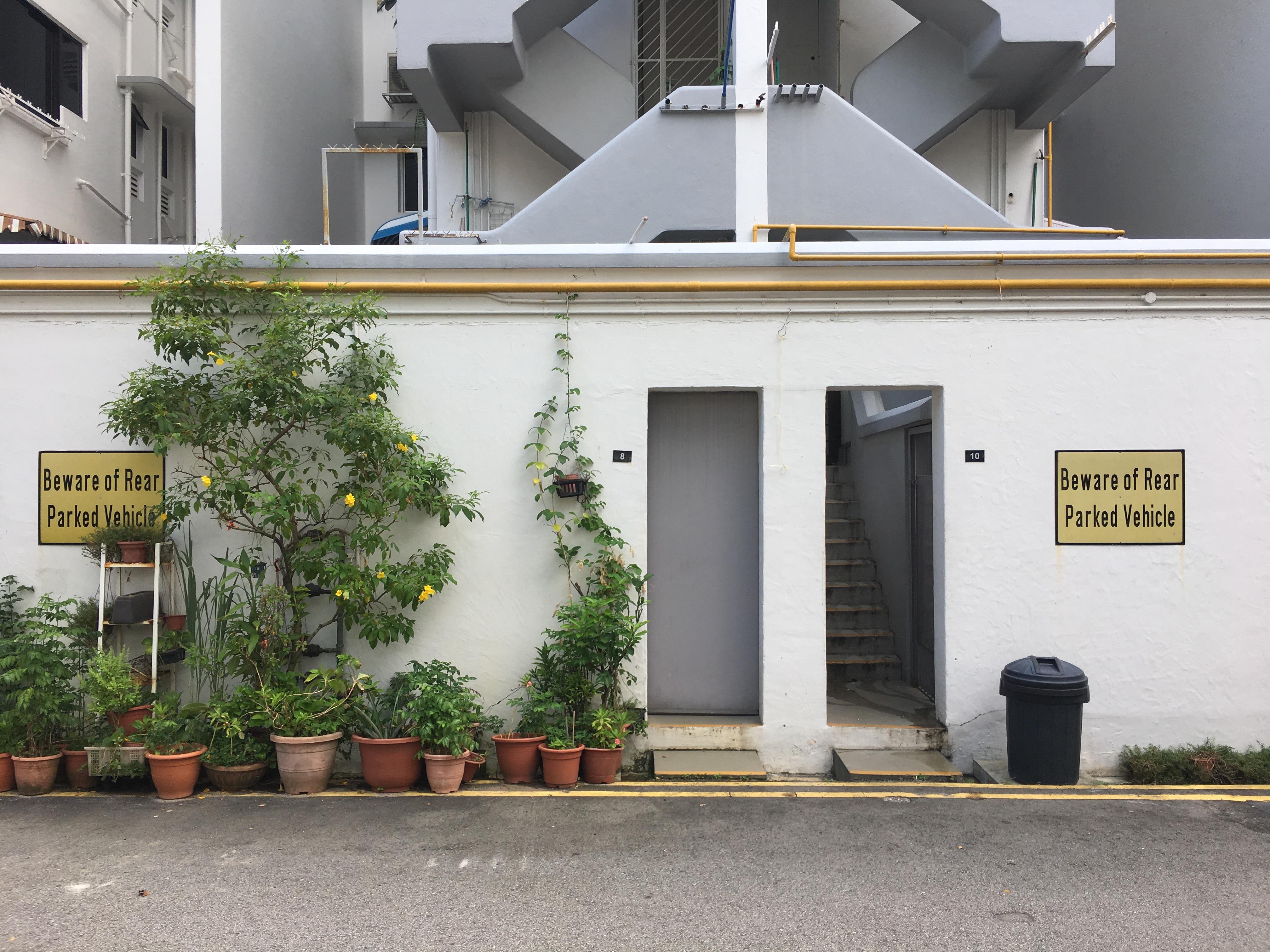
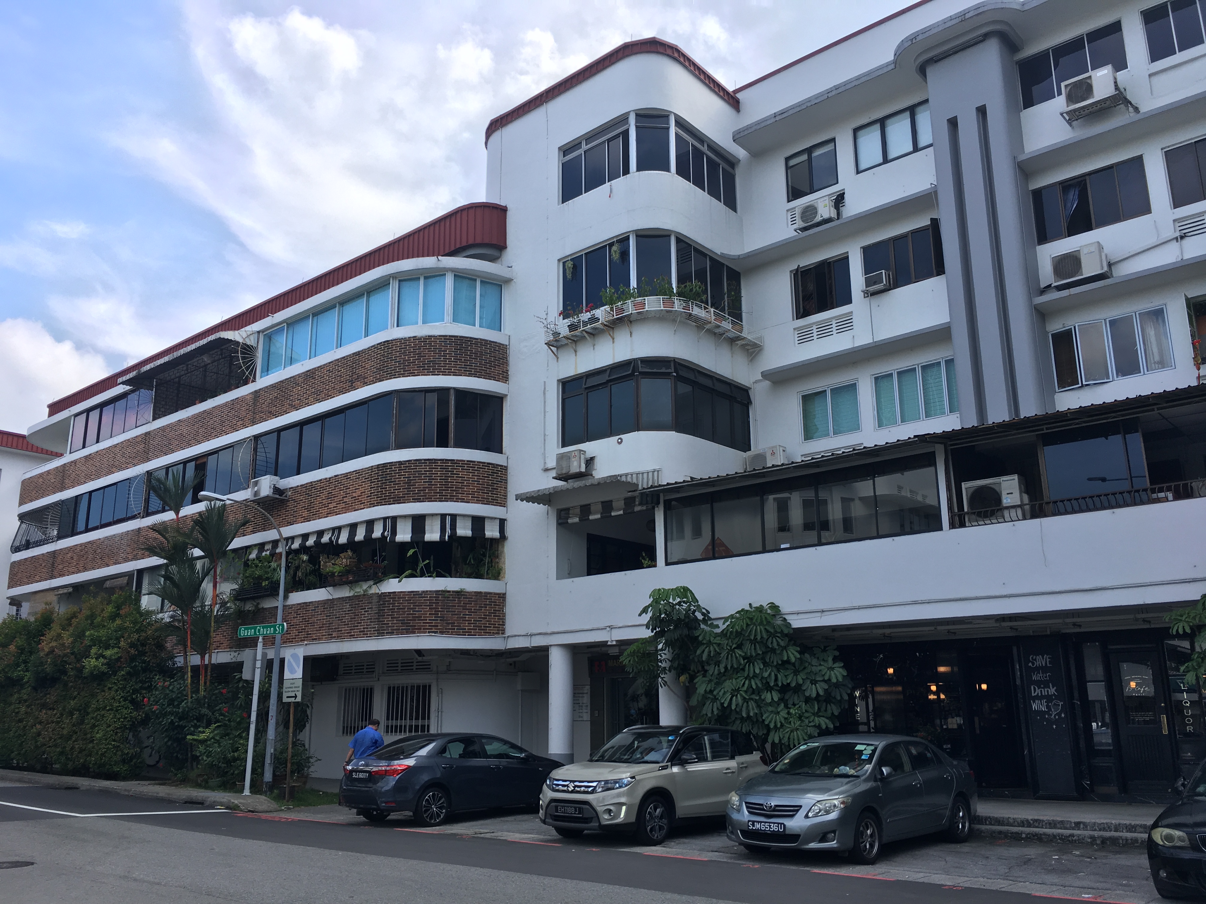
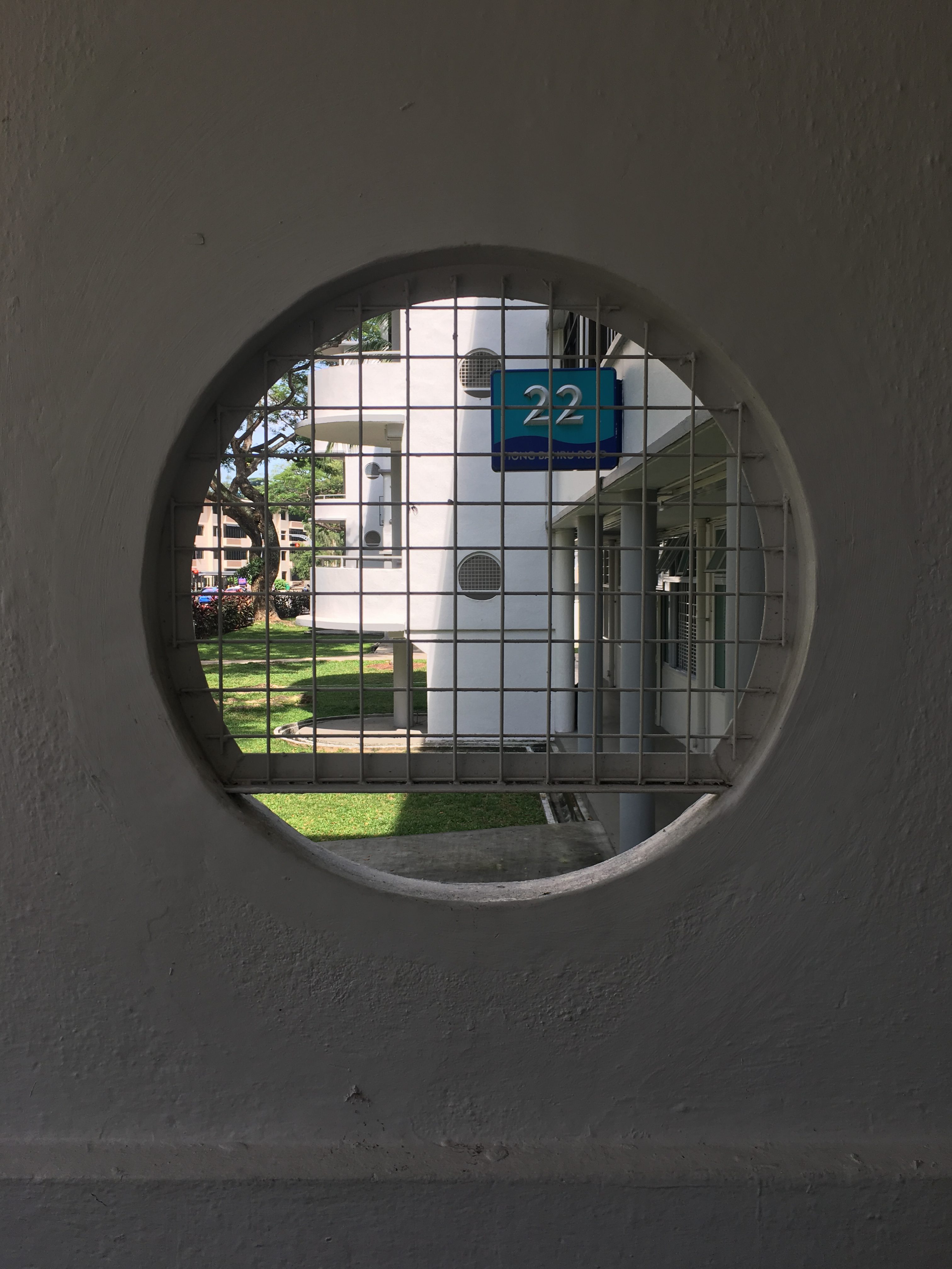
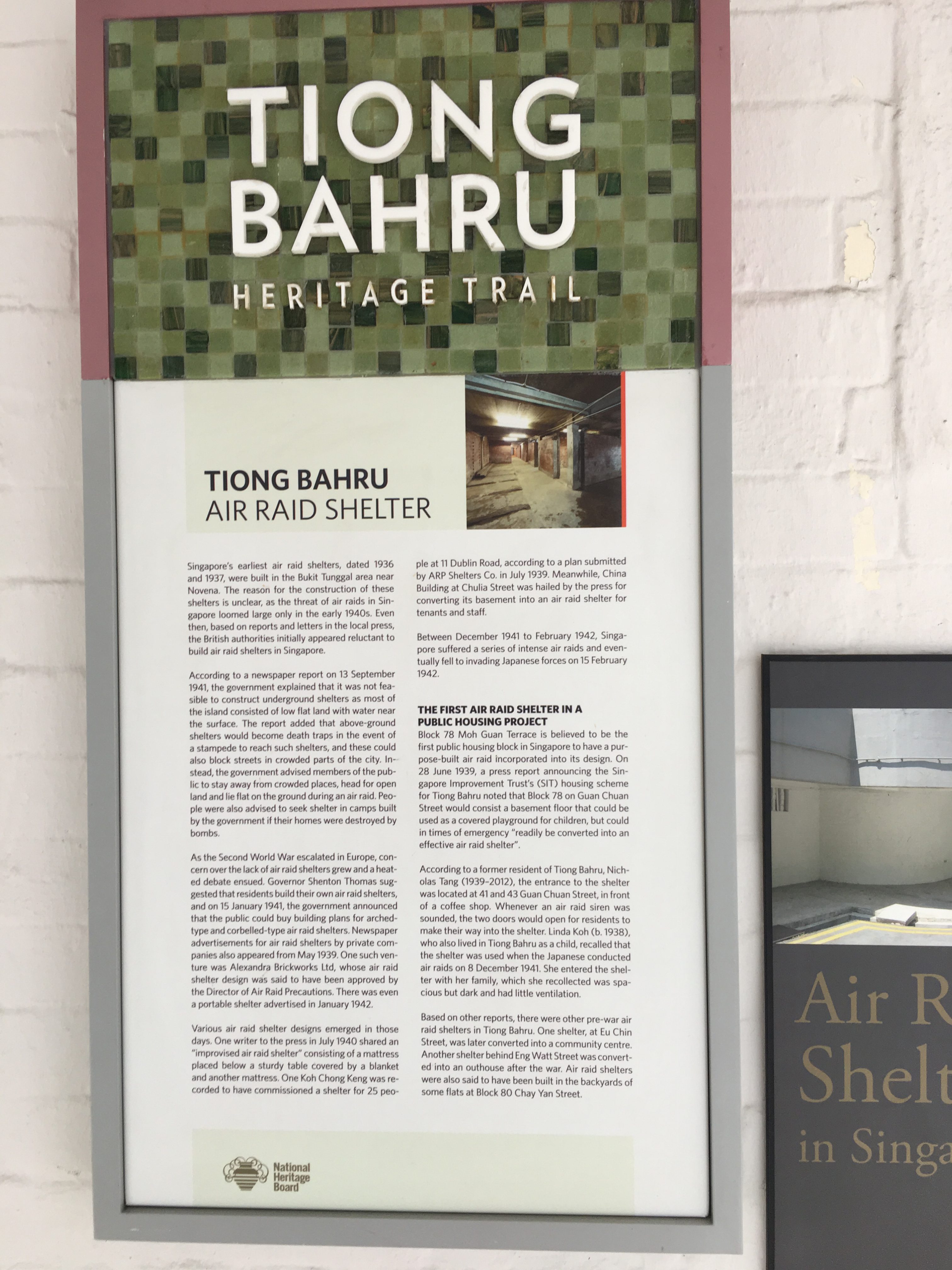
Some pictures I took @ Tiong Bahru

I tried looking for motifs which could be simplified or abstracted but due to the nature of the Art Deco style in Tiong Bahru, I realised that I would end up working with simple geometrical shapes if I were to choose a vector approach in terms of my art direction.

Thus, I drafted the cover page and 2 spreads, inspired by circular motifs and soundscape.
Here are some soundscapes which I was inspired by.

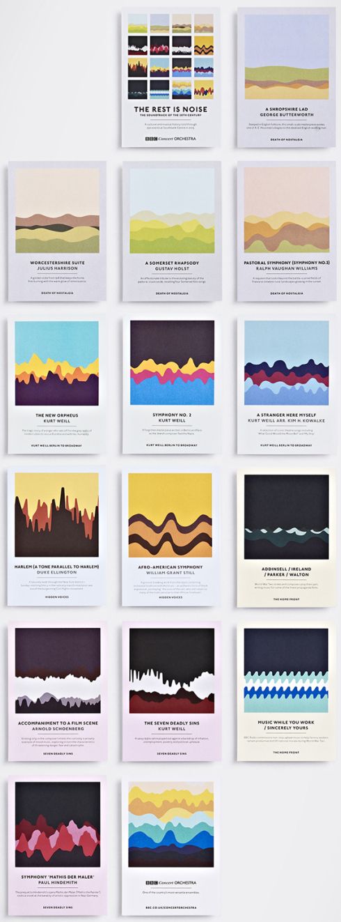
Studio Output’s set of graphic postcards for London’s Southbank Centre.

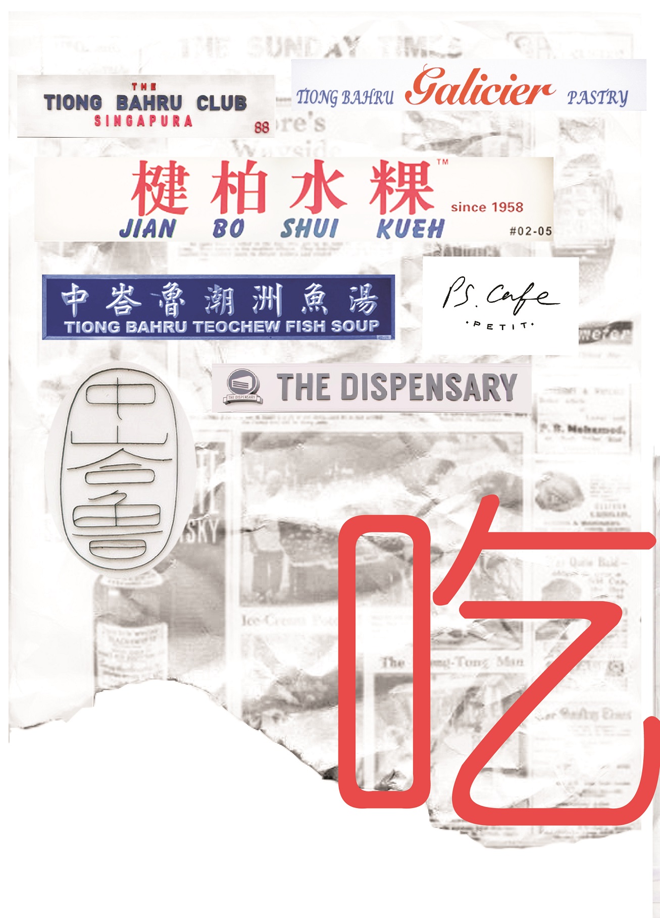
I would be exploring with soundscapes and forms which reflects the activity within Tiong Bahru. As my unique selling point is “Embracing the new and the old”, the overarching theme to show activities of the new and old would be through a simple Chinese idiom, “吃喝玩乐” (Translation: Eat, drink, play, enjoy).

My first 2 spreads were minimalist. I mainly used basic shapes to convey the activities in Tiong Bahru. The four pages are representative of “吃喝玩乐”,
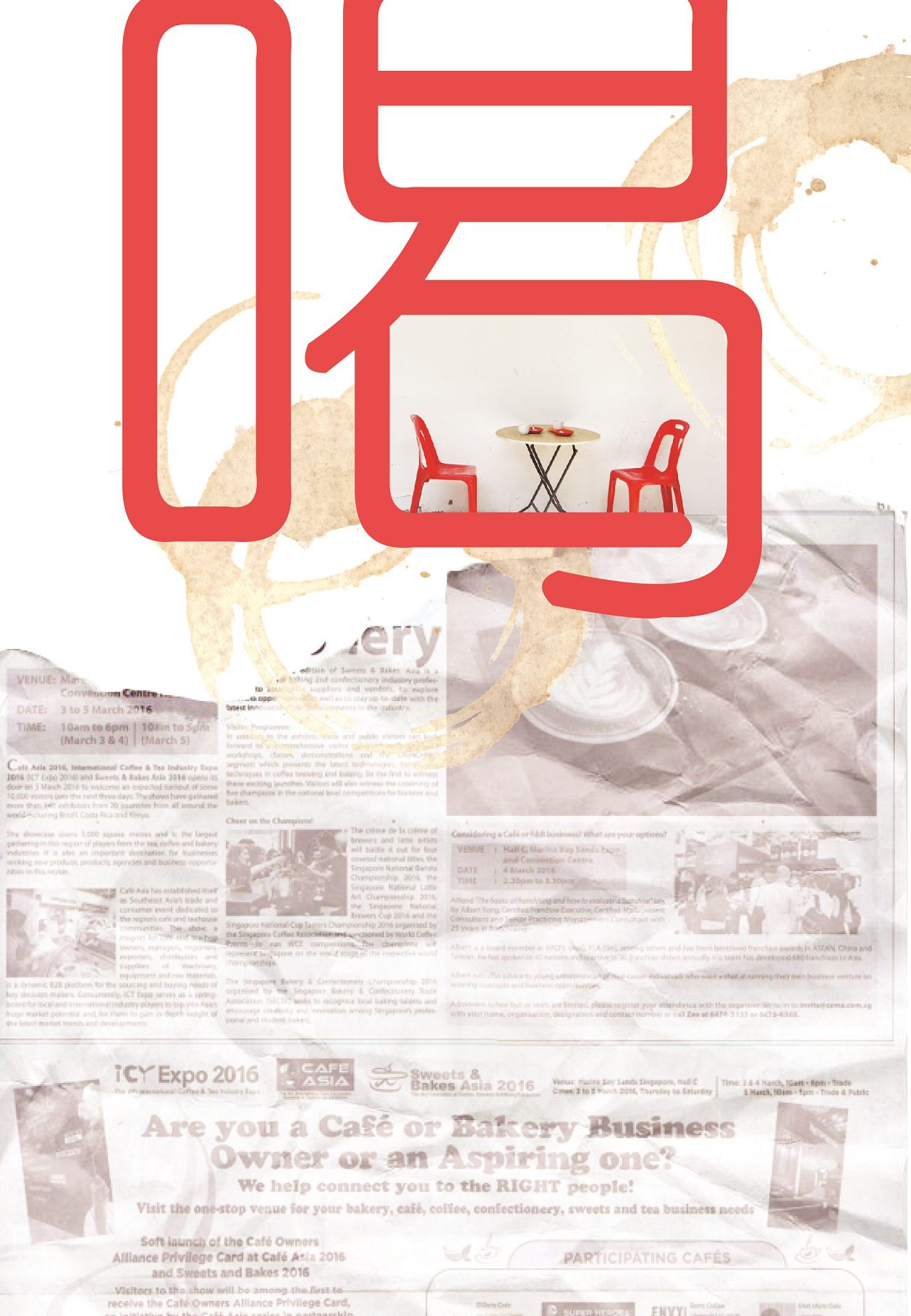
Relaxed, fulfilment, happiness. I associate eating with these based on what I have observed. Whether is it at the market or the cafes, everyone was pretty relaxed and happy.

Coffee talks; something which stood out to me the most as I was at the site. A cup of kopi or a cup of cappuccino, young or old, the scene of them chatting always warms my heart. Relating to the soundscape, the soundscape represents a conversation of something telling a story, where it is calm at the start and it slowly peaks to the climax of the story.

Although the meaning of “play” here is disappearing as everyone nowadays are fixated on their phone screens, I still do see kids at the playground once in awhile, screaming and having fun. Thus, these higher frequencies of soundscape to represent them.

To me, enjoyment within Tiong Bahru gives a nostalgic vibe. When I interviewed some residents, they mentioned how they used to play with fire, rear chickens, have a bird corner and how they remember that the newspaper uncle could throw the newspaper all the way up from the ground floor to the third. These are small nostalgic moments which I would like to capture.

However, I felt that this vector and minimalist approach limits the visual quality of portraying Tiong Bahru. Other than the signature red and blue colour, the motifs are too minimalistic to be an abstract representation of the site. As mentioned in my consultation, some aspects which I can explore are textures, motifs, patterns and typography.

MY SECOND IDEA

As I have always worked with vector illustrations, I find it hard to bring out visual qualities of a site using anything but vectors. So, in my second (failed) attempt, I tried incorporating some textures and marks I found in that area, such as newspaper and coffee stains. However, it ended up looking messy and with no focal point. Also, because I took the signs and collaged them, it added on to the chaoticness of the spread. So I scraped this eventually.

Some points to note:

Maybe I could extract the typography on the signs.
Use pictures instead.

References:
Studio Output’s soundwave concert postcards

02 Locale: Research

To start off project 2, here’s the research I’ve conducted, primary and secondary, to find out more about my chosen site: Tiong Bahru.

PRIMARY RESEARCH

ETHNOGRAPHIC RESEARCH (QUALITATIVE)

01 Site Observations

Firstly, to know more about the place itself, I visited the site and explored around Tiong Bahru. I went ahead to observe things up close which I normally don’t, such as, the architecture, the shops, the housing areas, the courtyards outside the Singapore Improvement Trust (SIT) flats an even the bomb shelter located at the old estate.

As I walked around the area, I took down some notes using the POEMS framework; a design thinking framework useful for ethnographic research.


02 Ethnographic Interviews

Other than observations, I interviewed the people around the area – residents and passers-by. To obtain more holistic information through the interviews, I ensured that I interviewed a range of people, especially from teens to elderly as I felt that their varying responses were key to finding good insights about this place.

Here’s a sample of the interview questions.


SECONDARY RESEARCH

WEBSITE AND ARTICLES (QUANTITATIVE)

As for the secondary research, I looked up useful information which substantiates the information that I have gathered through the primary research. I found reliable information from government websites, such as the Urban Redevelopment Authority (URA), the Tiong Bahru: Heritage trail by the Singapore National Heritage Board and the Straits Times.

Source: Urban Redevelopment Authority (URA)

Singapore Improvement Trust flats in the Tiong Bahru estate. (c. 1953. Image from National Museum of Singapore.)

Singapore Improvement Trust flats in the Tiong Bahru estate. (c. 1953. Image from National Museum of Singapore.)Singapore Improvement Trust flats in the Tiong Bahru estate. (c. 1953. Image from National Museum of Singapore.)

From these sources, I have found out many interesting facts and the rich history of Tiong Bahru regarding the estate. Information such as when was the first block built and who were the people living in the block and even the following developments. Basically, Tiong Bahru’s timeline as an estate.  One of the most iconic blocks of the estate to me was the one with a purpose-built air raid shelter, which I visited during my site visit as well. I was pretty surprised when I found it as it was really in the middle of all the flats. Some interviewees also pointed out the bird singing corner (which I couldn’t find during this visit). Without getting to see it, I just googled it to know more about it. (But, in the end, I went back to Tiong Bahru again to take a look at things which I have missed out, like the bird singing corner.)

References:
http://eresources.nlb.gov.sg/infopedia/articles/SIP_1700_2010-08-11.html
https://www.challenge.gov.sg/print/life-style/tiong-bahru-tales
https://www.ura.gov.sg/-/media/User%20Defined/URA%20Online/Guidelines/Conservation/Tiong%20Bahru%20General%20Guidelines%20240913.pdf
http://www.tiongbahru.sg/tiong-bahru-estate/
http://www.visitsingapore.com/see-do-singapore/architecture/historical/sit-flats/

MAP OF TIONG BAHRU FOR SIT FLATS, c.1920

01 Image Making Through Type: Ideation and Process

IDEATION

I began my ideation with the basics,

“My name is…”

I wrote down as many variations of my name, which I felt that will be helpful later on, when I have to decide which name/initials will be more suitable for my letter form.

Concept (process):
As we have to come up with 4 different designs, I felt that maybe I could link them up and tell a story. I started with looking into my dream jobs and these are some jobs which I listed out:

Architect
Interior designer
Packaging designer
Brand identity designer
UIUX/User experience designer
Goldsmith/jeweller (jewel crafter)
Pastry chef/pâtissier
Tattoo artist
Spiritual healer (shaman/witch/enchanter)  
Fragrance chemist (Alchemist)
Adventurer


Eventually, I narrowed down the list and got my 4 jobs.

The Journey of Dream Jobs
Tone: Positive
Message: Sometimes, dream jobs are seemingly impossible due to constrictions and practicality. Nonetheless, going through this identity crisis of being conflicted with what we want is mandatory to find ourselves; in hopes that everything will eventually work out.


In chronological order,

Patissier
Architect
Tattoo artist
Packaging designer


As this project was to incorporate the letterform which reflects a particular job, I found these examples really interesting and useful: how they managed to visualise both letterforms and shapes and make sense out of it.


Chineasy by ShaoLan Hsueh


Moonshine poster by Jon Klassen


Mariano Pascual’s 36 Days of Type (click to see the rest)

36 Days of Type by Shiffa


PROCESS

PATISSIER


To show this impossible dream of mine, I portrayed a dessert to be pretty-looking on the outside and disgusting on the inside.

Initially, I wanted to use solely complementary colours but subsequently, I felt that it was lacking colours and vibrancy.

Also, in the composition with the green background, my letterforms were incorporated into the reflection of the slime (k a i). However, after consultations, Joy mentioned that the letterforms could be incorporated into something more significant to my story/dream job.

So, I have made some changes, like the colours used. I included a range of analogous colours instead. The letterform, K, is in a form of the crack seen on the plate instead: showing how impossible this dream is and that is a bad choice for me to do so.

As compared to the letterforms in the slime, I found it slightly easier to incorporate the letter K as a crack as it is angular. Whereas, the slime took on an organic shape and fitting angular letterforms would cause it to warp even further, losing their readability.

ARCHITECT


I was Inspired by Zaha Hadid, an Iraqi-British architect. Known as the “Queen of Curves”, her architecture style is advanced and sleek.


In this design, I wanted to illustrate impossible architecture through exaggerating the structure and subtracting the basics of what makes a building foundationally sound and strong. In my sketches, I tried creating this structure using geometrical and organic shapes, or a mix of both. Depending on my choice, the letterforms chosen varies. My initials, “KT”, as compared to “KAI” seemed more appropriate as the angularity of it is an advantage. The letterforms are illustrated as sticks which are trying to support the structure but from consultations, Joy suggested to make this structure look “even more impossible”.

For the last design, I added texture to it so that it looks more dynamic.

TATTOO ARTIST


Inspired by the Ukiyo-e art movement, I wanted to design something which reflected a rebellious phase of mine, and also the practicality of being a tattoo artist due to cultural constrictions. I started off experimenting with the neon-sign look as it reminds of shady places that bad and messed up people visit. Also, the tattoo artist is drawn in lines, unlike the person getting tattooed, as it represents this dream job of mine does not even exist at all; an impossible vision.

However, I couldn’t think of how should my letterforms be in this composition as the line work illustrations are a little distracting.

In the last picture, I experimented with the brush tool that I have learnt in class. Instead of illustrating the chain manually, I made a pattern brush, using chains. Most probably, I would include this chain element in my letterform as it represents the cultural restrictions of being a tattoo artist.

PACKAGING DESIGNER


Memphis artist, Peter Judson,
with his vivid isometric illustrations.


In my final design, I played with basic shapes as I was inspired by memphis art style. By utilising this art style, I felt that the placement of elements and colours used played a great part in creating a dynamic composition; one that looks playful and joyful.

References

https://www.behance.net/gallery/16735099/36-Days-of-Type
http://www.mariano-pascual.com/36-Days-of-type
http://www.nathanfowkesart.com/
https://www.kickstarter.com/projects/shaolanchineasy/chineasy-begins-
https://www.pinterest.com/pin/192599321539037000/
https://www.pinterest.com/pin/463378249133358484/