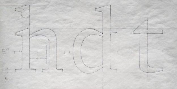
Having to experience a transitional period where technology is evolving, Matthew Carter shared many stories and insights about typography and his own experience as a typographer. Carter is renown and even if one has never come across his name, they will have definitely seen his works before. Carter is the man behind typefaces such as Verdana, Georgia and Bell Centennial. One of the video’s highlight was the problem where fonts used to require large data back in the days. As such, Carter “solved” the problem by adjusting the points on a serif font – just that the problem was already solved by engineers 2 weeks before Carter found them the solution.
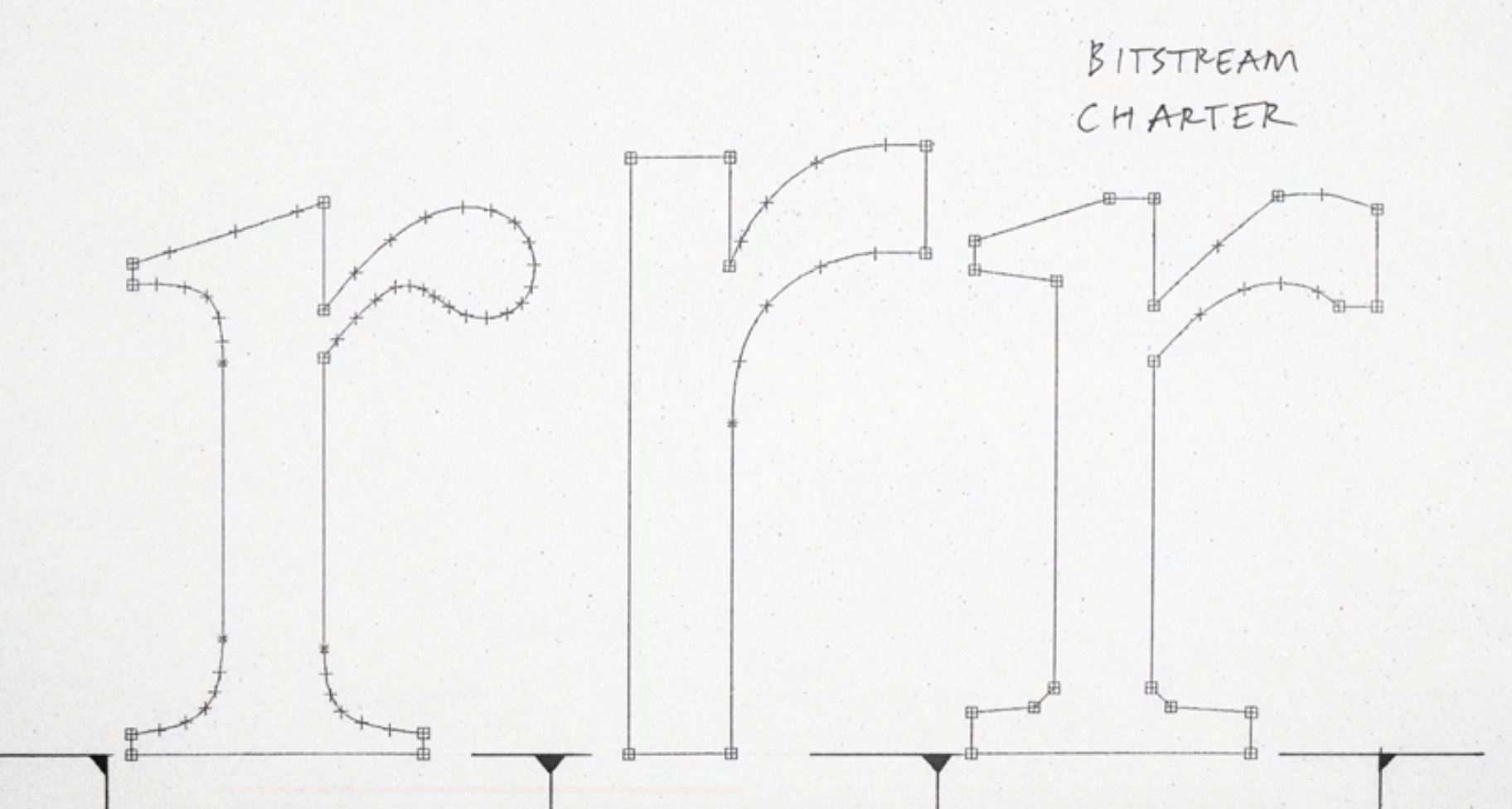
“What had started out as a technical exercise became an aesthetic exercise. “
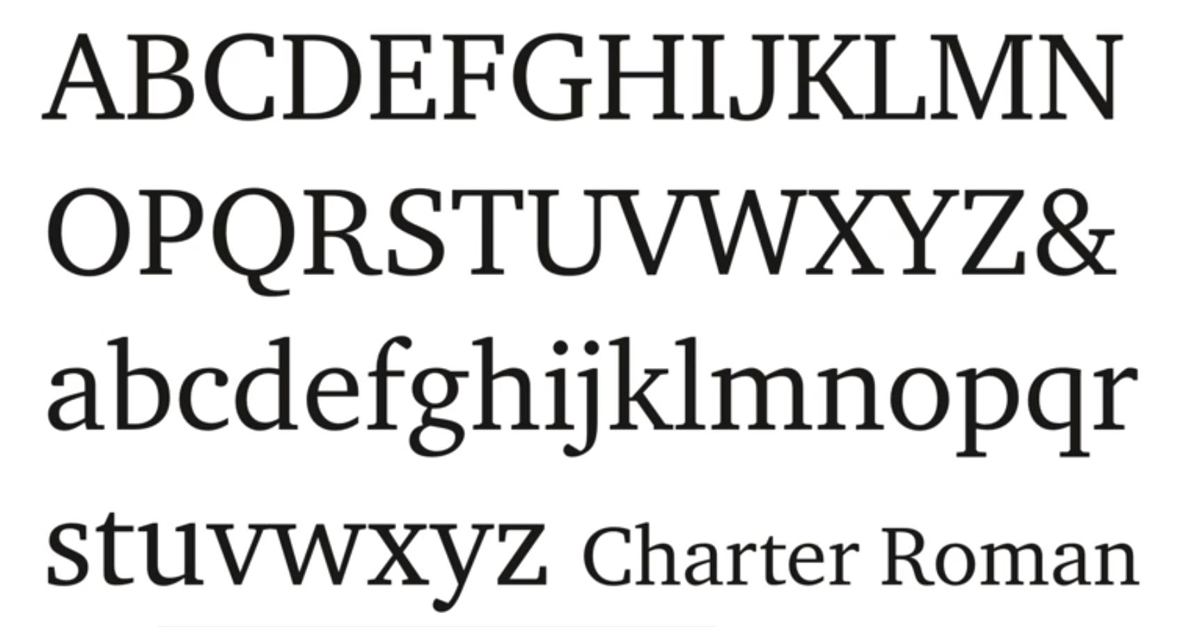
Regardless of Carter’s redundant solution, he grew to like the aesthetics of his creation. Him misunderstanding the technology has offered doors to innovative designs. In my opinion, it was a good thing even though his solution flopped, as he created something of value to himself as a designer. Today, designers create everything with a purpose, an intention. Creating another Charter like this would be rather rare, and that was the beauty that Carter saw in the type.
References: