Monthly Archives: September 2018

Week 5: Bauhaus Shapes & Colour

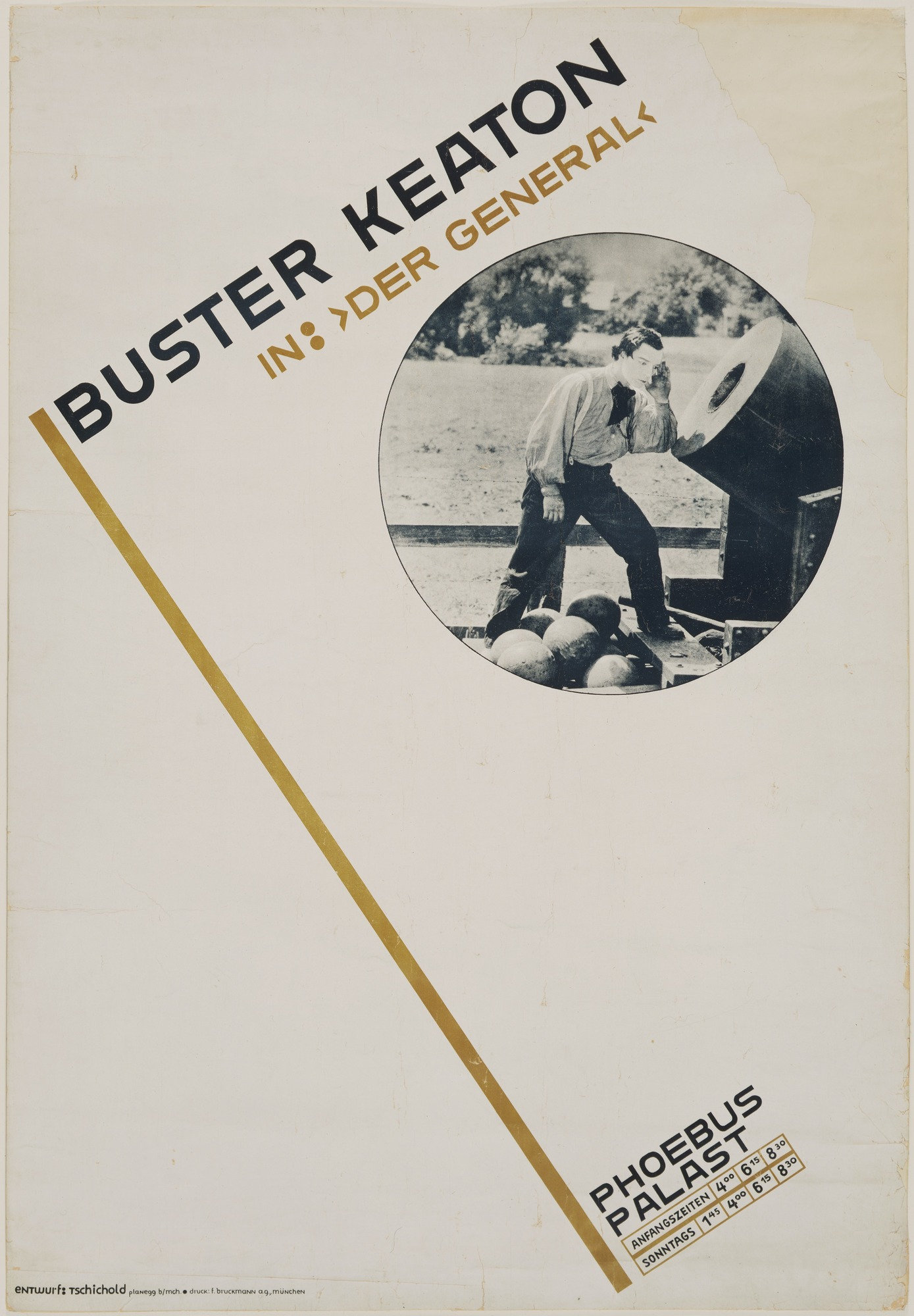
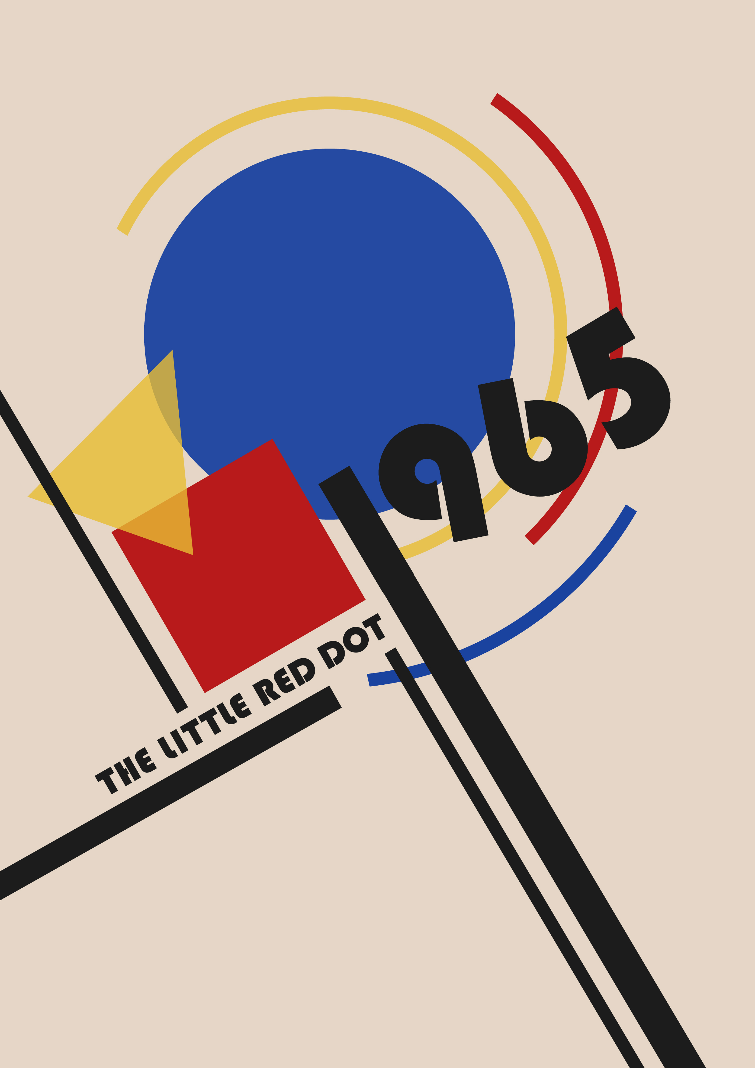
The Little Red Dot? Where? All I see is a blue circle.

All Singaporeans should know that “the Little Red Dot” refers to Singapore. It is a nickname often used in the media, as a reference to Singapore. It refers to how the nation is depicted on many maps as a tiny red dot. The concept behind this piece is about Singapore, as a small country, being able to achieve immense growth throughout the years since independence in 1965. Today, this thriving city is the result of many generations’ of hard work.

Inspired by the Bauhaus art movement, I used the “ideal” colours of the square, triangle and circle to create a harmonious piece. The different shapes represent many different aspects of Singapore. When I explored the relationship between the colours and shapes, I felt that the red square looked rigid and intense, suitable for an aspect such as political power and political stability. The yellow triangle, looked warm yet edgy, which reminded me of how Singapore is uniquely multicultural and that this fusion has made the Singapore society and community exuberant. Lastly, the blue circle, which is the largest in proportion, represents the growth of Singapore, technologically and as a smart nation. Even though a circle may look dull, the blue gave it its vibrancy. Just like how Singapore may be a really small country, but it is developed and advanced for its size. Known for being a smart nation, I felt blue was the most suitable colour; a colour of intelligence, wisdom and trust. Rather than keeping the shapes straight, I arranged and intersected them, representing the harmonious, good balance in all aspects Singapore has. Regardless of being recognised as a “red dot”, this country is definitely more than just that.

Typographer of the Week: Jan Tschichold

I have to admit, I have never heard of Jan Tschichold before. With that being said, the readings were astounding to me; to know that this artist has left such a great impression on typography and a legacy behind in the typography world.

Jan Tschichold
Jan Tschichold is an influential German author and typographer. He was vital in the development of typography in the 20th century, most notably because of advocating the beauty of sans serif fonts, set principles of typography and also developing the page canons.

Notable works 

1. Die Neue Typographie by Jan Tschichold

Following the success and intrigue of his manifesto, Tschichold focused his attention on dealing with this idea of ‘modern typography’.  He wrote ‘Die Neue Typographie’ and had it published in Berlin. People described it as sympathising with the philosophy of the communist revolution. In Die Neue Typographie, Tschicold also provided a set of rules that standardized the practices relating to modern typography.

2. Page Canons

In one of his books, he wrote, “Asymmetry is the rhythmic expression of functional design.”  He found the way to design a harmonious page. A perfect page. There were many rules, guides and ratio which he has set in order to create the perfect page he desired. Every single detail matters. Some of the guides are the Van de Graaf Canon and Tschichold’s recommended 2:3 page-size ratio. Many of these guides are still evident in today’s design.

   
Sonderheft Typographische Mitteilungen (1925) by Jan Tschichold


ABC of Hermes Crafts


Kinfolk Magazine

Some thoughts:


A poster by Jan Tschicold 

His way of creating is definitely something worth remembering and learning. The different ways in which he played with typography, space, layout – very experimental yet essential. He was bored of seeing the same type layouts over and over again and it motivated him to be experimental with typography and layout. This experimental mindset is what will set an artist apart from the rest.

One thing which I really love about his works is the perfect page harmony. The canons of page construction can basically turn a page into something so aesthetically beautiful and pleasing to the eye, as the reader reads the text or admires a picture in a book. I have learnt that in typography, there is a fine line between order and disorder. Underlying the what (might seem) disorderly or asymmetrical text might be the typography guides that these designers have been using since then.

References:

The Secret Law of Page Harmony


https://thecharnelhouse.org/wp-content/uploads/2016/11/jan-tschichold-the-new-typography-1928.pdf

Type In The Wild

Firstly, I’ve never put in much thought about type in signages/posters/billboards around Singapore – or maybe I subconsciously do. I could, however, tell whether one poster or even a shop sign looks aesthetically pleasing or not; and that is actually what I think, we all have been learning in class. Why does it look aesthetically pleasing? All of this is thanks to, the font used, kerning, leading, emphasis, harmony, etc.

And these are some pictures which I took when I travelled to Tiong Bahru/Redhill area. In general, what I noticed about sign boards (not for shops, but for directional, instructional ones), is that the fonts are more formal and readable. For the “Tiong Bahru Road” sign and the “Pedestrians, use crossing signs” in the picture with a cat, they are sans serif type, Grotesk Sans Serif – heavier in weight, uniform and cleaner as there are no serifs. As these fonts are easily readable, the text on the signs has both form and function. (Unlike the No smoking sign which has an awkward (to me) serif font that says “By Law” – lighter in weight, too much vertical stress as the “L” barely visible.

Many of the other shop signs and even the poster, used sans serifs fonts. Overall, they give a cleaner look and enhances readability. However, some places choose to use serif fonts but I realised that they are mostly brand names (many alcohol brand logos are in serif), short words and texts or that they have a more “traditional” look.

Here comes the bad typography. (in my opinion)

(The irony of this picture though)

Regardless, I think the suitability of the typeface used is extremely important and determines the outcome. Some fonts just don’t work out. For example, the menu picture from Tiong Bahru Bakery – yes, the handwritten typeface style is cute and friendly but it takes quite some time to read a font like that – it is lightweight, irregular, and has asymmetrical curves. Other than readability issues, it is not entirely a bad font.

The last bad typography would be the “Xiao Long Bao”. Firstly, the g stands out like a sore tongue. I have no idea why they chose comic sans, but I do find the readability good as it is heavier in weight and the round edges make it look like “friendly, less-edgy and approachable”.

First Impressions

Good typography is just all about nice fonts. Am I right? Wrong. 

We are all surrounded by fonts and we see them everyday. Having to actually learn about them in details is slightly new to me. My first impression of typography lessons was that we will be going straight into using texts, learning about fonts and doing editorial/poster stuff. But, I came to realise after the lessons that what we learn here are back to the basics, foundational knowledge that every design student should be aware of and skilled in. Even things such as the history of typography and the books many renown, key artists have written, are very important in the learning process. Why does a particular layout or font look better the way it is? I guess we can now answer this kind of questions.

Nonetheless, it was fun thus far and my group is Bangkok Fish n Chips. We chose Bodoni as our font and it would be an interesting journey to be learning more about this font.


Week 4: DADA

“CHOPE”
This is the Dada poster which I have created using a collage technique and typography. In this piece, there is no perfect sense as to why those objects were chosen or placed where they are. I used an element of chance to determine the placement and as for the objects, they were the first few things in my mind when I thought of “Singapore”. Some of them randomly appeared in my google search while I was searching for those in mind and I included them in as well. The essence of this piece is about the extent of absurdity Singapore’s “Chope” culture is and I wanted to show this through my poster using the nonsensical, satirical elements from Dadaism.

Chope

  1. (Singapore, informal) To reserve a place, such as a seat in a fast food restaurant, sometimes by placing a packet of tissue paper on it. (Definition by Wiktionary)

Singaporeans, known for being “kiasu” (translation: scared to lose) and living in an extremely fast-paced city, can literally chope anything or do anything so as to be the first. For example, Singaporeans can queue HOURS for the gongcha bubble tea, or rush and snatch for anything that’s free. The way that our people live, is in such a way where we “cannot lose out” and must excel in every aspect (or for many people). Although these traits are unique to Singaporeans, I do feel that it also reveals the negative side of society when it is to the extreme. Nonetheless, I think it is quite funny how people use satire to respond to this culture and how we all culturally understand “chope” as Singaporeans.

PROCESS

Attempts using an element of chance.


2nd GIF was a fail though.

ABCD (Self-portrait) A photomontage from 1923–24 by Raoul Hausmann (Left)
Cut with the Kitchen Knife Dada through the Beer-Belly of the Weimar Republic, 1919 by Hannah Höch (Right)

I was inspired by these two Dada artists. Many of their works are nonsensical and satirical; either towards the government, about the society or a certain issue. Hausmann is a founder member of the Berlin Dada group and portrayed satire and political protest in his works. He is known for his criticism through his art and I adored how he incorporated his message in his works. As for Hoch, her key themes are: political issues and the switch of gender roles and she is well known for her collaging technique.

References:
https://www.tate.org.uk/art/artworks/hausmann-the-art-critic-t01918
https://www.britannica.com/biography/Hannah-Hoch